NASA Earth Science
Overview
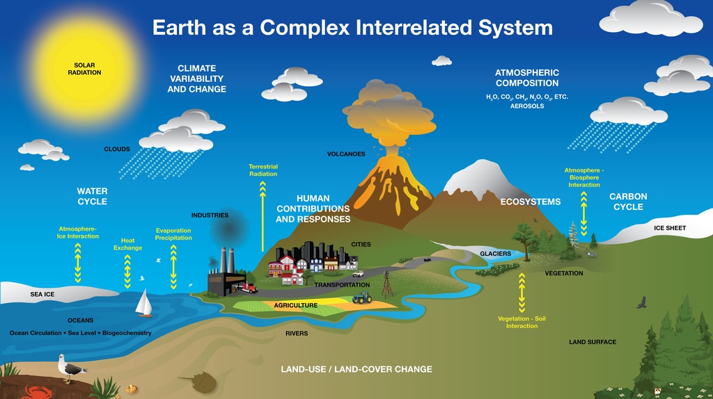
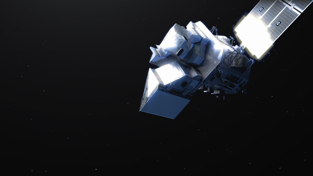
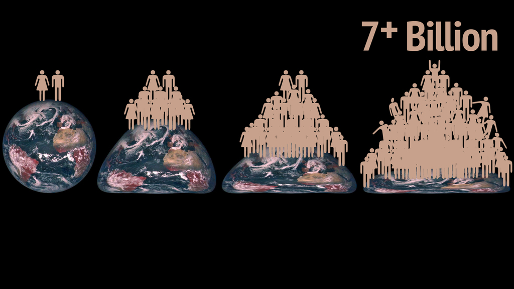
NASA’s Earth Science Division (ESD) missions help us to understand our planet’s interconnected systems, from a global scale down to minute processes. Working in concert with a satellite network of international partners, ESD can measure precipitation around the world, and it can employ its own constellation of small satellites to look into the eye of a hurricane. ESD technology can track dust storms across continents and mosquito habitats across cities.
For more information: https://science.nasa.gov/earth-science
Atmospheric Composition
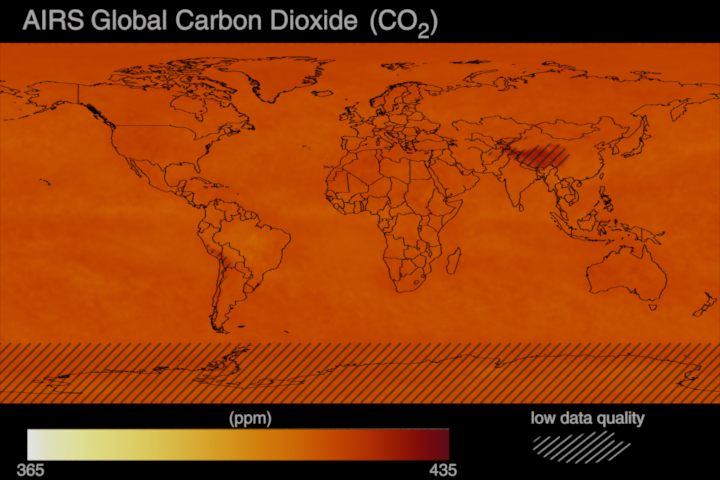
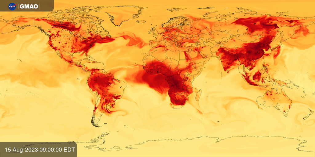
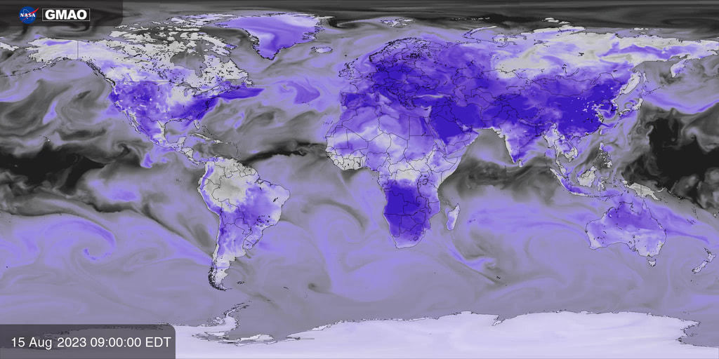
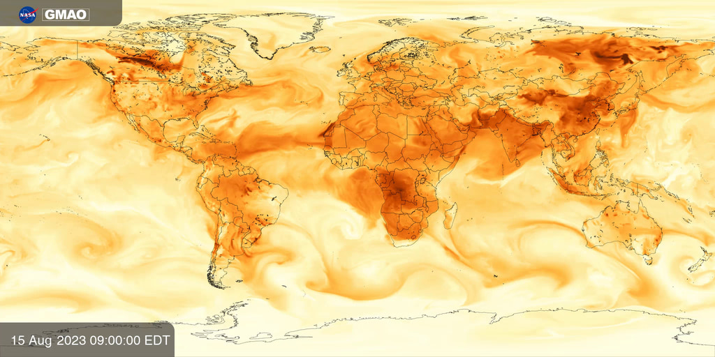
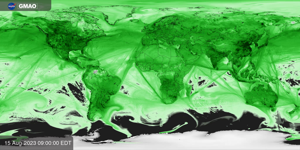
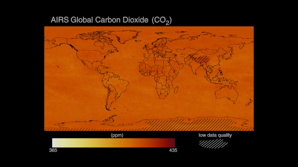
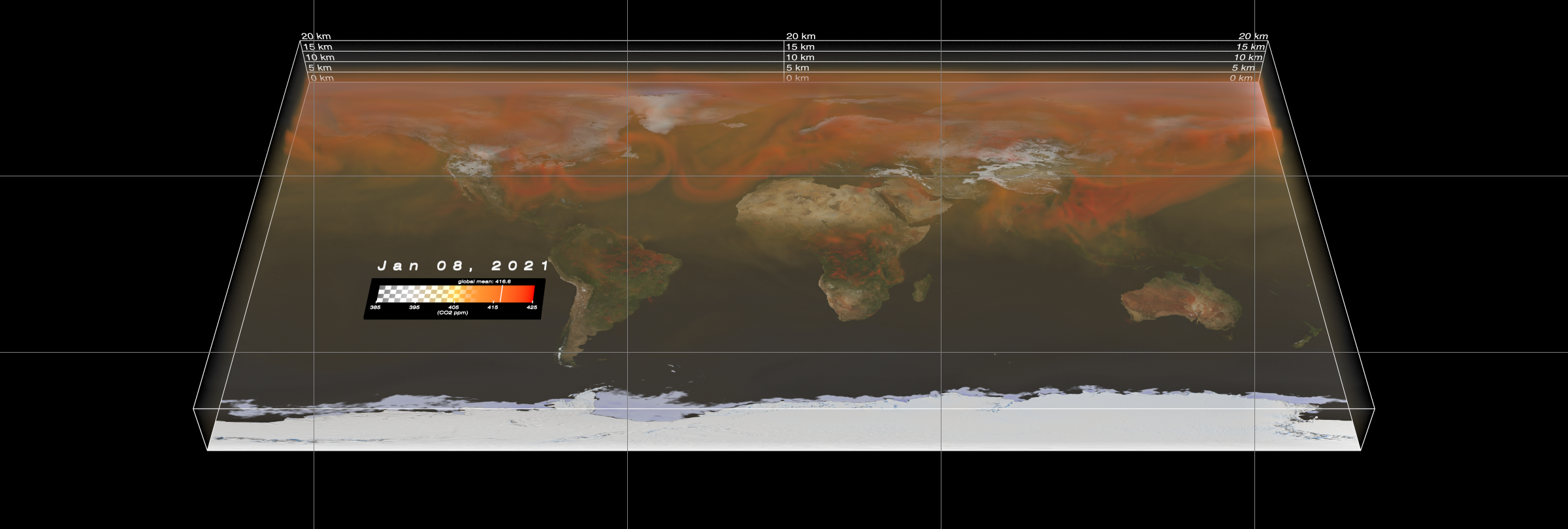
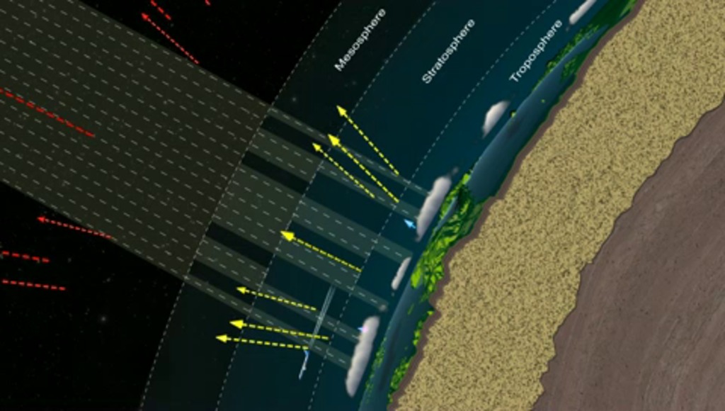
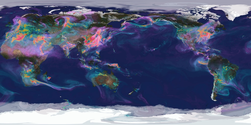
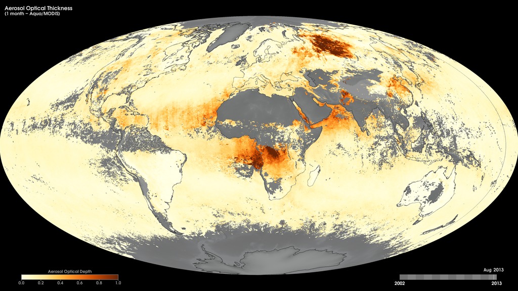
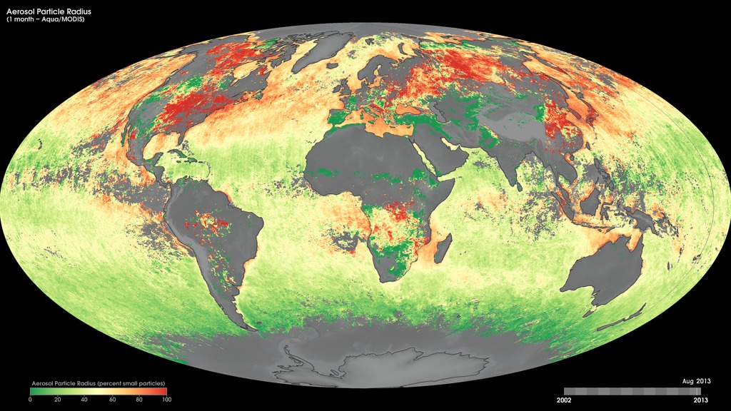
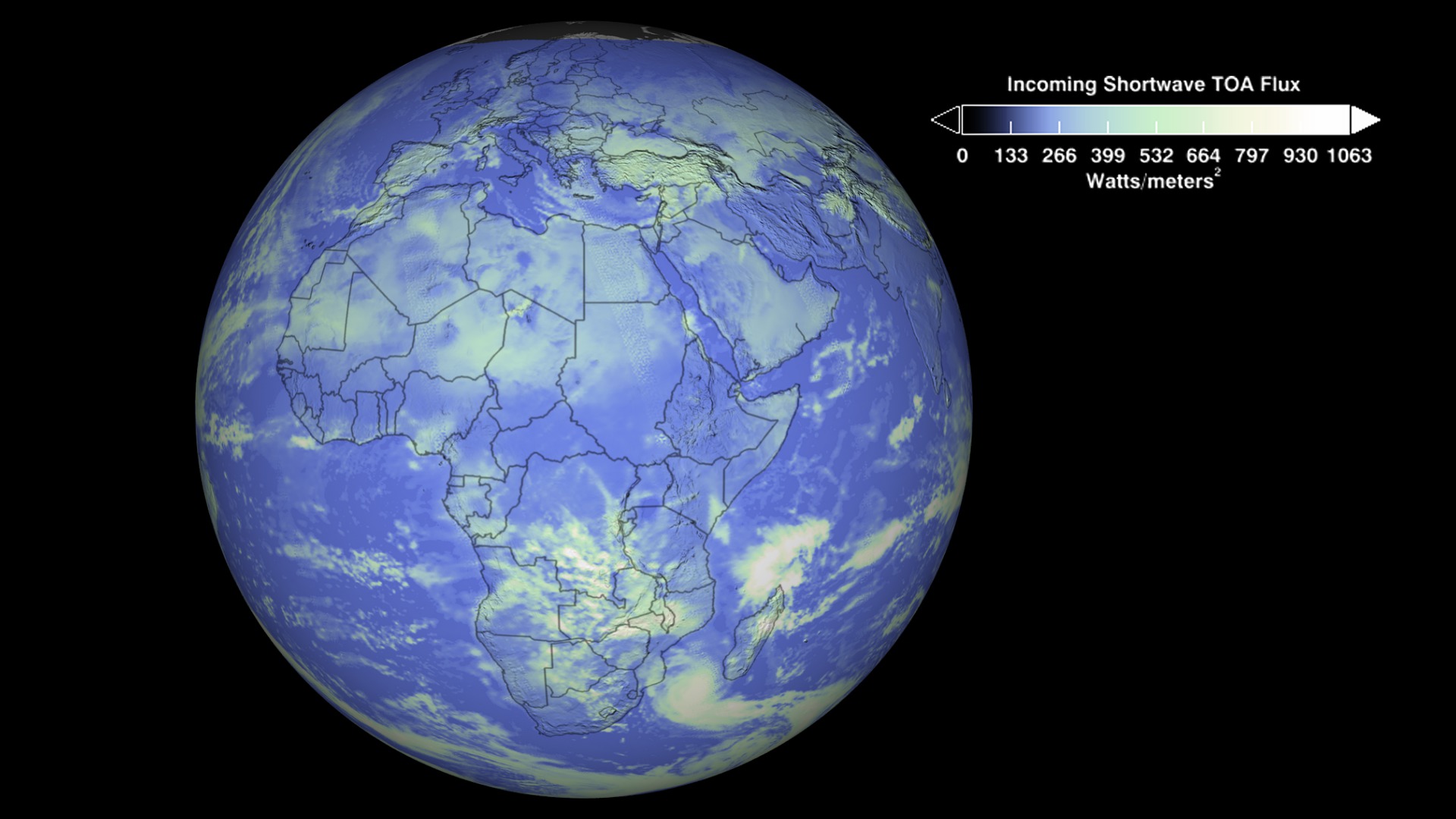
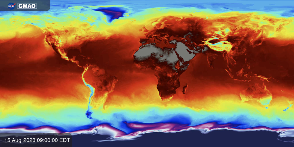
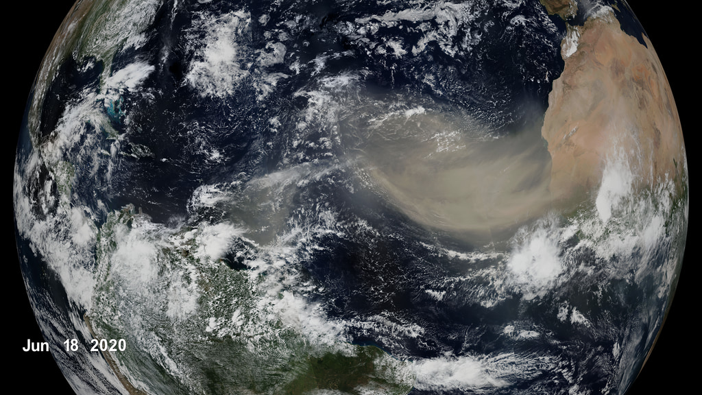
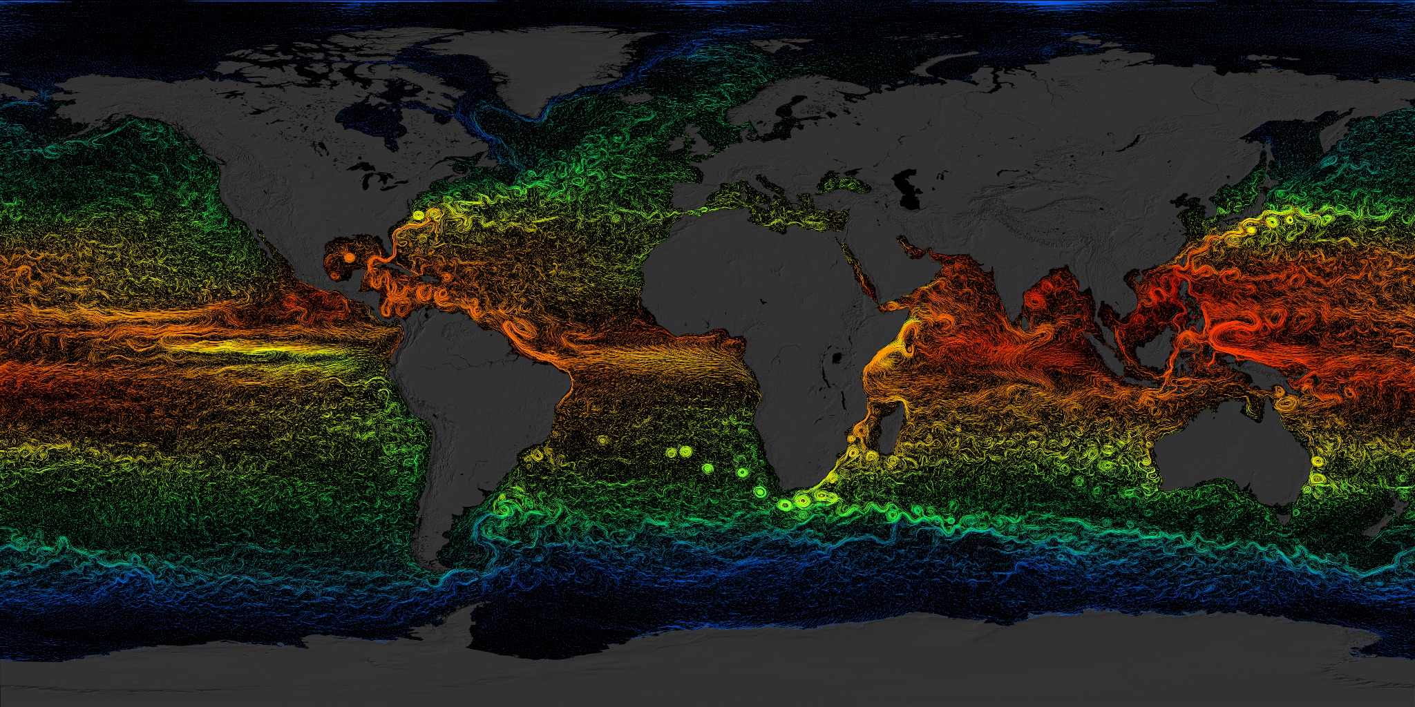
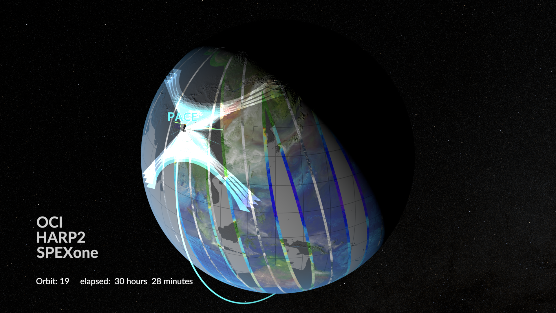
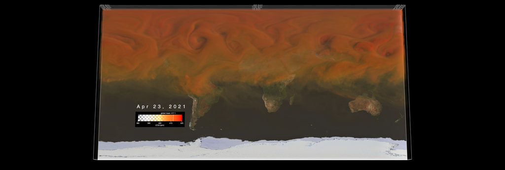
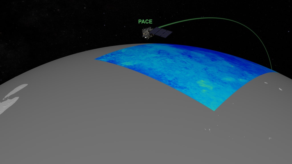
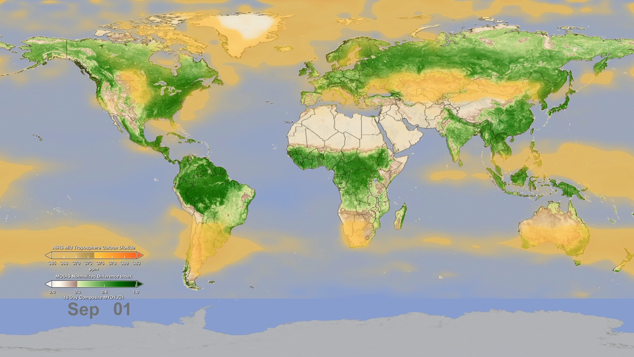
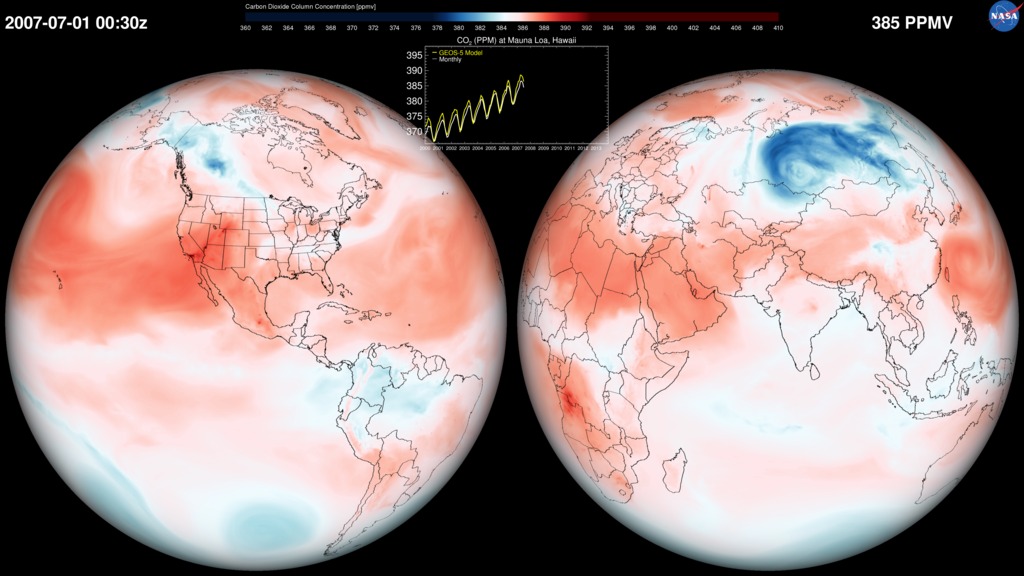
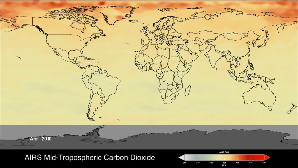
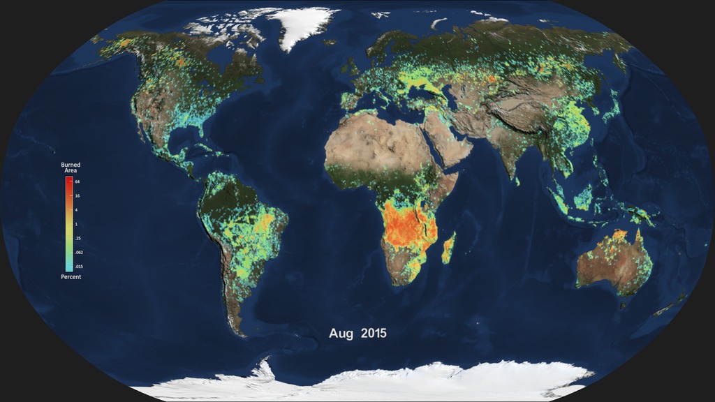
The Atmospheric Composition focus area (AC) studies the variations in and processes that affect aerosols, clouds, and trace gases, which influence climate, weather, and air quality. AC provides observations and modeling tools to assess the effects of climate change on ozone recovery and future atmospheric composition; improve climate forecasts based on fluctuations in global environmental change; and model past, present, and future air quality, both regionally and globally. This research, combined with observations, data assimilation, and modeling, improves society’s ability to predict how future changes in atmospheric composition will affect climate, weather, and air quality.
- ID: 5234
- ID: 5153
 Visualization
 - ID: 5152
 Visualization
 - ID: 5151
 Visualization
 - ID: 5154
 Visualization
 - ID: 5118
 Visualization
 - ID: 5116
 Visualization
 - ID: 5115
 Visualization
 - ID: 5081
- ID: 5024
- ID: 5022
 Visualization
 - ID: 5025
- ID: 5007
 Visualization
 - ID: 4962
- ID: 4990
- ID: 14056
![Universal Production Music: The Mysterious Staircase by Brice Davoli [SACEM], Suspended in Time by Brice Davoli [SACEM]Stock Footage: Pond5Complete transcript available.](/vis/a010000/a014000/a014056/14056_Still.jpg) Produced Video
Produced Video - ID: 4949
 Visualization
 - ID: 31139
 Hyperwall Visual
 - ID: 11937
 Produced Video
 - ID: 30641
 Hyperwall Visual
 - ID: 4397
 Visualization
 - ID: 4439
- ID: 12772
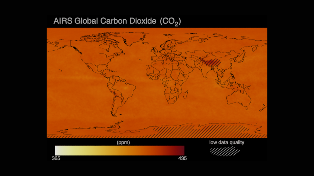
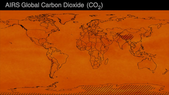
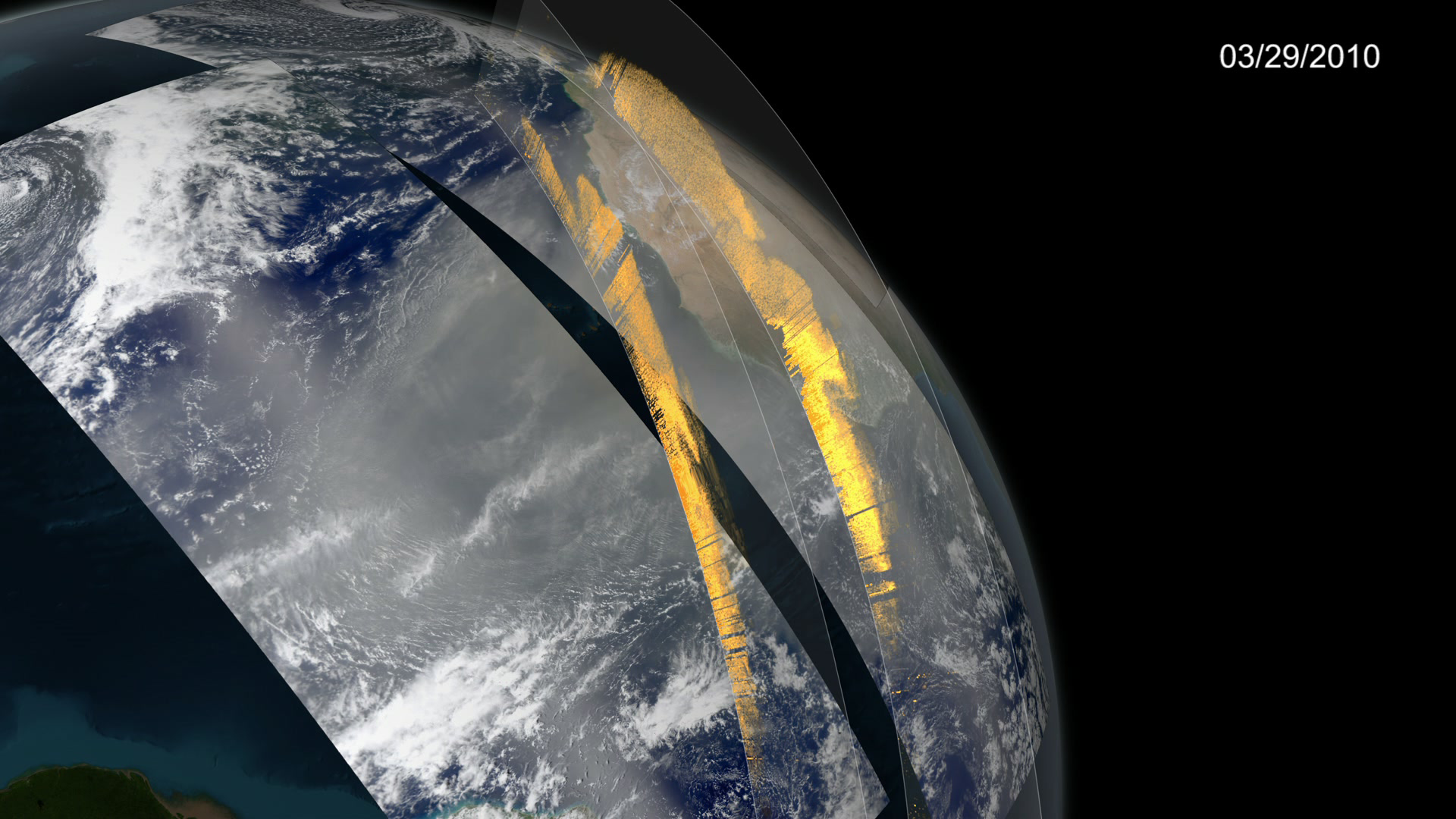
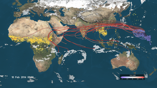
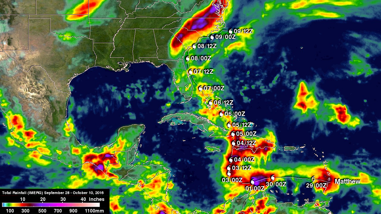
![Tracking aerosols over land and water from August 1 to November 1, 2017. Hurricanes and tropical storms are obvious from the large amounts of sea salt particles caught up in their swirling winds. The dust blowing off the Sahara, however, gets caught by water droplets and is rained out of the storm system. Smoke from the massive fires in the Pacific Northwest region of North America are blown across the Atlantic to the UK and Europe. This visualization is a result of combining NASA satellite data with sophisticated mathematical models that describe the underlying physical processes.Music: Elapsing Time by Christian Telford [ASCAP], Robert Anthony Navarro [ASCAP]Complete transcript available.Watch this video on the NASA Goddard YouTube channel.](/vis/a010000/a012700/a012772/12772_hurricanes_and_aerosols_1080p_youtube_1080.00001_print.jpg) Produced Video
Produced Video - ID: 4514
 Visualization
 - ID: 30699
 Hyperwall Visual
 - ID: 4273
- ID: 4654

- ID: 30590
 Hyperwall Visual
 - ID: 4676
 Visualization
 - ID: 30637
 Hyperwall Visual
 - ID: 4377
 Visualization
 - ID: 4683
 Visualization
 - ID: 30394
 Hyperwall Visual
 - ID: 30395
 Hyperwall Visual
 - ID: 4431
 Visualization
 - ID: 3926
 Visualization
 - ID: 3925
 Visualization
 - ID: 30988
 Hyperwall Visual
Weather and Atmospheric Dynamics
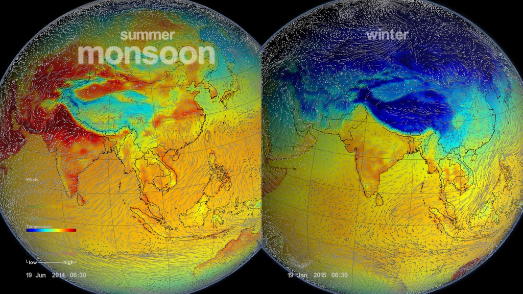
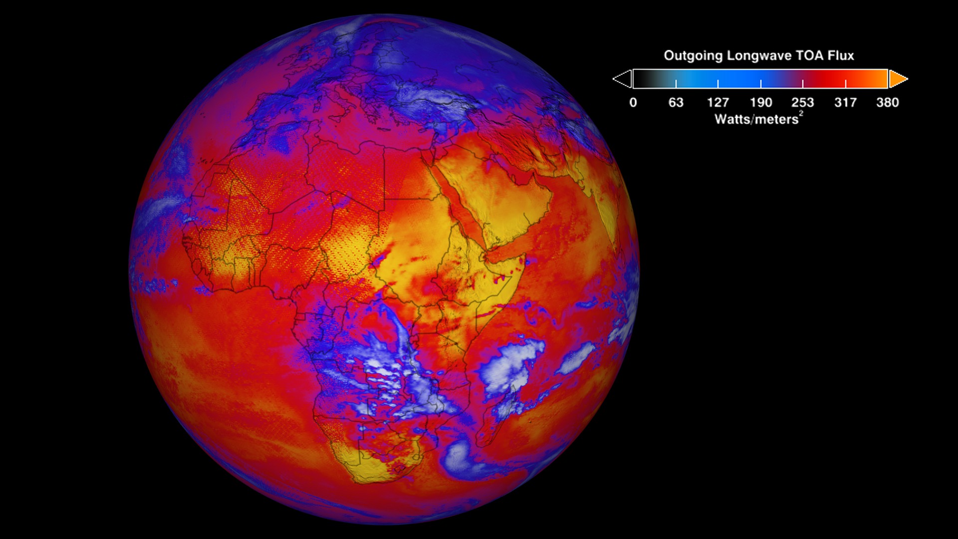
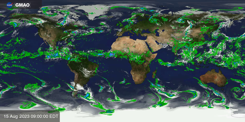
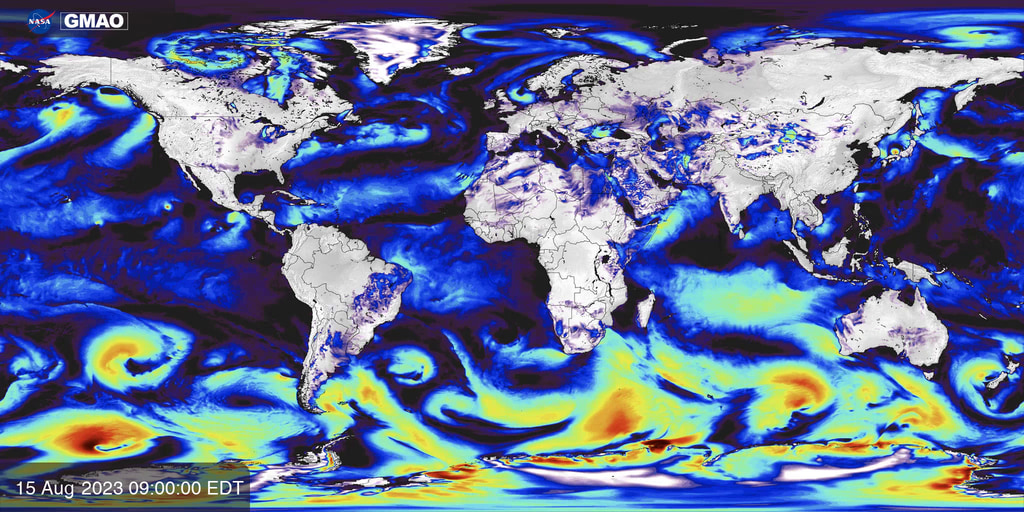
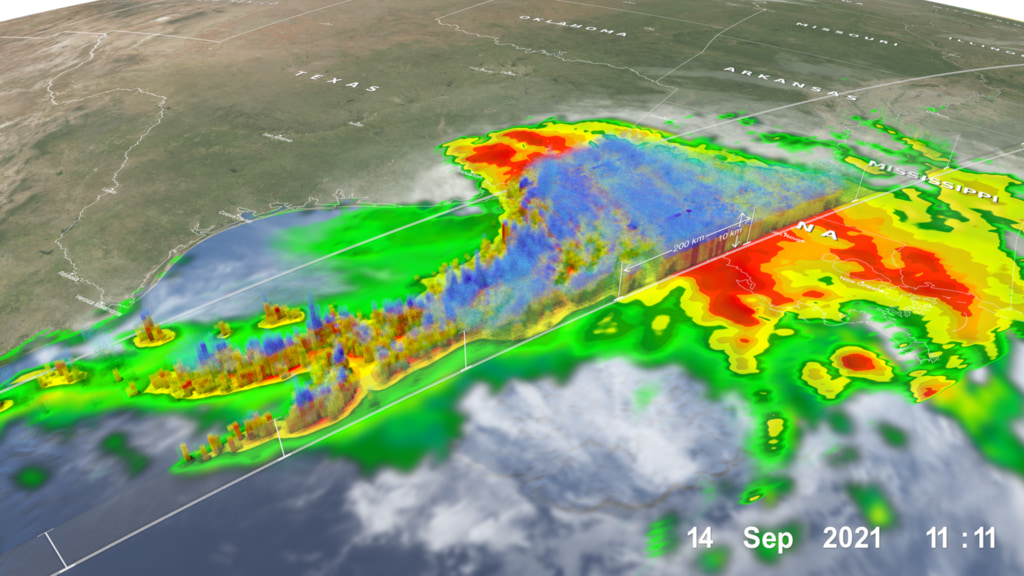
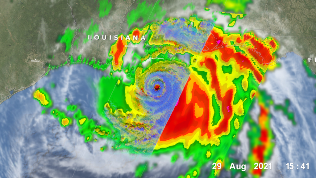
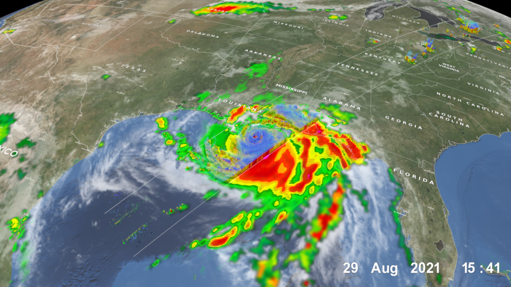
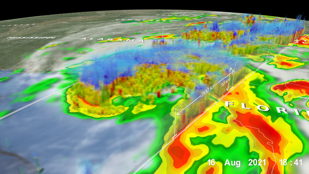
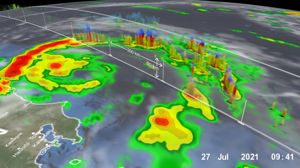
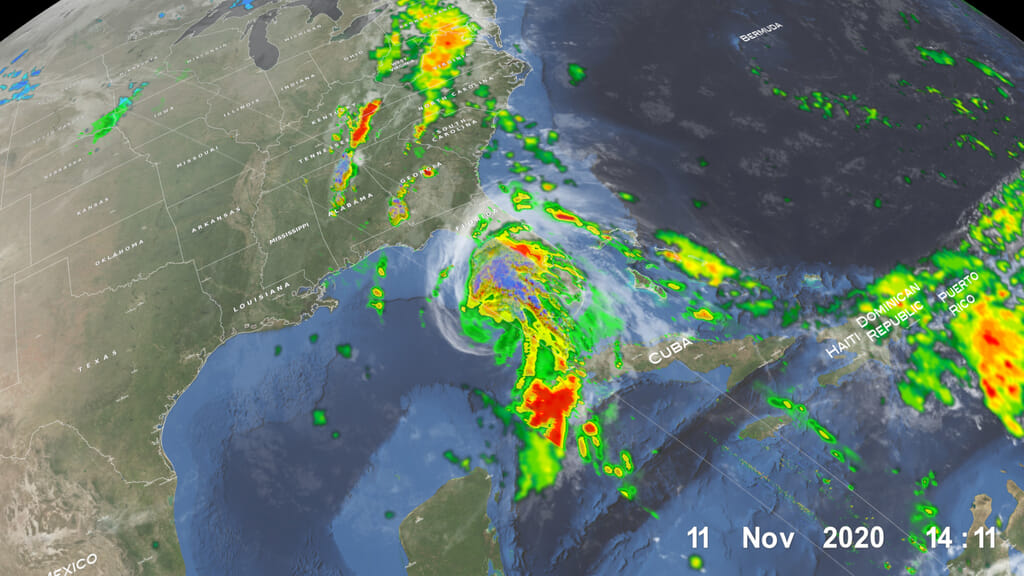
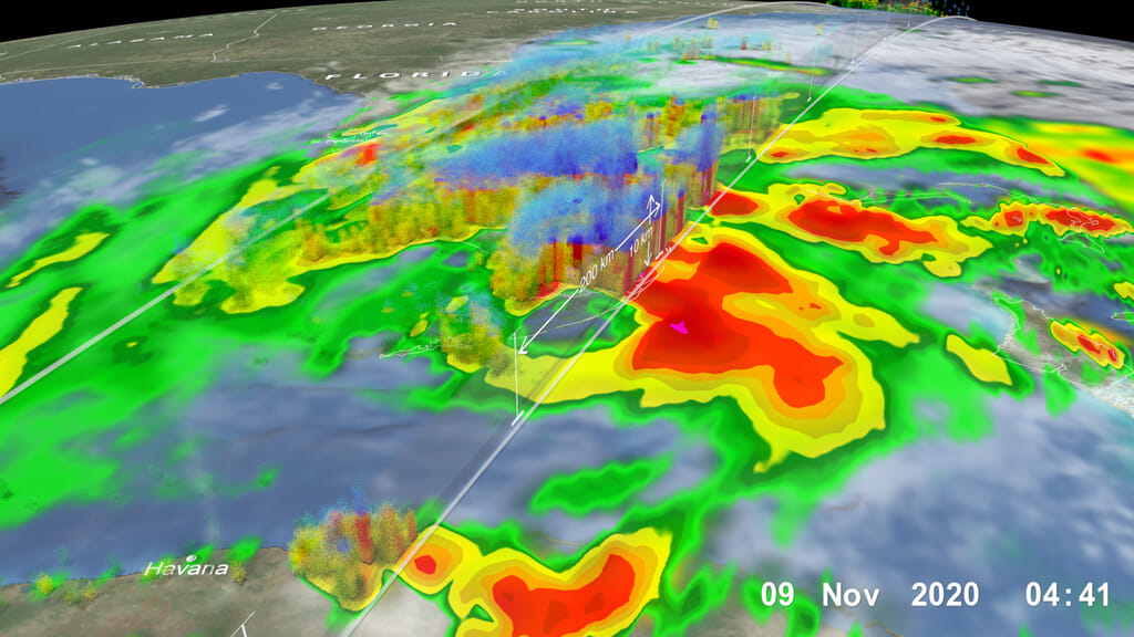
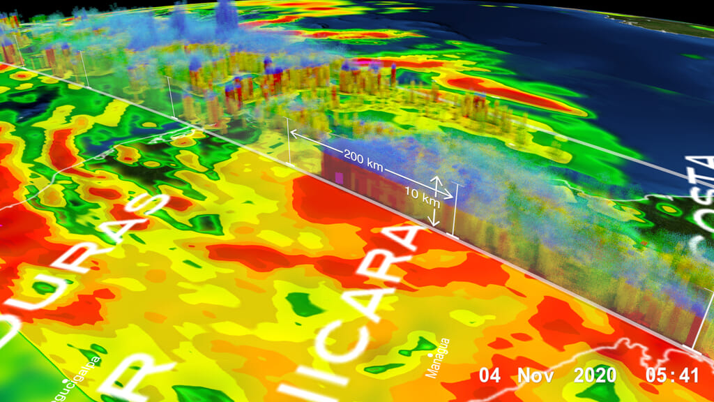
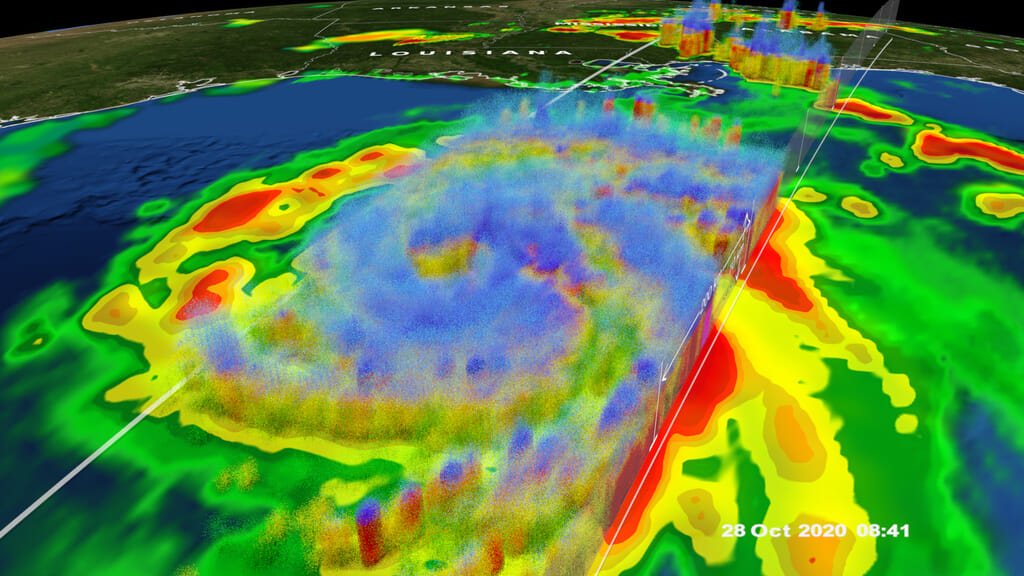
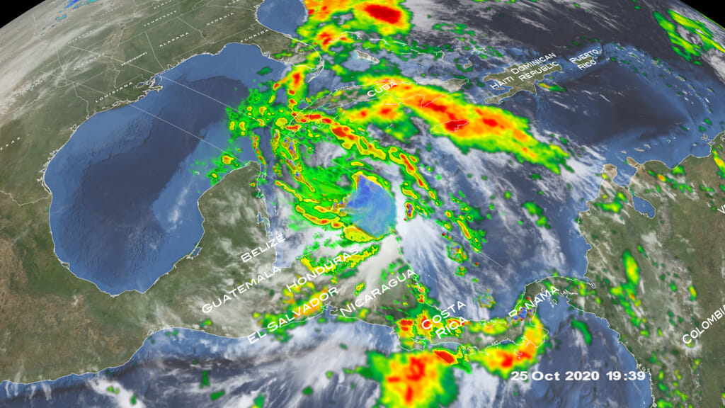
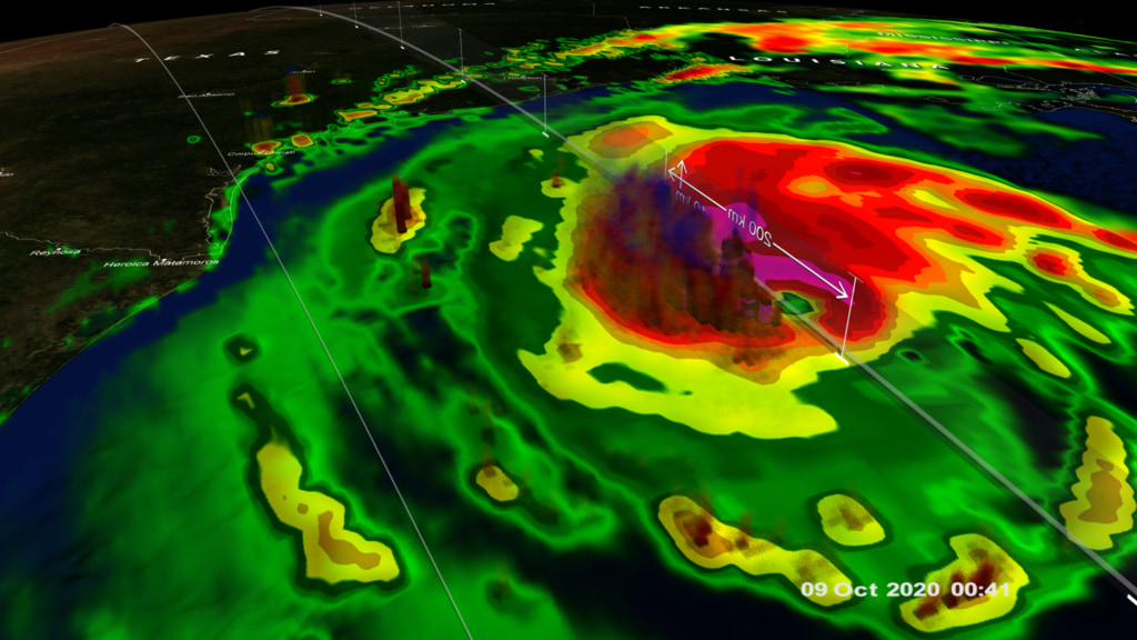
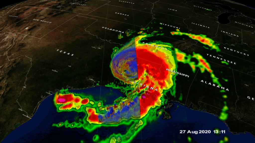
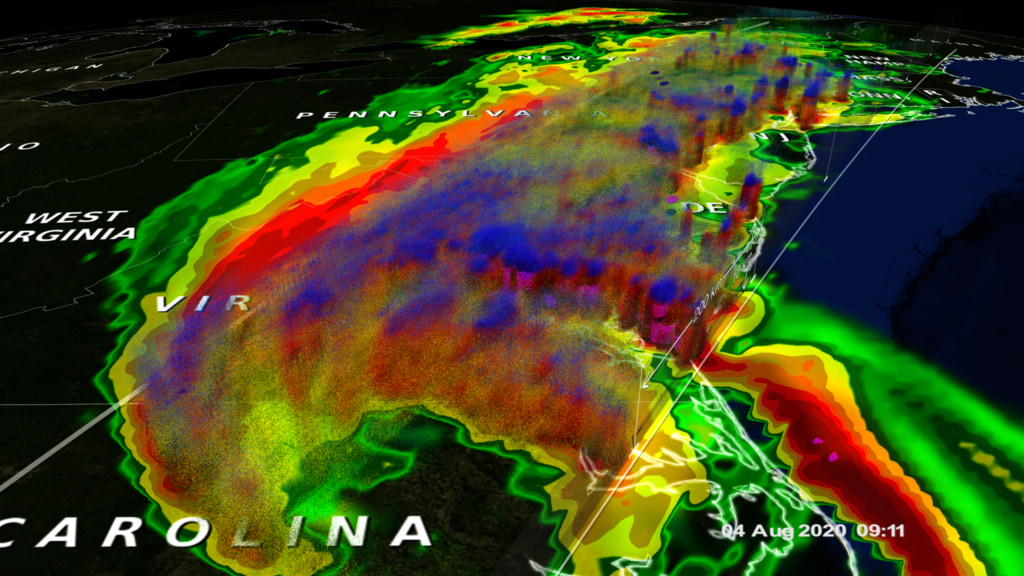
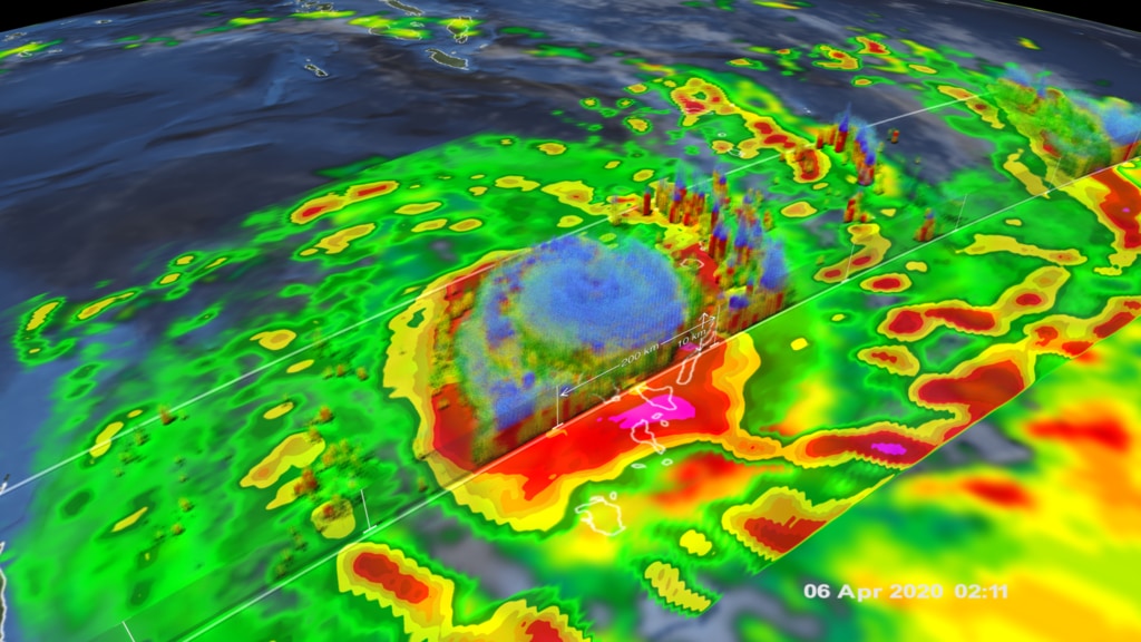
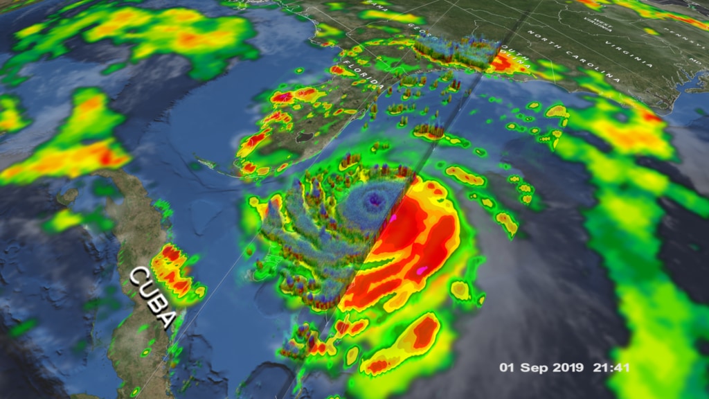
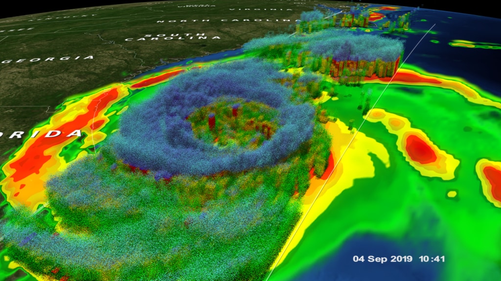
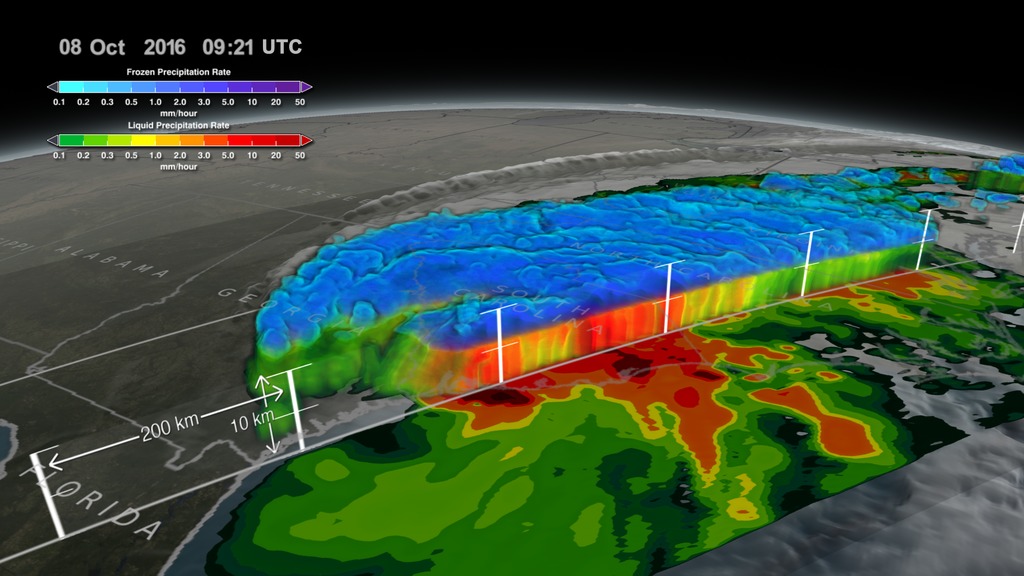
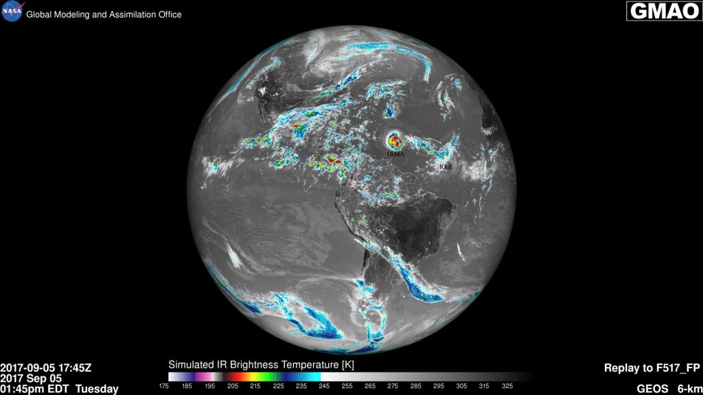
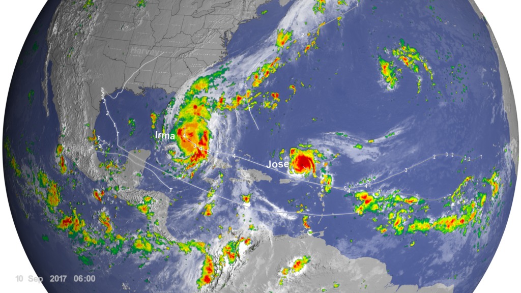
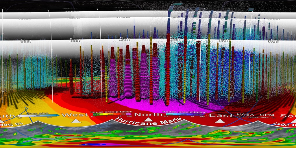
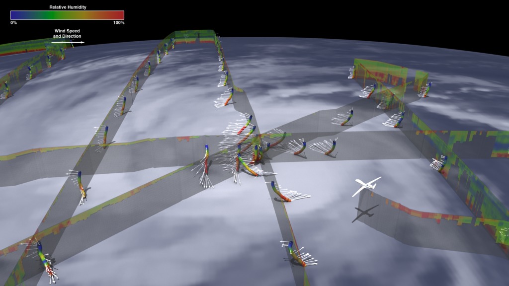
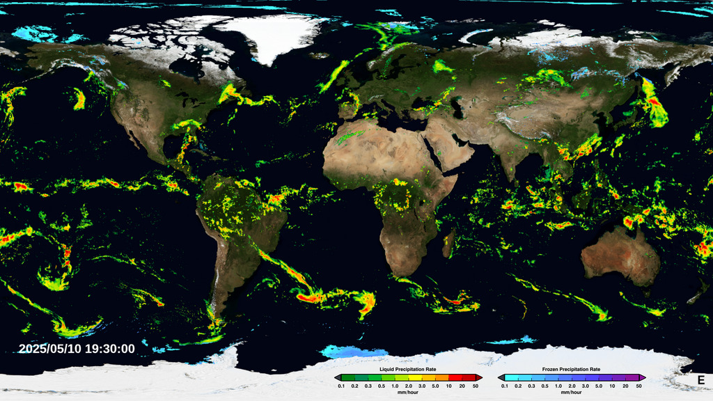
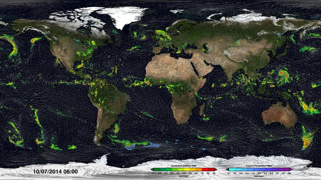
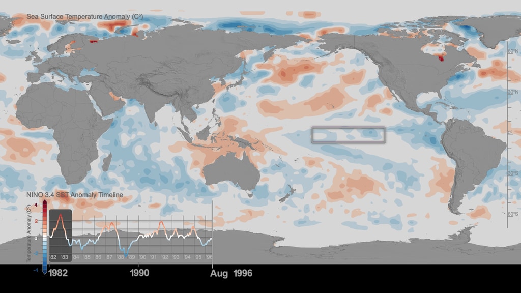
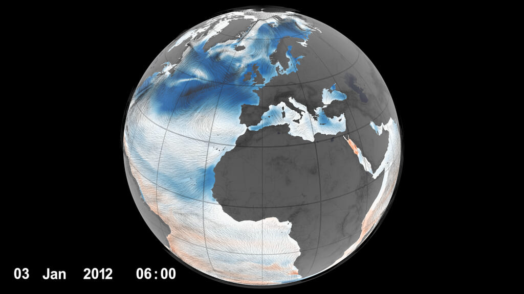
The Weather and Atmospheric Dynamics focus area (WAD) supports research to obtain accurate measurements of the atmosphere that help improve short-term, subseasonal, and seasonal weather predictions at local, regional, and global scales. Weather includes everything from localized microphysical processes that occur in minutes, to global-scale phenomena that can occur for an entire season. WAD helps improve our knowledge of the fundamental processes that drive these systems and inform the operational infrastructure upon which other federal agencies rely, including the National Oceanic and Atmospheric Administration (NOAA), the Federal Aviation Administration (FAA), and the Department of Defense (DOD). WAD further supports research into profiling winds, temperature, humidity, pressure, and aerosols; air-sea and land-atmosphere interactions; and lightning occurrences.
- ID: 5150
 Visualization
 - ID: 5149
 Visualization
 - ID: 5148
 Visualization
 - ID: 5147
 Visualization
 - ID: 4940
- ID: 4933
 Visualization
 - ID: 4932
- ID: 4926
- ID: 4919
- ID: 4849
 Visualization
 - ID: 4897
- ID: 4845
- ID: 4808
 Visualization
 - ID: 4876
 Visualization
 - ID: 4870
- ID: 4869
- ID: 4866
- ID: 4855
- ID: 4847
 Visualization
 - ID: 4846
- ID: 4844
 Visualization
 - ID: 4843
 Visualization
 - ID: 4842
- ID: 31139Hyperwall Visual
- ID: 4812
 Visualization
 - ID: 4751
 Visualization
 - ID: 4571
 Visualization
 - ID: 4753
 Visualization
 - ID: 4694
- ID: 4682
- ID: 4681
- ID: 4658
- ID: 30895
 Hyperwall Visual
 - ID: 30899
 Hyperwall Visual
 - ID: 12733
 Produced Video
 - ID: 4584
 Visualization
 - ID: 4358
 Visualization
 - ID: 4512
 Visualization
 - ID: 30911
 Hyperwall Visual
 - ID: 4586
- ID: 4685
 Visualization
 - ID: 30833
 Hyperwall Visual
 - ID: 4575
 Visualization
 - ID: 4735
- ID: 4287
- ID: 4456
 Visualization
 - ID: 4439
- ID: 4397Visualization
- ID: 4285
- ID: 4382
 Visualization
 - ID: 30023
 Hyperwall Visual
 - ID: 30203
 Hyperwall Visual
 - ID: 4634
 Visualization
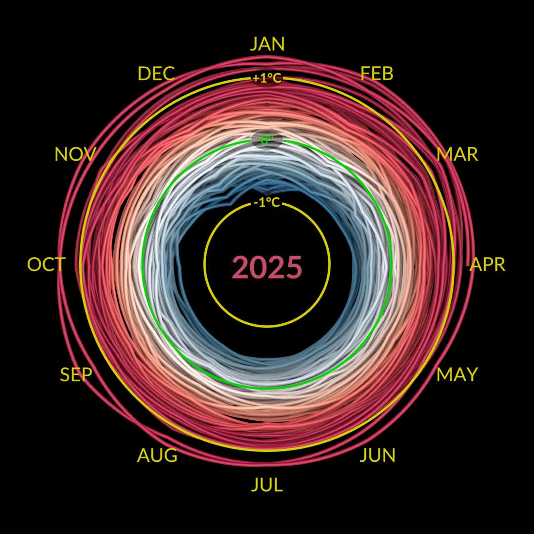
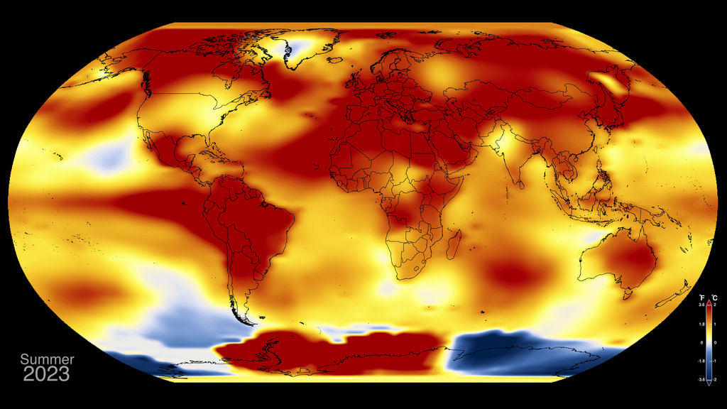
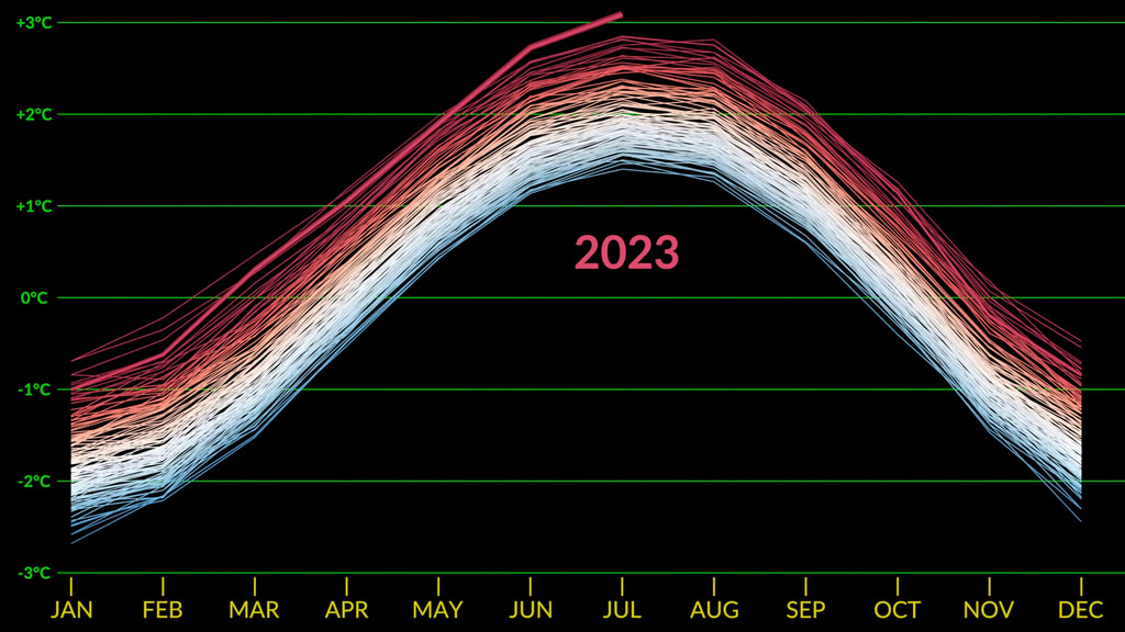
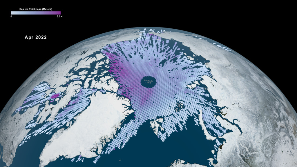
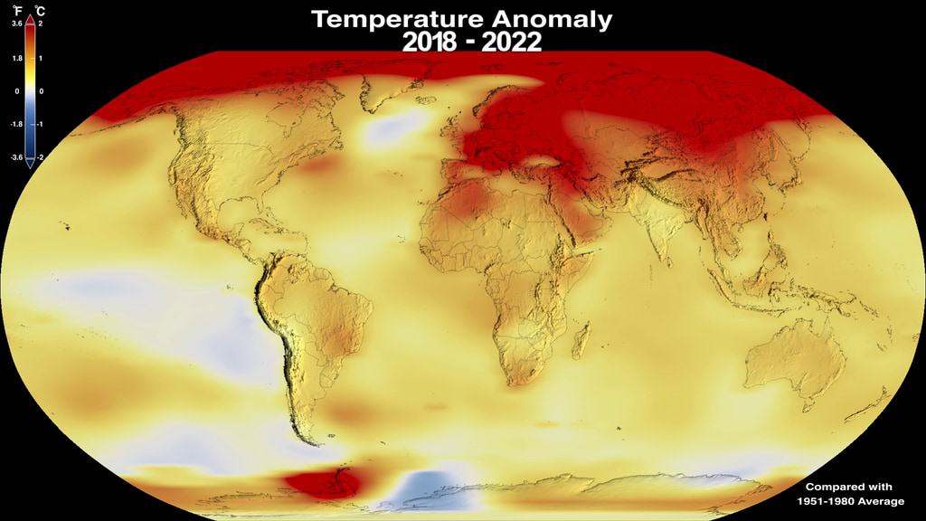
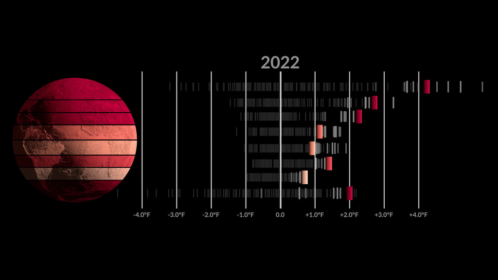
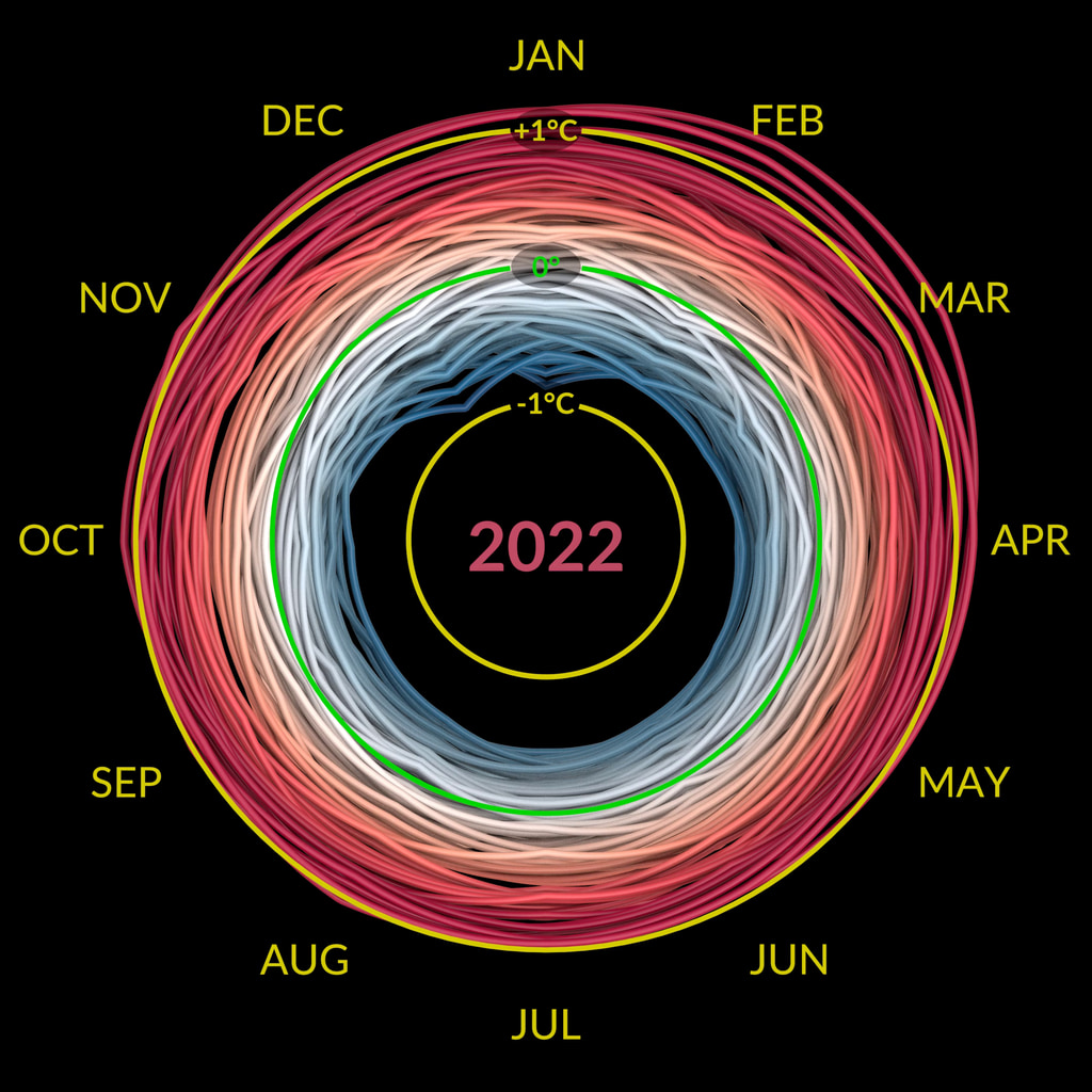
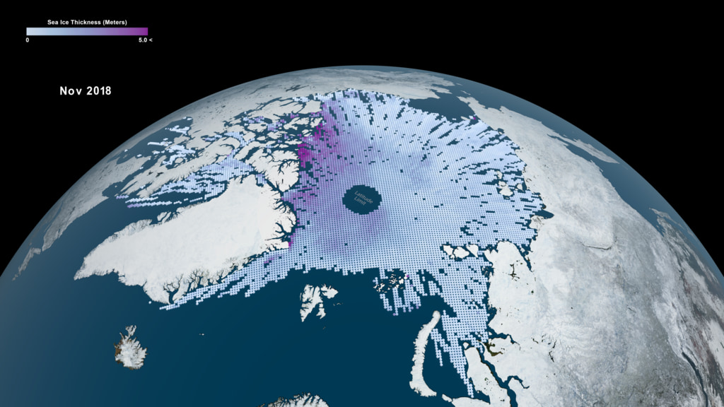
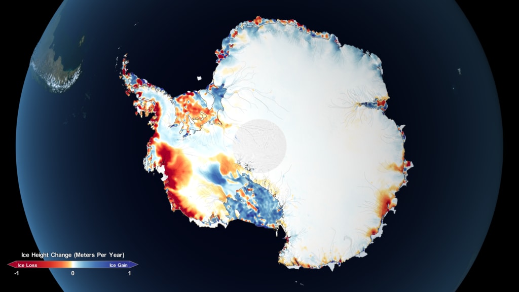
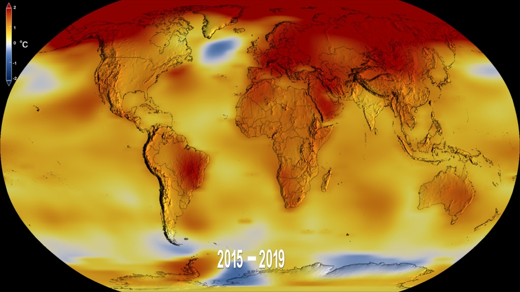
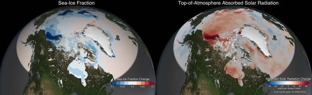
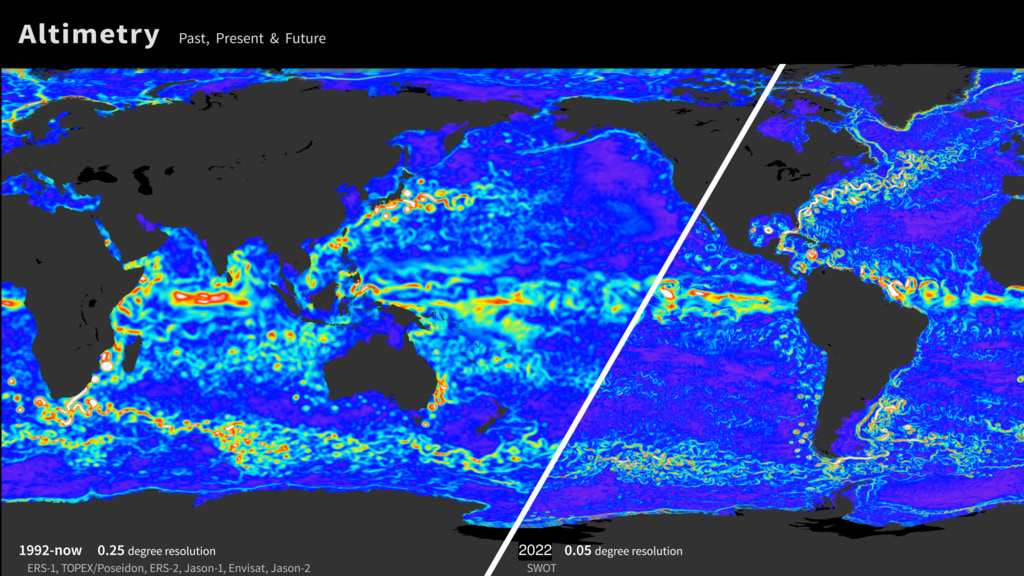
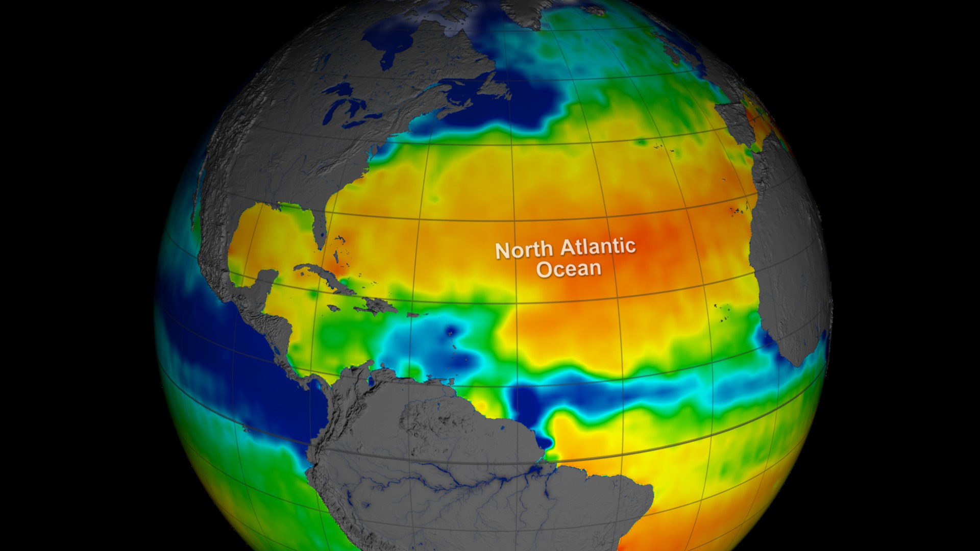
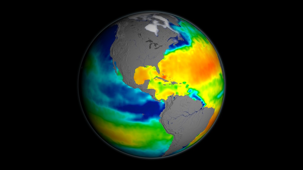
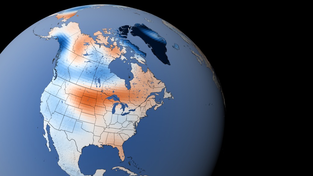
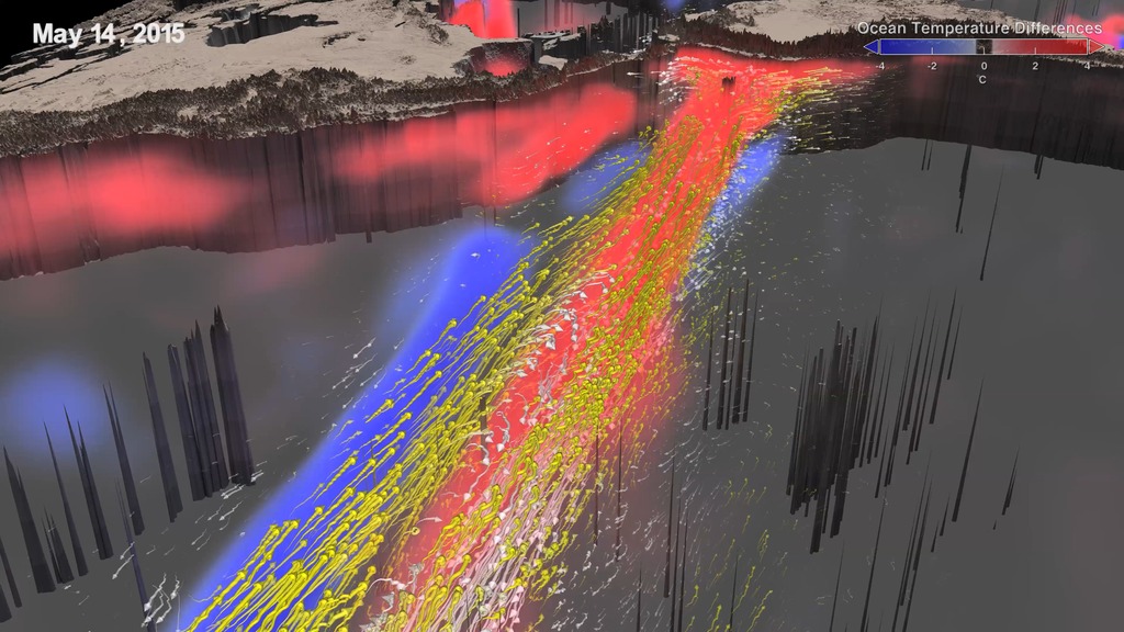
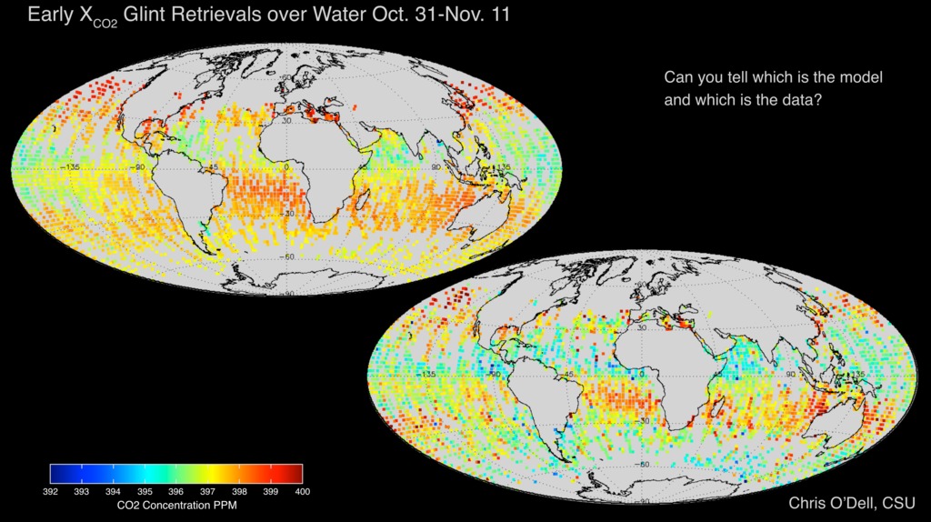
Climate Variability and Change
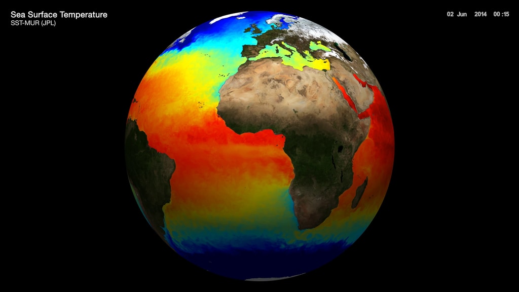
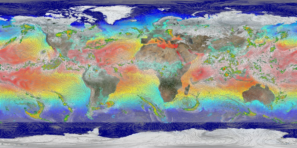
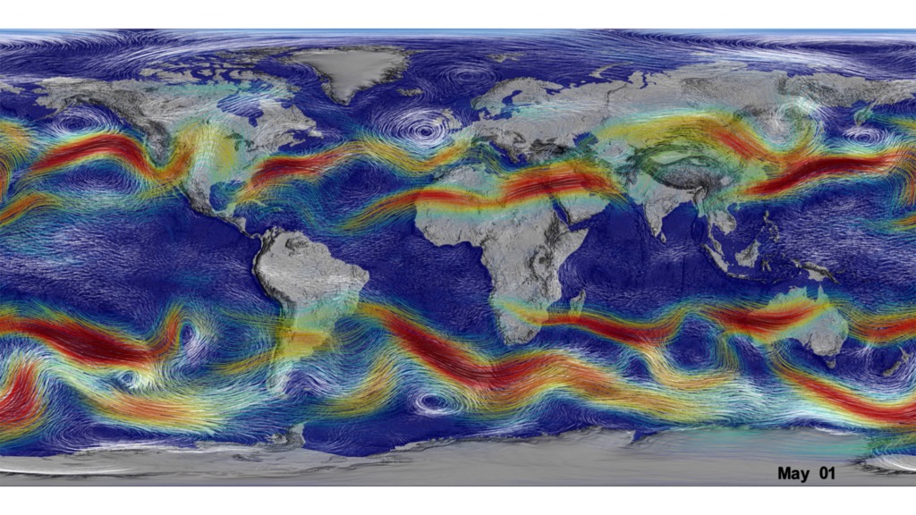
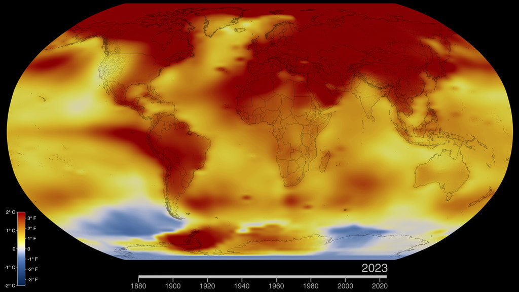
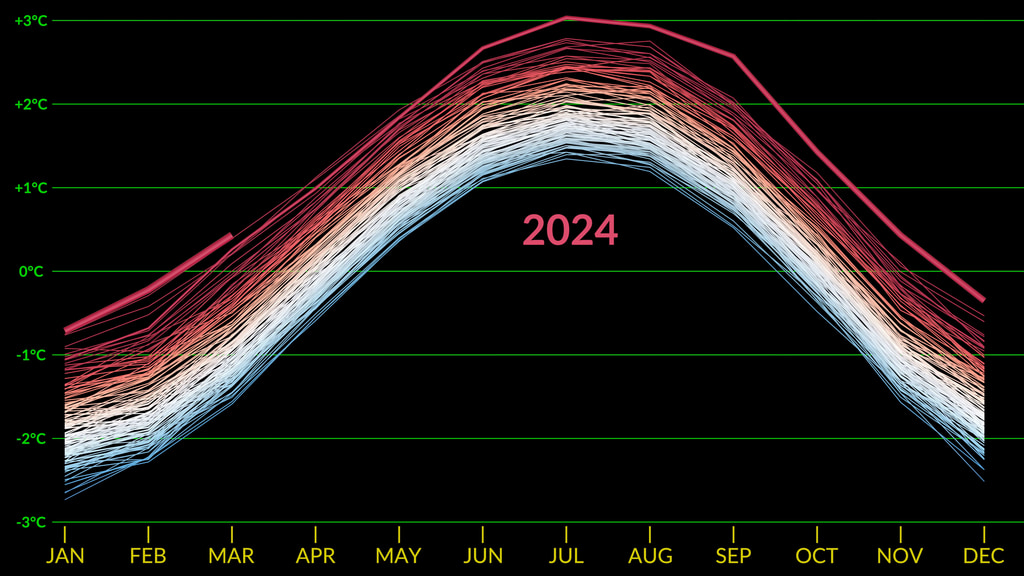
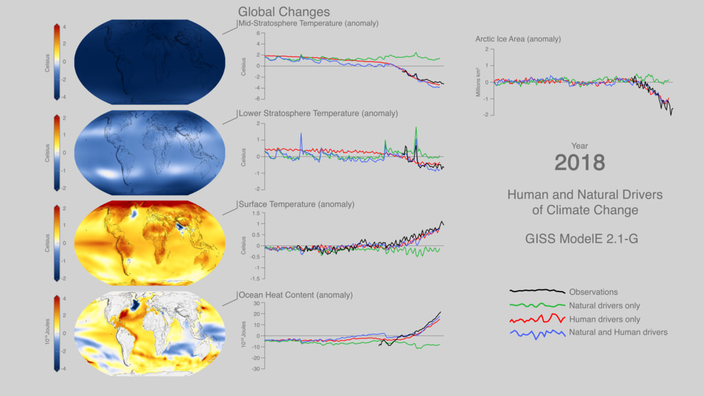
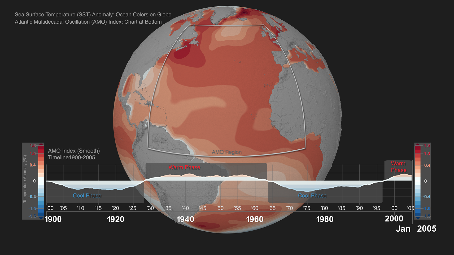
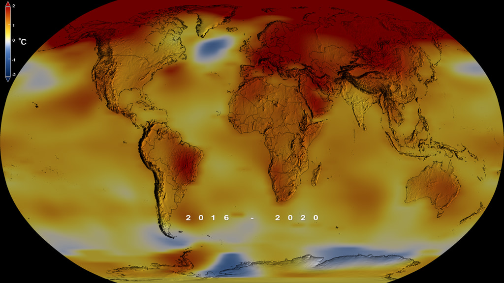
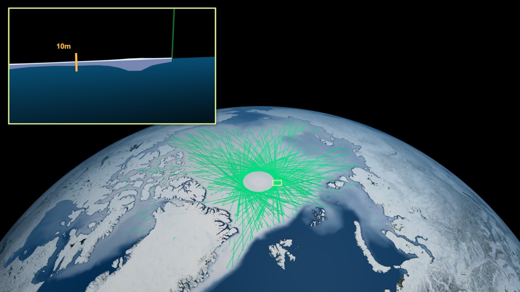
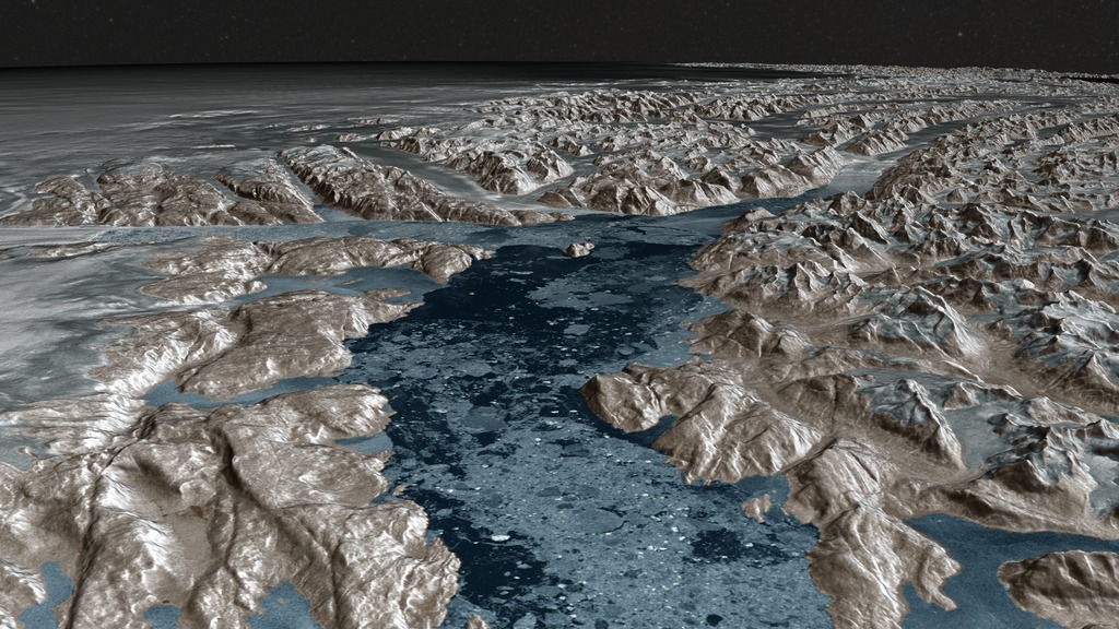
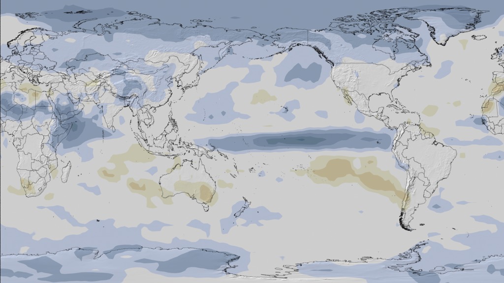
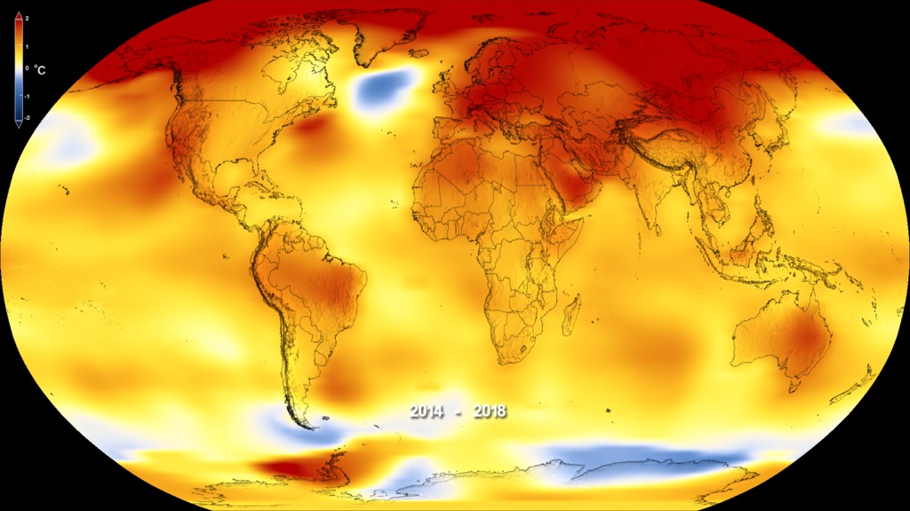
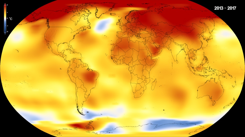
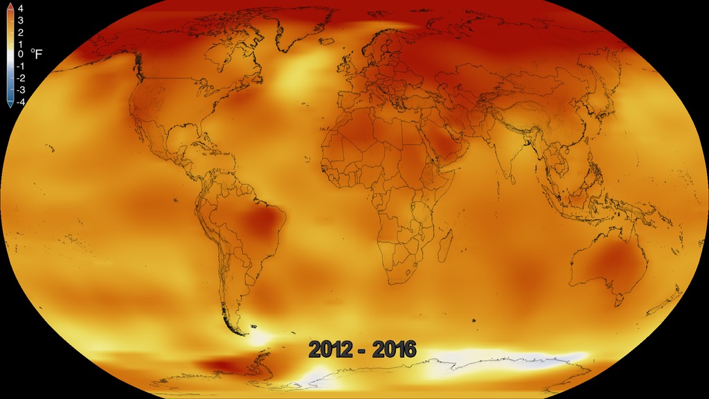
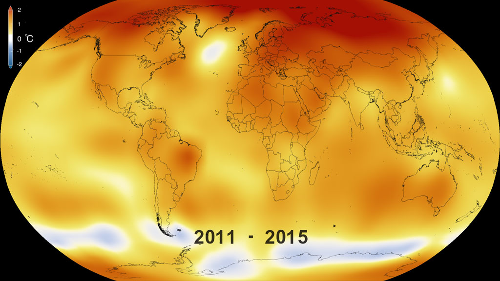
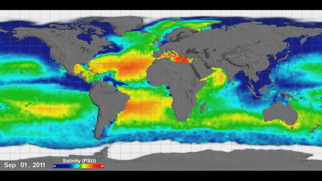
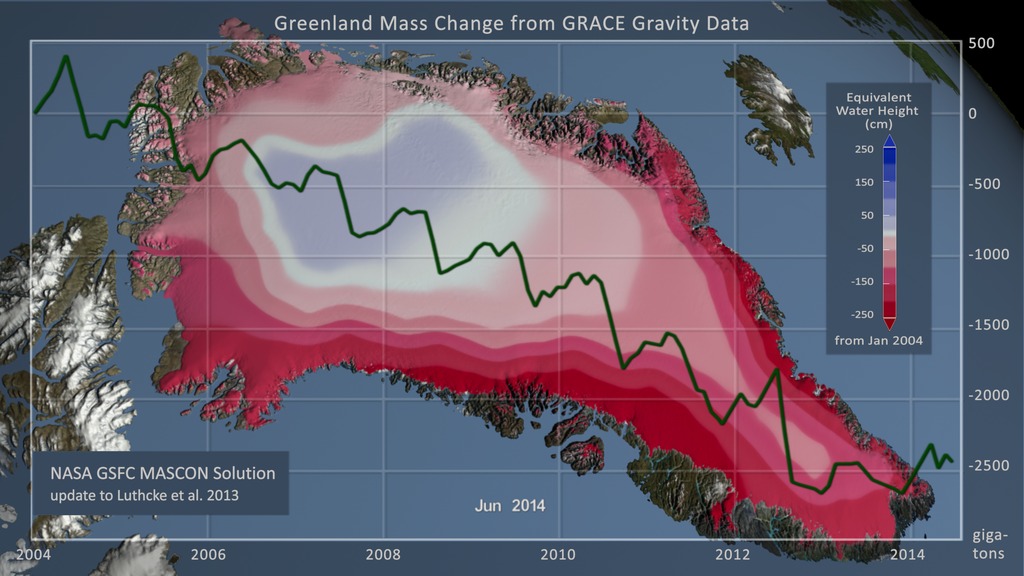
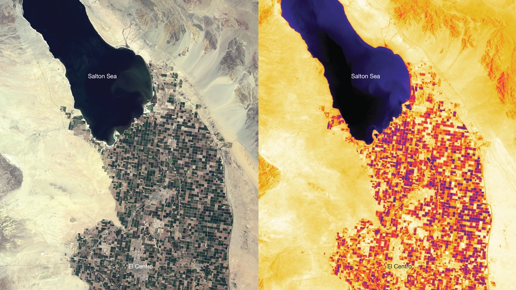
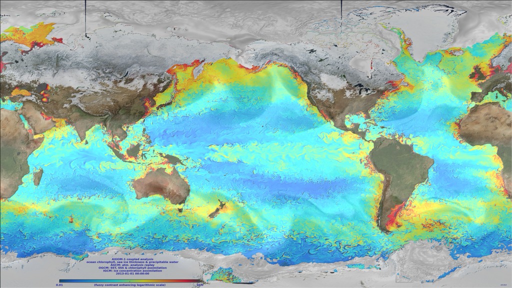
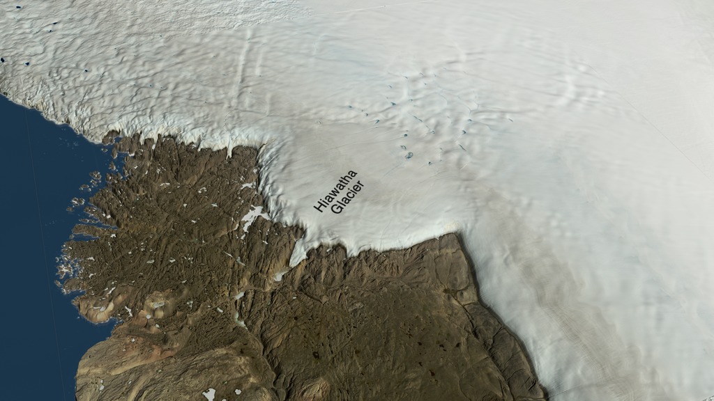
The Climate Variability and Change focus area (CVC) supports research to better understand the overall state of Earth’s climate and the physical processes that affect it. CVC supports focused and interdisciplinary research to better describe, understand, and predict the ways in which Earth’s ocean, atmosphere, land, and ice will interact and influence Earth’s climate over a wide range of timescales. To do this, CVC supports the development of climate data sets and computer models that leverage observations from relevant NASA and non-NASA platforms, including satellites, aircraft, and ships. These datasets include observations of sea surface height, temperature, and salinity; ocean currents and vector winds; sea ice extent and thickness; glacial topography, motion, and mass change; aerosol and cloud processes that affect Earth’s energy balance; and more. Through this work, CVC hopes to better predict changes in the Earth’s climate from sub-seasonal to multi-decadal time scales.
- ID: 5327

- ID: 5328

- ID: 5311
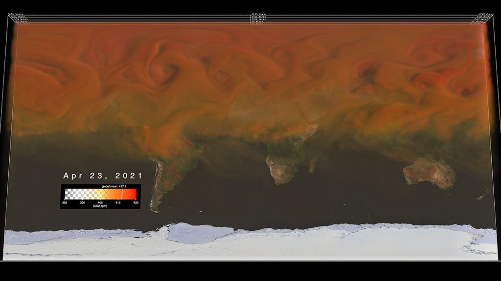
- ID: 5234
- ID: 5209
 Visualization
 - ID: 5207
 Visualization
 - ID: 5191
 Visualization
 - ID: 5190
 Visualization
 - ID: 5161
 Visualization
 - ID: 5137
 Visualization
 - ID: 5100
 Visualization
 - ID: 5081
- ID: 5060
 Visualization
 - ID: 5059
 Visualization
 - ID: 5057
 Visualization
 - ID: 5024
- ID: 5022Visualization
- ID: 5025
- ID: 5007Visualization
- ID: 4990
- ID: 4988
 Visualization
 - ID: 4978
 Visualization
 - ID: 4975
 Visualization
 - ID: 4964
 Visualization
 - ID: 31168
 Hyperwall Visual
 - ID: 4913
 Visualization
 - ID: 4908
 Visualization
 - ID: 4901
 Visualization
 - ID: 4849Visualization
- ID: 4895
 Visualization
 - ID: 4882
 Visualization
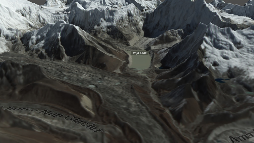
 - ID: 13699
![Music: "Dew" by Matthew Nicholson [PRS], Suki Jeanette Finn [PRS]This video can be freely shared and downloaded. While the video in its entirety can be shared without permission, some individual imagery provided by pond5.com is obtained through permission and may not be excised or remixed in other products. Specific details on stock footage may be found here. For more information on NASA’s media guidelines, visit https://www.nasa.gov/multimedia/guidelines/index.html.Complete transcript available.](/vis/a010000/a013600/a013699/ImjaLake.jpg) Produced Video
Produced Video - ID: 4834
- ID: 4796
 Visualization
 - ID: 4724
- ID: 4747
- ID: 4787
 Visualization
 - ID: 4785
- ID: 4781

- ID: 4782
- ID: 4783

- ID: 4784
- ID: 4765
- ID: 3912
 Visualization
 - ID: 4750

- ID: 4734
 Visualization
 - ID: 4328
 Visualization
 - ID: 4149
- ID: 4626
 Visualization
 - ID: 4609
 Visualization
 - ID: 4546
 Visualization
 - ID: 4419
 Visualization
 - ID: 4252
 Visualization
 - ID: 4746
 Visualization
 - ID: 4438
 Visualization
 - ID: 12828
 Produced Video
 - ID: 30615
 Hyperwall Visual
 - ID: 4433

- ID: 4245
- ID: 30500
 Hyperwall Visual
 - ID: 4045
 Visualization
 - ID: 4234
- ID: 4233
 Visualization
 - ID: 30008
 Hyperwall Visual
 - ID: 30556
 Hyperwall Visual
 - ID: 4695
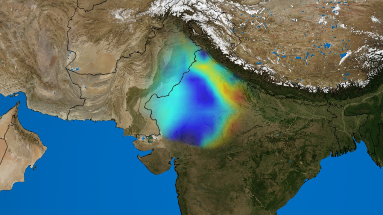
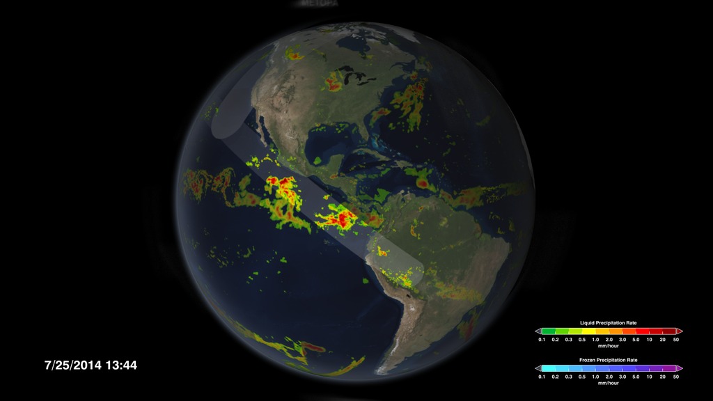
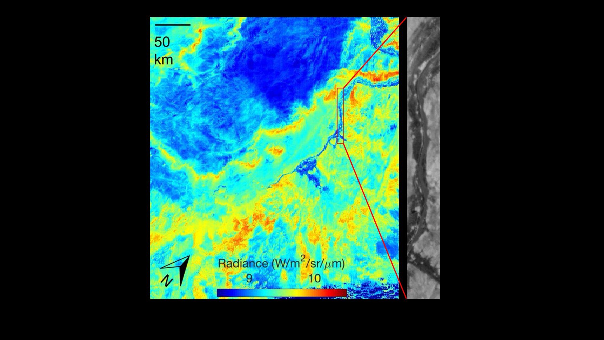
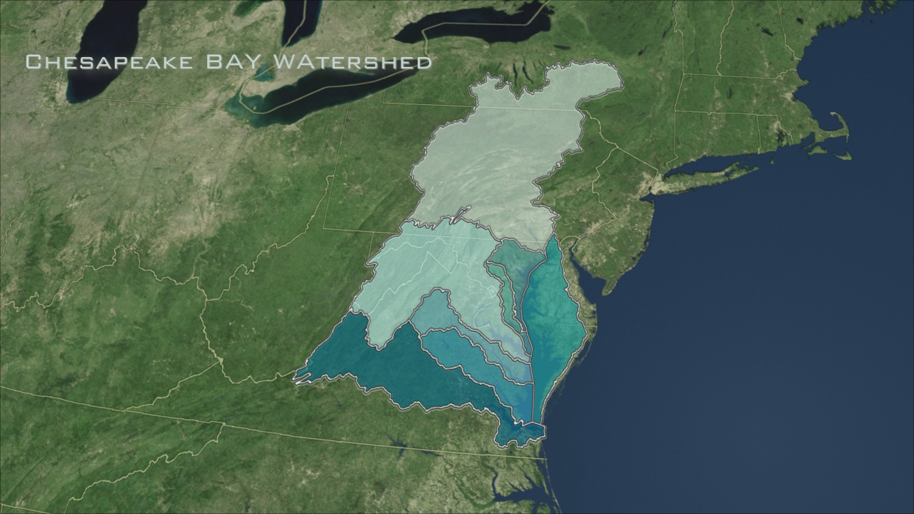
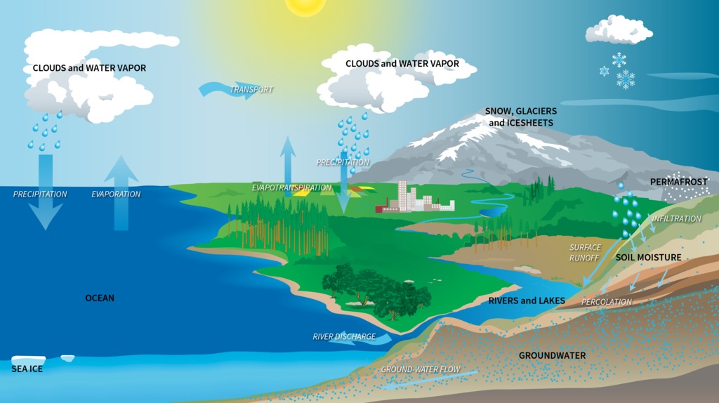
Water and Energy Cycle
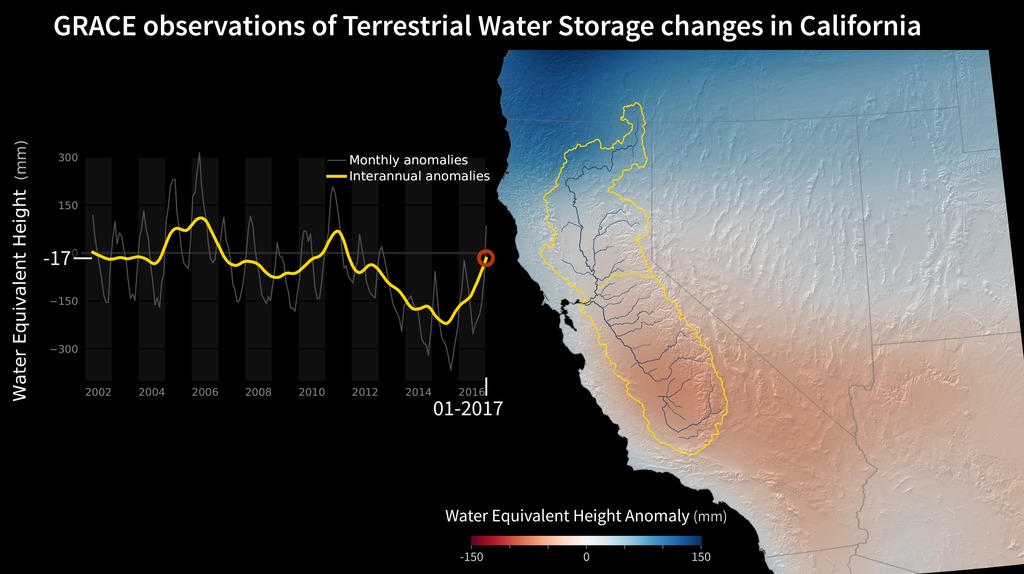
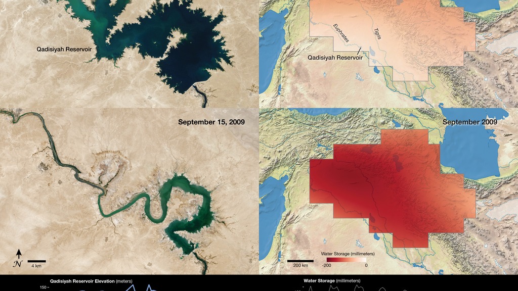
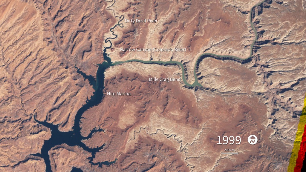
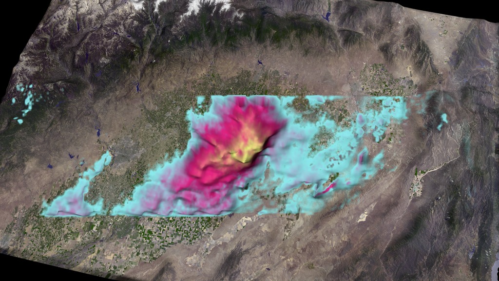
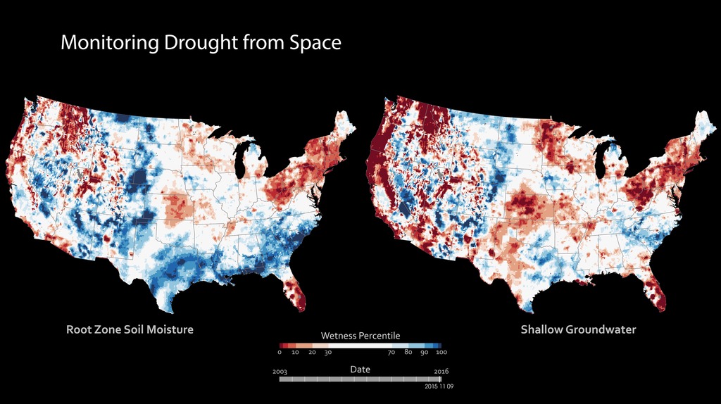
The Water and Energy Cycle focus area (WEC) works to define, quantify, and model the different components of the water cycle that take place on land, including precipitation, snow, soil moisture, surface water and groundwater, and their interactions with other Earth systems. This research helps improve our understanding of how much water exists on Earth, how it’s changing over time, and what quality it’s in. It also helps us understand the energy that is transferred when water moves around the Earth and changes phase from liquid water to water vapor to snow. WEC uses observations from satellites and aircraft to help inform this research, and they partner with other Research and Analysis Program focus areas on crosscutting topics like ocean dynamics and cloud formation.
- ID: 4913Visualization
- ID: 4823
 Visualization
 - ID: 4325
- ID: 4042
 Visualization
 - ID: 30862
 Hyperwall Visual
 - ID: 30473
 Hyperwall Visual
 - ID: 30073
 Hyperwall Visual
 - ID: 4588
- ID: 30716
 Hyperwall Visual
 - ID: 4627
 Visualization
 - ID: 3623
 Visualization
 - ID: 4544
- ID: 4283
 Visualization
 - ID: 30203Hyperwall Visual
- ID: 30979
 Hyperwall Visual
 - ID: 3472
 Visualization
 - ID: 3477
 Visualization
 - ID: 30017
 Hyperwall Visual
 - ID: 30580
 Hyperwall Visual
 - ID: 30469
 Hyperwall Visual
 - ID: 30584
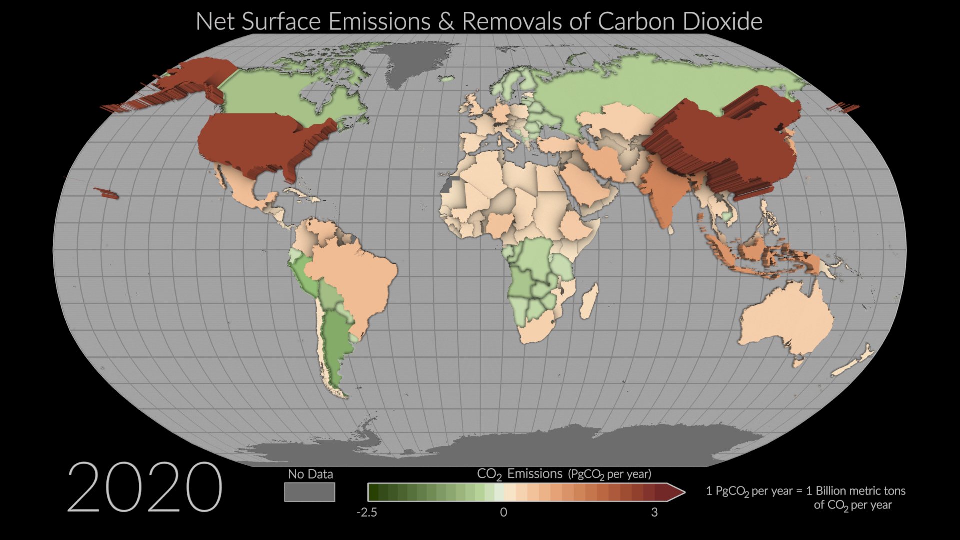
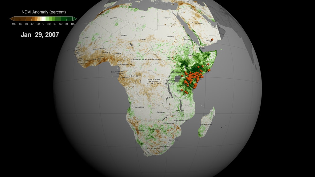
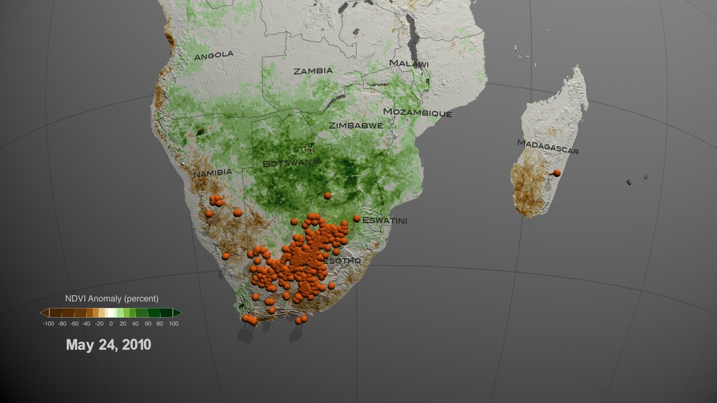
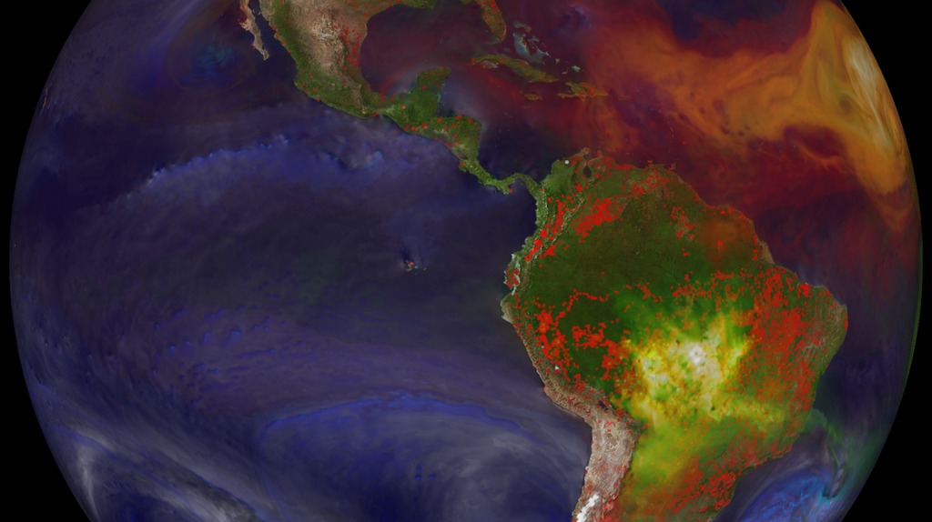
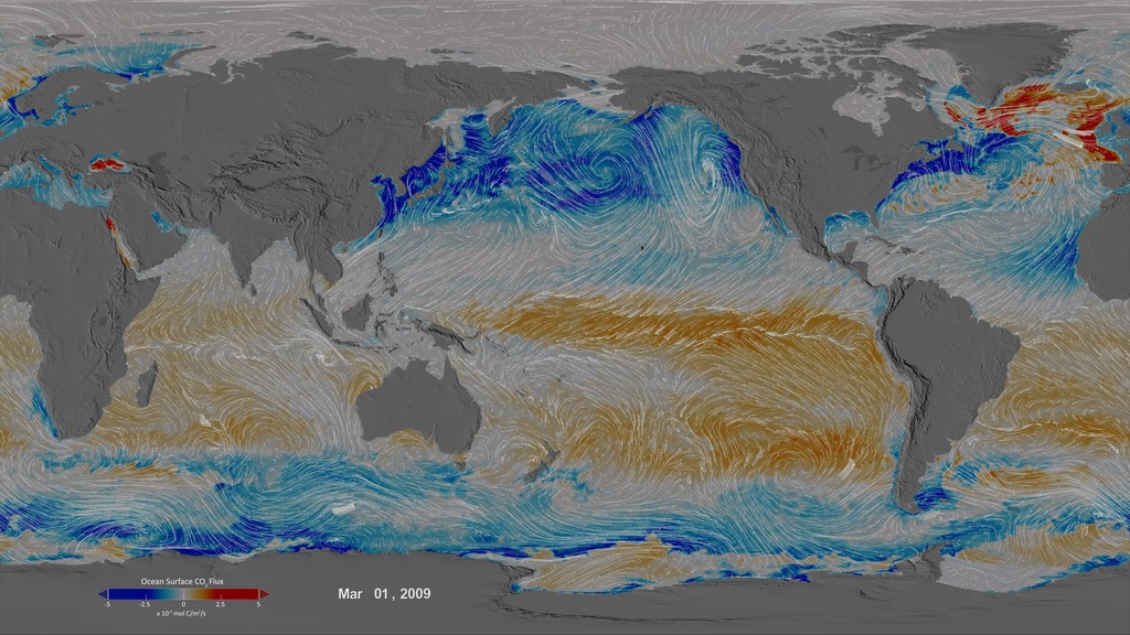
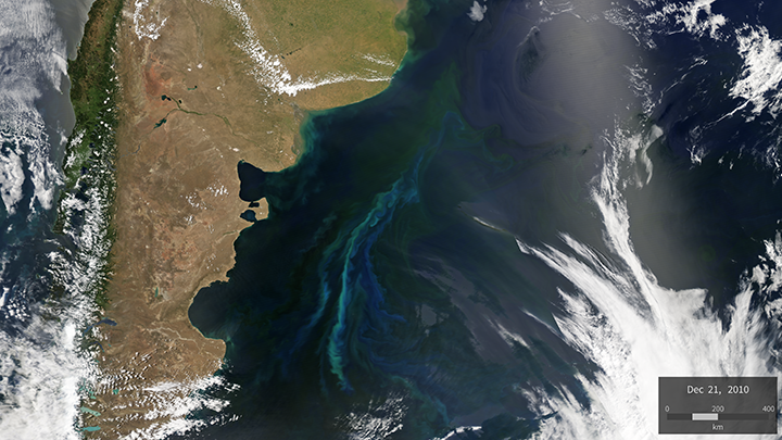
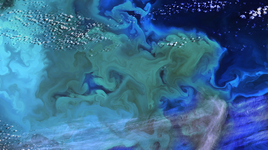
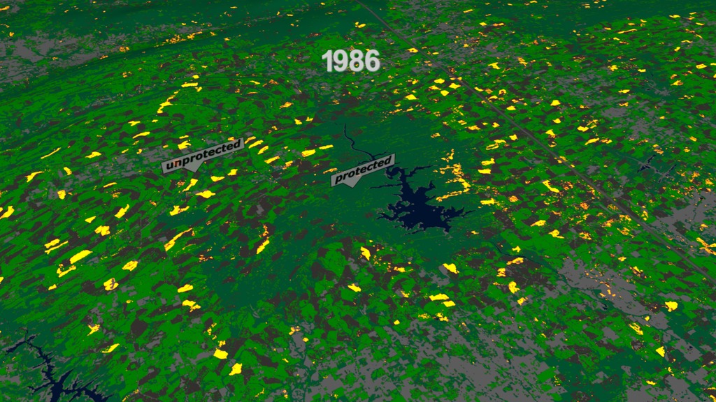
Carbon Cycle and Ecosystems
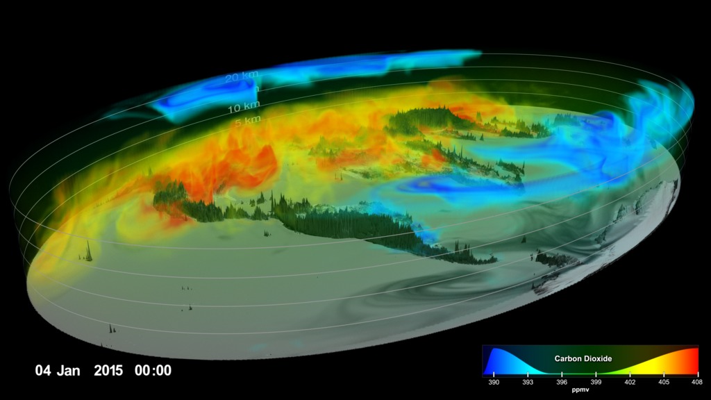
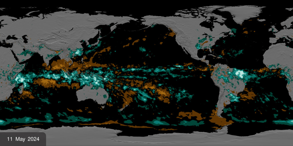
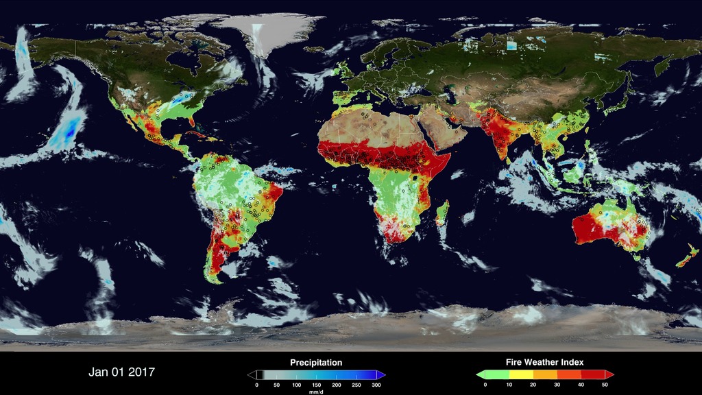
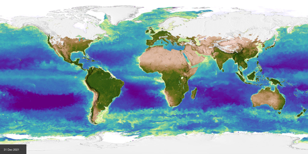
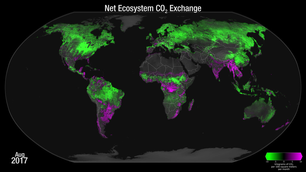
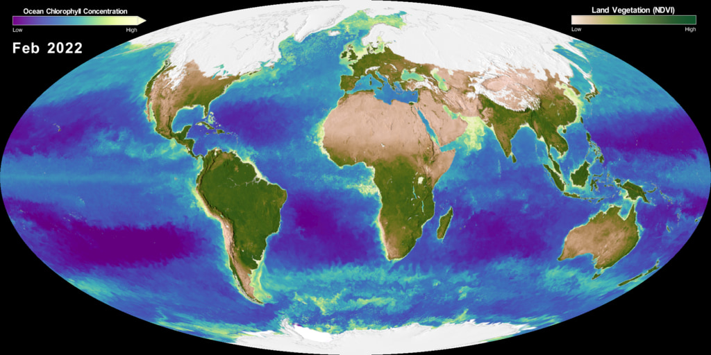
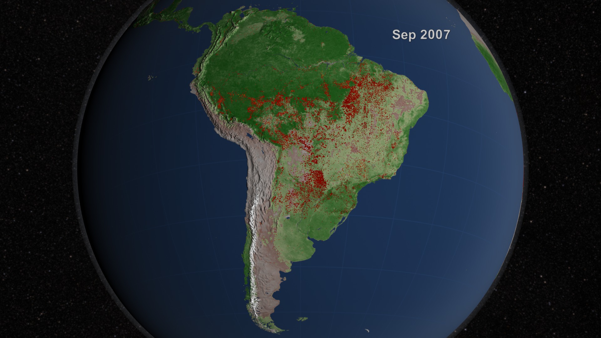
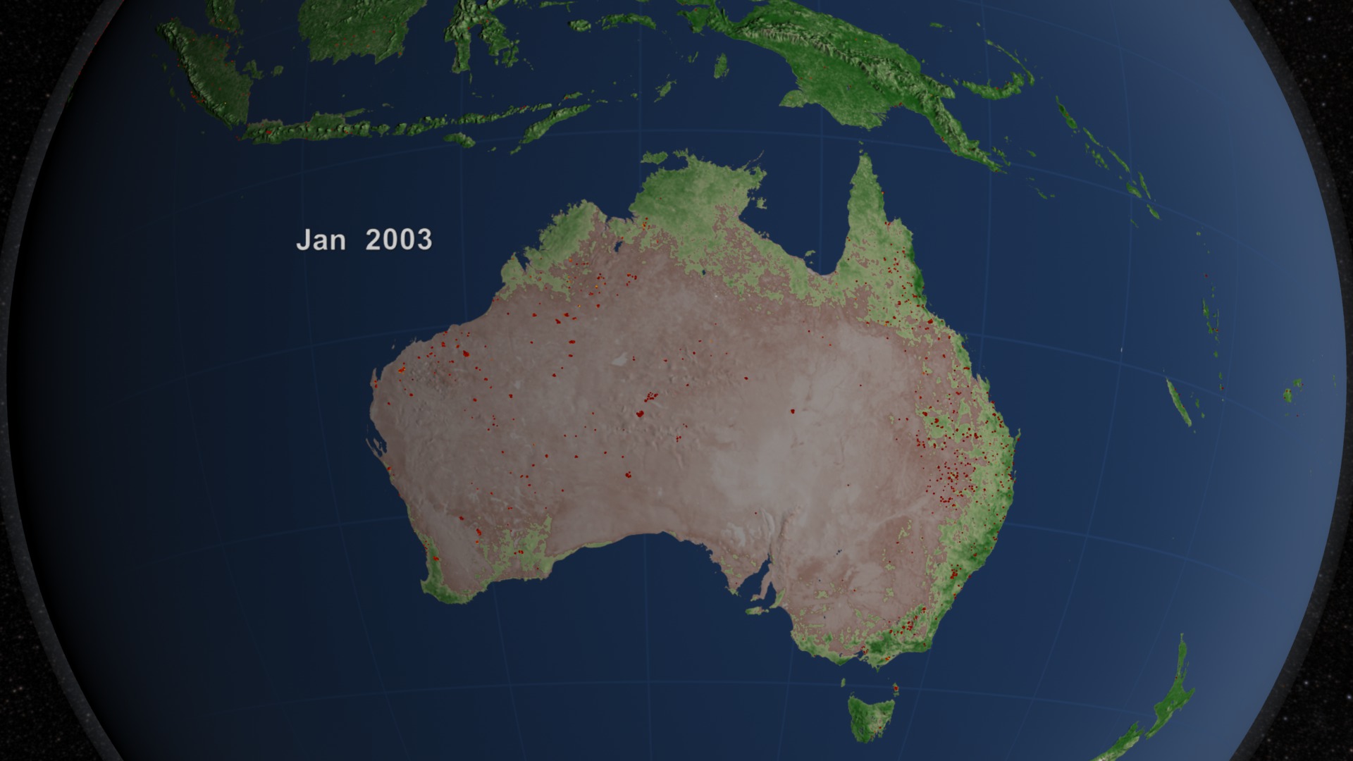
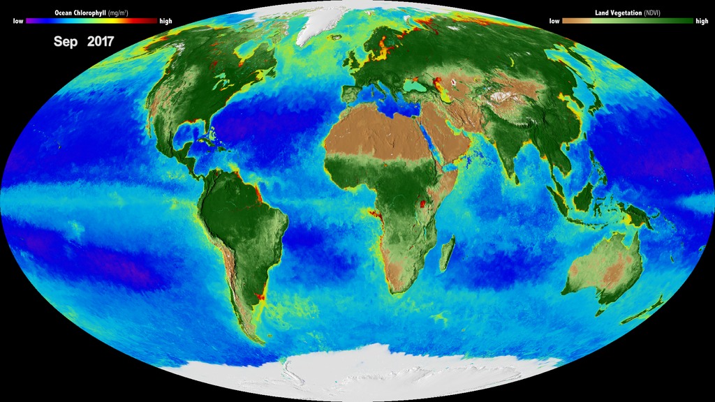
The Carbon Cycle and Ecosystems focus area (CCE) supports interdisciplinary research initiatives into Earth’s ecosystems and biogeochemical cycles, including how carbon, nitrogen and other nutrients are stored and cycled throughout the environment. CCE uses satellite remote sensing instruments, field campaigns, laboratory studies, and modeling to improve our understanding of how terrestrial and aquatic ecosystems around the world, such as forests, jungles, deserts, oceans, coasts, and polar environments, are changing over time. CCE also studies how changes in these ecosystems may affect how the planet stores nutrients like carbon and nitrogen in the future. Resolving these uncertainties will help us understand fluctuations in Earth’s climate and have major implications for biodiversity and sustainable resource management.
- ID: 5234
- ID: 5116Visualization
- ID: 5115Visualization
- ID: 5081
- ID: 5075
 Visualization
 - ID: 5024
- ID: 5022Visualization
- ID: 5047
 Visualization
 - ID: 5025
- ID: 5019
 Visualization
 - ID: 5006
 Visualization
 - ID: 4990
- ID: 4983
 Visualization
 - ID: 4949Visualization
- ID: 4873
 Visualization
 - ID: 4514Visualization
- ID: 3868
 Visualization
 - ID: 3870
 Visualization
 - ID: 3873
 Visualization
 - ID: 3869
 Visualization
 - ID: 3872
 Visualization
 - ID: 3871
 Visualization
 - ID: 4700
- ID: 3947
- ID: 4486
- ID: 30669
 Hyperwall Visual
 - ID: 30634
 Hyperwall Visual
 - ID: 30716Hyperwall Visual
- ID: 30724
 Hyperwall Visual
 - ID: 30735
 Hyperwall Visual
 - ID: 4533
 Visualization
 - ID: 30802
 Hyperwall Visual
 - ID: 30556Hyperwall Visual
- ID: 4596
 Visualization
 - ID: 4398
 Visualization
 - ID: 30511
 Hyperwall Visual
 - ID: 11835
 Produced Video
 - ID: 30600
 Hyperwall Visual
 - ID: 4399
- ID: 4407
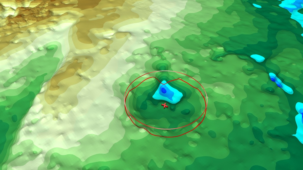
Earth Surface and Interior
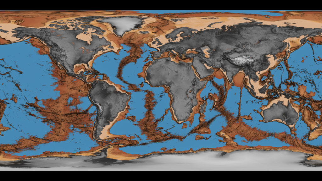
The Earth Surface and Interior focus area (ESI) supports innovative, cross-cutting research into solid Earth processes and properties. ESI uses NASA’s unique global observations to better understand the Earth from its inner core to its outer lithospheric crust, as well as the dynamics between these component parts and the Earth’s atmosphere and ocean. This research provides the foundational data, measurements, and observations that help us understand Earth’s shape, motion, and magnetism, as well as the basis for products needed to inform the assessment, mitigation, and forecasting of natural hazards like earthquakes, volcanic eruptions, tsunamis, landslides, and more.
- ID: 20317
 Animation
 - ID: 4735
- ID: 4588
- ID: 4691
- ID: 4572
 Visualization
 - ID: 3623Visualization
- ID: 4627Visualization
- ID: 30176
 Hyperwall Visual
 - ID: 30027
 Hyperwall Visual
 - ID: 30730
 Hyperwall Visual
 - ID: 30216Hyperwall Visual
- ID: 30469Hyperwall Visual