Near Real-Time Global Biosphere
The latest 2.5 years of Biosphere data with date annotations.
Constantly updated data visualization of the Earth's Biosphere
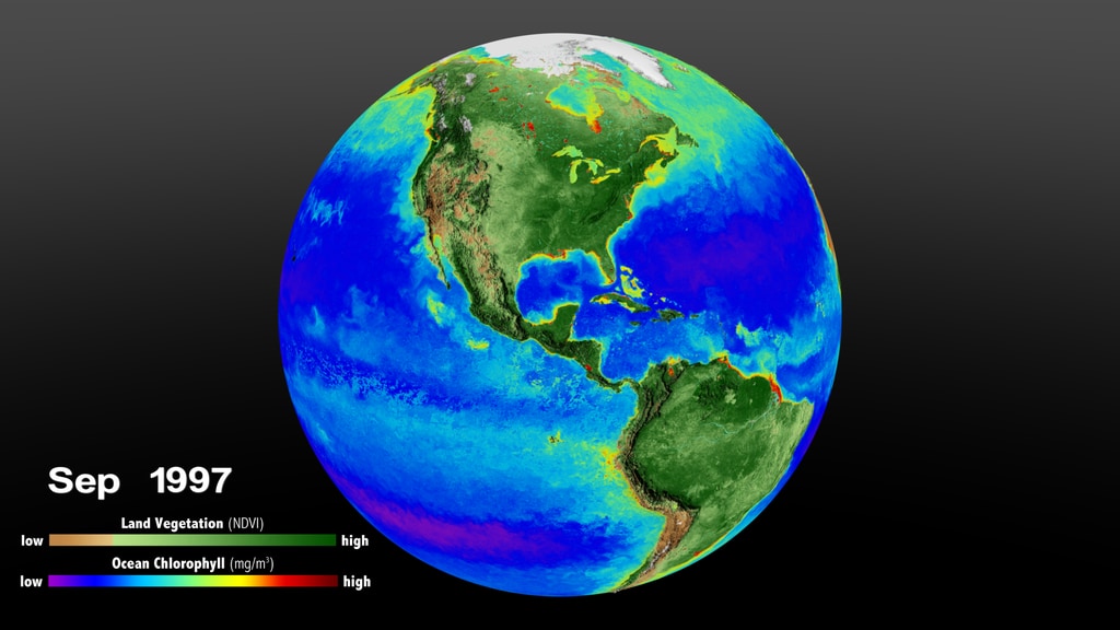
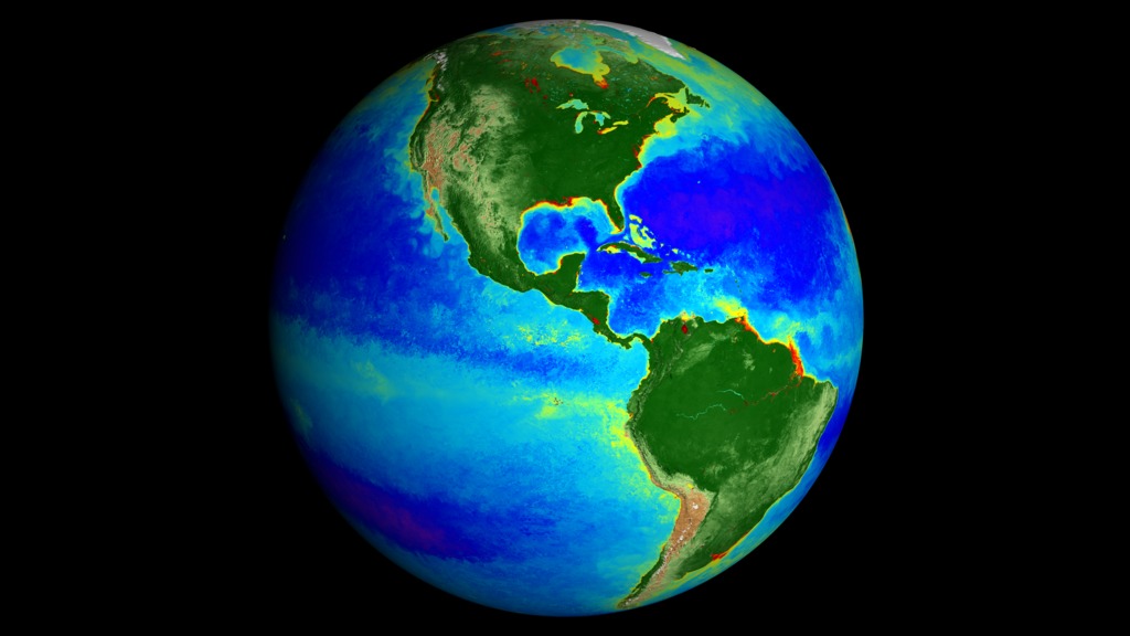
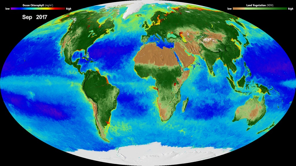
By monitoring the color of reflected light via satellite, scientists can determine how successfully plant life is photosynthesizing. A measurement of photosynthesis is essentially a measurement of successful growth, and growth means successful use of ambient carbon. This data visualization represents five years' worth of data taken primarily by Suomi NPP/VIIRS satellite sensors, showing the abundance of life both on land and in the sea. In the ocean, dark blue represents warmer areas where there is little life due to lack of nutrients, where yellow and orange represent cooler nutrient-rich areas. The nutrient-rich areas include coastal regions where cold water rises from the sea floor bringing nutrients along and areas at the mouths of rivers where the rivers have brought nutrients into the ocean from the land. On land, green represents areas of abundant plant life, such as forests and grasslands, while tan and white represent areas where plant life is sparse or non-existent, such as the deserts in Africa and the Middle East and snow-cover and ice at the poles.
Near real-time biosphere in Robinson projection.

Near real-time Biosphere in Plate Carree projection.
 land cover data. Shades of brown depict little to no vegetation (for example, the Sahara Desert), whereas deep green are large amounts of vegetation (for example, the South American Rainforest).")
Colorbar for the Normalized Difference Vegetation Index (NDVI) land cover data. Shades of brown depict little to no vegetation (for example, the Sahara Desert), whereas deep green are large amounts of vegetation (for example, the South American Rainforest).
Colorbar representing the Ocean's chlorophyll. Blues down to violet are areas with little to no chlorophyll. Green to yellow indicate high chlorophyll concentrations or other color dissolved organic materials.
Colorbar representing the Ocean's chlorophyll using actual data values . Blues down to violet are areas with little to no chlorophyll. Green to yellow indicate high chlorophyll concentrations or other color dissolved organic materials.
- Biological oceanography
- Biosphere
- Carbon Cycle and Ecosystems
- Cryology
- Cryosphere
- Earth Information Center
- Earth Science
- Ecological Dynamics
- Ecology
- For Educators
- HDTV
- Hydrosphere
- Hyperwall
- Microbiota Taxonomy
- ocean color
- Ocean Optics
- Oceans
- photosynthesis
- Physical oceanography
- Phytoplankton
- Plant Growth
- Producer
- Sea Ice
- Sea Ice Concentration
- SeaWiFS
- Snow Cover
- Snow/Ice
- SOS
- Terrestrial Hydrosphere
Credits
Please give credit for this item to:
NASA/Goddard Space Flight Center, The SeaWiFS Project and GeoEye, Scientific Visualization Studio. NOTE: All SeaWiFS images and data presented on this web site are for research and educational use only. All commercial use of SeaWiFS data must be coordinated with GeoEye (NOTE: In January 2013, DigitalGlobe and GeoEye combined to become DigitalGlobe).
-
Data visualizers
-
Alex Kekesi
(Global Science and Technology, Inc.)

- Horace Mitchell (NASA/GSFC)
-
Greg Shirah
(NASA/GSFC)
-
Alex Kekesi
(Global Science and Technology, Inc.)
-
Scientists
- Jeremy Werdell (NASA/GSFC)
- Sean W. Bailey (NASA/GSFC)
- Compton Tucker (NASA/GSFC)
-
Technical support
- Laurence Schuler (ADNET Systems, Inc.)
- Ian Jones (ADNET Systems, Inc.)
Series
This page can be found in the following series:Datasets used
-
Comiso's Daily Sea Ice Concentration
ID: 539 -
IMS Daily Northern Hemisphere Snow and Ice Analysis (IMS Daily Northern Hemisphere Snow and Ice Analysis - 24 km Resolution) [Interactive Multisensor Snow and Ice Mapping System (IMS)]
ID: 778This dataset can be found at: http://nsidc.org/data/docs/noaa/g02156_ims_snow_ice_analysis/
See all pages that use this dataset -
10 km Daily Sea Ice Concentration [SHIZUKU (GCOM-W1): AMSR2]
ID: 795Credit: AMSR2 data courtesy of the Japan Aerospace Exploration Agency (JAXA).
See all pages that use this dataset -
Chlorophyll (Chlorophyll Concentration) [Suomi NPP: VIIRS]
ID: 987 -
Normalized Difference Vegetation Index (NDVI) [Suomi NPP: VIIRS]
ID: 988
Note: While we identify the data sets used on this page, we do not store any further details, nor the data sets themselves on our site.
Related

Older Versions
- ID: 4813
 Visualization
 - ID: 4597
 Visualization
 - ID: 4596
 Visualization
Release date
This page was originally published on Monday, February 13, 2023.
This page was last updated on Tuesday, June 2, 2026 at 5:50 PM EDT.