Visualizations for Educators
Overview
Phenomena are observable events that occur in nature. Data visualizations can offer new ways for students to experience and explore Earth and space phenomena that happen over large scales of time and at great distances. This gallery includes visualizations of phenomena that support topics that are taught in middle and high school and are aligned with select Next Generation Science Standards.
This gallery was curated by Anne Arundle County Science Teachers Margaret Graham and Jeremy Milligan with support from Dr. Rachel Connolly during the summer of 2022. A video showing how Jeremy Milligan uses SVS resources to develop a phenomena-based lesson is also available.
ESS1.A The Universe and its Stars
The Earth’s Place in the Universe collection contains visuals that support phenomena based learning with a focus on the NGSS standards. The middle school standards focus on patterns of motion including rotation, seasons, eclipses, moon phases, orbits of planets, and the motions of galaxies. At the high school level topics include the life cycle of the Sun, Big Bang theory, and orbital motion.
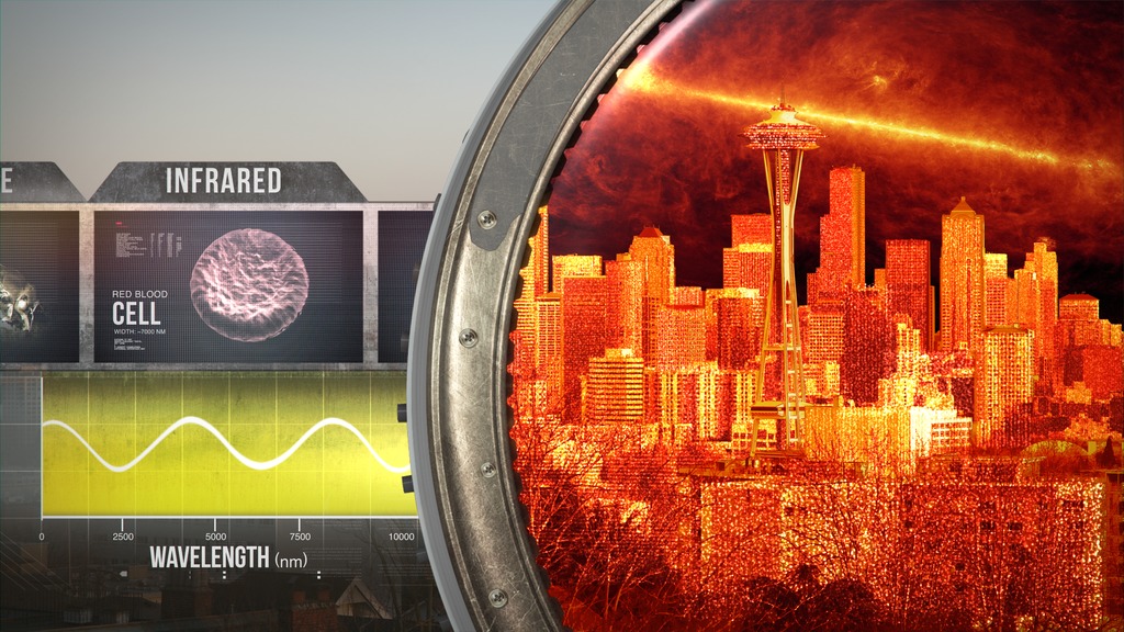
- Electromagnetic Spectrum (A graphical representation of the electromagnetic spectrum, Animation depicting the different characteristics of each wavelength type)
- Big Bang Animation
- Zoom In on Galaxy M87
- Black Holes Orrery
- ID: 20142 Animation
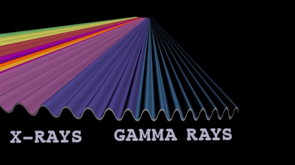
Electromagnetic Spectrum
Go to this pageThis animation shows a graphical representation of the electromagnetic spectrum and includes - Radio Waves, Infrared, Visible, Ultraviolet, X-Rays and Gamma Rays ||
- ID: 20241 Animation
The Electromagnetic Spectrum
Go to this pageAnimation depicting the electromagnetic spectrum and the different characteristics of each wavelength type. 4k resolution. || WFirst_ElectromagneticSpectrum.0830_print.jpg (1024x576) [228.7 KB] || WFirst_ElectromagneticSpectrum.0830.png (3840x2160) [13.8 MB] || WFirst_ElectromagneticSpectrum.0830_searchweb.png (320x180) [105.9 KB] || WFirst_ElectromagneticSpectrum.0830_thm.png (80x40) [7.1 KB] || WFirst_LightSpectrum_Final_H264_HD_1080p.mov (1920x1080) [150.2 MB] || WFirst_LightSpectrum_Final_H264_HD_1080p.webm (1920x1080) [8.7 MB] || WFirst_LightSpectrum_Final_4K_ProRes.mov (3840x2160) [5.6 GB] || frames/3840x2160_16x9_30p/ (3840x2160) [256.0 KB] || WFirst_LightSpectrum_Final_H264-4K.mov (3840x2160) [196.0 MB] ||
- ID: 12656 Produced Video
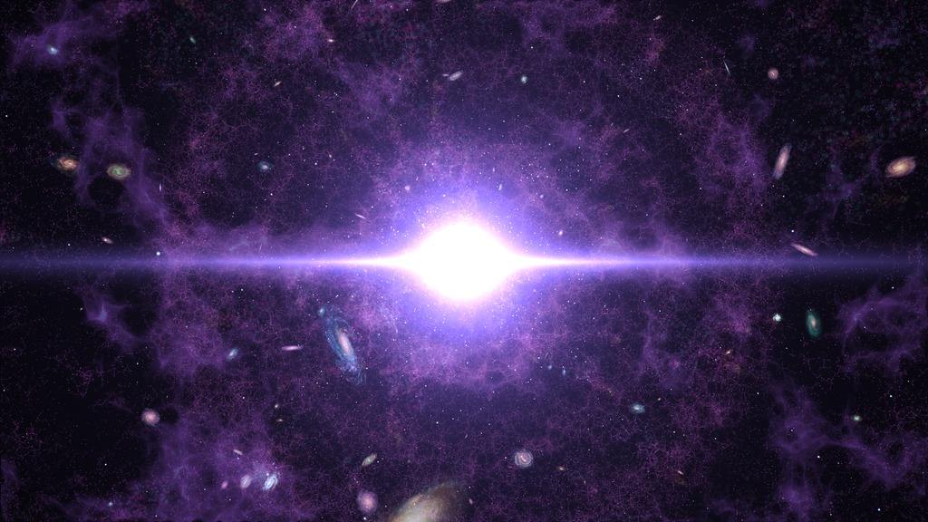
Big Bang Animation--5k Resolution
Go to this pageArtist's interpretation of the Big Bang, with representations of the early universe and its expansion. || BigBang_final-v01_162_print.jpg (1024x576) [187.9 KB] || BigBang_final-v01_162.png (5760x3240) [28.0 MB] || BigBang_final-v01_162_searchweb.png (320x180) [96.3 KB] || BigBang_final-v01_162_web.png (320x180) [96.3 KB] || BigBang_final-v01_162_thm.png (80x40) [6.4 KB] || 12656_Big_Bang_1080.mov (1920x1080) [112.4 MB] || 12656_Big_Bang_1080.webm (1920x1080) [3.0 MB] || 12656_Big_Bang_ProRes_5760x3240_30.mov (5760x3240) [1.9 GB] || frames/5760x3240_16x9_30p/ (5760x3240) [64.0 KB] || 12656_Big_Bang_4K.mov (3840x2160) [84.8 MB] || 12656_Big_Bang_4k.m4v (3840x2160) [93.5 MB] ||
- ID: 13239 Produced Video
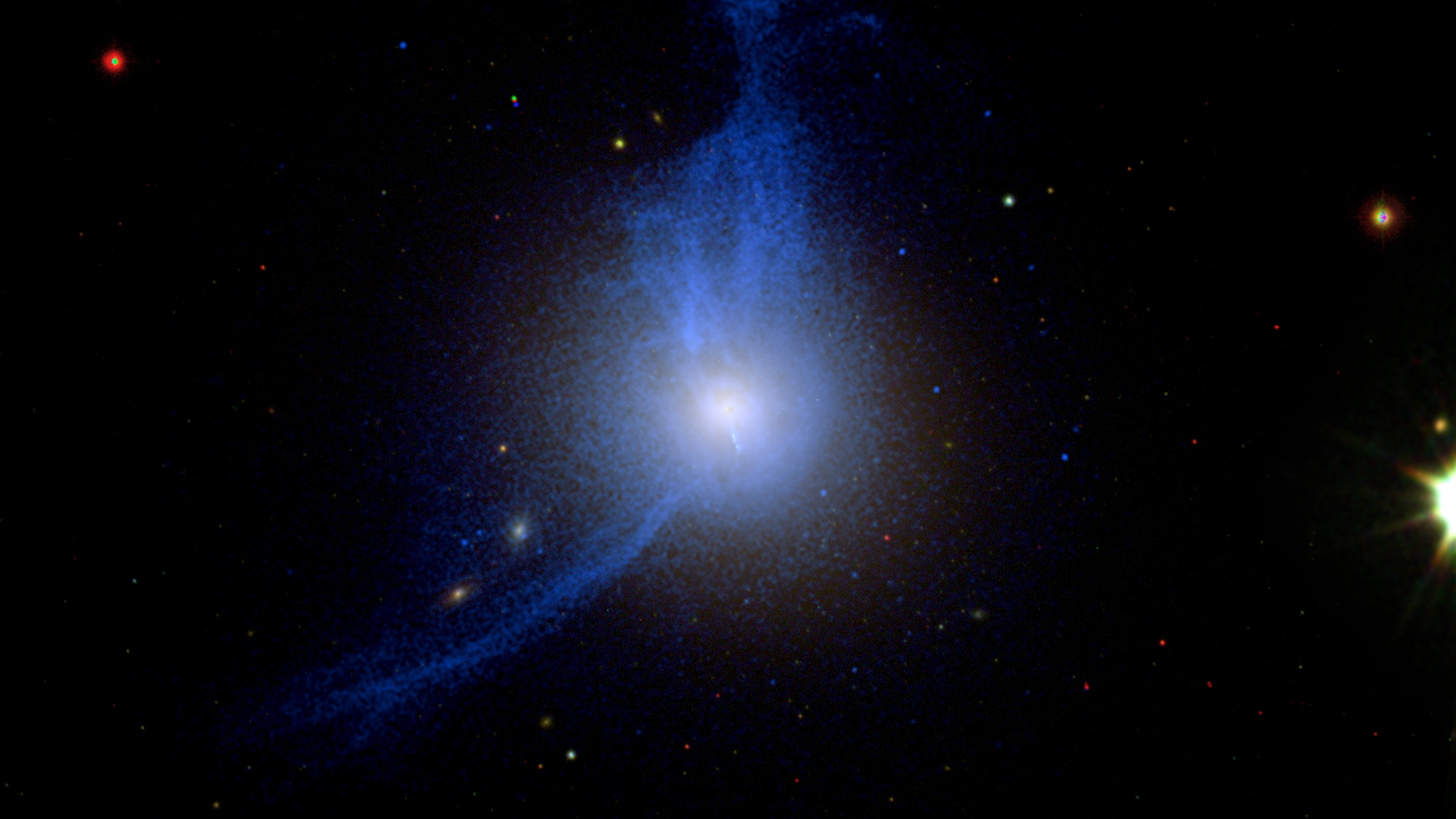
Zoom In on Galaxy M87
Go to this pageThis movie zooms into galaxy M87 using real visible light, X-ray and radio pictures of the galaxy, its jet of high-speed particles, and the shadow of its central black hole. ||
- ID: 4996 Visualization
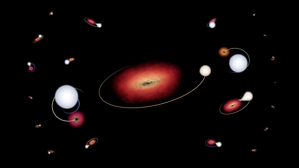
An Orrery of Black Holes and Their Companions
Go to this pageFull visualization of the binary system black hole orrery with labels and legend included.Credit: NASA's Scientific Visualization Studio || explainerComp_5-27-2022a_2160p60.02000_print.jpg (1024x576) [54.7 KB] || frames/3840x2160_16x9_60p/explainerComp_5-27-2022a/ (3840x2160) [512.0 KB] || explainerComp_5-27-2022a_2160p60.mp4 (3840x2160) [35.7 MB] || explainerComp_5-27-2022a_2160p60.webm (3840x2160) [26.6 MB] ||
ESS1.B: Earth and the Solar System
Earth and the Solar System (ESS1.B)
- NASA Eyes Interactive
- Solar System Orbits
- Moon Rotation and Revolution
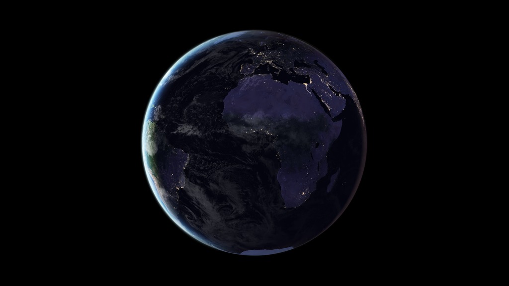
- Rotating Earth at Night
- Great Zoom with Spin
- Solar System Orbits
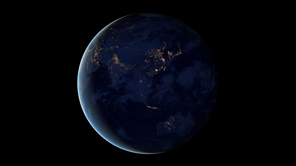
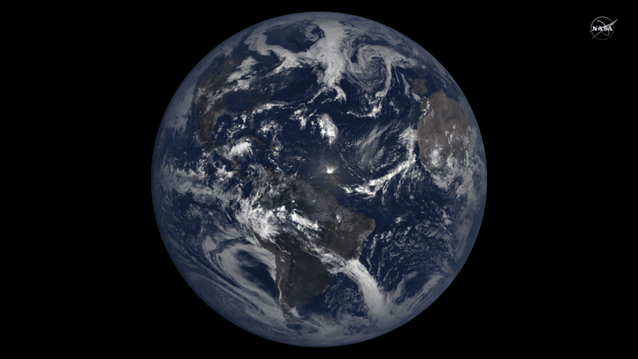
- Black Marble
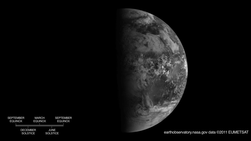
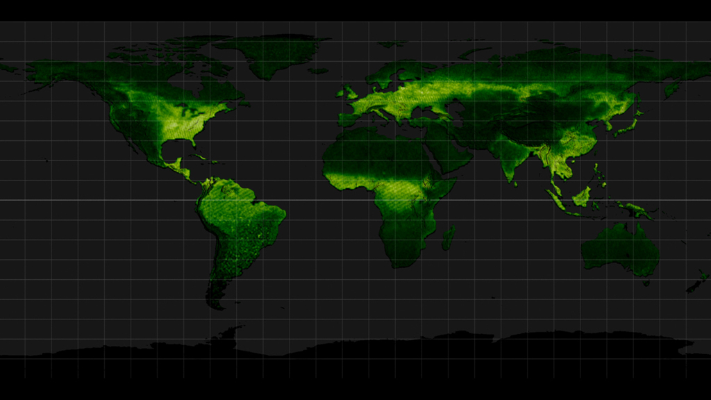
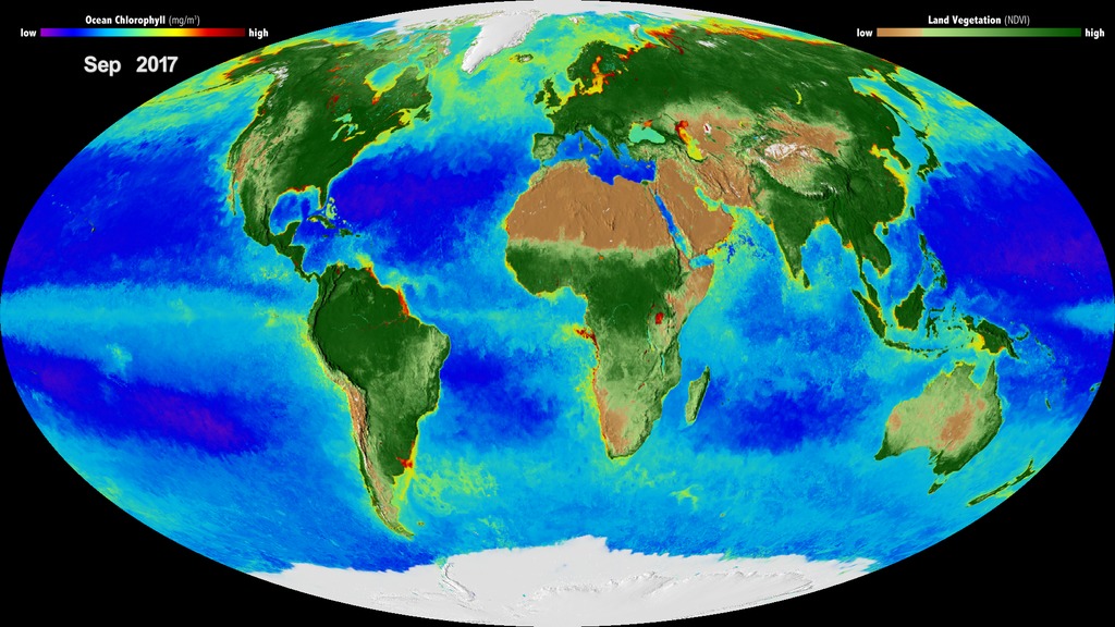
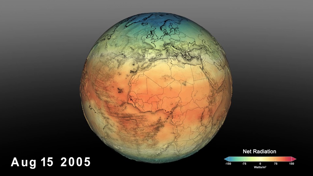
- Seasons (Reason for the Seasons, Vegetation Index, Seasonal Ice and Snow Cover, Seasonal Glow from plants, Global Biosphere, Net Radiation)
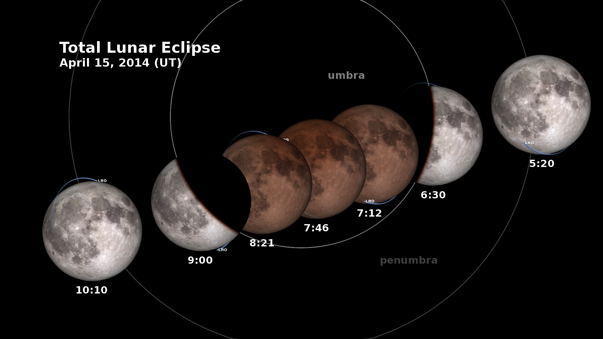
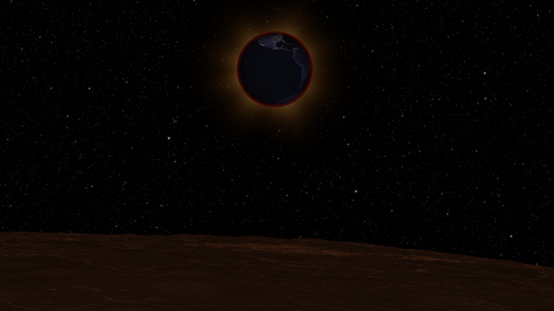
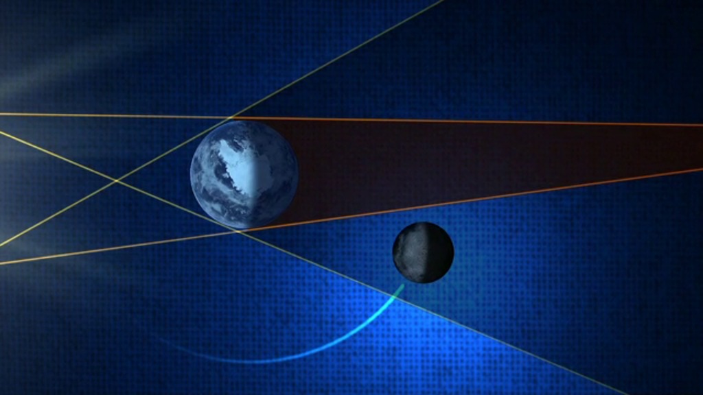
- Eclipses (Lunar Eclipse, Eclipses Orbit, Lunar Eclipse from Moon, Lunar Eclipse Explained, Solar Eclipse)
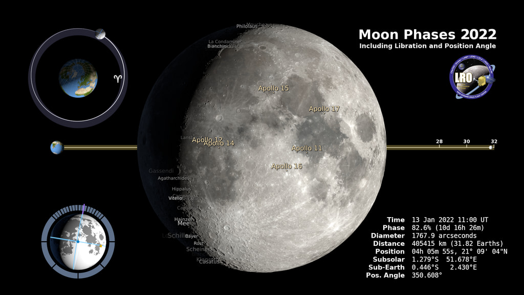
- Moon Phases (Moon Phases for 1 year, Moon Phases w/ Moon orbit)
 Link
Link- ID: 4709
 Visualization
 - ID: 30082
 Hyperwall Visual
 - ID: 2377
- ID: 30878
 Hyperwall Visual
 - ID: 11664
 Produced Video
 - ID: 4816
- ID: 3899
 Visualization
 - ID: 11420
 Produced Video
 - ID: 4596
 Visualization
 - ID: 4817
 Visualization
 - ID: 4155
 Visualization
 - ID: 4158
 Visualization
 - ID: 4157
 Visualization
 - ID: 10787
 Produced Video
 - ID: 12690
 Produced Video
 - ID: 4955
 Visualization
ESS1.B: Weather and Climate
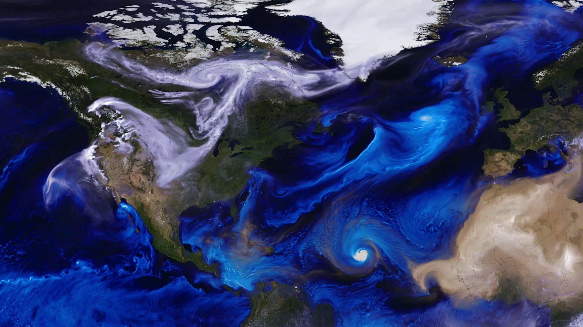
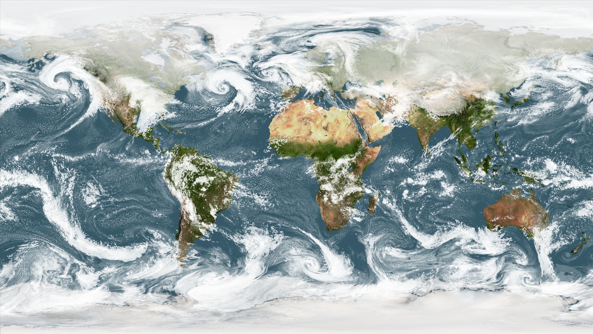
The Earth’s Systems collection contains visuals showing weather and climate. These standards also focus on systems like the hydrologic cycle, ocean currents, glacial ice melt, and the carbon cycle.
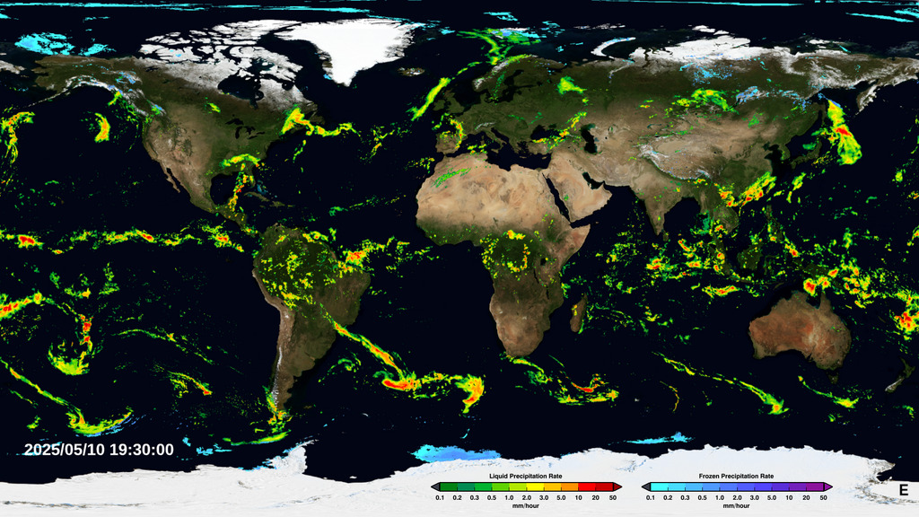
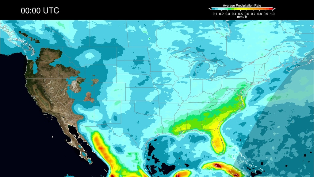
Weather and Climate(ESS1.B)- Global Precipitation 1 Week (current)
- Global Tour of Precipitation
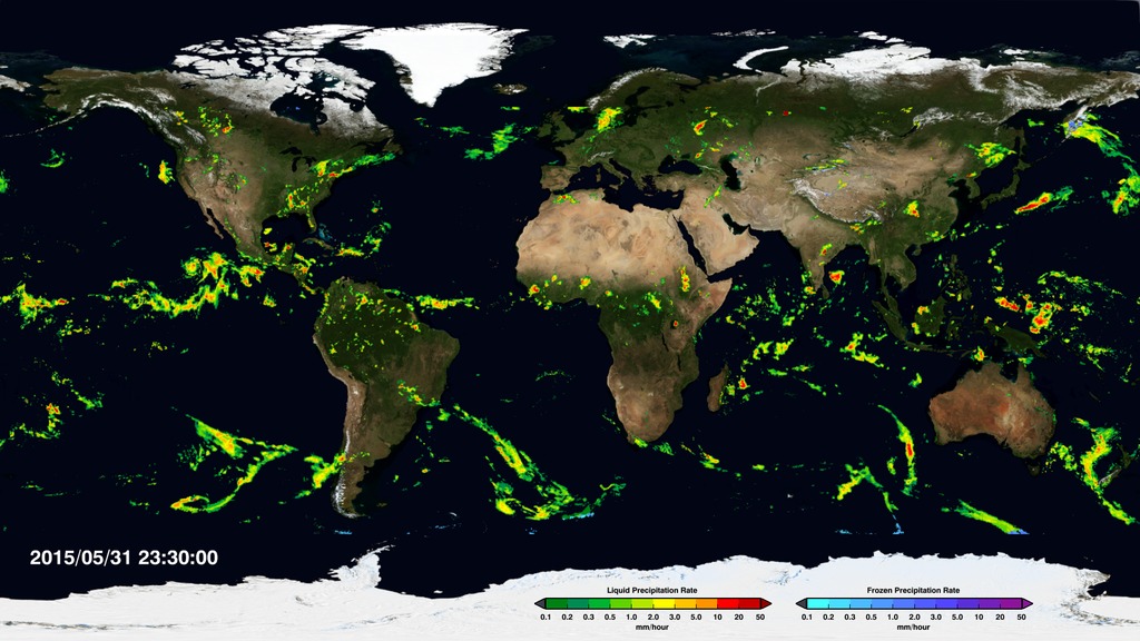
- Global Precipitation June 2015 - Sept 2015
- Earth System of Systems (precipitation, soil moist, wind, clouds)
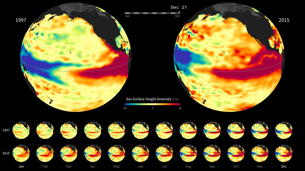
- El Nino
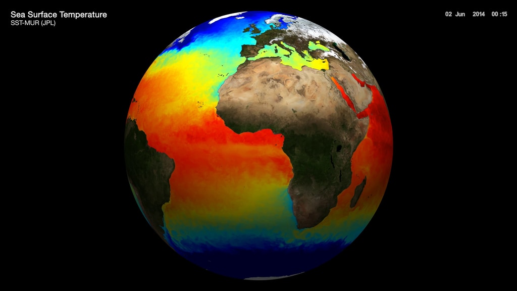
- El Nino Sea Surface Temperature
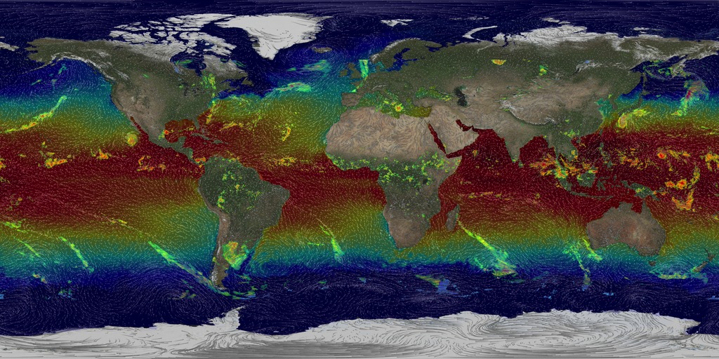
- Water Vapor
- Precipitation Diurnal Cycles
- 2021 Hurricane Season
- Aerosols in the Atmosphere
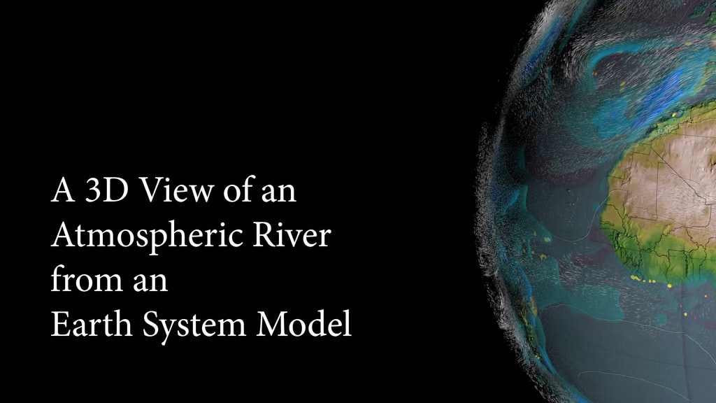
- 3D Atmospheric River
- Dust in the Wind (aerosols)
- Simulated Clouds & Aerosols
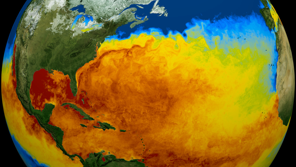
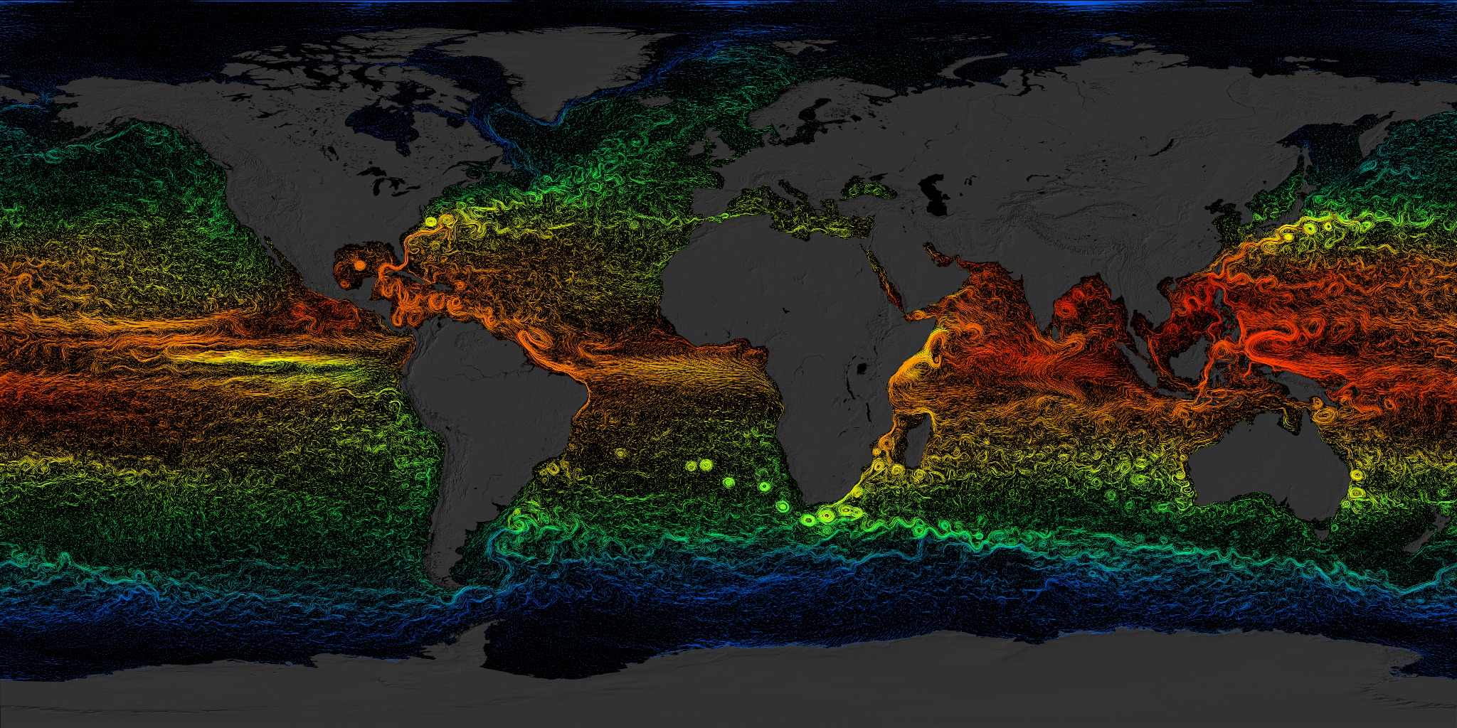
- Global Sea Surface Currents and Temperatures
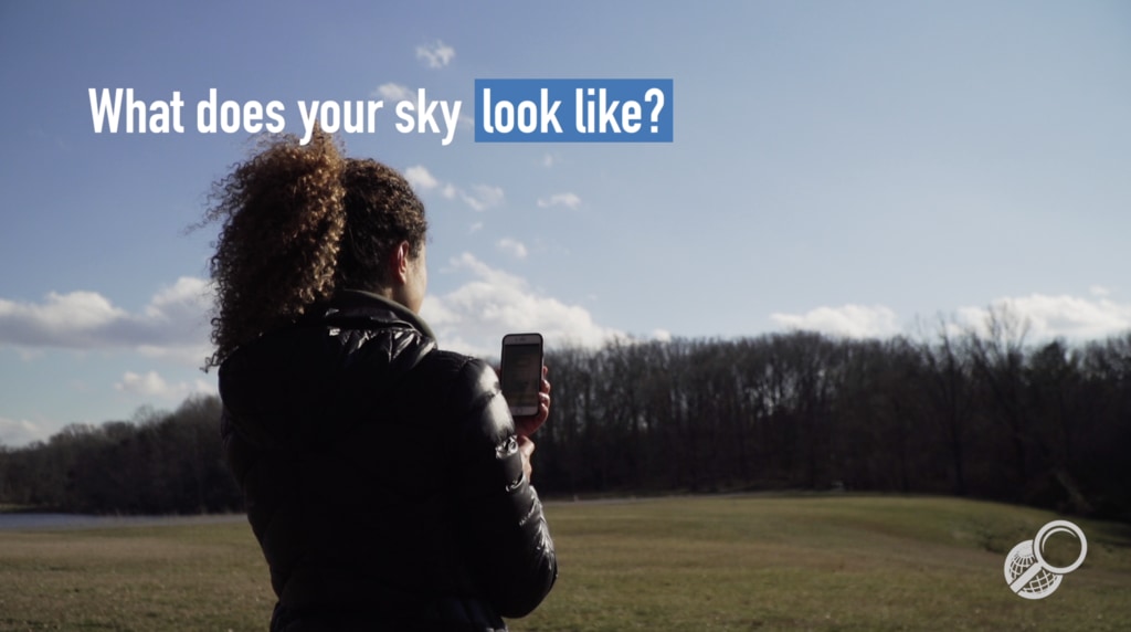
- GLOBE Observer Clouds App
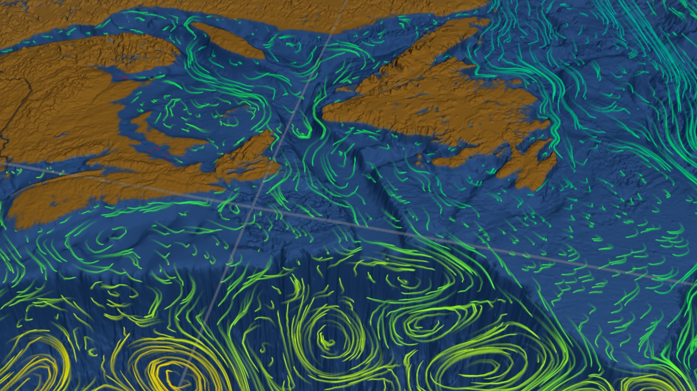
- North Atlantic Surface Currents and Temperatures
- North Atlantic Surface Currents and Temperatures
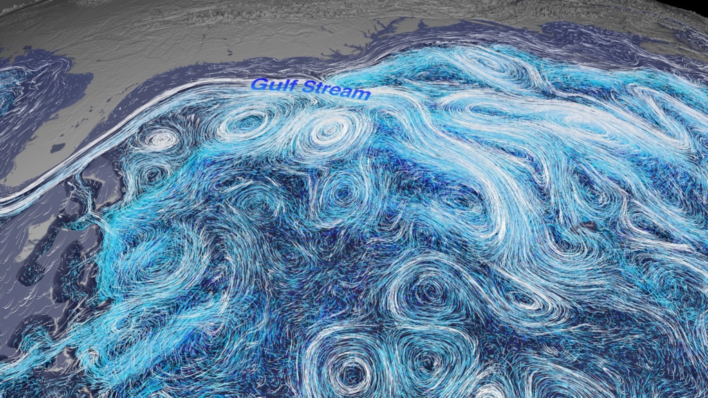
- Gulf Stream Surface & Depth
- ID: 4285
- ID: 12126
- ID: 4372
 Visualization
 - ID: 31139
 Hyperwall Visual
 - ID: 30629
 Hyperwall Visual
 - ID: 4433

- ID: 30388
 Hyperwall Visual
 - ID: 13346
 Produced Video
 - ID: 4982
 Visualization
 - ID: 30637
 Hyperwall Visual
 - ID: 4960
- ID: 12983
 Produced Video
 - ID: 3723
- ID: 13149
 Produced Video
 - ID: 3912
 Visualization
 - ID: 3913
 Visualization
 - ID: 4802
HESS3.C: Human Impacts on Earth Systems
The Earth and Human Activity collection focuses on how humans interact with and change the Earth. These standards include global climate change, environmental hazards and mitigation strategies, and the effects of population increases on natural resources.
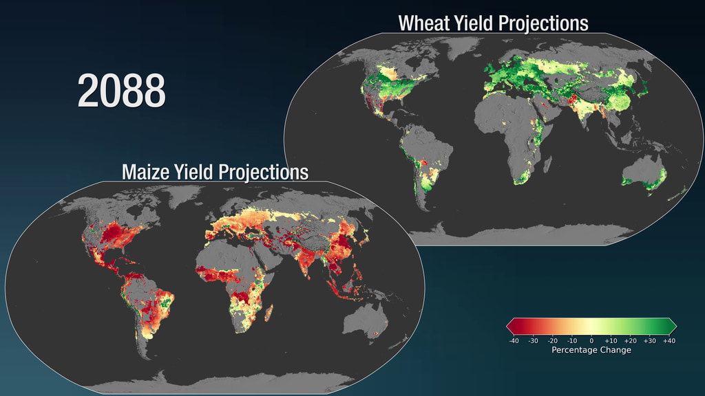
- Impact of Climate Change on Crops
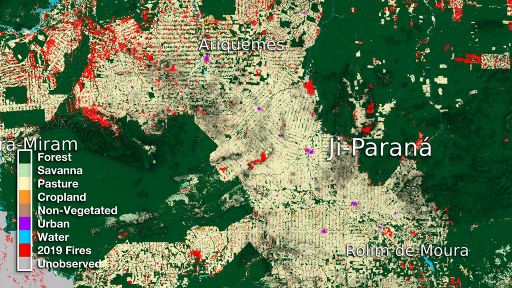
- Deforestation in Ji-Parana
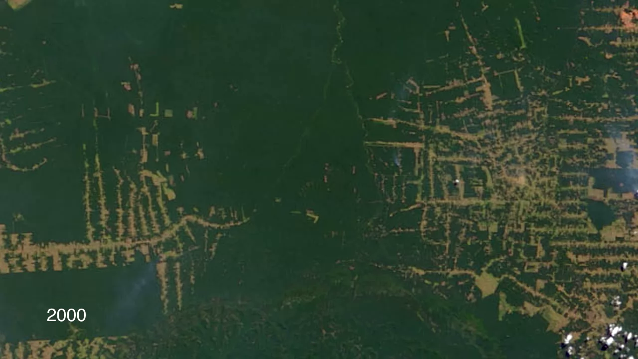
- Amazon Deforestation 2000-2010
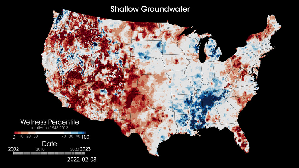
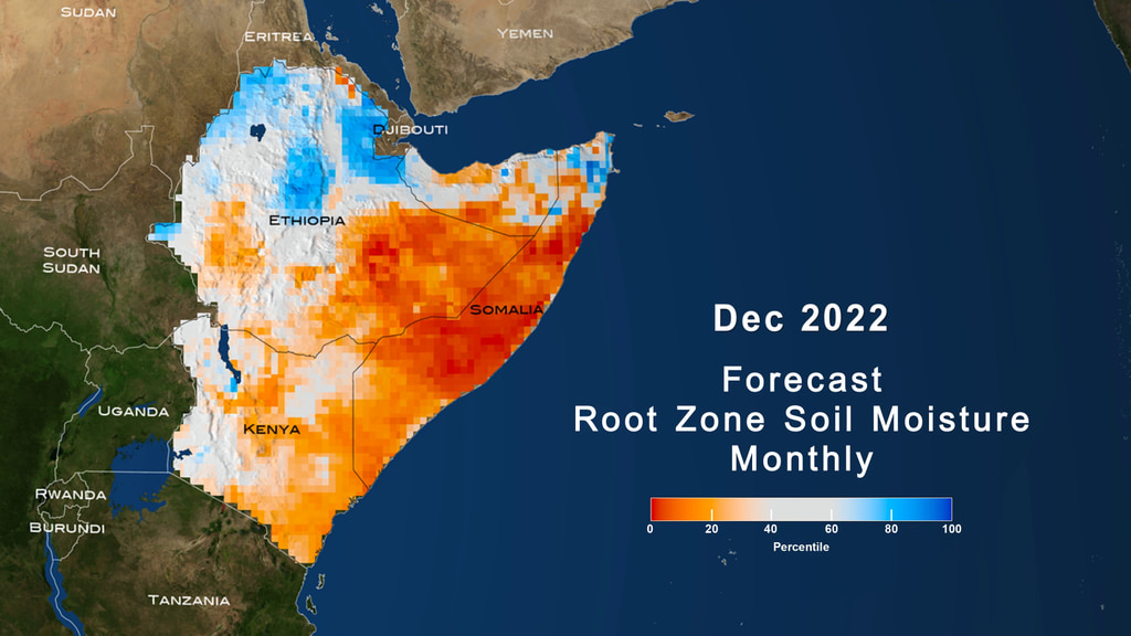
- Droughts (Root Zone & Groundwater)
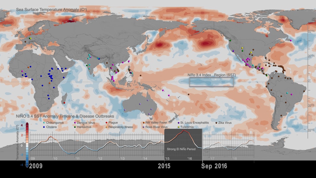
- Sea Surface Temp & Diseases
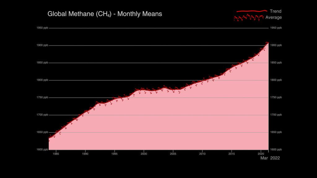
- Global Methane Trends
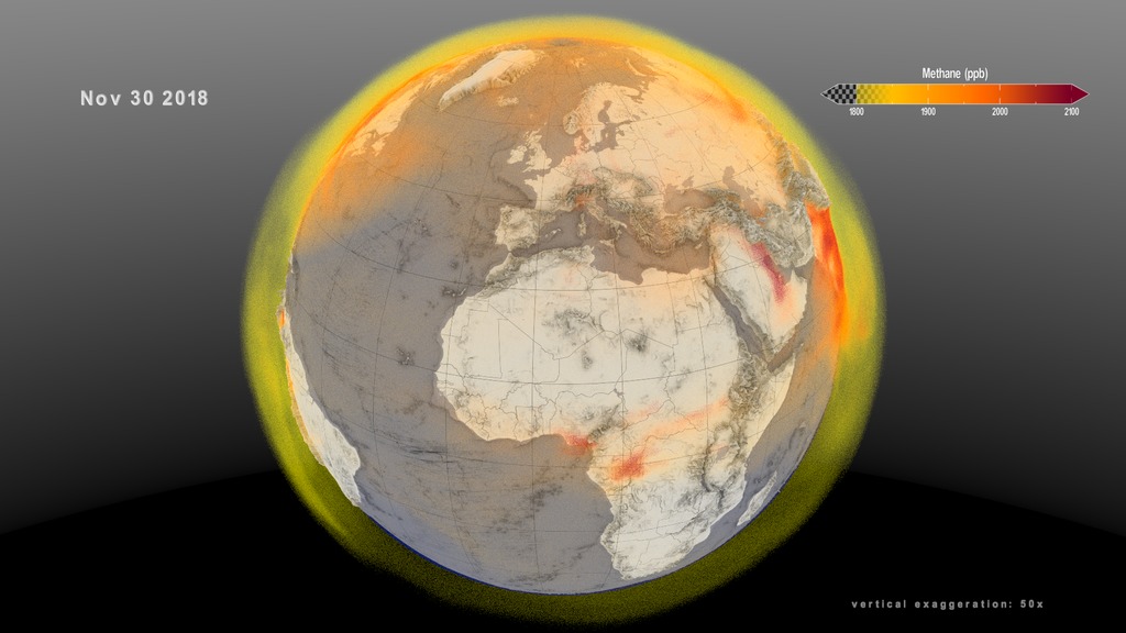
- Atmospheric Methane for 1 year
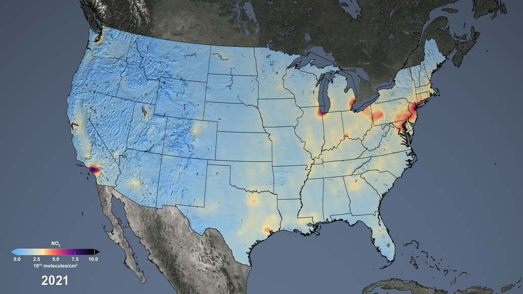
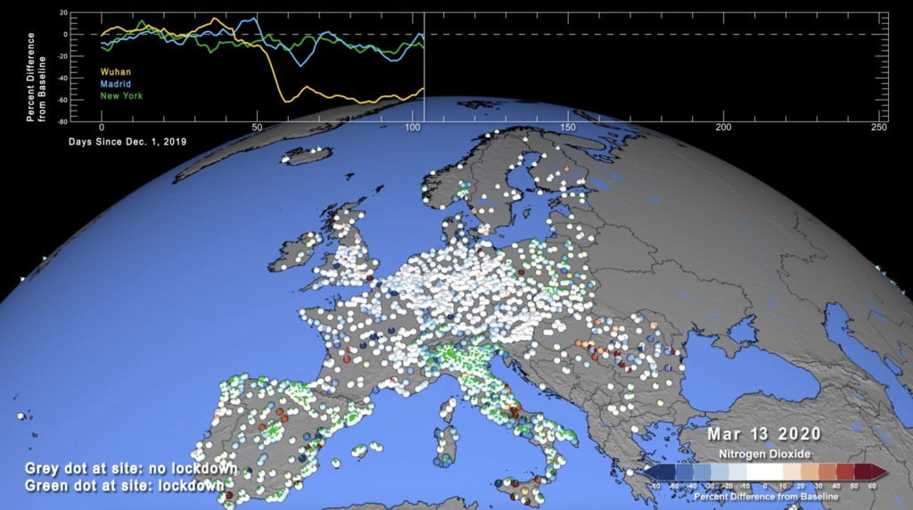
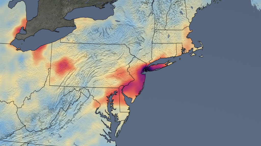
- Nitrogen Dioxide 2005-2021
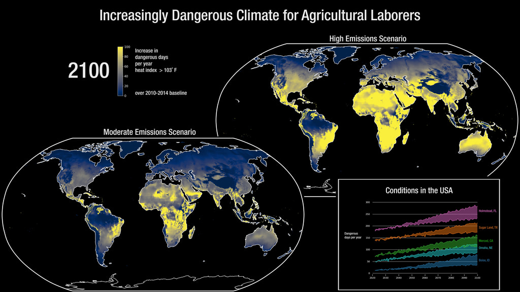
- Human Vulnerability (Danger for Agriculture Workers)
- Covid Shutdowns and Emissions
- Reduced Pollution from Covid-19
- ID: 4974
 Visualization
 - ID: 4829
 Visualization
 - ID: 30166
 Hyperwall Visual
 - ID: 31176
 Hyperwall Visual
 - ID: 5014
 Visualization
 - ID: 4785
- ID: 5007
 Visualization
 - ID: 4798
 Visualization
 - ID: 4994
 Visualization
 - ID: 4972
 Visualization
 - ID: 13753
 Produced Video
 - ID: 4810
HESS3.D: Human Impacts on Earth Systems
- Weekly Arctic Sea Ice 1984-2019
- Global Temp Anomalies
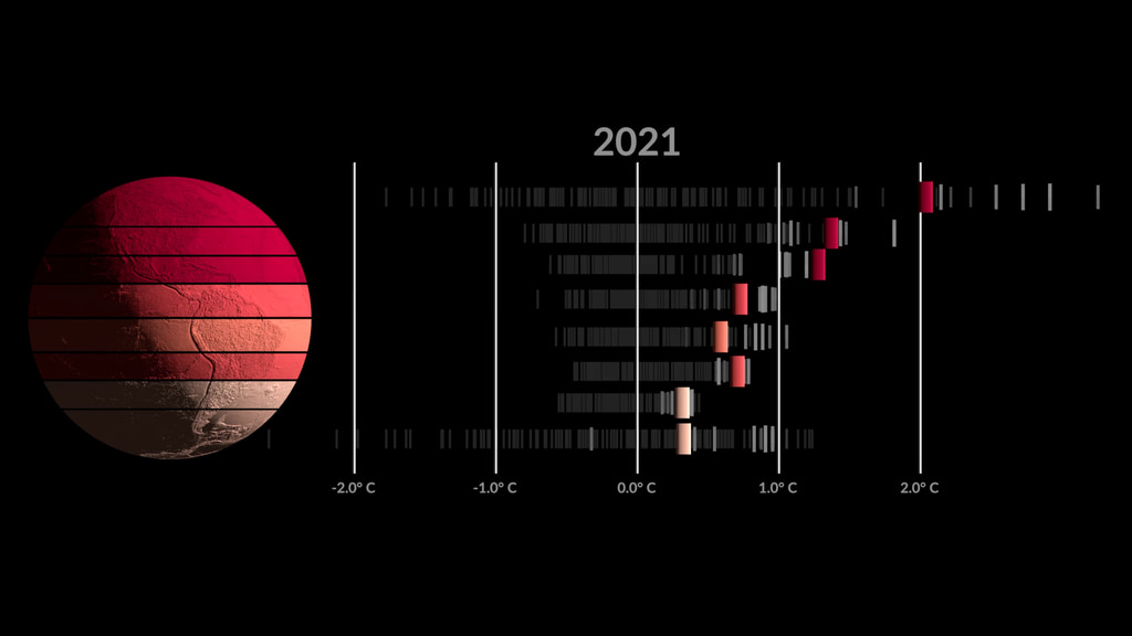
- 2021 Global Temperature Report
- NASA Earth Observatory Temp Anomaly Graph
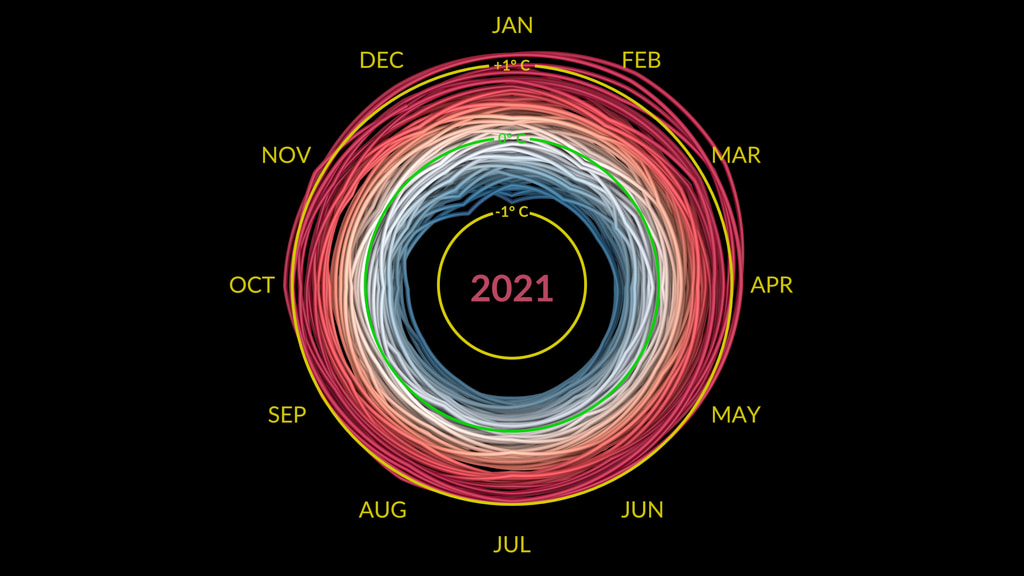
- Cimate Spiral
- Zonal Climate Anomalies
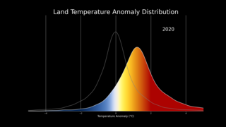
- Shifting Temperature Distribution
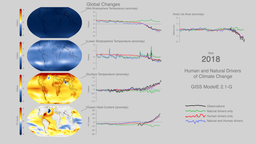
- Climate Drivers (visual & graphs)
- Impact of climate change on crops
- Global Biosphere 20 years (ocean chlorophyll & land plants)
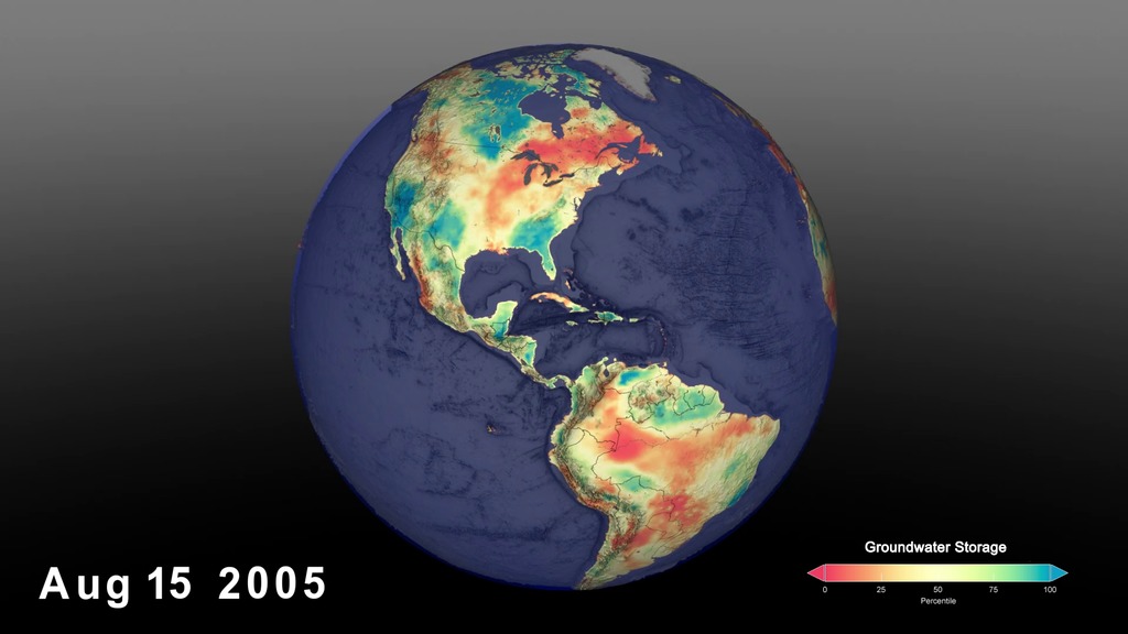
- Groundwater Storage
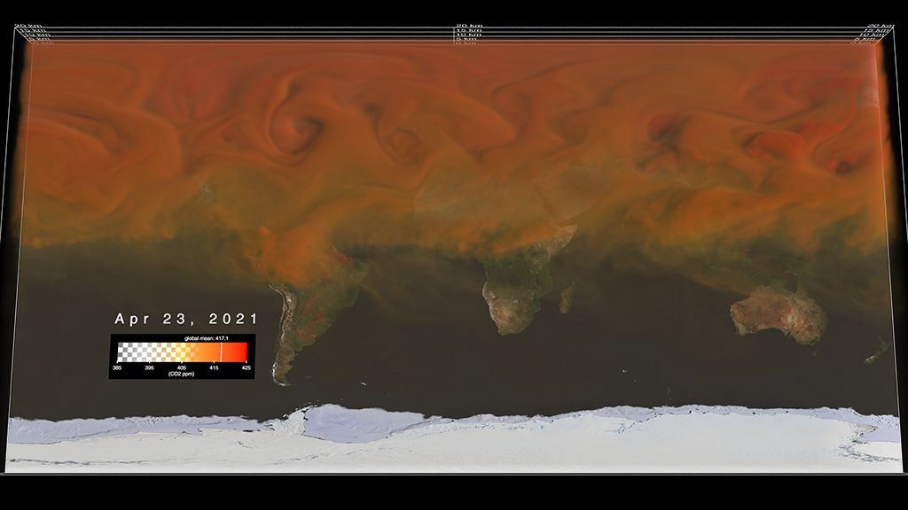
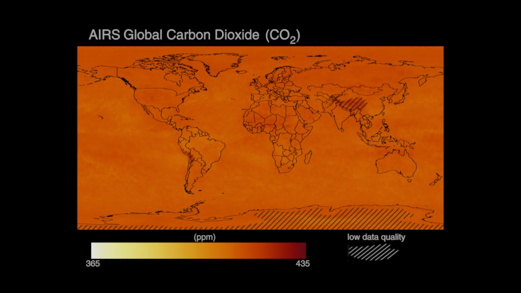
- CO2 over a year (2020-2021)
- CO2 over 20 years (2002-2022) from space
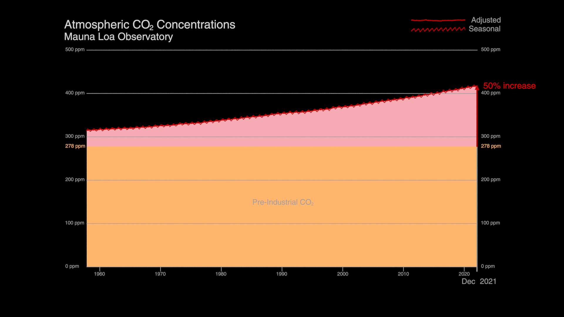
- CO2 increase graph (Keeling Curve)
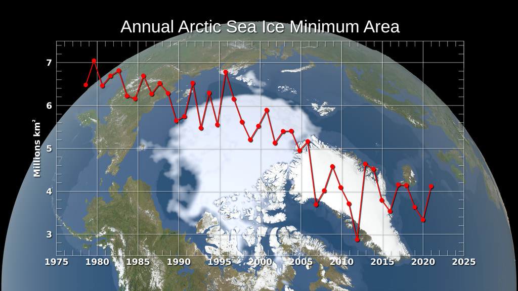
- Annual Arctic Sea Ice Min
- Climate Change in Yellowstone
- Ocean Garbage Patch Visualization Experiment
- ID: 4974Visualization
- ID: 4829Visualization
- ID: 30166Hyperwall Visual
- ID: 31176Hyperwall Visual
- ID: 4785
- ID: 5007Visualization
- ID: 4994Visualization
- ID: 4972Visualization
- ID: 13753Produced Video
- ID: 4810
- ID: 4750

- ID: 4964
 Visualization
 - ID: 14066
![Universal Production Music: Knock and Wait (Instrumental) by Brice Davoli [SACEM], Well That’s Difference (Instrumental) by Jeff Cardoni [ASCAP], Wanna Be Hipster (Instrumental) by Jeff Cardoni [ASCAP], Curiosity Killed Kitty (Instrumental) by Robert Leslie Bennett [ASCAP], Eco Issues (Instrumental) by Max van Thun [GEMA] Additional Footage: Pond5.com, CSPANComplete transcript available.](/vis/a010000/a014000/a014066/Title.jpg) Produced Video
Produced Video 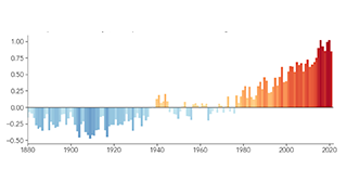
- ID: 4975
 Visualization
 - ID: 4978
 Visualization
 - ID: 4891
- ID: 4908
 Visualization
 - ID: 4596Visualization
- ID: 4818
 Visualization
 - ID: 4949
 Visualization
 - ID: 4990
- ID: 4962
- ID: 5002
 Visualization
 - ID: 30554
 Hyperwall Visual
 - ID: 4174
 Visualization