Garbage Patch Visualization Experiment
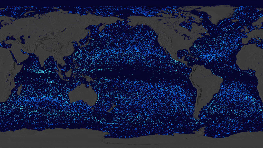
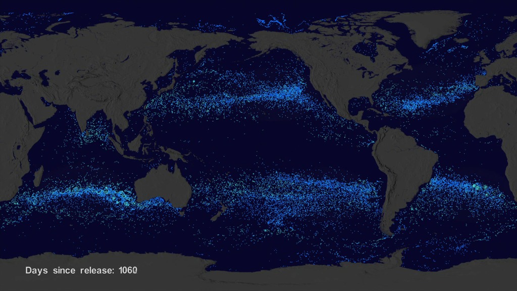
We wanted to see if we could visualize the so-called ocean garbage patches. We start with data from floating, scientific buoys that NOAA has been distributing in the oceans for the last 35-year represented here as white dots. Let's speed up time to see where the buoys go... Since new buoys are continually released, it's hard to tell where older buoys move to. Let's clear the map and add the starting locations of all the buoys... Interesting patterns appear all over the place. Lines of buoys are due to ships and planes that released buoys periodically. If we let all of the buoys go at the same time, we can observe buoy migration patterns. The number of buoys decreases because some buoys don't last as long as others. The buoys migrate to 5 known gyres also called ocean garbage patches.
We can also see this in a computational model of ocean currents called ECCO-2. We release particles evenly around the world and let the modeled currents carry the particles. The particles from the model also migrate to the garbage patches. Even though the retimed buoys and modeled particles did not react to currents at the same times, the fact that the data tend to accumulate in the same regions show how robust the result is.
The dataset used for the ocean buoy visualization is the Global Drifter Database from the GDP Drifter Data Assembly Center, part of the NOAA Atlantic Oceanographic & Meteorological Laboratory. The data covered the period February 1979 through September 2013. Although the actual dataset has a wealth of data, including surface temperatures, salinities, etc., only the buoy positions were used in the visualization.
This visualization was accepted as one of the "Dailies" at SIGGRAPH 2015.
SIGGRAPH Version
For complete transcript, click here.
This video is also available on our YouTube channel.
The NOAA drifter buoys had been released at various times and locations around the world. As you watch new buoys get released, notice the patterns of the buoys. These are due to the way that they were release. For exmaple, a boat sailing in a roughly straight line might release a series of buoys every few hours causing a line of dots to appear; or, a bunch of buoys might be released near a research station making the buoys look like they all emerge from one location.
The previous visualization of the NOAA drifter buoys does not show how the buoys might move towards the garbage patches becasue they are continuously released. We shifted the timing of each buoy data set so that the start time of each buoy data set was the same. This means that the buoys you see at any particular time have been in the water the same amount of time. This also allows you to see the interesting patterns of buoy release. While there are likely seasonal variations in how buoys move, the general pattern shows that the buoys tend to move around until they move into slow moving larger circulation patterns which are the garbage patches.
We distributed thousands of particles (virutal buoys) aroung the world, then ran a simulation based on the ECCO2 flow vectors to see where those particles would move to over time. These simulated particles were colored blue/cyan based on the paricle's speed. Notice that over time garbage patches develop in each of the ocean basins.
Finally, we combined the two data sets with the retimed NOAA difter buoys in white on top and the ECCO2 simulated particles in cyan/blue on the bottom. The observed NOAA drifters and the ECCO2 particle simulation both appear to evolve towards the garbage patches.

Add all drifters so they can start at the same time
 meters per second up to cyan which is 0.25 meters per second and higher.")
Color bar for the ECCO2 particle simulation ranging from blue which is very slow (close to zero) meters per second up to cyan which is 0.25 meters per second and higher.
Credits
Please give credit for this item to:
NASA's Scientific Visualization Studio
-
Animators
-
Greg Shirah
(NASA/GSFC)

- Horace Mitchell (NASA/GSFC)
-
Greg Shirah
(NASA/GSFC)
-
Project support
- Leann Johnson (Global Science and Technology, Inc.)
- Laurence Schuler (ADNET Systems, Inc.)
- Ian Jones (ADNET Systems, Inc.)
Series
This page can be found in the following series:Datasets used
-
ECCO2 (ECCO2 High Resolution Ocean and Sea Ice Model)
ID: 707 -
Ocean Drifters (Global Drifter Database) [Ocean Surface Buoys: Various]
ID: 893
Note: While we identify the data sets used on this page, we do not store any further details, nor the data sets themselves on our site.
Related
- ID: 11920
 Produced Video
 - ID: 4375
 Visualization
Release date
This page was originally published on Monday, August 10, 2015.
This page was last updated on Sunday, February 2, 2025 at 10:15 PM EST.