Seasonal Glow
Scientists are now able to view the vitality of Earth’s terrestrial plant life with satellites orbiting hundreds of miles above the planet. The key lies in distinguishing the faint glow, or fluorescence, emitted by healthy plants when they convert sunlight to energy via photosynthesis. NASA researchers have detected the glow, invisible to the naked eye, with an instrument on a European meteorological satellite. Using data collected by the satellite from 2007 to 2011, they created a global map of the phenomenon that reveals how plant productivity changes through the seasons. Watch the video to see how different parts of the world brighten and dim over the course of an average year.

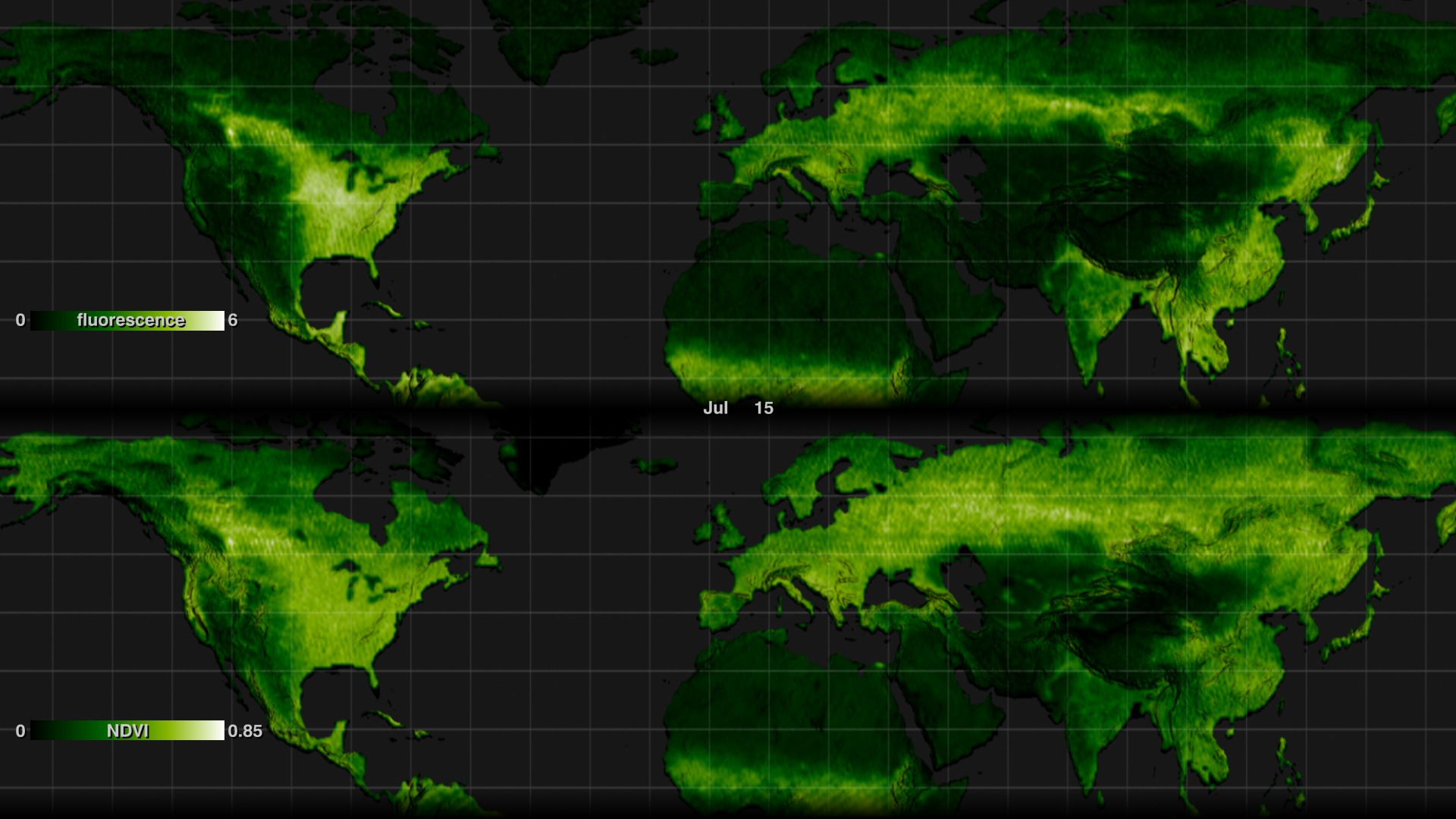
Scientists map the light emitted by Earth’s land plants.
Darker green indicates regions with little or no fluorescence; lighter green and white indicates regions of high fluorescence.
The northward march of fluorescence during spring in the northern hemisphere reflects thriving vegetation.
Fluorescence peaks during summer in the northern hemisphere.
By fall in the northern hemisphere, fewer hours of sunlight slows photosynthesis and fluorescence wanes.
Photosynthesis—and thus fluorescence—is minimal during winter in the northern hemisphere.
Credits
Please give credit for this item to:
NASA's Goddard Space Flight Center
-
Animator
-
Greg Shirah
(NASA/GSFC)

-
Greg Shirah
(NASA/GSFC)
-
Producer
- Kayvon Sharghi (USRA)
-
Scientist
- Joanna Joiner (NASA/GSFC)
-
Writer
- Kathryn Hansen (Wyle Information Systems)
Related
- ID: 4100
Release date
This page was originally published on Thursday, January 9, 2014.
This page was last updated on Wednesday, May 3, 2023 at 1:51 PM EDT.