A newer version of this visualization is available.
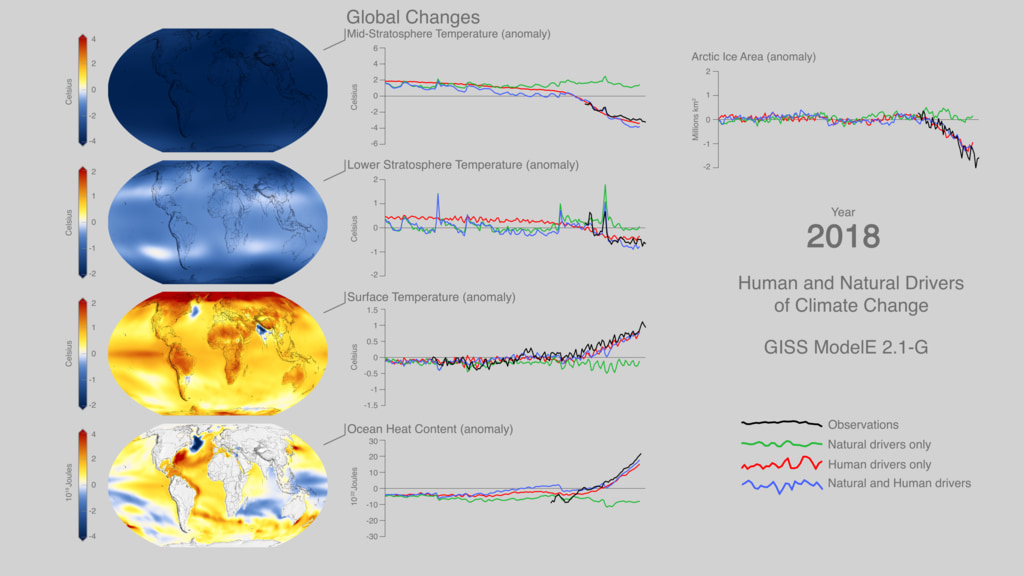
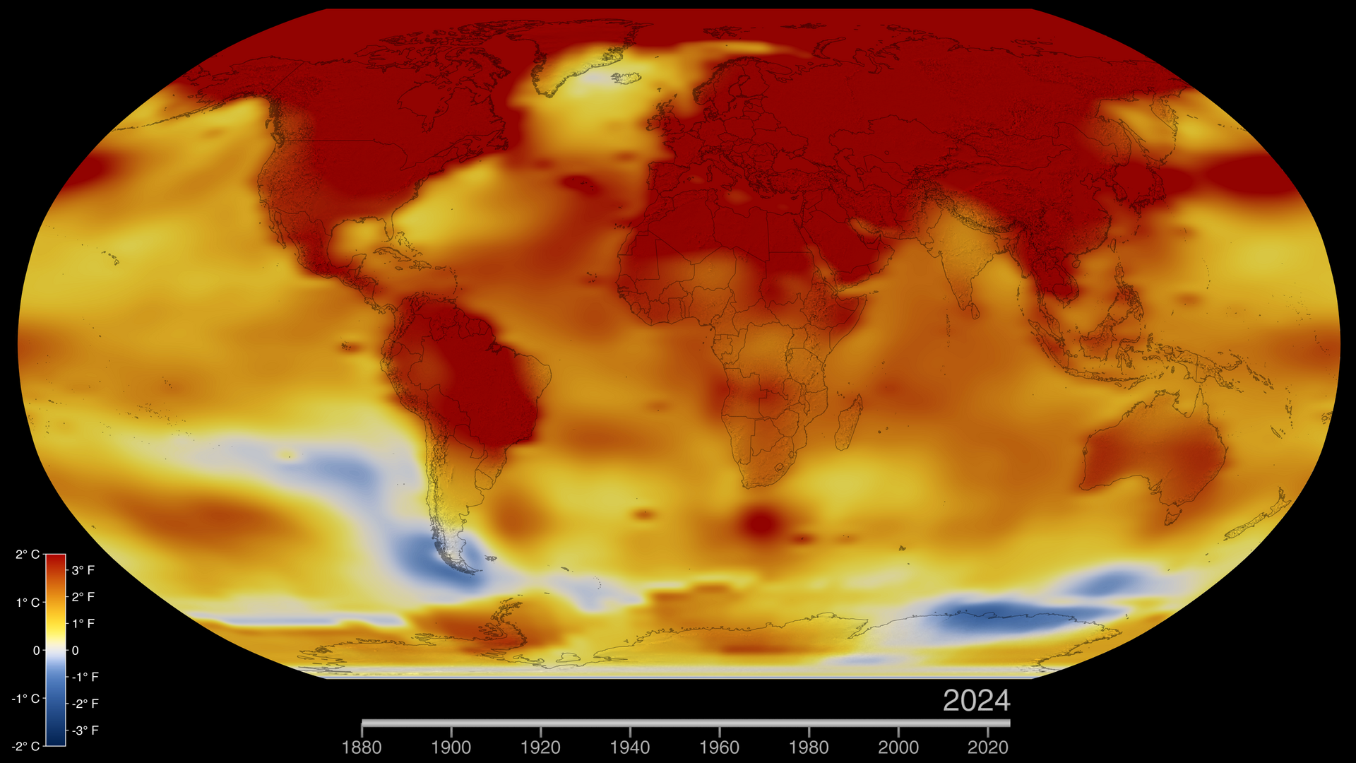
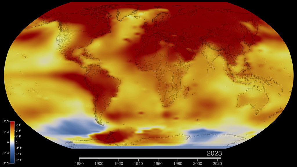
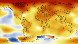
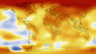
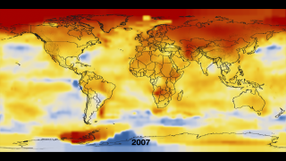
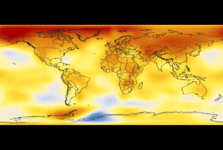
Global Temperature Anomalies from 1880 to 2022
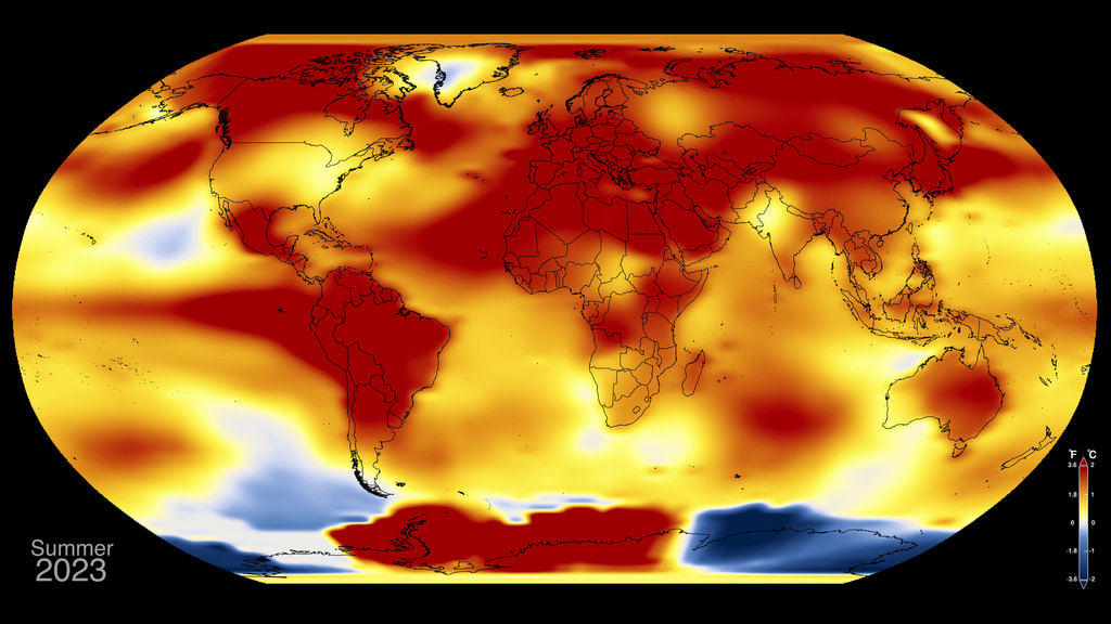
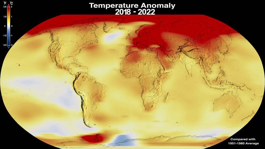
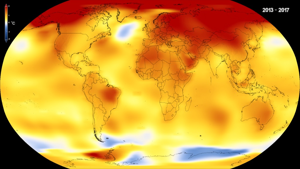
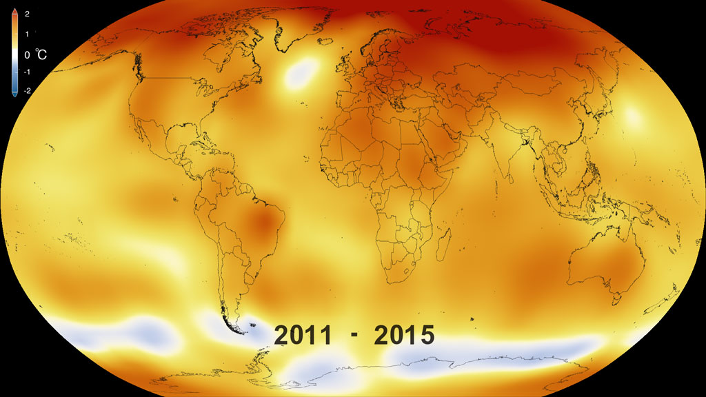
This color-coded map in Robinson projection displays a progression of changing global surface temperature anomalies. Normal temperatures are shown in white. Higher than normal temperatures are shown in red and lower than normal temperatures are shown in blue. Normal temperatures are calculated over the 30 year baseline period 1951-1980. The final frame represents the 5 year global temperature anomalies from 2018-2022.
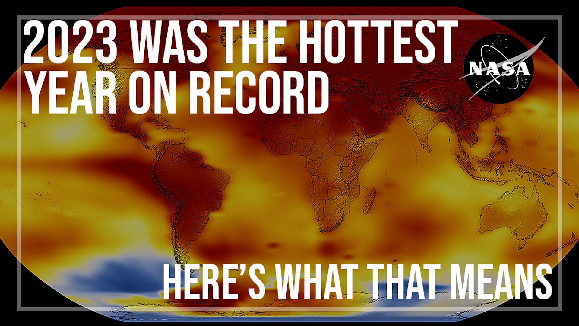
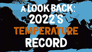
NASA Reports 2022 Tied for 5th Warmest Year on Record, Continuing a Trend
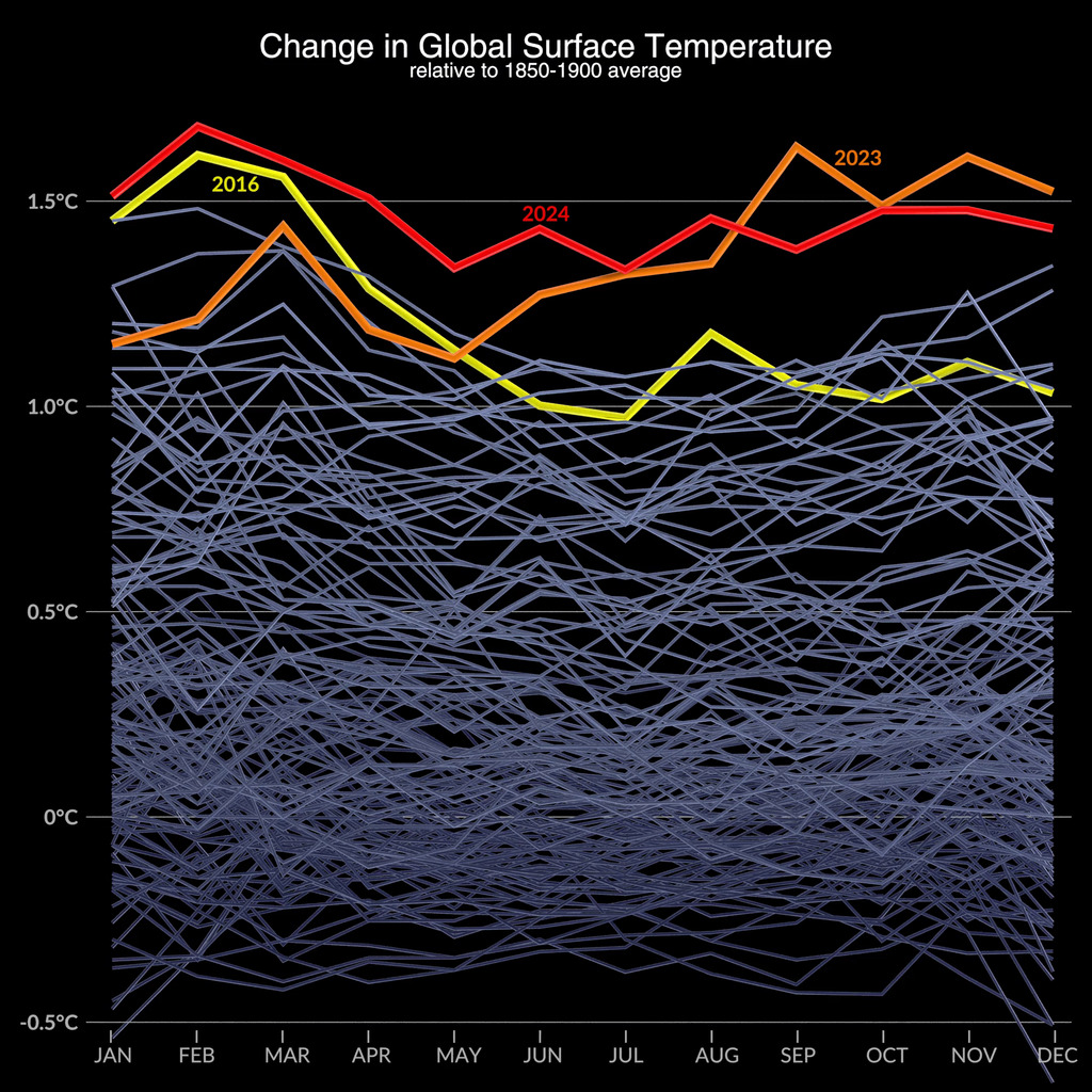
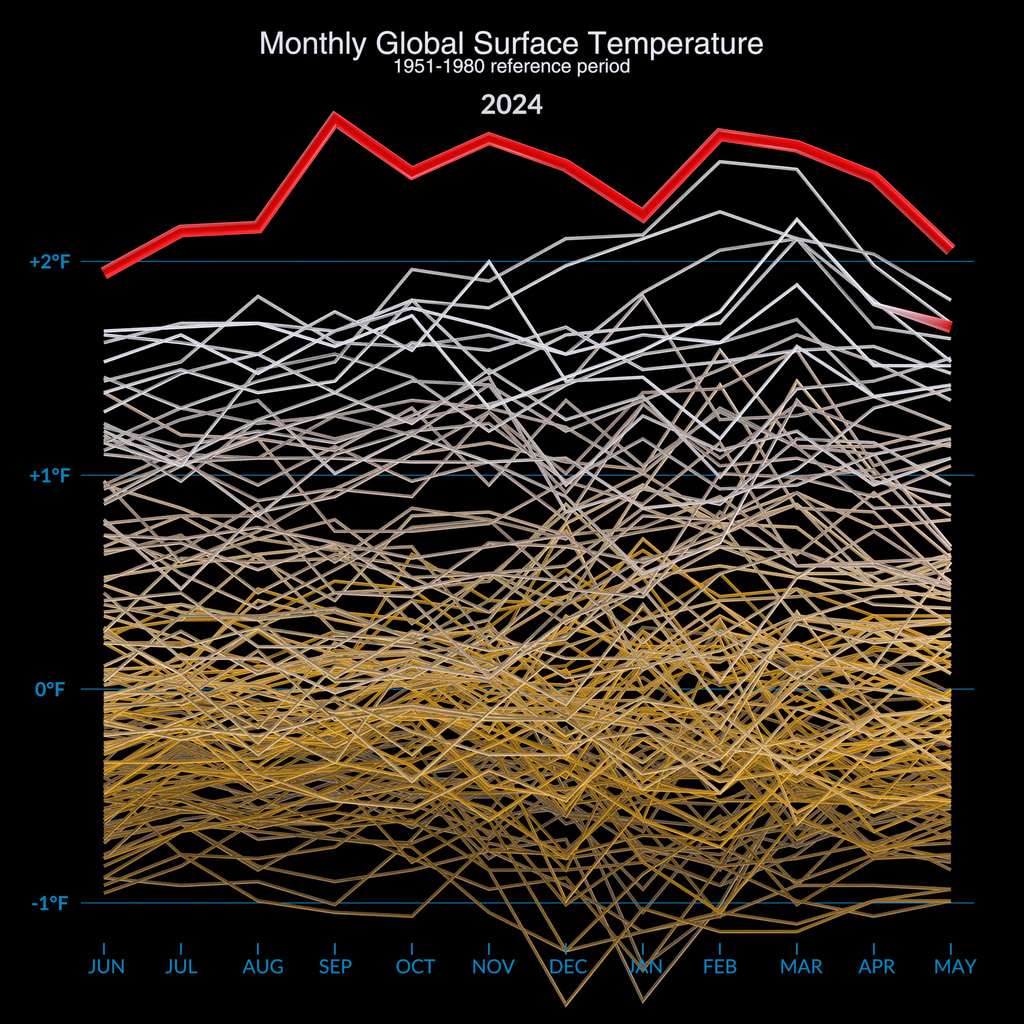
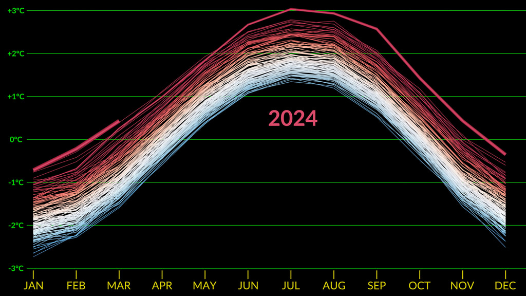
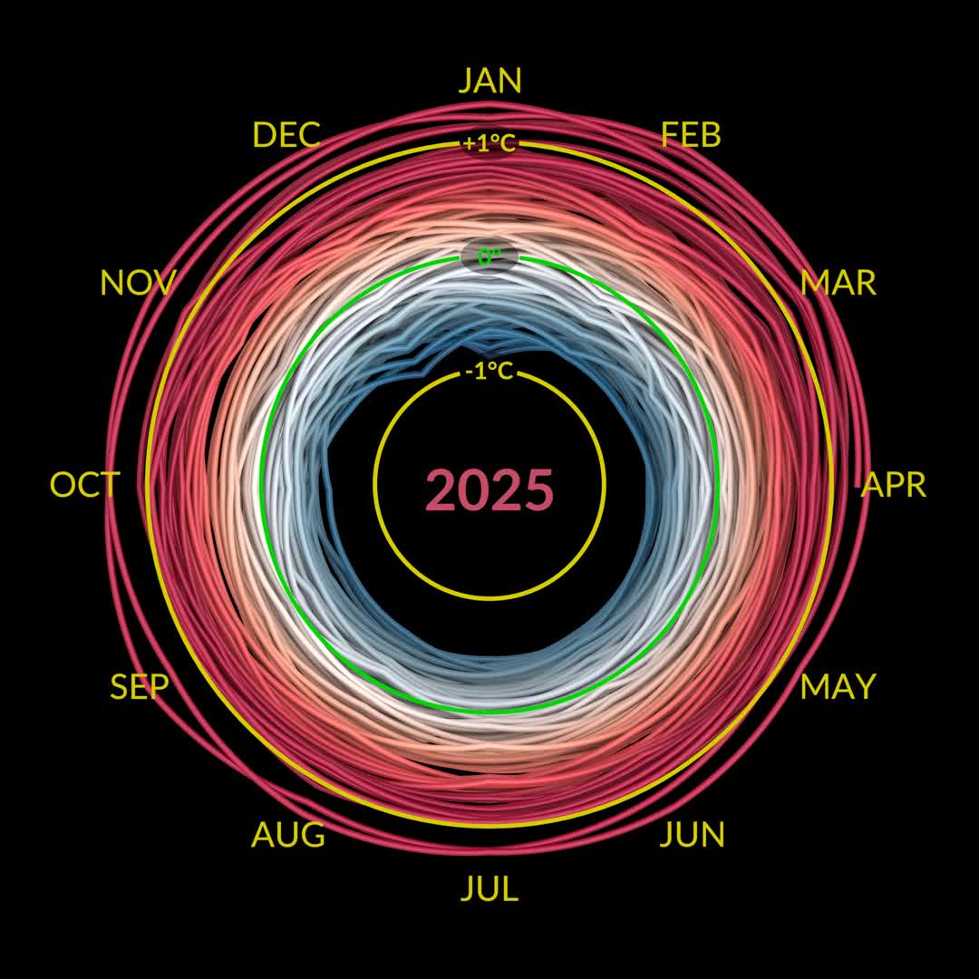
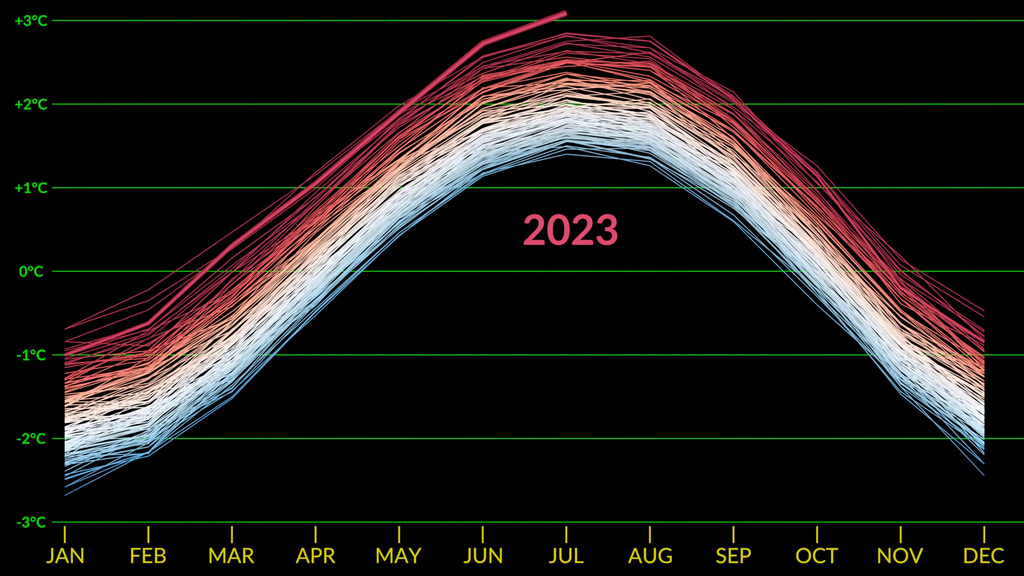
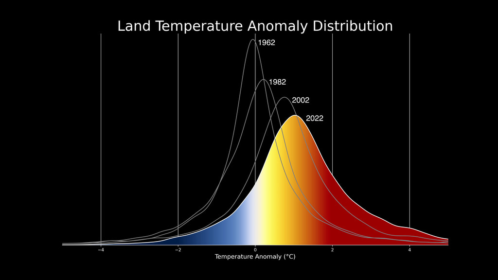
Earth's global average surface temperature in 2022 tied with 2015 as the fifth warmest on record, according to an analysis by NASA. Continuing the planet's long-term warming trend, global temperatures in 2022 were 1.6 degrees Fahrenheit (0.89 degrees Celsius) above the average for NASA's baseline period (1951-1980), scientists from NASA's Goddard Institute for Space Studies (GISS) reported.
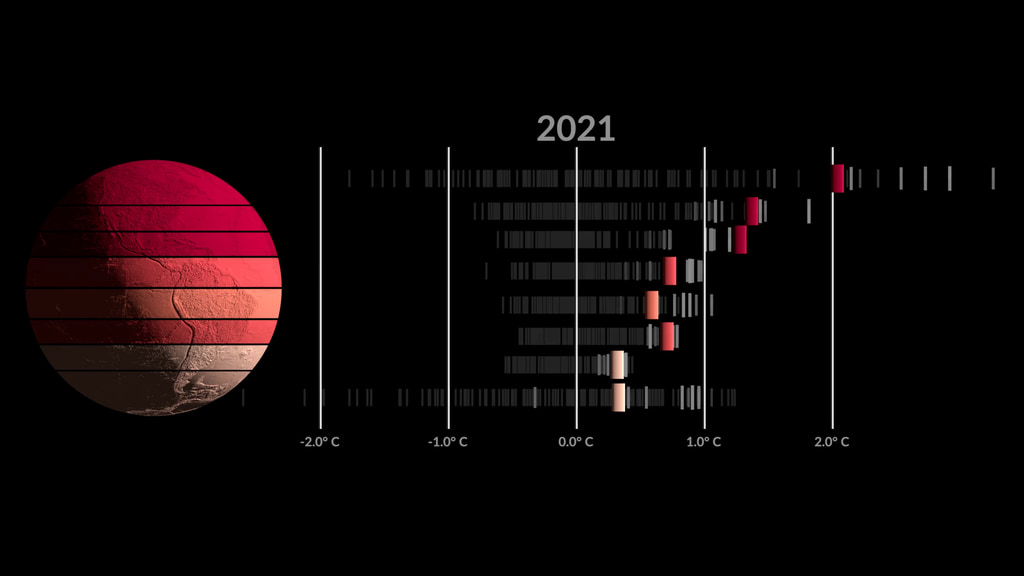
The past nine years have been the warmest years since modern recordkeeping began in 1880. This means Earth in 2022 was about 2 degrees Fahrenheit (or about 1.11 degrees Celsius) warmer than the late 19th century average.
“The reason for the warming trend is that human activities continue to pump enormous amounts of greenhouse gases into the atmosphere, and the long-term planetary impacts will also continue,” said Gavin Schmidt, director of GISS, NASA's leading center for climate modeling.
Human-driven greenhouse gas emissions have rebounded following a short-lived dip in 2020 due to the COVID-19 pandemic. Recently, international scientists, including those at NASA, determined carbon dioxide emissions were the highest on record in 2022. NASA also identified some super-emitters of methane – another powerful greenhouse gas – using the Earth Surface Mineral Dust Source Investigation instrument that launched to the International Space Station earlier this year.
The Arctic region continues to experience the strongest warming trends – close to four times the global average – according to new GISS research presented at the 2022 annual meeting of the American Geophysical Union and a separate study.
NASA uses the period from 1951-1980 as a baseline to understand how global temperatures change over time. That baseline includes climate patterns such as La Niña and El Niño, as well as unusually hot or cold years due to other factors, ensuring that it encompasses natural variations in Earth's temperature.
Many factors can affect the average temperature in any given year. For example, 2022 was one of the warmest on record despite a third consecutive year of La Niña conditions in the tropical Pacific Ocean. NASA scientists estimate that La Niña’s cooling influence may have lowered global temperatures slightly (about 0.11 degrees Fahrenheit or 0.06 degrees Celsius) from what the average would have been under more typical ocean conditions.
A separate, independent analysis by the National Oceanic and Atmospheric Administration (NOAA) concluded that the global surface temperature for 2022 was the sixth highest since 1880. NOAA scientists use much of the same raw temperature data in their analysis and have a different baseline period (1901-2000) and methodology. Although rankings for specific years can differ slightly between the records, they are in broad agreement and both reflect ongoing long-term warming.
NASA's full dataset of global surface temperatures through 2022, as well as full details with code of how NASA scientists conducted the analysis, are publicly available from GISS.
GISS is a NASA laboratory managed by the Earth Sciences Division of the agency's Goddard Space Flight Center in Greenbelt, Maryland. The laboratory is affiliated with Columbia University's Earth Institute and School of Engineering and Applied Science in New York.
For more information about NASA's Earth science programs, visit:
https://www.nasa.gov/earth

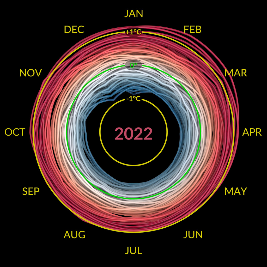
This data visualization shows the 2022 global surface temperature anomaly compared with the 1951-1980 average.
This data visualization shows only the 2022 global surface temperature anomalies on a rotating globe to highlight the La Niña. 2022 was one of the warmest on record despite a third consecutive year of La Niña conditions in the tropical Pacific Ocean. NASA scientists estimate that La Niña’s cooling influence may have lowered global temperatures about 0.11 degrees Fahrenheit from what the average would have been under more typical ocean conditions.

Colortable is both degrees fahrenheit and degrees celsius.
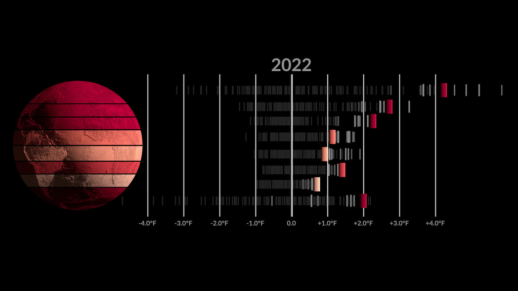
This image is the single year 2022 GISS temperature anomaly as compared with the 1951-1980 average. This version does not have any titles or text overlays, except for the corresponding colorbar.

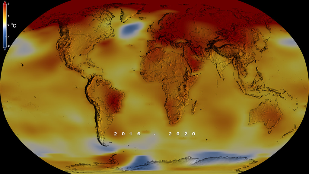
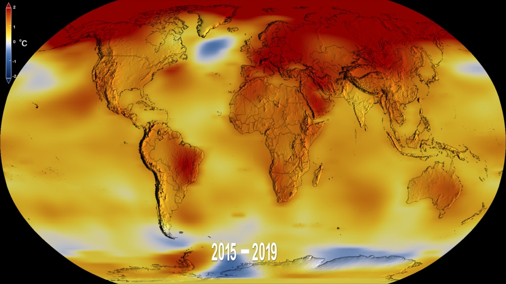
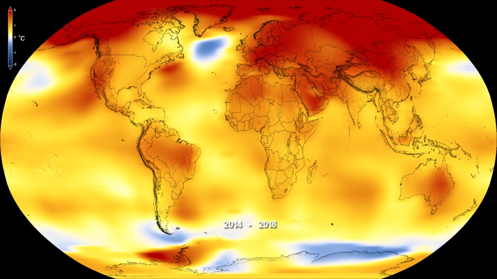
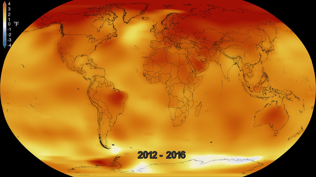
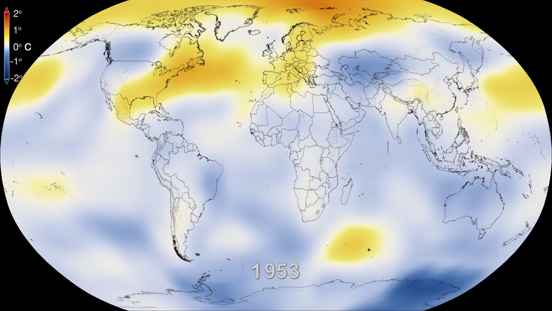
This frame sequence of color-coded global temperature anomalies in robinson projection display a progression of changing global surface temperatures anomalies in even degrees Fahrenheit. The first frame in this sequence represents the data from 1880-1884. The second frame represents 1881-1885, ...and the last frame represents 2018-2022. Higher than normal temperatures are shown in red and lower than normal are shown in blue. Normal temperatures are the average over the 30 year baseline period 1951-1980.
This sequence of images are the corresponding date overlays for the 5 year rolling averages used in the first visualization on this page.

This frame sequence of color-coded global temperature anomalies in degrees celsius is designed to be displayed on the Science on a Sphere projection system. Each image represents a unique 5 year rolling time period with no fades between datasets. Frame 1884 represents data from 1880-1884, frame 1885 represents data from 1881-1885,... frame 2022 represents data from 2018-2022. Higher than normal temperatures are shown in red and lower than normal are shown in blue. Normal temperatures are the average over the 30 year baseline period 1951-1980.

This is the colorbar for the Science on a Sphere frameset above. It is in degrees celsius.
Credits
Please give credit for this item to:
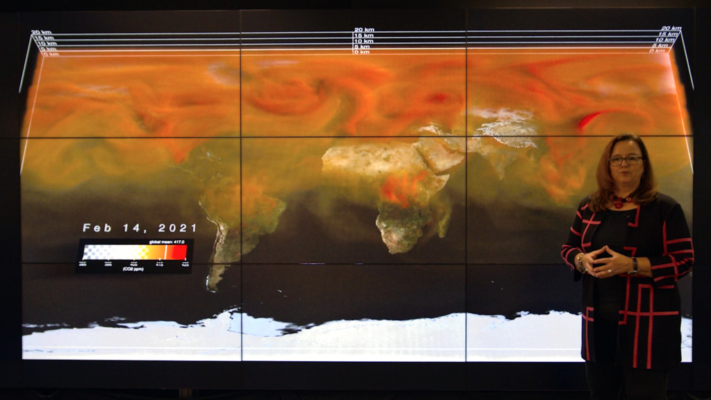
NASA's Scientific Visualization Studio
Data provided by Robert B. Schmunk (NASA/GSFC GISS)
-
Visualizers
- Lori Perkins (NASA/GSFC)
-
Mark SubbaRao
(NASA/GSFC)

-
Scientists
-
Gavin A. Schmidt
(NASA/GSFC GISS)
-
Robert B Schmunk
(SIGMA Space Partners, LLC.)
-
Reto A. Ruedy
(SIGMA Space Partners, LLC.)
-
Gavin A. Schmidt
(NASA/GSFC GISS)
-
Producers
- Kathryn Mersmann (USRA)
- Katie Jepson (USRA)
- Kathleen Gaeta (Advocates in Manpower Management, Inc.)
- Sofie Bates (KBR Wyle Services, LLC)
-
Public affairs officer
-
Peter H. Jacobs
(NASA/GSFC)
-
Peter H. Jacobs
(NASA/GSFC)
-
Writer
- Sally Younger (NASA/JPL)
Series
This page can be found in the following series:Datasets used
-
GISTEMP [GISS Surface Temperature Analysis (GISTEMP)]
ID: 585The GISS Surface Temperature Analysis version 4 (GISTEMP v4) is an estimate of global surface temperature change. Graphs and tables are updated around the middle of every month using current data files from NOAA GHCN v4 (meteorological stations) and ERSST v5 (ocean areas), combined as described in our publications Hansen et al. (2010), Lenssen et al. (2019), and Lenssen et al. (2024).
Credit: Lenssen, N., G.A. Schmidt, M. Hendrickson, P. Jacobs, M. Menne, and R. Ruedy, 2024: A GISTEMPv4 observational uncertainty ensemble. J. Geophys. Res. Atmos., 129, no. 17, e2023JD040179, doi:10.1029/2023JD040179.
This dataset can be found at: https://data.giss.nasa.gov/gistemp/
See all pages that use this dataset
Note: While we identify the data sets used on this page, we do not store any further details, nor the data sets themselves on our site.
Related
- ID: 5376
 Visualization
 - ID: 5451
 Visualization
 - ID: 5452
- ID: 5383
 Visualization
 - ID: 5311
- ID: 5327

- ID: 5208
 Visualization
 - ID: 5209
 Visualization
 - ID: 5211
- ID: 14502
 Produced Video
 - ID: 5191
 Visualization
 - ID: 5190
 Visualization
 - ID: 5161
 Visualization
 - ID: 5137
 Visualization
 - ID: 5065
- ID: 14327
- ID: 5057
 Visualization
 - ID: 5059
 Visualization
 - ID: 14273
 Produced Video
 - ID: 4978
 Visualization
 - ID: 4975
 Visualization
 - ID: 14069
- ID: 4908
 Visualization
 - ID: 4891
- ID: 13791
 Produced Video
Newer Versions
- ID: 5450
 Visualization
 - ID: 5207
 Visualization
 - ID: 5060
 Visualization
Older Versions
- ID: 5060Visualization
- ID: 4882
 Visualization
 - ID: 4787
 Visualization
 - ID: 4626
 Visualization
 - ID: 4609
 Visualization
 - ID: 4546
 Visualization
 - ID: 4419
 Visualization
 - ID: 4252
 Visualization
 - ID: 4135
 Visualization
 - ID: 4030
 Visualization
 - ID: 3901
- ID: 3490
- ID: 3375
Used as a Source In
- ID: 14066
![Universal Production Music: Knock and Wait (Instrumental) by Brice Davoli [SACEM], Well That’s Difference (Instrumental) by Jeff Cardoni [ASCAP], Wanna Be Hipster (Instrumental) by Jeff Cardoni [ASCAP], Curiosity Killed Kitty (Instrumental) by Robert Leslie Bennett [ASCAP], Eco Issues (Instrumental) by Max van Thun [GEMA] Additional Footage: Pond5.com, CSPANComplete transcript available.](/vis/a010000/a014000/a014066/Title.jpg) Produced Video
Produced Video - ID: 31168
 Hyperwall Visual
 - ID: 13979
![Music: Futurity by Lee Groves [PRS] and Peter George Marett [PRS]Complete transcript available.](/vis/a010000/a013900/a013979/Screen_Shot_2021-10-28_at_2.29.18_PM.png)
- ID: 13909
 Produced Video
 - ID: 13814
 Produced Video
 - ID: 13799
![Music: Organic Machine by Bernhard Hering [GEMA] and Matthias Kruger [GEMA]Complete transcript available.](/vis/a010000/a013700/a013799/2020Temp.png) Produced Video
Produced Video - ID: 13781
![Music: A Curious Incident by Jay Price [PRS] and Paul Reeves [PRS]Complete transcript available.](/vis/a010000/a013700/a013781/CO20.jpg)
- ID: 13747
![Music: Rain over the Sea by Bruno Vouillon [SACEM]Complete transcript available.](/vis/a010000/a013700/a013747/Thumbnail0.jpg) Produced Video
Produced Video - ID: 13652
![Music: "Solar Winds" by Ben Niblett [PRS] and Jon Cotton [PRS] courtesy of Universal Production Music.
Complete transcript available.](/vis/a010000/a013600/a013652/BushFire_Still_2.jpg) Produced Video
Produced Video - ID: 13516
![Music: Avalanches by Chris Constantinou [PRS] and Paul Frazer [PRS]Complete transcript available.](/vis/a010000/a013500/a013516/2019Temp.png) Produced Video
Produced Video - ID: 13309
![Music: Hiraeth by Anthony Edwin Phillips [PRS], James Edward CollinsComplete transcript available.](/vis/a010000/a013300/a013309/Arctic_Min_2019_Thumbnail_LKW.png) Produced Video
Produced Video - ID: 13281
![Music: Stepping Stone Bridge by Timothy Michael Hammond [PRS], Wayne Roberts [PRS]Watching Ladybirds by Benjamin James Parsons [PRS] This video can be freely shared and downloaded. While the video in its entirety can be shared without permission, some individual imagery provided by pond5.com and Artbeats is obtained through permission and may not be excised or remixed in other products. Specific details on stock footage may be found here. For more information on NASA’s media guidelines, visit https://www.nasa.gov/multimedia/guidelines/index.html. Complete transcript available.](/vis/a010000/a013200/a013281/Thumbnail_Arctic_Fires_Print.jpg) Produced Video
Produced Video - ID: 13188
![Music: After the Sun by Andrew Michael Britton [PRS], David Stephen Goldsmith [PRS], Andrew Skeet [PRS]Complete transcript available.](/vis/a010000/a013100/a013188/Still_print.jpg) Produced Video
Produced Video - ID: 13142
![Music: Sculpture by Axel Coon [GEMA], Ralf Goebel [GEMA]Complete transcript available.](/vis/a010000/a013100/a013142/FlatMapStill.jpg) Produced Video
Produced Video
Release date
This page was originally published on Thursday, January 12, 2023.
This page was last updated on Thursday, January 25, 2024 at 2:18 PM EST.