SVS YouTube Candidates
Overview
These are the proposed visualization candidates to be included in the SVS YouTube Channel.
Featured Videos
- ID: 11003
 Produced Video
 - ID: 3827
 Visualization
 - ID: 3413
 Visualization
 - ID: 3595
 Visualization
 - ID: 3354
 Visualization
 - ID: 4370
 Visualization
 - ID: 4397
 Visualization
 - ID: 4013
- ID: 4094
 Visualization
 - ID: 11214
 Produced Video
 - ID: 4045
 Visualization
 - ID: 3437
 Visualization
 - ID: 2853
 Visualization
 - ID: 11491
 Produced Video
 - ID: 11508
 Produced Video
 - ID: 12164
 Produced Video
 - ID: 12007
 Produced Video
 - ID: 11635
 Produced Video
 - ID: 11376
- ID: 1402
 Visualization
 - ID: 10349
 Produced Video
 - ID: 3619
 Visualization
 - ID: 4436
 Visualization
 - ID: 4129
 Visualization
 - ID: 12117
 Produced Video
 - ID: 4253
 Visualization
 - ID: 11218
 Produced Video
 - ID: 10929
 Produced Video
 - ID: 4249
 Visualization
 - ID: 4306
 Visualization
 - ID: 3667
 Visualization
 - ID: 12221
 Produced Video
 - ID: 4430
 Visualization
 - ID: 2133
 Visualization
 - ID: 4060
 Visualization
 - ID: 3868
 Visualization
 - ID: 12252
 Produced Video
 - ID: 11354
 Produced Video
 - ID: 10416
 Produced Video
 - ID: 11223
 Produced Video
 - ID: 11604
 Produced Video
 - ID: 12096
 Produced Video
 - ID: 11812
 Produced Video
Tom Bridgman's Visualization Choices
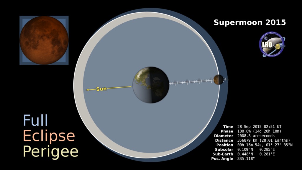
- ID: 4453 Visualization
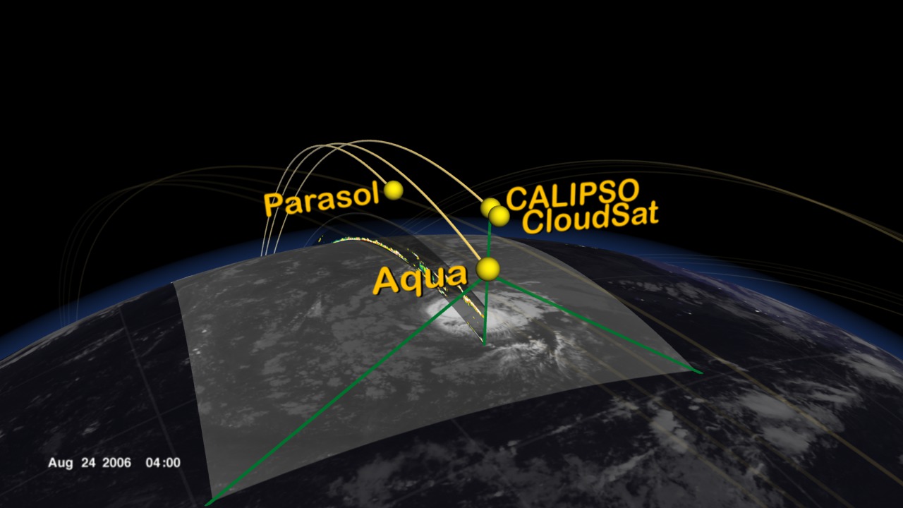
Zoom in to MMS and Magnetopause Reconnection
Go to this pageThe visualization starts with an overview of the MMS orbit. || MMSpursuit_Fly2Pursuit2Stop_Oct16data_RE_MMS.slate_RigRHS.HD1080i.0200_print.jpg (1024x576) [91.6 KB] || MMSpursuit_Fly2Pursuit2Stop_Oct16data_RE_MMS.slate_RigRHS.HD1080i.0200_searchweb.png (320x180) [71.3 KB] || MMSpursuit_Fly2Pursuit2Stop_Oct16data_RE_MMS.slate_RigRHS.HD1080i.0200_thm.png (80x40) [4.9 KB] || 1920x1080_16x9_30p (1920x1080) [0 Item(s)] || MMSpursuit_Fly2Pursuit2Stop_Oct16data_HD1080i_p30.mp4 (1920x1080) [81.6 MB] || MMSpursuit_Fly2Pursuit2Stop_Oct16data_HD1080i_p30.webm (1920x1080) [9.3 MB] || 3840x2160_16x9_30p (3840x2160) [0 Item(s)] || MMSpursuit_Fly2Pursuit2Stop_Oct16data.UHD3840p30.mp4 (3840x2160) [238.2 MB] || MMSpursuit_Fly2Pursuit2Stop_Oct16data_HD1080i_p30.mp4.hwshow [270 bytes] ||
- ID: 4391 Visualization
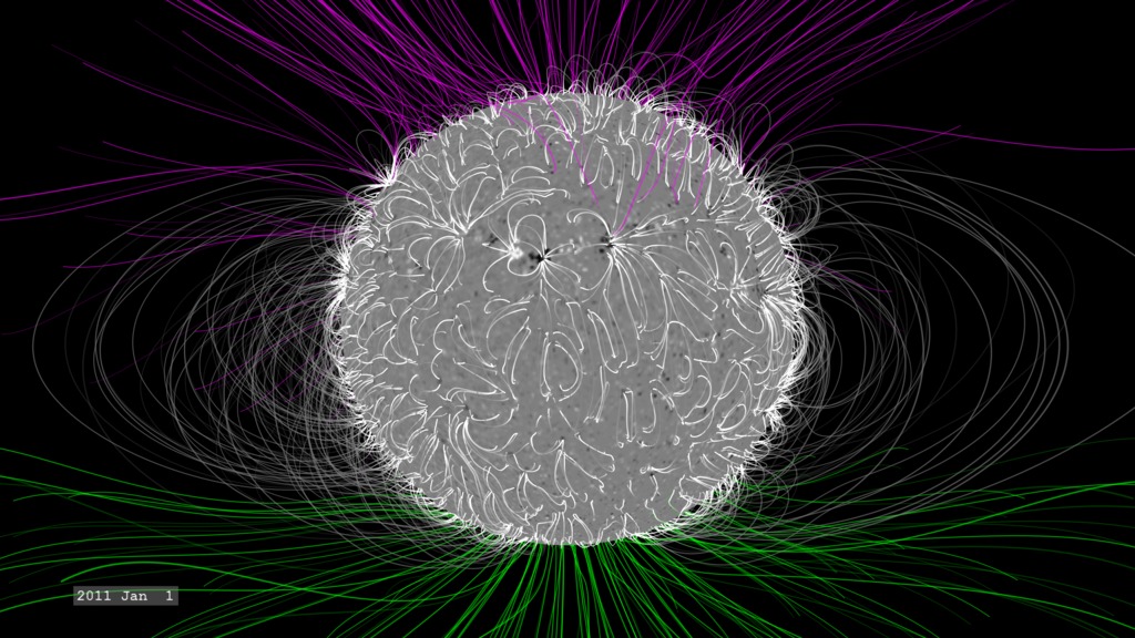
The Dynamic Solar Magnetic Field
Go to this pageA visualization of the slow changes of the solar magnetic field over the course of four years. || PFSSbasicView_inertial.HD1080i.0400_print.jpg (1024x576) [168.7 KB] || PFSSbasicView_inertial.HD1080i.0400_searchweb.png (180x320) [78.9 KB] || PFSSbasicView_inertial.HD1080i.0400_thm.png (80x40) [5.8 KB] || PFSSbasicView_inertial_1080p30.webm (1920x1080) [18.1 MB] || PFSSbasicView (1920x1080) [128.0 KB] || PFSSbasicView_inertial_1080p30.mp4 (1920x1080) [326.6 MB] || PFSSbasicView_inertial_1080p10.mp4 (1920x1080) [470.2 MB] || PFSSbasicView_HD1080p10.mov (1920x1080) [804.4 MB] || PFSSbasicView_inertial_1080p30.mp4.hwshow [232 bytes] ||
- ID: 4343 Visualization
Lots of Comets - Long trail version
Go to this pageThis visualization presents 14 years of comets seen by SOHO from the perspective of an observer orbiting a fixed point above the ecliptic plane with the Sun at the center.This video is also available on our YouTube channel. || LotsaComets-orbit.slate_HAEmove.HD1080i.1000_print.jpg (1024x576) [110.2 KB] || LotsaComets-orbit.slate_HAEmove.HD1080i.1000_searchweb.png (320x180) [71.5 KB] || LotsaComets-orbit.slate_HAEmove.HD1080i.1000_thm.png (80x40) [4.7 KB] || Orbit (1920x1080) [512.0 KB] || LotsaComets-orbit_1080p30.mp4 (1920x1080) [188.3 MB] || LotsaComets-orbit_1080p30.webm (1920x1080) [20.8 MB] ||
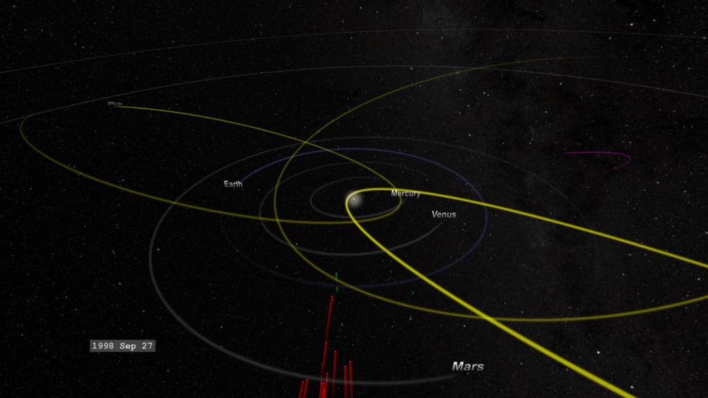
- ID: 4288 Visualization
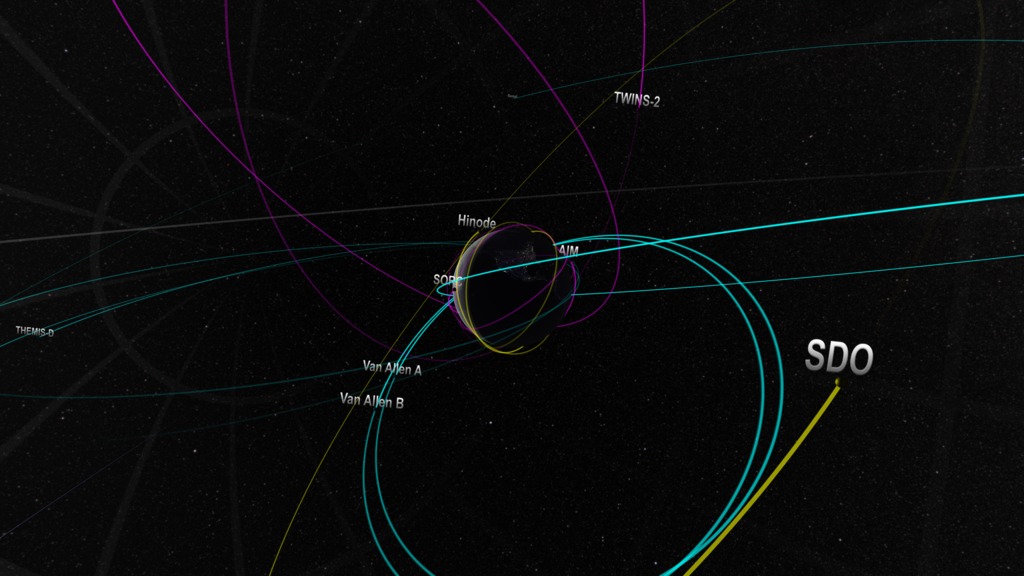
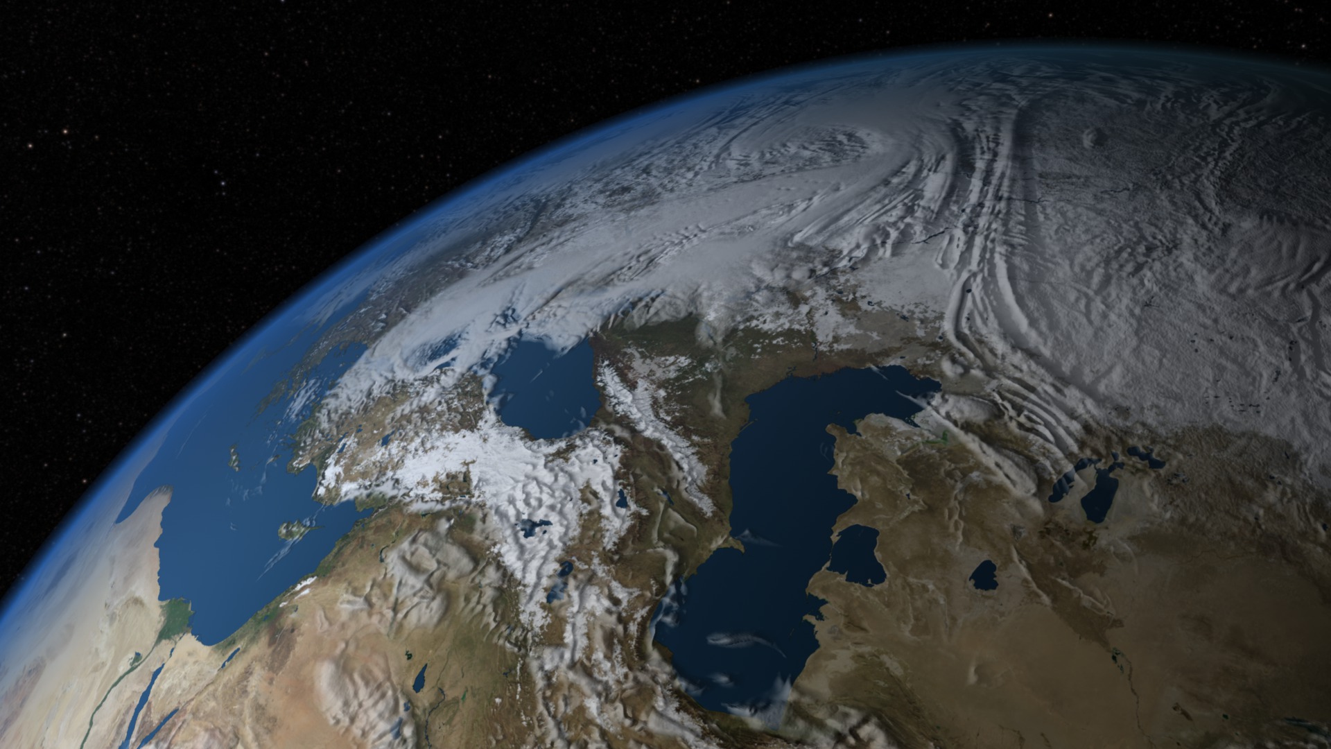
The 2015 Earth-Orbiting Heliophysics Fleet
Go to this pageMovie showing the heliosphysics missions from near Earth orbit out to the orbit of the Moon.This video is also available on our YouTube channel. || Helio2015A.MMStour.slate_RigRHS.HD1080i.0500_print.jpg (1024x576) [112.6 KB] || Helio2015A.MMStour.HD1080.webm (1920x1080) [6.7 MB] || WithoutTimeStamp (1920x1080) [128.0 KB] || Helio2015A.MMStour.HD1080.mov (1920x1080) [196.3 MB] || Helio2015_4288.pptx [198.6 MB] || Helio2015_4288.key [201.3 MB] ||
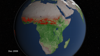
- ID: 4188 Visualization
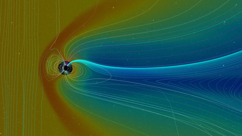
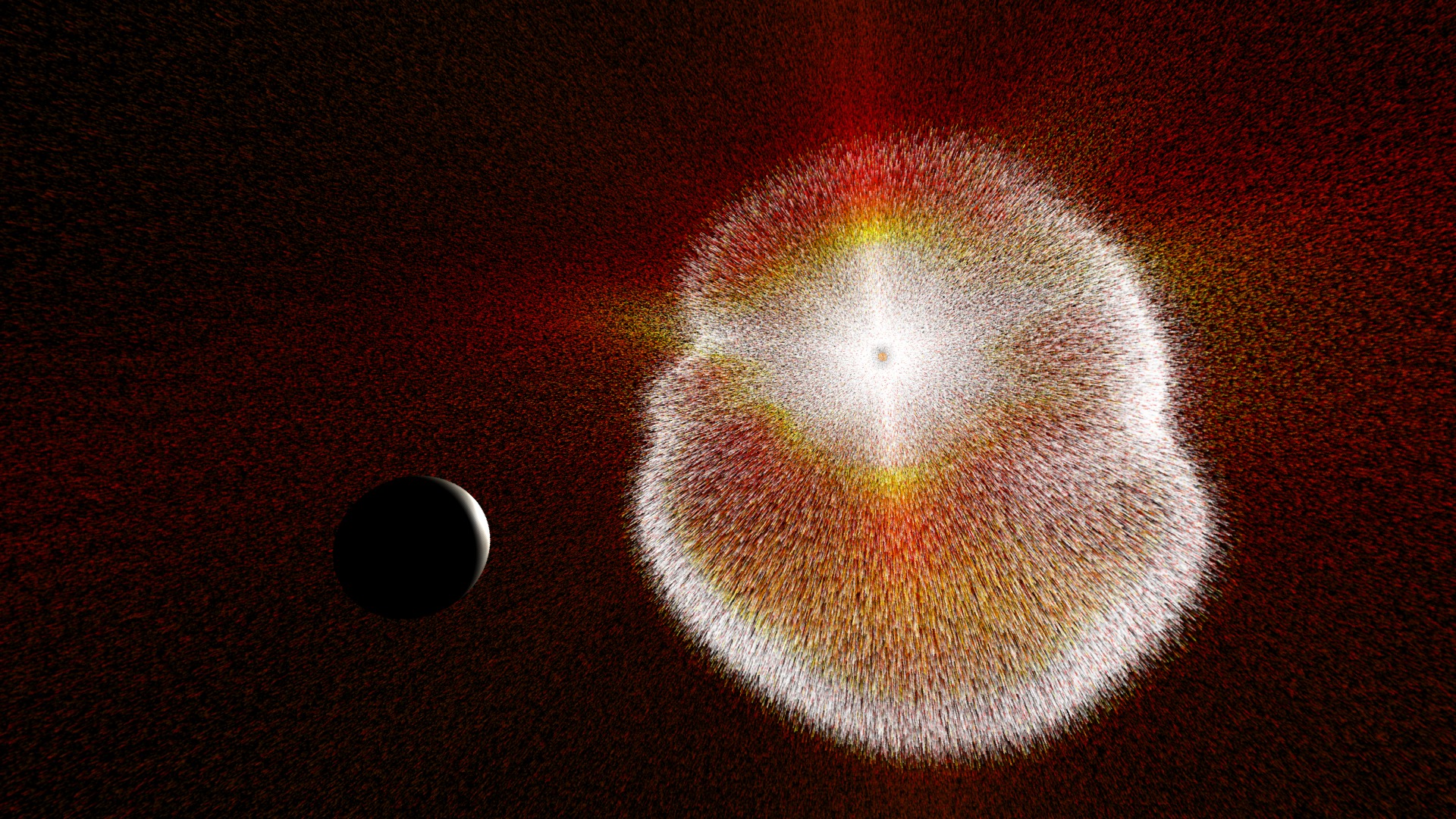
Comparative Magnetospheres: A Noteworthy Coronal Mass Ejection
Go to this pageIn an effort to understand and predict the impact of space weather events on Earth, the Community-Coordinated Modeling Center (CCMC) at NASA Goddard Space Flight Center, routinely runs computer models of the many historical events. These model runs are then compared to actual data to determine ways to improve the model, and therefore forecasts of the impacts of future space weather events.In mid-December of 2006, the Sun erupted with a bright flare and coronal mass ejection (CME) that launched particles Earthward. While not the brightest or largest event observed, its impact on Earth was substantial, requiring some effort to protect satellites (ESA: Reacting to a solar flare).The visualization presented here is a CCMC run of a BATS-R-US model simulating the impact of this event on Earth. Here, lines are used to represent the 'flow direction' of magnetic field of the solar wind impacting Earth, as well as the effects on Earth's geomagnetic field. A 'cut-plane' through the data illustrates the changes in the particle density in the solar wind and magnetosphere. The color of the data represents a logarithmic scaling of density, with red as the highest (1000 particles per cubic centimeter) down to blue (0.01 particles per cubic centimeter). In this simulation, each frame of the movie corresponds to two minutes of real time.In the movie, we see vertical field lines of magnetic field carried by the solar wind, coming in from the left. As this field, and the plasma carrying it, strike Earth's magnetic field, they bend and reconnect, around the Earth. Some field lines actually reconnect to the polar regions of the Earth, providing a ready flow-path for particles to reach the ionosphere and generate aurora. This interaction between the solar wind and the plasma trapped in Earth's magnetosphere also creates a density enhancement between Earth and the solar wind helping to shield Earth from some of the effects. A lower density wake forms behind Earth (the blue region). There is a circular 'hole' around the Earth which is a gap in the model. ||
- ID: 4167 Visualization
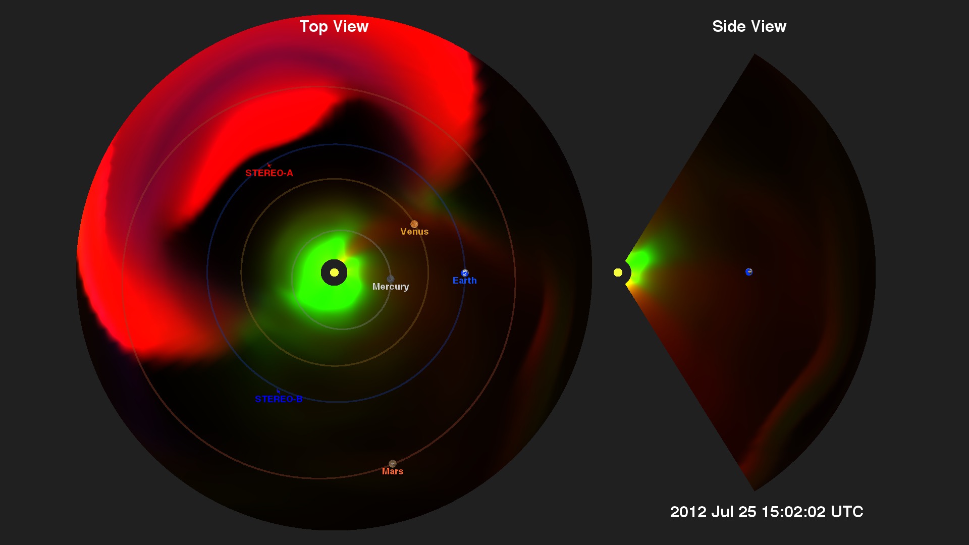
The Big CME that Missed Earth
Go to this pageJuly of 2012 witnessed the eruption of a very large and fast solar coronal mass ejection (CME) (see NASA STEREO Observes One of the Fastest CMEs On Record and Carrington-class CME Narrowly Misses Earth ). While not directed at Earth, it was sufficiently large that it could have seriously disrupted the global electrical infrastructure. The event did impact STEREO-A of NASA's heliophysics fleet which provided a host of measurements (see Sentinels of the Heliosphere).One of the conditions which contributed to the high speed of this event is that two smaller CMEs were launched a little earlier, and these events cleared out much of the solar wind material, leaving little to slow the outflow of the July 23 event (UTC).In the visualizations below, generated from the Enlil space weather model, green represents particle density, usually protons and other ions. In green, we see the Parker spiral moving out from the sun generated by the sun's current sheet (Wikipedia). Red represents particles at high temperatures and shows the CME is hotter than the usual solar wind flow. Large changes in density are represented in blue. These three colors sometimes combine to tell us more about the characteristics of the event (noted in the 3-color Venn diagram below).However, if this CME had struck Earth's magnetosphere, which has a much stronger magnetic field, the changing magnetic field would induce much larger voltages in systems with long electrical conductors, such as power lines that run over long distances. These significantly higher voltages can damage power transformers. ||
- ID: 4117 Visualization
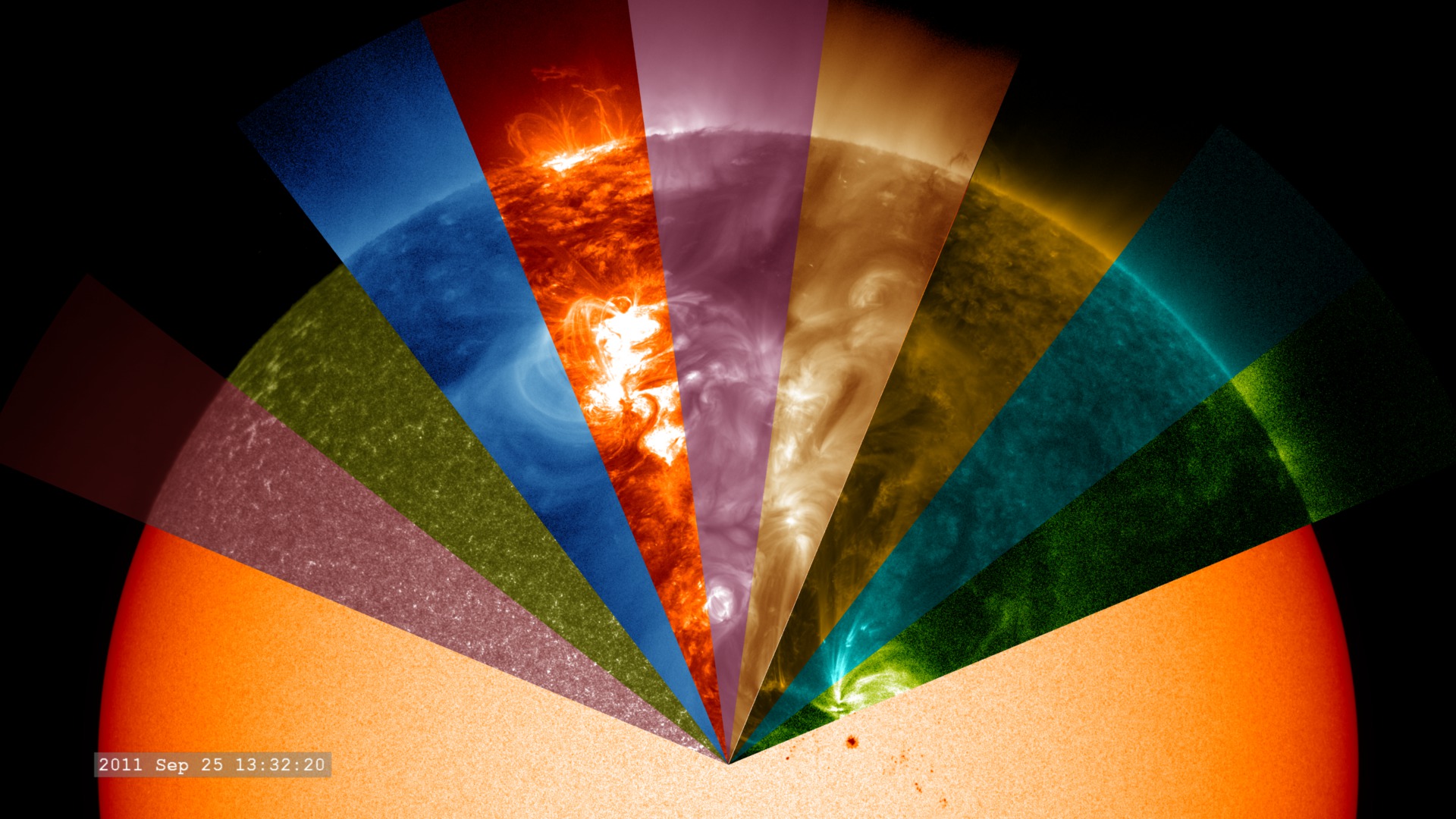
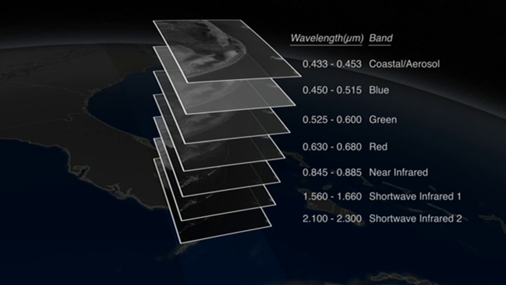
Solar Dynamics Observatory - Argo view
Go to this pageArgos (or Argus Panoptes) was the 100-eyed giant in Greek mythology (wikipedia).While the Solar Dynamics Observatory (SDO) has significantly less than 100 eyes, (see "SDO Jewelbox: The Many Eyes of SDO"), seeing connections in the solar atmosphere through the many filters of SDO presents a number of interesting challenges. This visualization experiment illustrates a mechanism for highlighting these connections.The wavelengths presented are: 617.3nm optical light from SDO/HMI. From SDO/AIA we have 170nm (pink), then 160nm (green), 33.5nm (blue), 30.4nm (orange), 21.1nm (violet), 19.3nm (bronze), 17.1nm (gold), 13.1nm (aqua) and 9.4nm (green).We've locked the camera to rotate the view of the Sun so each wedge-shaped wavelength filter passes over a region of the Sun. As the features pass from one wavelength to the next, we can see dramatic differences in solar structures that appear in different wavelengths.Filaments extending off the limb of the Sun which are bright in 30.4 nanometers, appear dark in many other wavelengths.Sunspots which appear dark in optical wavelengths, are festooned with glowing ribbons in ultraviolet wavelengths.Small flares, invisible in optical wavelengths, are bright ribbons in ultraviolet wavelengths.If we compare the visible light limb of the Sun with the 170 nanometer filter on the left, with the visible light limb and the 9.4 nanometer filter on the right, we see that the 'edge' is at different heights. This effect is due to the different amounts of absorption, and emission, of the solar atmosphere in ultraviolet light.In far ultraviolet light, the photosphere is dark since the black-body spectrum at a temperature of 5700 Kelvin emits very little light in this wavelength. ||
- ID: 3610 Visualization
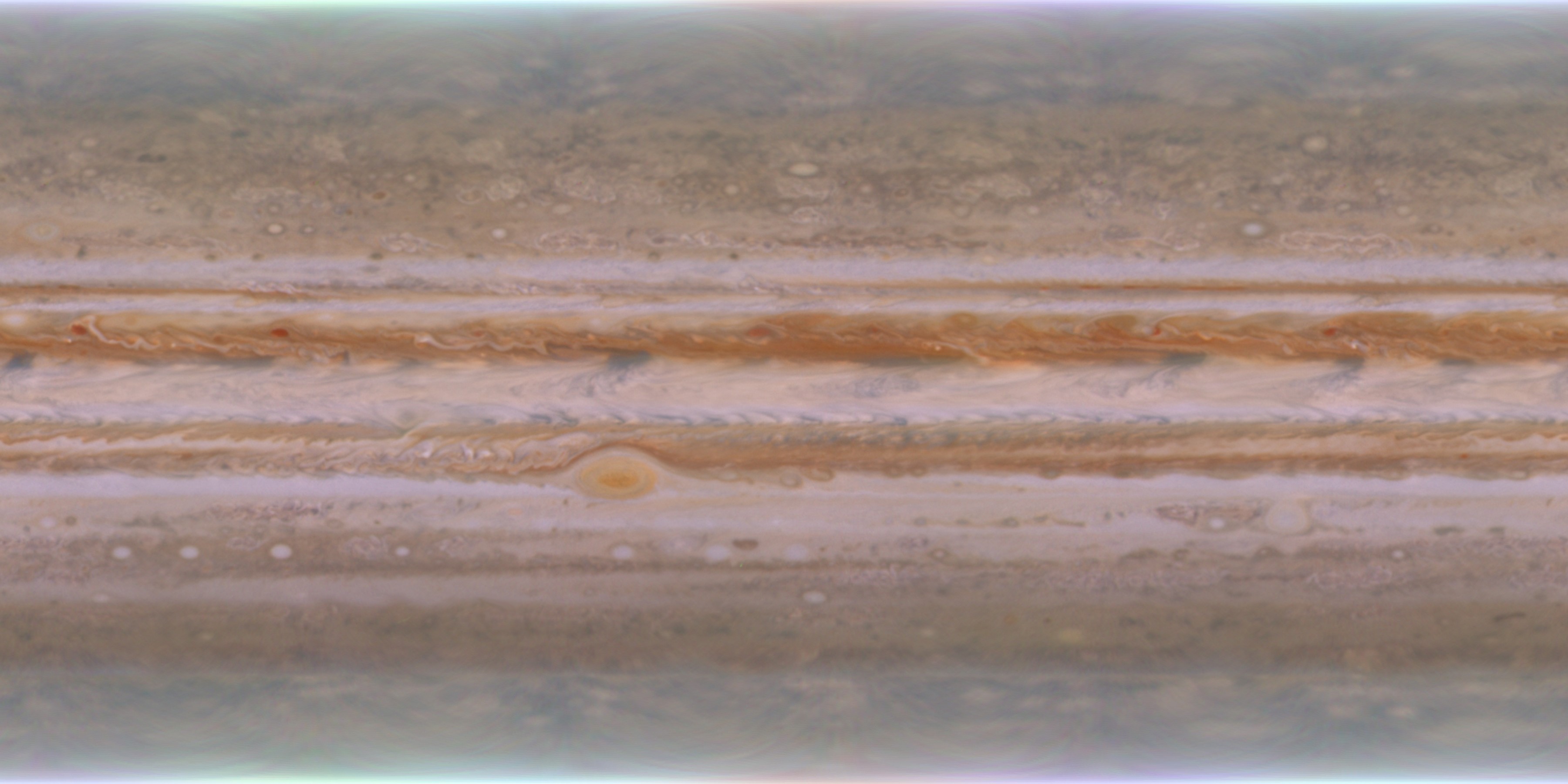
Jupiter Cloud Sequence from Cassini
Go to this pageWhen the Cassini mission flew by the planet Jupiter in late 2000, a sequence of full disk images were taken of the planet. Assembled with proper spatial and temporal registration, the sequence could produce fourteen distinct images suitable for wrapping around a sphere.But the time steps between images were large and exhibited significant jumping. The solution was to create additional images between the existing set by interpolation. But simple interpolation would not work due to significant changes between the images.To solve this, we interpolated between the images using the velocity vector field of the cloud images. The velocity vector field was computed by performing a 2-dimensional cross-correlation (Wikipedia: Cross-correlation) between the images. This velocity field was checked against Jupiter velocity profiles from the scientific literature and agreement was excellent. With the addition of a simple vortex flow at the location of the Great Red Spot, the interpolation process was used to generate intermediate images, increasing the total number of images from 14 to 220 and resulting in a smoother animation. The elapsed time between each interpolated frame corresponds to about 1 hour. More info on the image sequence is available at Jupiter Mosaics and Movies - Rings, Satellites, AtmosphereIMPORTANT NOTE: These images are for visualization purposes only. They are not suitable for scientific analysis. ||
- ID: 2509 Visualization
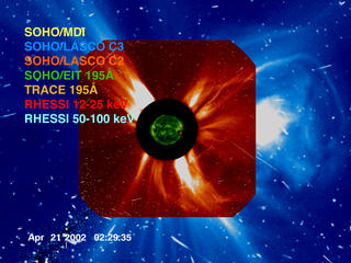
A Multi-Mission View of the AR9906 Solar Flare with Instrument Labels
Go to this pageHere's a view of the Sun, from the point of view of a fleet of Sun-observing spacecraft - SOHO, TRACE, and RHESSI. The time scales of the data samples in this visualization range from six hours to as short as 12 seconds and the display rate varies throughout the movie. The region and event of interest is the solar flare over solar active region AR9906 on April 21, 2002. In this visualization, the instrument names appear in a color roughly matching the color used for the data, and black corresponds to no (current) instrument coverage. ||
Kel Elkins' Visualization Choices
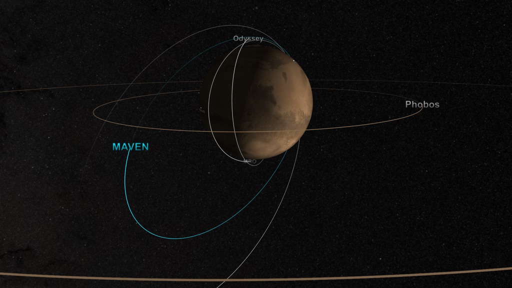
- ID: 4346 Visualization
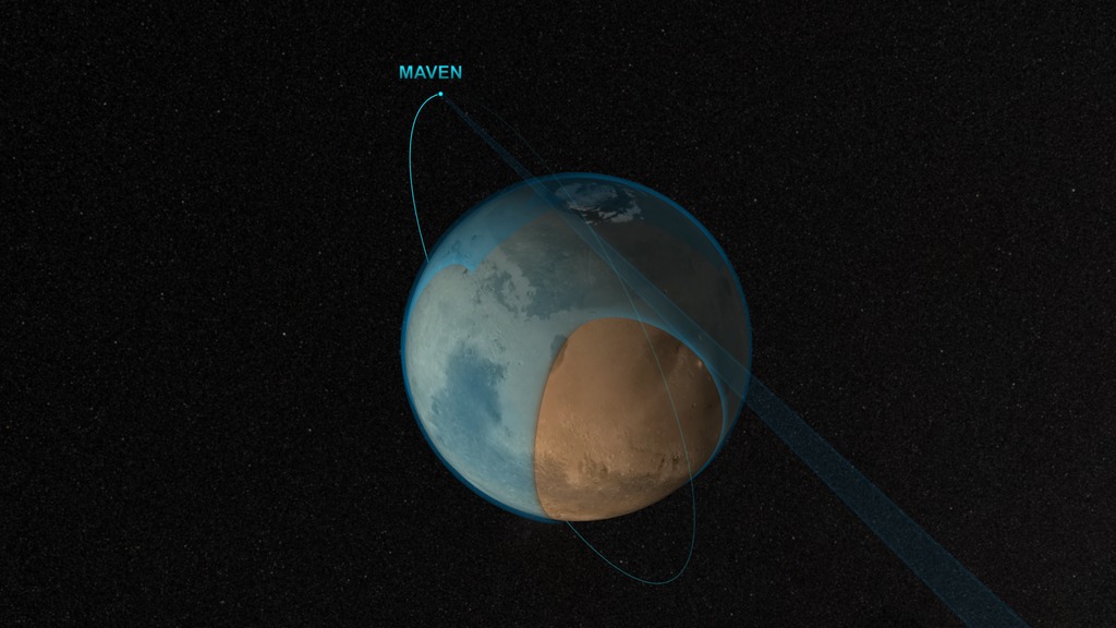
MAVEN Stellar Occultation Atmospheric Coverage
Go to this pageVisualization depicting NASA's MAVEN satellite in an elliptical orbit around Mars. The horizon is scanned to determine atmospheric makeup. Blue sections of the atmosphere represent regions that have been scanned, and total coverage is achieved after roughly six orbits. This video is also available on our YouTube channel. || MAVEN_StellarOccultation9_60fps.0615_print.jpg (1024x576) [118.3 KB] || MAVEN_StellarOccultation9_60fps.0615_searchweb.png (320x180) [67.9 KB] || MAVEN_StellarOccultation9_60fps.0615_thm.png (80x40) [4.1 KB] || MAVEN_StellarOccultation9_60fps (1920x1080) [0 Item(s)] || MAVEN_StellarOccultation_60fps_720p.mp4 (1280x720) [16.0 MB] || MAVEN_StellarOccultation_60fps_1080p.mp4 (1920x1080) [32.4 MB] || MAVEN_StellarOccultation_60fps_1080p.webm (1920x1080) [3.0 MB] || MavenMarsCoverage30fps.mov (1920x1080) [429.4 MB] || MavenMarsCoverage60fps.mov (1920x1080) [873.5 MB] ||
- ID: 4465 Visualization
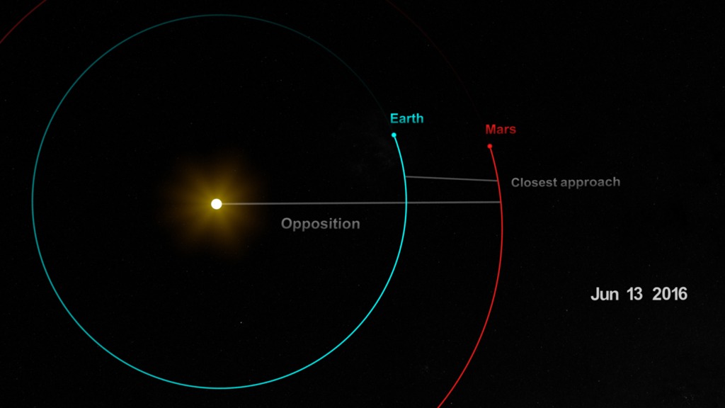
2016 Mars Opposition
Go to this pageVisualization depicting Mars opposition and closest approach occurring in May 2016This video is also available on our YouTube channel. || mars_opposition_closest-approach.2475_print.jpg (1024x576) [53.0 KB] || mars_opposition_closest-approach.2475_searchweb.png (320x180) [43.5 KB] || mars_opposition_closest-approach.2475_thm.png (80x40) [3.0 KB] || opposition_closest-approach (1920x1080) [0 Item(s)] || mars_opposition_closest-approach_1080p30.mp4 (1920x1080) [11.6 MB] || mars_opposition_closest-approach_1080p60.mp4 (1920x1080) [9.5 MB] || mars_opposition_closest-approach_1080p30.webm (1920x1080) [2.4 MB] || mars_opposition_closest-approach_1080p30.mp4.hwshow [206 bytes] ||
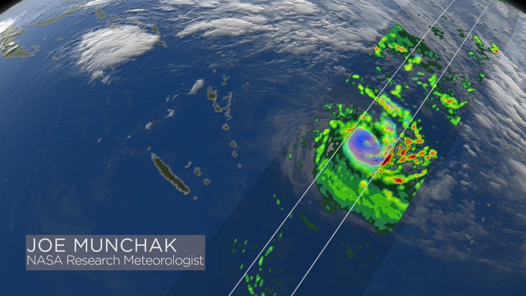
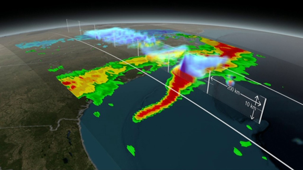
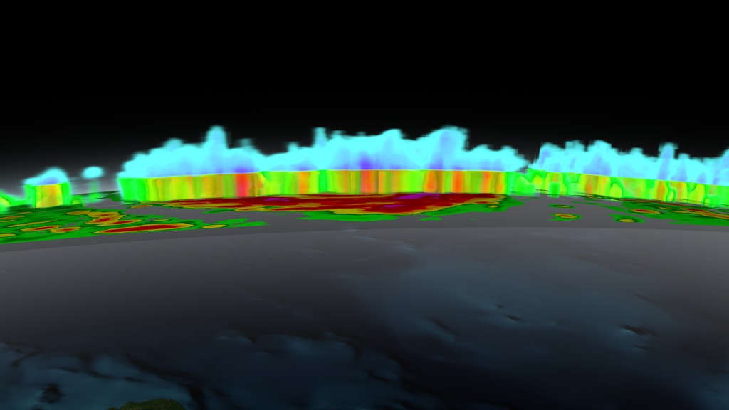
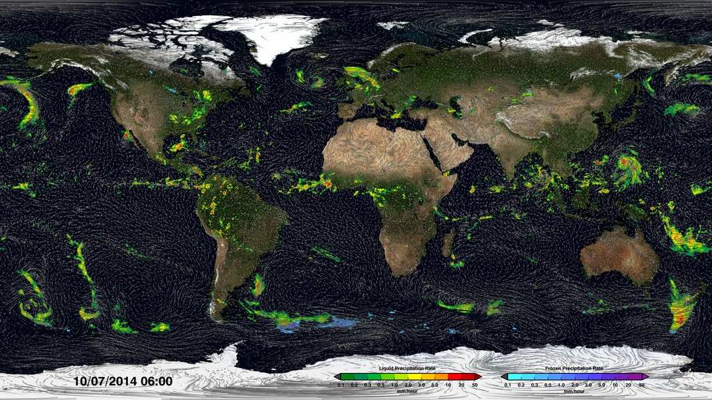
- ID: 4248 Visualization
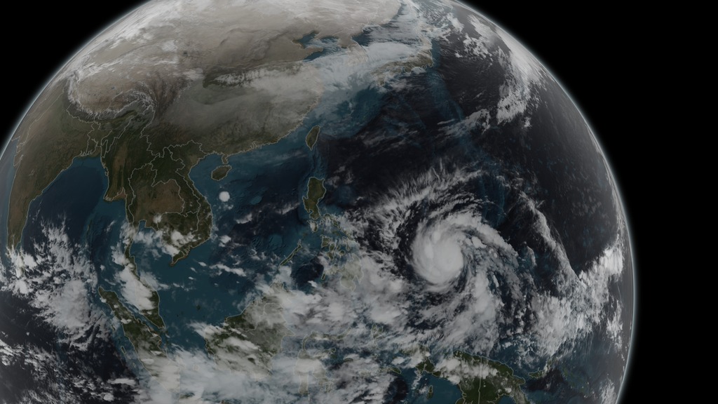
GPM Dissects Typhoon Hagupit
Go to this pageAnimation revealing a swath of GPM/GMI precipitation rates over Typhoon Hagupit. As the camera moves in on the storm, DPR's volumetric view of the storm is revealed. A slicing plane moves across the volume to display precipitation rates throughout the storm. Shades of green to red represent liquid precipitation extending down to the ground.This video is also available on our YouTube channel. || Hagupit_1080p_01.0396_print.jpg (1024x576) [146.6 KB] || Hagupit_1080p_01.0396_searchweb.png (320x180) [80.3 KB] || Hagupit_1080p_01.0396_thm.png (80x40) [6.7 KB] || Hagupit_1080p_01.0396_web.png (320x180) [80.3 KB] || Hagupit_1080p_01_1080.mp4 (1920x1080) [39.7 MB] || Hagupit_720p_01_720.mp4 (1280x720) [10.1 MB] || Hagupit_540p_30.mp4 (960x540) [6.9 MB] || 1920x1080_16x9_30p (1920x1080) [128.0 KB] || Hagupit_colorbar_1080p_p30.mp4 (1920x1080) [40.6 MB] || Hagupit_colorbar_1080p_p30.webm (1920x1080) [4.1 MB] || Hagupit_1080p_01_1080.mp4.hwshow [214 bytes] ||
- ID: 4351 Visualization

CATS/CPL Underflight
Go to this pageVisualization depicting the International Space Station (ISS) flying over an ER-2 aircraft. Data from the CATS instrument (aboard the ISS) is compared to data collected from the CPL instrument (aboard the ER-2 aircraft). After the overflight occurs, the camera zooms in to a region of interest and the two datasets are shown side-by-side. Similar features can be seen in both datasets. This video is also available on our YouTube channel. || CATS_Underflight.5255_print.jpg (1024x576) [51.3 KB] || CATS_Underflight.5255_searchweb.png (320x180) [48.2 KB] || CATS_Underflight.5255_thm.png (80x40) [4.7 KB] || 1920x1080_16x9_60p (1920x1080) [512.0 KB] || CATS_Underflight_720p60.mp4 (1280x720) [19.1 MB] || CATS_Underflight_1080p60.mp4 (1920x1080) [46.4 MB] || CATS_Underflight_1080p60.webm (1920x1080) [7.8 MB] ||
- ID: 4345 Visualization

22-year Sea Level Rise - TOPEX/JASON
Go to this pageSpinning globe showing TOPEX/JASON 22-year sea level data. Earth spins once before camera zooms into West Atlantic, East Pacific, and West Pacific regions. With colorbarThis video is also available on our YouTube channel. || SLR_WithColorBar_03659_print.jpg (1024x576) [75.0 KB] || SLR_WithColorBar_03659_searchweb.png (180x320) [52.7 KB] || SLR_WithColorBar_03659_thm.png (80x40) [4.7 KB] || SLR_WithColorBar_720p60.webm (1280x720) [6.9 MB] || SLR_3dGlobe_wColorbar (1920x1080) [256.0 KB] || SLR_WithColorBar_720p60.mp4 (1280x720) [17.5 MB] || SLR_WithColorBar_1080p60.mp4 (1920x1080) [36.6 MB] || 22_years_Sea_level_rise_4345.key [20.4 MB] || 22_years_Sea_level_rise_4345.pptx [17.9 MB] ||
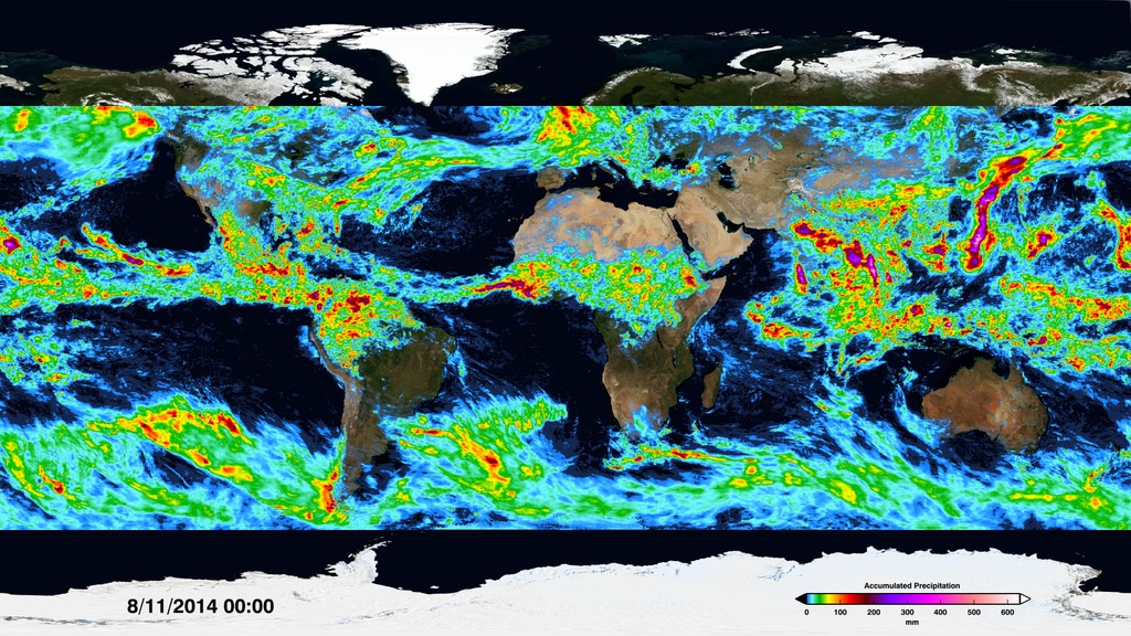
- ID: 4278 Visualization
GPM Observes Snow Storm over Kentucky, West Virginia, and North Carolina (Feb. 17, 2015)
Go to this pageAnimation depicting a snowstorm over Kentucky, West Virginia, Virginia, and North Carolina. A slicing plane reveals the inside of the storm, showing where the precipitation switches from rain (yellow, green, and red) to snow and ice (light blue and purple).This video is also available on our YouTube channel. || EcoastSnowstorm_1080p_30fps.0362_print.jpg (1024x576) [126.3 KB] || EcoastSnowstorm_1080p_30fps.0362_searchweb.png (320x180) [79.8 KB] || EcoastSnowstorm_1080p_30fps.0362_web.png (320x180) [79.8 KB] || EcoastSnowstorm_1080p_30fps.0362_thm.png (80x40) [6.1 KB] || 1920x1080_16x9_30p (1920x1080) [128.0 KB] || Feb17_2015_Snowstorm_720p_30fps.mp4 (1280x720) [9.2 MB] || Feb17_2015_Snowstorm_1080p_30fps.mp4 (1920x1080) [15.6 MB] || EcoastSnowstorm_colorbars_1080p_p30.mp4 (1920x1080) [31.8 MB] || EcoastSnowstorm_colorbars_1080p_p30.webm (1920x1080) [3.1 MB] || Feb17_2015_Snowstorm_360p_30fps.mp4 (640x360) [3.5 MB] ||
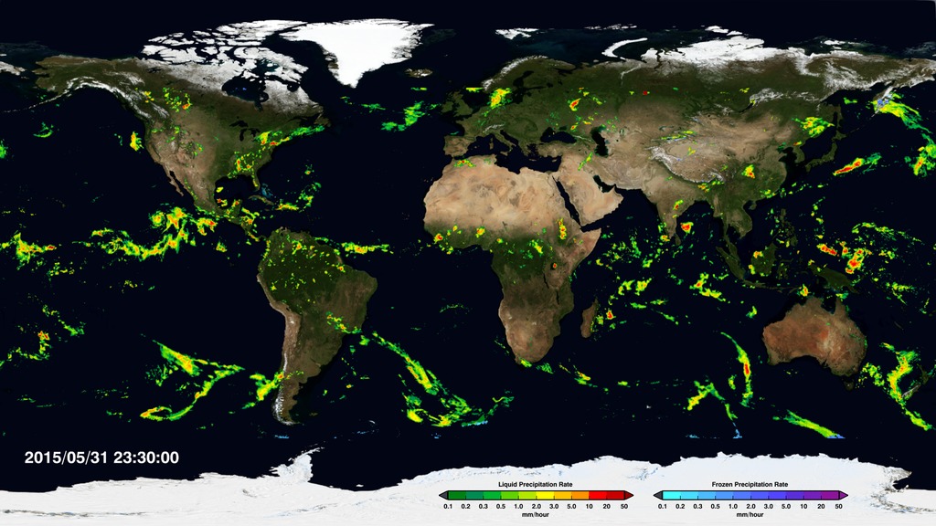
- ID: 4229 Visualization
GPM Explores Typhoon Vongfong
Go to this pageAnimation revealing a swath of GPM/GMI precipitation rates over Typhoon Vongfong. As the camera moves in on the storm, DPR's volumetric view of the storm is revealed. A slicing plane moves across the volume to display precipitation rates throughout the storm. Shades of green to red represent liquid precipitation extending down to the ground. This video is also available on our YouTube channel. || vongfong_720p.0690_print.jpg (1024x576) [146.8 KB] || 1920x1080_16x9_30p (1920x1080) [64.0 KB] || 1280x720_16x9_30p (1280x720) [64.0 KB] || vongfong_1080p.mp4 (1920x1080) [19.2 MB] || vongfong_720p.mp4 (1280x720) [10.5 MB] || Vongfong_colorbar_1080p_p30.mp4 (1920x1080) [44.1 MB] || Vongfong_colorbar_1080p_p30.webm (1920x1080) [3.1 MB] || vongfong_640x360.mp4 (640x360) [4.2 MB] || vongfong_1080p.mp4.hwshow [200 bytes] ||
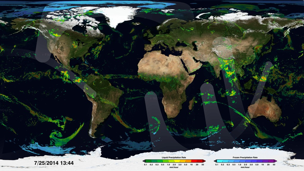
- ID: 4303 Visualization
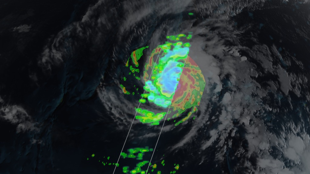
GPM Examines Super Typhoon Maysak
Go to this pageVisualization depicting Typhoon Maysak in the Southwest Pacific region as observed by the Global Precipitation Measurement (GPM) Core Satellite on March 30th, 2015. GPM/GMI precipitation rates are displayed as the camera moves in on the storm. A slicing plane moves across the volume to display precipitation rates throughout the structure of the storm. Shades of green to red represent liquid precipitation extending down to the ground. This video is also available on our YouTube channel. || Maysak_1080.1345_print.jpg (1024x576) [104.6 KB] || Maysak_1080.1345_print_thm.png (80x40) [6.4 KB] || Maysak_1080.1345_searchweb.png (320x180) [91.5 KB] || Maysak_720p30.mp4 (1280x720) [10.1 MB] || Maysak_1080p30.mp4 (1920x1080) [17.4 MB] || 1920x1080_16x9_30p (1920x1080) [128.0 KB] || Mayask_colorbar_1080p_p30.mp4 (1920x1080) [36.3 MB] || Mayask_colorbar_1080p_p30.webm (1920x1080) [4.0 MB] || Maysak_360p30.mp4 (640x360) [3.9 MB] ||
- ID: 4371 Visualization
Joaquin 360
Go to this pageVisualization of Tropical Storm Joaquin on September 29, 2015, just before the storm intensified into a hurricane. Visualization depicts a full 360 degree view of the storm. || joaquin360_00070_print.jpg (1024x576) [62.7 KB] || joaquin360_00070_searchweb.png (320x180) [46.0 KB] || joaquin360_00070_thm.png (80x40) [4.1 KB] || 1920x1080_16x9_30p (1920x1080) [0 Item(s)] || joaquin360_1080p30.mp4 (1920x1080) [24.6 MB] || joaquin360_1080p30.webm (1920x1080) [2.8 MB] || joaquin360_4371.key [28.3 MB] || joaquin360_4371.pptx [25.8 MB] || hurricane-joaquin-360.hwshow [184 bytes] ||
- ID: 4367 Visualization
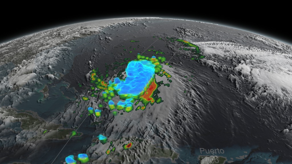
Joaquin
Go to this pageAnimation of Tropical Storm Joaquin on September 29, 2015 right before it intensified into a hurricane. The camera moves in on the storm, and the visualization concludes with a 360 degree view around the storm. This video is also available on our YouTube channel. || joaquin.0290_print.jpg (1024x576) [157.3 KB] || joaquin.0290_searchweb.png (320x180) [98.0 KB] || joaquin.0290_thm.png (80x40) [6.7 KB] || joaquin_w360 (1920x1080) [0 Item(s)] || joaquin_w360_1080p30.mp4 (1920x1080) [59.7 MB] || Joaquin_colorbar_1080p_p30.mp4 (1920x1080) [61.5 MB] || Joaquin_colorbar_1080p_p30.webm (1920x1080) [6.4 MB] || joaquin_w360_4367.key [63.8 MB] || joaquin_w360_4367.pptx [61.3 MB] ||
Alex Kekesi's Visualization Choices
- ID: 4337
- ID: 4437
 Visualization
 - ID: 4415
 Visualization
 - ID: 4339
 Visualization
 - ID: 4298
- ID: 4076
 Visualization
 - ID: 4004
- ID: 3908
 Visualization
 - ID: 3791
 Visualization
 - ID: 3858
 Visualization
 - ID: 4029
Helen-Nicole Kostis' Visualization Choices
- ID: 4005 Visualization
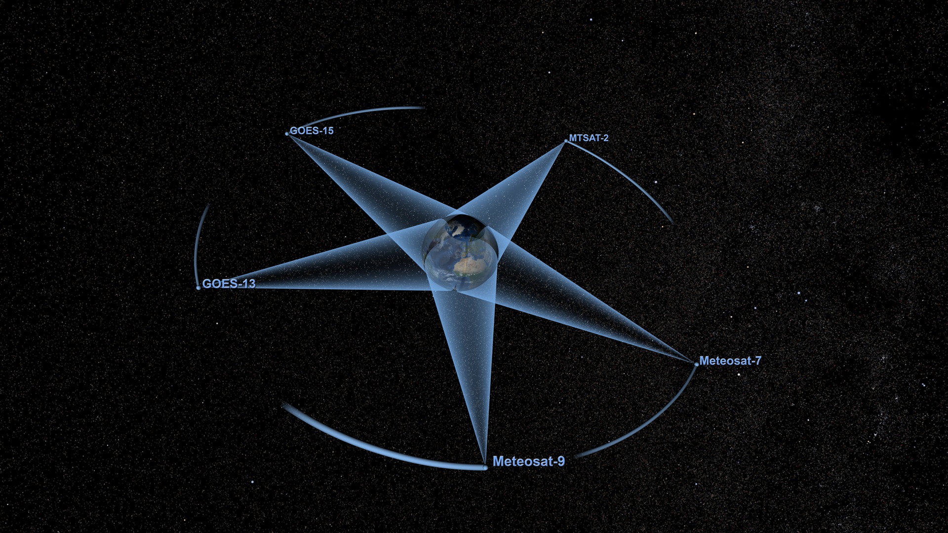
Weather Satellites in Orbit (updated 2012)
Go to this pageThis visualization showcases the five weather satellites that create NOAA's Climate Prediction Center (CPC) products. The five geosynchronous satellites are: GOES-13, GOES-15, Meteosat-7, Meteosat-9 and MTSAT-2.This is updated version of entry: #3781: Weather Satellites in Orbit (completed in 2010) ||
- ID: 4015 Visualization
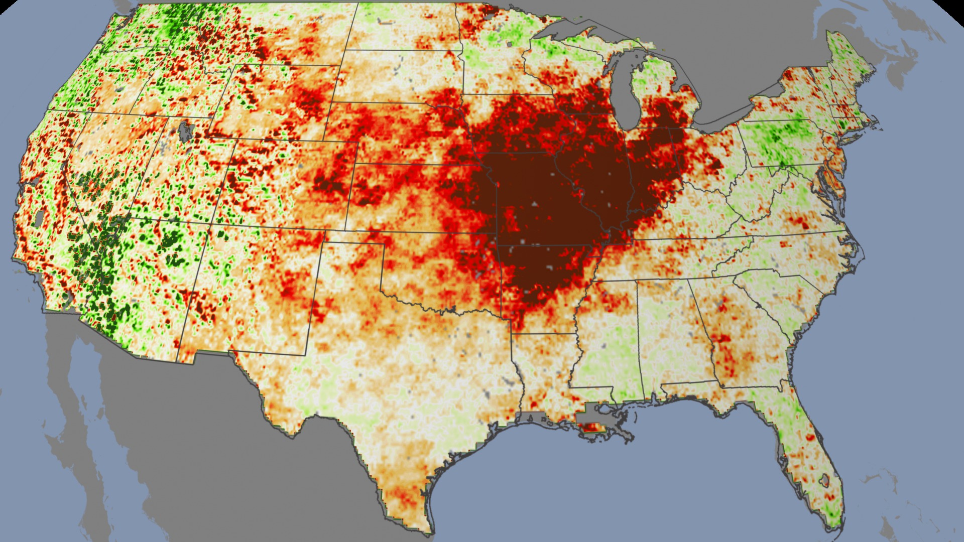
Drought 2010-2012
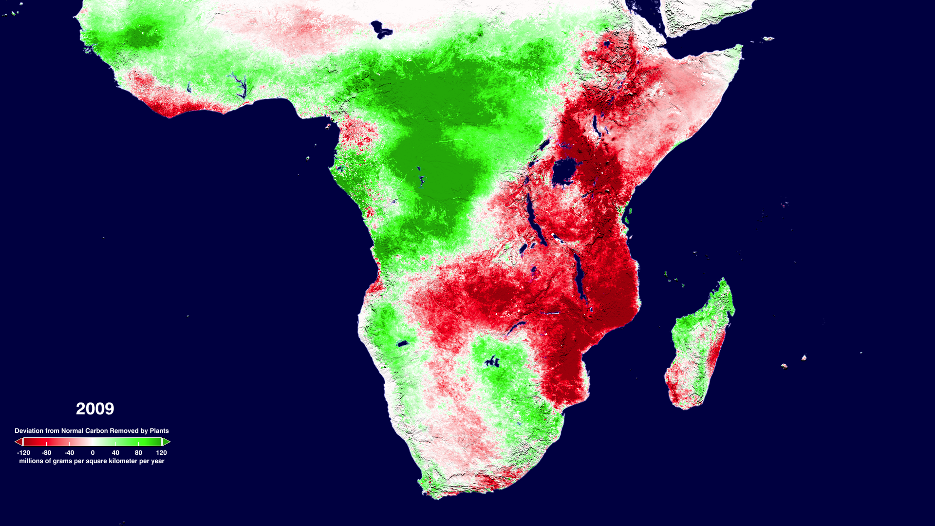
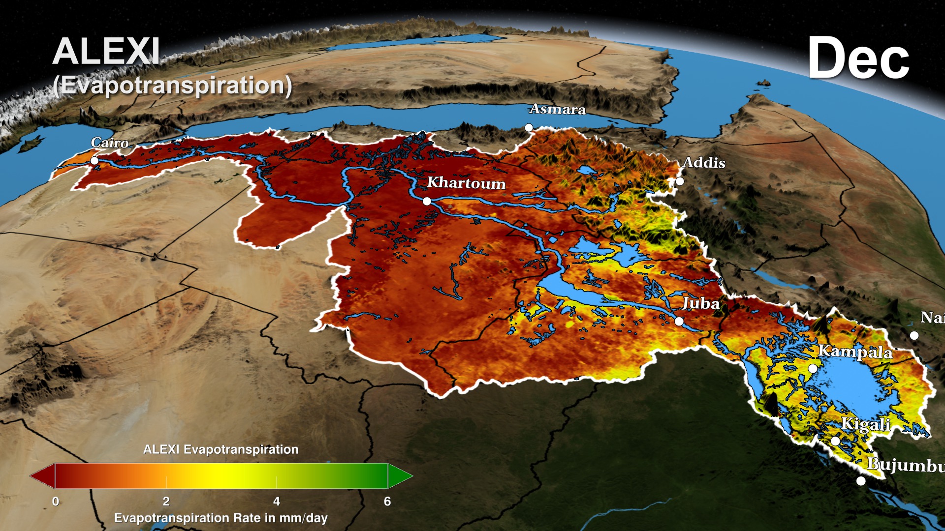
Go to this pageThe Evaporative Stress Index (ESI) provides objective, high-resolution information about the evaporation of water from land surface. The ESI model combines satellite data with other meteorological factors to determine how much water is used by crops and vegetation. The resulting data helps to detect drought.This visualization shows ESI data for 2010, 2011, and 2012. 2010 was a relatively wet year despite occasional drought. In 2011, the ESI shows extremely dry conditions across all of Texas, Louisiana, and Oklahoma, tracking one of the country's most devastating droughts. In 2012, the ESI shows plant stress in the Corn Belt region as early as May. These warning signs later developed into a full drought that impacted the world's corn and soy been supply.The kind of early-warning detection system ESI provides will enhance the US arsenal of drought monitoring tools and help farmers adapt to drought before it evolves. ||
Horace Mitchell's Visualization Choices
- ID: 4418
- ID: 4389
 Visualization
 - ID: 4382
 Visualization
 - ID: 4372
 Visualization
 - ID: 4369
 Visualization
 - ID: 4284
- ID: 4205
 Visualization
 - ID: 4206

- ID: 10885
 Produced Video
 - ID: 10884
 Produced Video
 - ID: 10883
 Produced Video
 - ID: 10882
 Produced Video
 - ID: 3764
 Visualization
 - ID: 3765
- ID: 3348
 Visualization
 - ID: 3487
 Visualization
Lori Perkins' Visualization Choices
- ID: 4433 Visualization

El Niño: GMAO Daily Sea Surface Temperature Anomaly from 1997/1998 and 2015/2016
Go to this pageThis visualization shows how the Sea Surface Temperature Anomaly (SSTA) data and subsurface Temperature Anomaly from the 1997 El Nino year compares to the 2015 El Nino year. The visualization shows how the 1997 event started from colder-than-average sea surface temperatures – but the 2015 event started with warmer-than-average temperatures not only in the Pacific but also in in the Atlantic and Indian Oceans.This video is also available on our YouTube channel. || SSTcompare1997_2015_0000_print.jpg (1024x576) [87.4 KB] || SSTcompare1997_2015_0000_searchweb.png (320x180) [53.0 KB] || SSTcompare1997_2015_0000_thm.png (80x40) [5.6 KB] || Compare1997_2015_SSTA.mp4 (1920x1080) [28.7 MB] || compare (1920x1080) [0 Item(s)] || Compare1997_2015_SSTA.webm (1920x1080) [1.5 MB] || Compare1997_2015_SSTA.m4v (640x360) [2.5 MB] || Compare1997_2015_SSTA.mp4.hwshow [187 bytes] ||
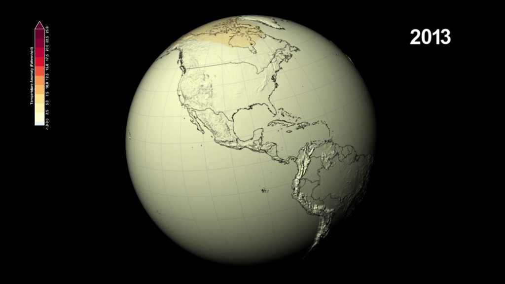
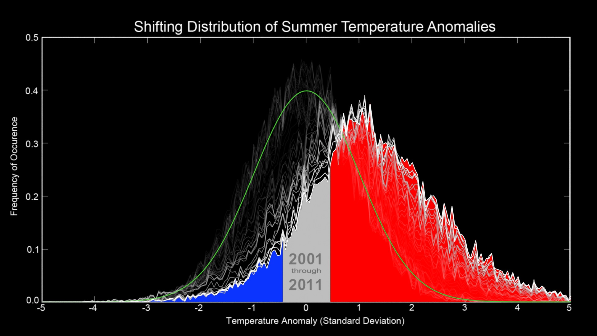
- ID: 4419 Visualization
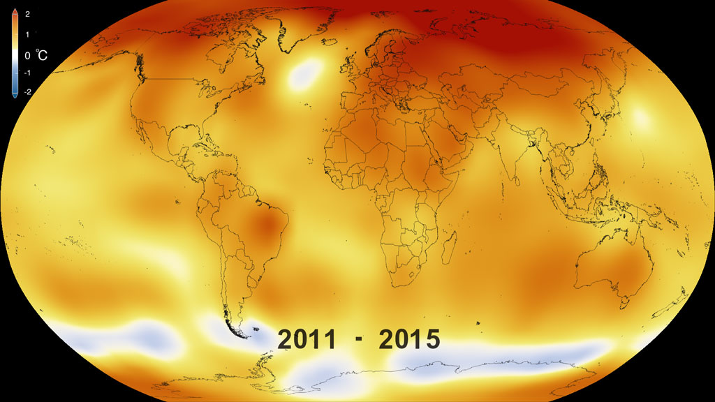
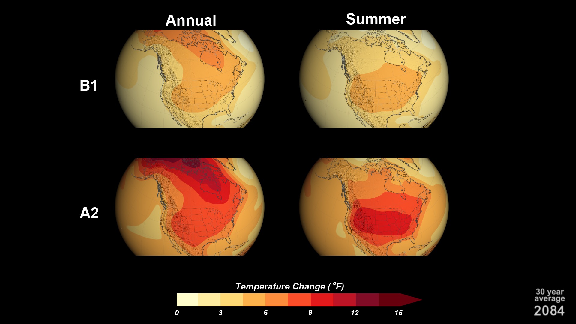
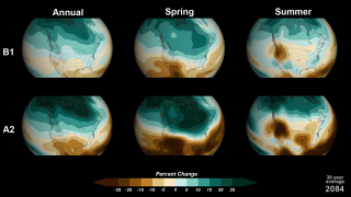
Five-Year Global Temperature Anomalies from 1880 to 2015
Go to this pageThis color-coded map in Robinson projection displays a progression of changing global surface temperature anomalies from 1880 through 2015. Higher than normal temperatures are shown in red and lower then normal termperatures are shown in blue. The final frame represents the global temperatures 5-year averaged from 2011 through 2015. Scale in degree Celsius.This video is also available on our YouTube channel. || 4419_GISTEMP_2015_Robinson_C_print.jpg (1024x576) [107.0 KB] || 4419_GISTEMP_2015_Robinson_C_print_searchweb.png (320x180) [78.5 KB] || 4419_GISTEMP_2015_Robinson_C_print_thm.png (80x40) [7.3 KB] || celsius_composite (1920x1080) [0 Item(s)] || 4419_GISTEMP_2015_Robinson_C_youtube_hq.mov (1920x1080) [79.5 MB] || 4419_GISTEMP_2015_Robinson_C.webm (960x540) [13.3 MB] || 4419_GISTEMP_2015_Robinson_C_appletv.m4v (1280x720) [16.3 MB] || 4419_GISTEMP_2015_Robinson_C.mpeg (1280x720) [122.2 MB] || 4419_GISTEMP_2015_Robinson_C_prores.mov (1280x720) [533.7 MB] || 4419_GISTEMP_2015_Robinson_C.key [20.0 MB] || 4419_GISTEMP_2015_Robinson_C.pptx [17.4 MB] || 4419_GISTEMP_2015_Robinson_C_ipod_sm.mp4 (320x240) [4.8 MB] ||
- ID: 4245 Visualization
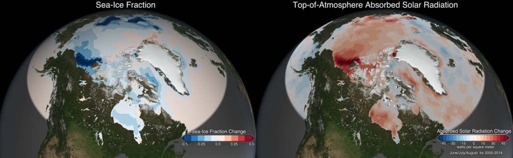
Link between Sea-Ice Fraction and Absorbed Solar Radiation over the Arctic Ocean
Go to this pageNASA satellite instruments have observed a marked increase in solar radiation absorbed in the Arctic since the year 2000 – a trend that aligns with the drastic decrease in Arctic sea ice during the same period. This visual shows the Arctic Sea Ice Change and the corresponding Absorbed Solar Radiation Change during June, July, and August from 2000 through 2014.This video is also available on our YouTube channel. || seaice_solarAbsorption_0344_print.jpg (1024x576) [117.1 KB] || SeaIceSolarAbsorptionChange.webm (1920x1080) [1.2 MB] || 1920x1080_16x9_60p (1920x1080) [0 Item(s)] || SeaIceSolarAbsorptionChange.mp4 (1920x1080) [12.1 MB] || composite (1920x1080) [0 Item(s)] || source (1920x1080) [0 Item(s)] || SeaIceSolarAbsorptionChange.m4v (640x360) [2.1 MB] ||
- ID: 4036 Visualization
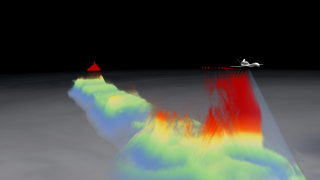
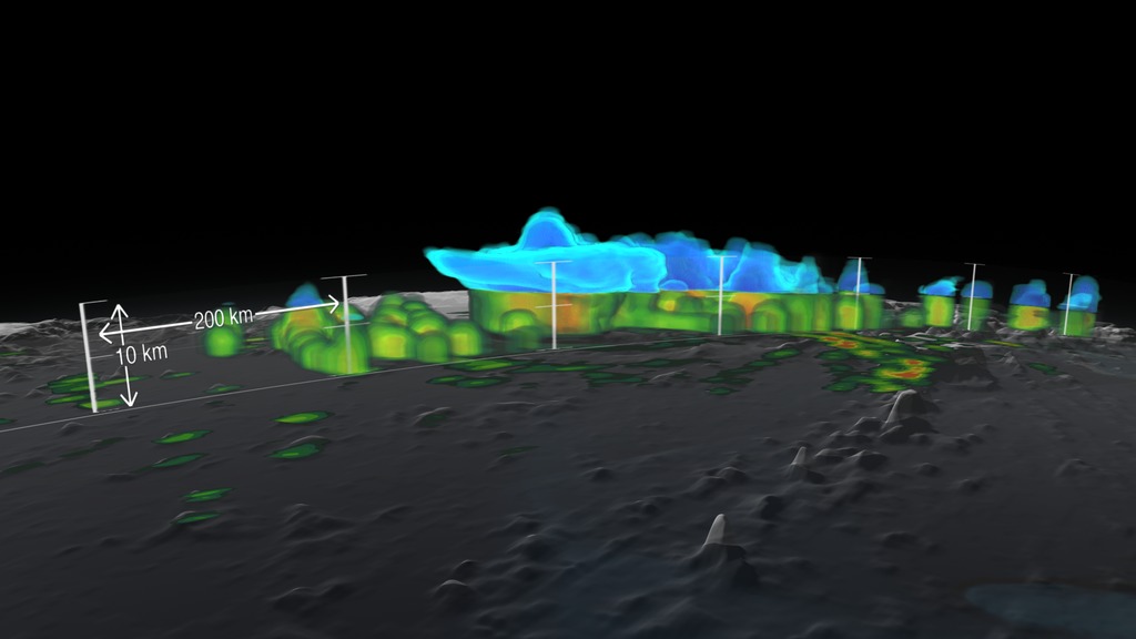
Global Hawk Takes High Altitude Imaging Wind and Rain Airborne Profiler (HIWRAP) Data
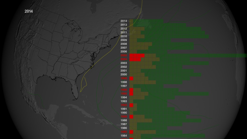
Go to this pageThe dual-wavelength (Ku- and Ka-band) High Altitude Imaging Wind and Rain Airborne Profiler (HIWRAP) flew for the first time on the Global Hawk Unmanned Aerial Vehicle (UAV) during the 2010 Genesis and Rapid Intensification Processes (GRIP). The HIWRAP is able to measure line-of-sight and ocean surface winds for a longer period of time than obtained by current satellites and lower-altitude instrumented aircraft. HIWRAP is conical scanning, and winds and reflectivity can be mapped within the swath below the Global Hawk. This visual will highlight the UAV measuring Hurricane Karl's HIWRAP Ku-band observations on September 16 from 18:53:10 through 19:19:18. The dimensions of the Global Hawk were exaggerated by a factor of 10 so the viewer could see the UAV. The Global Hawk actual dimensions are 44.4 ft (13.5 m) length by 116.2 ft. (35.4 m) wingspan by 15.2 ft (4.6 m) height. The movie starts as the Global Hawk flies over Hurricane Karl to reveal a hot tower. Hot towers are important to understanding hurricane intensification because they can carry hot moist air through the high layer of cirrus clouds above a hurricane. Hot towers are hard to study because they go so high and they do not last very long. The structure of this storm is seen through reflectivity data where dbz is between 25 and 40. The HIWRAP data is colored based on the height from the surface. Red shows 12 km above sea level, orange is 10 km, yellow is 7.5 km, green is 6 km, and blue is under 6 km.For more information on GRIP and other elements of NASA's Hurricane and Severe Storm Sentinel project, visit http://www.nasa.gov/HS3. ||
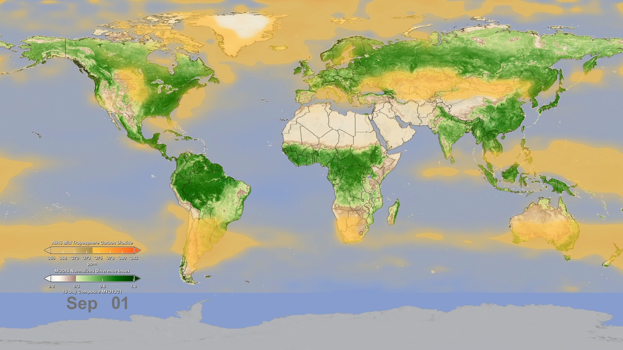
- ID: 4184 Visualization
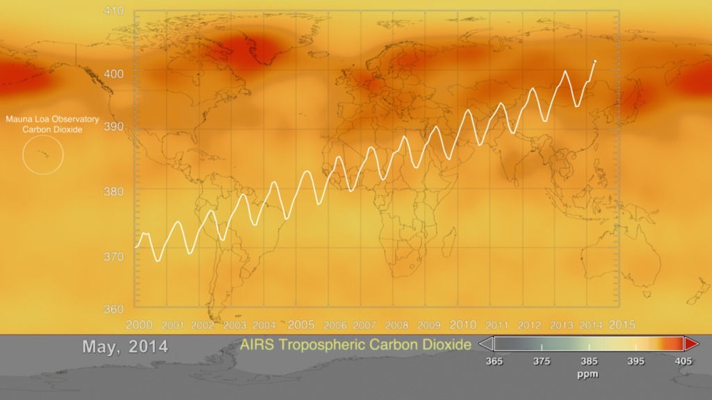
2014 Update Aqua/AIRS Carbon Dioxide with Mauna Loa Carbon Dioxide
Go to this pageThis visualization is a time-series of the global distribution and variation of the concentration of mid-tropospheric carbon dioxide observed by the Atmospheric Infrared Sounder (AIRS) on the NASA Aqua spacecraft. For comparison, it is overlain by a graph of the seasonal variation and interannual increase of carbon dioxide observed at the Mauna Loa, Hawaii observatory.The graph shows data, commonly called the Keeling Curve, from the Scripps measurements of monthly carbon dioxide concentration at Mauna Loa Observatory. The collection of this data was started by C. David Keeling of the Scripps Institution of Oceanography in March of 1958 at a facility of the National Oceanic and Atmospheric Administration [Keeling, 1976]. The two most notable features of this visualization are the seasonal variation of carbon dioxide and the trend of increase in its concentration from year to year. The global map clearly shows that the carbon dioxide in the Northern Hemisphere peaks in April-May and then drops to a minimum in September-October. Although the seasonal cycle is less pronounced in the Southern Hemisphere it is opposite to that in the Northern Hemisphere. This seasonal cycle is governed by the growth cycle of plants. The Northern Hemisphere has the majority of the land masses, and so the amplitude of the cycle is greater in that hemisphere. The overall color of the map shifts toward the red with advancing time due to the annual increase of carbon dioxide.The concentration of carbon dioxide in the mid-troposphere lags the concentration found at the surface as mixing from the lower to upper altitudes usually takes days to weeks.More information about AIRS can be found at http://airs.jpl.nasa.gov. More information about the carbon dioxide concentration at Mauna Loa Observatory can be found at http://scrippsco2.ucsd.edu/ ||
- ID: 4055 Visualization
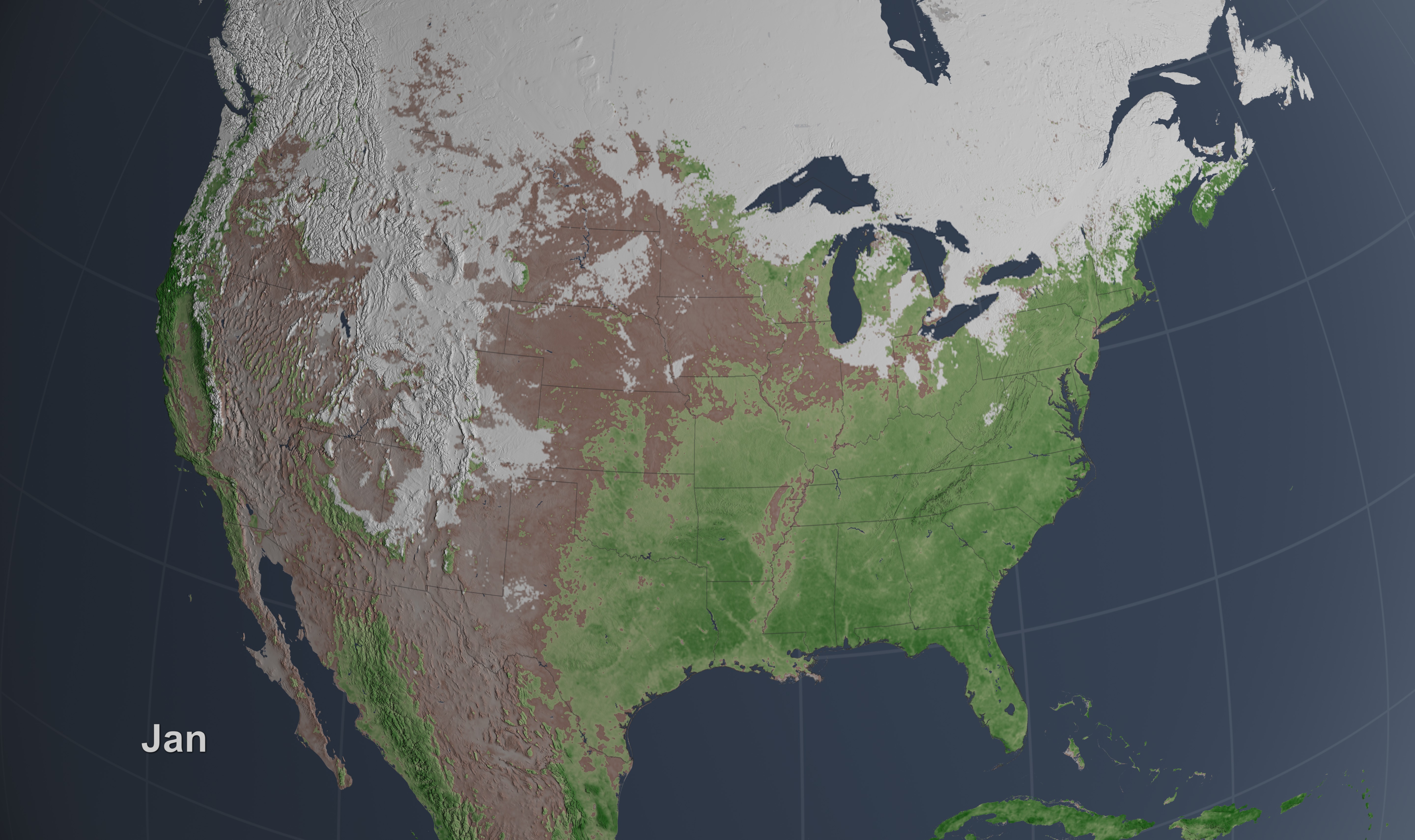
Seasonal Vegetation and Snow Change
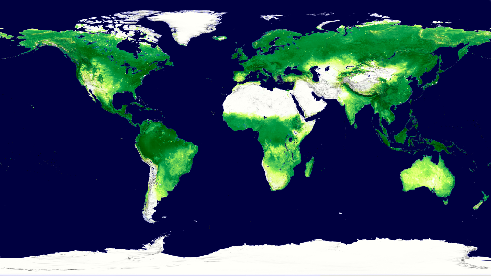
Go to this pageTo determine the density of green on a patch of land, researchers must observe the wavelengths of visible and near-infrared sunlight reflected by the plants. The pigment in plant leaves, chlorophyll, strongly absorbs visible light (from 0.4 um - 0.7 um). Vegetation strongly reflects near-infrared light (from 0.7 -1.0 um). The more healthy leaves a plant has, the more the the visible light will be absorbed and the near-infrared will be reflected. In this animation, dark green indicates dense, healthy vegetation, whereas beige areas represent bare soil. Snow from the MODIS instruments is overlaid on top. ||
- ID: 4092 Visualization
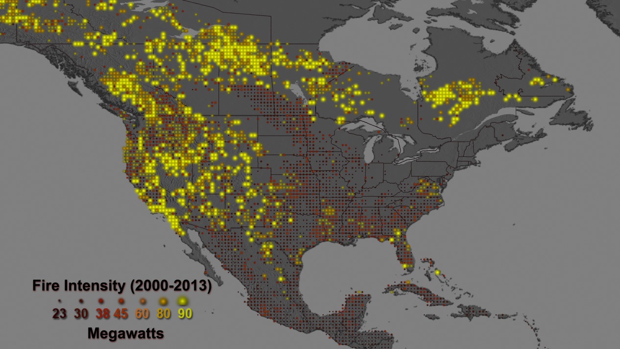
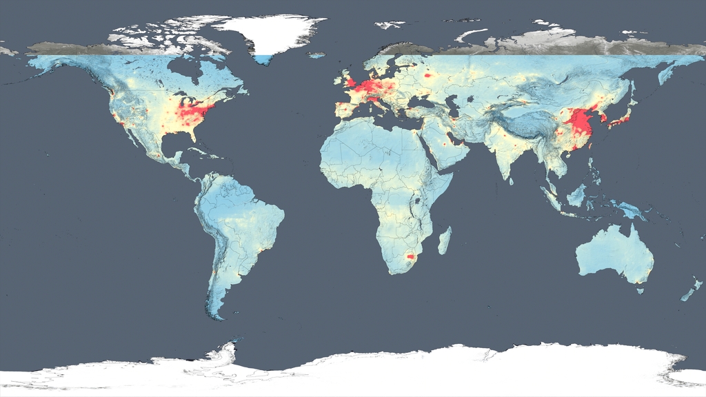
Mapping the Fire Intensity Record for the United States (2000 through 2013)
Go to this pageThis visualization displays the MODIS Climate Modeling Grid (CMG) Mean Fire Radiative Power (FRP). The CMG fire products incorporate MODIS active fire data into gridded statistical summaries of fire pixel information intended for use in regional and global modeling. The products are currently generated at 0.5 degree spatial resolution. Many of the lower intensity fires shown in red were prescribed fires, lit for either agricultural or ecosystem management purposes. Orange indicates fires that were more intense with the most intense FRP being shown in yellow. Most of these intense fires occurred in the western United States, where lightning and human activity often sparks blazes that firefighters cannot contain. ||
- ID: 3869 Visualization
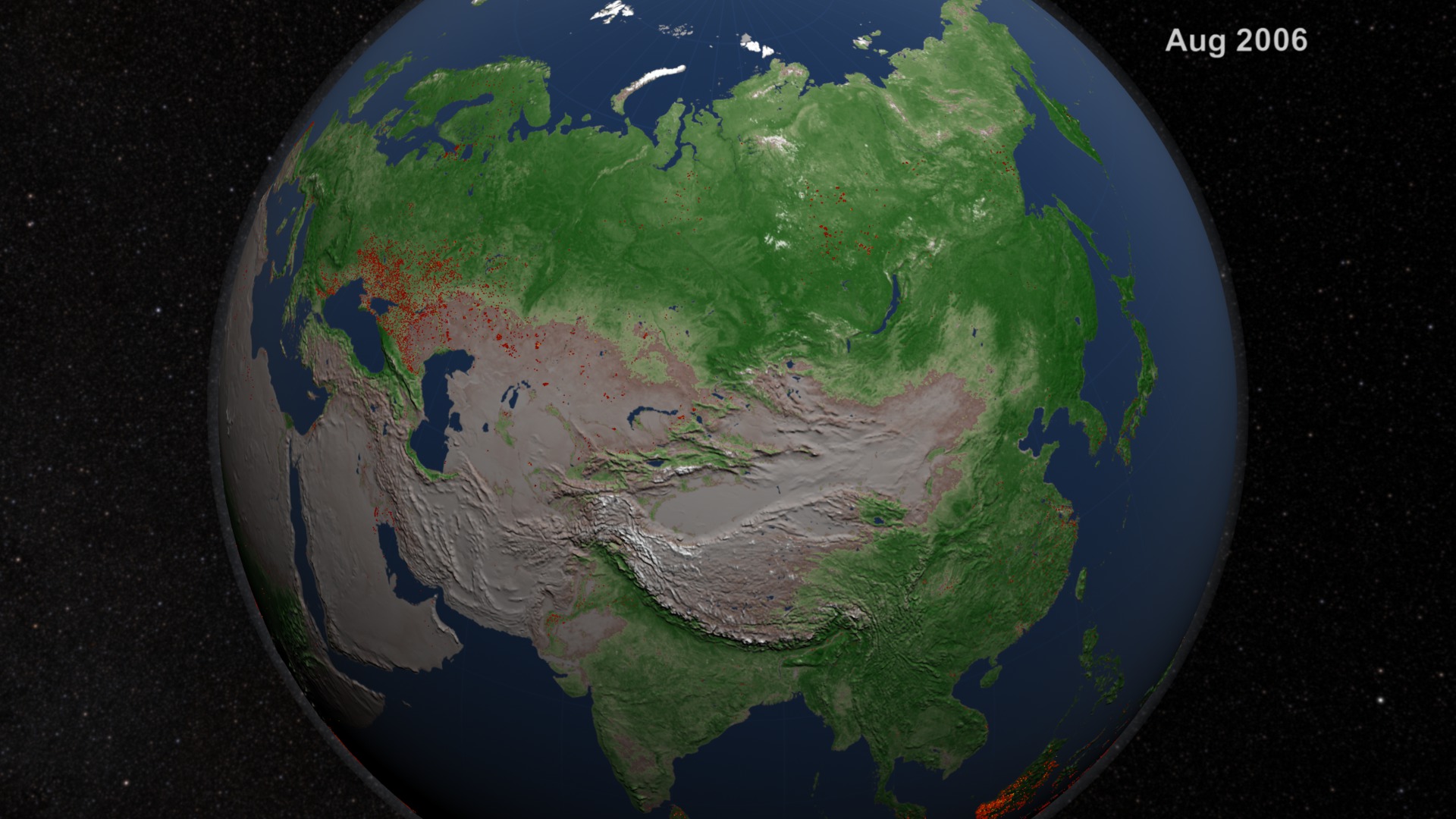
Boreal Forest Fire Observations and MODIS NDVI
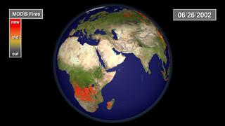
Go to this pageNASA has released a series of new visualizations that show the locations of the millions of fires detected by key fire-monitoring instruments on NASA satellites over the last decade. This visualization shows fire observations made by the MODerate Resolution Imaging Spectroradiometer (MODIS) instruments on board the Terra and Aqua satellites in Europe and Asia from July 2002 through July 2011. "It's incredibly satisfying to see such a long record of fires visualized," said Chris Justice, a scientist from the University of Maryland who leads NASA's effort to use MODIS data to study the world's fires. "It's not only exciting visually, but what you see here is a very good representation of the data scientists use to understand the global distribution of fires and to determine where and how fires are responding to climate change and population growth."More information on the Fire Information for Resource Management System (FIRMS) is available at https://earthdata.nasa.gov/earth-observation-data/near-real-time/firms. ||
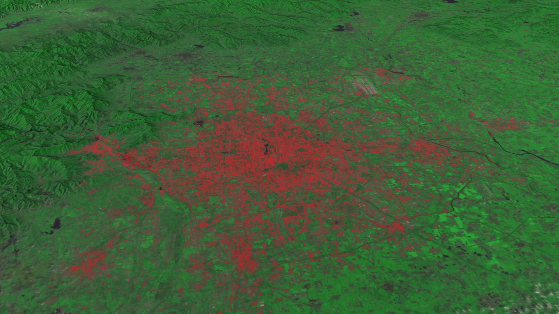
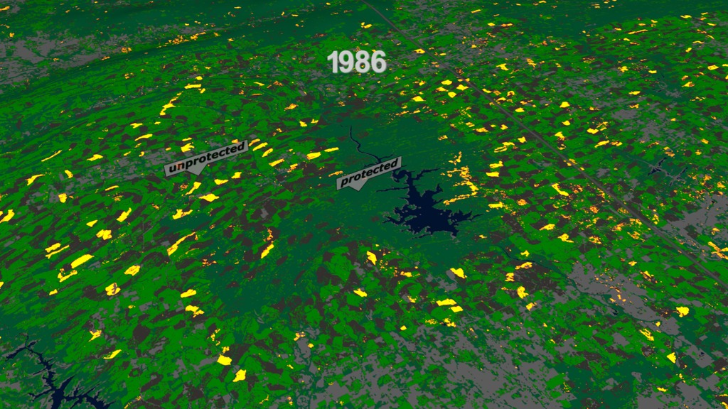
- ID: 3868 Visualization
Global Fire Observations and MODIS NDVI
Go to this pageThis visualization leads viewers on a narrated global tour of fire detections beginning in July 2002 and ending July 2011. The visualization also includes vegetation and snow cover data to show how fires respond to seasonal changes. The tour begins in Australia in 2002 by showing a network of massive grassland fires spreading across interior Australia as well as the greener Eucalyptus forests in the northern and eastern part of the continent. The tour then shifts to Asia where large numbers of agricultural fires are visible first in China in June 2004, then across a huge swath of Europe and western Russia in August, and then across India and Southeast Asia through the early part of 2005. It moves next to Africa, the continent that has more abundant burning than any other. MODIS observations have shown that some 70 percent of the world's fires occur in Africa alone. In what's a fairly average burning season, the visualization shows a huge outbreak of savanna fires during the dry season in Central Africa in July, August, and September of 2006, driven mainly by agricultural activities but also by the fact that the region experiences more lightning than anywhere else in the world. The tour shifts next to South America where a steady flickering of fire is visible across much of the Amazon rainforest with peaks of activity in September and November of 2009. Almost all of the fires in the Amazon are the direct result of human activity, including slash-and-burn agriculture, because the high moisture levels in the region prevent inhibit natural fires from occurring. It concludes in North America, a region where fires are comparatively rare. North American fires make up just 2 percent of the world's burned area each year. The fires that receive the most attention in the United States, the uncontrolled forest fires in the West, are less visible than the wave of agricultural fires prominent in the Southeast and along the Mississippi River Valley, but some of the large wildfires that struck Texas earlier this spring are visible. More information on the Fire Information for Resource Management System (FIRMS) is available at http://maps.geog.umd.edu/firms/. ||
- ID: 3947 Visualization
Watching the Earth Breathe:
An Animation of Seasonal Vegetation and its effect on Earth's Global Atmospheric Carbon DioxideGo to this pageIn this animation, NASA instruments show the seasonal cycle of vegetation and the concentration of carbon dioxide in the atmosphere. The animation begins on January 1, when the northern hemisphere is in winter and the southern hemisphere is in summer. At this time of year, the bulk of living vegetation, shown in green, hovers around the equator and below it, in the southern hemisphere.As the animation plays forward through mid-April, the concentration of carbon dioxide, shown in orange-yellow, in the middle part of Earth's lowest atmospheric layer, the troposphere, increases and spreads throughout the northern hemisphere, reaching a maximum around May. This blooming effect of carbon dioxide follows the seasonal changes that occur in northern latitude ecosystems, in which deciduous trees lose their leaves, resulting in a net release of carbon dioxide through a process called respiration. Carbon dioxide is also released in early spring as soils begin to warm. Almost 10 percent of atmospheric carbon dioxide passes through soils each year.After April, the northern hemisphere moves into late spring and summer and plants begin to grow, reaching a peak in the late summer. The process of plant photosynthesis removes carbon dioxide from the air. The animation shows how carbon dioxide is scrubbed out of the atmosphere by the large volume of new and growing vegetation. Following the peak in vegetation, the drawdown of atmospheric carbon dioxide due to photosynthesis becomes apparent, particularly over the boreal forests.Note that there is roughly a three-month lag between the state of vegetation at Earth's surface and its effect on carbon dioxide in the middle troposphere.Data like these give scientists a new opportunity to better understand the relationships between carbon dioxide in Earth's middle troposphere and the seasonal cycle of vegetation near the surface.Creating the AnimationThis animation was created with data taken from two NASA spaceborne instruments. The concentration of carbon dioxide data from the Atmospheric Infrared Sounder (AIRS), a weather and climate instrument that flies aboard NASA's Aqua spacecraft, is overlain on measurements of vegetation index from the Moderate Resolution Imaging Spectroradiometer (MODIS) instrument, also on NASA's Aqua spacecraft, to better understand how photosynthesis and respiration influences the atmospheric carbon dioxide cycle over the globe. The animation runs from January through December and repeats. The AIRS tropospheric carbon dioxide seasonal cycle values were made by averaging AIRS data collected between 2003 and 2010, from which the annual carbon dioxide growth trend of 2 parts per million per year has been removed. For example, the data used for January 1 is actually an average of eight years of AIRS carbon dioxide data taken each year on January 1. The vegetation values were made using data averaged over a four-year period, from 2003 to 2006.Further DetailAIRS uses infrared technology to determine the concentration of atmospheric water vapor and several important trace gases as well as information about temperature and clouds. AIRS orbits Earth from pole-to-pole at an altitude of 438 miles (705 kilometers), measuring Earth's infrared spectrum in 3,278 channels spanning a wavelength range from 3.74 microns to 15.4 microns. Originally designed to improve weather forecasts, AIRS has improved operational five-day weather forecasts more than any other single instrument over the past decade. AIRS has also been found to be sensitive to atmospheric carbon dioxide in the middle troposphere, at an altitude of 5 to 10 kilometers or 3 to 6 miles. AIRS is managed by NASA's Jet Propulsion Laboratory, Pasadena, Calif., under contract to NASA. JPL is a division of the California Institute of Technology in Pasadena. For further information, access the AIRS projectThe MODIS instrument is managed by NASA's Goddard Space Flight Center, Greenbelt, Md. For further information, access the MODIS project. ||
Trent Schindler's Visualization Choices
- ID: 4044
 Visualization
 - ID: 3849
 Visualization
 - ID: 4160
 Visualization
 - ID: 4412
- ID: 4272
- ID: 3864
 Visualization
 - ID: 3850
- ID: 3638
- ID: 3628
 Visualization
 - ID: 3586
- ID: 4016
- ID: 3623
 Visualization
 - ID: 4007

Greg Shirah's Visualization Choices
- ID: 4274
 Visualization
 - ID: 3958
 Visualization
 - ID: 3912
 Visualization
 - ID: 4287
- ID: 3927
- ID: 4192
 Visualization
 - ID: 3975
- ID: 4399
- ID: 4154
- ID: 4270
- ID: 3820
Cindy Starr's Visualization Choices
- ID: 4440 Visualization
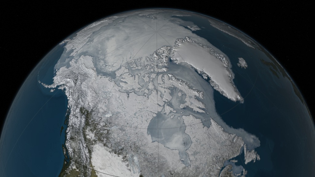
Arctic Sea Ice Maximum - 2016
Go to this pageAn animation of the Arctic sea ice from September 7th, 2015 through March 24th, 2016 with datesThis video is also available on our YouTube channel. || Arctic_sea_ice_2016.1499_print.jpg (1024x576) [105.4 KB] || Arctic_sea_ice_2016_wDate_p30_1080p.mp4 (1920x1080) [15.0 MB] || Arctic_sea_ice_2016_wDate_1080p60.mp4 (1920x1080) [16.6 MB] || Arctic_sea_ice_2016_p30_1080p.webm (1920x1080) [2.8 MB] || seaIce_wDate (1920x1080) [0 Item(s)] || seaIce_wDate (1920x1080) [0 Item(s)] || Arctic_seaIce_2016_wDate_4k_p30_2160p.mp4 (3840x2160) [58.3 MB] || seaIce_wDate (3840x2160) [0 Item(s)] || seaIce_wDate (3840x2160) [0 Item(s)] || Arctic_seaIce_2016_wDate_4k_2160p30x2.mp4 (3840x2160) [99.4 MB] ||
- ID: 4435 Visualization
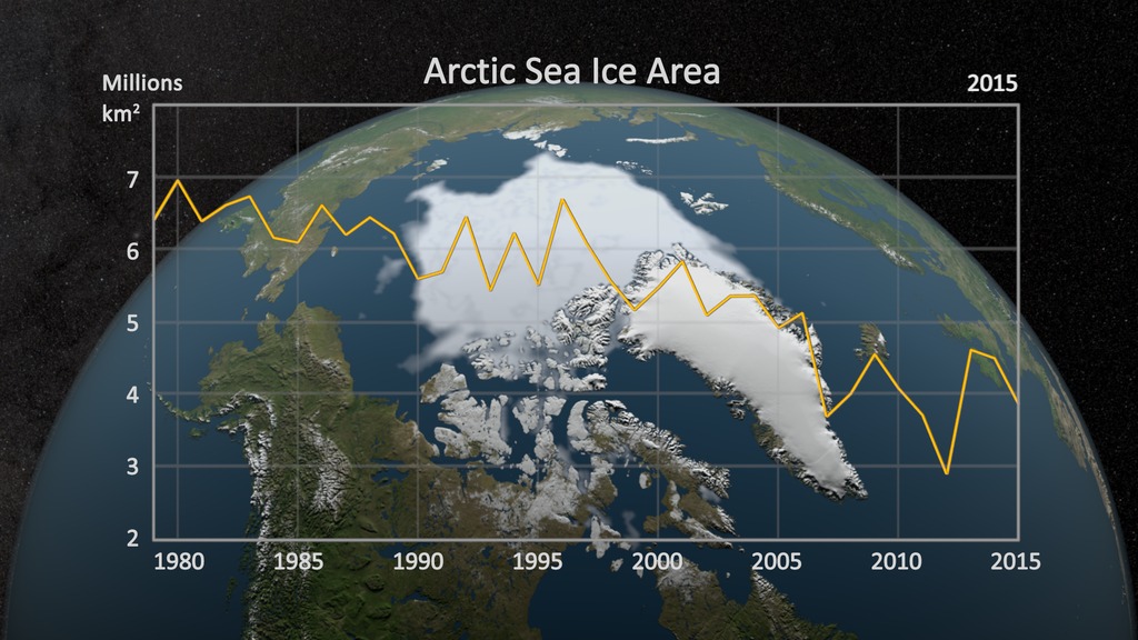
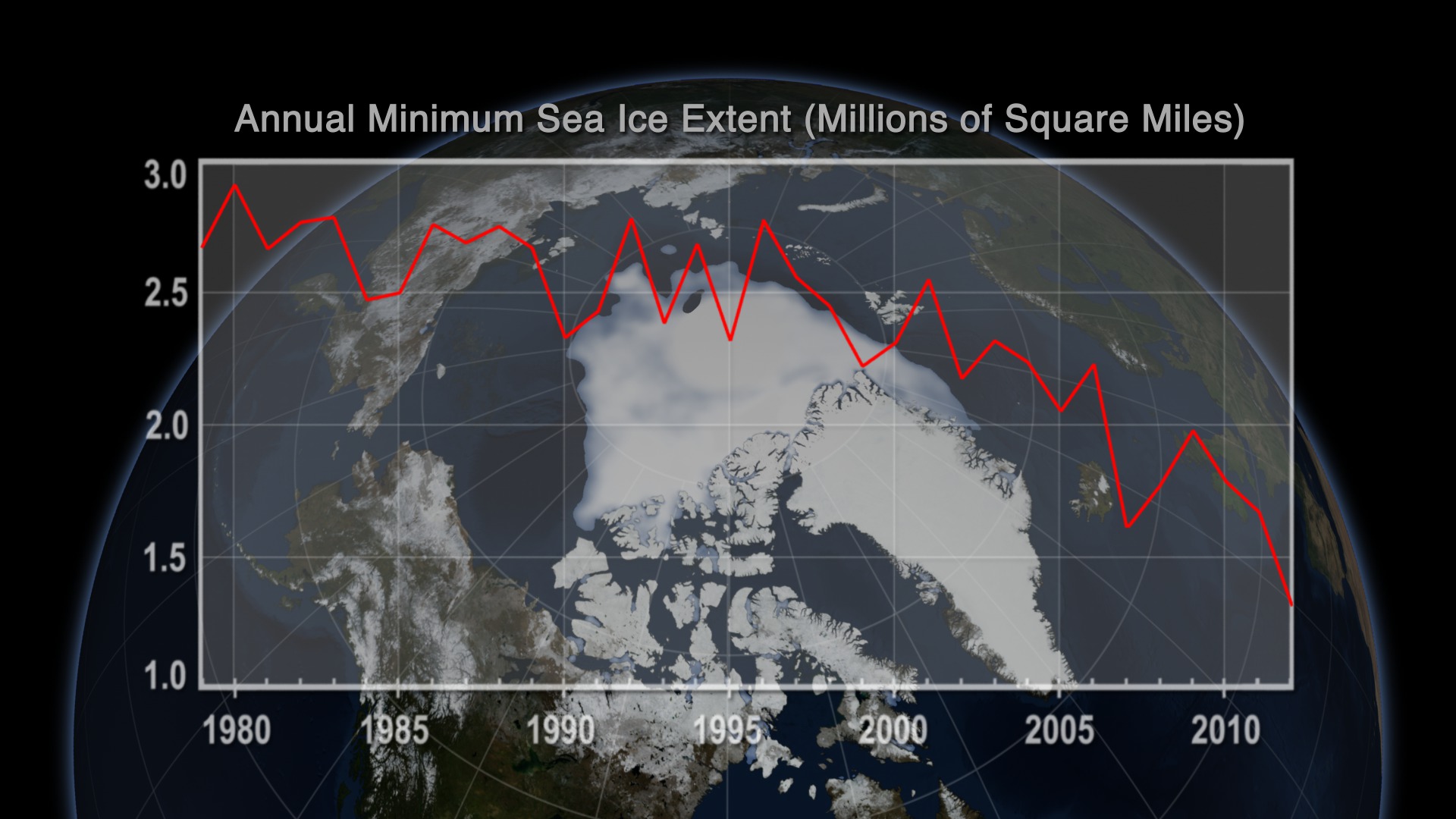
Annual Arctic Sea Ice Minimum 1979-2015 with Area Graph
Go to this pageAn animation of the annual Arctic sea ice minimum with a graph overlay showing the area of the minimum sea ice in millions of square kilometers.This video is also available on our YouTube channel. || seaIceWgraph_HD.1079_print.jpg (1024x576) [160.4 KB] || seaIceWgraph_HD.1079_searchweb.png (320x180) [91.5 KB] || seaIceWgraph_HD.1079_thm.png (80x40) [6.8 KB] || seaIceWgraph_HD_1080p30.mp4 (1920x1080) [15.5 MB] || seaIceMin_withGraph (1920x1080) [0 Item(s)] || seaIceWgraph_HD_1080p30.webm (1920x1080) [2.9 MB] || seaIceMin_withGraph (3840x2160) [0 Item(s)] || seaIceWgraph_4k_2160p30.mp4 (3840x2160) [66.3 MB] || seaIceWgraph_HD_1080p30.mp4.hwshow [218 bytes] ||
- ID: 4376 Visualization
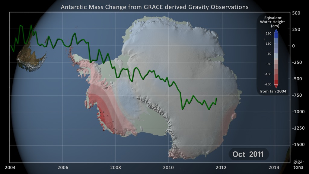
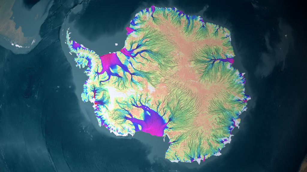
Antarctic Mass Change from GRACE derived Gravity Observations: Jan 2004 - Jun 2014
Go to this pageGRACE, NASA's Gravity Recovery and Climate Experiment, consists of twin co-orbiting satellites that fly in a near polar orbit separated by a distance of 220 km. GRACE precisely measures the distance between the two spacecraft in order to make detailed measurements of the Earth's gravitational field. Since its launch in 2002, GRACE has provided a continuous record of changes in the mass of the Earth's ice sheets.These animations show the change in the mass of the Antarctic Ice Sheet between January 2004 and June 2014 as measured by the pair of GRACE satellites. The 1-arc-deg NASA GSFC mascon solution data was resampled to a 5130 x 5130 data array using Kriging interpolation. A color scale was applied where blue values indicate an increase in the ice sheet mass while red shades indicate a decrease. In addition, a graph overlay shows the running total of the accumulated mass change in gigatons.Four separate animations are shown here: one of the full Antarctic Ice Sheet (above) and three of individual regional views (below) showing the regions of West Antarctica, the Antarctic Peninsula and East Antarctica. The time-series of each region is shown with a graph depicting the ice loss for the region alone. Note that the range on the color scale is different for each regional view in order to portray the most detail possible. Areas outside the region being shown are colored in a pale green to indicate that it is not included in the view. The floating ice shelves, shown in a lighter shade of green, are also not included.Technical Note: The glacial isostatic adjustment signal (Earth mass redistribution in response to historical ice loading) has been removed using the ICE-6G model (Peltier et al. 2015). ||
- ID: 4328 Visualization
Greenland's Glaciers as seen by RadarSat
Go to this pageAn animation up the Greenland's Sermilik Fjord to the calving front of the Helheim Glacier, showing the glacier front's change between 2000 to 2013This video is also available on our YouTube channel. || Helheim_radarsat_4k.0800_print.jpg (1024x576) [242.6 KB] || Helheim_radarsat_4k.0800_searchweb.png (180x320) [121.8 KB] || Helheim_radarsat_4k.0800_web.png (320x180) [121.8 KB] || Helheim_radarsat_4k.0800_thm.png (80x40) [7.6 KB] || Helheim_radarsat_4k_1080p30.mp4 (1920x1080) [84.5 MB] || Helheim_radarsat_4k_720p30.mp4 (1280x720) [43.3 MB] || Helheim_radarsat_4k_2160p30.webm (3840x2160) [16.2 MB] || Helheim (3840x2160) [256.0 KB] || Helheim_radarsat_4k_2160p30.mp4 (3840x2160) [225.6 MB] ||
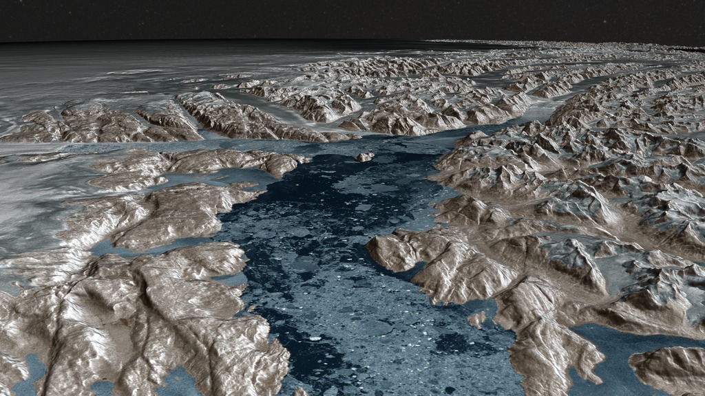
- ID: 3962 Visualization
Greenland Ice Flow
Go to this pageGreenland looks like a big pile of snow seen from space using a regular camera. But satellite radar interferometry helps us detect the motion of ice beneath the snow. Ice starts flowing from the flanks of topographic divides in the interior of the island, and increases in speed toward the coastline where it is channelized along a set of narrow, powerful outlet glaciers. In the east, these glaciers make their sinuous way through complex terrain at low speed. They form long floating extensions that deform slowly in the cold north. As we move toward sectors of higher snowfall in the northwest and center west, ice flow speeds increase by nearly a factor of 10, with many, smaller glaciers flowing straight down to the coastline at several kilometers per year.This complete description of ice motion was only made possible from the coordinated effort of four space agencies: the Japanese Space Agency, the Canadian Space Agency, the European Space Agency, and NASA's Jet Propulsion Laboratory. The data will help scientists improve their understanding of the dynamics of ice in Greenland and in projecting how the Greenland Ice Sheet will respond to climate change in the decades and centuries to come. ||
- ID: 3939 Visualization
Landsat Data Continuity Mission (LDCM) Orbits
Go to this pageThe Landsat Data Continuity Mission (LDCM), also to be named Landsat 8 after its scheduled launch in February 2013, will be the eighth in the series of Landsat satellites. Since 1972, Landsat satellites have been observing and measuring Earth's continental and coastal landscapes at 15 to 30 meter resolution, where human impacts and natural changes can be monitored and characterized over time.This animation portrays how the LDCM satellite will orbit the Earth 13 times per day at an altitude of 705 km collecting landcover data. With a cross-track width of 185 km, the satellite will completely cover the globe in a 16 day period compiling a total of 233 orbits. A day number and the elapsed time are shown to clearly depict the passage of time which starts slowly in the beginning and increases to day-by-day steps at the end of the animation. The terrain is exaggerated by 6 times during the first day portrayed, but is increased to 12 times when the camera pulls out to a global view. An artificial orbit trail is shown following the spacecraft to indicate its position when the satellite itself is too small to be visible. ||
- ID: 3783 Visualization
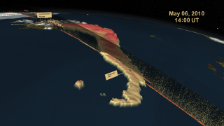
Iceland's Eyjafjallajökull Volcanic Ash Plume May 6-8, 2010 - Stereoscopic Version
Go to this pageDuring April and May, 2010, the Eyjafjallajökull volcano on Iceland's southern coast erupted, creating an expansive ash cloud that disrupted air traffic throughout Europe and across the Atlantic. This animation shows the flow of this ash cloud for three days in early May on an hourly basis as sensed from a geostationary satellite. The ash cloud heights were determined using an approach developed by NOAA/NESDIS/STAR for the next generation of Geostationary Operational Environmental Satellite (GOES-R). Data from EUMETSAT's Spinning Enhanced Visible and Infrared Imager (SEVIRI) was used as a proxy for GOES-R Advanced Baseline Imager (ABI) data. This data is shown intersecting with the CALIPSO Parallel Attenuated Backscatter curtain on May 6th. In this page the visualization content is offered in two different modes to accommodate stereoscopic systems as: Left and Right Eye separate and Left and Right Eye side-by-side combined on the same frame. ||
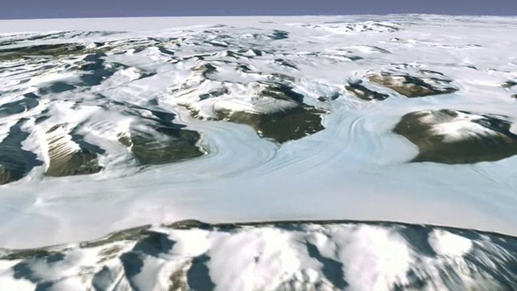
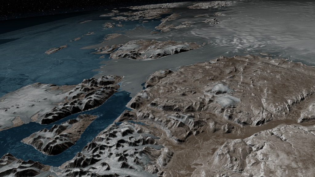
- ID: 4097 Visualization
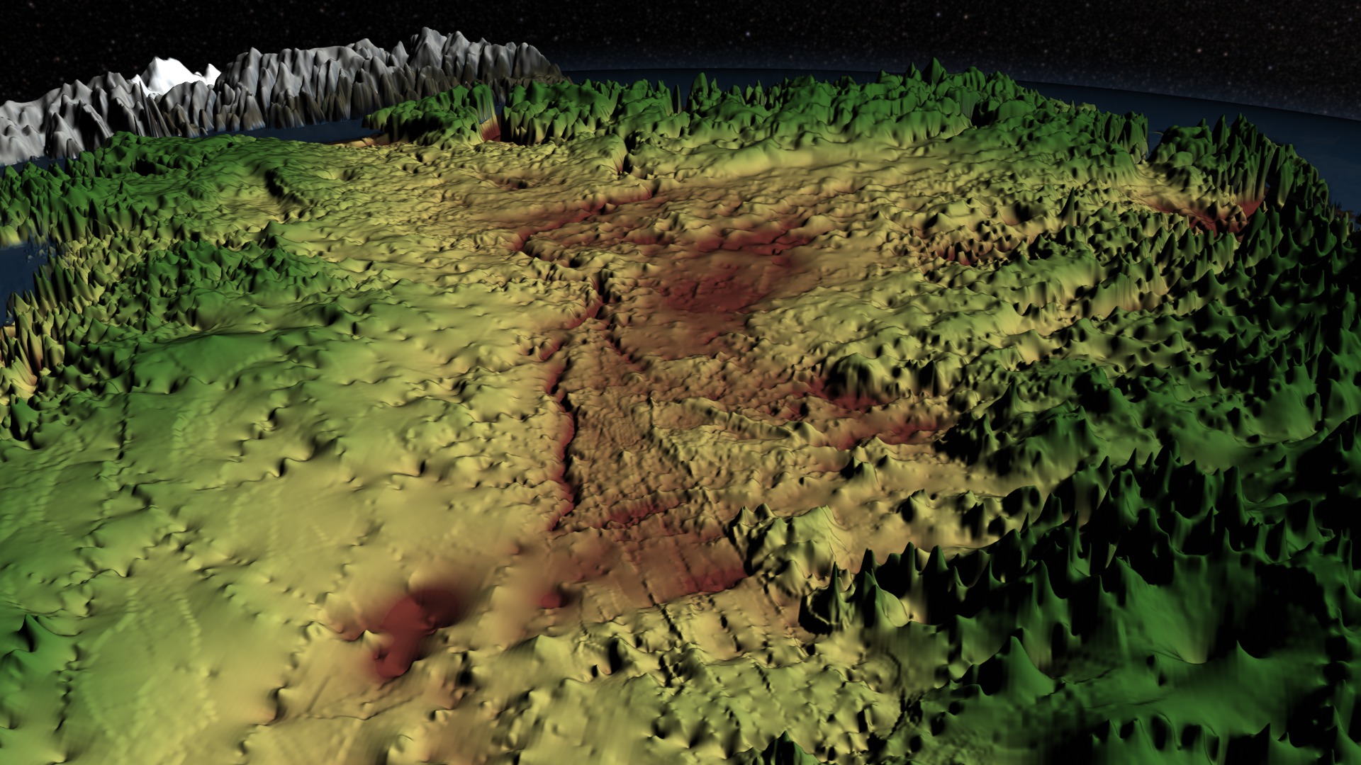
Greenland's Mega-Canyon beneath the Ice Sheet
Go to this pageSubglacial topography plays an important role in modulating the distribution and flow of meltwater beneath the ice known as basal water flow. This animation portrays topographic data of the bedrock under the Greenland ice sheet derived from ice-penetrating radar data. Clearly evident in the topography is a 750-km-long subglacial canyon in northern Greenland that is likely to have influenced basal water flow from the ice sheet interior to the margin. The authors suggest that the mega-canyon predates ice sheet inception and has influenced basal hydrology in Greenland over past glacial cycles. (See reference under "Science Paper" below)Starting with a view of the surface of Greenland, the animation zooms closer to the surface as the ice sheet is stripped away to reveal the false-color topography of the bedrock that lies beneath. Regions above sea level are shown in shades of green while areas below zero are colored by shades of brown. Yellow indicates the area near sea level. The topography is exaggerated from 12 to 40 times in order to accentuate the topographic relief. Visible in the topography from about the midpoint of Greenland to its Northwest coast is the 750-km-long subglacial canyon described by the authors. ||
Ernie Wright's Visualization Choices
- ID: 4427
 Visualization
 - ID: 4404
 Visualization
 - ID: 4356
- ID: 4349
 Visualization
 - ID: 4341
- ID: 4242
 Visualization
 - ID: 4185
 Visualization
 - ID: 4075
 Visualization
 - ID: 4057
 Visualization
 - ID: 4014
 Visualization
 - ID: 3818
 Visualization
 - ID: 3728
 Visualization
 - ID: 3866
 Visualization
 - ID: 3690
- ID: 3662
 Visualization
Cheng Zhang's Visualization Choices
- ID: 4334 Visualization
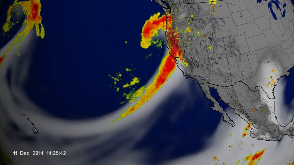
Atmospheric River Reaching California
Go to this pageAn atmospheric river occured between 9th and 12th of Dec. 2014 over the Pacific Ocean and Southwest US. || tm_atmosphericRiver_waterVapor_Imerg_4xSlow_0_print.jpg (1024x576) [112.1 KB] || tm_atmosphericRiver_waterVapor_Imerg_4xSlow_0_searchweb.png (320x180) [73.4 KB] || tm_atmosphericRiver_waterVapor_Imerg_4xSlow_0_thm.png (80x40) [6.1 KB] || tm_atmosphericRiver_waterVapor_Imerg_4xSlow_0_web.png (320x180) [73.4 KB] || tm_atmosphericRiver_waterVapor_Imerg_4xSlow_0.mp4 (1920x1080) [5.5 MB] || atmosphericRiverOnly (1920x1080) [32.0 KB] || tm_atmosphericRiver_waterVapor_Imerg_4xSlow_0.webm (1920x1080) [1.0 MB] || tm_atmosphericRiver_waterVapor_Imerg_4xSlow_0001_720p30.mp4 (1280x720) [3.1 MB] || tm_atomsphericRiver_waterWapor_Imerg_4xSlow_f24453.tif (5760x3240) [19.1 MB] || tm_atmosphericRiver_waterVapor_Imerg_4xSlow_0001_360p30.mp4 (640x360) [1.2 MB] ||
Visualization Experiments and Behind-the-Scenes Videos
- ID: 4180 Visualization
Volume-Rendered Global Atmospheric Model
Go to this pageThis visualization shows early test renderings of a global computational model of Earth's atmosphere based on data from NASA's Goddard Earth Observing System Model, Version 5 (GEOS-5). This particular run, called 7km GEOS-5 Nature Run (7km-G5NR), was run on a supercomputer, spanned 2 years of simulation time at 30 minute intervals, and produced petabytes of output. The model uses a 7.5 km cube-sphere parameterization. Geographic coordinate output volumes from the model are 5760 x 2881 x 72 voxels per time step. For each voxel numerous physical parameters are available such as temperature, wind speed and direction, pressure, humidity, etc. This visualziation uses a combination of the CLOUD and TAUIR parameters.The visualization spans a little more than 7 days of simulation time which is 354 time steps. The time period was chosen because a simulated category-4 typhoon developed off the coast of China. The frames were rendered using Renderman. Brickmap volumes generated for each time step are about 2.6 gigabytes. This short visualization referenced nearly a terabyte of brickmap files. The 7 day period is repeated several times during the course of the visualization.This visualization was presented at SIGGRAPH 2014 during the Dailies session. ||
- ID: 4174 Visualization
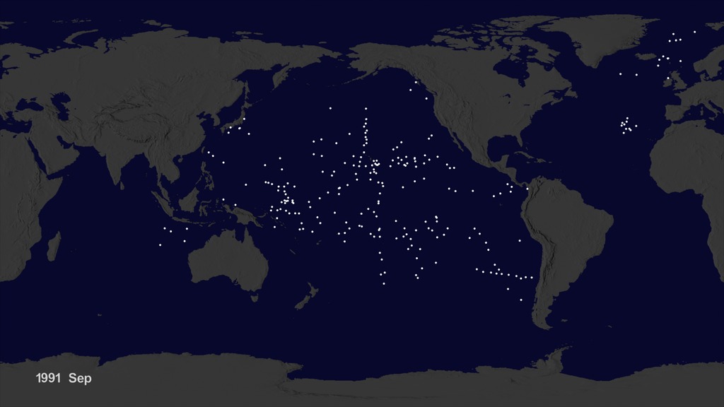
Garbage Patch Visualization Experiment
Go to this pageWe wanted to see if we could visualize the so-called ocean garbage patches. We start with data from floating, scientific buoys that NOAA has been distributing in the oceans for the last 35-year represented here as white dots. Let's speed up time to see where the buoys go... Since new buoys are continually released, it's hard to tell where older buoys move to. Let's clear the map and add the starting locations of all the buoys... Interesting patterns appear all over the place. Lines of buoys are due to ships and planes that released buoys periodically. If we let all of the buoys go at the same time, we can observe buoy migration patterns. The number of buoys decreases because some buoys don't last as long as others. The buoys migrate to 5 known gyres also called ocean garbage patches.We can also see this in a computational model of ocean currents called ECCO-2. We release particles evenly around the world and let the modeled currents carry the particles. The particles from the model also migrate to the garbage patches. Even though the retimed buoys and modeled particles did not react to currents at the same times, the fact that the data tend to accumulate in the same regions show how robust the result is.The dataset used for the ocean buoy visualization is the Global Drifter Database from the GDP Drifter Data Assembly Center, part of the NOAA Atlantic Oceanographic & Meteorological Laboratory. The data covered the period February 1979 through September 2013. Although the actual dataset has a wealth of data, including surface temperatures, salinities, etc., only the buoy positions were used in the visualization.This visualization was accepted as one of the "Dailies" at SIGGRAPH 2015. ||
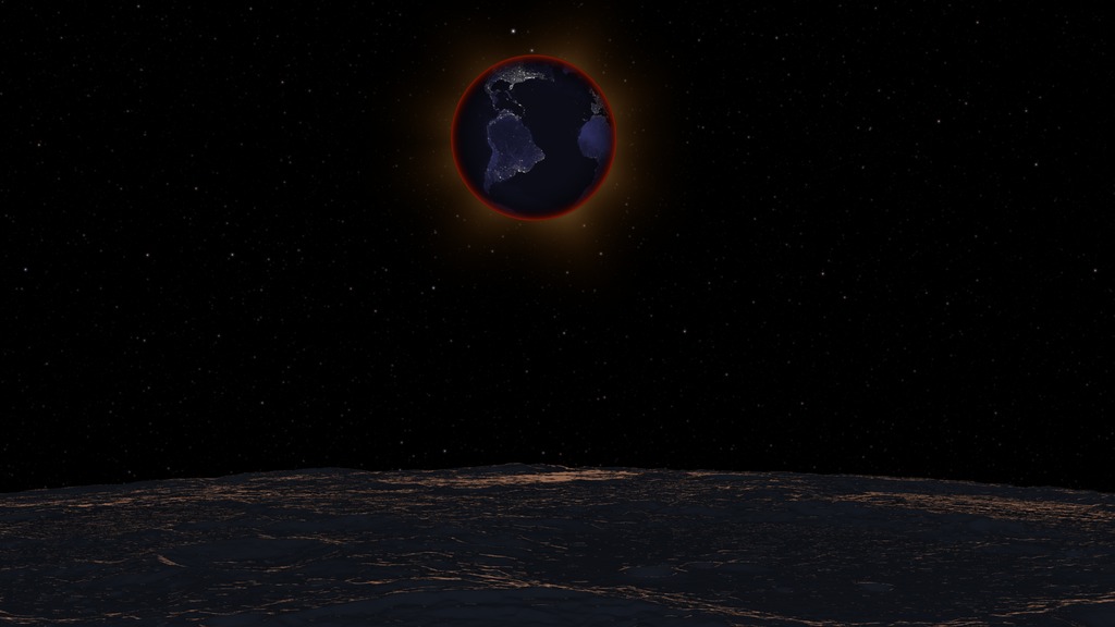
- ID: 3621 Visualization
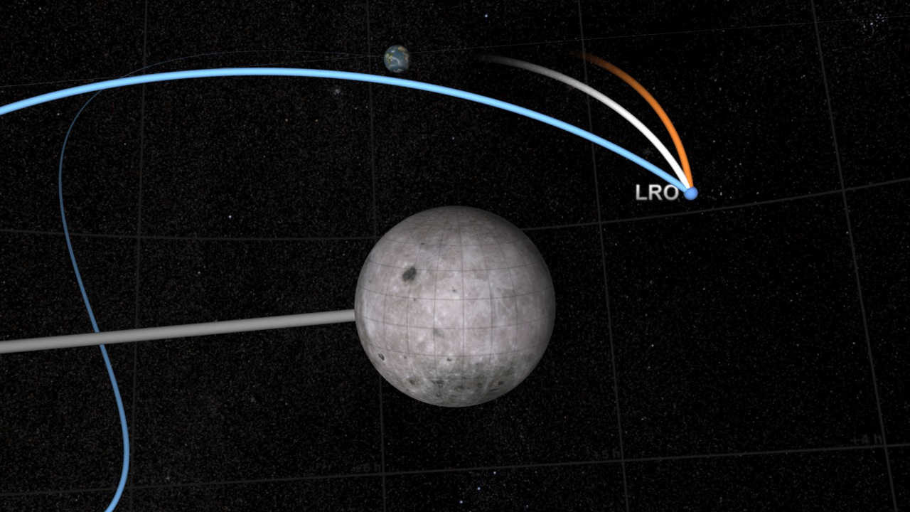
LRO Transition from Earth-Centered to Moon-Centered Coordinates
Go to this pageThis animation illustrates the solution to a human factors problem in the visualization of an orbit path, in this case the launch and lunar orbit insertion of the Lunar Reconnaissance Orbiter satellite.The visualization (found HERE) shows LRO orbiting the Earth, traveling from the Earth to the moon, and entering lunar orbit. Throughout the visualization, a trail is drawn to show LRO's path. This trail is a history of LRO's motion.The viewer's expectation is that LRO first travels in a circular orbit centered on the Earth, then follows a smoothly curving path connecting the Earth to the moon, and finally enters an elliptical orbit around the moon. The problem for the animator is that an accurate trail satisfying all of these expectations is impossible to draw in a single coordinate system. A trail drawn in Earth-centered coordinates forms a looping, spring-like path when LRO enters lunar orbit, and a trail drawn in moon body-fixed coordinates becomes disconnected from the Earth and precesses through space.Simply switching from one coordinate system to the other would make the trail appear to jump suddenly and dramatically. Creating a hybrid trail would leave a visually confusing elbow in LRO's path.The solution illustrated here is to morph the trail from one coordinate system to the other. The blue trail is the Earth-centered path, the orange trail is the moon body-fixed path, and the white trail is the morph between the two. In the visualization, the Earth trail shortens, disconnecting it from the Earth, and then morphs over about 400 frames into the moon body-fixed trail. With careful timing, the result is a visually seamless transition from one coordinate system to the other.Notice that the difference in coordinate systems creates no ambiguity about the present position of LRO at any given time. LRO is always at the intersection of the trails. The problem arises when attempting to depict the history of its motion. That history takes different shapes in coordinate systems that move relative to one another.An animation showing LRO's entire path in both coordinate systems simultaneously can be found HERE. ||
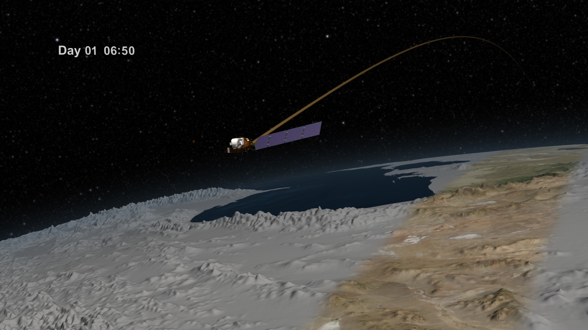
- ID: 3618 Visualization
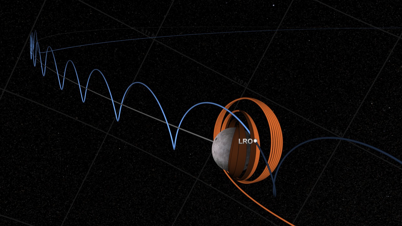
LRO in Earth Centered and Moon Centered Coordinates
Go to this pageThis visualization shows the Lunar Reconnaissance Orbiter (LRO) orbit insertion from two different points of view (i.e., coordinate systems): Earth centered inertial coordinates and moon centered fixed coordinates. Orbit trails are shown in bright colors where the orbits have been and in darker colors for where the orbits will be. At any particular time, LRO is exactly at the intersection of the two orbit trail curves. The Earth centered coordinates are in blue and the moon centered coordinate are in orange.Why are there two different trails?Because the moon is moving, the moon centered coordinate system is moving. If the moon was stationary with respect to the Earth, both trails would look the same; but since the moon is moving, the moon's trail is always moving and the trails look different.Think of LRO orbiting the moon. From the moon's perspective, it's just going in an ellipse around the moon. In this case, the observation point (the moon) is moving with LRO. But, from the Earth's perspective, if you plotted out the trail of LRO, you would get a series of loops as LRO goes around the moon and as the moon moves through the sky.Animating an orbit trail that changes between two discrete coordinate systems is a challenge. A discontinuity arises if you just switch over from one trail to another. To animate a smooth transition one solution is to carefully select sections of the Earth centered and moon centered curves and then morph from the Earth centered curve section to the moon centered curve section while the animation was playing. This technique was used here as well. ||
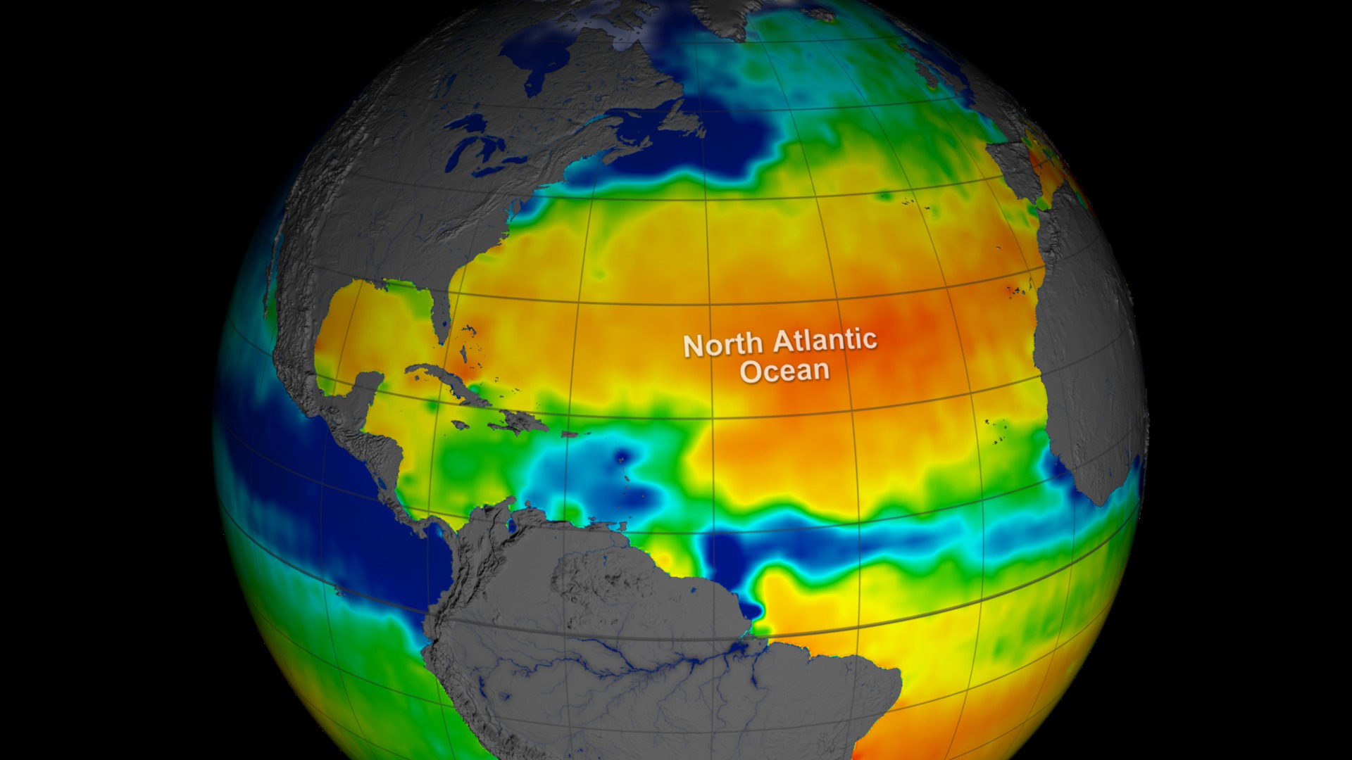
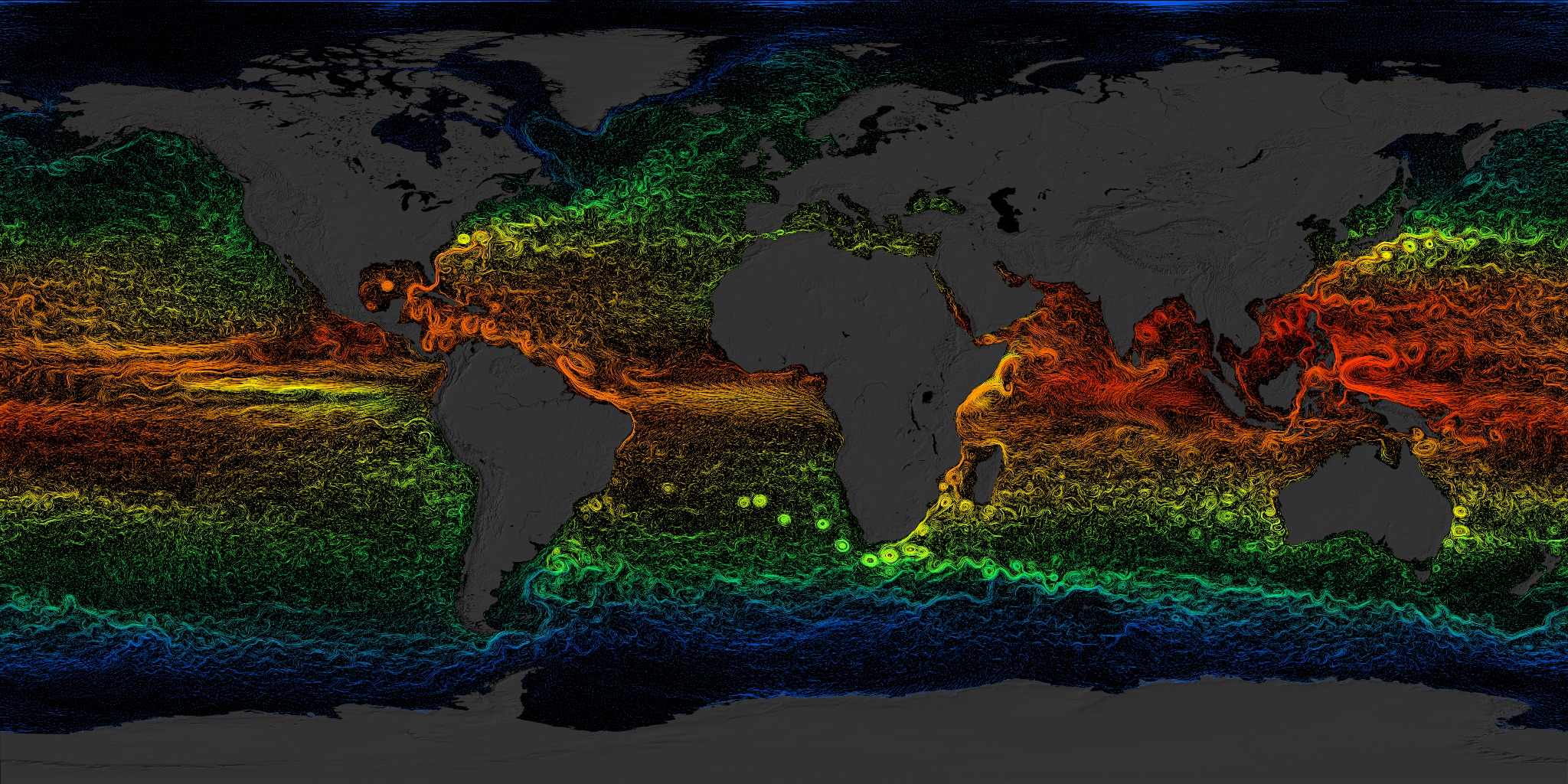
- ID: 3884 Visualization
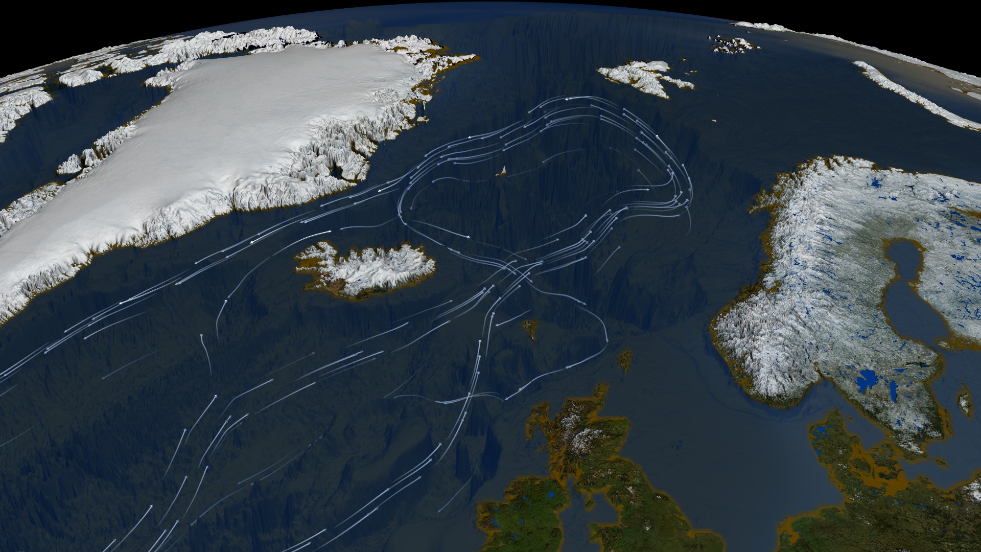
Thermohaline Circulation using Improved Flow Field
Go to this pageThe oceans are mostly composed of warm salty water near the surface over cold, less salty water in the ocean depths. These two regions don't mix except in certain special areas. The ocean currents, the movement of the ocean in the surface layer, are driven primarily by the wind. In certain areas near the polar oceans, the colder surface water also gets saltier due to evaporation or sea ice formation. In these regions, the surface water becomes dense enough to sink to the ocean depths. This pumping of surface water into the deep ocean forces the deep water to move horizontally until it can find an area on the world where it can rise back to the surface and close the current loop. This usually occurs in the equatorial ocean, mostly in the Pacific and Indian Oceans. This very large, slow current is called the thermohaline circulation because it is caused by temperature and salinity (haline) variations.This animation shows one of the major regions where this pumping occurs, the North Atlantic Ocean around Greenland, Iceland, and the North Sea. The surface ocean current brings new water to this region from the South Atlantic via the Gulf Stream and the water returns to the South Atlantic via the North Atlantic Deep Water current. The continual influx of warm water into the North Atlantic polar ocean keeps the regions around Iceland and southern Greenland generally free of sea ice year round.The animation also shows another feature of the global ocean circulation: the Antarctic Circumpolar Current. The region around latitude 60 south is the only part of the Earth where the ocean can flow all the way around the world with no obstruction by land. As a result, both the surface and deep waters flow from west to east around Antarctica. This circumpolar motion links the world's oceans and allows the deep water circulation from the Atlantic to rise in the Indian and Pacific Oceans, thereby closing the surface circulation with the northward flow in the Atlantic.The color on the world's ocean's at the beginning of this animation represents surface water density, with dark regions being most dense and light regions being least dense (see the animation Sea Surface Temperature, Salinity and Density). The depths of the oceans are highly exaggerated (100x in oceans, 20x on land) to better illustrate the differences between the surface flows and deep water flows. The actual flows in this model are based on current theories of the thermohaline circulation rather than actual data. The thermohaline circulation is a very slow moving current that can be difficult to distinguish from general ocean circulation. Therefore, it is difficult to measure or simulate.This version of the visualization combines the Earth look of the original thermohaline visualization with the new thermohaline flow field generated for the Science On a Sphere production, "Loop".This version is also designed so it can be played on 3x3 or 5x3 hyperwalls. When playing on a 3x3 hyperwall, use b1 -> d3 tiles. Each individual image tile is 1368x768. ||
- ID: 4273 Visualization
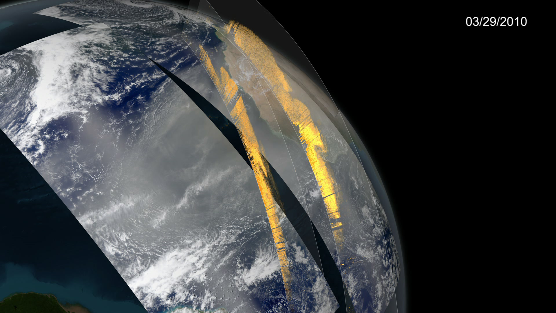
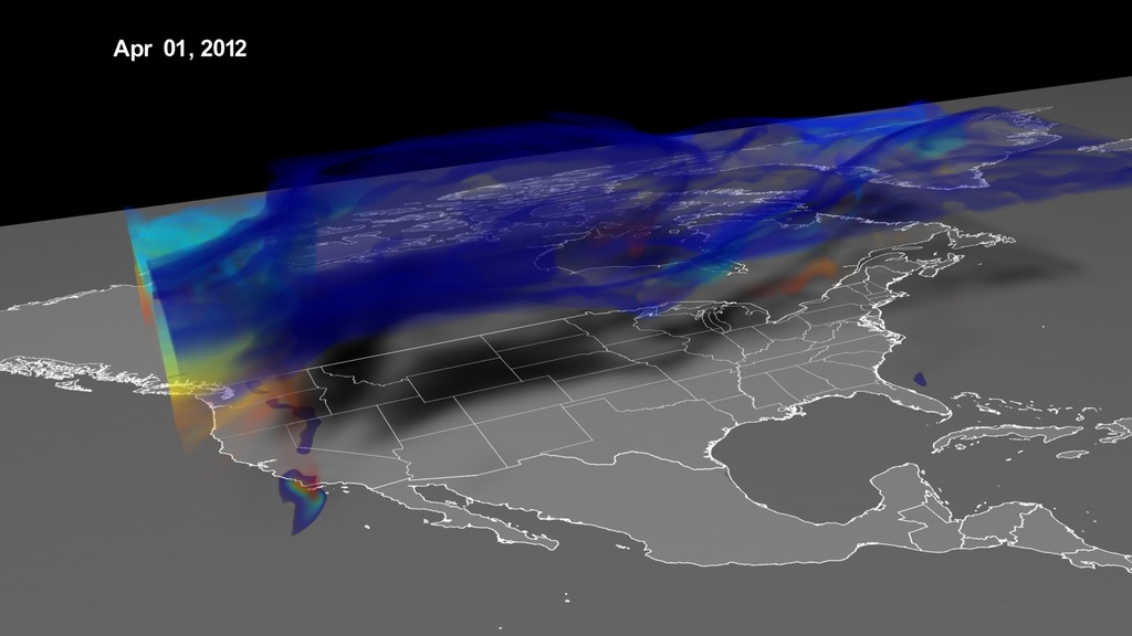
CALIPSO observes Saharan dust crossing the Atlantic Ocean
Go to this pageSubtitled visualization depicting Saharan dust travelling across the Atlantic Ocean to the Amazon Basin. MODIS imagery shows a 2D representation of the dust cloud, which is then compared to CALIPSO data curtains showing dust throughout the air column. Seasonal dust flux measurements are visualized using particles systems. Finally, average annual dust deposition into the Amazon Basin is shown by Amazon boundary import/export measurements. || Dust_Entire_1080p_60fps.3072_print.jpg (1024x576) [124.9 KB] || Dust_Entire_1080p_60fps.3072_searchweb.png (180x320) [69.8 KB] || Dust_Entire_1080p_60fps.3072_web.png (320x180) [69.8 KB] || Dust_Entire_1080p_60fps.3072_thm.png (80x40) [5.4 KB] || SaharanDust_720p_60fps.mp4 (1280x720) [73.6 MB] || SaharanDust_1080p_60fps.webm (1920x1080) [12.3 MB] || SaharanDust_1080p_60fps.mp4 (1920x1080) [189.6 MB] || entire_4k (3840x2160) [0 Item(s)] || Dust_4k_30fps_2160p.mp4 (3840x2160) [365.9 MB] ||
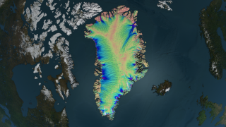
- ID: 4308 Visualization
SIGGRAPH Daily 2015: How did we tile Greenland?
Go to this pageThis narrated animation shown as a Daily at SIGGRAPH 2015 describes a method of automatically mapping of 87 gigapixels of data over Greenland. For complete transcript, click here.This video is also available on our YouTube channel. || Radarsat_Daily.2178_print.jpg (1024x576) [186.4 KB] || Radarsat_Daily.2178_thm.png (80x40) [7.1 KB] || Radarsat_Daily.2178_searchweb.png (180x320) [106.4 KB] || 1920x1080_16x9_30p (1920x1080) [256.0 KB] || 4308_Tiling_Greenland_appletv_subtitles.m4v (1280x720) [47.1 MB] || 4308_Tiling_Greenland_VX-70360.webm (1280x720) [9.0 MB] || 1280x720_16x9_30p (1280x720) [256.0 KB] || 4308_Tiling_Greenland_H264_1080p.mp4 (1920x1080) [133.1 MB] || 4308_Tiling_Greenland_prores.mov (1920x1080) [1.5 GB] || 4308_Tiling_Greenland_1280x720.wmv (1280x720) [37.5 MB] || 4308_Tiling_Greenland_VX-70360.mpeg (1280x720) [366.2 MB] || 4308_Tiling_Greenland_appletv.m4v (1280x720) [47.0 MB] || 4308_Tiling_Greenland_youtube_hq.mov (1280x720) [161.9 MB] || 4308_Tiling_Greenland_H264_1080p.mov (1920x1080) [133.1 MB] || 4308_Tiling_Greenland.en_US.srt [2.0 KB] || 4308_Tiling_Greenland.en_US.vtt [1.9 KB] || 4308_Tiling_Greenland_ipod_sm.mp4 (320x240) [21.1 MB] ||
- ID: 4137 Visualization

SVS Animation Sampler
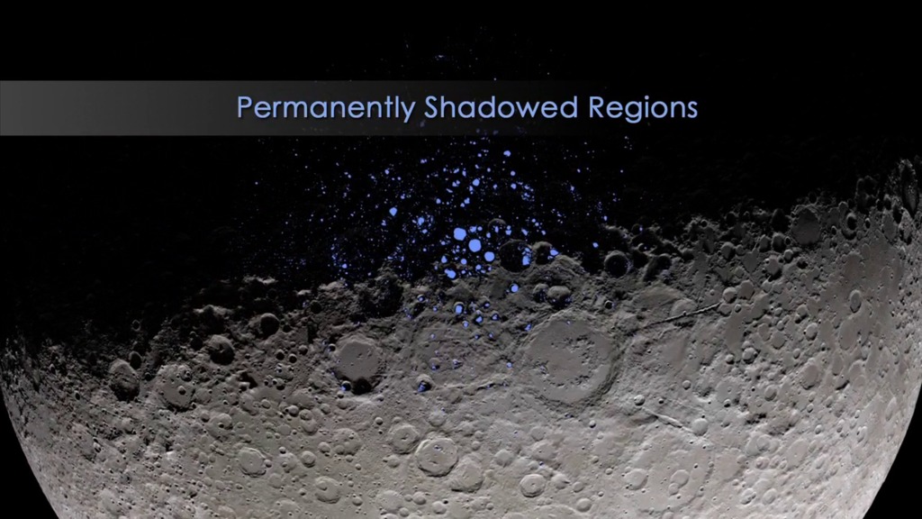
Go to this pageThe SVS Animation Sampler features a collection of thirty three recent animations created in the Scientific Visualization Studio. A short segment is shown from each animation. The speed of playback on some segments has been altered in order to include more of the original animation in the time allowed. A table enumerating each animation included in this sampler is displayed below. The full animations along with the documentation for each can be accessed through the links listed in the table. In addition, a PDF document that briefly summarizes each animation is available here.1. CME Strikes the Earth17. GPM Instruments2. CME Research Model18. Orbits of Landsat-83. Moon's Phase and Libration19. Landsat-8 Band Remix4. Moon's Permanently Shadowed Regions20. Landsat Land Use Change: 25 Years5. Lunar Topography21. Chelyabinsk Bolide Plume6. Global Hawk Measures Convection in "Hot Tower"22. Antarctic Ocean Flows7. Global Hawk Observes Saharan Air Layer23. Ice-Penetrating Radar8. GOES-5 Hurricane Simulation24. Antarctic Bedrock9. Perpetual Ocean25. Sea Ice10. IPCC Temperature Projection26. Snow Cover11. Van Allen Probes View Radiation Belts27. Active Fires12. Comet ISON28. Drought13. Lunar Maps29. Nile Basin Water Balance14. Orbits of Weather Satellites30. Greenland's Ice Sheet Flow15. NASA's Earth Observing Fleet31. Greenland's Mega-Canyon16. Landsat-8 Long Swath32. Solar Dynamics Observatory 33. Earthrise ||
- ID: 4469 Visualization
Dynamic Earth-A New Beginning
Go to this pageThe visualization 'Excerpt from "Dynamic Earth"' has been one of the most popular visualizations that the Scientific Visualization Studio has ever created. It's often used in presentations and Hyperwall shows to illustrate the connections between the Earth and the Sun, as well as the power of computer simulation in understanding those connections.There is one part of this visualization, however, that has always seemed a little clumsy to us. The opening shot is a pullback from the limb of the sun, where the sun is represented by a movie of 304 Angstrom images from the Solar Dynamics Observatory (SDO). It is difficult to pull back from the limb of a flat sun image and make the sun look spherical, and the problem was made more difficult because the original sun images were in a spherical dome show format. As a result, the pullback from the sun showed some odd reprojection artifacts.The best solution to this issue was to replace the existing pullout with a new one, one which pulled directly out from the center of the solar disk. For the new beginning, we chose a series of SDO images in the 171 Angstrom channel that show a visible coronal mass ejection (CME) in the lower right corner of the solar disk. Although this is not the specific CME that is seen affecting Venus and Earth later in this visualization, its presence links the SDO animation thematically to the later solar storm. The SDO images were also brightened considerably and tinted yellow to match the common perception of the Sun as a bright yellow object (even though it is actually white).Please go to the original version of this visualization to see the complete credits and additional details. ||