What's New with Earth Today
Overview
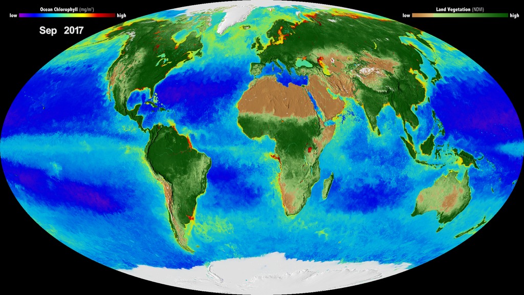
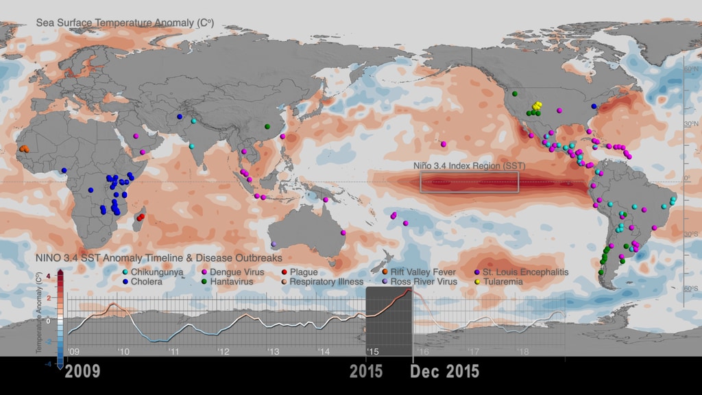
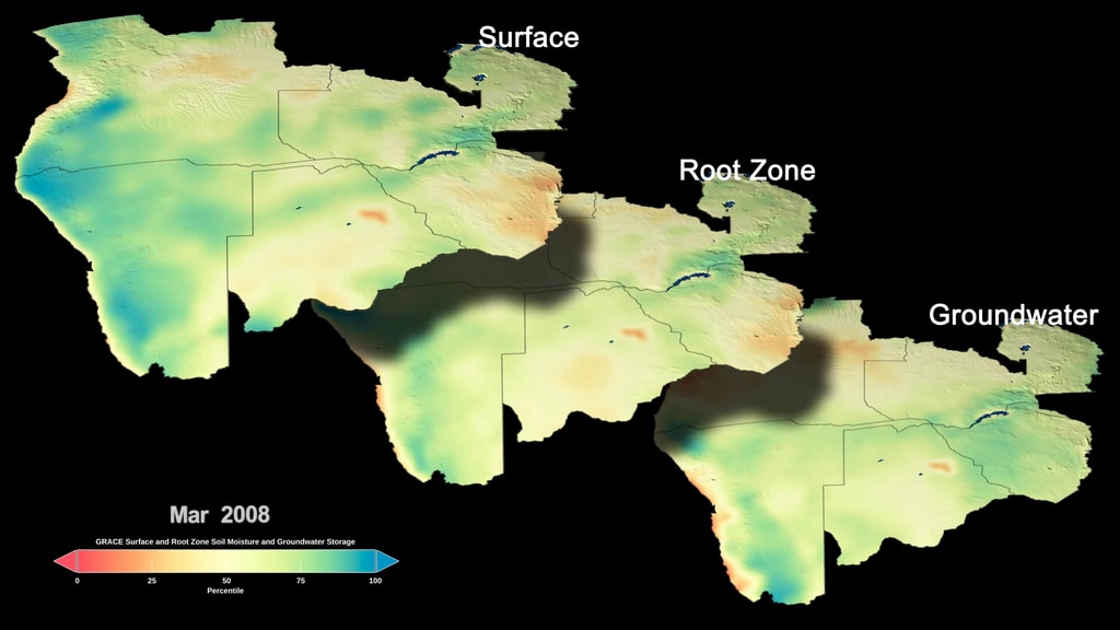
Explore the latest visualizations of NASA's Earth Observing satellites and the data they collect. NASA researchers are constantly tracking remote-sensing data and modeling processes to better understand our home planet.
Latest Earth Visuals
- ID: 5046
 Visualization
 Section
- ID: 5113
 Visualization
 - ID: 5070
 Visualization
  Section
 Section
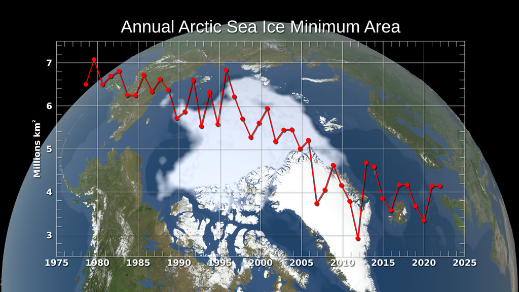
 Section
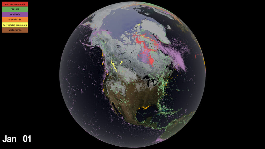
- ID: 4993
 Visualization
 - ID: 4992
 Visualization
 Section
- ID: 4971

- ID: 4976
 Visualization
 - ID: 4960
- ID: 4990
 Section
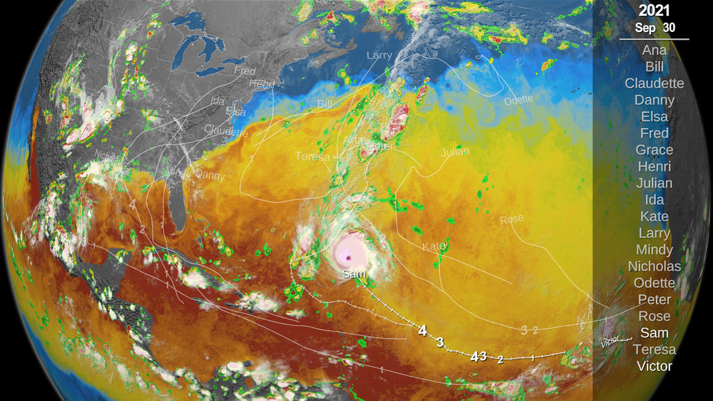
- ID: 5059
 Visualization
 - ID: 5091
 Visualization
 Section
- ID: 31166
 Visualization
 - ID: 31156
 Visualization
 - ID: 31158
 Visualization
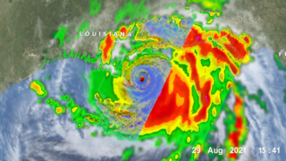
- ID: 4877
- ID: 4947
 Visualization
 - ID: 4853
 Visualization
 - ID: 40249
 Gallery
 - ID: 40170
 Gallery
 - ID: 4804
 Visualization
 - ID: 4834
- ID: 4847
 Visualization
- ID: 4820
 Visualization
  Section
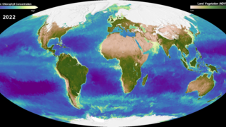
- ID: 4596
 Visualization
 - ID: 4765
- ID: 31100
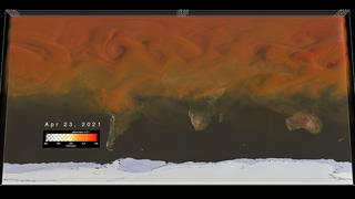
 Hyperwall Visual
 - ID: 4806
 Visualization
 - ID: 13577
![VIDEO: "Witness the Breathtaking Beauty of Earth’s Polar Regions"
Operation IceBridge recorded the diversity and fragility of our rapidly changing polar regions. These areas are some of the most inhospitable, but breathtaking places on Earth. Sit back and witness the polar regions, from western Greenland to Antarctica. Notable features include the Pine Island Glacier, Larsen C ice shelf, and rapid summer melt on the western Greenland Ice Sheet.
Learn more: Operation IceBridge
Music Provided by Universal Production Music: "Arabesque No.1" by Claude Debussy [PD]
This video is also available on our YouTube channel.](/vis/a010000/a013500/a013577/13577_Cryosphere_Beauty_Classic.00018_print.jpg)
- ID: 4800
 Visualization
 - ID: 4745
 Visualization
 - ID: 4794
 Visualization
 - ID: 4754
- ID: 4837
 Visualization
  Section
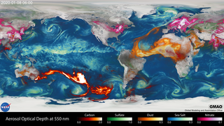
![Tracking aerosols over land and water from August 1 to November 1, 2017. Hurricanes and tropical storms are obvious from the large amounts of sea salt particles caught up in their swirling winds. The dust blowing off the Sahara, however, gets caught by water droplets and is rained out of the storm system. Smoke from the massive fires in the Pacific Northwest region of North America are blown across the Atlantic to the UK and Europe. This visualization is a result of combining NASA satellite data with sophisticated mathematical models that describe the underlying physical processes.Music: Elapsing Time by Christian Telford [ASCAP], Robert Anthony Navarro [ASCAP]Complete transcript available.Watch this video on the NASA Goddard YouTube channel.](/vis/a010000/a012700/a012772/12772_hurricanes_and_aerosols_1080p_youtube_1080.00001_searchweb.png)
- ID: 4984
 Visualization
Earth Day
- ID: 13586
 Produced Video
 - ID: 4817
 Visualization
 - ID: 4815
 Visualization
 - ID: 4816
- ID: 4818
 Visualization
 - ID: 4819
 Visualization
 - ID: 4809
- ID: 4801
 Visualization
 - ID: 4813
 Visualization
 - ID: 4802
- ID: 4798
 Visualization
COVID-19 Earth Observations
As cities and countries locked down during COVID-19, some changes were visible from space.
- ID: 13650 Produced Video
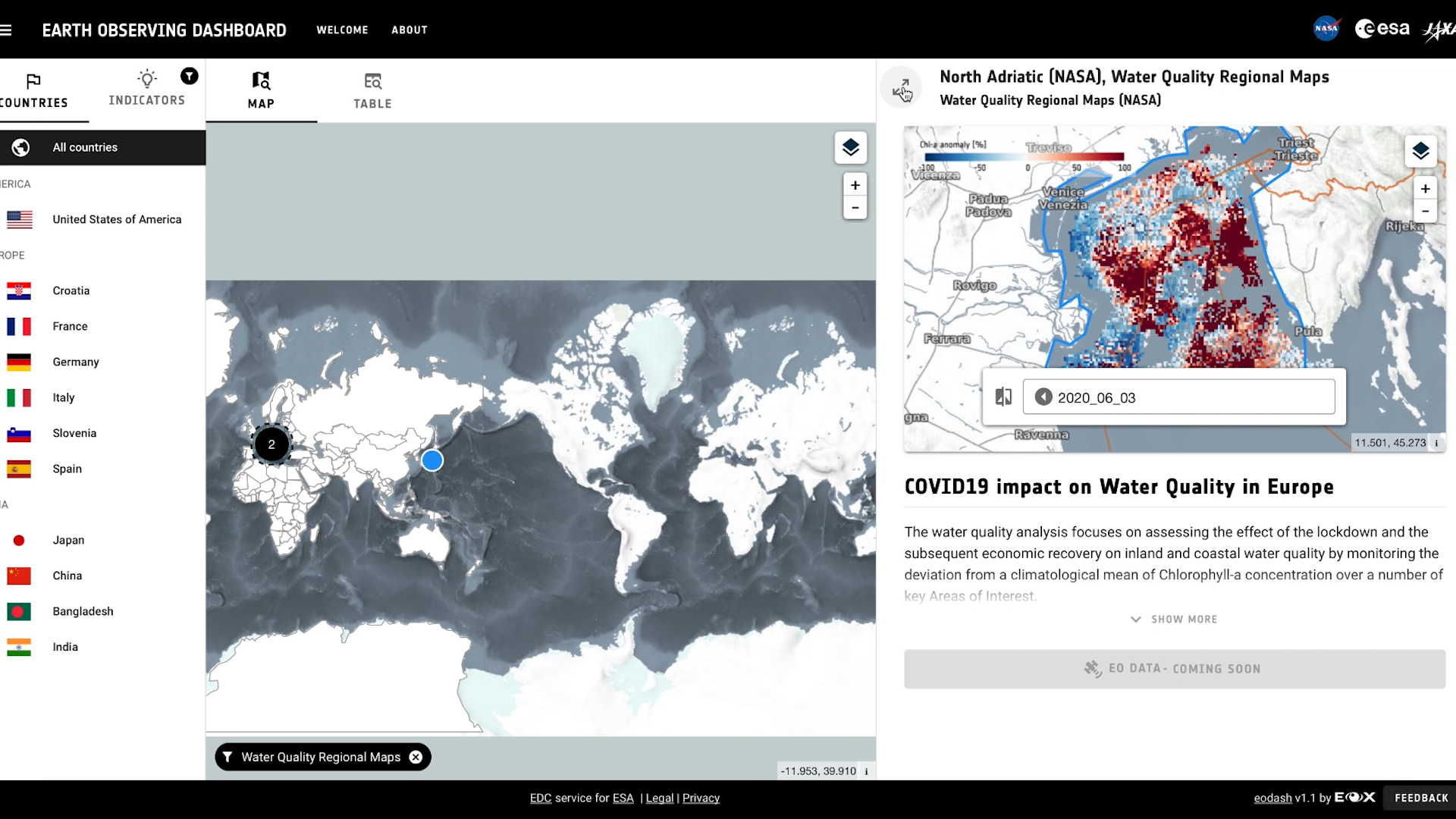
NASA, ESA and JAXA Partner to Create COVID-19 Earth Observation Dashboard
Go to this pageAs cities and countries locked down during COVID-19, some changes were visible from space. NASA, ESA and JAXA have partnered to create a dashboard making those data available.Read more: https://www.nasa.gov/press-release/nasa-partner-space-agencies-amass-global-view-of-covid-19-impacts ||
- ID: 13647 Produced Video
NASA, ESA, JAXA Release Global View of COVID-19 Impacts
Go to this pageNASA, ESA (European Space Agency) and JAXA (Japan Aerospace Exploration Agency) have created a dashboard of satellite data showing impacts on the environment and socioeconomic activity caused by the global response to the coronavirus (COVID-19) pandemic.The dashboard will be released on Thursday, June 25 during a tri-agency media briefing. The briefing speakers are:•Josef Aschbacher, director of ESA Earth Observation Programmes•Thomas Zurbuchen, associate administrator of NASA’s Science Mission Directorate•Koji Terada, vice president and director general for the Space Technology Directorate at JAXA•Shin-ichi Sobue, project manager for JAXA’s ALOS-2 mission•Ken Jucks, program scientist for NASA’s OCO-2 and Aura missions•Anca Anghelea, open data scientist, ESA Earth observation programmes ||
- ID: 4835 Visualization
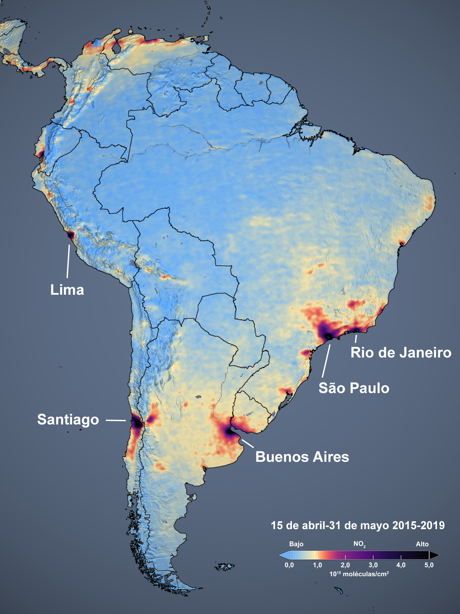
NO2 Decline Related to Restrictions Due to COVID-19 in South America
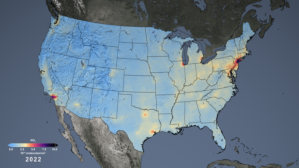
Go to this pageOn June 1, the World Health Organization noted that Central and South American countries have become “the intense zones” for COVID-19 transmission. The Ozone Monitoring Instrument (OMI) on board NASA’s Aura satellite provides data that indicate that restrictions on human activity have led to about a 36% decrease in NO2 levels in Rio de Janeiro, Brazil, relative to previous years. Other large cities in South America show similar decreases in NO2: 36% in Santiago, Chile; 35% in São Paolo, Brazil; and 40% in Buenos Aires, Argentina. One notable exception is in Lima, Peru, showing a 69% decrease. The large decrease may partly be associated with natural variations in weather that can, for instance, disperse air pollution more quickly. Additional analysis is required to determine the amount of the decrease of NO2 in Lima that is associated with a decrease in human activity. A notable increase in NO2 occurred in northern South America, which is likely associated with increased agricultural burning in 2020 relative to previous years. ||
- ID: 4810 Visualization
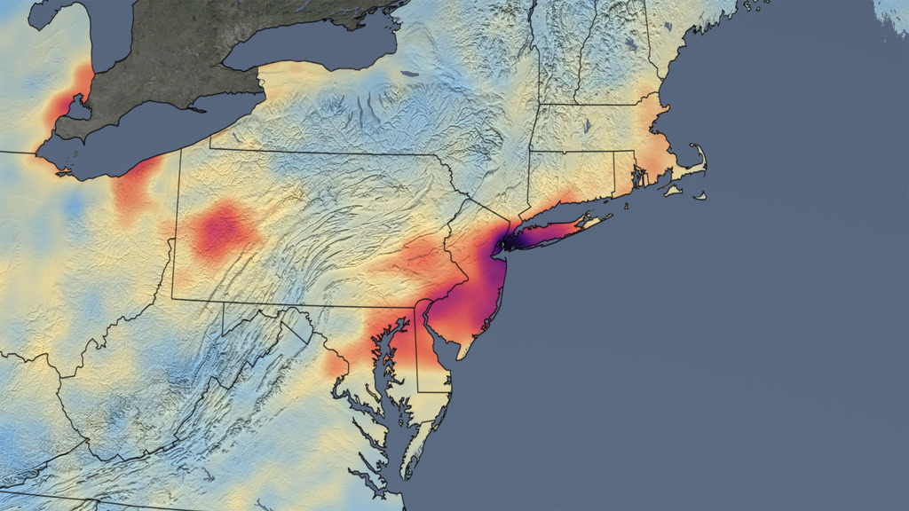
Reductions in Pollution Associated with Decreased Fossil Fuel Use Resulting from COVID-19 Mitigation
Go to this pageOver the past several weeks, the United States has seen significant reductions in air pollution over its major metropolitan areas. Similar reductions in air pollution have been observed in other regions of the world. || Tropospheric NO2 Column, Animated GIF || cropped_NO2_2019_2020.gif (848x862) [54.4 MB] || cropped_NO2_2019_2020_print.jpg (1024x1040) [318.2 KB] || cropped_NO2_2019_2020_searchweb.png (320x180) [102.2 KB] ||
- ID: 31144 Hyperwall Visual
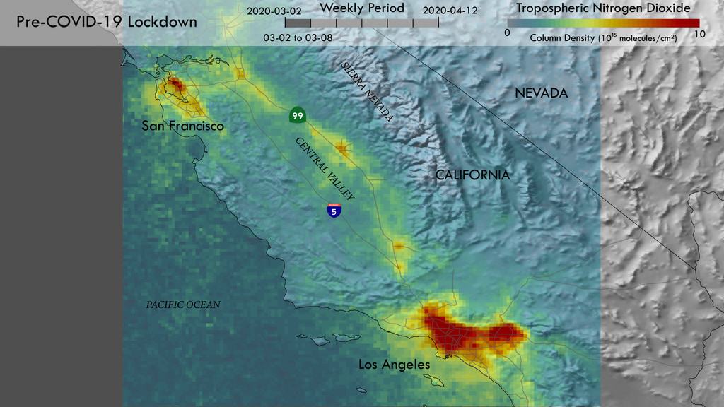
New-Generation Satellite Observations Monitor Air Pollution During COVID-19 Lockdown Measures in California
Go to this pageTROPOMI Nitrogen Dioxide animation. || tropomi_california_20200302_20200308_print.jpg (1024x576) [179.6 KB] || tropomi_california_20200302_20200308_searchweb.png (320x180) [95.9 KB] || tropomi_california_20200302_20200308_thm.png (80x40) [6.5 KB] || tropomi_california_covid-19_1080p.mp4 (1920x1080) [2.9 MB] || tropomi_california_covid-19_720p.mp4 (1280x720) [1.7 MB] || tropomi_california_covid-19_720p.webm (1280x720) [1.6 MB] || tropomi_california_20200302_20200308.tif (3840x2160) [7.5 MB] || tropomi_california_20200309_20200315.tif (3840x2160) [7.5 MB] || tropomi_california_20200316_20200322.tif (3840x2160) [7.4 MB] || tropomi_california_20200323_20200329.tif (3840x2160) [7.3 MB] || tropomi_california_20200330_20200405.tif (3840x2160) [7.3 MB] || tropomi_california_20200406_20200412.tif (3840x2160) [7.4 MB] || tropomi_california_covid-19_2160p.mp4 (3840x2160) [8.3 MB] || tropomi_california_covid-19_1080p.hwshow [115 bytes] ||
- ID: 31142 Hyperwall Visual
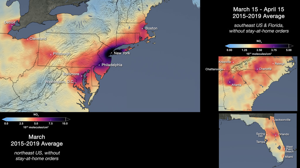
COVID-19: NASA Satellite Data Show Drop in Air Pollution Over U.S.
Go to this pageTropospheric NO2 Column, March 15-April 15 2015-2019 average vs. 2020, USA regions || 3-regions_1080p.00001_print.jpg (1024x576) [141.7 KB] || 3-regions_1080p.00001_searchweb.png (320x180) [62.9 KB] || 3-regions_1080p.00001_thm.png (80x40) [5.2 KB] || 3-regions_1080p.mp4 (1920x1080) [1.9 MB] || 3-regions_720p.mp4 (1280x720) [1.0 MB] || 3-regions_1080p.webm (1920x1080) [2.3 MB] || 3-regions_2160p.mp4 (3840x2160) [5.6 MB] ||