Air Quality
Overview
Air is all around us, but it’s hard to see when harmful particulates are, too. That’s why we use NASA’s Earth-observing satellites to track air quality on our home planet. The data they generate are incorporated into products like the U.S. Air Quality Index the public uses to make decisions that protect their health and well-being.
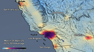
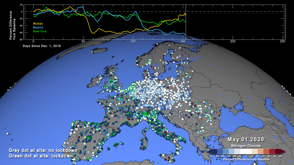
Air Quality- Nitrogen Dioxide Changes related to COVID-19
- ID: 4810
- ID: 4835
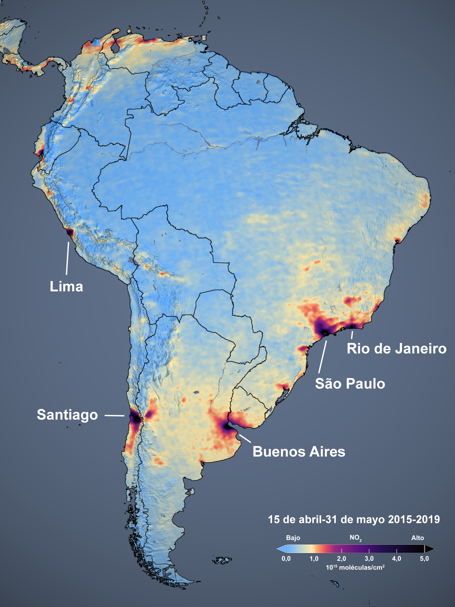
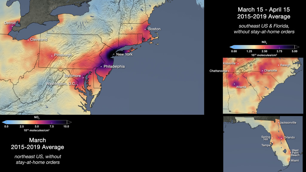
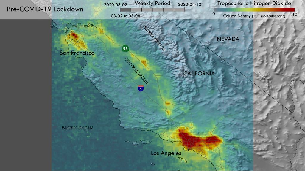
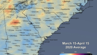
- ID: 31142
 Hyperwall Visual
 - ID: 31144
- ID: 4872
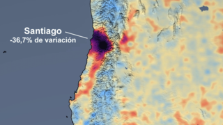
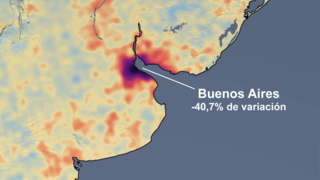
Air Quality - Sulfur Dioxide Measurement Changes related to COVID-19
- Section
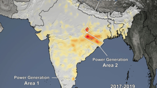
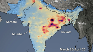
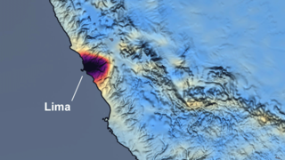
India - Reductions in Sulfur Dioxide Associated with Decreased Fossil Fuel Use Resulting from COVID-19 Mitigation
Go to this sectionAnimated Gif - Tropospheric SO2 Column, March 25-April 25 time series of Indian Subcontinent. On March 24, 2020, Prime Minister Modi ordered a nationwide stay-at-home order for India’s 1.3 billion citizens in an attempt to slow the spread of COVID-19.
- ID: 4676 Visualization
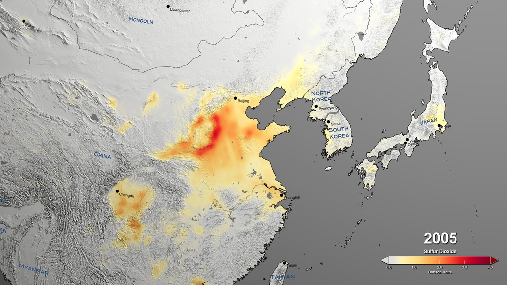
Sulfur Dioxide 2018 Update
Go to this pageChina || so2_china_4K.0000_print.jpg (1024x576) [176.6 KB] || so2_china_4K.0000_thm.png (80x40) [6.0 KB] || so2_china_4K.0000_searchweb.png (320x180) [81.6 KB] || so2_china_4K.0000_web.png (320x180) [81.6 KB] || china (3840x2160) [64.0 KB] || so2_china_4K_2160p30.webm (3840x2160) [4.1 MB] || so2_china_4K_2160p30.mp4 (3840x2160) [113.0 MB] ||
Additional Resources
- ID: 4798 Visualization
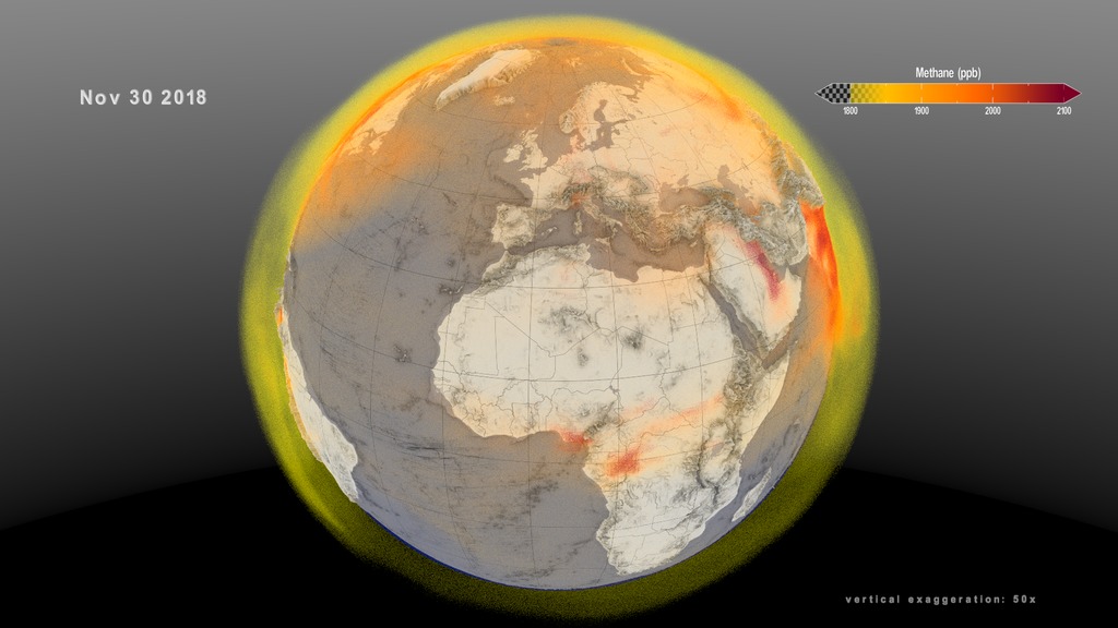
Earth Day 2020: Global Atmospheric Methane
Go to this pageThis 3D volumetric visualization shows a global view of the methane emission and transport between December 1, 2017 and November 30, 2018. This visualizaion of the rotating global view is designed to be played in a continuous loop.This video is also available on our YouTube channel. || Earth_Day_Methane_loop.2919_print.jpg (1024x576) [102.0 KB] || Earth_Day_Methane_loop.2919_searchweb.png (320x180) [54.3 KB] || Earth_Day_Methane_loop.2919_thm.png (80x40) [5.0 KB] || loop_composite (1920x1080) [0 Item(s)] || Earth_Day_Methane_loop_1080p30.webm (1920x1080) [11.5 MB] || Earth_Day_Methane_loop_1080p30.mp4 (1920x1080) [355.8 MB] || captions_silent.29410.en_US.srt [43 bytes] || Earth_Day_Methane_loop_1080p30.mp4.hwshow [196 bytes] ||
- ID: 13580 Produced Video
![Music: "Interconnecting Threads" by Axel Tenner [GEMA]; "Night Drift" by Andrew Michael Britton [PRS], David Stephen Goldsmith [PRS], from Universal Production MusicWatch this video on the NASA Goddard YouTube channel. Complete transcript available.](/vis/a010000/a013500/a013580/ChemicalSpecies_Still_print.jpg)
NASA Models the Complex Chemistry of Earth's Atmosphere
Go to this pageMusic: "Interconnecting Threads" by Axel Tenner [GEMA]; "Night Drift" by Andrew Michael Britton [PRS], David Stephen Goldsmith [PRS], from Universal Production MusicWatch this video on the NASA Goddard YouTube channel. Complete transcript available. || ChemicalSpecies_Still_print.jpg (1024x576) [313.1 KB] || ChemicalSpecies_Still.jpg (3840x2160) [2.0 MB] || ChemicalSpecies_Still_searchweb.png (320x180) [104.5 KB] || ChemicalSpecies_Still_web.png (320x180) [104.5 KB] || ChemicalSpecies_Still_thm.png (80x40) [7.8 KB] || 13580_ChemSpecies_Final.mov (1920x1080) [1.8 GB] || 13580_ChemSpecies_Final_lowres.mp4 (1280x720) [82.5 MB] || 13580_ChemSpecies_Final.mp4 (1920x1080) [467.4 MB] || 13580_ChemSpecies_Final.webm (1920x1080) [2.7 MB] || ChemicalSpecies.en_US.srt [4.2 KB] || ChemicalSpecies.en_US.vtt [4.2 KB] ||
- ID: 31100 Hyperwall Visual
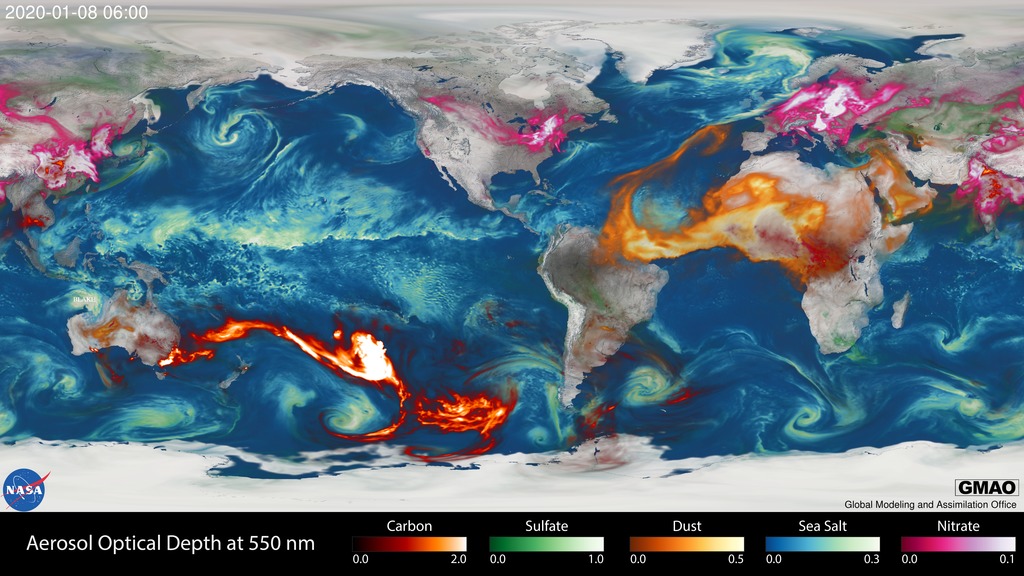
Global Transport of Smoke from Australian Bushfires
Go to this pageAnimation of global aerosols from August 1, 2019 to January 29, 2020 || australia_fire_smoke_print.jpg (1024x576) [184.6 KB] || australia_fire_smoke.png (3840x2160) [8.2 MB] || australia_fire_smoke_searchweb.png (180x320) [104.5 KB] || australia_fire_smoke_thm.png (80x40) [7.7 KB] || australia_fire_smoke_720p.webm (1280x720) [11.3 MB] || australia_fire_smoke_1080p.mp4 (1920x1080) [228.5 MB] || AerosolFrames (10080x5043) [0 Item(s)] || AerosolFrames (5760x3240) [0 Item(s)] || australia_fire_smoke_2160p.mp4 (3840x2160) [688.8 MB] ||
- ID: 4789 Visualization
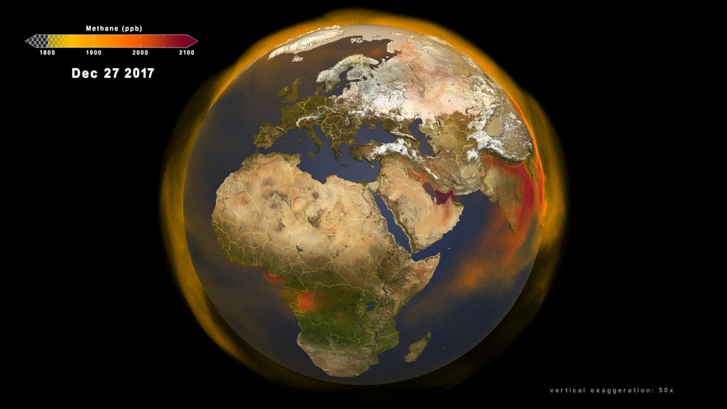
Global Atmospheric Methane
Go to this pageThis first 3D volumetric visualization focuses on several continents showing the emission and transport of atmospheric methane around the globe between January 1, 2017 and November 30, 2018. This video is also available on our YouTube channel. || Global_methane_comp.1320_print.jpg (1024x576) [163.2 KB] || Global_methane_comp_1080p30.webm (1920x1080) [22.1 MB] || composite (1920x1080) [0 Item(s)] || captions_silent.29083.en_US.srt [43 bytes] || Global_methane_comp_1080p30.mp4 (1920x1080) [1.4 GB] || Global_methane_comp_1080p30.mp4.hwshow ||
- ID: 4676 Visualization
Sulfur Dioxide 2018 Update
Go to this pageChina || so2_china_4K.0000_print.jpg (1024x576) [176.6 KB] || so2_china_4K.0000_thm.png (80x40) [6.0 KB] || so2_china_4K.0000_searchweb.png (320x180) [81.6 KB] || so2_china_4K.0000_web.png (320x180) [81.6 KB] || china (3840x2160) [64.0 KB] || so2_china_4K_2160p30.webm (3840x2160) [4.1 MB] || so2_china_4K_2160p30.mp4 (3840x2160) [113.0 MB] ||
- ID: 4677 Visualization
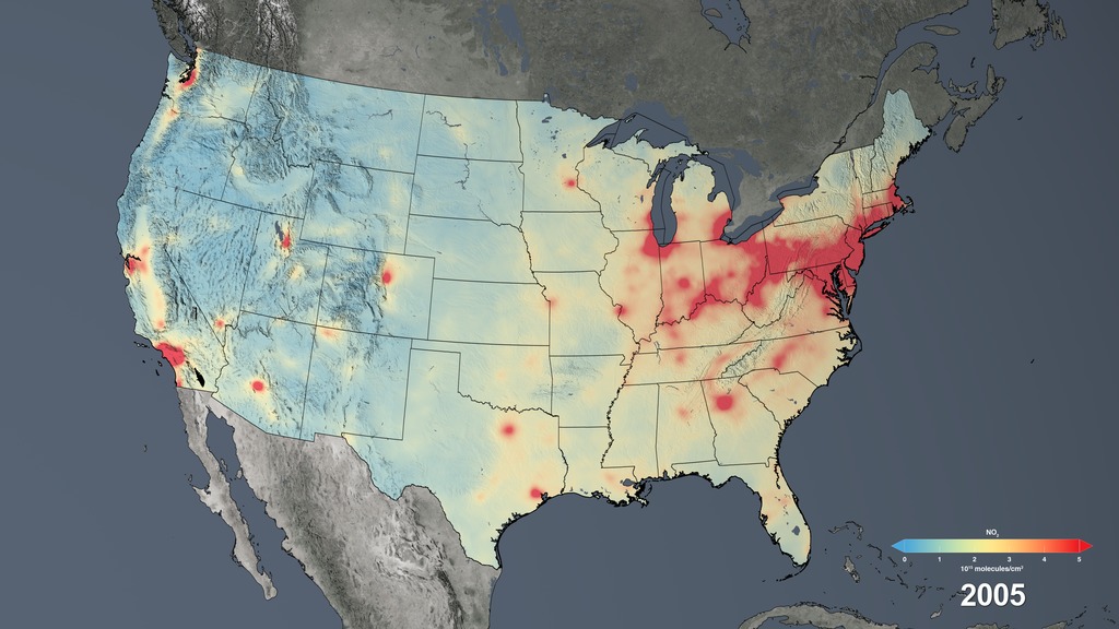
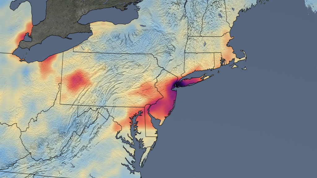
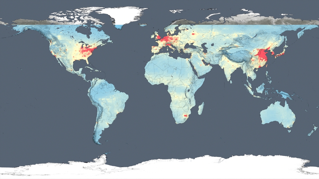
2005-2016 USA NO2 Hyperwall Show
Go to this pageUSA NO2, Updated to 2016 || USA_4_17_HW.0000_print.jpg (1024x576) [140.2 KB] || USA_4_17_HW.0000_searchweb.png (320x180) [75.5 KB] || USA_4_17_HW.0000_thm.png (80x40) [5.8 KB] || USA_4_17_HW_1080p30.mp4 (1920x1080) [5.0 MB] || 5760x3240_16x9_30p (5760x3240) [0 Item(s)] || USA_4_17_HW_2160p30.webm (3840x2160) [955.7 KB] || USA_4_17_HW_2160p30.mp4 (3840x2160) [16.4 MB] || USA_4_17_HW_1080p30.mp4.hwshow [185 bytes] ||
- ID: 4412 Visualization
NASA Images Show Human Fingerprint on Global Air Quality – Release Materials
Go to this pageThis video provides an overview of the study findings. An HD version of this video is available here: Human Fingerprint on Global Air Quality || 12096-MASTER_appletv_print.jpg (1024x576) [139.8 KB] || 12096-MASTER_appletv.m4v (1280x720) [60.8 MB] || 12096-MASTER_appletv.webm (1280x720) [13.0 MB] ||
- ID: 4772 Visualization
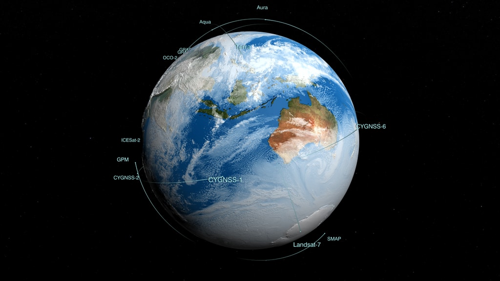
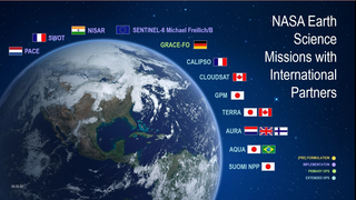
Earth Observing Fleet (December 2019)
Go to this pageNASA's Earth Observing Fleet (December 2019) || fleet201912_HD.6000_print.jpg (1024x576) [71.7 KB] || fleet201912_HD.6000_searchweb.png (320x180) [52.3 KB] || fleet201912_HD.6000_thm.png (80x40) [4.0 KB] || fleet201912_HD_1080p30.mp4 (1920x1080) [89.3 MB] || 1920x1080_16x9_30p (1920x1080) [0 Item(s)] || fleet201912_HD_1080p30.webm (1920x1080) [14.3 MB] || 3840x2160_16x9_30p (3840x2160) [0 Item(s)] || comp (9600x3240) [0 Item(s)] || stars_only (9600x3240) [0 Item(s)] || orbits_and_earth (9600x3240) [0 Item(s)] || fleet201912_4k_2160p30.mp4 (3840x2160) [299.6 MB] || fleet201912_HD_1080p30.mp4.hwshow [188 bytes] ||
- ID: 40410 Gallery
Earth at Night Imagery
Go to this pageDazzling photographs and images from space of our planet’s nightlights have captivated public attention for decades. In such images, patterns are immediately seen based on the presence or absence of light: a distinct coastline, bodies of water recognizable by their dark silhouettes, and the faint tendrils of roads and highways emanating from the brilliant blobs of light that are our modern, well-lit cities. For nearly 25 years, satellite images of Earth at night have served as a fundamental research tool, while also stoking public curiosity. These images paint an expansive and revealing picture, showing how natural phenomena light up the darkness and how humans have illuminated and shaped the planet in profound ways since the invention of the light bulb 140 years ago.