Earth at Night Imagery
Overview
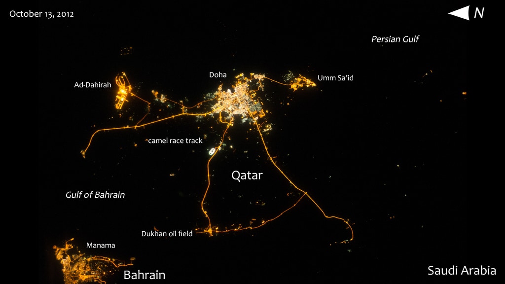
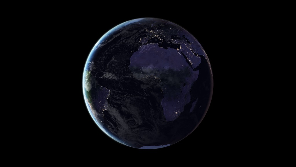
Dazzling photographs and images from space of our planet’s nightlights have captivated public attention for decades. In such images, patterns are immediately seen based on the presence or absence of light: a distinct coastline, bodies of water recognizable by their dark silhouettes, and the faint tendrils of roads and highways emanating from the brilliant blobs of light that are our modern, well-lit cities.
For nearly 25 years, satellite images of Earth at night have served as a fundamental research tool, while also stoking public curiosity. These images paint an expansive and revealing picture, showing how natural phenomena light up the darkness and how humans have illuminated and shaped the planet in profound ways since the invention of the light bulb 140 years ago.
Earth at Night
imagery showing natural and human-caused nocturnal illumination
- ID: 31094
 Hyperwall Visual
 - ID: 31098
 Hyperwall Visual
 - ID: 31121
 Hyperwall Visual
 - ID: 31096
 Hyperwall Visual
 - ID: 31097
 Hyperwall Visual
 - ID: 31095
 Hyperwall Visual
 - ID: 31122
 Hyperwall Visual
 - ID: 31116
 Hyperwall Visual
 - ID: 31029
 Hyperwall Visual
 - ID: 30790
 Hyperwall Visual
 - ID: 30180
 Hyperwall Visual
 - ID: 31120
 Hyperwall Visual
 - ID: 31110
 Hyperwall Visual
 - ID: 30977
 Hyperwall Visual
 - ID: 30965
 Hyperwall Visual
 - ID: 31103
 Hyperwall Visual
 - ID: 30627
 Hyperwall Visual
 - ID: 30195
 Hyperwall Visual
 - ID: 31106
 Hyperwall Visual
 - ID: 30890
- ID: 30898
 Hyperwall Visual
 - ID: 30220
 Hyperwall Visual
 - ID: 31119
 Hyperwall Visual
 - ID: 31124
 Hyperwall Visual
 - ID: 30908
 Hyperwall Visual
 - ID: 31107
 Hyperwall Visual
 - ID: 31108
 Hyperwall Visual
 - ID: 31111
 Hyperwall Visual
 - ID: 31112
 Hyperwall Visual
 - ID: 31113
 Hyperwall Visual
 - ID: 31114
 Hyperwall Visual
 - ID: 12963
 Produced Video
 - ID: 31115
 Hyperwall Visual
 - ID: 31118
 Hyperwall Visual
 - ID: 31127
 Hyperwall Visual
 - ID: 31123
 Hyperwall Visual
 - ID: 31129
 Hyperwall Visual
 - ID: 31117
 Hyperwall Visual
 - ID: 31126
 Hyperwall Visual
Black Marble
visualizations of the Black Marble dataset
- ID: 30876 Hyperwall Visual
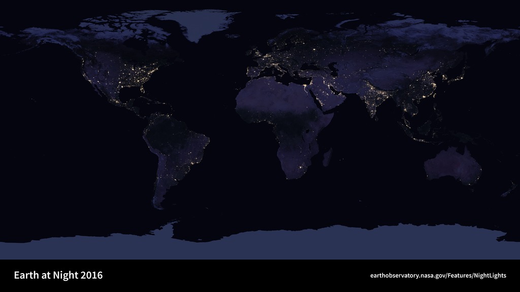
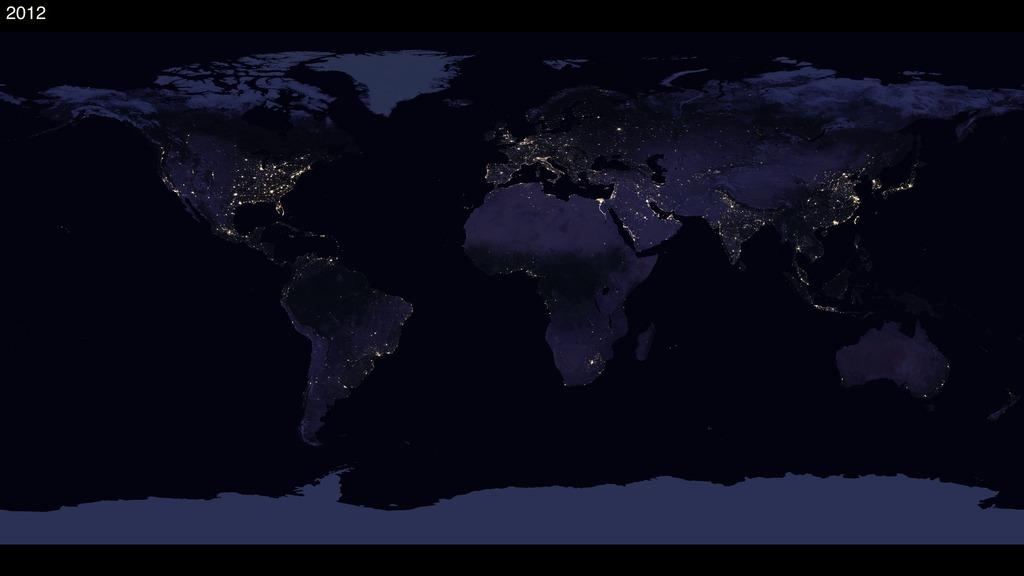
Black Marble 2016
Go to this pageAn composite image shows a cloud-free view of Earth || BlackMarble_2016_global_7km_print.jpg (1024x576) [62.9 KB] || BlackMarble_2016_global_7km.png (5760x3240) [6.3 MB] || BlackMarble_2016_global_7km_searchweb.png (180x320) [34.9 KB] || BlackMarble_2016_global_7km_thm.png (80x40) [3.7 KB] || BlackMarble_2016_global_7km.hwshow [222 bytes] ||
- ID: 30878 Hyperwall Visual
Black Marble 2016 (Rotating Globe)
Go to this pageA rotating globe rendered from the blackmarble 2016 image. || BlackMarble_2016_rotate_print.jpg (1024x576) [47.1 KB] || BlackMarble_2016_rotate.png (3840x2160) [3.0 MB] || BlackMarble_2016_rotate_searchweb.png (320x180) [28.2 KB] || BlackMarble_2016_rotate_thm.png (80x40) [2.9 KB] || BlackMarble_2016_rotate_720p.mp4 (1280x720) [11.5 MB] || BlackMarble_2016_rotate_720p.webm (1280x720) [17.2 MB] || BlackMarble_2016_rotate_1080p.mp4 (1920x1080) [23.9 MB] || 3840x2160_16x9_30p (3840x2160) [0 Item(s)] || BlackMarble_2016_rotate_2160p.mp4 (3840x2160) [108.6 MB] ||
- ID: 30877 Hyperwall Visual
Black Marble 2016 (Regions)
Go to this pageSatellite images of Earth at night—often referred to as "night lights"—have been a gee-whiz curiosity for the public and a tool for fundamental research for nearly 25 years. They have provided a broad, beautiful picture, showing how humans have shaped the planet and lit up the darkness. Produced every decade or so, such maps have spawned hundreds of pop-culture uses and dozens of economic, social science, and environmental research projects. ||
- ID: 30886 Hyperwall Visual
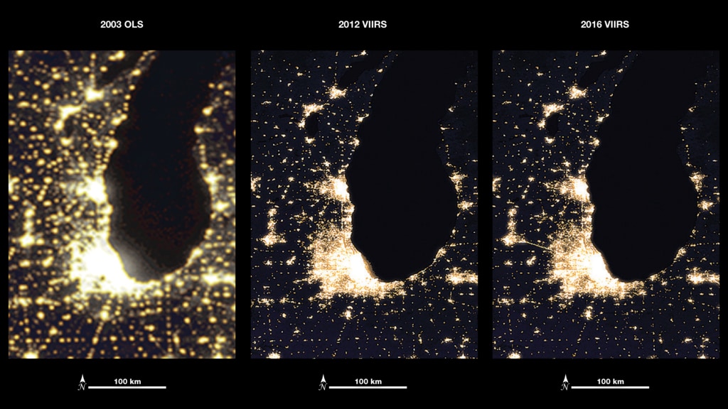
Black Marble 2012 vs. 2016
Go to this pageBlack Marble comparing 2012 lights vs. 2016 lights || black_marble_swipe_1080p.00001_print.jpg (1024x576) [58.2 KB] || black_marble_swipe_1080p.00001_searchweb.png (320x180) [34.2 KB] || black_marble_swipe_1080p.00001_thm.png (80x40) [3.6 KB] || black_marble_swipe_1080p.mp4 (1920x1080) [3.5 MB] || black_marble_swipe_720p.mp4 (1280x720) [2.0 MB] || black_marble_swipe_1080p.webm (1920x1080) [7.8 MB] || black_marble_swipe_2304p.mp4 (4096x2304) [11.1 MB] || 4104x2304_16x9_30p (4104x2304) [0 Item(s)] ||
- ID: 30919 Hyperwall Visual
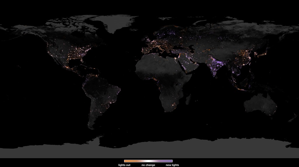
A Changing Earth at Night
Go to this pageChanges in lights from 2012 to 2016 || BlackMarble20162012diff500m_cb_print.jpg (1024x574) [96.1 KB] || BlackMarble20162012diff500m_cb_searchweb.png (180x320) [32.4 KB] || BlackMarble20162012diff500m_cb_thm.png (80x40) [4.4 KB] || BlackMarble20162012diff500m_cb.tif (4104x2304) [3.6 MB] || BlackMarble20162012diff500m.tif (4104x2052) [3.5 MB] || BlackMarble20162012diff500m_huge.tif (86400x43200) [868.6 MB] || a-changing-earth-at-night.hwshow [223 bytes] ||
- ID: 31099 Hyperwall Visual
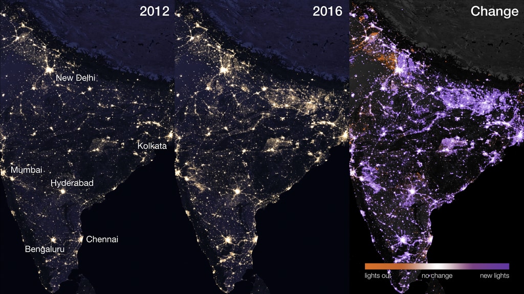
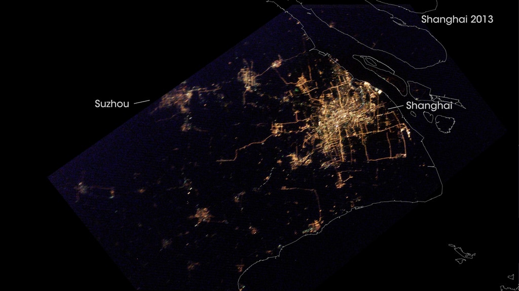
A Changing Earth at Night (Regions)
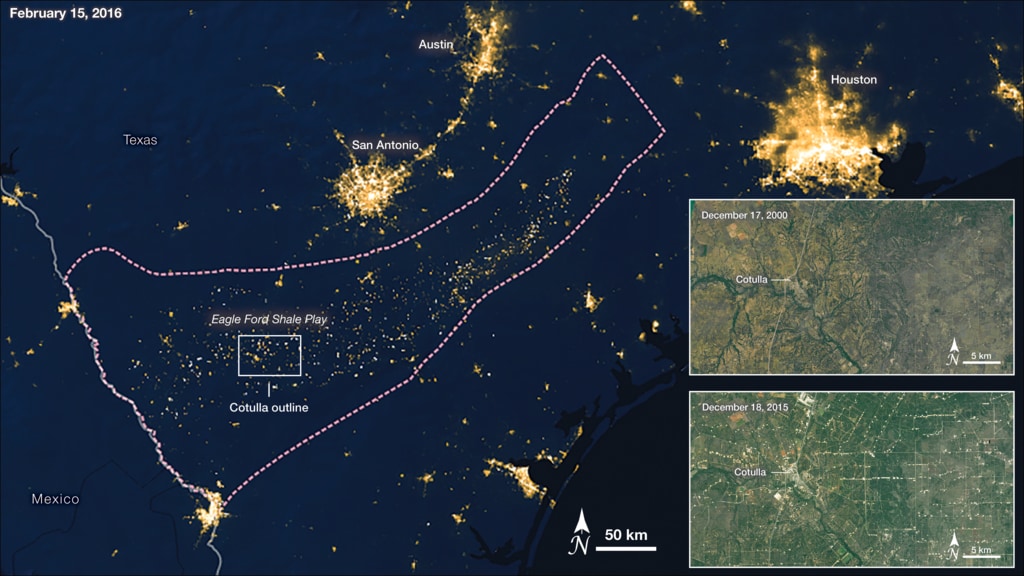
Go to this pageNASA’s Black Marble products are also being used by scientists and decision-makers to monitor gradual changes driven by urbanization, out-migration, economic changes, and electrification. These images show the rapid electrification of India’s rural settlements in recent years. Huge swaths of northern India, relatively dark in 2012 night shots, are lit up in NASA’s Black Marble imagery from 2016. || NightLights.010_print.jpg (1024x576) [175.5 KB] || NightLights.010.png (5760x3240) [20.0 MB] || NightLights.010_searchweb.png (320x180) [101.2 KB] || NightLights.010_thm.png (80x40) [6.8 KB] ||
- ID: 30693 Hyperwall Visual
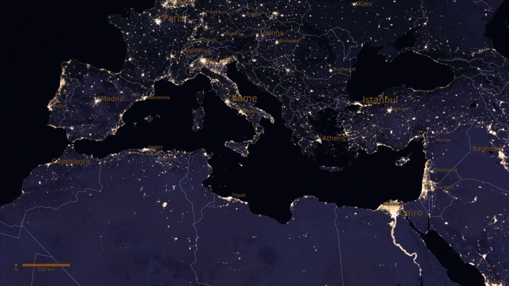
Southwestern Europe and Australia at Night 2014-2015
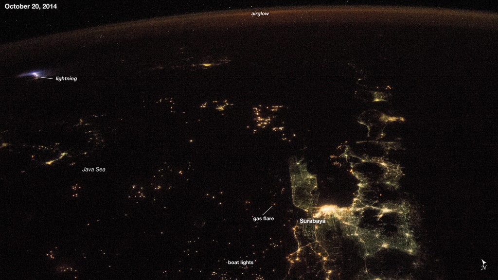
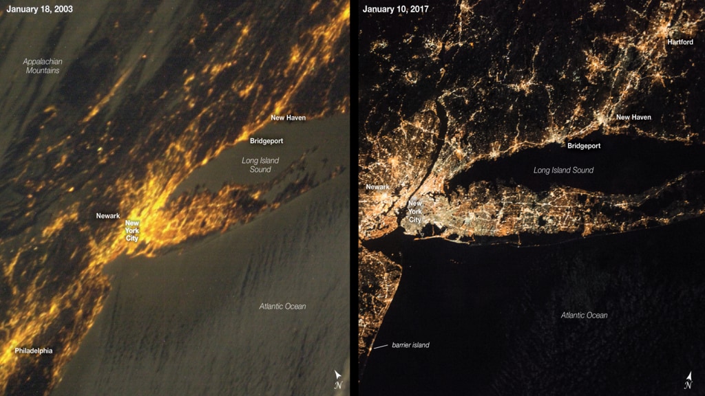
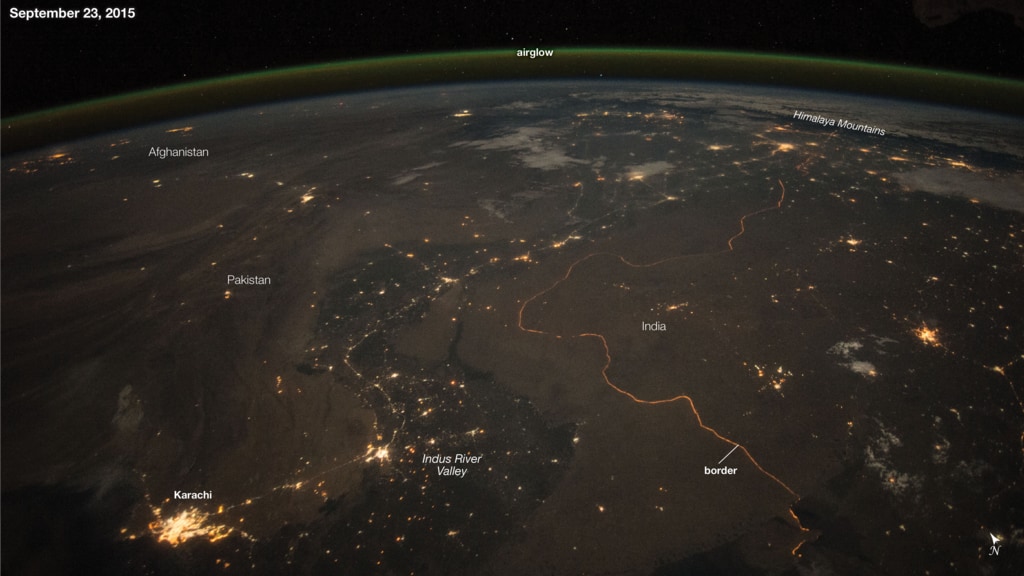
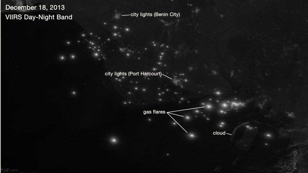
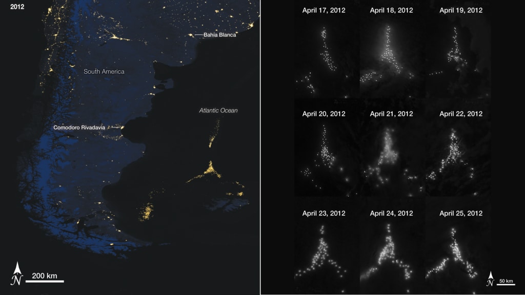
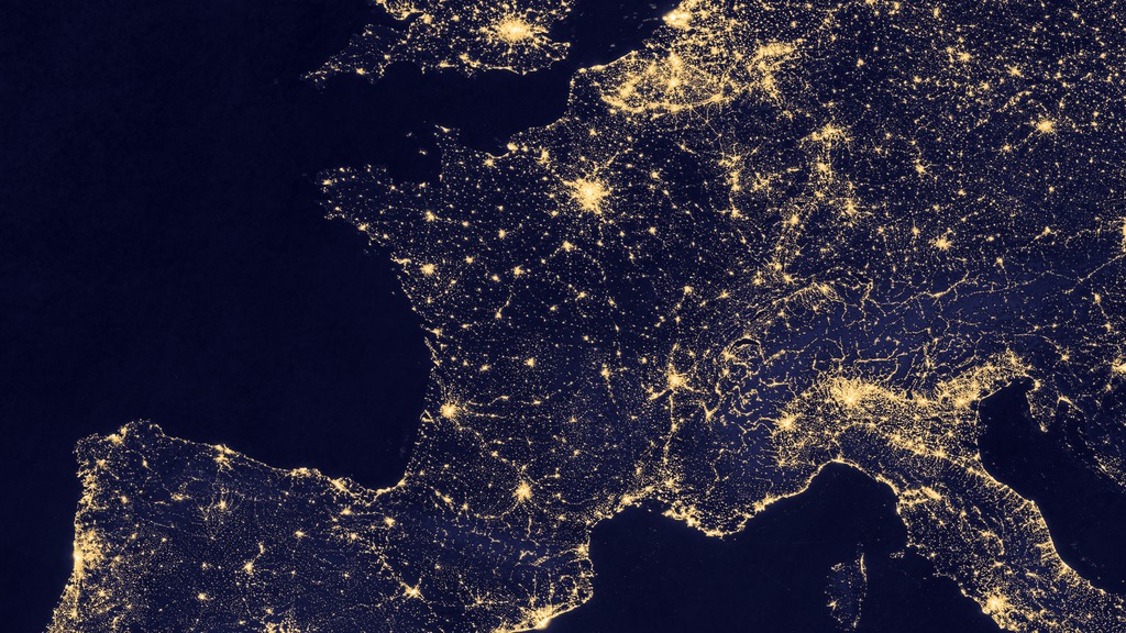
Go to this pageOne way to study the spatial distribution, or arrangement, of human settlements is to view the planet from space during nighttime hours. Scientists have observed the Earth’s lights at night for more than four decades using military satellites and astronaut photography; however, the view became significantly clearer after using satellite data from a low-light sensor onboard the Suomi National Polar-orbiting Partnership (NPP) satellite, launched in October 2011. The satellite’s Visible Infrared Imaging Radiometer Suite (VIIRS) “day-night band” can observe dim signals such as city lights (down to the scale of an isolated highway lamp), wildfires, gas flares, auroras, and reflected moonlight during nighttime hours. Swaths of VIIRS data are processed to find moonless, non-cloudy pixels. These “good” pixels are averaged at each location to produce a global image that depicts the Earth’s lights at night. Each pixel shows roughly 0.46 miles (742 meters) across.The top image, centered on France, is a composite of VIIRS data acquired between October 1, 2014 and April 30, 2015. Paris is visible just above the center of the image. North of Paris and across the English Channel (black), London is visible. The relatively dim Alps, characterized by their crescent-shaped geography, are speckled with lights from car headlights and lit roadways. South of the Alps several major cities in Italy are visible with the brightest spot being Milan. Rome is visible in the bottom right of the image. Strings and clusters of light out at sea are produced by ship lights. The second image, centered on France, is a composite of data from the Defense Meteorological Satellite Program (DMSP) Operational Linescan System (OLS) acquired during 2013. Each pixel shows roughly 1.86 miles (3 kilometers) across. The DMSP OLS night-lights data are available starting in 1992, and provide the ability to measure changes in light extent and locations over the past two decades.The image of Australia at night is a composite of VIIRS data acquired between January 1, 2015 and July 31, 2015. Major cities such as Brisbane, Sydney, Melbourne, and Perth are well lit along the coast. Alice Springs—situated in the geographic center of Australia—is some 1,500 kilometers from the nearest major city. Transient lights—those visible in only one monthly image—are colored red. These lights are mainly from brushfires burning during the dry season (May-July) in Australia’s Northern Territory and northern parts of Western Australia. Aside from fires, some of the transient lights could be attributed to natural gas flares, lightning, oil drilling, or mining operations. ||