GISTEMP Climate Spiral
- Visualizations by:
- Mark SubbaRao
- View full credits
Movies
- GISTEMP_Spiral_2022-03-06_1851_1080sq.mp4 (1080x1080) [21.6 MB]
- GISTEMP_Spiral_2022-03-06_1851_1080sq.webm (1080x1080) [8.0 MB]
- GISTEMP_Spiral_2022-03-06_2257.mp4 (3840x2160) [33.0 MB]
Images
- GISTEMP_Spiral_2022-03-06_2257.01710_print.jpg (1024x576) [122.0 KB]
- GISTEMP_Spiral_2022-03-06_2257.01710_thm.png (80x40) [3.6 KB]
- GISTEMP_Spiral_2022-03-06_2257.01710_searchweb.png (320x180) [43.9 KB]
Frames
- frames/3840x2160_16x9_30p/ (3840x2160) [120.0 KB]
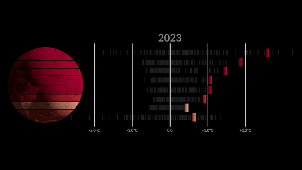
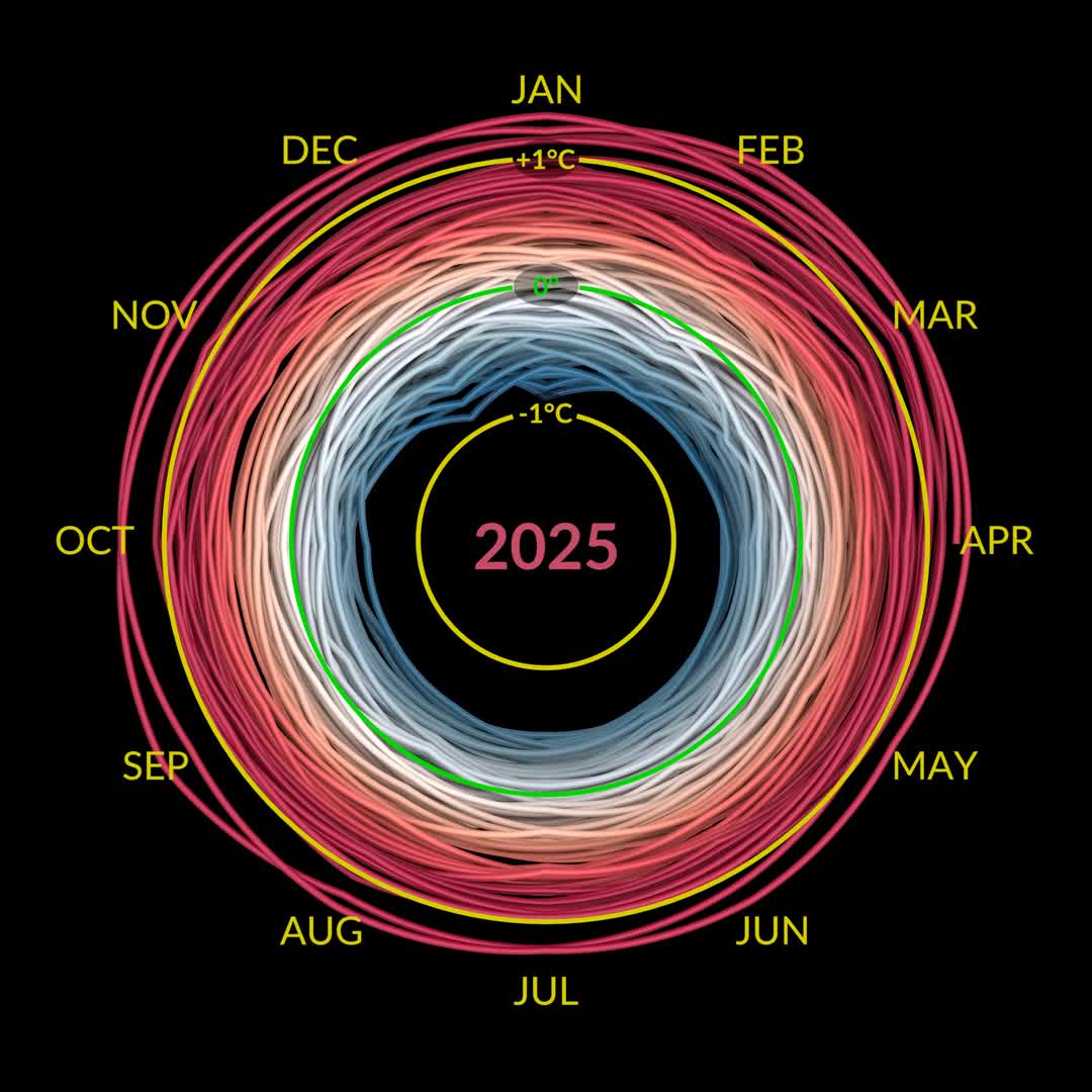
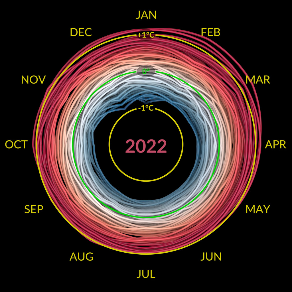
The GISTEMP climate spiral 1880-2021. This version is in Celsius, see below for an alternate version in Fahrenheit.
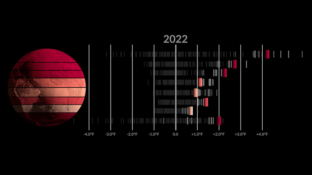
The GISTEMP climate spiral 1880-2021. This version is in The GISTEMP climate spiral 1880-2021. This version is in Fahrenheit, see above for an alternate version in Celsius.
The Goddard Institute of Space Studies (GISS) is a NASA laboratory managed by the Earth Sciences Division of the agency’s Goddard Space Flight Center in Greenbelt, Maryland. The laboratory is affiliated with Columbia University’s Earth Institute and School of Engineering and Applied Science in New York.
The 'climate spiral' is a visualization designed by climate scientist Ed Hawkins from the National Centre for Atmospheric Science, University of Reading. Climate spiral visualizations have been widely distributed, a version was even part of the opening ceremony of the Rio de Janeiro Olympics.
Credits
Please give credit for this item to:
NASA's Scientific Visualization Studio
Visualizers
- Mark SubbaRao (NASA/GSFC) [Lead]
- Ed Hawkins (National Centre for Atmospheric Science, University of Reading)
Technical support
- Ian Jones (ADNET)
- Laurence Schuler (ADNET)
Datasets used in this visualization
GISTEMP (Collected with the GISS Surface Temperature Analysis (GISTEMP) sensor)
Note: While we identify the data sets used in these visualizations, we do not store any further details nor the data sets themselves on our site.
Related pages
Zonal Climate Anomalies 1880-2022
Jan. 12th, 2023
Read moreA visualization of zonal temperature anomalies. The latitude zones are 90N-64N, 64N-44N, 44N-24N, 24N-EQU, EQU-24S, 24S-44S, 44S-64S, 64S-90S. The anomalies are calculated relative to a baseline period of 1951-1980. This version is in Fahrenheit, an alternate version in Celsius is also available. A visualization of zonal temperature anomalies. The latitude zones are 90N-64N, 64N-44N, 44N-24N, 24N-EQU, EQU-24S, 24S-44S, 44S-64S, 64S-90S. The anomalies are calculated relative to a baseline period of 1951-1980. This version is in Celsius, an alternate version in Fahrenheit is also available. The visualization presents zonal temperature anomalies between the years 1880-2022. The visualization illustrates that the Arctic is warming much faster than other regions of the Earth.These temperatures are based on the GISS Surface Temperature Analysis (GISTEMP v4), an estimate of global surface temperature change. The latitude zones are 90N-64N, 64N-44N, 44N-24N, 24N-EQU, EQU-24S, 24S-44S, 44S-64S, 64S-90S. Anomalies are defined relative to a base period of 1951-1980. The data file used to create this visualization can be accessed here.The Goddard Institute of Space Studies (GISS) is a NASA laboratory managed by the Earth Sciences Division of the agency’s Goddard Space Flight Center in Greenbelt, Maryland. The laboratory is affiliated with Columbia University’s Earth Institute and School of Engineering and Applied Science in New York.
Global Temperature Anomalies from 1880 to 2022
Jan. 12th, 2023
Read moreThis color-coded map in Robinson projection displays a progression of changing global surface temperature anomalies. Normal temperatures are shown in white. Higher than normal temperatures are shown in red and lower than normal temperatures are shown in blue. Normal temperatures are calculated over the 30 year baseline period 1951-1980. The final frame represents the 5 year global temperature anomalies from 2018-2022. This data visualization shows the 2022 global surface temperature anomaly compared with the 1951-1980 average. This data visualization shows only the 2022 global surface temperature anomalies on a rotating globe to highlight the La Niña. 2022 was one of the warmest on record despite a third consecutive year of La Niña conditions in the tropical Pacific Ocean. NASA scientists estimate that La Niña’s cooling influence may have lowered global temperatures about 0.11 degrees Fahrenheit from what the average would have been under more typical ocean conditions. Colortable is both degrees fahrenheit and degrees celsius. This image is the single year 2022 GISS temperature anomaly as compared with the 1951-1980 average. This version does not have any titles or text overlays, except for the corresponding colorbar. This frame sequence of color-coded global temperature anomalies in robinson projection display a progression of changing global surface temperatures anomalies in even degrees Fahrenheit. The first frame in this sequence represents the data from 1880-1884. The second frame represents 1881-1885, ...and the last frame represents 2018-2022. Higher than normal temperatures are shown in red and lower than normal are shown in blue. Normal temperatures are the average over the 30 year baseline period 1951-1980. This sequence of images are the corresponding date overlays for the 5 year rolling averages used in the first visualization on this page. This frame sequence of color-coded global temperature anomalies in degrees celsius is designed to be displayed on the Science on a Sphere projection system. Each image represents a unique 5 year rolling time period with no fades between datasets. Frame 1884 represents data from 1880-1884, frame 1885 represents data from 1881-1885,... frame 2022 represents data from 2018-2022. Higher than normal temperatures are shown in red and lower than normal are shown in blue. Normal temperatures are the average over the 30 year baseline period 1951-1980. This is the colorbar for the Science on a Sphere frameset above. It is in degrees celsius.
Arctic Sea Ice Spiral
Sept. 22nd, 2022
Read moreA data visualization of the Arctic sea ice extent from October 1978 to September 2022. This version is in units of square miles, see below for version in square kilometers. A data visualization of the Arctic sea ice extent from October 1978 to September 2022. This version is in units of square kilometers, see above for version in square miles. This data visualization shows the Arctic sea ice extent from October 1978 to September 2022. The amount of Arctic sea ice varies seasonally, typically reaching a maximum in March and a minimum in September. Recently, the Arctic sea ice minimum has been decreasing at a rate of 13% per decade. Please see Global Climate Change Vital Signs: Arctic Sea Ice Minimum Extent for more information. Related pages
Zonal Climate Anomalies
March 7th, 2022
Read moreA visualization of zonal temperature anomalies. The latitude zones are 90N-64N, 64N-44N, 44N-24N, 24N-EQU, EQU-24S, 24S-44S, 44S-64S, 64S-90S. The anomalies are calculated relative to a baseline period of 1951-1980. The visualization presents zonal temperature anomalies between the years 1880-2021. The visualization illustrates that the Arctic is warming much faster than other regions of the Earth.These temperatures are based on the GISS Surface Temperature Analysis (GISTEMP v4), an estimate of global surface temperature change. The latitude zones are 90N-64N, 64N-44N, 44N-24N, 24N-EQU, EQU-24S, 24S-44S, 44S-64S, 64S-90S. Anomalies are defined relative to a base period of 1951-1980. The data file used to create this visualization can be accessed here.The Goddard Institute of Space Studies (GISS) is a NASA laboratory managed by the Earth Sciences Division of the agency’s Goddard Space Flight Center in Greenbelt, Maryland. The laboratory is affiliated with Columbia University’s Earth Institute and School of Engineering and Applied Science in New York. Related pages
Global Temperature Anomalies from 1880 to 2021
Jan. 13th, 2022
Read moreThis color-coded map in Robinson projection displays a progression of changing global surface temperature anomalies. Normal temperatures are shown in white. Higher than normal temperatures are shown in red and lower than normal temperatures are shown in blue. Normal temperatures are calculated over the 30 year baseline period 1951-1980. The final frame represents the 5 year global temperature anomalies from 2017-2021. Scale in degrees Fahrenheit. This data visualization shows the 2021 global surface temperature anomalies on a rotating globe to highlight the La Niña. La Niña has developed and is expected to last into early 2022. Despite the cooling influence of this naturally occurring climate phenomenon, temperatures in many parts of the world are above average. The year 2000 also saw a La Niña event of similar strength to that in 2021, but 2021 global temperatures was more than 0.75 degrees Fahrenheit hotter than 2000. This color-coded map in Robinson projection displays a progression of changing global surface temperature anomalies. Normal temperatures are shown in white. Higher than normal temperatures are shown in red and lower than normal temperatures are shown in blue. Normal temperatures are calculated over the 30 year baseline period 1951-1980. The final frame represents the 5 year global temperature anomalies from 2017-2021. Scale in degrees Celsius. This frame sequence is the corresponding date range for each frame in the sequence. Degrees Fahrenheit Colorbar Degrees Celsius Colorbar This frame sequence of color-coded global temperature anomalies in robinson projection display a progression of changing global surface temperatures anomalies in Fahrenheit. The first frame in this sequence represents the data from 1880-1884. The second frame represents 1881-1885, ...and the last frame represents 2017-2021. Higher than normal temperatures are shown in red and lower than normal are shown in blue. Normal temperatures are the average over the 30 year baseline period 1951-1980. This frame sequence of color-coded global temperature anomalies in degrees celsius is designed to be displayed on the Science on a Sphere projection system. Each image represents a unique 5 year rolling time period with no fades between datasets. Frame 1884 represents data from 1880-1884, frame 1885 represents data from 1881-1885,... frame 2021 represents data from 2017-2021. Higher than normal temperatures are shown in red and lower than normal are shown in blue. Normal temperatures are the average over the 30 year baseline period 1951-1980. This is the colorbar for the Science on a Sphere frameset above. It is in degrees celsius. Earth’s global average surface temperature in 2021 tied with 2018 as the sixth warmest on record, according to independent analyses done by NASA and NOAA. Continuing the planet’s long-term warming trend, global temperatures in 2021 were 1.5 degrees Fahrenheit (or 0.85 degrees Celsius) above the average for NASA’s baseline period, according to scientists at NASA’s Goddard Institute for Space Studies (GISS) in New York.Collectively, the past eight years are the top eight warmest years since modern record keeping began in 1880. This annual temperature data makes up the global temperature record – and it’s how scientists know that the planet is warming.GISS is a NASA laboratory managed by the Earth Sciences Division of the agency’s Goddard Space Flight Center in Greenbelt, Maryland. The laboratory is affiliated with Columbia University’s Earth Institute and School of Engineering and Applied Science in New York.For more information about NASA’s Earth science missions, visit: https://www.nasa.gov/earth Related pages
Shifting Distribution of Land Temperature Anomalies, 1951-2020
April 23rd, 2021
Read moreThe change in the distribution of land temperature anomalies over the years 1951 to 2020 A ridgeline plot showing how the land temperature anomaly distribution has changed over seven decades This visualization shows how the distribution of land temperature anomalies has varied over time. As the planet has warmed, we see the peak of the distribution shifting to the right. The distribution of temperatures broadens as well. This broadening is most likely due to differential regional warming rather than increased temperature variability at any given location.These distributions are calculated from the Goddard Institute of Space Studies GISTEMP surface temperature analysis. Distributions are determined for each year using a kernal density esitmator, and we morph between those distributions in the animation.NASA’s full surface temperature data set – and the complete methodology used to make the temperature calculation – are available at: https://data.giss.nasa.gov/gistempGISS is a NASA laboratory managed by the Earth Sciences Division of the agency’s Goddard Space Flight Center in Greenbelt, Maryland. The laboratory is affiliated with Columbia University’s Earth Institute and School of Engineering and Applied Science in New York.The python based Jupyter Notebook used to create these visualizations is available. Click here to download. Related pages
NASA Climate Spiral 1880-2022
Jan. 12th, 2023
Read moreThe NASA climate spiral 1880-2022. This version is in Celsius; see below for an alternate version in Fahrenheit. Both a 30 fps, 60 second duration video and 60 fps, 30 second duration video are available. 
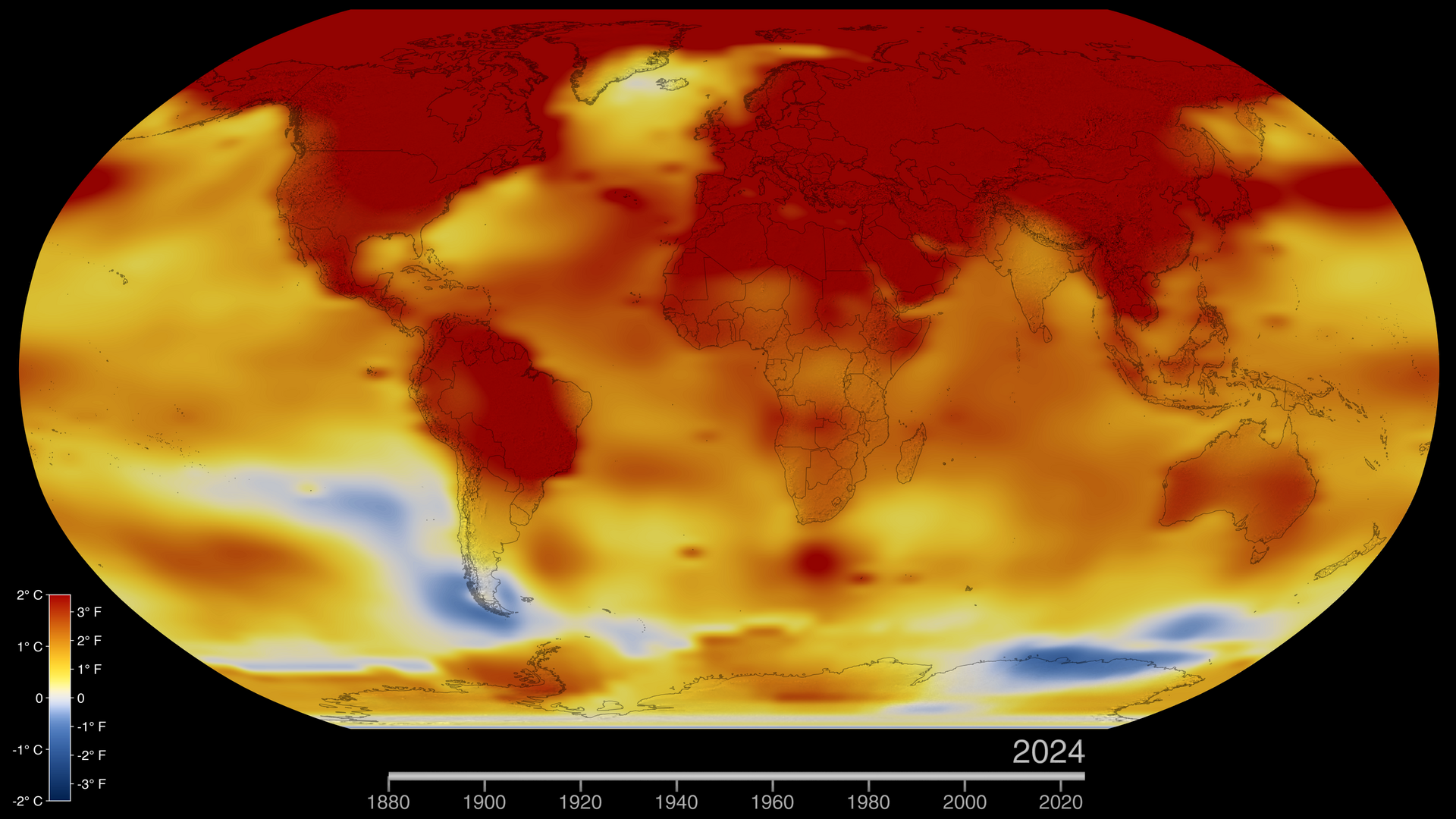
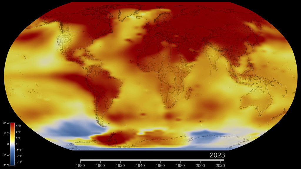
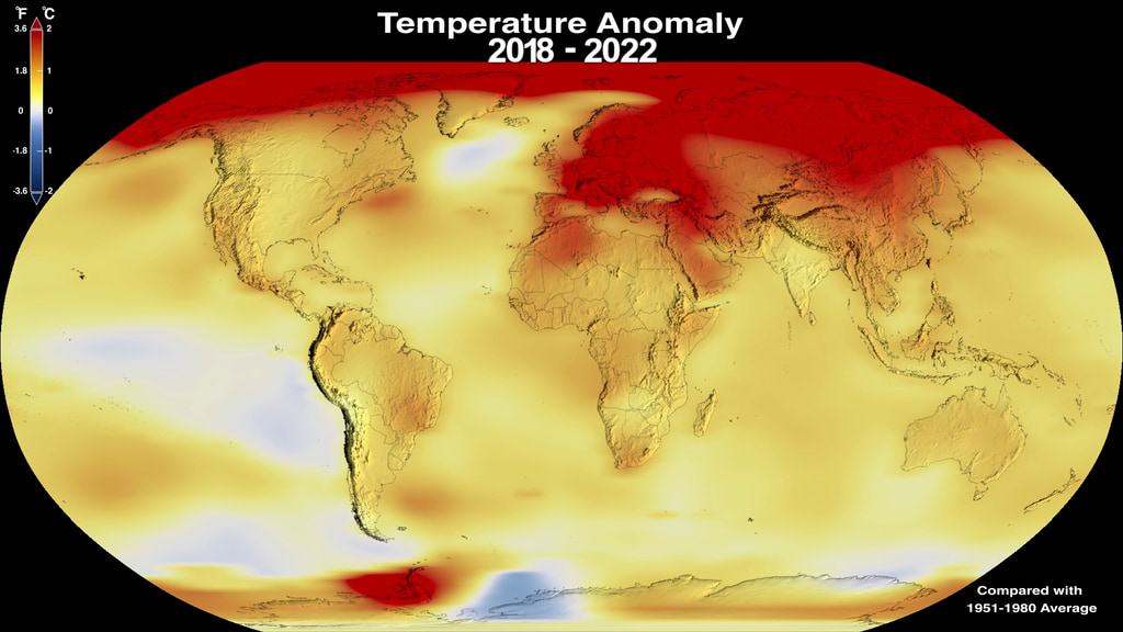
The visualization presents monthly global temperature anomalies between the years 1880-2022. Temperature anomalies are deviations from a long term global avergage. In this case the period 1951-1980 is used to define the baseline for the anomaly. These temperatures are based on the GISS Surface Temperature Analysis (GISTEMP v4), an estimate of global surface temperature change. The data file used to create this visualization is publically accessible here.The term 'climate spiral' describes an animated radial plot of global temperatures. Climate scientist Ed Hawkins from the National Centre for Atmospheric Science, University of Reading popularized this style of visualization in 2016.The Goddard Institute of Space Studies (GISS) is a NASA laboratory managed by the Earth Sciences Division of the agency’s Goddard Space Flight Center in Greenbelt, Maryland. The laboratory is affiliated with Columbia University’s Earth Institute and School of Engineering and Applied Science in New York. The NASA climate spiral 1880-2022. This version is in Fahrenheit; see above for an alternate version in Celsius. Both a 30 fps, 60 second duration video and 60 fps, 30 second duration video are available. Related pages