Hyperwall Stories for specific event
Overview
The hyperwall gallery features visualizations that have been selected for use at NASA's hyperwall at event
Return to Main Hyperwall Gallery.
New
 Link
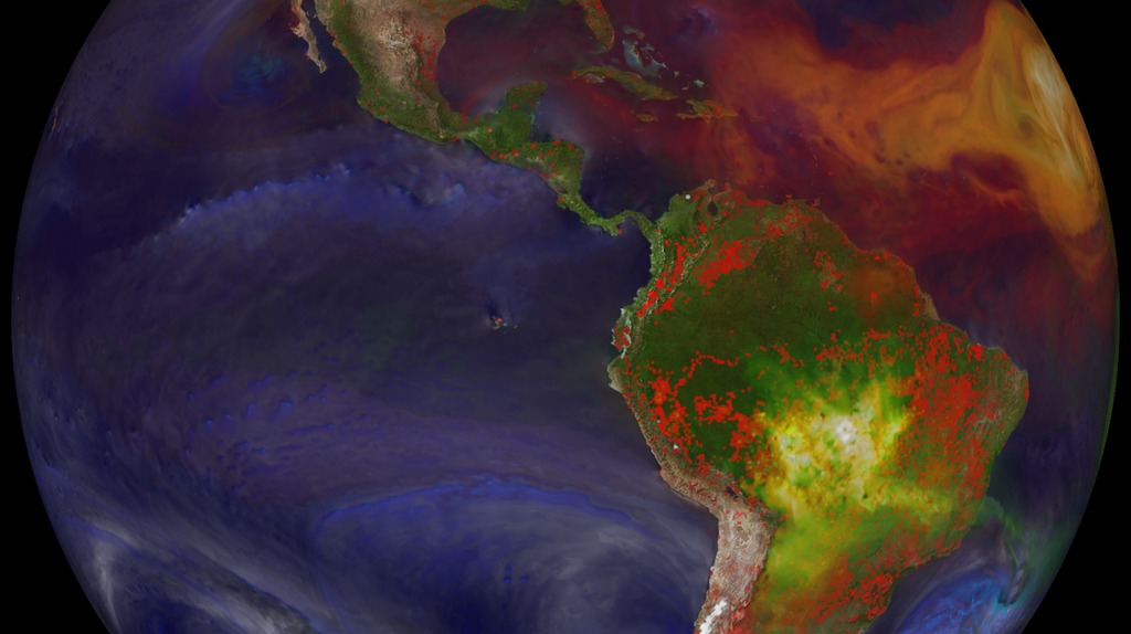
LinkIn Katrina's Wake
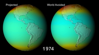
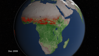
Hurricane Katrina took the world by storm when it ravaged Louisiana and surrounding states in late August of 2005. Katrina's effects were far reaching, and researchers continue to uncover new areas of devastation left in her wake. Using data from NASA's Landsat and Terra satellites, along with ecological field investigations and statistical analyses, a group of researchers has quantified losses to Gulf Coast forests inflicted by Hurricane Katrina. The results, published in the 2007 November 16th issue of Science, estimate that Katrina killed or damaged 320 million large trees and affected more than 5 millions acres of forest. In this climate of warming temperatures and frequent, intensified storms, some scientists debate whether this is just the first taste of what's to come.
Go to this link- ID: 4266 Visualization
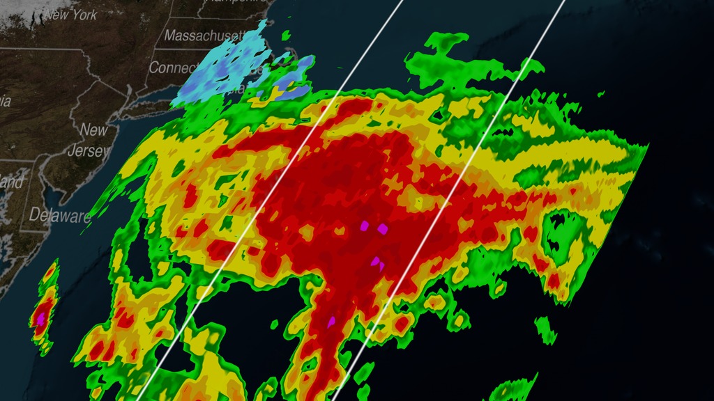
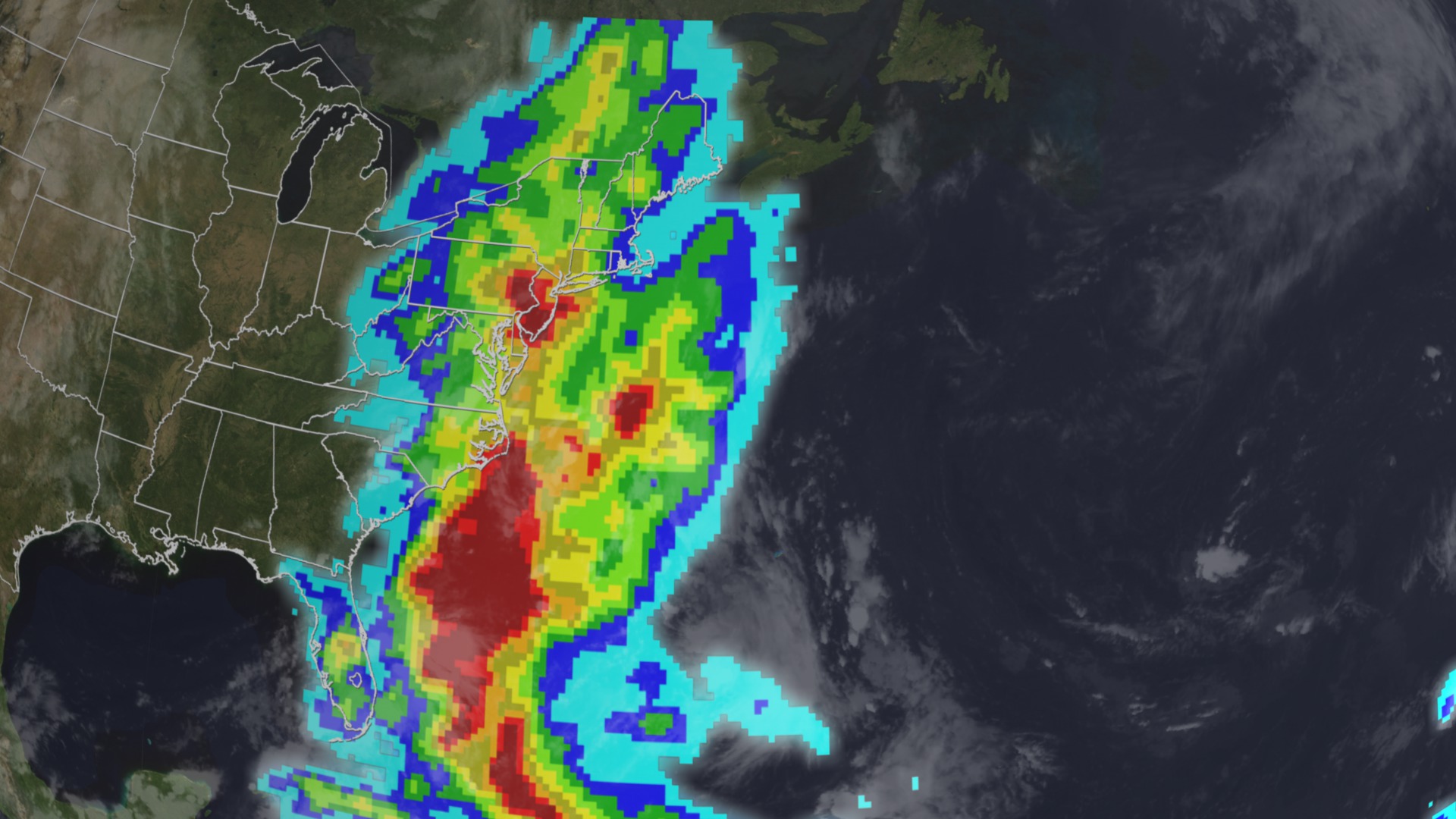
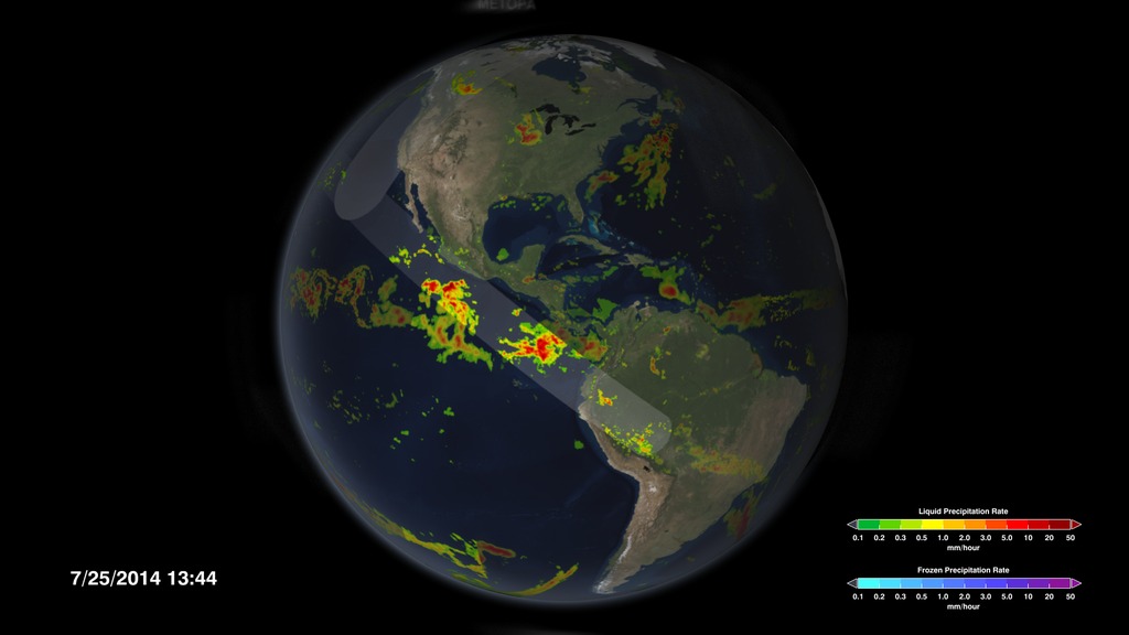
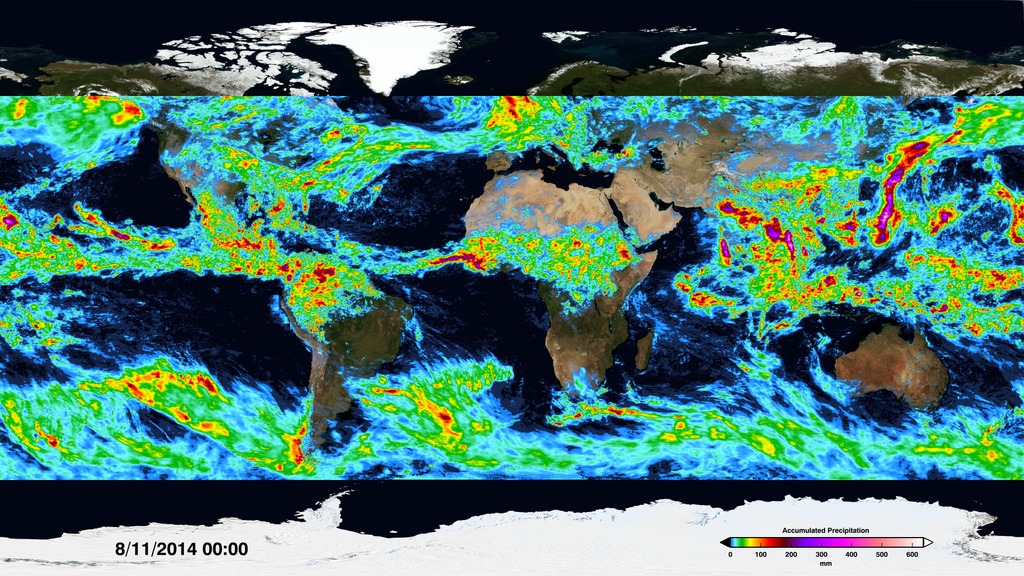
GPM Sees 2015 Nor'easter Dump Snow on New England
Go to this pageAnimation of the Nor'easter as it develops and moves east of the New England coast and then stops on January 26 at 5:06pm EST while GPM takes a snapshot of the storm. Slicing through the volumetric precipitation data shows the low lying nature of this storm as well as the intense precipitation amounts at it's center. The massive potentional for precipitation can be seen in the underlying GMI ground precipitation data. Had the center of the storm parked over New England, it could have generated massive amounts of snowfall. Luckily, it quickly moved out over the warmer ocean water and only the outer bands affected New England, still generating considerable snowfall, but not the historical totals that had been anticipated. || juno1080p.0300_print.jpg (1024x576) [166.7 KB] || juno720p.webm (1280x720) [5.1 MB] || juno1080p.mp4 (1920x1080) [21.3 MB] || juno720p.mp4 (1280x720) [11.2 MB] || 1920x1080_16x9_30p (1920x1080) [64.0 KB] || juno1080p_4266.pptx [23.0 MB] || juno1080p_4266.key [25.6 MB] || juno1080p.mp4.hwshow [190 bytes] ||
- ID: 4256 Visualization
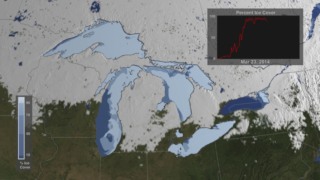
The Winter of 2013 – 2014: A Cold, Snowy and Icy Winter in North America
Go to this pageThis animation shows the snow cover over North America during the 2013-2014 winter as well as the ice concentration over the Great Lakes. The date and a graph showing the percent of ice cover over the Great Lakes and Lake Superior is shown on this version. || GreatLakes_ice_2014-15_30p.02845_print.jpg (1024x576) [134.0 KB] || GreatLakes_ice_2014-15_30p.02845_searchweb.png (320x180) [90.3 KB] || GreatLakes_ice_2014-15_30p.02845_thm.png (80x40) [6.6 KB] || GreatLakes_Ice_2013-2014_720.mp4 (1280x720) [42.1 MB] || GreatLakes_Ice_2013-2014_1080.mp4 (1920x1080) [74.5 MB] || GreatLakes_ice_withOlay (1920x1080) [0 Item(s)] || GreatLakes_ice_withOlay (1920x1080) [0 Item(s)] || GreatLakes_Ice_2013-2014_720.webm (1280x720) [27.5 MB] || GreatLakes_Ice_2013-2014_4256.key [45.7 MB] || GreatLakes_Ice_2013-2014_4256.pptx [43.1 MB] ||
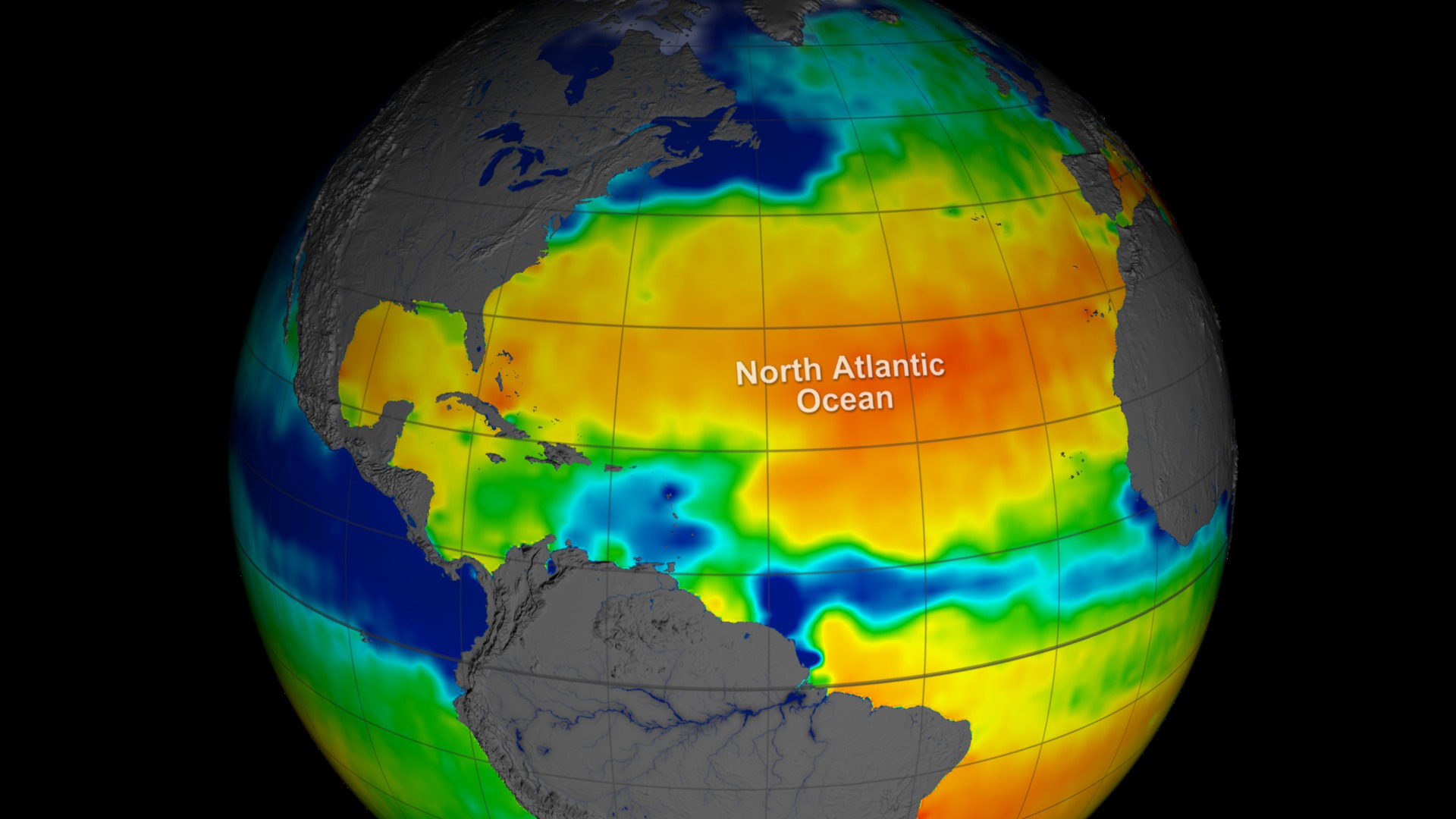
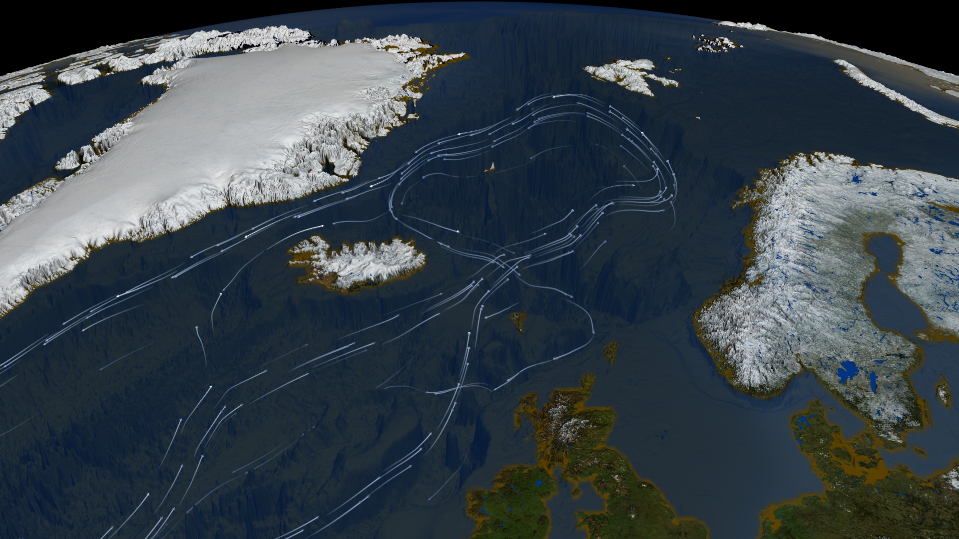
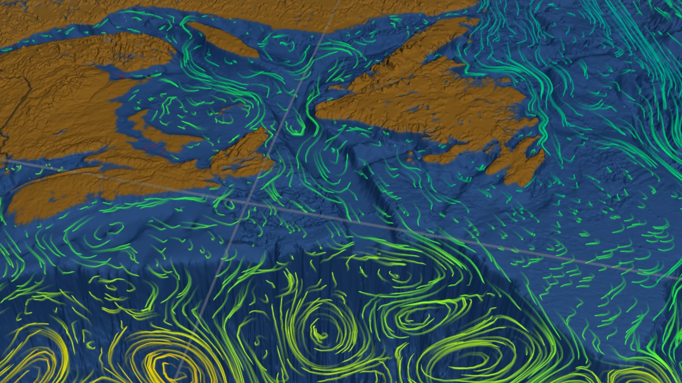
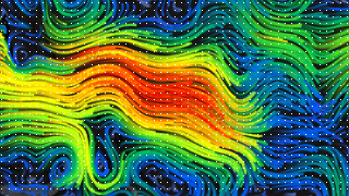
- ID: 4240 Visualization
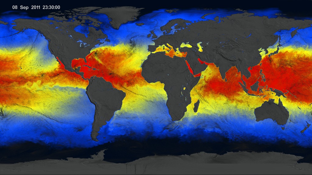
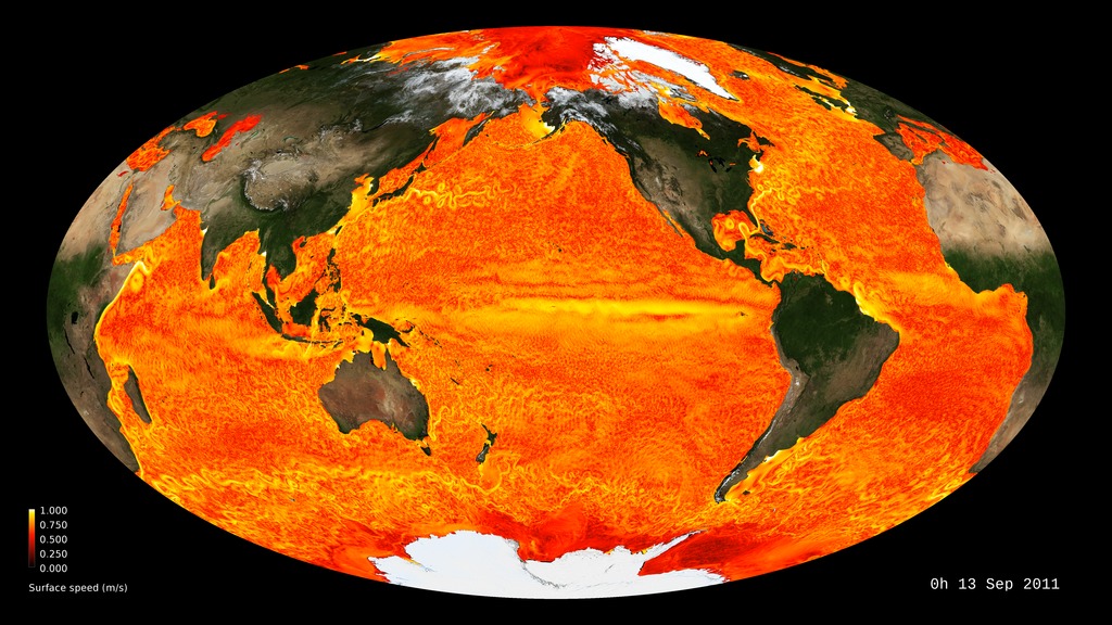
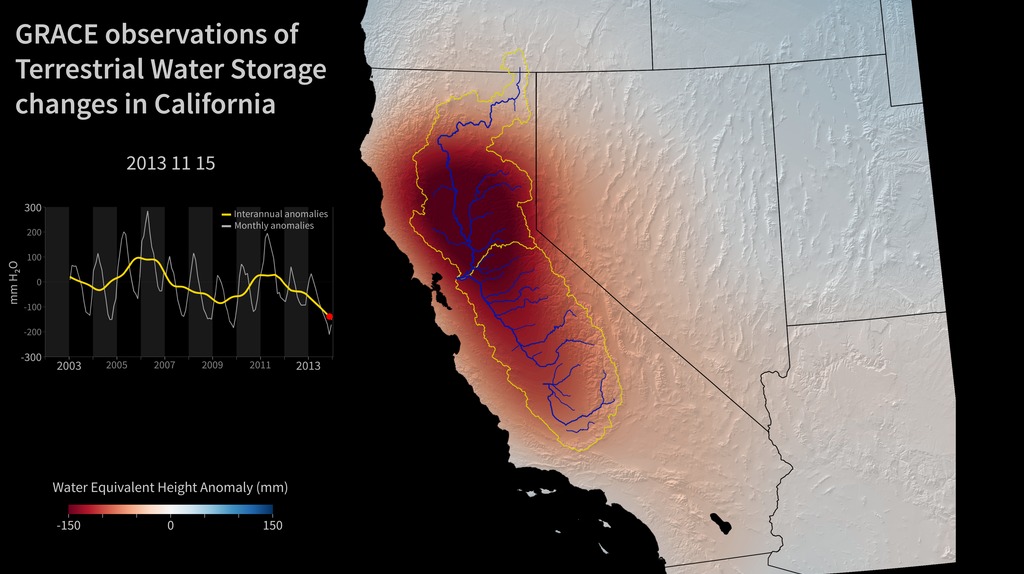
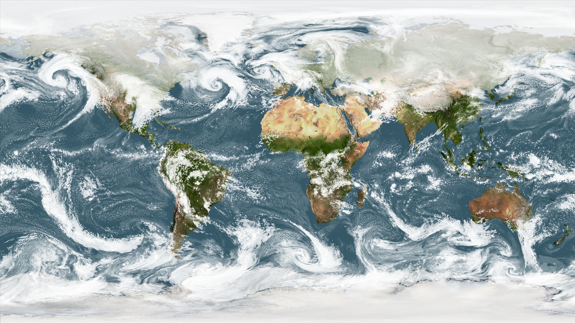
CCMP Winds from June through October 2011
Go to this pageNorth Atlantic surface wind vector flow lines over sea surface temperature from June 1, 2011 to October 31, 2011. || ccmp_atlantic_sstHD36.4800_print.jpg (1024x576) [249.9 KB] || ccmp_atlantic_sstHD36.webm (1920x1080) [37.2 MB] || ccmp_atlantic_sstHD36 (1920x1080) [0 Item(s)] || ccmp_atlantic_sstHD36.mp4 (1920x1080) [593.5 MB] || ccmp_atlantic_sstHD36.m4v (640x360) [44.2 MB] || ccmp_atlantic_sst35 (5760x3240) [0 Item(s)] || CCMP_atlantic_sstHD36.key [150.9 MB] || CCMP_atlantic_sstHD36.pptx [149.1 MB] ||
Observing Earth from Space
- ID: 30496
 Hyperwall Visual
 - ID: 30065
 Hyperwall Visual
- ID: 3891
 Visualization
 - ID: 30280
 Hyperwall Visual
 - ID: 3253
 Visualization
 - ID: 3852
 Visualization
 - ID: 30477
 Hyperwall Visual
 - ID: 30178
 Hyperwall Visual
 - ID: 30220
 Hyperwall Visual
 - ID: 30595
 Hyperwall Visual
 - ID: 30614
 Hyperwall Visual
 - ID: 30610
 Hyperwall Visual
 - ID: 11858
 Produced Video
 - ID: 30590
 Hyperwall Visual
 - ID: 4135
 Visualization
 - ID: 30028
 Hyperwall Visual
Changes at Earth's Poles
- ID: 4301 Visualization
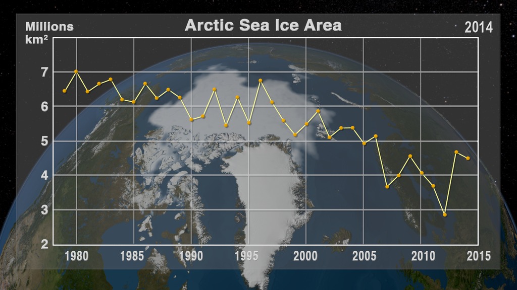
Annual Arctic Sea Ice Minimum 1979-2014 with Area Graph
Go to this pageThis animation shows the annual Arctic sea ice minimum with a graph overlay that depicts the area of the sea ice in millions of square kilometers. || seaIce_1979-2014_min_wGraph.2499_print.jpg (1024x576) [129.9 KB] || seaIce_1979-2014_min_wGraph.2499_searchweb.png (180x320) [83.9 KB] || seaIce_1979-2014_min_wGraph.2499_web.png (320x180) [83.9 KB] || seaIce_1979-2014_min_wGraph.2499_thm.png (80x40) [9.0 KB] || seaIce_1979-2014_min_wGraph_720p30.mp4 (1280x720) [7.5 MB] || seaIce_1979-2014_min_wGraph_1080p30.mp4 (1920x1080) [14.4 MB] || composite (1920x1080) [256.0 KB] || seaIce_1979-2014_min_wGraph_720p30.webm (1280x720) [5.0 MB] || composite (1920x1080) [128.0 KB] || seaIce_1979-2014_min_wGraph_4301.key [22.3 MB] || seaIce_1979-2014_min_wGraph_4301.pptx [19.7 MB] || seaIce_1979-2014_min_wGraph_1080p30.mp4.hwshow [242 bytes] ||
- ID: 30478 Hyperwall Visual
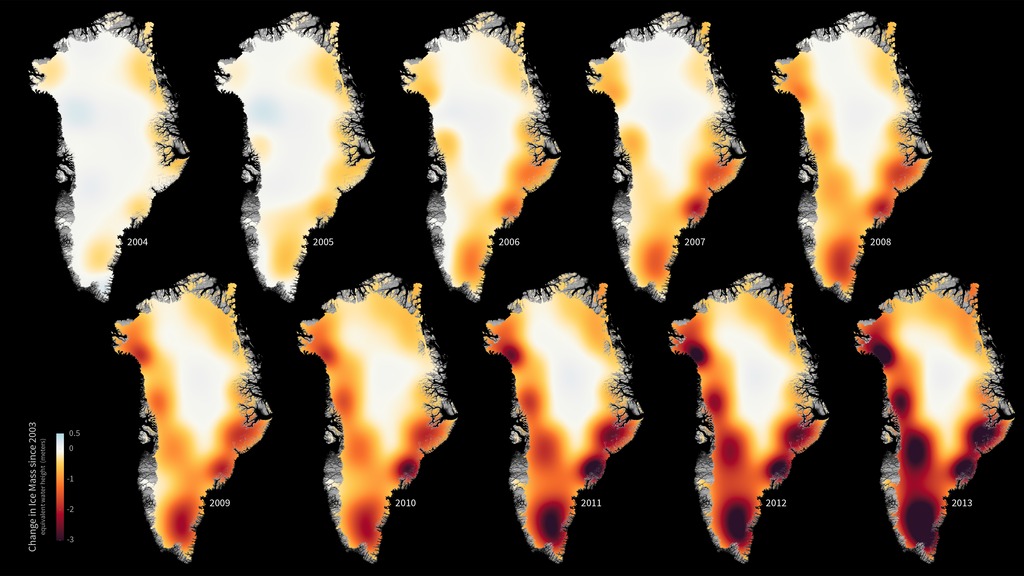
Greenland Ice Loss 2003-2013
Go to this pageThe mass of the Greenland ice sheet has rapidly been declining over the last several years due to surface melting and iceberg calving. Research based on observations from NASA’s twin Gravity Recovery and Climate Experiment (GRACE) satellites indicates that between 2003 and 2013, Greenland shed approximately 280 gigatons of ice per year, causing global sea level to rise by 0.8 millimeters per year. These images, created with GRACE data, show changes in Greenland ice mass since 2003. Orange and red shades indicate areas that lost ice mass, while light blue shades indicate areas that gained ice mass. White indicates areas where there has been very little or no change in ice mass since 2003. In general, higher-elevation areas near the center of Greenland experienced little to no change, while lower-elevation and coastal areas experienced up to 3 meters of ice mass loss (dark red) over a ten-year period. The largest mass decreases of up to 30 centimeters per year occurred over southeastern Greenland. ||
- ID: 30492 Hyperwall Visual
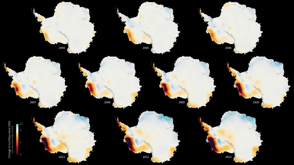
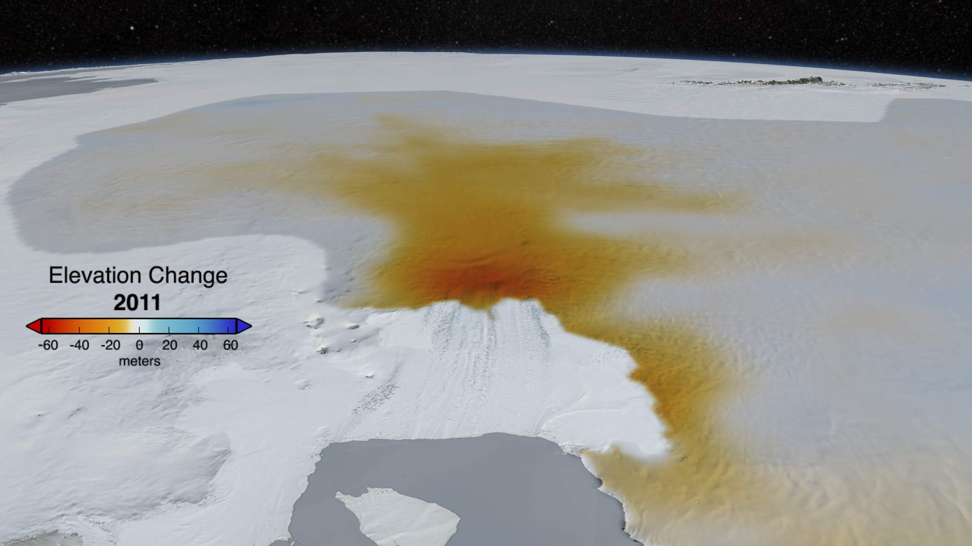
Antarctic Ice Loss 2003-2013
Go to this pageThe mass of the Antarctic ice sheet has changed over the last several years. Research based on observations from NASA’s twin Gravity Recovery and Climate Experiment (GRACE) satellites indicates that between 2003 and 2013, Antarctica shed approximately 90 gigatons of ice per year, causing global sea level to rise by 0.25 millimeters per year.These images, created with GRACE data, show changes in Antarctic ice mass since 2003. Orange and red shades indicate areas that lost ice mass, while light blue shades indicate areas that gained ice mass. White indicates areas where there has been very little or no change in ice mass since 2003. In general, areas near the center of Antarctica experienced small amounts of positive or negative change, while the West Antarctic Ice Sheet experienced a significant ice mass loss (dark red) over the ten-year period. ||
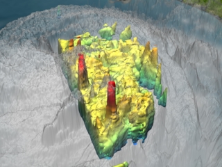
- ID: 3848 Visualization
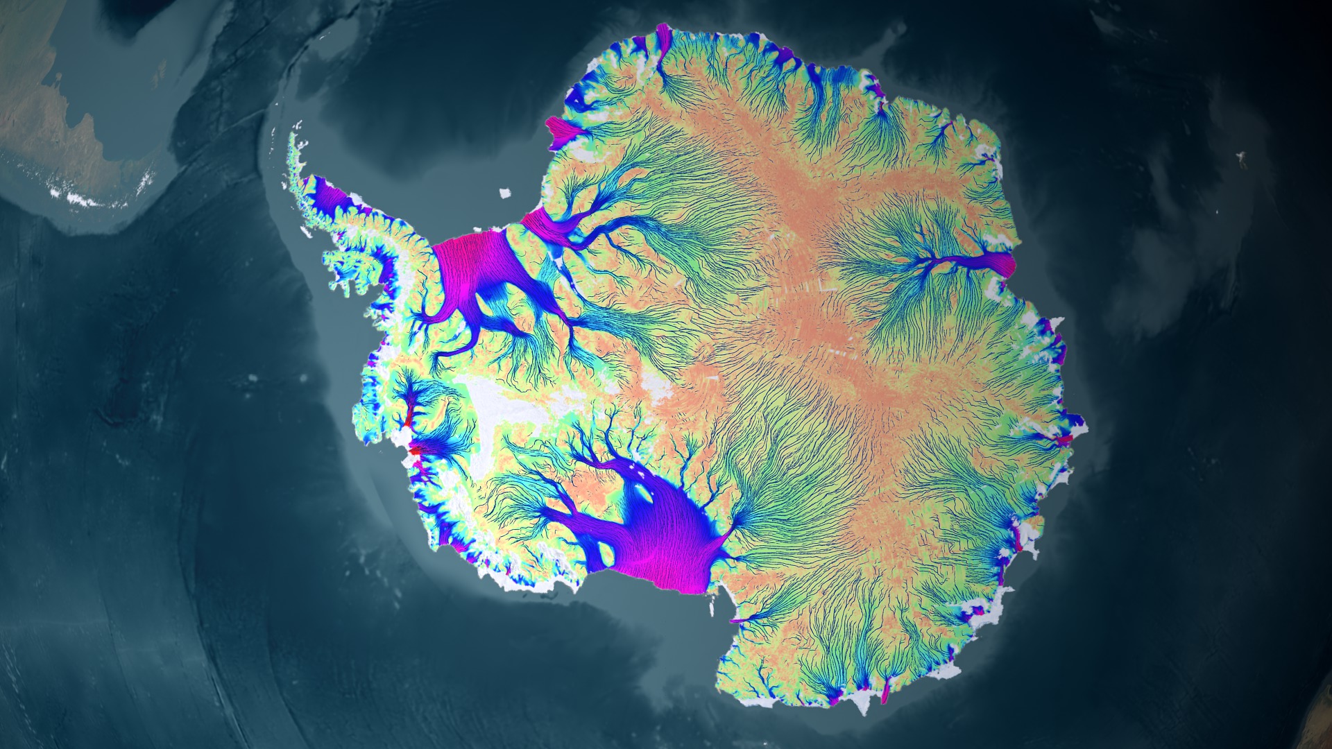
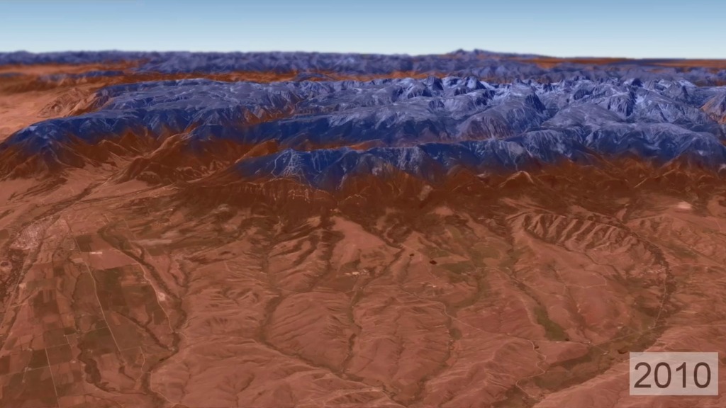
NASA Research Leads to First Complete Map of Antarctic Ice Flow
Go to this pageThis animation shows the motion of ice in Antarctica as measured by satellite data from CSA, JAXA and ESA processed by a NASA Research Team at UC Irvine. The background image from Landsat (visible imagery) is progressively replaced by a map of ice velocity color coded on a logarithmic scale, with values varying from 1 m/yr (brown to green) to 3,000 m/yr (green to blue and red). The animation does not show where ice is melting but how ice is naturally transported from the interior regions where it accumulates from snowfall to the coastal regions where it is discharged into the ocean as tabular icebergs and ice-shelf melt water. For the purpose of the animation, we are representing hundreds to thousands of years of motion. In the first animation, the dynamic range of the flow has been compressed, with slower flows scaled up in velocity to make visible how the flows feed from the interior of the continent. In the second, the flows speeds are in scale to each other.The result illustrates that zones of enhanced motion take their source far into the interior regions of Antarctica, at the foothills of the ridges formed by the ice tops of the continent. This pattern of motion has never been observed on that scale before. These observations have vast implications on our understanding of the flow of ice sheets and how they might respond to climate change in the future and contribute to sea level change. ||
- ID: 4004 Visualization
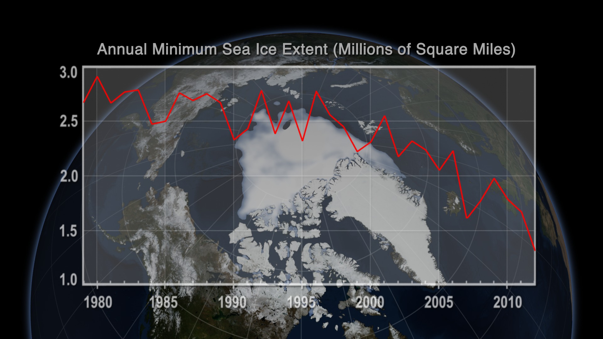
National Climate Assessment Annual Arctic Minimum Sea Ice Extents (1979-2012)
Go to this pageThe National Climate Assessment (NCA) is a central component of the U.S. Global Change Research Program (USGCRP). Every four years, the NCA is required to produce a report for Congress that integrates, evaluates, and interprets the findings of the USGCRP; analyzes the effects of global change on the natural environment, agriculture, energy production and use, land and water resources, transportation, human health and welfare, human social systems, and biological diversity; and analyzes current trends in global change, both human-induced and natural, and projects major trends for the subsequent 25 to 100 years. A draft of the Third National Climate Assessment report is available on the Federal Advisory Committee website. The final report is slated to be released in 2014. This scientific visualization of annual minimum sea ice area over the Arctic from 1979-2012 is one element of the NCA that highlights findings conveyed in the "Our Changing Climate", the "Alaska and the Arctic" and the "Impacts of Climate Change on Tribal, Indigenous, and Native Lands and Resources" chapters of the draft Third NCA report. This record shows a persistent decline in the minimum extent of Arctic sea ice cover. The satellite observations are from passive microwave sensors and processed using the NASA Team algorithm developed by scientists at NASA Goddard Space Flight Center. The sensors that collected the data are the Scanning Multichannel Microwave Radiometer (SMMR) on the NASA Nimbus-7 satellite and a series of Special Sensor Microwave Imagers (SSM/I) and Special Sensor Microwave Imager and Sounders (SSMIS) on U.S. Department of Defense Meteorological Satellite Program (DMSP) satellites. The data from the different sensors are carefully assembled to assure consistency throughout the 34 year record.This visualization is similar to another developed by NASA, but is based on a slightly different algorithm to process the same sensor data. Both show similar downward trends in minimum sea ice area coverage over this time period. ||
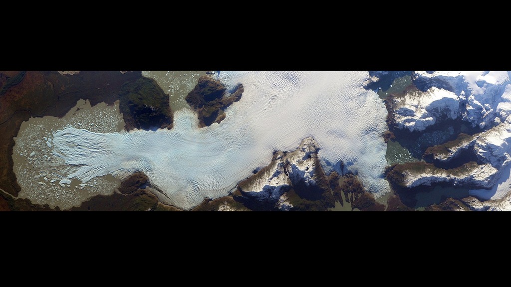
- ID: 3889 Visualization
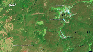
Pine Island Glacier Ice Flows and Elevation Change
Go to this pageThis animation shows glacier changes detected by ATM, ICESat and ice bridge data in the highly dynamic Pine Island Glacier. We know that ice speeds in this area have increased dramatically from the late 1990s to the present as the ice shelves in this area have thinned and the bottom of the ice has lost contact with the bed beneath. As the ice has accelerated, ice upstream of the coast must be stretched more vigorously, causing it to thin. NASA-sponsored aircraft missions first measured the ice surface height in this region in 2002, followed by ICESat data between 2002 and 2009. Ice Bridge aircraft have measured further surface heights in 2009 and 2010, and these measurements continue today. Integrating these altimetry sources allows us to estimate surface height changes throughout the drainage regions of the most important glaciers in the region. We see large and accelerating elevation changes extending inland from the coast on Pine Island glacier shown centered here. The changes on Pine Island mark these as potential continuing sources of ice to the sea, and has been surveyed in 2011 by Ice Bridge aircraft and targeted for repeat measurements in coming years. ||
- ID: 10923 Produced Video
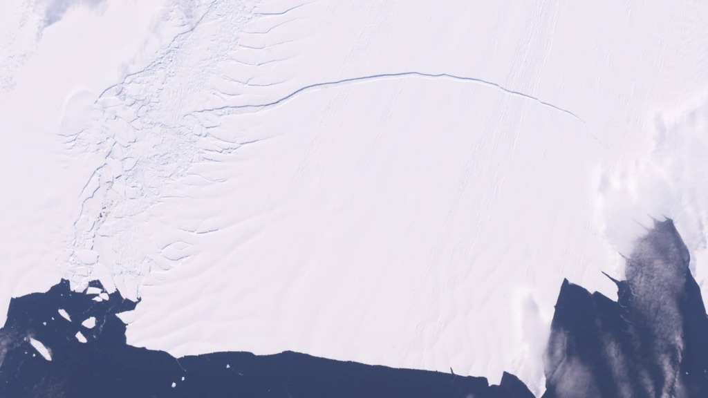
Flying through the Rift: An update on the crack in the P.I.G.
Go to this pageNASA's DC-8 flew over the Pine Island Glacier Ice Shelf on Oct. 14, 2011, as part of Operation IceBridge. A large, long-running crack was plainly visible across the ice shelf. The DC-8 took off on Oct. 26, 2011, to collect more data on the ice shelf and the crack. The area beyond the crack that could calve in the coming months covers about 310 square miles (800 sq. km). ||
- ID: 30160 Hyperwall Visual
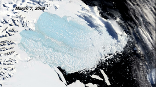
Collapse of the Larsen B Ice Shelf
Go to this pageIn the Southern Hemisphere summer of 2002, scientists monitoring daily satellite images of the Antarctic Peninsula watched almost the entire Larsen-B Ice Shelf splinter and collapse in just over one month. They had never witnessed such a large area—1250 square miles (~3237 square kilometers)—disintegrate so rapidly. The collapse of the Larsen-B Ice Shelf was captured in this series of images between January 31 and April 13, 2002. At the start of the series, the ice shelf (left) is tattooed with pools of meltwater (blue). By February 17, the leading edge of the C-shaped shelf had retreated about 6 miles (~10 kilometers). By March 7, the shelf had disintegrated into a blue-tinged mixture, or mélange, of slush and icebergs. The collapse appears to have been due to a series of warm summers on the Antarctic Peninsula, which culminated with an exceptionally warm summer in 2002. Warm ocean temperatures in the Weddell Sea that occurred during the same period might have caused thinning and melting on the underside of the ice shelf. ||
- ID: 30055 Hyperwall Visual
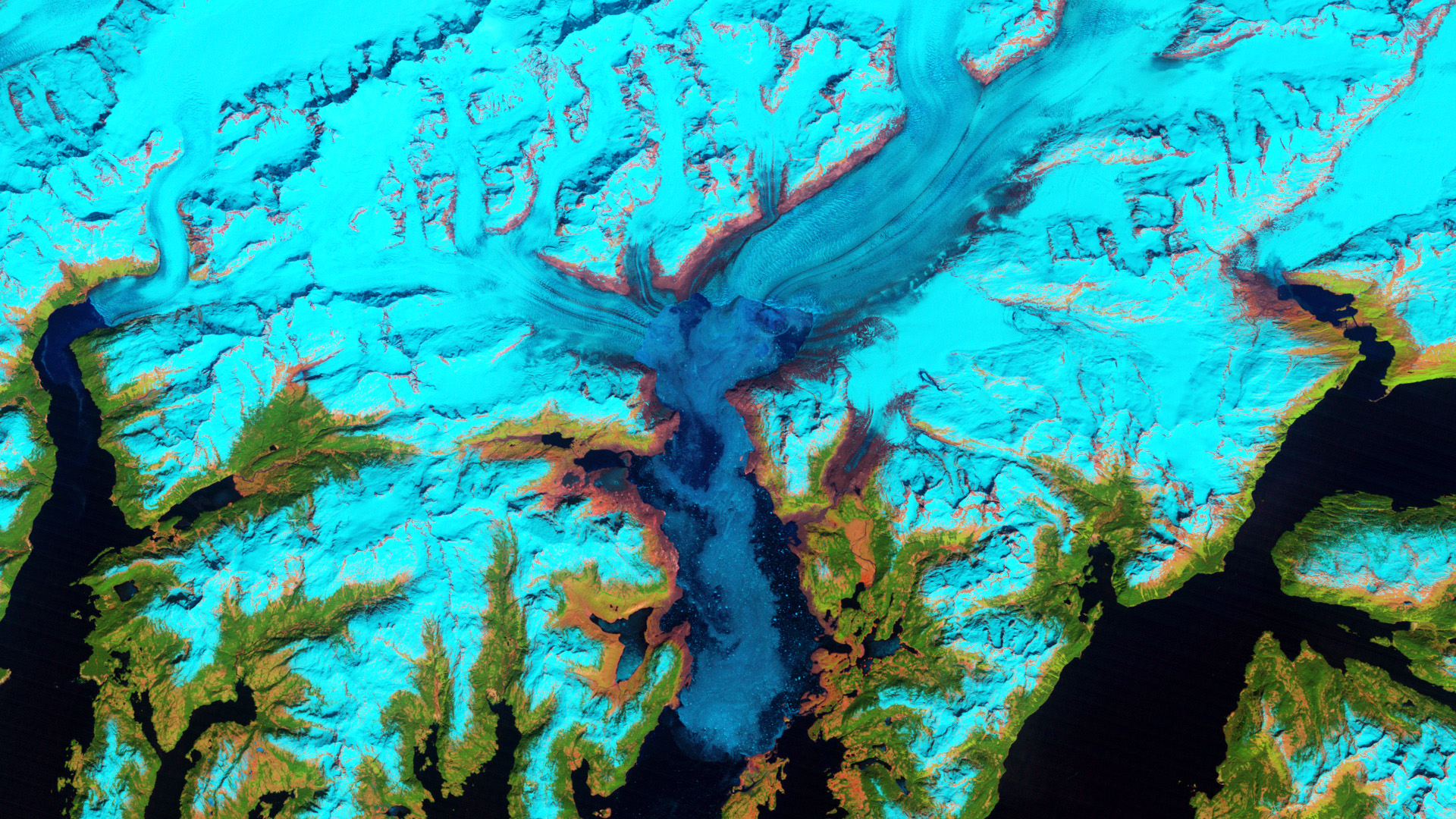
Columbia Glacier, Alaska
Go to this pageThe Columbia Glacier in Alaska is one of the most rapidly changing glaciers in the world. These false-color images show how the glacier and the surrounding landscape has changed since 1986. Snow and ice appears bright cyan, vegetation is green, clouds are white or light orange, and the open ocean is dark blue. Exposed bedrock is brown, while rocky debris on the glacier’s surface is gray. By 2011, the terminus had retreated more than 20 kilometers (12 miles) to the north. Since the 1980s, the glacier has lost about half of its total thickness and volume. The retreat of the Columbia contributes to global sea-level rise, mostly through iceberg calving. This one glacier accounts for nearly half of the ice loss in the Chugach Mountains. However, the ice losses are not exclusively tied to increasing air and water temperatures. Climate change may have given the Columbia an initial nudge, but it has more to do with mechanical processes. In fact, when the Columbia reaches the shoreline, its retreat will likely slow down. The more stable surface will cause the rate of calving to decline, making it possible for the glacier to start rebuilding a moraine and advancing once again. ||
- ID: 30598 Hyperwall Visual
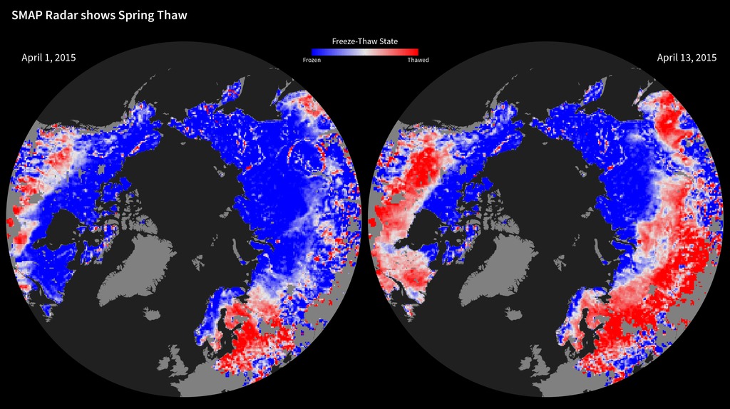
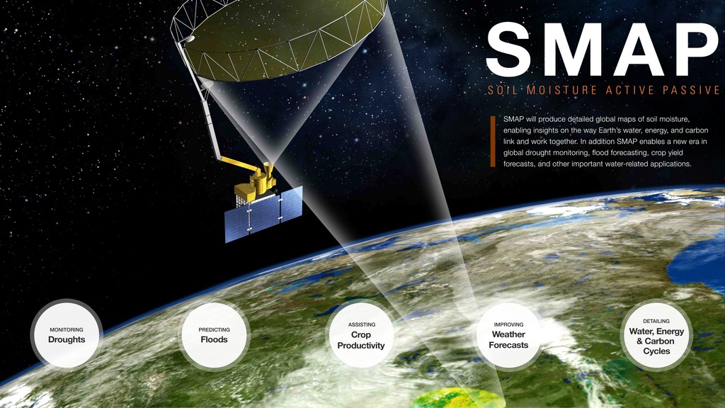
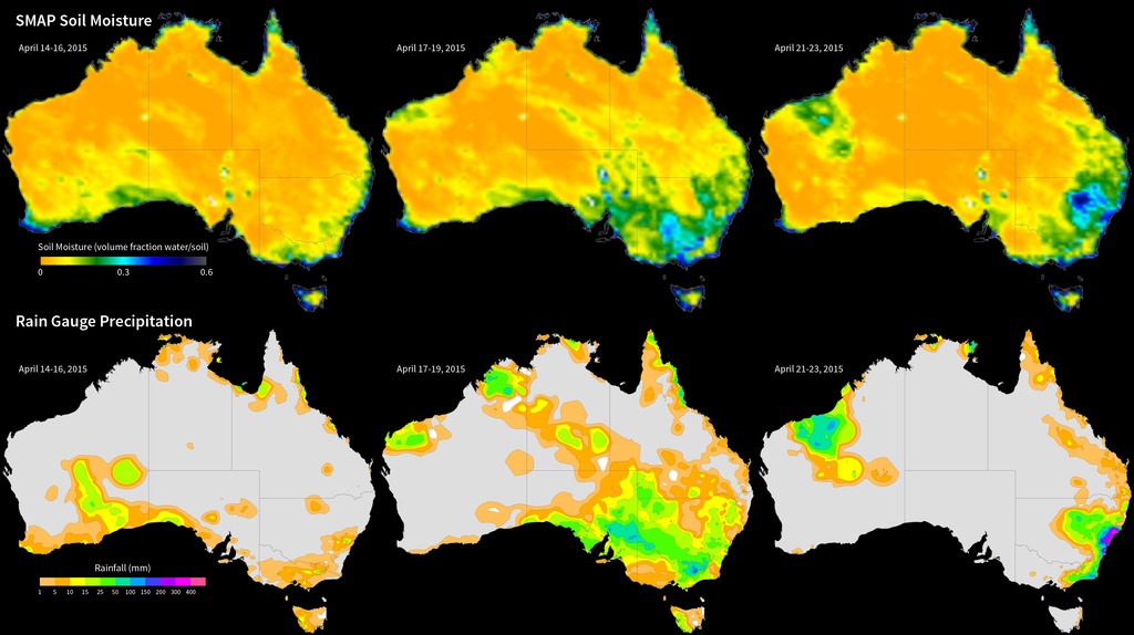
SMAP Radar Shows Spring Thaw
Go to this pageFeeze/Thaw state for two days in April 2015 || smap_freeze_thaw_2015_pia11399_print.jpg (1024x574) [171.9 KB] || smap_freeze_thaw_2015_pia11399.png (4104x2304) [1022.1 KB] || smap_freeze_thaw_2015_pia11399_searchweb.png (320x180) [72.3 KB] || smap_freeze_thaw_2015_pia11399_thm.png (80x40) [6.8 KB] || smap_freeze_thaw_2015_30598.key [3.9 MB] || smap_freeze_thaw_2015_30598.pptx [1.3 MB] || smap_freeze_thaw_2015_pia11399.hwshow [228 bytes] ||
Earth's Ocean and Water Resources
- ID: 30008
 Hyperwall Visual
 - ID: 3912
 Visualization
 - ID: 4045
 Visualization
 - ID: 3884
 Visualization
 - ID: 3913
 Visualization
 - ID: 3958
 Visualization
 - ID: 30494
 Hyperwall Visual
 - ID: 30504
 Hyperwall Visual
 - ID: 30550
 Hyperwall Visual
 - ID: 30509
 Hyperwall Visual
 - ID: 30500
 Hyperwall Visual
 - ID: 30502
 Hyperwall Visual
 - ID: 3887
 Visualization
 - ID: 30019
 Hyperwall Visual
 - ID: 30503
 Hyperwall Visual
 - ID: 30287
 Hyperwall Visual
 - ID: 30289
 Hyperwall Visual
 - ID: 30073
 Hyperwall Visual
 - ID: 30158
 Hyperwall Visual
 - ID: 3623
 Visualization
 - ID: 30489
 Hyperwall Visual
 - ID: 30054
 Hyperwall Visual
 - ID: 30045
 Hyperwall Visual
 - ID: 30521
 Hyperwall Visual
 - ID: 30512
 Hyperwall Visual
 - ID: 4233
 Visualization
 - ID: 30583
- ID: 30582
 Infographic
 - ID: 30601
 Hyperwall Visual
 - ID: 30599
 Hyperwall Visual
 - ID: 4283
 Visualization
 - ID: 4284
- ID: 30584
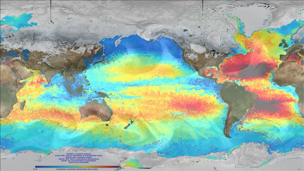
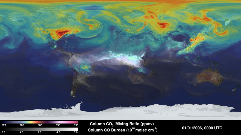
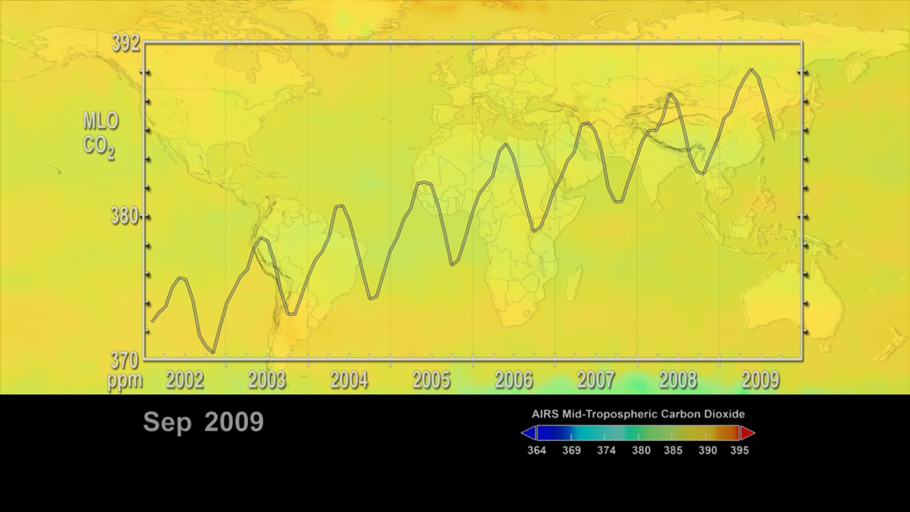
- ID: 4270
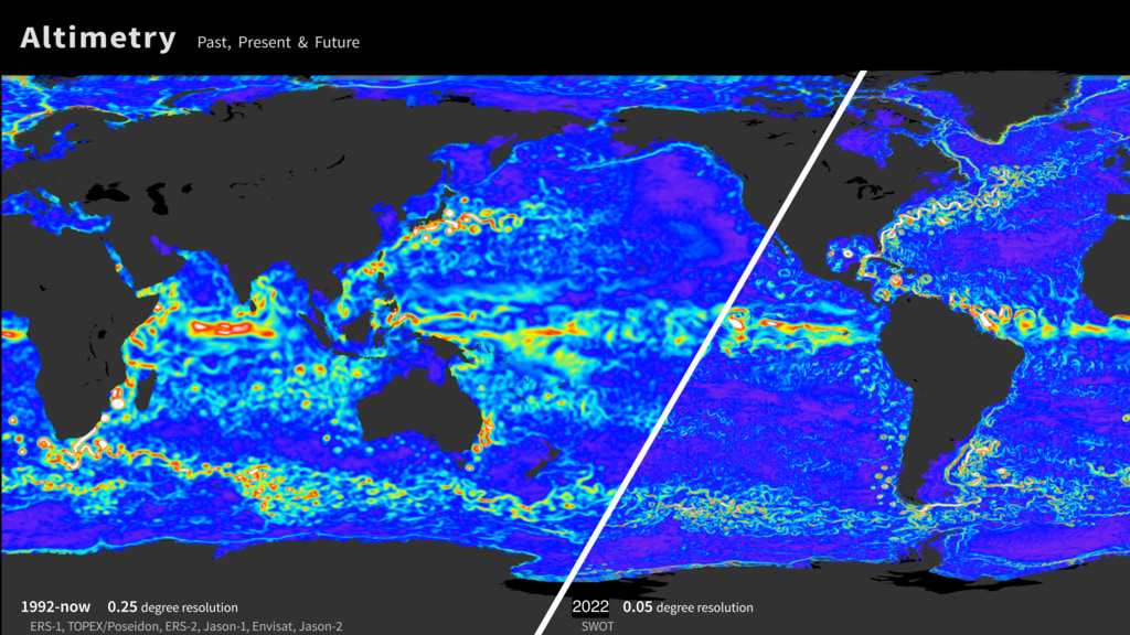
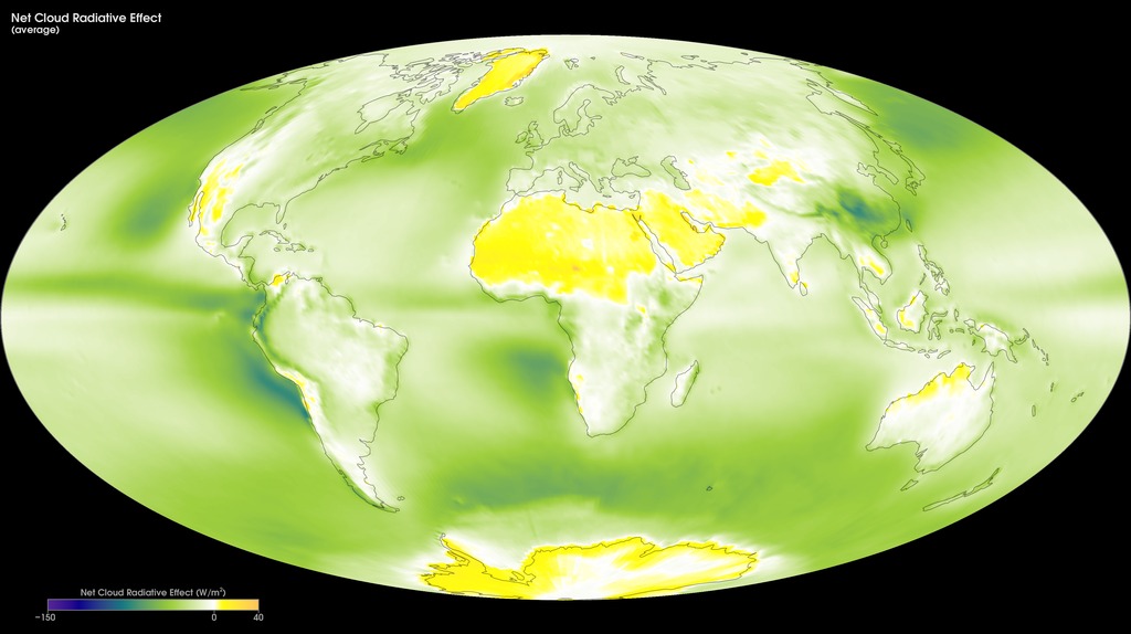
- ID: 4240Visualization
- ID: 30552
 Hyperwall Visual
Atmospheric Composition and Aerosols
- ID: 30515
 Hyperwall Visual
 - ID: 11579
- ID: 3586
- ID: 3685
- ID: 30017
 Hyperwall Visual
 - ID: 3947
- ID: 3882
 Visualization
 - ID: 30014
 Hyperwall Visual
 - ID: 3783
- ID: 3722

- ID: 3723
- ID: 30603
 Hyperwall Visual
 - ID: 30476
 Hyperwall Visual
 - ID: 11775
 Produced Video
 - ID: 4184
- ID: 30602
 Hyperwall Visual
Forests and Biodiversity
- ID: 30595 Hyperwall Visual
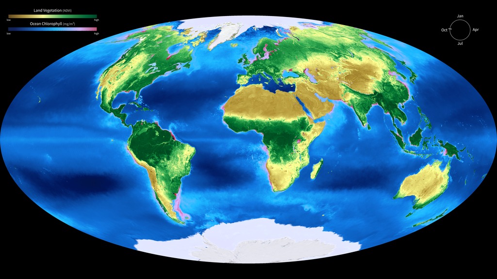
Global Biosphere, Yearly Cycle
Go to this pageA different color scheme to differentiate ocean and land. || biosphere_cryo_280_print.jpg (1024x576) [145.4 KB] || biosphere_cryo_280_searchweb.png (180x320) [77.2 KB] || biosphere_cryo_280_thm.png (80x40) [7.2 KB] || biosphere_cryo_1080p.mp4 (1920x1080) [10.5 MB] || biosphere_cryo_720p.mp4 (1280x720) [5.0 MB] || biosphere_cryo_720p.webm (1280x720) [1.4 MB] || biosphere_cryo_2160p.mp4 (3840x2160) [37.2 MB] || biosphere_cryo_280.tif (5760x3240) [14.7 MB] || biosphere_cryo_3240p.mp4 (5760x3240) [43.6 MB] || biosphere_cryo_30595.key [14.6 MB] || biosphere_cryo_30595.pptx [12.0 MB] ||
- ID: 3868 Visualization
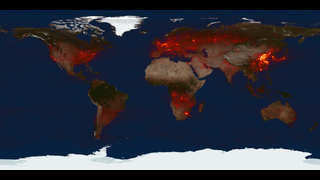
Global Fire Observations and MODIS NDVI
Go to this pageThis visualization leads viewers on a narrated global tour of fire detections beginning in July 2002 and ending July 2011. The visualization also includes vegetation and snow cover data to show how fires respond to seasonal changes. The tour begins in Australia in 2002 by showing a network of massive grassland fires spreading across interior Australia as well as the greener Eucalyptus forests in the northern and eastern part of the continent. The tour then shifts to Asia where large numbers of agricultural fires are visible first in China in June 2004, then across a huge swath of Europe and western Russia in August, and then across India and Southeast Asia through the early part of 2005. It moves next to Africa, the continent that has more abundant burning than any other. MODIS observations have shown that some 70 percent of the world's fires occur in Africa alone. In what's a fairly average burning season, the visualization shows a huge outbreak of savanna fires during the dry season in Central Africa in July, August, and September of 2006, driven mainly by agricultural activities but also by the fact that the region experiences more lightning than anywhere else in the world. The tour shifts next to South America where a steady flickering of fire is visible across much of the Amazon rainforest with peaks of activity in September and November of 2009. Almost all of the fires in the Amazon are the direct result of human activity, including slash-and-burn agriculture, because the high moisture levels in the region prevent inhibit natural fires from occurring. It concludes in North America, a region where fires are comparatively rare. North American fires make up just 2 percent of the world's burned area each year. The fires that receive the most attention in the United States, the uncontrolled forest fires in the West, are less visible than the wave of agricultural fires prominent in the Southeast and along the Mississippi River Valley, but some of the large wildfires that struck Texas earlier this spring are visible. More information on the Fire Information for Resource Management System (FIRMS) is available at http://maps.geog.umd.edu/firms/. ||
- ID: 30194 Hyperwall Visual
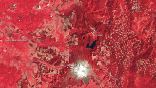
Burn Recovery in Yellowstone
Go to this pageIn the summer of 1988, lightning- and human-ignited fires consumed vast stretches of Yellowstone National Park. By the time the first snowfall extinguished the last flames in September, 793,000 of the park’s 2,221,800 acres had burned.This series of images shows the scars left in the wake of the western Yellowstone fires and the slow recovery in the twenty years that followed. Taken by Landsat-5, the images were made with a combination of visible and infrared light (green, short-wave infrared, and near infrared) to highlight the burned area and changes in vegetation. In the years that follow, the burn scar fades progressively. On the ground, grasses and wildflowers sprung up from the ashes and tiny pine trees took root and began to grow. Though changes did occur between 1988 and 2010, recovery has been slow. In 2010, the burned area is still clearly discernible.Images acquired by Landsat satellites Reference: NASA’s Earth Observatory ||
- ID: 30162 Hyperwall Visual
Devastation and Recovery of Mt. St. Helens
Go to this pageIn the nearly four decades since the eruption (1980), Mt. St. Helens has given scientists an unprecedented opportunity to witness the steps through which life reclaims a devastated landscape. The scale of the eruption and the beginning of reclamation in the Mt. St. Helens blast zone are documented in this series of images between 1979 and 2017. The older images are false-color (vegetation is red). Not surprisingly, the first noticeable recovery (late 1980s) takes place in the northwestern quadrant of the blast zone, farthest from the volcano. It is another decade (late 1990s) before the terrain east of Spirit Lake is considerably greener. By the end of the series, the only area (beyond the slopes of the mountain itself) that remains conspicuously bare at the scale of these images is the Pumice Plain. ||
- ID: 30166 Hyperwall Visual
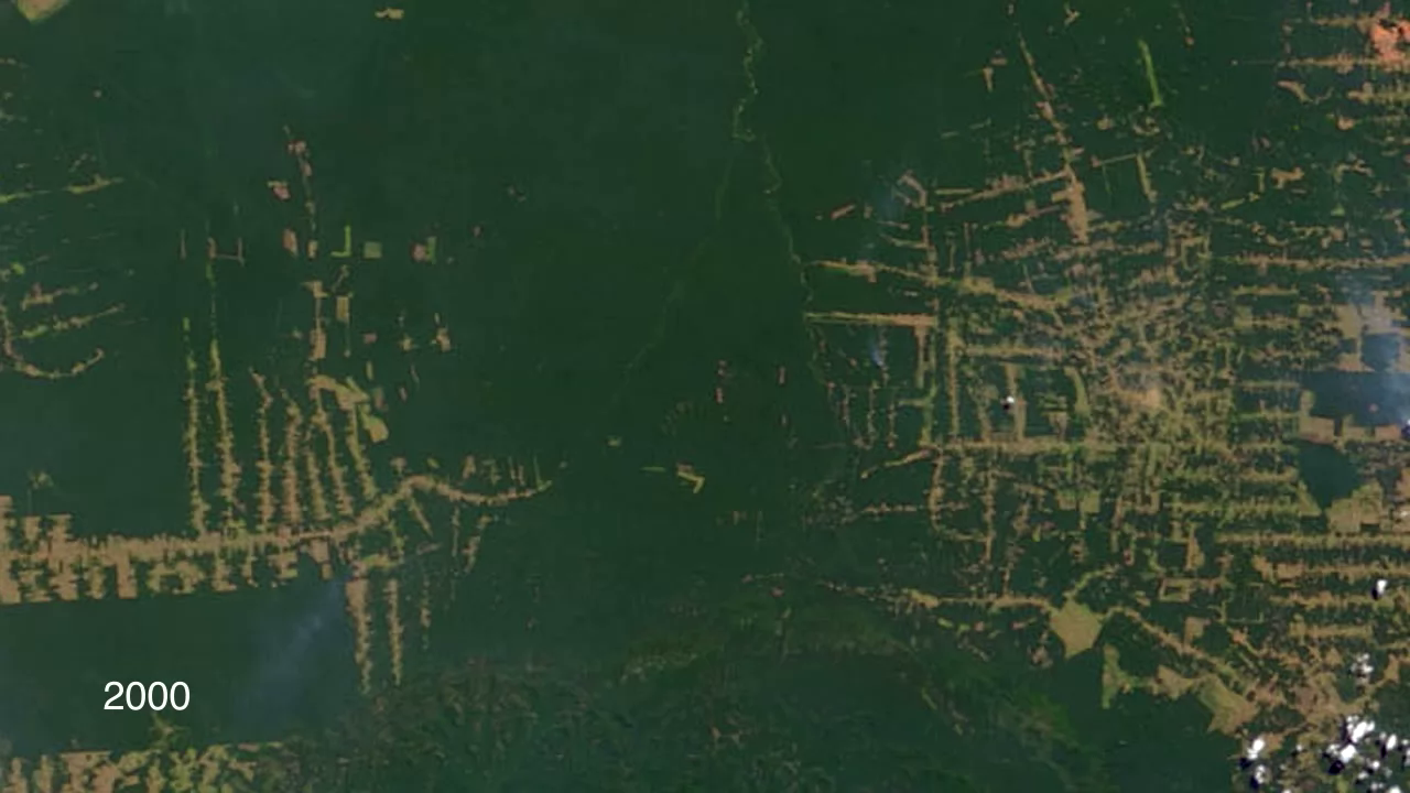
Amazon Deforestation
Go to this pageThe state of Rondônia in western Brazil has become one of the most deforested parts of the Amazon. This image series, created with data from the Moderate Resolution Imaging Spectroradiometer (MODIS) onboard NASA’s Terra satellite, shows the region from 2000 to 2010. By the year 2000, the frontier had reached the remote northwest corner of Rondônia. Intact forest is deep green, while cleared areas are tan (bare ground) or light green (crops, pastures). Deforestation follows a predictable pattern in these images. The first clearings appear in a fishbone pattern, arrayed along the edges of roads. Over time, the fishbones collapse into a mixture of forest remnants, cleared areas, and settlements. This pattern is common in the Amazon. Legal and illegal roads penetrate a remote part of the forest, and small farmers migrate to the area. They claim land along the road and clear some of it for crops. Within a few years, heavy rains and erosion deplete the soil, and crop yields fall. Farmers then convert the degraded land to cattle pasture, and clear more forest for crops. ||
- ID: 30059 Hyperwall Visual
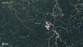
Mountaintop Mining, West Virginia
Go to this pageThese images illustrate the growth of the Hobet mine in Boone County, WV as it moves from ridge to ridge between 1984 and 2015. The natural forested landscape appears dark green, creased by steams and indented by hollows. Active mining areas, however, appear off-white and areas being reclaimed with vegetation appear light green. The law requires coal operators to restore the land to its approximate original shape, but the rock debris generally can’t be securely piled as high or graded as steeply as the original mountaintop. There is always too much rock left over, and coal companies dispose of it by building valley fills in hollows, gullies, and streams. While the image from 2015 shows apparent green-up of restored lands, it also shows expanded operations in the west. The resulting impacts to stream biodiversity, forest health, and ground-water quality are high, and may be irreversible. ||
- ID: 30555 Hyperwall Visual
Projected Suitable Habitats for Whitebark Pine
Go to this pageProjected changes in suitable habitats for whitebark pine from 2010-2099. || proj_suitable_habitats_whitebark_pine_print.jpg (1024x576) [127.0 KB] || proj_suitable_habitats_whitebark_pine_searchweb.png (320x180) [91.3 KB] || proj_suitable_habitats_whitebark_pine_web.png (320x180) [91.3 KB] || proj_suitable_habitats_whitebark_pine_thm.png (80x40) [6.2 KB] || proj_suitable_habitats_whitebark_pine.webm (1280x720) [8.1 MB] || 4104x2304_16x9_30p (4104x2304) [256.0 KB] || proj_suitable_habitats_whitebark_pine.mp4 (1280x720) [201.0 MB] || Projected_Hab_Whitebark_pine_4096x2304.mp4 (4104x2304) [284.3 MB] || proj_suitable_habitats_whitebark_pine.pptx [202.2 MB] || proj_suitable_habitats_whitebark_pine.key [205.0 MB] || projected-suitable-habitats-for-whitebark-pine.hwshow [243 bytes] ||
- ID: 4100 Visualization
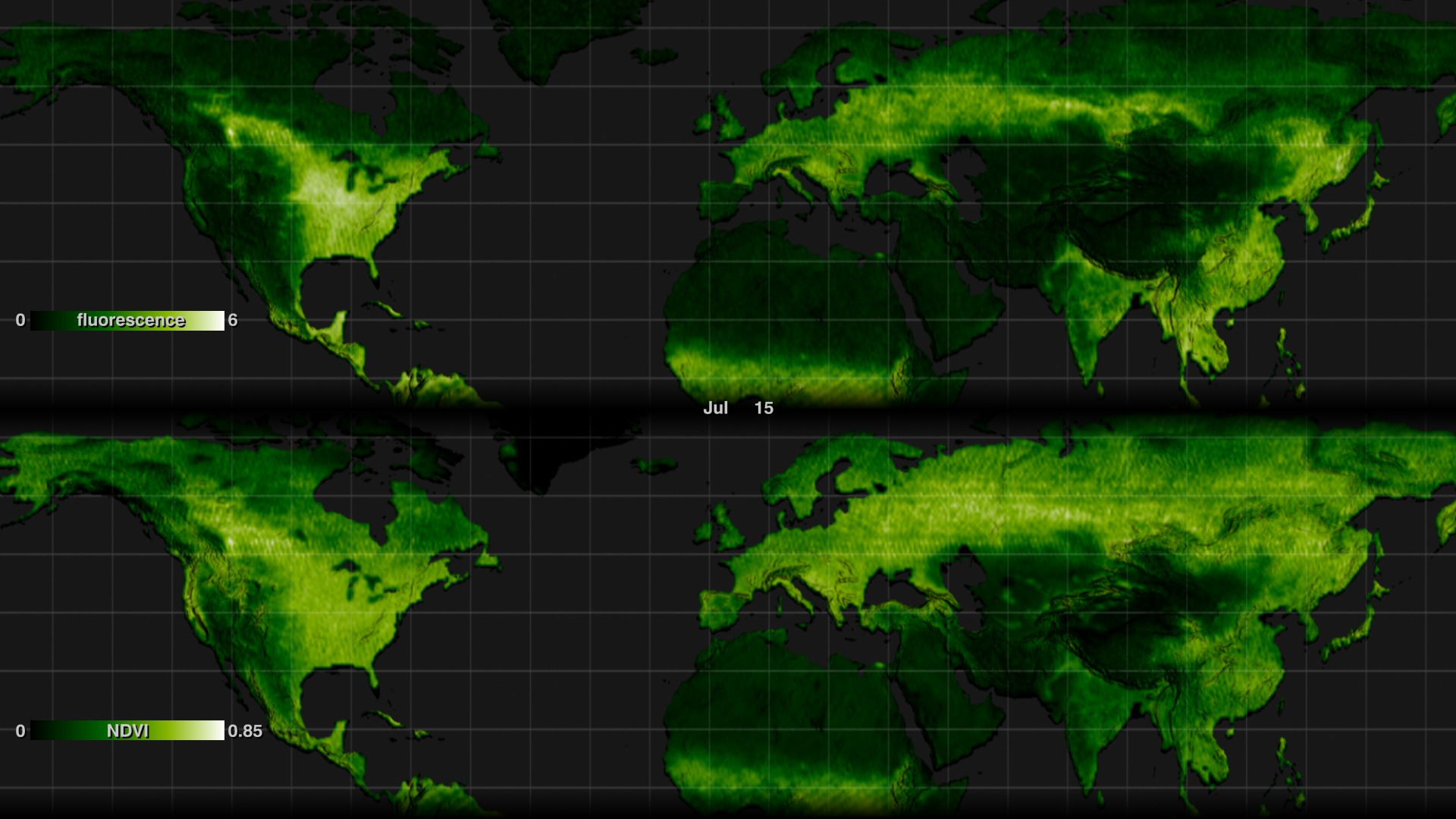
Fluorescence Visualizations in High-Resolution (Comparison to NDVI)
Go to this pageDuring photosynthesis, plants fluoresce. This faint glow is in the infrared part of the spectrum, not visible to the naked eye but detectable by satellites orbiting hundreds of miles above Earth. NASA scientists established a method to turn this satellite data into global maps of the subtle phenomenon in more detail than ever before.The new maps, released in 2013, provide a 16-fold increase in spatial resolution and a 3-fold increase in temporal resolution over the first proof-of-concept maps released in 2011. This lets scientists use fluorescence to observe, for example, variation in the length of the growing season.These visualizations of the phenomenon shows global land plant fluorescence data collected from 2007 to 2011, combined to depict a single average year. Darker greens indicates regions with little or no fluorescence; lighter greens and white indicate regions of high fluorescence.Fluorescence and Normalized Difference Vegetation Index (NDVI) are compared. A visualization is provided comparing the northern hemisphere of both data sets. Individual visualizations are also provided in a standard cylindrical equidistant projection for wrapping to a globe. The same color bars are used for both data sets for easier comparison. ||
- ID: 11393 Produced Video

Global Forest Cover, Loss, and Gain 2000-2012
Go to this pageTwelve years of global deforestation, wildfires, windstorms, insect infestations, and more are captured in a new set of forest disturbance maps created from billions of pixels acquired by the imager on the NASA-USGS Landsat 7 satellite. The maps are the first to measure forest loss and gain using a consistent method around the globe at high spatial resolution, allowing scientists to compare forest changes in different countries and to monitor annual deforestation. Since each pixel in a Landsat image represents a piece of land about the size of a baseball diamond, researchers can see enough detail to tell local, regional and global stories. Hansen and colleagues analyzed 143 billion pixels in 654,000 Landsat images to compile maps of forest loss and gain between 2000 and 2012. During that period, 888,000 square miles (2.3 million square kilometers) of forest was lost, and 308,900 square miles (0.8 million square kilometers) regrew. The researchers, including scientists from the University of Maryland, Google, the State University of New York, Woods Hole Research Center, the U.S. Geological Survey and South Dakota State University, published their work in the Nov. 15, 2013, issue of the journal Science.Key to the project was collaboration with team members from Google Earth Engine, who reproduced in the Google Cloud the models developed at the University of Maryland for processing and characterizing the Landsat data; Google Earth Engine contains a complete copy of the Landsat record. The computing required to generate these maps would have taken 15 years on a single desktop computer, but with cloud computing was performed in a few days. Since 1972, the Landsat program has played a critical role in monitoring, understanding and managing the resources needed to sustain human life such as food, water and forests. Landsat 8 launched Feb. 11, 2013, and is jointly managed by NASA and USGS to continue the 40-plus years of Earth observations. To view the forest cover maps in Google Earth Engine, visit: http://earthenginepartners.appspot.com/google.com/science-2013-global-forest ||
Human Footprints
- ID: 30028 Hyperwall Visual
Earth at Night 2012
Go to this pageThis new space-based view of Earth's city lights is a composite assembled from data acquired by the Suomi National Polar-orbiting Partnership (Suomi NPP) satellite. The data was acquired over nine days in April 2012 and thirteen days in October 2012. It took the satellite 312 orbits and 2.5 terabytes of data to get a clear shot of every parcel of Earth's land surface and islands. This new data was then mapped over existing MODIS Blue Marble imagery to provide a realistic view of the planet.The view was made possible by the "day-night band" of Suomi NPP's Visible Infrared Imaging Radiometer Suite. VIIRS detects light in a range of wavelengths from green to near-infrared and uses "smart" light sensors to observe dim signals such as city lights, auroras, wildfires, and reflected moonlight. This low-light sensor can distinguish night lights tens to hundreds of times better than previous satellites. ||
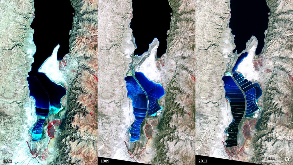
- ID: 30165 Hyperwall Visual

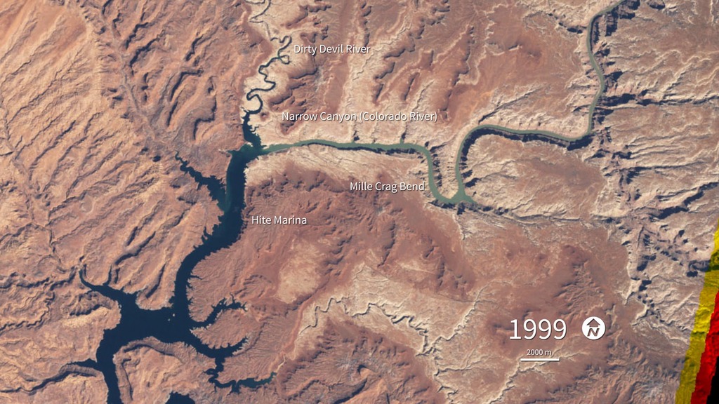
Shrinking Aral Sea
Go to this pageIn the 1960s, the Soviet Union undertook a major water diversion project on the arid plains of Kazakhstan, Uzbekistan, and Turkmenistan. The lake they made, the Aral Sea, was once the fourth largest lake in the world. Although irrigation made the desert bloom, it devastated the Aral Sea. At the start of the series in 2000, the lake was already a fraction of its 1960 extent (black line). The Northern Aral Sea (small) had separated from the Southern (large) Aral Sea. The Southern Aral Sea had split into an eastern and a western lobe that remained tenuously connected at both ends. By 2001, the southern connection had been severed, and the shallower eastern part retreated rapidly over the next several years. After Kazakhstan built a dam between the northern and southern parts of the Aral Sea, all of the water flowing into the desert basin from the Syr Darya stayed in the Northern Aral Sea. The differences in water color are due to changes in sediment.Images acquired from the Moderate Resolution Imaging Spectroradiometer (MODIS) on NASA’s Terra satelliteReference: NASA’s Earth Observatory ||
- ID: 30212 Hyperwall Visual
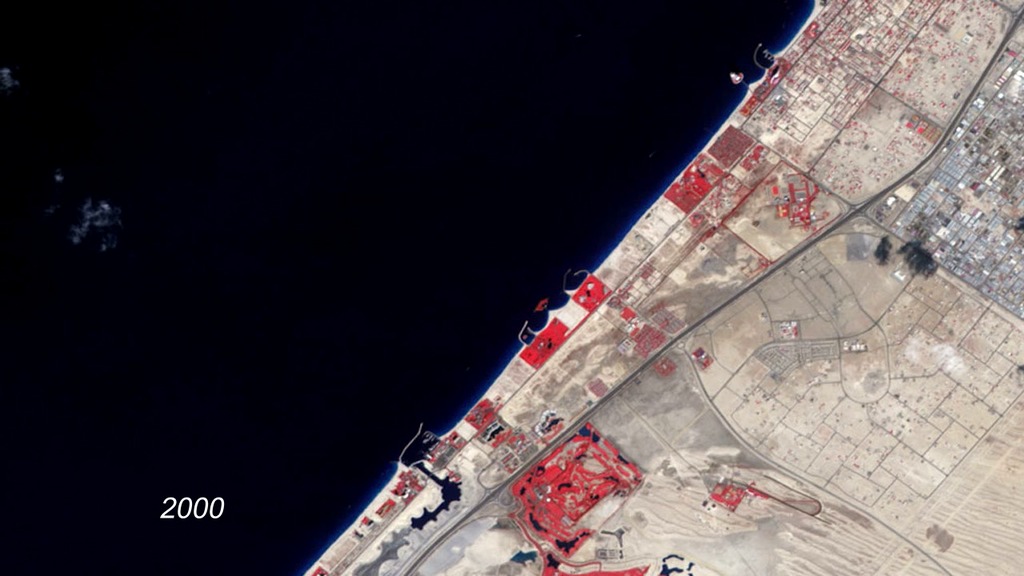
Urbanization of Dubai
Go to this pageTo expand the possibilities for beachfront tourist development, Dubai, undertook a massive engineering project to create hundreds of artificial islands along its Persian Gulf coastline. This image series shows the progress of the Palm Jumeirah Island from 2000 to 2011. In these false-color images, bare ground appears brown, vegetation appears red, water appears dark blue, and buildings and paved surfaces appear light blue or gray. The first image shows the area prior to the island’s construction. The final image, acquired in February 2011, shows vegetation on most of the palm fronds, and numerous buildings on the tree trunk. As the years pass, urbanization spreads, and the final image shows the area almost entirely filled by roads, buildings, and irrigated land. ||
- ID: 30207 Hyperwall Visual
Yellow River Delta
Go to this pageChina’s Yellow River is the most sediment-filled river on Earth. The river crosses a plateau blanketed with up to 300 meters (980 feet) of fine, wind-blown soil. The soil is easily eroded, and millions of tons of it are carried away by the river every year. Some of it reaches the river’s mouth, where it builds and rebuilds the delta. The Yellow River Delta has wandered up and down several hundred kilometers of coastline over the past two thousand years. Since the mid-nineteenth century, however, the lower reaches of the river and the delta have been extensively engineered to control flooding and to protect coastal development. This sequence of natural-color images shows the delta near the present river mouth at five-year intervals from 1989 to 2009. In 1996, engineers blocked the main channel and forced the river to veer northeast. By 1999, a new peninsula had formed to the north. The new peninsula thickened in the next five-years, and what appears to be aquaculture (dark-colored rectangles) expanded significantly in areas south of the river as of 2004. By 2009, the shoreline northwest of the new river mouth had filled in considerably. The land northwest of the newly fortified shoreline is home to an extensive field of oil and gas wells. ||
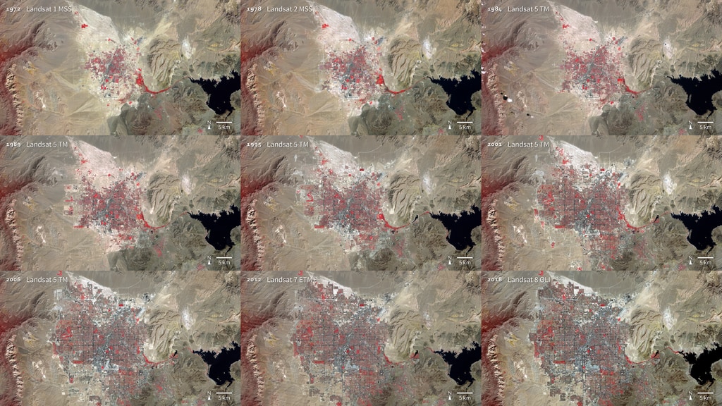
- ID: 30056 Hyperwall Visual

Athabasca Oil Sands
Go to this pageBuried under Canada’s boreal forest is one of the world’s largest reserves of oil. Bitumen—a very thick and heavy form of oil (also called asphalt)—coats grains of sand and other minerals in a deposit that covers about 142,200 square kilometers of northwest Alberta.Only 20 percent of the oil sands lie near the surface where they can easily be mined. The rest of the oil sands are buried more than 75 meters below ground and are extracted by injecting hot water into a well that liquefies the oil for pumping. This series of images from the Landsat satellite shows the growth of surface mines over the Athabasca oil sands between 1984 and 2015.These images show slow growth between 1984 and 2000, followed by a decade of more rapid development. The first mine (from 1967, now part of the Millennium Mine) is visible near the Athabasca River in the 1984 image. The only new development visible between 1984 and 2000 is the Mildred Lake Mine (west of the river), which began production in 1996. By 2015 operations have expanded to the north and east. ||
- ID: 30053 Hyperwall Visual
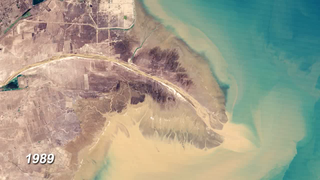
Dead Sea Salt Farming
Go to this pageThe Dead Sea is so named because its high salinity discourages the growth of fish, plants, and other wildlife. It is the lowest surface feature on Earth, sitting roughly 1,300 feet below sea level. On a hot, dry summer day, the water level can drop as much as one inch because of evaporation. These three false-color images were captured in 1972, 1989, and 2011 by Landsat satellites. Deep waters are blue or dark blue, while brighter blues indicate shallow waters or salt ponds. Green indicates sparsely vegetated lands. Denser vegetation appears bright red. The ancient Egyptians used salts from the Dead Sea for mummification, fertilizers, and potash (a potassium-based salt). In the modern age, sodium chloride and potassium salts culled from the sea are used for water conditioning, road de-icing, and the manufacturing of polyvinyl chloride (PVC) plastics. The expansions of massive salt evaporation projects are clearly visible over the span of 39 years. ||
- ID: 30183 Hyperwall Visual
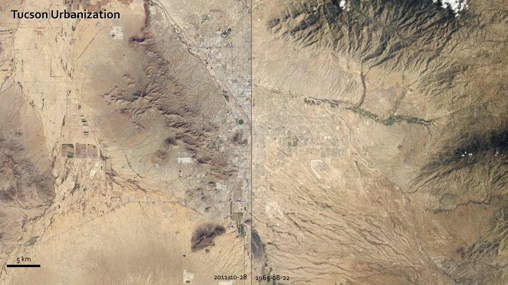
Urban Growth in Tucson, Arizona
Go to this pageThe astronauts who snapped photos of Earth during the Mercury and Gemini missions produced more than just pretty pictures. They planted seeds at the USGS and NASA. In the mid-1960s, the director of USGS proposed a satellite program to observe our planet from above, and later described Landsat as “a direct result of the demonstrated utility of the Mercury and Gemini orbital photography to Earth resource studies.”On a flight in late August 1965, Gemini V astronauts Gordon Cooper and Pete Conrad took photos of the Earth, including a shot showing Tucson, Arizona. A lot changed in the 46 years between that photo and the satellite image acquired in 2011 by the Thematic Mapper on Landsat 5.A comparison of the images shows more city and less green. The expansion of urbanized areas is readily identifiable by the grid pattern of city streets. Between 1965 and 2011, Tucson’s population grew rapidly. In 1970, the population was 262,933; in 2010, it was 520,116. ||
- ID: 30215 Hyperwall Visual
Urban Growth in Las Vegas
Go to this pageThe city of Las Vegas—meaning the meadows—was established in 1905. Its grassy meadows and artesian springs attracted settlers traveling across the arid Desert Southwest in the early 1800s. In the 1930s, gambling became legalized and construction of the Hoover Dam began, resulting in the city's first growth spurt. Since then, Las Vegas has not stopped growing. Population has reached nearly two million over the past decade, becoming one of the fastest growing metropolitan areas in the world. These false-color images show the rapid urbanization of Las Vegas between 1972 and 2018. The city streets and other impervious surfaces appear gray, while irrigated vegetation appears red. Over the years, the expansion of irrigated vegetation (e.g., lawns and golf courses) has stretched the city’s desert bounds. ||
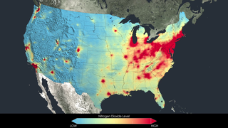
- ID: 30403 Hyperwall Visual
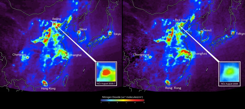
NASA Satellite Data Reveal Impact of Olympic Pollution Controls in Beijing, China
Go to this pageChinese government regulators had clearer skies and easier breathing in mind in the summer of 2008 when they temporarily shuttered some factories and banished many cars in a pre-Olympic sprint to clean up Beijing’s air. And that's what they got.They were not necessarily planning for something else: an unprecedented experiment using satellites to measure the impact of air pollution controls. Taking advantage of the opportunity, NASA researchers have since analyzed data from NASA's Aura and Terra satellites that show how key pollutants responded to the Olympic restrictions.The image on the left, an average of August 2005-07 nitrogen dioxide (NO2) levels, shows high levels of pollution in Beijing and other areas of eastern China. In contrast, levels of nitrogen dioxide (NO2) plunged nearly 50 percent in and around Beijing in August 2008 (right image) after officials instituted strict traffic restrictions in preparation for the Olympic Games. ||