NASA Summer 2023 Temperature Media Resources
The summer of 2023 was Earth’s hottest since global records began in 1880, according to an analysis by scientists at NASA’s Goddard Institute of Space Studies (GISS) in New York.
The months of June, July, and August combined were 0.41 degrees Fahrenheit (0.23 degrees Celsius) warmer than any other summer in NASA’s record, and 2.1 degrees F (1.2 C) warmer than the average summer between 1951 and 1980. August alone was 2.2 F (1.2 C) warmer than the average. June through August is considered meteorological summer in the Northern Hemisphere. This new record comes as exceptional heat swept across much of the world, exacerbating deadly wildfires in Canada and Hawaii, and searing heat waves in South America, Japan, Europe, and the U.S., while likely contributing to severe rainfall in Italy, Greece, and Central Europe.
NASA assembles its temperature record, known as GISTEMP, from surface air temperature data acquired by tens of thousands of meteorological stations, as well as sea surface temperature data from ship- and buoy-based instruments. This raw data is analyzed using methods that account for the varied spacing of temperature stations around the globe and for urban heating effects that could skew the calculations.
This map shows monthly temperature anomalies measure from 1880 to August 2023 measured with respect to a the baseline period 1951-1980.
Versions are provided in both English and Spanish.
Monthly temperature anomalies measure from 1880 to August 2023 measured with respect to a the baseline period 1951-1980. This graph includes the seasonal cycle (from MERRA2) showing that June 2023, July 2023, and August 2023 were each the warmest month on record.
Versions of the graphic are provided in Celsius and Fahrenheit, as well as in English and Spanish.
This 'climate spiral' graphic shows monthly temperature anomalies measure from 1880 to August 2023 measured with respect to a the baseline period 1951-1980.
The term 'climate spiral' describes an animated radial plot of global temperatures. Climate scientist Ed Hawkins from the National Centre for Atmospheric Science, University of Reading popularized this style of visualization in 2016.
Versions are provided in both Celsius and Fahrenheit, as well as in English and Spanish.
 2023. It shows how much warmer or cooler Earth was compared to the baseline average from 1951 to 1980. NASA Earth Observatory image by Lauren Dauphin, based on data from NASA’s Goddard Institute for Space Studies.")
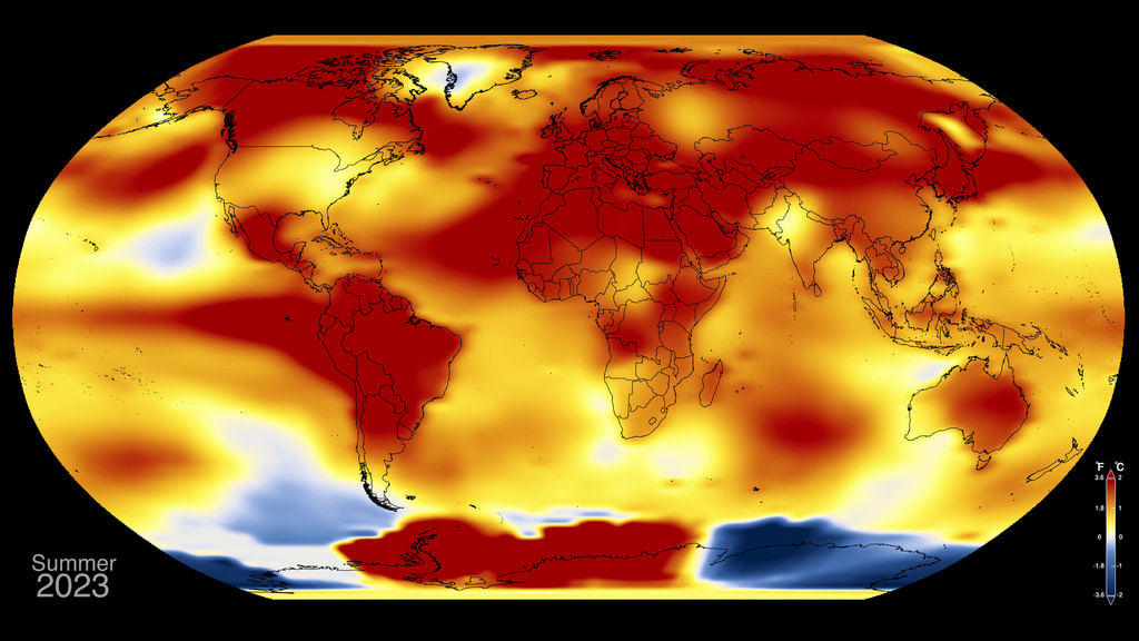
This map depicts global temperature anomalies for meteorological summer (June, July, and August) 2023. It shows how much warmer or cooler Earth was compared to the baseline average from 1951 to 1980.
NASA Earth Observatory image by Lauren Dauphin, based on data from NASA’s Goddard Institute for Space Studies.
 temperature anomaly each year since 1880. The warmer-than-usual summer in 2023 continues a long-term trend of warming, driven primarily by human-caused greenhouse gas emissions. NASA Earth Observatory image by Lauren Dauphin, based on data from NASA’s Goddard Institute for Space Studies.")
This chart shows the meteorological summer (June, July, and August) temperature anomaly each year since 1880. The warmer-than-usual summer in 2023 continues a long-term trend of warming, driven primarily by human-caused greenhouse gas emissions.
NASA Earth Observatory image by Lauren Dauphin, based on data from NASA’s Goddard Institute for Space Studies.
Celsius gif: A line graph of summer 2023 temperature anomalies, with a jagged bright red line growing from left to right across the page. The Y axis is labeled Temperature Anomaly in degrees Celsius, running from -.5 to 1. The X axis is labeled Year, running from 1880 to past 2000, with the line reaching 2023. Although the data line does not uniformly go up, with peaks and dips especially in the earlier years, the overall trend is rising temperatures. By 2023, the line is above the 1 degree Celsius point.
Celsius still: A line graph of summer 2023 temperature anomalies, with a jagged bright red line from left to right across the page. The Y axis is labeled Temperature Anomaly in degrees Celsius, running from -.5 to 1. The X axis is labeled Year, running from 1880 to past 2000, with the line reaching 2023. Although the data line does not uniformly go up, with peaks and dips especially in the earlier years, the overall trend is rising temperatures. By 2023, the line is above the 1 degree Celsius point.
Fahrenheit gif: A line graph of August temperature anomalies, with a jagged bright red line growing from left to right across the page. The Y axis is labeled Temperature Anomaly in degrees Celsius, running from -1 to 2. The X axis is labeled Year, running from 1880 to past 2000, with the line reaching 2023. Although the data line does not uniformly go up, with peaks and dips especially in the earlier years, the overall trend is rising temperatures. By 2023, the line is at the 2 degree Fahrenheit point.
Fahrenheit still: A line graph of August temperature anomalies, with a jagged bright red line from left to right across the page. The Y axis is labeled Temperature Anomaly in degrees Fahrenheit, running from -1 to 2. The X axis is labeled Year, running from 1880 to past 2000, with the line reaching 2023. Although the data line does not uniformly go up, with peaks and dips especially in the earlier years, the overall trend is rising temperatures. By 2023, the line is at the 2 degree Fahrenheit point.
Celsius (early baseline) still: A line graph of summer 2023 temperature anomalies, with a jagged bright red line from left to right across the page. The Y axis is labeled Temperature Anomaly in degrees Celsius, running from 0 to 1. The X axis is labeled Year, running from 1880 to past 2000, with the line reaching 2023. Although the data line does not uniformly go up, with peaks and dips especially in the earlier years, the overall trend is rising temperatures. Instead of the traditional 1951-1980 reference period, this graph is shown with a late 19th century baseline (1880-1899).
Versions of the graphics in English and Spanish.
A climate spiral animation.
The chart is circular with the year in the center and months of the year around the outside. There are three concentric circles labeled with measures from negative 1 degree Celsius to 1 degree Celsius, with the outer ring being the largest value. As the years count up, a line spirals through the months of the year and around the circle. The line starts with blue hues when temperatures are below average and changes to red and orange hues when temperatures are above average. As the spiral progresses, the lines form a deformed circle that becomes larger and more red, indicating Earth’s warming up to just above 1 degree Celsius above average. The animation rotates to show the spiral from the side, with the spirals growing taller as temperatures get higher over the years. White text below the visualization says “This summer was the hottest in NASA’s 144-year record. June, July, and August 2023 all set records for their respective months. July was the hottest month ever on record."
Complete transcript available.
Two stacked data visualizations.
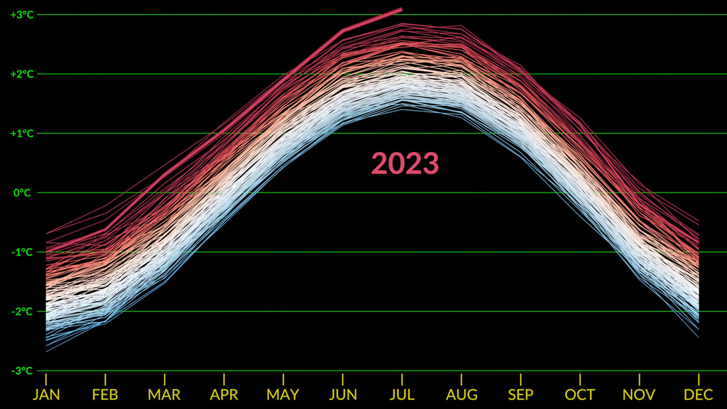
Between them, white text reads “Summer 2023 Was the Hottest in NASA’s Record.” On top, a line graph with monthly temperature anomalies from each year from 1880 to 2023 grows across the graph to create a stacked bell shape. The Y-axis is labeled negative 3 degrees Celsius to 3 degrees Celsius and the X-axis has each month from January to December. As time goes on, the curved lines stack higher and higher, and the colors of the lines change from white and blue to dark red. Finally, the 2023 line stops at August, the latest month we have data, and it’s clear that June, July, & August 2023 were all hotter than any previous respective month. On the bottom, a map of the globe with temperature anomalies in Celsius. Anomalies up to 3 degrees higher than average are shown in red. Anomalies up to 3 degrees lower than average are shown in blue. The animation shows August temperature anomalies starting in 1880 through 2023. As the animation plays, various areas are red or blue. By the end, nearly everywhere on Earth is some shade of red except for some places in the Antarctic.
Complete transcript available.
Universal Production Music: Knock and Wait (Instrumental) by Brice Davoli [SACEM], Well That’s Difference (Instrumental) by Jeff Cardoni [ASCAP], Wanna Be Hipster (Instrumental) by Jeff Cardoni [ASCAP], Curiosity Killed Kitty (Instrumental) by Robert Leslie Bennett [ASCAP], Eco Issues (Instrumental) by Max van Thun [GEMA]
Additional Footage: Pond5.com, CSPAN
Complete transcript available.
Interview with GISS Director Dr. Gavin Schmidt regarding July 2023 temperatures.
Is climate change the same as global warming? Not quite. The warming of Earth — or global warming — is just one factor that makes up a range of changes that are happening to our planet, which is climate change. And NASA is studying all of it.
Producers: Jessica Wilde, Scott Bednar
Editor: Daniel Salazar
Complete transcript available.
Why does climate change matter? Because it's happening and we’re already feeling its effects around the world. But there's hope. NASA Chief Scientist and Senior Climate Advisor Dr. Kate Calvin explains how NASA collects data and develops tools that can help us better understand and prepare for climate change.
Producer: Jessica Wilde
Editor: Scott Bednar
Complete transcript available.
How do we know what Earth's climate was like long ago? If you look closely, there are clues just about everywhere across our globe. Some are easy to see and others are more subtle. NASA climate scientist Dr. Gavin Schmidt explains.
Producers: Scott Bednar, Jessica Wilde
Editor: Daniel Salazar
Complete transcript available.
Credits
Please give credit for this item to:
NASA's Goddard Space Flight Center
-
Visualizers
- Peter H. Jacobs (NASA/GSFC)
- Mark SubbaRao (NASA/GSFC)
- Lauren Dauphin (SSAI)
-
Writer
- Jenny Marder Fadoul (Telophase)
-
Producers
- Emily Furfaro (MORI Associates)
- Grace Weikert (GSFC Interns)
- Katie Jepson (KBR Wyle Services, LLC)
- Scott Bednar (National Institute of Aerospace)
- Jessica Wilde (National Institute of Aerospace)
-
Social media support
- Sofie Bates (KBR Wyle Services, LLC)
- Kathryn Mersmann (KBR Wyle Services, LLC)
- Jocelyn Argueta (JPL)
Release date
This page was originally published on Thursday, September 14, 2023.
This page was last updated on Thursday, September 21, 2023 at 10:44 PM EDT.
Series
This visualization can be found in the following series:Related
- ID: 5161
 Visualization
 - ID: 5137
 Visualization
 - ID: 14396
 Produced Video
 - ID: 14066
![Universal Production Music: Knock and Wait (Instrumental) by Brice Davoli [SACEM], Well That’s Difference (Instrumental) by Jeff Cardoni [ASCAP], Wanna Be Hipster (Instrumental) by Jeff Cardoni [ASCAP], Curiosity Killed Kitty (Instrumental) by Robert Leslie Bennett [ASCAP], Eco Issues (Instrumental) by Max van Thun [GEMA] Additional Footage: Pond5.com, CSPANComplete transcript available.](/vis/a010000/a014000/a014066/Title.jpg) Produced Video
Produced Video