ESD data for Societal Benefit
General
- Section
Current Earth Observing Fleet
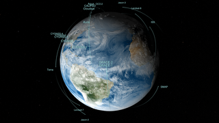
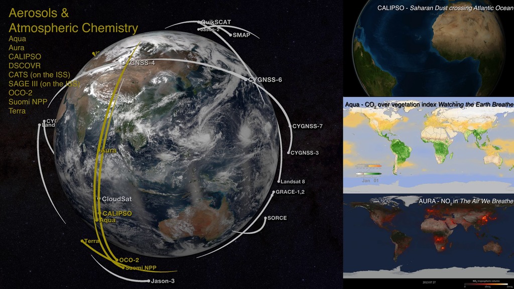
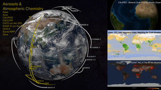
Go to this sectionLike orbiting sentinels, NASA’s Earth-observing satellites vigilantly monitor our planet’s ever-changing pulse from their unique vantage points in orbit. This animation shows the orbits of all of the current satellite missions. The flight paths are based on actual orbital elements. These missions—many joint with other nations and/or agencies—are able to collect global measurements of rainfall, solar irradiance, clouds, sea surface height, ocean salinity, and other aspects of the environment. Together, these measurements help scientists better diagnose the “health” of the Earth system.This animation will be regularly updated to show the orbits of the current earth observing fleet. This most recent version, published in March 2014 includes the recently launched GPM satellite and removes Jason-1 which was decommissioned in 2013.
Previous versions from recent years include: entry 4274 a February 2015 version including SMAP entry 3996 a spring 2014 version including GPM entry 4070 a May 2013 version which added Landsat-8 entry 3892 a Dec 2011 version which added Suomi NPP and Aquarius entry 3725 a version from June 2010 - Section
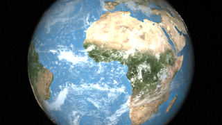
Blue Marble 2015
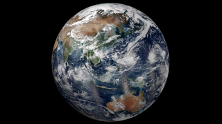
Go to this sectionSatellites like Suomi National Polar-orbiting Partnership (NPP) get a complete view of our planet each day, which allows us to create beautiful images of Earth like the one shown here. While it might seem simple, it is actually a rather complex process. Multiple, adjacent swaths of satellite data are pieced together like a quilt to make one global image. Suomi NPP was placed in a unique polar-orbit around the planet that takes the satellite over the equator at the same local (ground) time every orbit. The satellite passes are generally separated by 90 minutes and the instruments image the Earth’s surface in long wedges, called swaths. The swaths from each successive orbit overlap one another, so that at the end of the day, the satellite has a complete view of the world. This composite image, captured by Suomi NPP’s Visible Infrared Imaging Radiometer Suite (VIIRS), shows how the Earth looked from space on October 14, 2015—a day the contiguous United States had mostly clear skies. The movement of clouds is not easily visible between consecutive swaths of data; however, by the end of the day, the cumulative movement of clouds can be seen at the vertical seam located near the center of the Pacific Ocean. The vertical lines of haze near the equator are caused by sunglint, the reflection of sunlight off the ocean.
- Section
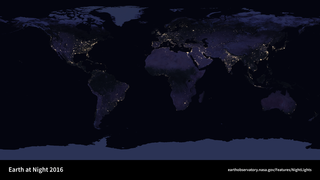
Rotating Earth at Night
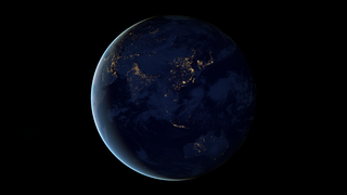
Go to this sectionThis new space-based view of Earth’s city lights is a composite assembled from data acquired by the Suomi National Polar-orbiting Partnership (Suomi NPP) satellite. The data was acquired over nine days in April 2012 and thirteen days in October 2012. It took the satellite 312 orbits and 2.5 terabytes of data to get a clear shot of every parcel of Earth’s land surface and islands. This new data was then mapped over existing MODIS Blue Marble imagery to provide a realistic view of the planet. The view was made possible by the “day-night band” of Suomi NPP’s Visible Infrared Imaging Radiometer Suite. VIIRS detects light in a range of wavelengths from green to near-infrared and uses “smart” light sensors to observe dim signals such as city lights, auroras, wildfires, and reflected moonlight. This low-light sensor can distinguish night lights tens to hundreds of times better than previous satellites.
- Section

NASA Earth Science Division Missions
Go to this sectionIn order to study the Earth as a whole system and understand how it is changing, NASA develops and supports a large number of Earth observing missions. These missions provide Earth science researchers the necessary data to address key questions about global climate change. Missions begin with a study phase during which the key science objectives of the mission are identified, and designs for spacecraft and instruments are analyzed. Following a successful study phase, missions enter a development phase whereby all aspects of the mission are developed and tested to insure it meets the mission objectives. Operating missions are those missions that are currently active and providing science data to researchers. Operating missions may be in their primary operational phase or in an extended operational phase. Missions begin with a study phase during which the key science objectives of the mission are identified, and designs for spacecraft and instruments are analyzed. Following a successful study phase, missions enter a development phase whereby all aspects of the mission are developed and tested to insure it meets the mission objectives.
- Section
Remotely Sensing Our Planet
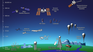
Go to this sectionThe term "remote sensing” is commonly used to describe the science—and art—of identifying, observing, and measuring an object without coming into direct contact with it. This process involves the detection and measurement of radiation of different wavelengths reflected or emitted from distant objects or materials, by which they may be identified and categorized by class/type, substance, and spatial distribution. Remote sensing is used in numerous fields, including geography, land surveying and most Earth Science disciplines; it also has military, intelligence, commercial, economic, planning, and humanitarian applications. This diagram reveals the variety of remote sensing platforms used today—offering a multi-scale, multi-resolution view of our planet. Remote sensing instruments are of two primary types—active and passive. Active sensors, provide their own source of energy to illuminate the objects they observe. An active sensor emits radiation in the direction of the target to be investigated. The sensor then detects and measures the radiation that is reflected or backscattered from the target. Passive sensors, on the other hand, detect natural energy (radiation) that is emitted or reflected by the object or scene being observed. Reflected sunlight is the most common source of radiation measured by passive sensors. To access and download NASA Earth-observing data, visit earthdata.nasa.gov.
- ID: 30590 Hyperwall Visual
From Observations to Models
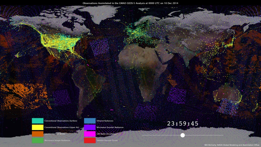
Go to this pageNASA’s Global Modeling and Assimilation Office (GMAO) uses the Goddard Earth Observing System Model, Version 5 Data Assimilation System (GEOS-5 DAS) to produce global numerical weather forecasts on a routine basis. GMAO forecasts play important roles in managing NASA’s fleet of science satellites and in researching the impact of new satellite observations. In order to provide timely information about the state of the atmosphere for NASA instrument teams and researchers, the GMAO runs the GEOS-5 DAS four times each day in real time. For each forecast, it is necessary to provide accurate initial conditions that drive the GEOS-5 forecasts. To do this, the best estimate of the full, three-dimensional atmospheric state is determined by combining the latest observations and a short-term, 6-hour forecast—a process known as data assimilation. The GEOS-5 DAS assimilates more than 5 million observations during each 6-hour assimilation period.These observations are assembled from a number of sources from around the globe, including NASA, NOAA, EUMETSAT (European Organization for the Exploitation of Meteorological Satellites), commercial airlines, the US Department of Defense, and many others. Similarly, each observation type has its own sampling characteristics. It can be seen in the animation how different observation types have different strategies. One of the main challenges of data assimilation is to understand how all these observations are alike, how they differ, and how they interact with each other.Funding for the development of the GEOS-5 model and data assimilation system development comes from NASA's Modeling, Analysis, and Prediction Program and the NASA Weather Focus Area's contribution to the Joint Center for Satellite Data Assimilation.The GEOS-5 DAS runs at the NASA Center for Climate Simulation, which is funded by NASA’s High-End Computing Program.For More Information:http://gmao.gsfc.nasa.gov/http://www.nccs.nasa.gov/images/data_assim_story_072815.pdf ||
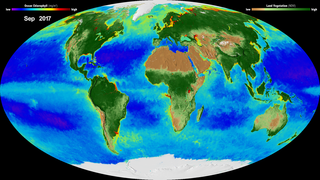
Water & Ice
 Section
- ID: 3912
 Visualization
 - ID: 4544
- ID: 4443
 Visualization
  Section
 Section
 Section


 Section
 Section
- ID: 30880
 Hyperwall Visual
- ID: 30781
 Hyperwall Visual
Atmosphere
- ID: 30637
 Hyperwall Visual
- ID: 12772
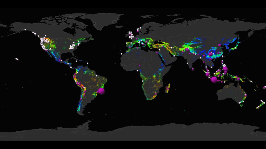
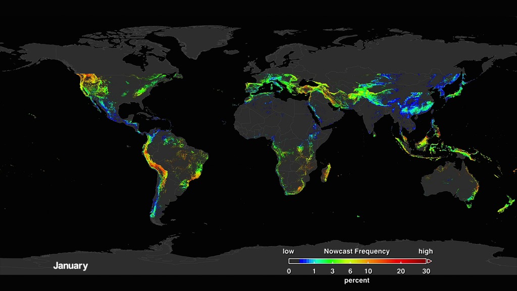
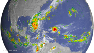
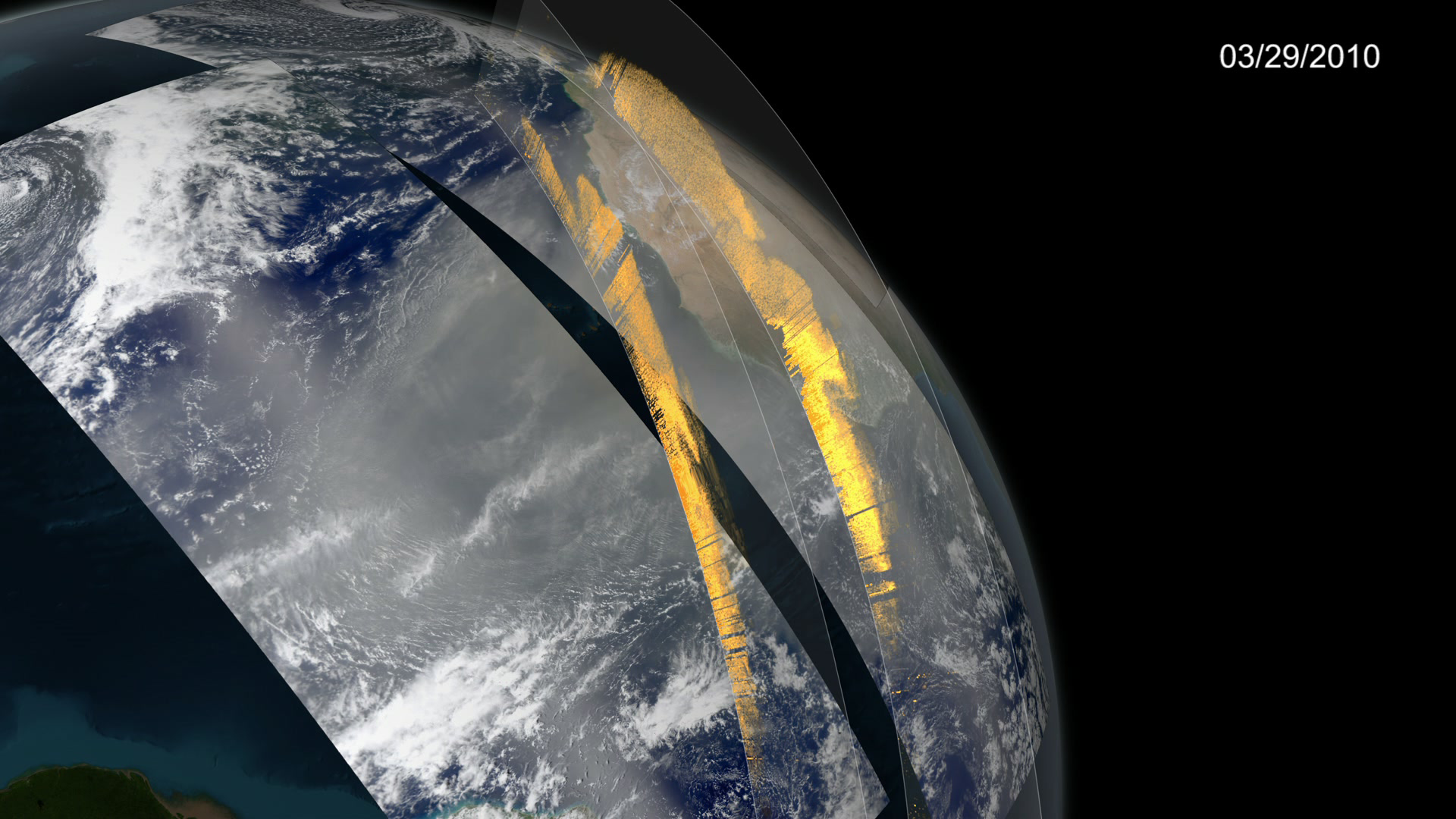
![Tracking aerosols over land and water from August 1 to November 1, 2017. Hurricanes and tropical storms are obvious from the large amounts of sea salt particles caught up in their swirling winds. The dust blowing off the Sahara, however, gets caught by water droplets and is rained out of the storm system. Smoke from the massive fires in the Pacific Northwest region of North America are blown across the Atlantic to the UK and Europe. This visualization is a result of combining NASA satellite data with sophisticated mathematical models that describe the underlying physical processes.Music: Elapsing Time by Christian Telford [ASCAP], Robert Anthony Navarro [ASCAP]Complete transcript available.Watch this video on the NASA Goddard YouTube channel.](/vis/a010000/a012700/a012772/12772_hurricanes_and_aerosols_1080p_youtube_1080.00001_print.jpg) Produced Video
Produced Video - ID: 3947

- ID: 4412
- ID: 30556
 Hyperwall Visual
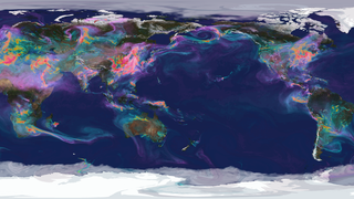
 Section
- ID: 30918
 Hyperwall Visual
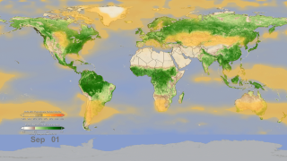
Biosphere & Population

 Section
 Section
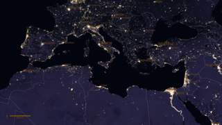 Section
 Section
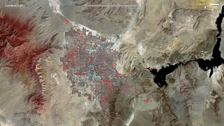 Section
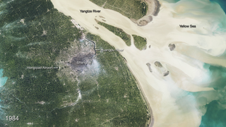 Section
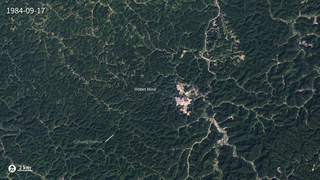
 Section
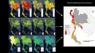
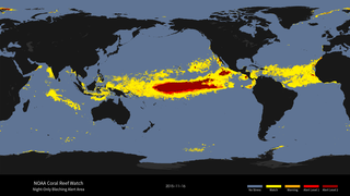
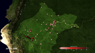
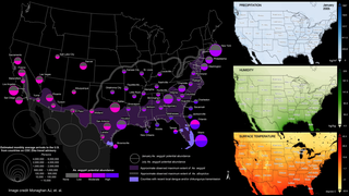
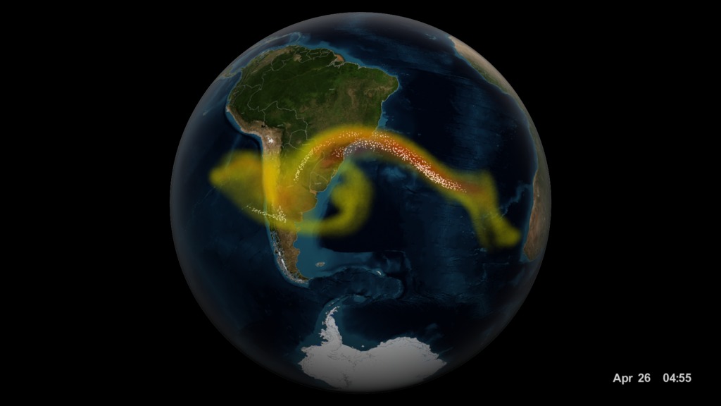
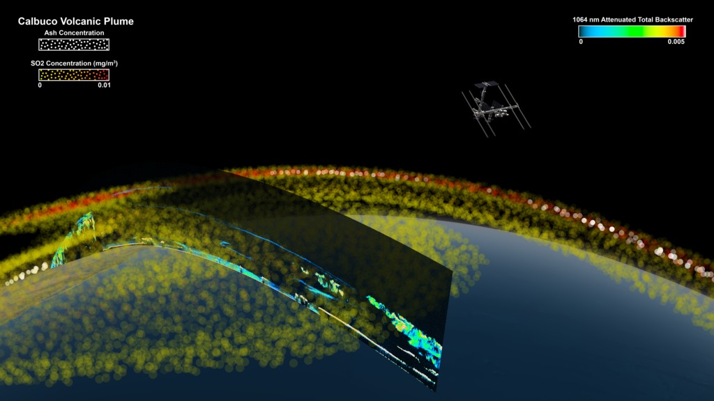
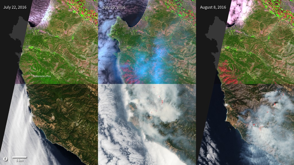
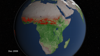
Disasters
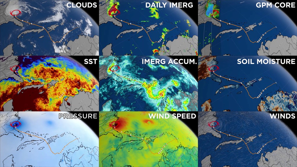
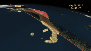
- ID: 4631
- ID: 12897
- ID: 4575
 Visualization
 - ID: 4543
 Visualization
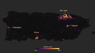
 Section
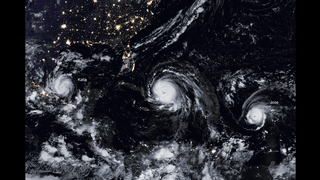 Section
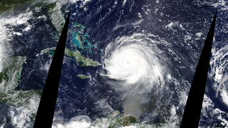
- ID: 12221
 Produced Video
 - ID: 4542
 Visualization
 - ID: 3783
- ID: 4273
- ID: 30797
 Hyperwall Visual
 - ID: 3868
 Visualization
 - ID: 4484
 Visualization
 - ID: 30888
 Hyperwall Visual
 - ID: 30627
 Hyperwall Visual
 - ID: 30781Hyperwall Visual