A newer version of this visualization is available.
Global Temperature Anomalies from 1880 to 2020
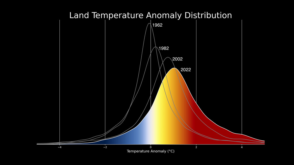
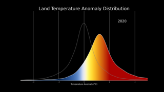
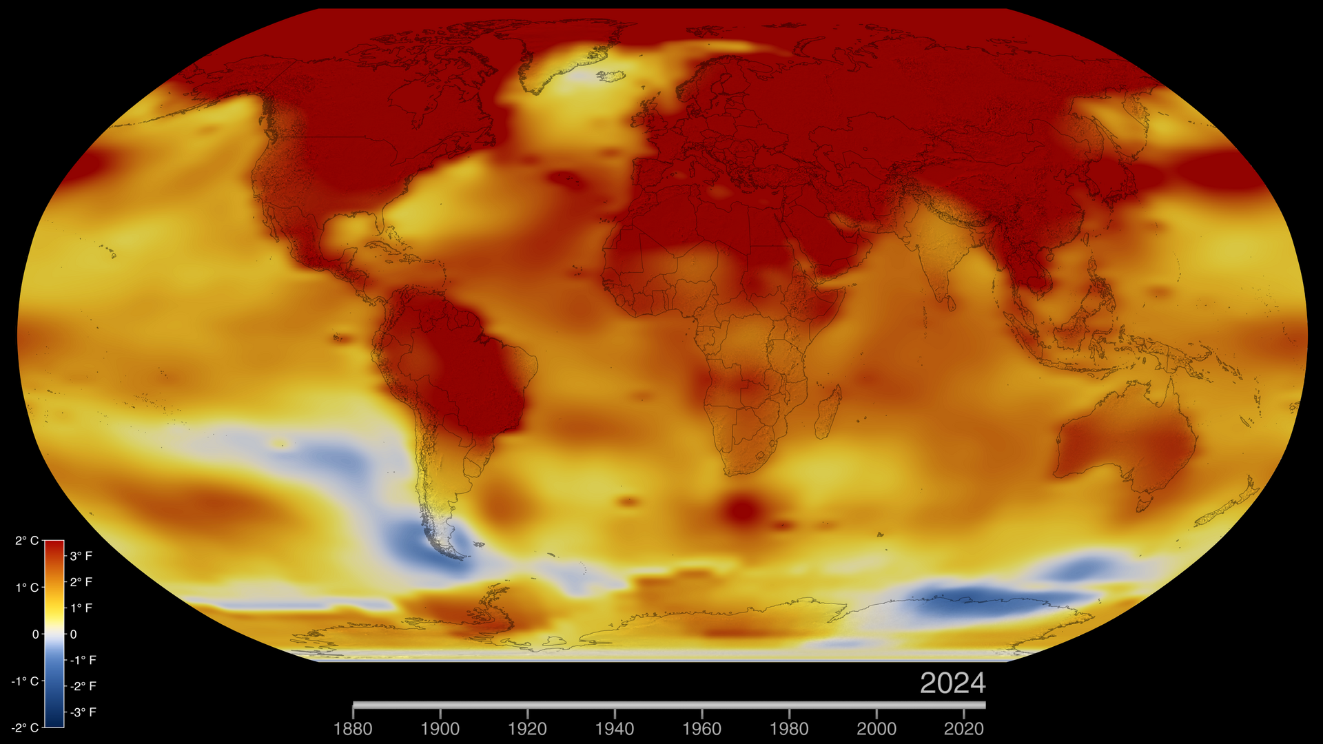
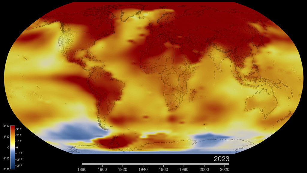
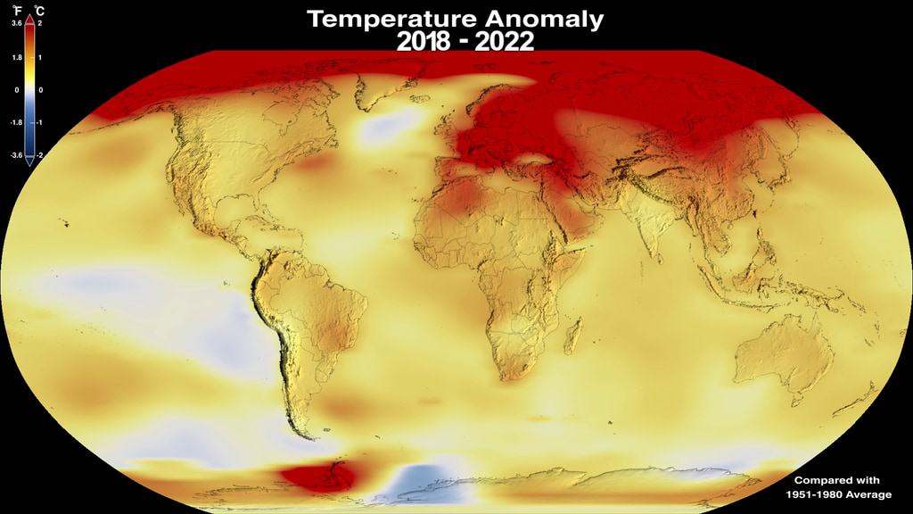
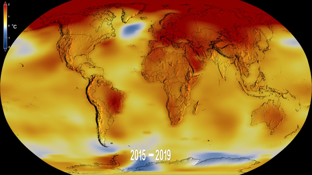
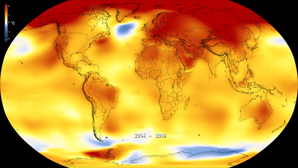
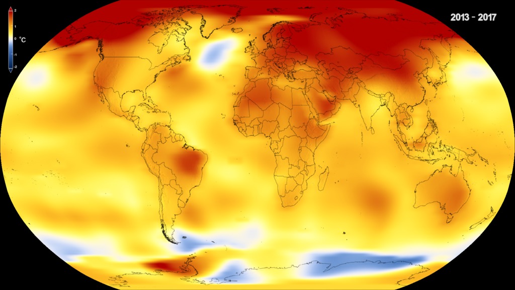
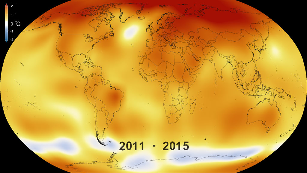
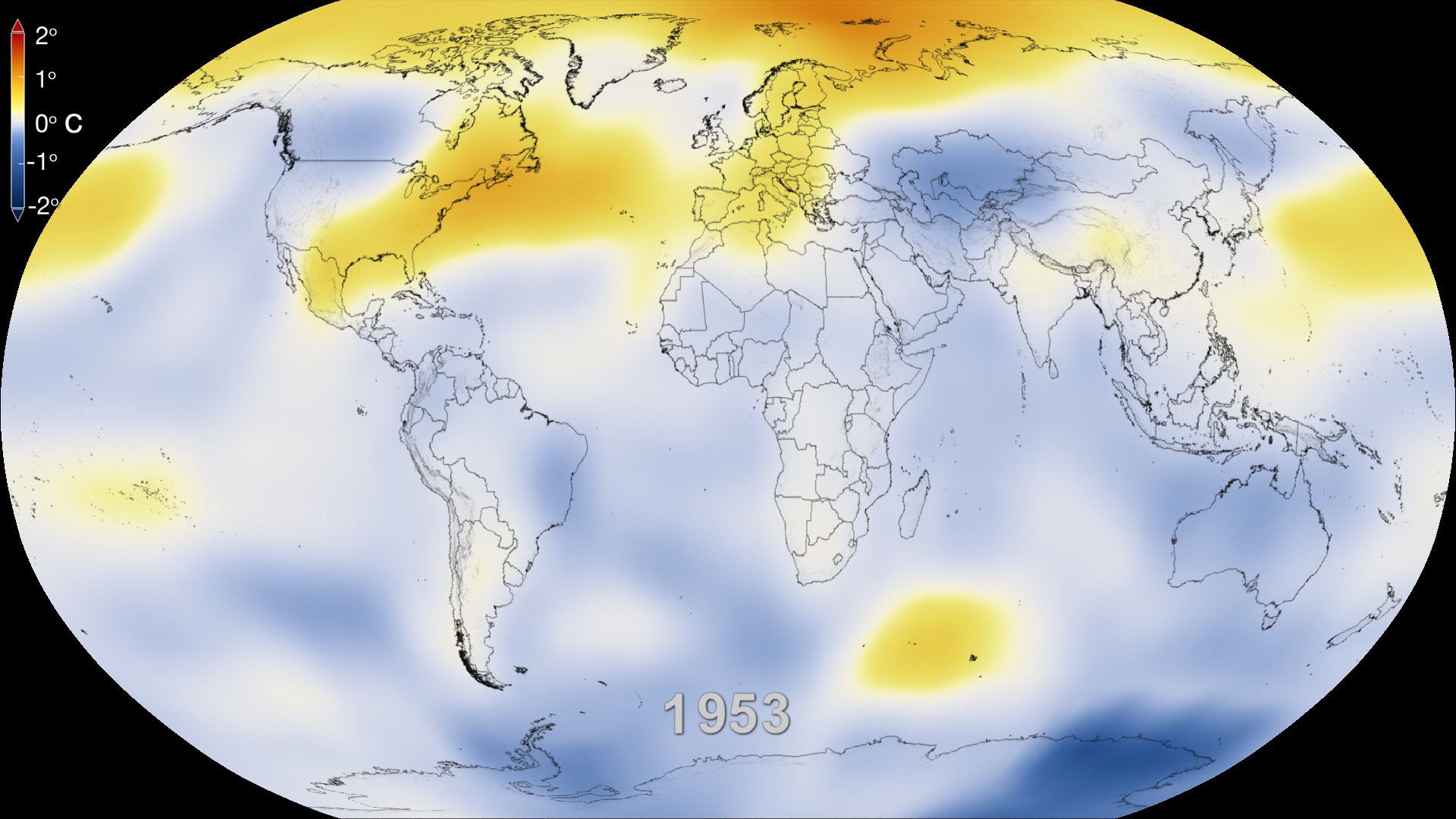
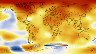
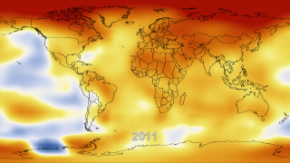
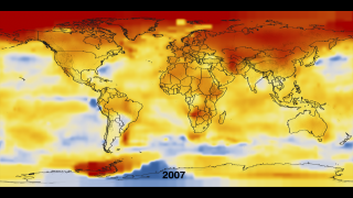
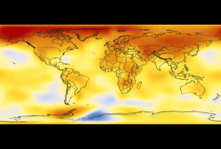
This color-coded map in Robinson projection displays a progression of changing global surface temperature anomalies. Normal temperatures are the average over the 30 year baseline period 1951-1980. Higher than normal temperatures are shown in red and lower than normal temperatures are shown in blue. The final frame represents the 5 year global temperature anomalies from 2016-2020. Scale in degrees Celsius.
2020 Tied for Warmest Year on Record, NASA Analysis Shows
Earth’s global average surface temperature in 2020 tied with 2016 as the warmest year on record, according to an analysis by NASA.
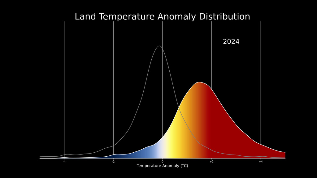
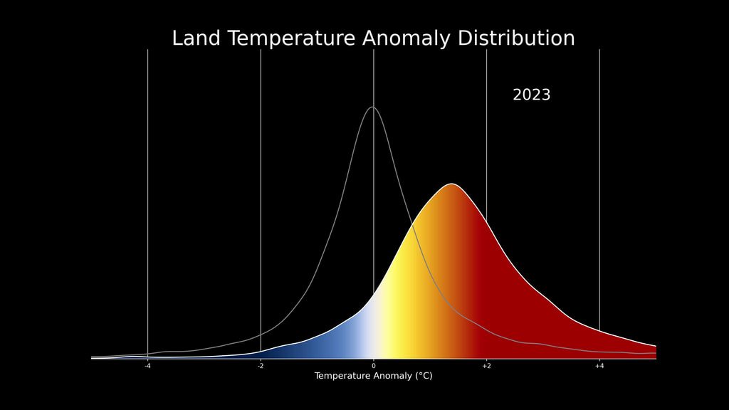
Continuing the planet’s long-term warming trend, the year’s globally averaged temperature was 1.84 degrees Fahrenheit (1.02 degrees Celsius) warmer than the baseline 1951-1980 mean, according to scientists at NASA’s Goddard Institute for Space Studies (GISS) in New York. 2020 edged out 2016 by a very small amount, within the margin of error of the analysis, making the years effectively tied for the warmest year on record.
“The last seven years have been the warmest seven years on record, typifying the ongoing and dramatic warming trend,” said GISS Director Gavin Schmidt. “Whether one year is a record or not is not really that important – the important things are long-term trends. With these trends, and as the human impact on the climate increases, we have to expect that records will continue to be broken.”
A Warming, Changing World
Tracking global temperature trends provides a critical indicator of the impact of human activities – specifically, greenhouse gas emissions – on our planet. Earth's average temperature has risen more than 2 degrees Fahrenheit (1.2 degrees Celsius) since the late 19th century.
Rising temperatures are causing phenomena such as loss of sea ice and ice sheet mass, sea level rise, longer and more intense heat waves, and shifts in plant and animal habitats. Understanding such long-term climate trends is essential for the safety and quality of human life, allowing humans to adapt to the changing environment in ways such as planting different crops, managing our water resources and preparing for extreme weather events.
Land, Sea, Air and Space
NASA’s analysis incorporates surface temperature measurements from more than 26,000 weather stations and thousands of ship- and buoy-based observations of sea surface temperatures. These raw measurements are analyzed using an algorithm that considers the varied spacing of temperature stations around the globe and urban heating effects that could skew the conclusions if not taken into account. The result of these calculations is an estimate of the global average temperature difference from a baseline period of 1951 to 1980.
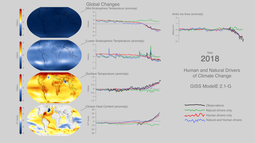
NASA measures Earth's vital signs from land, air, and space with a fleet of satellites, as well as airborne and ground-based observation campaigns. The satellite surface temperature record from the Atmospheric Infrared Sounder (AIRS) instrument aboard NASA’s Aura satellite confirms the GISTEMP results of the past seven years being the warmest on record. Satellite measurements of air temperature, sea surface temperature, and sea levels, as well as other space-based observations, also reflect a warming, changing world. The agency develops new ways to observe and study Earth's interconnected natural systems with long-term data records and computer analysis tools to better see how our planet is changing. NASA shares this unique knowledge with the global community and works with institutions in the United States and around the world that contribute to understanding and protecting our home planet.
NASA’s full surface temperature data set – and the complete methodology used to make the temperature calculation – are available at: https://data.giss.nasa.gov/gistemp
GISS is a NASA laboratory managed by the Earth Sciences Division of the agency’s Goddard Space Flight Center in Greenbelt, Maryland. The laboratory is affiliated with Columbia University’s Earth Institute and School of Engineering and Applied Science in New York.
For more information about NASA’s Earth science missions, visit:
https://www.nasa.gov/earth
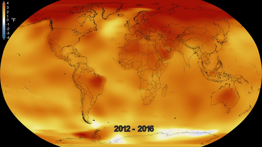
This color-coded map in Robinson projection displays a progression of changing global surface temperature anomalies. Normal temperatures are the average over the 30 year baseline period 1951-1980. Higher than normal temperatures are shown in red and lower than normal temperatures are shown in blue. The final frame represents the 5 year global temperature anomalies from 2016-2020. Scale in degrees Fahrenheit.
This data visualization places the most recent time step, 2016-2020, of our global surface temperature anomalies on a rotating globe. Normal temperatures are the average over the 30 year baseline period 1951-1980. Higher than normal temperatures are shown in red and lower than normal temperatures are shown in blue. Scale is in degrees Fahrenheit. THe Earth's topography is exaggerated by 10x.

This frame sequence is the corresponding date range for each frame in the sequence.

This 136 frame sequence of color-coded global temperature anomalies in robinson projection display a progression of changing global surface temperatures anomalies in Fahrenheit. The first frame in this sequence represents the data from 1880-1884. The second frame represents 1881-1885, ...and the last frame represents 2016-2020. Higher than normal temperatures are shown in red and lower than normal are shown in blue. Normal temperatures are the average over the 30 year baseline period 1951-1980.

Degrees Fahrenheit Colorbar

Degrees Celsius Colorbar

This frame sequence of color-coded global temperature anomalies in degrees celsius is designed to be displayed on the Science on a Sphere projection system. Each image represents a unique 5 year rolling time period with no fades between datasets. Frame 1884 represents data from 1880-1884, frame 1885 represents data from 1881-1885,... frame 2020 represents data from 2016-2020. Higher than normal temperatures are shown in red and lower than normal are shown in blue. Normal temperatures are the average over the 30 year baseline period 1951-1980.

Degrees Celsius horizontal colorbar
Credits
Please give credit for this item to:
NASA's Scientific Visualization Studio
Data provided by Robert B. Schmunk (NASA/GSFC GISS)
-
Visualizer
- Lori Perkins (NASA/GSFC)
-
Scientists
-
Gavin A. Schmidt
(NASA/GSFC GISS)

-
Robert B Schmunk
(SIGMA Space Partners, LLC.)
-
Reto A. Ruedy
(SIGMA Space Partners, LLC.)
-
Gavin A. Schmidt
(NASA/GSFC GISS)
-
Producers
- Matthew R. Radcliff (USRA)
- Patrick Lynch (NASA/GSFC)
- Kathryn Mersmann (USRA)
- Katie Jepson (USRA)
-
Writer
- Sofie L. Bates (Intern)
-
Public affairs officers
-
Peter H. Jacobs
(NASA/GSFC)
- Jacob Richmond (NASA/GSFC)
-
Peter H. Jacobs
(NASA/GSFC)
Series
This page can be found in the following series:Datasets used
-
GISTEMP [GISS Surface Temperature Analysis (GISTEMP)]
ID: 585The GISS Surface Temperature Analysis version 4 (GISTEMP v4) is an estimate of global surface temperature change. Graphs and tables are updated around the middle of every month using current data files from NOAA GHCN v4 (meteorological stations) and ERSST v5 (ocean areas), combined as described in our publications Hansen et al. (2010), Lenssen et al. (2019), and Lenssen et al. (2024).
Credit: Lenssen, N., G.A. Schmidt, M. Hendrickson, P. Jacobs, M. Menne, and R. Ruedy, 2024: A GISTEMPv4 observational uncertainty ensemble. J. Geophys. Res. Atmos., 129, no. 17, e2023JD040179, doi:10.1029/2023JD040179.
This dataset can be found at: https://data.giss.nasa.gov/gistemp/
See all pages that use this dataset
Note: While we identify the data sets used on this page, we do not store any further details, nor the data sets themselves on our site.
Related
- ID: 5452
- ID: 5211
- ID: 5065
- ID: 4908
 Visualization
 - ID: 4891
- ID: 13791
 Produced Video
Newer Versions
- ID: 5450
 Visualization
 - ID: 5207
 Visualization
 - ID: 5060
 Visualization
 - ID: 4964
 Visualization
Older Versions
- ID: 4787
 Visualization
 - ID: 4626
 Visualization
 - ID: 4609
 Visualization
 - ID: 4546
 Visualization
 - ID: 4419
 Visualization
 - ID: 4252
 Visualization
 - ID: 4135
 Visualization
 - ID: 4030
 Visualization
 - ID: 3901
- ID: 3490
- ID: 3375
Used as a Source In
- ID: 31168
 Hyperwall Visual
 - ID: 13979
![Music: Futurity by Lee Groves [PRS] and Peter George Marett [PRS]Complete transcript available.](/vis/a010000/a013900/a013979/Screen_Shot_2021-10-28_at_2.29.18_PM.png)
- ID: 13909
 Produced Video
 - ID: 13814
 Produced Video
 - ID: 13799
![Music: Organic Machine by Bernhard Hering [GEMA] and Matthias Kruger [GEMA]Complete transcript available.](/vis/a010000/a013700/a013799/2020Temp.png) Produced Video
Produced Video - ID: 13781
![Music: A Curious Incident by Jay Price [PRS] and Paul Reeves [PRS]Complete transcript available.](/vis/a010000/a013700/a013781/CO20.jpg)
- ID: 13747
![Music: Rain over the Sea by Bruno Vouillon [SACEM]Complete transcript available.](/vis/a010000/a013700/a013747/Thumbnail0.jpg) Produced Video
Produced Video - ID: 13652
![Music: "Solar Winds" by Ben Niblett [PRS] and Jon Cotton [PRS] courtesy of Universal Production Music.
Complete transcript available.](/vis/a010000/a013600/a013652/BushFire_Still_2.jpg) Produced Video
Produced Video - ID: 13516
![Music: Avalanches by Chris Constantinou [PRS] and Paul Frazer [PRS]Complete transcript available.](/vis/a010000/a013500/a013516/2019Temp.png) Produced Video
Produced Video - ID: 13309
![Music: Hiraeth by Anthony Edwin Phillips [PRS], James Edward CollinsComplete transcript available.](/vis/a010000/a013300/a013309/Arctic_Min_2019_Thumbnail_LKW.png) Produced Video
Produced Video - ID: 13281
![Music: Stepping Stone Bridge by Timothy Michael Hammond [PRS], Wayne Roberts [PRS]Watching Ladybirds by Benjamin James Parsons [PRS] This video can be freely shared and downloaded. While the video in its entirety can be shared without permission, some individual imagery provided by pond5.com and Artbeats is obtained through permission and may not be excised or remixed in other products. Specific details on stock footage may be found here. For more information on NASA’s media guidelines, visit https://www.nasa.gov/multimedia/guidelines/index.html. Complete transcript available.](/vis/a010000/a013200/a013281/Thumbnail_Arctic_Fires_Print.jpg) Produced Video
Produced Video - ID: 13188
![Music: After the Sun by Andrew Michael Britton [PRS], David Stephen Goldsmith [PRS], Andrew Skeet [PRS]Complete transcript available.](/vis/a010000/a013100/a013188/Still_print.jpg) Produced Video
Produced Video - ID: 13142
![Music: Sculpture by Axel Coon [GEMA], Ralf Goebel [GEMA]Complete transcript available.](/vis/a010000/a013100/a013142/FlatMapStill.jpg) Produced Video
Produced Video
Release date
This page was originally published on Thursday, January 14, 2021.
This page was last updated on Monday, June 23, 2025 at 12:12 AM EDT.