CCMP Winds from June through October 2011
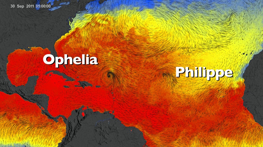
North Atlantic surface wind vector flow lines over sea surface temperature from June 1, 2011 to October 31, 2011.
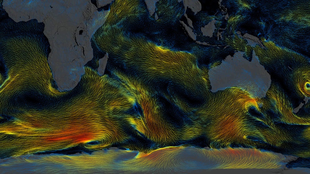
These visualizations show the directional flow and magnitude of surface wind vector data (calibrated to a 10 meter reference height) from June 2011 through October 2011. The first two of these visualizations include an underlay of sea surface temperature (SST) data rendered to show two unique perspectives: 1) a regional perspective of the North Atlantic region to highlight tropical cyclone activity and 2) the global perspective. A third visualization shows the surface wind vector flow lines colored to show the clear distinctions in wind speed. A color bar is provided below for interpretation.
As large storms such as hurricanes move over warm waters, notice how the SST cools. Warm surface water powers these storms, and as the storms absorb this energy they tend to leave cooler water trails in their wake. A great example is Hurricane Irene, which became a hurricane as it crossed the island of Puerto Rico and skirted the eastern and northern coastlines of Hispaniola on August 22, 2011. As Hurricane Irene enters the open Atlantic Ocean, the storm intensifies and an SST cooling effect is clearly visible in the wake of the storm track. This cooling effect takes place due to latent and sensible heat fluxes as well as well as wind-induced upwelling. The wind-induced upwelling is most pronounced to the right of the storm track.
The wind data is from the Cross-Calibrated Multi-Platform project. The SST data is from the Multi-scale Ultra-high Resolution (MUR) Sea Surface Temperature (SST) Analysis. Both CCMP and MUR data were funded by the NASA
MEaSUREs program.
Global surface wind vector flow lines over sea surface temperature from June 1, 2011 to October 31, 2011.

Color bar for sea surface temperature ranging from 0 to 36 degrees Celcius. Colors range from blue to yellow to red.
Global surface wind vector flow lines colored by wind speed from June 1, 2011 to October 31, 2011.

Color bar for wind speed ranging from 0 to 30 meters per second. Colors range from blue to yellow to red.
Global surface wind vector flow lines colored gray from June 1, 2011 to October 31, 2011.
Credits
Please give credit for this item to:
NASA's Scientific Visualization Studio and JPL
-
Animators
-
Greg Shirah
(NASA/GSFC)

- Horace Mitchell (NASA/GSFC)
- Lori Perkins (NASA/GSFC)
-
Greg Shirah
(NASA/GSFC)
-
Scientists
- Michelle M. Gierach (NASA/JPL CalTech)
- Jessica Hausman (NASA/JPL CalTech)
- Robert Atlas (NOAA AOML)
- Toshio Chen (NASA/JPL CalTech)
- David Moroni (NASA/JPL CalTech)
-
Project support
- Laurence Schuler (ADNET Systems, Inc.)
- Ian Jones (ADNET Systems, Inc.)
Datasets used
-
CCMP (Cross-Calibrated Multi-Platform Ocean Surface Wind Vector Analyses)
ID: 844 -
MUR SST (Multi-scale Ultra-high Resolution (MUR) Sea Surface Temperature (SST) Analysis)
ID: 845
Note: While we identify the data sets used on this page, we do not store any further details, nor the data sets themselves on our site.
Related
- ID: 11800
 Produced Video
 - ID: 11791
 Produced Video
Release date
This page was originally published on Monday, February 9, 2015.
This page was last updated on Sunday, February 2, 2025 at 10:19 PM EST.