What NASA Knows from Decades of Earth System Observations
Karen St. Germain, NASA's Director of Earth Science, gave this presentation to the 2021 United Nations Climate Change ConferenceWatch this video on the NASA Goddard YouTube channel.
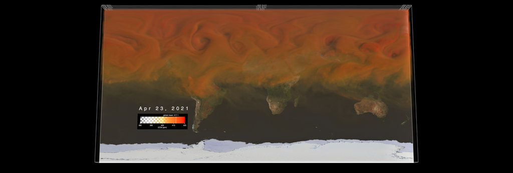
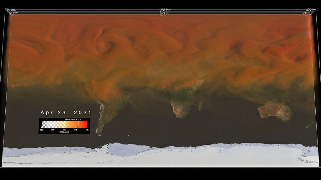
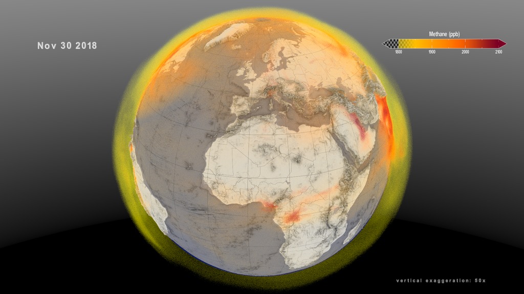
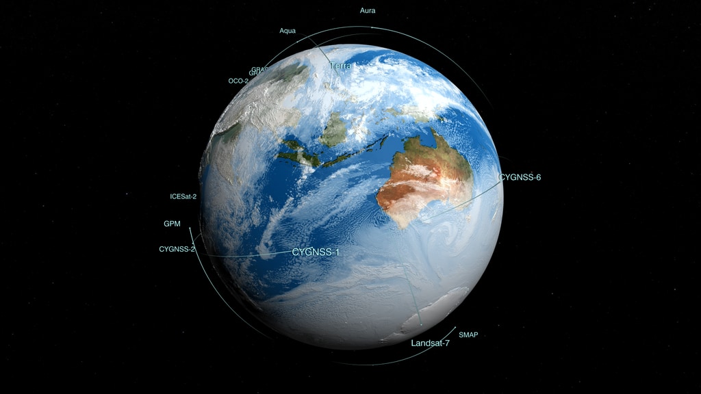
NASA has the world’s largest Earth observing fleet and has an uninterrupted record and observed evidence of climate change. Increased greenhouse gases trap heat in the Earth’s atmosphere.
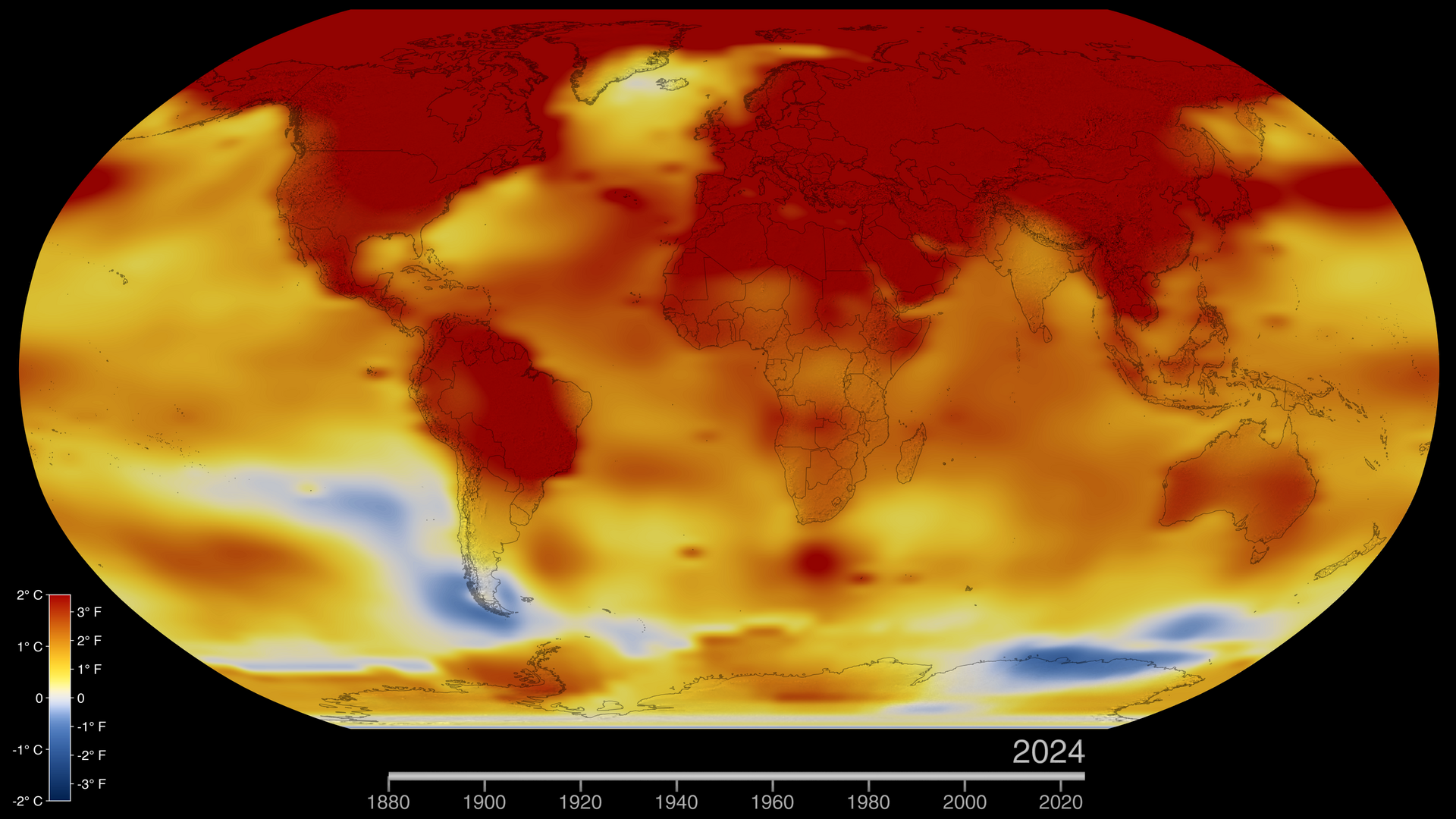
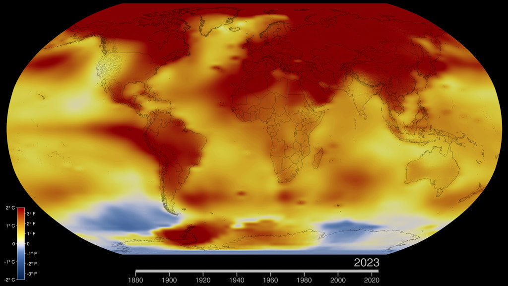
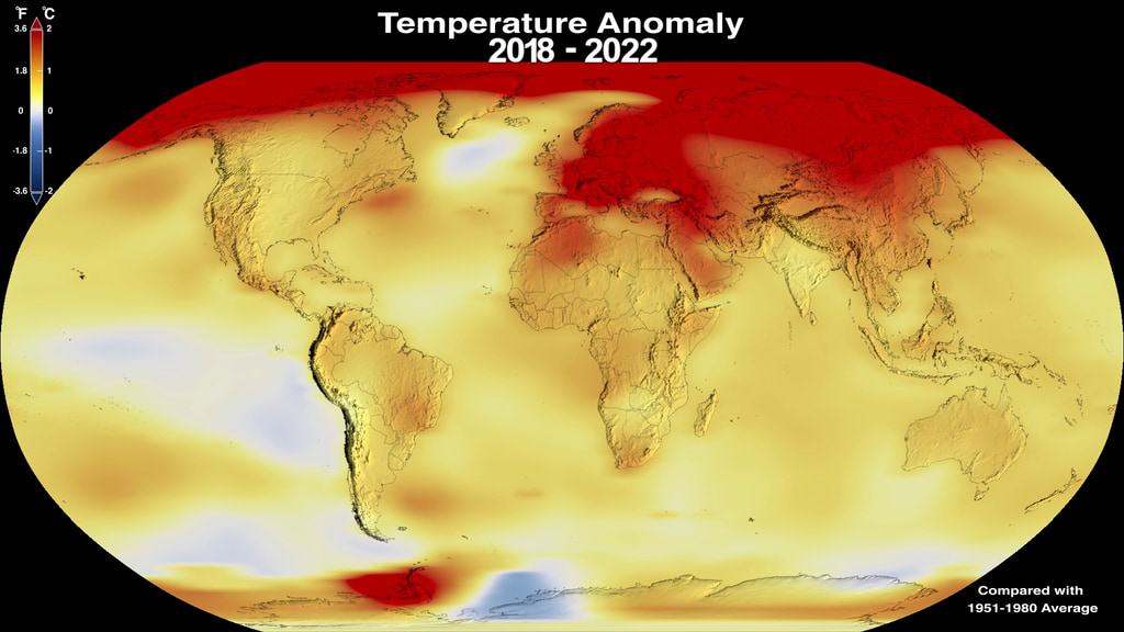
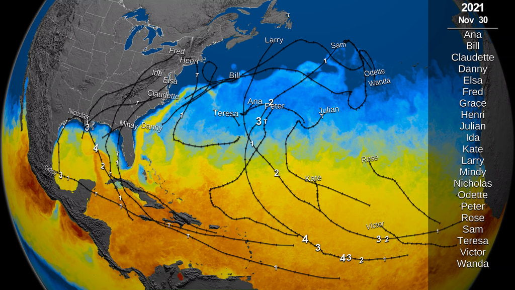
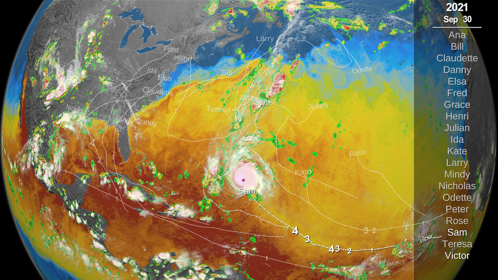
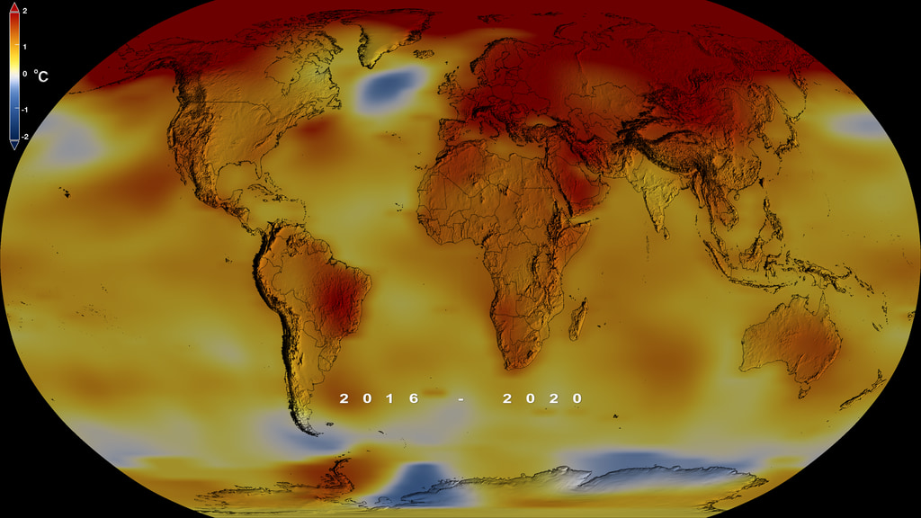
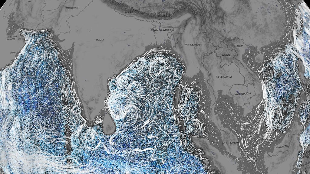
Trapped atmospheric greenhouse gases warm the planet – our land, ocean, and atmosphere. Most of the global warming goes into the ocean, delaying the full impact of global warming. Ocean currents move the heat around the globe, impacting your local weather and climate. Warmer oceans accelerate melting of ice sheets in Greenland and Antarctica. Rising seas are a major consequence of climate change, impacting coastal communities, infrastructure, and economy. Warmer climate amplifies Earth’s water cycle. Dry areas are getting drier and wet areas are getting wetter. Wet areas are experiencing more flooding and extreme storms, such as typhoons and hurricanes. Drought prone areas will see less rainfall, effecting agriculture. NASA data are used for projections that can help inform actions for the future. More extreme conditions are occurring due to climate change, such as wildfires. NASA data and knowledge are open and free, enabling informed decision-making. NASA information aids preparation and recovery from natural hazards around the world
Warmer climate amplifies Earth’s water cycle. Dry areas are getting drier and wet areas are getting wetter. The top left corner is global precipitation anomaly data from NASA/JAXA GPM IMERG. For the most recent global precipitation anomaly see https://svs.gsfc.nasa.gov/4897
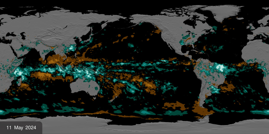
Wet areas are experiencing more flooding and extreme storms, such as typhoons and hurricanes.The top left corner shows the 2021 Hurricane season where the ocean is colored by sea surface temperature from NASA Aqua MODIS, MUR. The global precipitation is NASA/JAXA GPM IMERG, and the cloud data is NOAA CPC.
Trapped atmospheric greenhouse gases warm the planet – our land, ocean, and atmosphere. Temperature Difference from the average temperature is data from NASA GISSTEMP, and the total extra heat trapped in the earth system is data from NASA CERES.

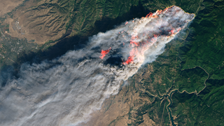
More extreme conditions are occurring due to climate change, such as wildfires.
The data on the left is activefires from NASA/NOAA Suomi-NPP/VIIRS. The data on the left is Landsat 8-OLI of the Camp Fire from Nov 8, 2018 https://landsat.visibleearth.nasa.gov/view.php?id=144225

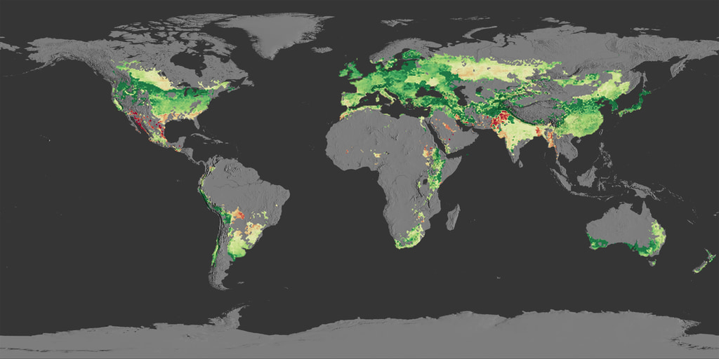
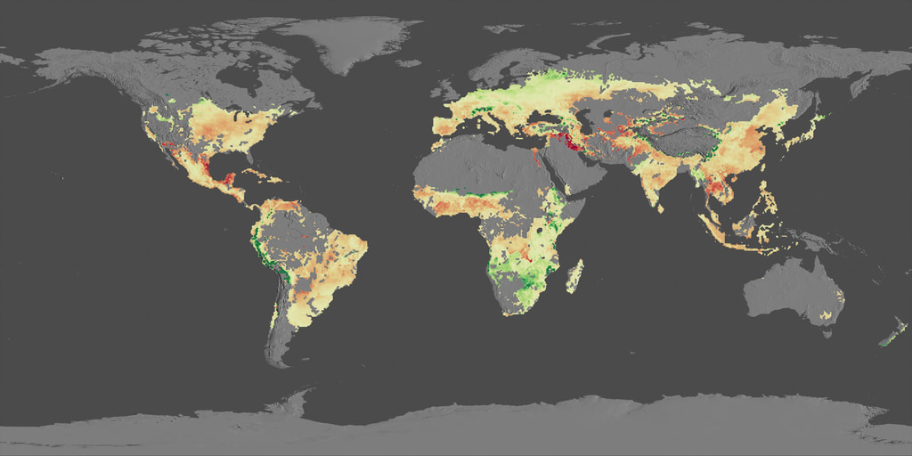
Drought prone areas will see less rainfall, effecting agriculture.
Data on the left is NASA SMAP data visualized by NASA Eyes. For the latest NASA SMAP data visualized with NASA Eyes see https://eyes.nasa.gov/apps/earth/#/vitalsign?vitalsign=soil_moisture&altid=0&animating=f&start=&end=
NASA's Oceans Melting Greenland (OMG) mission will test the connection between ocean warming and ice loss in Greenland. Warmer oceans accelerate melting of ice sheets in Greenland and Antarctica
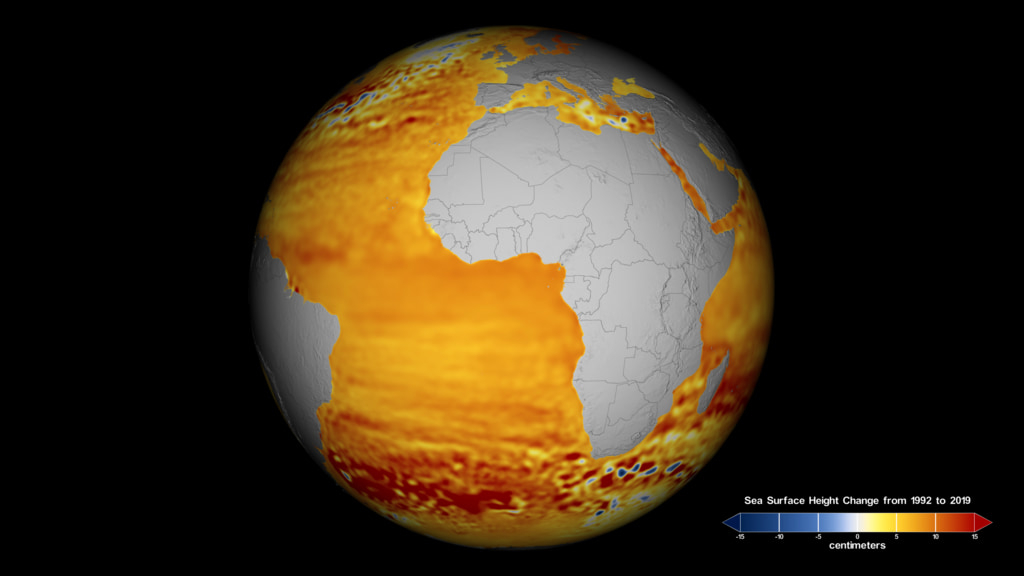
Rising seas are a major consequence of climate change, impacting coastal communities, infrastructure, and economy.
Source: NASA/CNES/NOAA/EUMETSAT/ESA TOPEX/Poseidon, Jason-1, 2, & 3, Sentinel-6MF
NASA data are used for projections that can help inform actions for the future. Here is an example of yield projections from wheat and maize. Source is Jaegermeyer et al. 2021 CMIP6, AgMIP, NASA Goddard.
NASA Informs Actionable Climate Decision Making
NASA information aids preparation and recovery from natural hazards around the world like tracking fires at https://firms.modaps.eosdis.nasa.gov/
Since 1993, NASA has continuously been measuring Sea Level Height of the global oceans.
NASA data and knowledge are open and free, enabling informed decision-making
Example: planning for sea level rise on 10-100 year horizons at your coastal city
https://sealevel.nasa.gov (also at UNFCCC)
Credits
Please give credit for this item to:
NASA's Scientific Visualization Studio
-
Scientists
- Karen St. Germain (NASA)
- Felix W. Landerer (NASA/JPL CalTech)
-
Gavin A. Schmidt
(NASA/GSFC GISS)

-
Doug C. Morton
(NASA/GSFC)
- Nadya Vinogradova-Shiffer (NASA/HQ)
- Jessica Hausman (NASA/JPL CalTech)
-
Data visualizers
-
Mark SubbaRao
(NASA/GSFC)
- Lori Perkins (NASA/GSFC)
-
Greg Shirah
(NASA/GSFC)
-
Alex Kekesi
(Global Science and Technology, Inc.)
-
Helen-Nicole Kostis
(USRA)
-
AJ Christensen
(SSAI)
- Trent L. Schindler (USRA)
- Marit Jentoft-Nilsen (Global Science and Technology, Inc.)
- Horace Mitchell (NASA/GSFC)
- Devika Elakara (GSFC Interns)
-
Cindy Starr
(Global Science and Technology, Inc.)
- Jason S Craig (NASA JPL, Caltech)
-
Mark SubbaRao
(NASA/GSFC)
-
Producers
- Katie Jepson (KBR Wyle Services, LLC)
- Kathleen Gaeta (Advocates in Manpower Management, Inc.)
Sources
- ID: 5450
 Visualization
 - ID: 31158
 Visualization
 - ID: 31156
 Visualization
 - ID: 5207
 Visualization
 - ID: 5060
 Visualization
 - ID: 4982
 Visualization
 - ID: 4983
 Visualization
 - ID: 4964
 Visualization
 - ID: 4949
 Visualization
 - ID: 4947
 Visualization
 - ID: 4914
 Visualization
 - ID: 4925
 Visualization
 - ID: 4897
- ID: 4882
 Visualization
 - ID: 4853
 Visualization
 - ID: 4858
 Visualization
 - ID: 4798
 Visualization
 - ID: 4772
 Visualization
 - ID: 13253
 Produced Video
Release date
This page was originally published on Monday, December 13, 2021.
This page was last updated on Monday, February 3, 2025 at 12:52 AM EST.