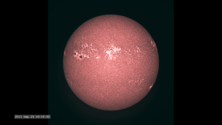
The Active Sun from SDO: HMI Dopplergram
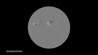
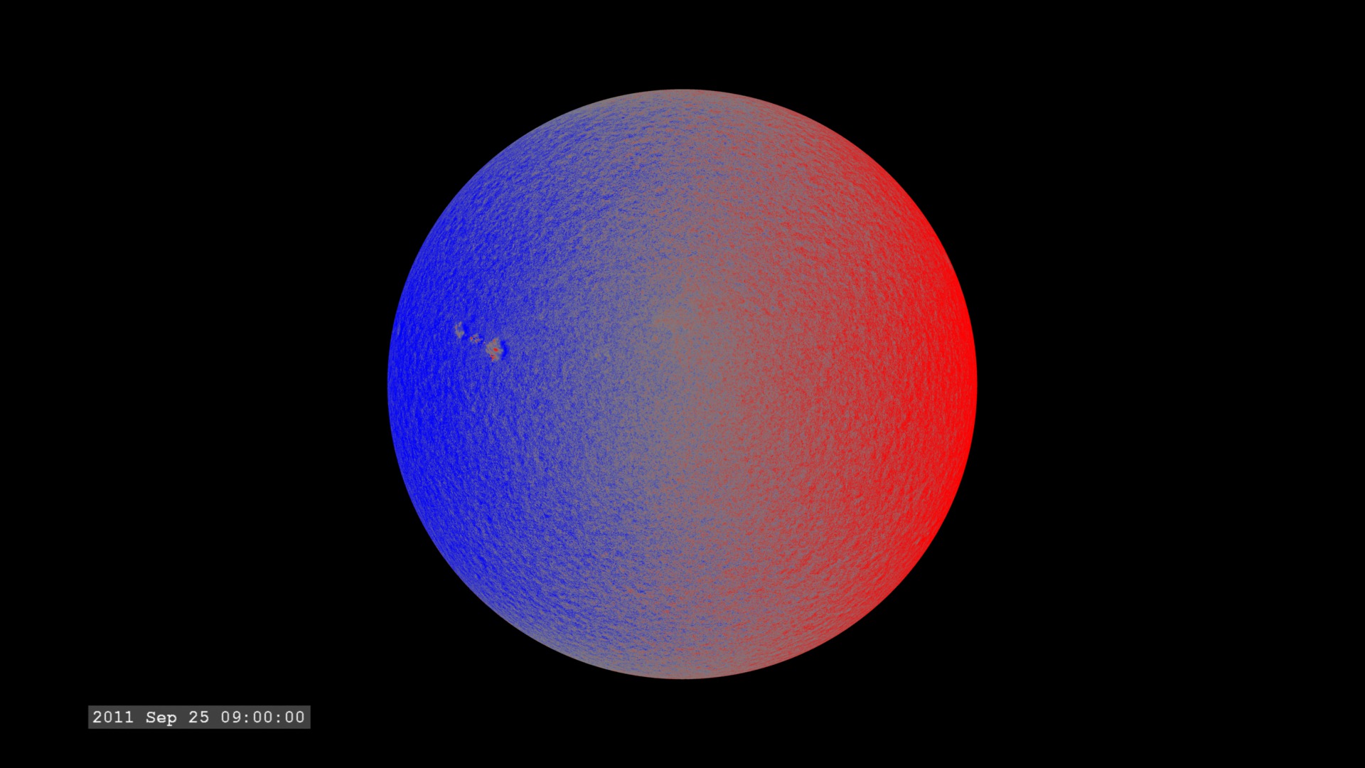
The Helioseismic Magnetic Imager (HMI) aboard the Solar Dynamics Observatory takes a series of images every 45 seconds in a very narrow range of wavelengths in visible light of the solar photosphere. The wavelengths correspond to a region around the 6173 Ångstroms (617.3 nanometers) spectral line of neutral iron (Fe I). From this series of images, it constructs a set of images which extract other characteristics of the photosphere. For this dataset, it measures the shifting of the spectral lines to determine the velocity of gas flows on the solar surface. This spectral line shift is due to the Doppler effect (Wikipedia). Blue represents motion towards the observer. Red indicates motion away from the observer.
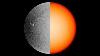
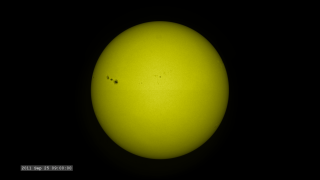
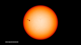
For the images below, the color is dominated by the solar rotation, so the solar limb on the right is moving away from us (and therefore red) while the left limb is moving towards us (and therefore blue). Motions on the solar surface generate the rippling in the color and you can see evidence of surface flows around the sunspot near the left limb.
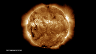
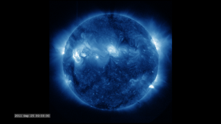
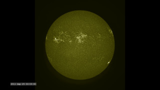
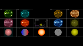
This visualization is one of a set of visualizations (others linked below) covering the same time span of 17 hours over the full wavelength range of the mission. They are setup to play synchronously on a Hyperwall, or can be run individually.
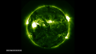
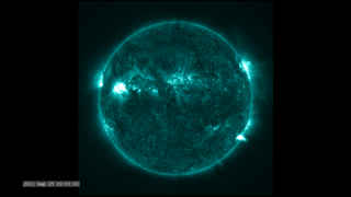
The images are sampled every 36 seconds, 1/3 of the standard time-cadence for SDO. This visualization is useful for illustrating how different solar phenomena, such as sunspots and active regions, look very different in different wavelengths of light. These differences enable scientists to study them more completely, with an eventual goal of improving Space Weather forecasting.
Related


Visualization Credits
Scott Wiessinger (USRA): Producer
Genna Duberstein (USRA): Producer
Phil Chamberlin (NASA/GSFC): Scientist
NASA/Goddard Space Flight Center Scientific Visualization Studio, the SDO Science Team, and the Virtual Solar Observatory.
https://svs.gsfc.nasa.gov/3990
Mission:
SDO
Data Used:
SDO/HMI/Dopplergram also referred to as: SDO Dopplergram
2011-09-25T08:00 - 2011-09-26T01:00This item is part of this series:
SDO Jewelbox
Keywords:
SVS >> HDTV
SVS >> Hyperwall
SVS >> SDO
SVS >> Solar Dynamics Observatory
SVS >> Heliophysics
NASA Science >> Sun


