Science On a Sphere Gallery
Overview
Content for NOAA's Science on a Sphere and related spherical display platforms.
Science on a Sphere Features
- ID: 10843 Produced Video
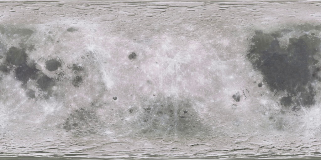
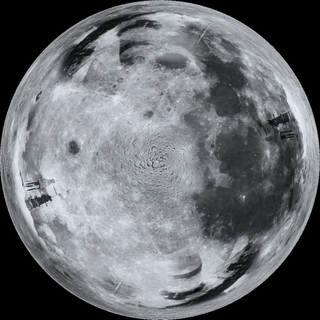
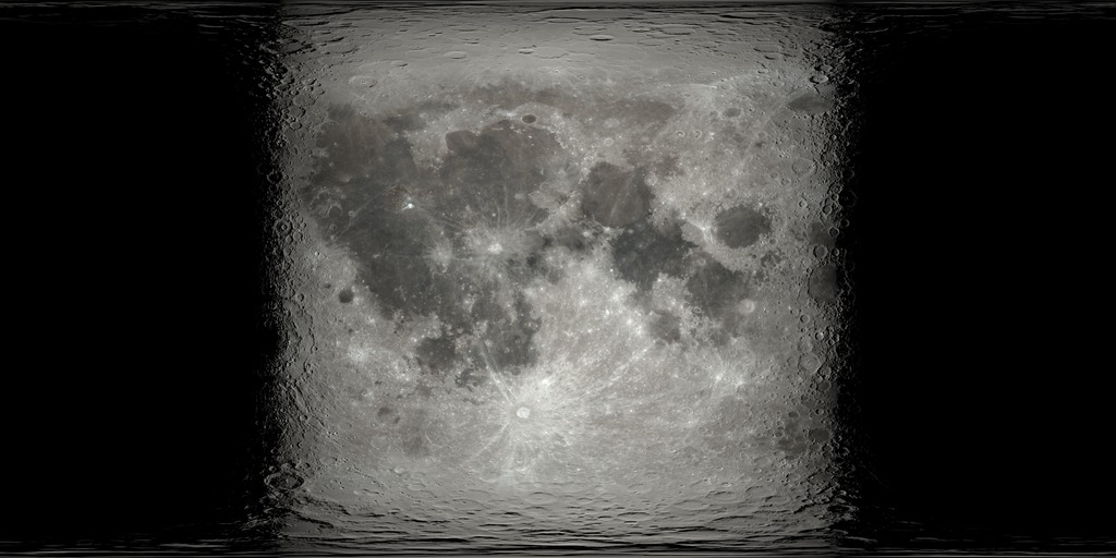
Science On a Sphere: Evolution of the Moon
Go to this pageNASA's Goddard Space Flight Center and the Lunar Reconnaissance Orbiter present to you a short, narrated Science On a Sphere show depicting the evolution of our moon—all the way from when it was just a ball of magma orbiting the Earth. See the large impacts that formed the basins of the moon, watch as lava seeps out and cools to form the dark-colored maria, and observe how thousands of crater impacts made the moon look like it does today! ||
- ID: 10572 Produced Video

FOOTPRINTS
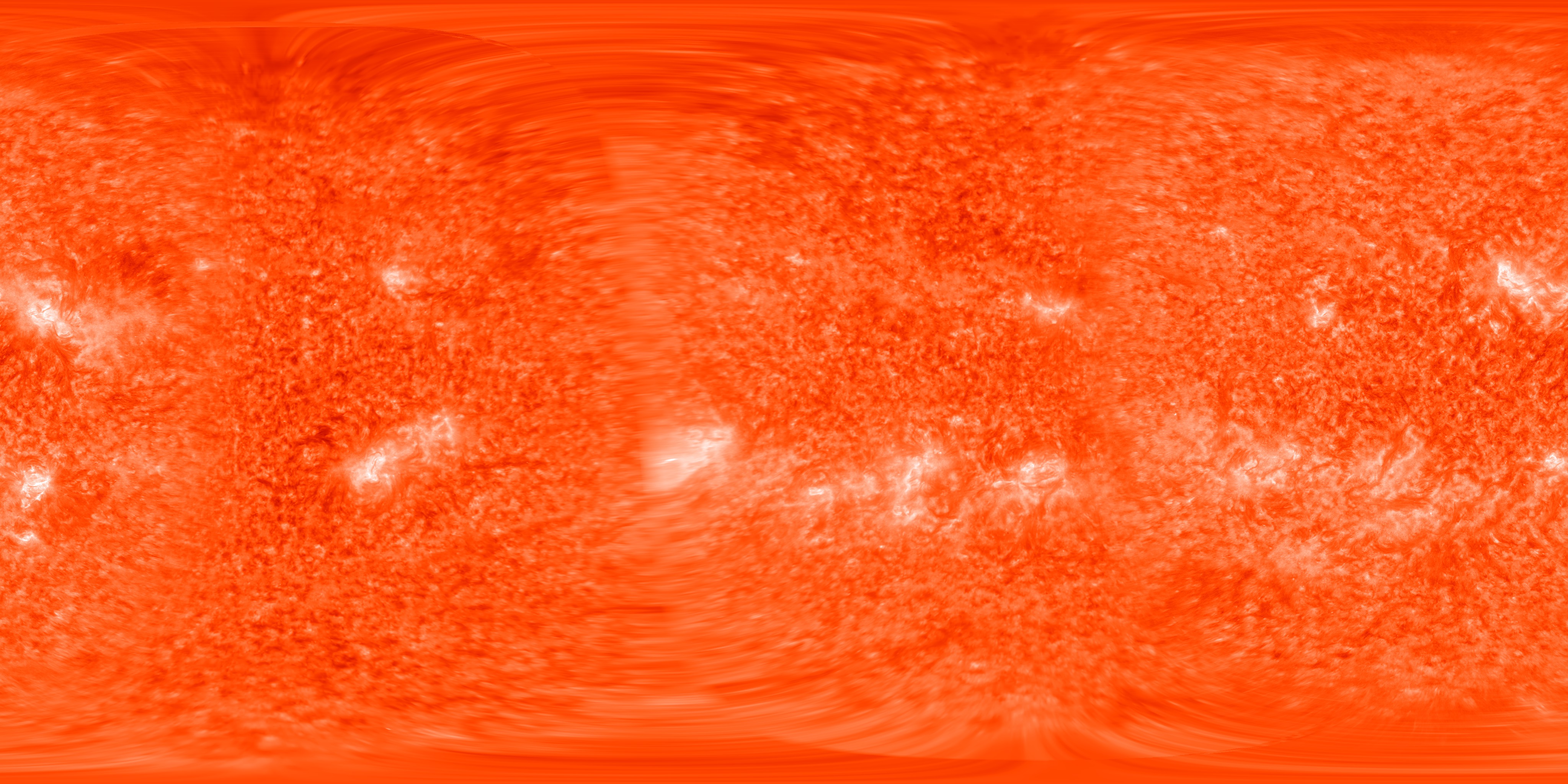
Go to this pageNASA's home for spherical films on Magic Planet. Download the Magic Planet-ready movie file here.The Earth is not flat.That's the conceptual spark for the astounding movie created at the NASA Goddard Space Flight Center. Using an advanced media projection technology called Science On a Sphere developed by the National Oceanic and Atmospheric Administration (NOAA), FOOTPRINTS is the first fully produced film of its kind. The movie presents advanced satellite data and other visual effects on a dramatic spherical screen, affording viewers a chance to experience planets and planetary science in a way that's more natural to their actual appearance. The Earth guest stars in a variety of guises, from depictions of the biosphere to planetary views of city lights at night to dramatic examinations about the science of hurricane formation. Other moons and planets make exciting cameos too, with special presentations of Mars and Earth's moon.Media and visualization experts at NASA began working with the NOAA technology in the fall of 2005. Until that time, Science On a Sphere had already established an impressive reputation for depiction of planetary data in a dramatic way. But FOOTPRINTS marks the first time that a thorough set of techniques and artistic rules have been applied in the service of a full featured production presented on a spherical screen. But more than just a showcase for discrete data sets, the 16 minute film provides a conceptual framework about the human drive to explore. By contextualizing data with compelling language, inventive pictures, and dramatic sound, FOOTPRINTS seeks to engage and enthuse audiences who may not understand the practicalities and majesty of NASA's and NOAA's observations, and may not otherwise have any contact with what these two science agencies actually do. As a presentation tool, Science On a Sphere is relatively new. NOAA invented and developed its core hardware and software within the past few years. According to Dr. Alexander MacDonald, the NOAA scientist located at the Earth System Research Laboratory in Boulder, Colorado, who originally conceived of it, Science On a Sphere is intended to present global science as it should be presented and to stimulate students to learn more about the Earth's environment and the solar system.In the past few years Science On a Sphere systems have begun to be installed in museums and science centers around the world. Scientists and administrators at NASA Goddard saw potential to use the Sphere as both a teaching and an outreach tool and with NOAA's support decided to bring one to the campus. It's currently installed at the Goddard Visitor Center.For several years there has been a slowly growing list of planetary data sets that can play on Spheres located in museums and institutions around the country. NASA and NOAA intend to dramatically augment that collection with new images and data. But FOOTPRINTS changes the playing field. With the release of this film, the Goddard team dramatically catapults forward the capabilities of the system, taking it far beyond its initial limits of merely depicting planetary data sets. Beyond encompassing state of the art data visualizations, the production team developed new ways for working with computer generated illustrations and animation, high definition video, graphics, text, and more. In a little more than three and a half months, the core group developed a palette of new technical processes and aesthetic guidelines for presenting media on the Sphere.The movie asks audiences to consider the idea that what they know is only a function of what questions they're willing to ask. It's an intellectual and creative backdrop to the overall production, and also a philosophical backdrop to the excitement about the vital work that NASA and NOAA do in service of the public interest. ||
- ID: 10573 Produced Video
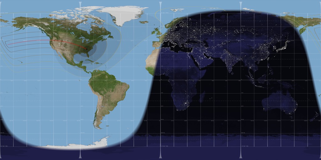
RETURN TO THE MOON
Go to this pageNASA's home for spherical films on Magic Planet. Download the Magic Planet-ready movie file here.The silvery disc of inspiration for countless philosophers and lovers also happens to be one of the great destinations in the annals of exploration. Earth's moon shines like a beacon, beckoning scientists and the simply curious. But it's been a long time since anyone has visited, and even the most basic signals from unmanned probes have been few and far between. Unfold your maps. With the advent of the NASA's Lunar Reconnaissance Orbiter (LRO), humanity makes a return to the moon like a herald announcing a new age. To commemorate the mission and champion the value of future planned lunar expeditions, the Space Agency created a new short film called RETURN TO THE MOON. Designed expressly for the Science On a Sphere platform, a striking spherical projection system now playing in theaters around the world, RETURN TO THE MOON shows off our silver sibling like a jewel of the night. Starting with a brief historical look back at the legacy of human achievement in lunar exploration, the movie presses audiences to take stock in their own relationship to the moon. Then it takes them on a journey. Travelling along with the LRO spacecraft, viewers will discover some of the essential scientific subjects that scientists plan to study. They'll follow LRO as it makes orbits around the moon, gathering data about the surface and what may lie beneath. And then, in a dramatic demonstration of a daring part of the mission, moviegoers will witness the inventive and powerful moment when NASA engineers intentionally crash a research probe into the surface of the moon to dig beneath the top layer. The space agency calls that impact probe LCROSS, and as both a research tool and a cinematic experience, it promises to deliver something exciting. RETURN TO THE MOON was produced by the media team at the Goddard Space Flight Center. One of NASA's premiere media teams, this group not only delivers state of the art data visualizations of ongoing research, but also helped write the book on spherical filmmaking. At its time of release, RETURN TO THE MOON was the third fully produced spherical movie from Goddard, and an exciting departure in terms of how these kind of products fuse dramatic presentational style with robust science. ||
- ID: 10477 Produced Video
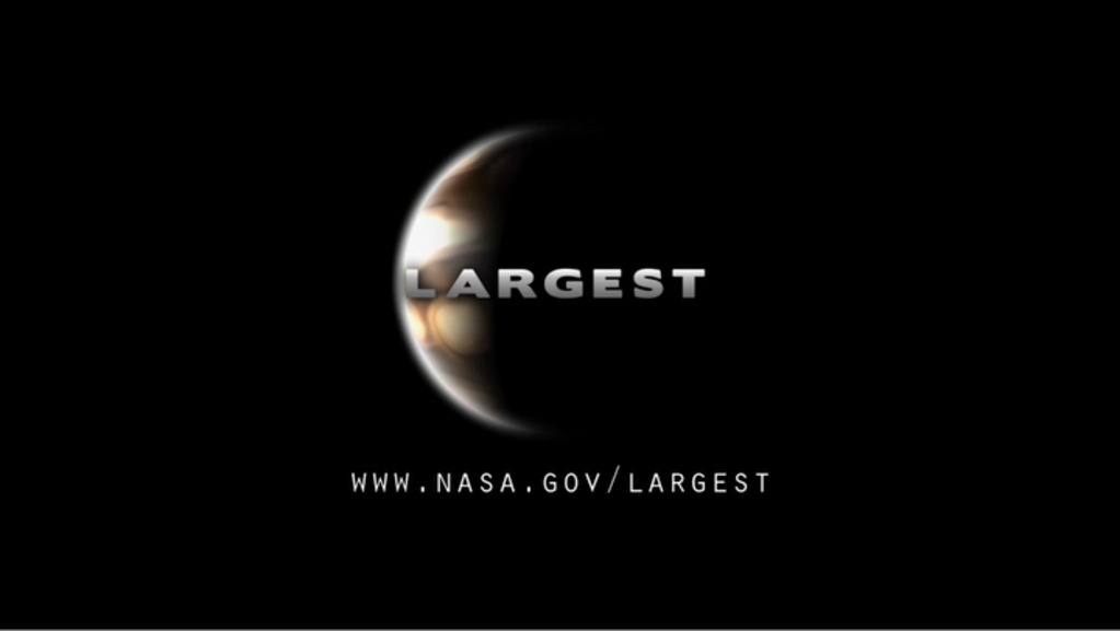
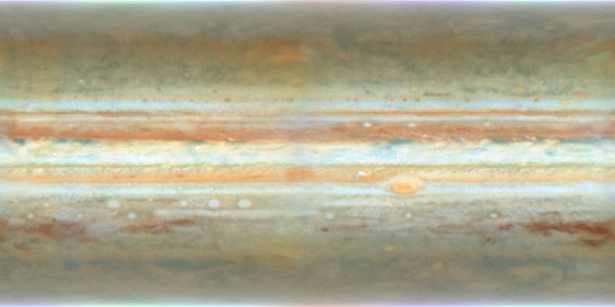
LARGEST: A Spherical Movie About Jupiter
Go to this pageNASA's home for spherical films on Magic Planet. Download the Magic Planet-ready movie file here.Three hundred and eighty million miles from Earth, the solar system's largest planet spins like a sizzling top in the night, massive and powerful beyond all comparison short of the sun itself. It's therefore only fitting—and certainly about time—that the fifth planet receive its proper cinematic due, set naturally on the most appropriate cinematic platform. With the movie LARGEST, Jupiter comes to Science On a Sphere.LARGEST examines the gas giant like a work of art, like a destination of celestial wonder. Starting with the basics, the movie examines the gross anatomy of the immense planet. From swirling winds to astounding rotational velocity to unimaginable size, Jupiter demands nothing less than a list of superlatives. But where general description sets the stage, LARGEST parts the curtains on humanity's experience with the fifth planet. The movie takes us on a journey to this immense sphere via dramatic fly-bys with some of the most astounding robotic probes ever designed. Then, with NASA instruments trained on the striped behemoth, the drama really begins.NASA released LARGEST on September 15, 2009. It is one in a series of spherical movies created entirely by staff at the NASA Goddard Space Flight Center. But while the process to create a fully spherical movie is something of an in-house Goddard creation, the Science On a Sphere projection system itself is an invention of the space agency's sibling NOAA.This film has been prepared exclusively for playback on spherical projections systems. It will not play properly on a traditional computer or television screen. If you are interested in downloading the complete final movie file for spherical playback, please visit ftp://public.sos.noaa.gov/extras/.For more information about the movie itself, visit the main website at www.nasa.gov/largest. ||
- ID: 12126 Produced Video
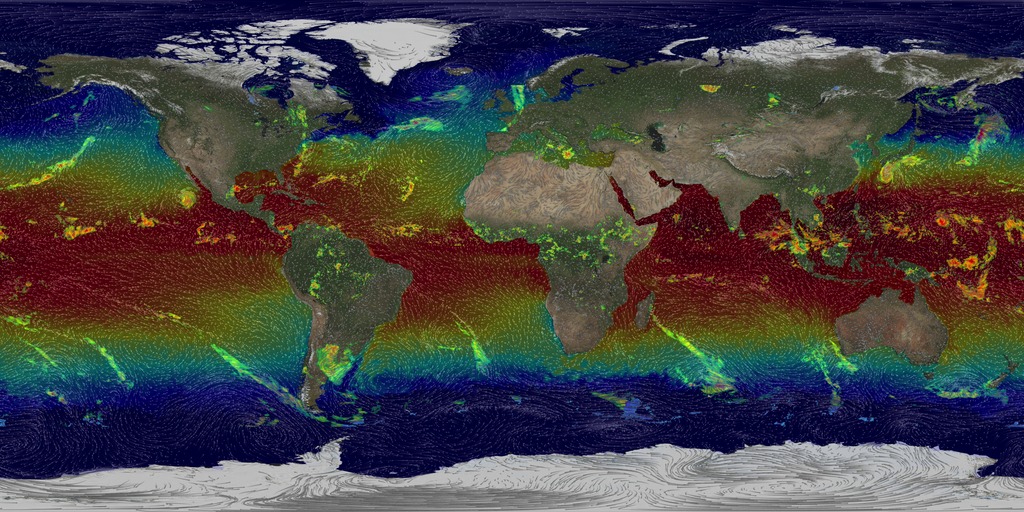
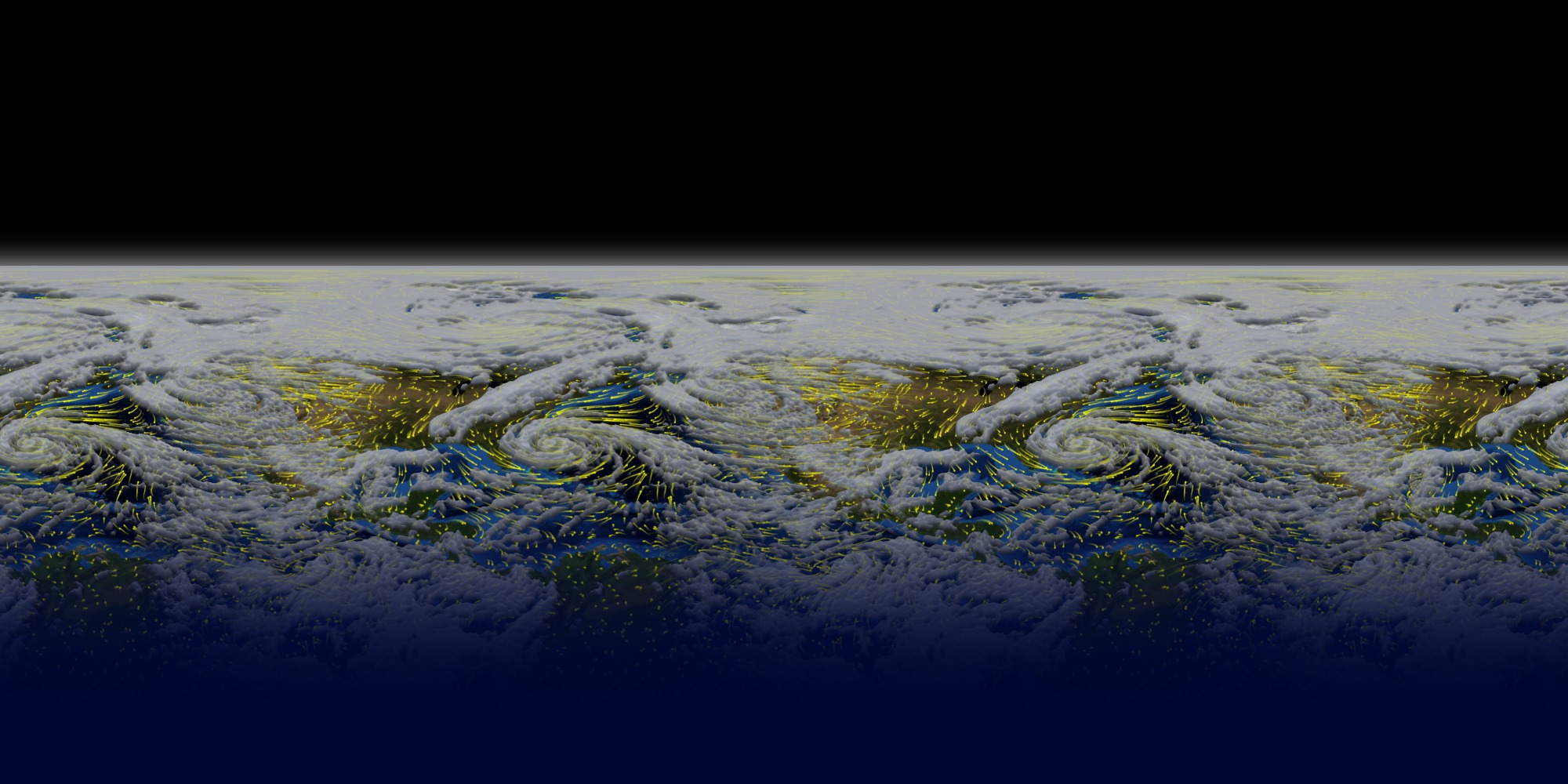
Science On a Sphere: A Global Tour of Precipitation from NASA
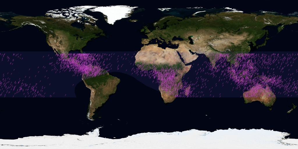
Go to this pagePrecipitation (falling rain and snow) is our fresh water reservoir in the sky and is fundamental to life on Earth. A Global Tour of Precipitation from NASA shows how rain and snowfall moves around the world from the vantage of space using measurements from the Global Precipitation Measurement Core Observatory, or GPM. This is a joint mission between NASA and the Japanese Aerospace Exploration Agency (JAXA) and offers the most detailed and worldwide view of rain and snowfall ever created.This narrated movie is created for Science On a Sphere, a platform designed by NOAA that displays movies on a spherical screen. Audiences can view the movie from any side of the sphere and can see any part of Earth. During this show viewers will be guided through a variety of precipitation patterns and display features such as the persistent band of the heaviest rainfall around the equator and tight swirls of tropical storms in the Northern Hemisphere. At subtropical latitudes in both hemispheres there are persistent dry areas and this is where most of the major deserts reside. Sea surface temperature and winds are also shown to highlight the interconnectedness of the Earth system. The movie concludes with near real-time global precipitation data from GPM, which is provided to Science On a Sphere roughly six hours after the observation.To download this movie formatted for a spherical screen, visit NOAA's official Science On a Sphere website below:• A Global Tour of Precipitation from NASA• Near Real-Time Global Precipitation Data ||
- ID: 11332 Produced Video
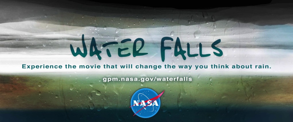
WATER FALLS — A Science On a Sphere Movie
Go to this pageThe Global Precipitation Measurement mission (GPM) is a massive, multinational mission utilizing a fleet of spacecraft, sophisticated ground based data processing systems, and years of planning. To capture the essence of this immense undertaking and introduce it to broad audiences, NASA's GPM project office decided to do something out of the box. WATER FALLS is the result. Designed specifically for spherical screens, WATER FALLS abstracts the complex mechanics of the GPM mission, and explores the diversity of phenomena inherent to the water cycle. Presented in sensual, evocative, even surprising ways, WATER FALLS offers vital information about GPM's profound importance to everyone who lives on Earth. ||
- ID: 4306 Visualization
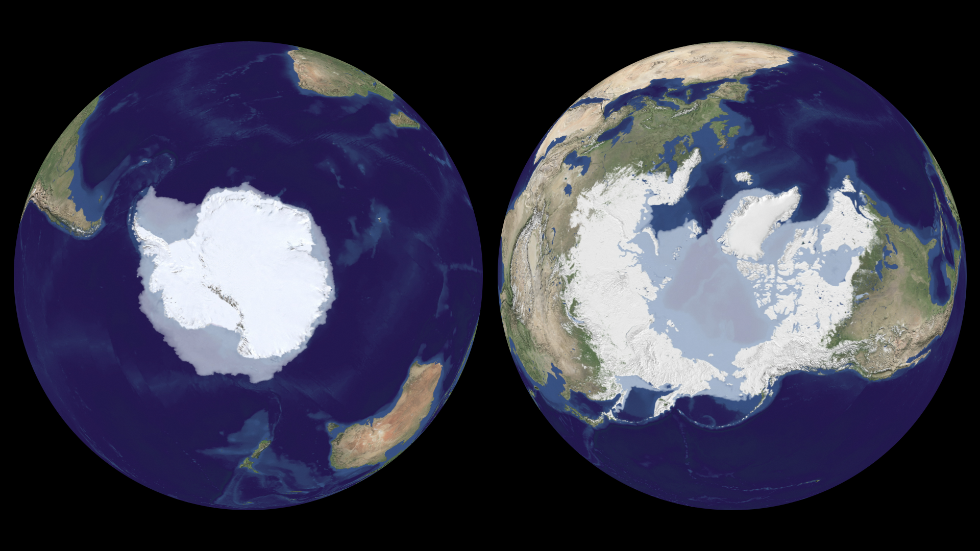
FROZEN: The Full Story
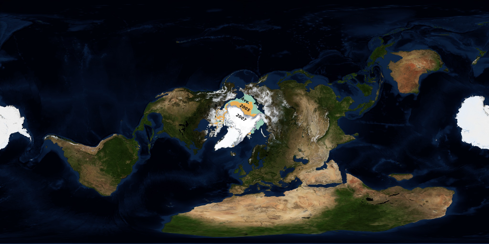
Go to this pageOn March 27, 2009, NASA released FROZEN, a twelve-minute show about the Earth's frozen regions designed for Science On a Sphere. Science On a Sphere was created by NOAA and displays movies on a spherical screen, which is ideal for a show about the Earth or the planets. The audience can view the show from any side of the sphere and can see any part of the Earth. Making a movie for this system is challenging, and FROZEN was an exciting project to create. Until now, only the "trailer" for FROZEN has been available for viewing from our site. Here, for the first time, is an on-line version of the complete show, presented in several different formats that show different aspects of the movie. ||
- ID: 10403 Produced Video
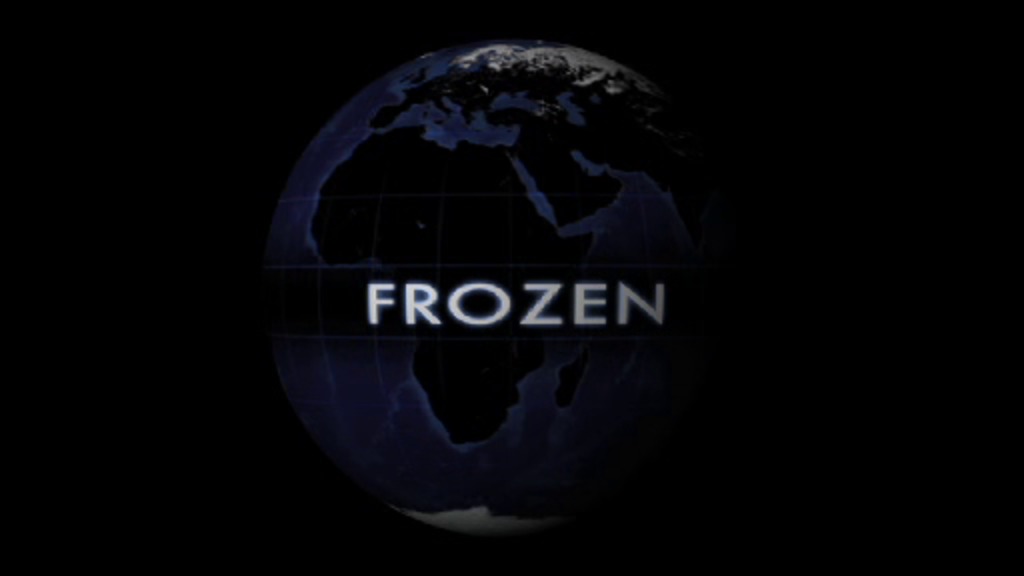
FROZEN: A Spherical Movie About the Cryosphere
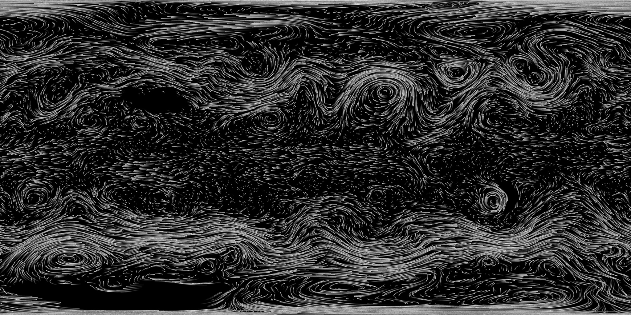
Go to this pageNASA's home for spherical films on Magic Planet. Download the Magic Planet-ready movie file here.Released on March 27, 2009, FROZEN is NASA's second major production for the Science On a Sphere platform, a novel cinema-in-the-round technology developed by the Space Agency's sibling NOAA. Viewers see the Earth suspended in darkness as if it were floating in space. Moving across the planet's face, viewers see the undulating wisps of clouds, the ephemeral sweep of fallen snow, the churning crash of shifting ice, and more.FROZEN brings the Earth alive. Turning in space, the sphere becomes a portal onto a virtual planet, complete with churning, swirling depictions of huge natural forces moving below. FROZEN features the global cryosphere, those places on Earth where the temperature doesn't generally rise above water's freezing point. As one of the most directly observable climate gauges, the changing cryosphere serves as a proxy for larger themes.But just as thrilling as this unusual—and unusually realistic—look at the planet's structure and behavior is the sheer fun and fascination of looking at a spherically shaped movie. FROZEN bends the rules of cinema, revealing new ways to tell exciting, valuable stories of all kinds. The movie may be FROZEN, but the experience itself rockets along. ||
- ID: 4387 Visualization
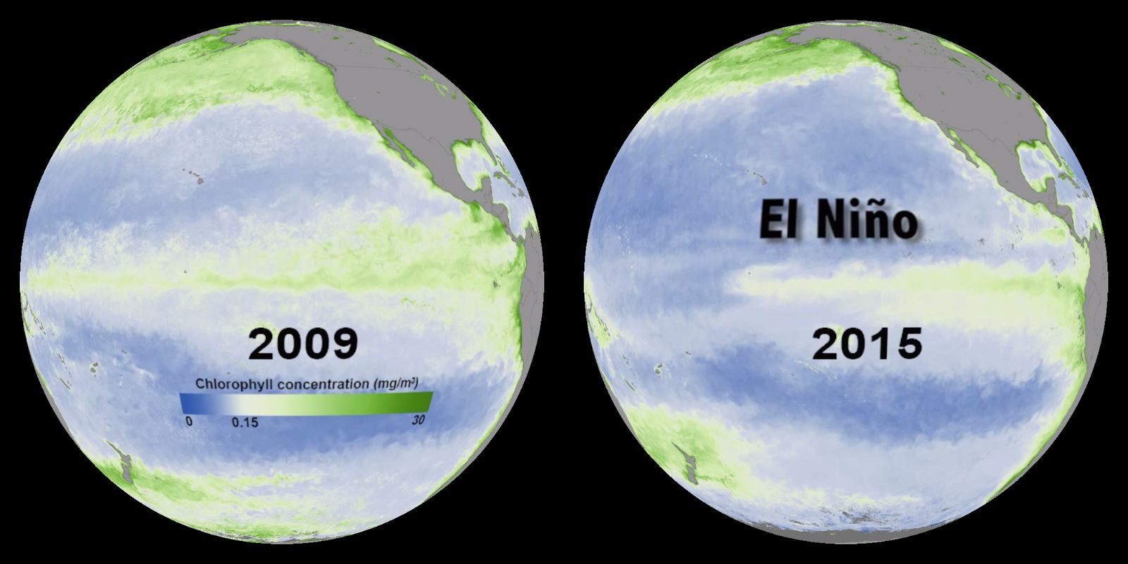
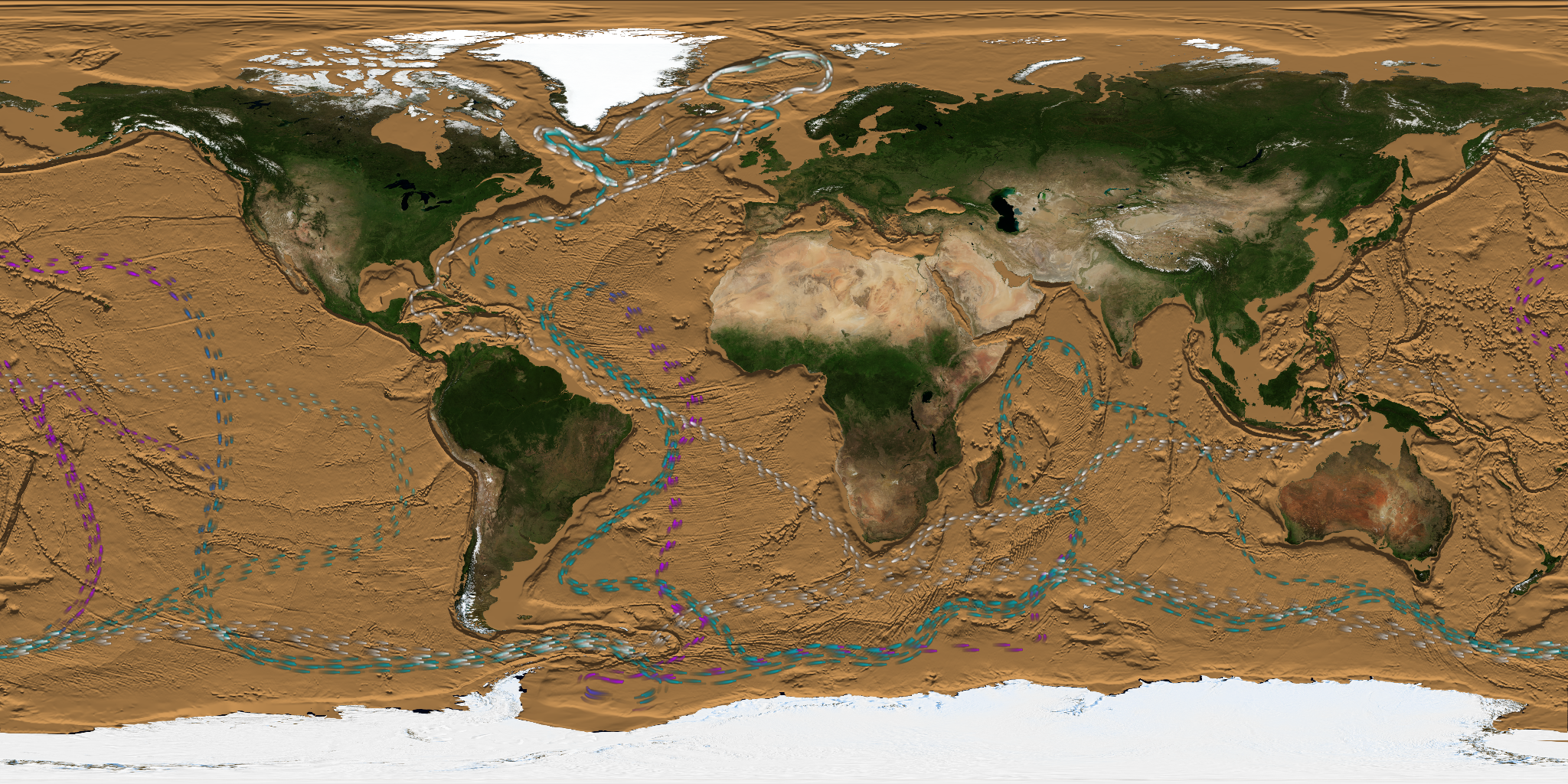
El Niño: Disrupting the Marine Food Web
Go to this pageThis gallery was created for Earth Science Week 2015 and beyond. It includes a quick start guide for educators and first-hand stories (blogs) for learners of all ages by NASA visualizers, scientists and educators. We hope that your understanding and use of NASA's visualizations will only increase as your appreciation grows for the beauty of the science they portray, and the communicative power they hold. Read all the blogs and find educational resources for all ages at: the Earth Science Week 2015 page.In case you haven’t heard, El Niño is starting to make headlines this year. Often nicknamed "the bad boy of weather," who is this guy?A long time ago, fishermen off the west coast of South America — one of the world's most productive fisheries — noticed that some years the fish disappeared. This was especially noticeable around Christmas time — giving it the name El Niño, which means Christ child in Spanish. Today we know why El Niño happens — but knowing when it will happen is still a challenge. Normally, winds blow from east to west along the equator, pushing surface water westward. As the water moves away from the east, nutrient-rich deeper ocean water rises to fill the void (called upwelling.) When nutrients rise into sunlight, they cause blooms of tiny plants called phytoplankton. These plants feed the entire marine food web from small fish such as sardines to bigger fish, sea birds, and marine mammals. When an El Niño develops, the normal east-to-west winds die and warm surface water from the west Pacific moves eastward. This stops the upwelling in the east. Without the supply of deeper, nutrient-rich water, less phytoplankton bloom and the fisheries collapse. From satellites in space we see how these changes impact the ocean’s color. Normally, the ocean looks more green along the equator (image below, left.) During El Niño, the ocean looks more blue and less green because there is less plant life (images below, right.) While this color change is subtle to our eyes, it means life or death for the species that depend upon plankton for food. Some animals starve (e.g. sea lions, marine iguanas, Galapagos penguins) while others move away to look for food elsewhere. ||
Science on a Sphere Visualizations
- ID: 5012
 Visualization
 - ID: 4990
- ID: 4914
 Visualization
 - ID: 4925
 Visualization
 - ID: 4882
 Visualization
 - ID: 4711
 Visualization
 - ID: 4675
 Visualization
 - ID: 12952
 Produced Video
 - ID: 4554
- ID: 4466
 Visualization
 - ID: 4174
 Visualization
 - ID: 4020
 Visualization
 - ID: 3851
 Visualization
 - ID: 3636
- ID: 3608
 Visualization
 - ID: 3579

- ID: 3481
- ID: 3534
- ID: 3523
 Visualization
 - ID: 3564
- ID: 3507
- ID: 3837
- ID: 4085
 Visualization
 - ID: 3881
 Visualization
 - ID: 3908
 Visualization
 - ID: 4245