NASA Studies Hurricane Matthew
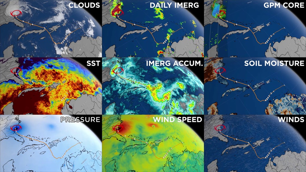
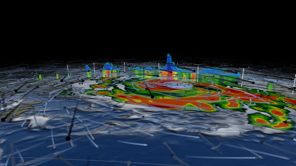
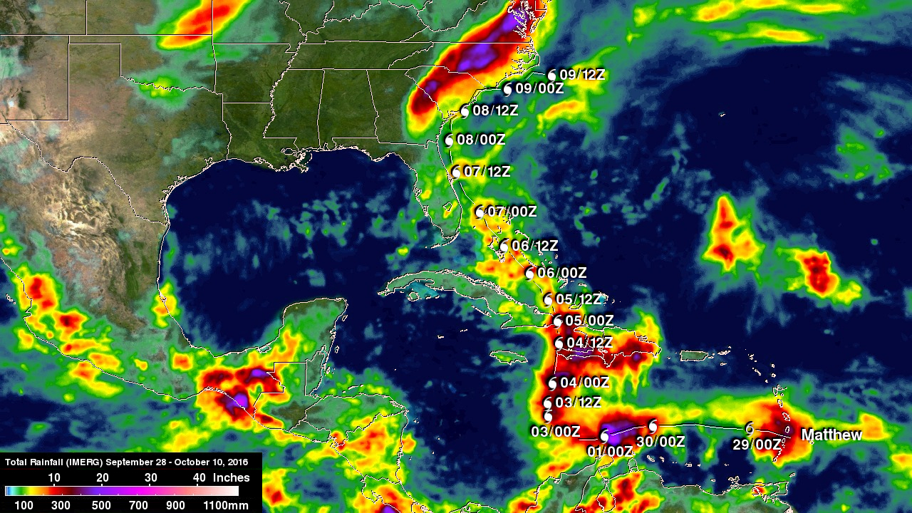
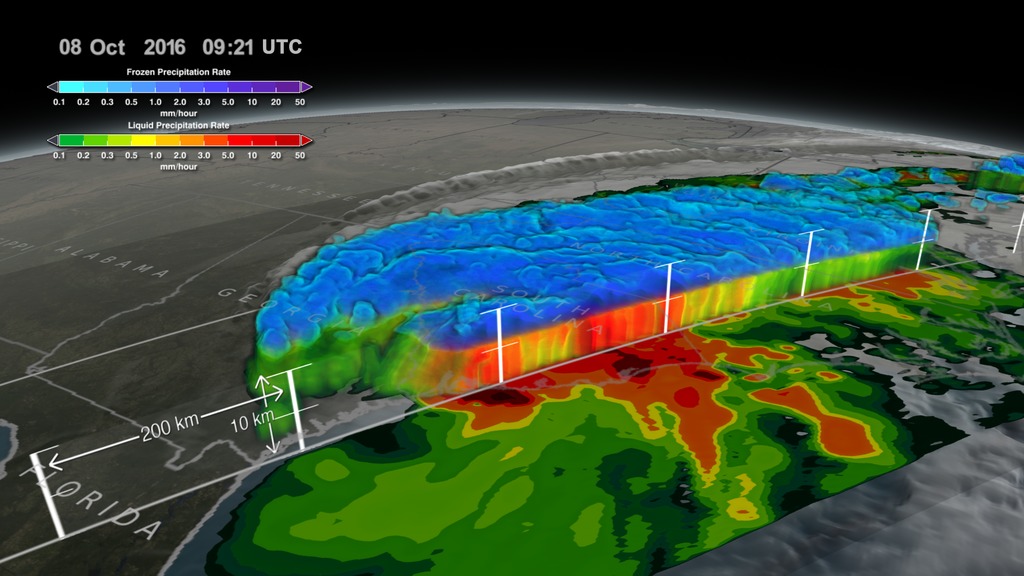
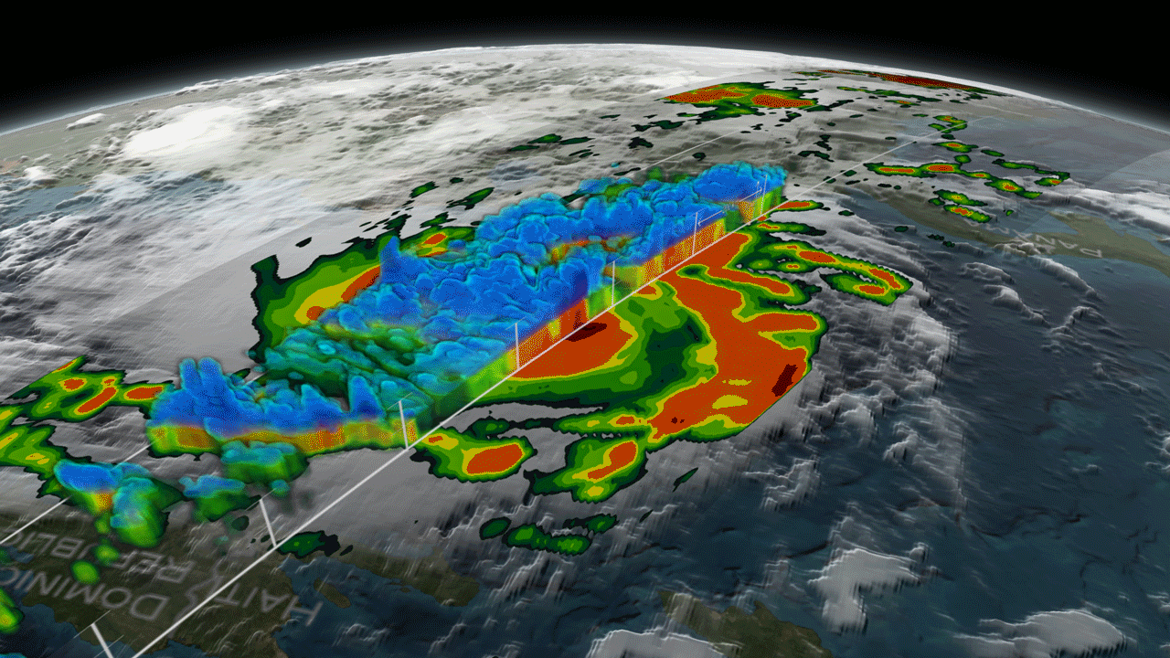
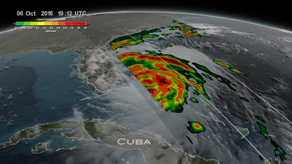
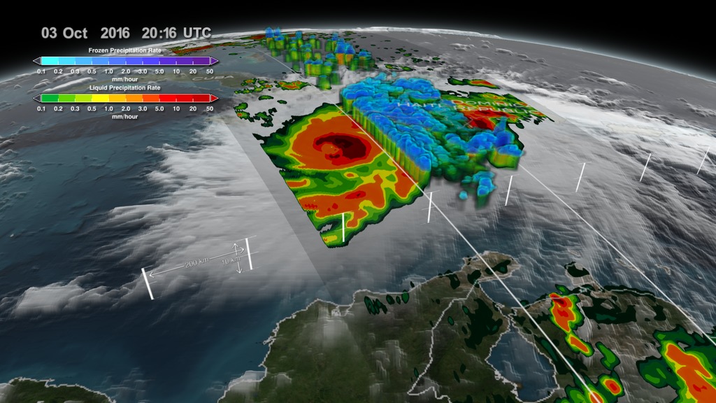
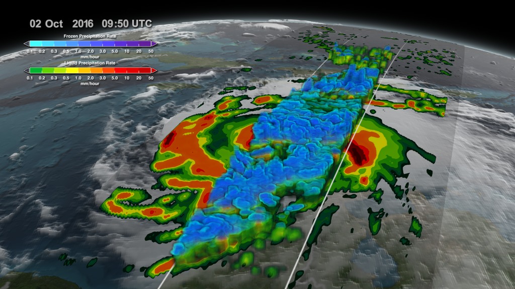
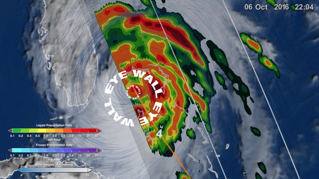
This data visualization follows Hurricane Matthew throughout its destructive run in the Caribbean and Southeast U.S. coast. By utilizing different data sets from NOAA's GOES satellite, NASA/JAXA's GPM, MERRA-2 model runs, IMERG, Goddard's soil moisture product, and sea surface temperatures, scientists are able to put together a clearer picture of how this hurricane quickly intensified and eventually weakened.
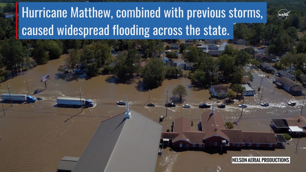
Hurricane Matthew was the first Category 5 Atlantic hurricane in almost ten years. Its torrential rains and winds caused significant damage and loss of life as it coursed through the Caribbean and up along the southeastern U.S. coast. Researchers use a combination of satellite observations to re-create a multi-dimensional picture of the hurricane in order to study the complex atmospheric interactions.
Animated time stamp to accompany data visualization of Hurricane Matthew. This is provided for video editors who would like to include accurate date and time information while showing the Hurricane Matthew visualization.

Wind height colorbar.
Color bar for frozen precipitation rates (ie, snow rates). Shades of cyan represent low amounts of frozen precipitation, whereas shades of purple represent high amounts of precipitation.
Color bar for liquid precipitation rates (ie, rain rates). Shades of green represent low amounts of liquid precipitation, whereas shades of red represent high amounts of precipitation.
Sea Surface Temperature Colorbar.
Soil Moisture Anomaly Colorbar.
- Agriculture
- Atmosphere
- Atmospheric Phenomena
- Atmospheric science
- Atmospheric Winds
- Cryology
- Earth Science
- floods
- HDTV
- Human Dimensions
- Hurricane Matthew
- Hurricanes
- Hydrology
- Hydrosphere
- Hyperwall
- Natural hazards
- Ocean Temperature
- Ocean Winds
- Oceans
- Physical oceanography
- precipitation
- Precipitation Amount
- Precipitation Anomalies
- Precipitation Rate
- sea surface temperature
- Sea Surface Temperature Anomaly
- snow
- Soil Absorption
- Soil Water Holding Capacity
- Soils
- surface water
- Terrestrial Hydrosphere
- Weather and Atmospheric Dynamics
- Wind Profiles
- Wind Shear
Credits
Please give credit for this item to:
NASA's Scientific Visualization Studio. GPM data provided by the joint NASA/JAXA GPM mission.
-
Data visualizers
-
Alex Kekesi
(Global Science and Technology, Inc.)

-
Greg Shirah
(NASA/GSFC)
- Horace Mitchell (NASA/GSFC)
- Trent L. Schindler (USRA)
-
Ernie Wright
(USRA)
-
Alex Kekesi
(Global Science and Technology, Inc.)
-
Scientists
- Gail Skofronick Jackson (NASA/GSFC)
-
George Huffman
(NASA/GSFC)
- Dalia B Kirschbaum (NASA/GSFC)
-
Technical support
- Laurence Schuler (ADNET Systems, Inc.)
- Ian Jones (ADNET Systems, Inc.)
-
Producer
- Ryan Fitzgibbons (USRA)
Missions
This page is related to the following missions:Series
This page can be found in the following series:Datasets used
-
[GOES: IR4]
ID: 33 -
Rain Rates (Surface Precipitation) [GPM: GMI]
ID: 822Credit: Data provided by the joint NASA/JAXA GPM mission.
See all pages that use this dataset -
Volumetric Precipitation data (Ku) [GPM: DPR]
ID: 830Credit: Data provided by the joint NASA/JAXA GPM mission.
See all pages that use this dataset -
MUR SST (Multi-scale Ultra-high Resolution (MUR) Sea Surface Temperature (SST) Analysis)
ID: 845 -
IMERG
ID: 863This dataset can be found at: http://pmm.nasa.gov/sites/default/files/document_files/IMERG_ATBD_V4.4.pdf
See all pages that use this dataset -
NASA-USDA-FAS Soil Moisture (Surface Soil Moisture corrected with SMOS imagery and assimilated by the Ensemble Kalman Filter)
ID: 954The surface soil moisture product is corrected by integrating satellite-derived Soil Moisture Ocean Salinity (SMOS) mission surface soil moisture retrievals into the modified Palmer two-layer soil moisture model. The SMOS imagery helps to correct the modified Pal
See all pages that use this dataset -
Winds [MERRA-2]
ID: 959
Note: While we identify the data sets used on this page, we do not store any further details, nor the data sets themselves on our site.
Related
- ID: 5361
 Visualization
 - ID: 4543
 Visualization
 - ID: 4548
 Visualization
 - ID: 30833
 Hyperwall Visual
 - ID: 12391
 Produced Video
 - ID: 4512
 Visualization
 - ID: 12389
 Produced Video
 - ID: 4511
 Visualization
 - ID: 12387
 Produced Video
 - ID: 4508
 Visualization
 - ID: 4507
 Visualization
Used as a Source In
- ID: 14617
 Produced Video
 - ID: 12195
![Music credit: 'Cellular Signals' by Laurent Levesque [SACEM] from Killer TracksComplete transcript available.Watch this video on the NASA Goddard YouTube channel.](/vis/a010000/a012100/a012195/LARGE_MP4-12195_EPOCH_Hurricanes2_large.00151_print.jpg) Produced Video
Produced Video - ID: 12635
 Produced Video
Release date
This page was originally published on Monday, July 31, 2017.
This page was last updated on Sunday, February 2, 2025 at 12:09 AM EST.