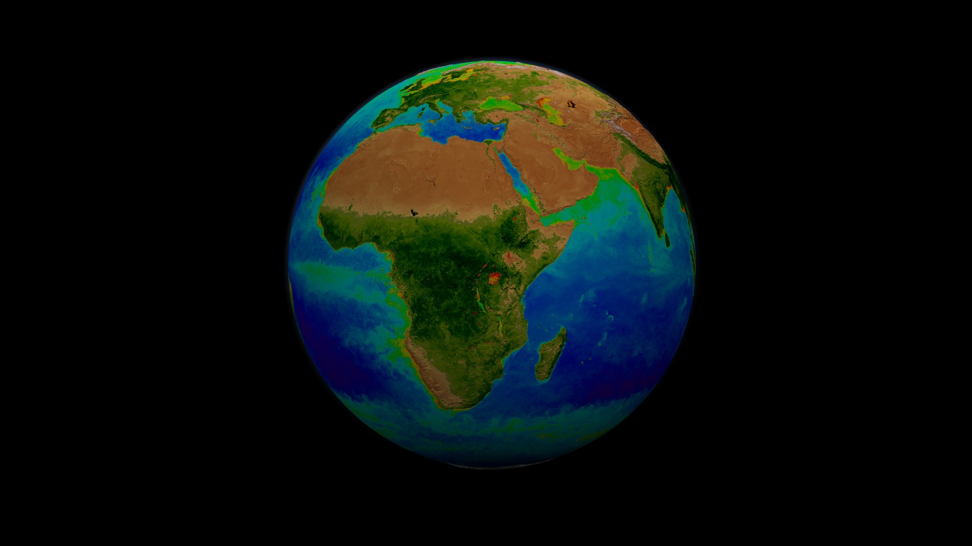
Stereoscopic SeaWiFS Biosphere Global Rotation: 1997-2006
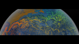
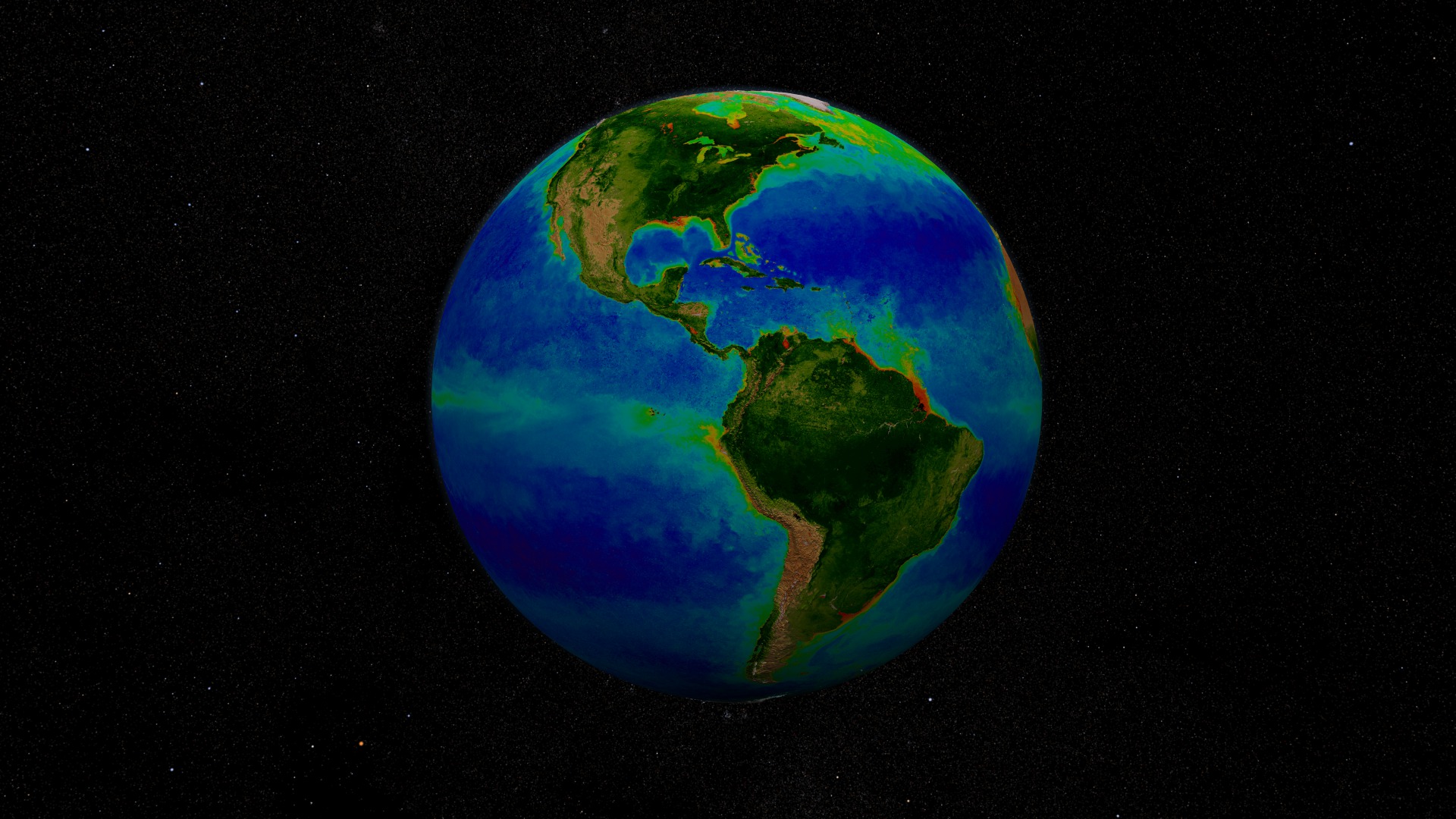
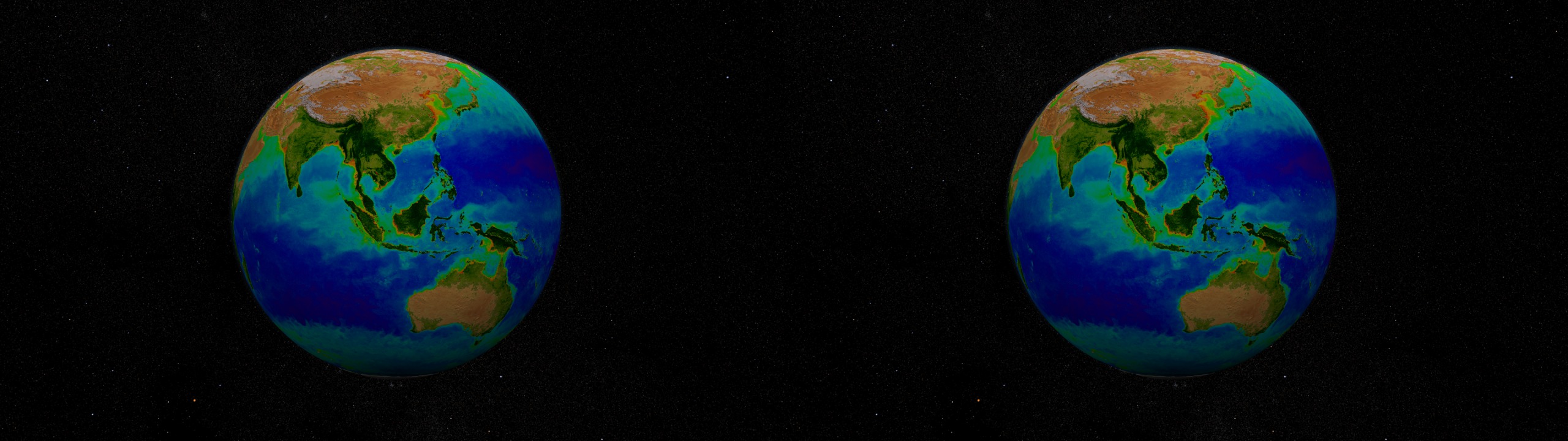
This animation represents nearly a decade's worth of data taken by the SeaWiFS instrument, showing the abundance of life in the sea. This time period repeats twice during the animation. Dark blue represents warmer areas where there is little life due to lack of nutrients, and greens and reds represent cooler nutrient-rich areas. The nutrient-rich areas include coastal regions where cold water rises from the sea floor bringing nutrients along and areas at the mouths of rivers where the rivers have brought nutrients into the ocean from the land. The nutrient-rich waters contribute to some of the oxygen-poor pockets of the seas called dead zones.
This visualization is a stereoscopic version of animation entry: #3420:SeaWiFS Biosphere Global Rotation from 1997 to 2006
Visualization Credits
Alex Kekesi (Global Science and Technology, Inc.): Animator
Helen-Nicole Kostis (UMBC): Video Editor
Horace Mitchell (NASA/GSFC): Producer
Gene Feldman (NASA/GSFC): Scientist
NASA/Goddard Space Flight Center, The SeaWiFS Project and GeoEye, Scientific Visualization Studio. NOTE: All SeaWiFS images and data presented on this web site are for research and educational use only. All commercial use of SeaWiFS data must be coordinated with GeoEye (NOTE: In January 2013, DigitalGlobe and GeoEye combined to become DigitalGlobe).
https://svs.gsfc.nasa.gov/3585
Data Used:
SeaStar/SeaWiFS/Global Biosphere
9/23/1997 - 9/20/2006NASA/Goddard Space Flight Center, The SeaWiFS Project and GeoEye, Scientific Visualization Studio. NOTE: All SeaWiFS images and data presented on this web site are for research and educational use only. All commercial use of SeaWiFS data must be coordinated with GeoEye (NOTE: In January 2013, DigitalGlobe and GeoEye combined to become one DigitalGlobe.).
This item is part of this series:
Narrated Movies
Keywords:
DLESE >> Biology
GCMD >> Earth Science >> Biosphere
GCMD >> Earth Science >> Biosphere >> Ecological Dynamics >> Photosynthesis
GCMD >> Earth Science >> Biosphere >> Microbiota Taxonomy >> Phytoplankton
GCMD >> Earth Science >> Biosphere >> Plant Taxonomy >> Phytoplankton
GCMD >> Earth Science >> Hydrosphere >> Water Quality/Water Chemistry >> Oxygen
SVS >> Stereo Display
SVS >> For Educators
SVS >> Food Chain
SVS >> Oceans >> Plant Life
NASA Science >> Earth
GCMD keywords can be found on the Internet with the following citation: Olsen, L.M., G. Major, K. Shein, J. Scialdone, S. Ritz, T. Stevens, M. Morahan, A. Aleman, R. Vogel, S. Leicester, H. Weir, M. Meaux, S. Grebas, C.Solomon, M. Holland, T. Northcutt, R. A. Restrepo, R. Bilodeau, 2013. NASA/Global Change Master Directory (GCMD) Earth Science Keywords. Version 8.0.0.0.0