SDO: Presentation Resources
Hyperwall
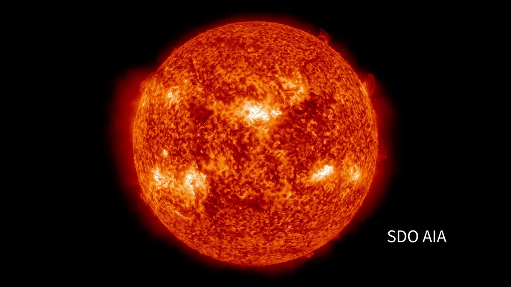
- ID: 30072
 Hyperwall Visual
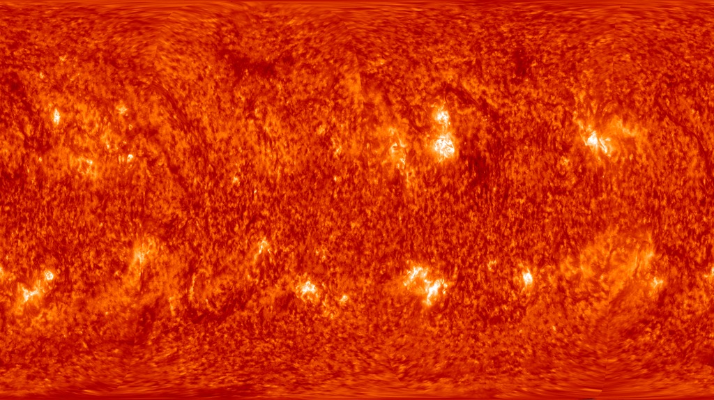
 - ID: 30362
 Hyperwall Visual
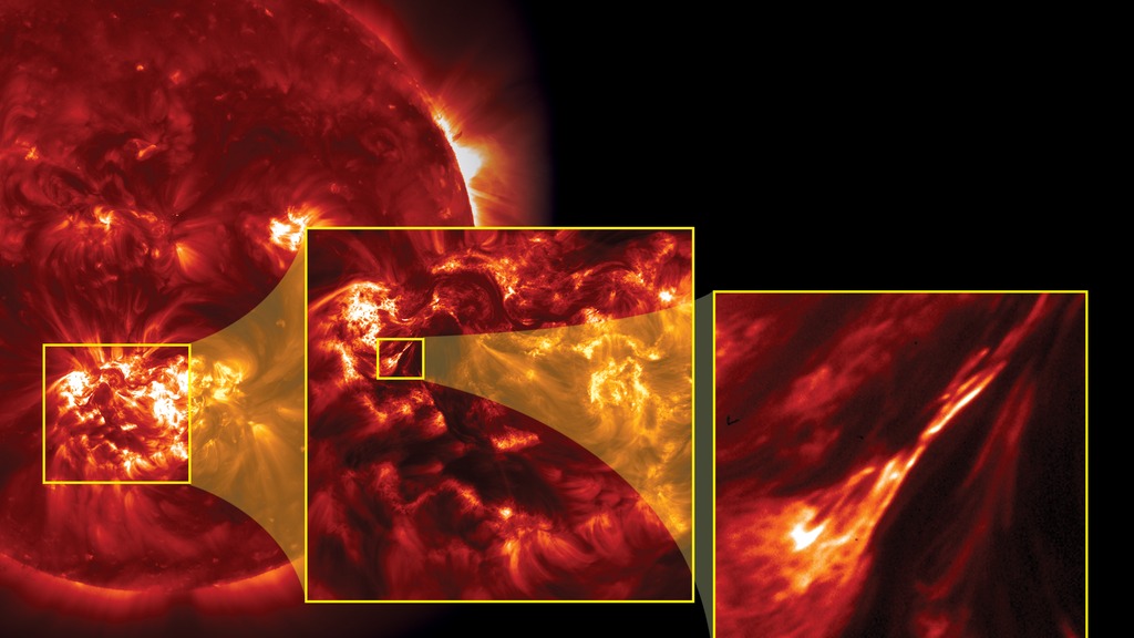
 - ID: 30466
 Hyperwall Visual
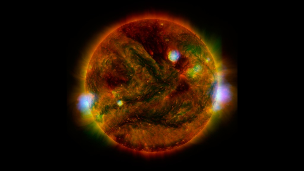
 - ID: 30726
 Hyperwall Visual
 - ID: 30780
 Hyperwall Visual
 - ID: 30893
 Hyperwall Visual
 - ID: 4008
 Visualization
 - ID: 4117
 Visualization
 - ID: 4128
 Visualization
 - ID: 3955
 Visualization
 - ID: 4269
 Visualization
Data Comparisons
- ID: 11072 Produced Video
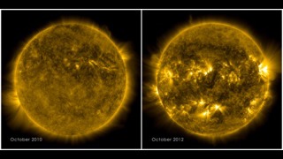
SDO Solar Comparison October 2010 to October 2012
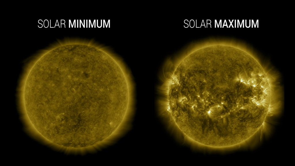
Go to this pageThe sun goes through a natural solar cycle approximately every 11 years. The cycle is marked by the increase and decrease of sunspots — visible as dark blemishes on the sun's surface, or photosphere. The greatest number of sunspots in any given solar cycle is designated as "solar maximum." The lowest number is "solar minimum." The solar cycle provides more than just increased sunspots, however. In the sun's atmosphere, or corona, bright active regions appear, which are rooted in the lower sunspots. Scientists track the active regions since they are often the origin of eruptions on the sun such as solar flares or coronal mass ejections. The most recent solar minimum occurred in 2008, and the sun began to ramp up in January 2010, with an M-class flare (a flare that is 10 times less powerful than the largest flares, labeled X-class). The sun has continued to get more active, with the next solar maximum predicted for 2013. The journey toward solar maximum is evident in current images of the sun, showing a marked difference from those of 2010, with bright active regions dotted around the star. ||
- ID: 11167 Produced Video
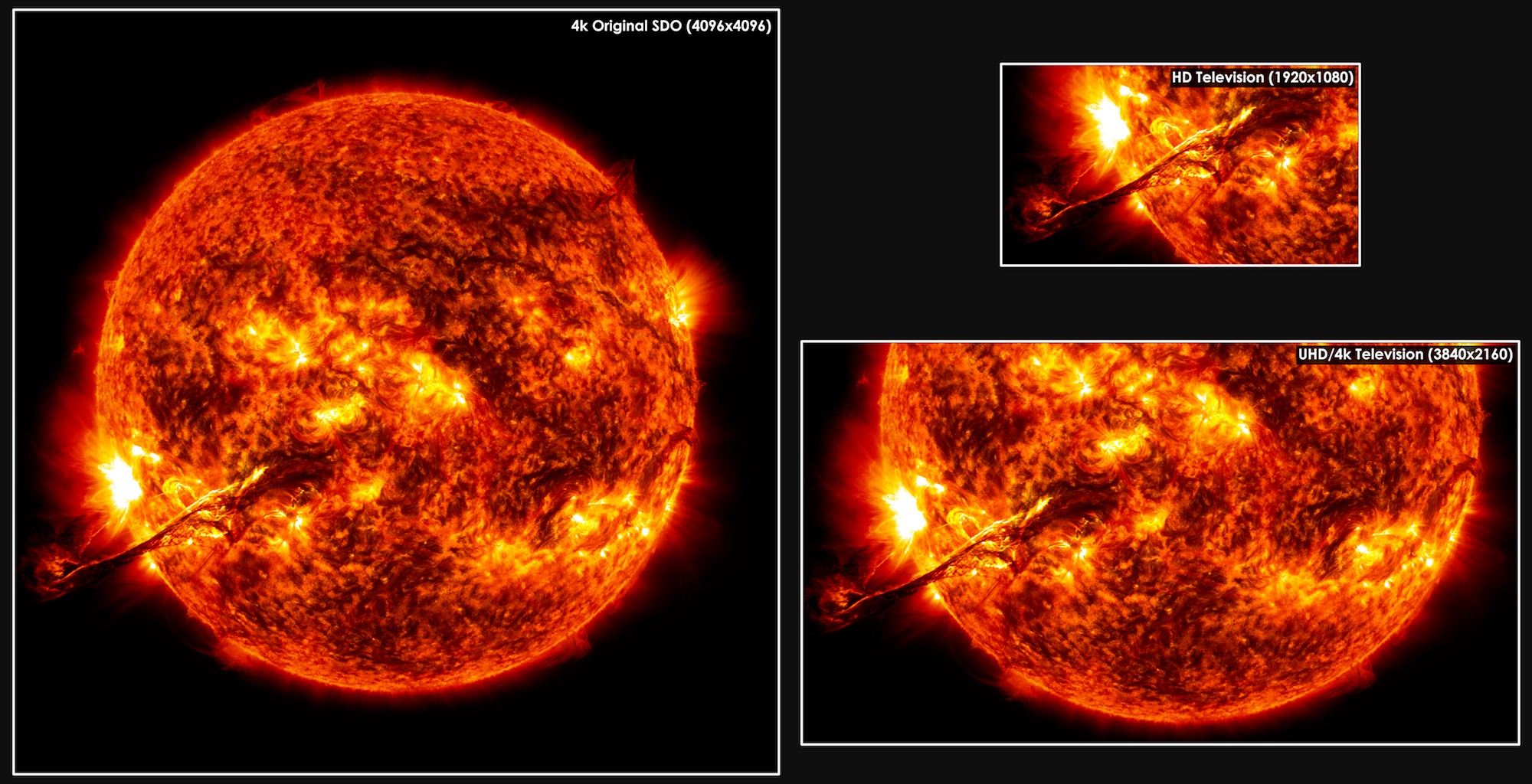
SDO Resolution Comparison Resource Page
Go to this pageUltra High Definition, or 4k, TV has four times as many pixels as a high definition 1080 TV. NASA's Solar Dynamics Observatory (SDO). Its Atmospheric Imaging Assembly (AIA) and Helioseismic Magnetic Imager (HMI) instruments together capture an image almost once a second that is twice again as large as what the ultra high-def screens can display. Such detailed pictures show features on the sun that are as small as 200 miles across, helping researchers observe such things as what causes giant eruptions on the sun known as coronal mass ejections (CME) that can travel toward Earth and interfere with our satellites. ||
- ID: 3435 Visualization
Solar Dynamics Observatory (SDO): Data Collection Comparison
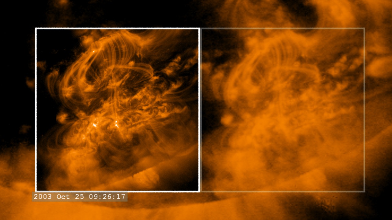
Go to this pageSolar Dynamics Observatory (SDO) will dramatically increase our ability to collect data about the Sun. This visualization compares the temporal and spatial resolution of SOHO/EIT with TRACE. SDO will enable TRACE-like image and temporal resolution over the entire solar disk. This movie opens with a full-disk view of the Sun in ultraviolet light (195 angstroms) from SOHO/EIT using the traditional TRACE 'gold' color table. We zoom in on the active region on the western limb where the TRACE instrument is pointing and fade-in an inset of the higher-resolution TRACE data. To emphasize the comparison, the TRACE inset is moved aside (with a solid white border) revealing the matching EIT data view (enclosed in the faint white border). At this point, we step through the time series of data frames. In this movie, much of the TRACE imagery is collected at time intervals between 3 and 40 seconds. On the other hand, a new SOHO/EIT image is taken about every 12 minutes (720 seconds). The SDO Atmospheric Imaging Assembly (AIA) will take full-disk solar images at four times the SOHO/EIT spatial resolution, a whopping 4096x4096, and at least 70 times the temporal resolution, 10 seconds or better per image. This creates a data rate over 1000x higher than SOHO/EIT. It is roughly equivalent to TRACE spatial and temporal resolution, but over the entire solar disk. ||
- ID: 3694 Visualization
A Comparative View of the Sun: SDO/AIA 193 and STEREO-B/EUVI 195
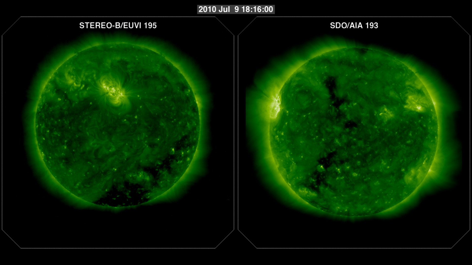
Go to this pageThis movie compares the spatial and temporal resolutions of the SDO/AIA (Atmospheric Imaging Assembly) imager to the STEREO/EUVI (Extreme UltraViolet Imager) imager. STEREO-B/EUVI's highest resolution is 2048x2048 pixels with images taken about every 5 minutes for the 195 Ångstrom band. The SDO/AIA 193 band takes images at 4096x4096 pixels every twelve seconds!While STEREO's vantage point at this time is very different from SDO, we can still identify some features of the Active Region 1087 in these two views. EUVI shows the launch of the filament, while AIA reveals many finer details.This visualization is a companion piece to A Comparative View of the Sun: SDO/AIA 193 and SOHO/EIT 195. ||
- ID: 3691 Visualization
A Comparative View of the Sun: SDO/AIA 193 and SOHO/EIT 195
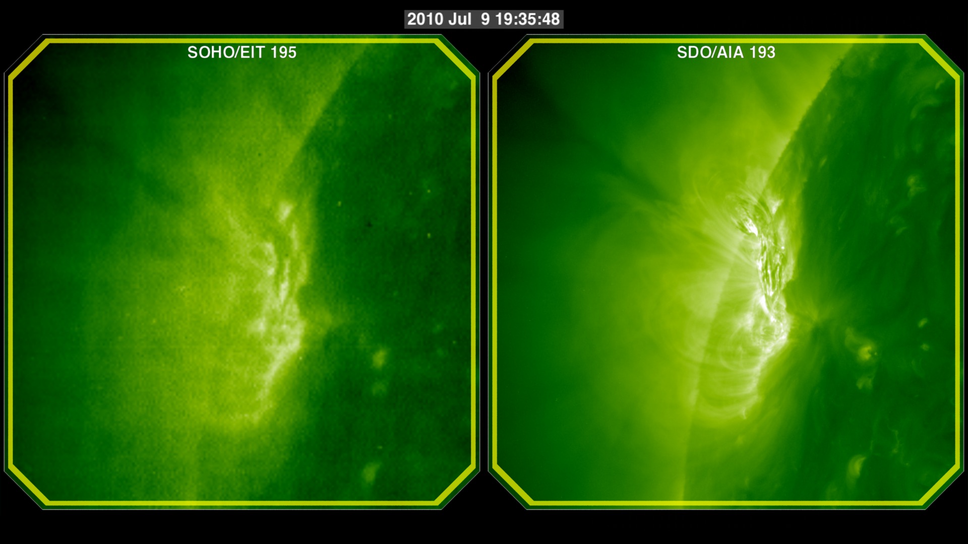
Go to this pageThis movie compares the spatial and temporal resolutions of the SDO/AIA (Atmospheric Imaging Assembly) imager to the SOHO/EIT (Extreme ultraviolet Imaging Telescope) imager. SOHO/EIT's highest resolution is 1024x1024 pixels with images taken about every 12 minutes for the 195 Ångstrom band. The SDO/AIA 193 band takes images at 4096x4096 pixels every twelve seconds!In this movie we can see the difference this makes for a closeup view of Active Region 1087. EIT reveals changes in the active region, which AIA reveals many details.This visualization is a companion piece to A Comparative View of the Sun: SDO/AIA 193 and STEREO-B/EUVI 195. ||
- ID: 11651 Produced Video
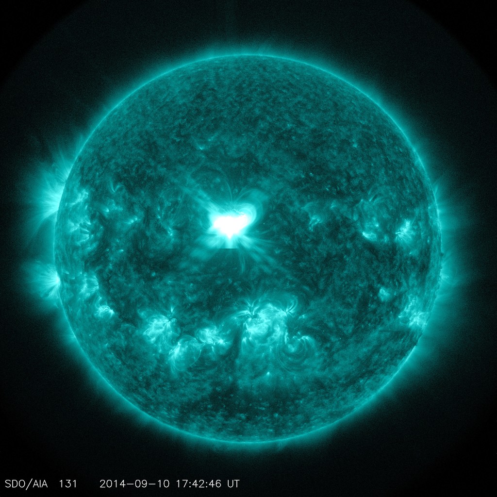
September 10, 2014 X1.6 flare
Go to this pageThe sun emitted a significant solar flare, peaking at 1:48 p.m. EDT on Sept. 10, 2014. NASA's Solar Dynamics Observatory captured images of the event. Solar flares are powerful bursts of radiation. Harmful radiation from a flare cannot pass through Earth's atmosphere to physically affect humans on the ground. However — when intense enough — they can disturb the atmosphere in the layer where GPS and communications signals travel.This flare is classified as an X1.6 class flare. "X-class" denotes the most intense flares, while the number provides more information about its strength. An X2 is twice as intense as an X1, an X3 is three times as intense, etc. ||
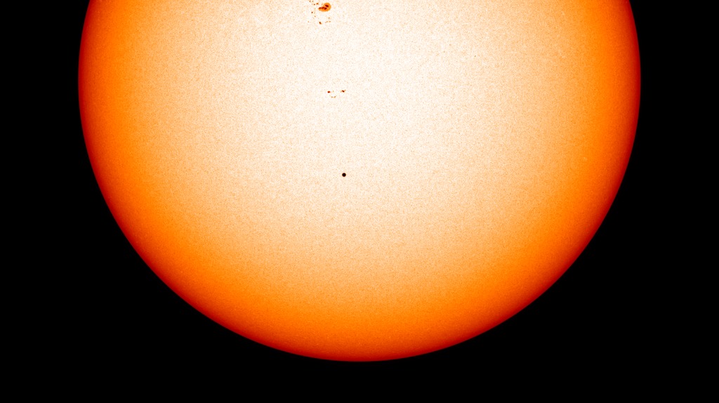
- ID: 4854 Visualization
Coronal Holes at Solar Minimum and Solar Maximum
Go to this pageA sample of solar coronal holes around the time of the maximum of sunspot activity (April 2014). Note the polar regions are devoid of coronal holes but a large hole appears in the southern hemisphere. || CoronalHoleMax_AIA193_00150_print.jpg (1024x1024) [173.1 KB] || CoronalHoleMax_AIA193_00150_searchweb.png (320x180) [89.6 KB] || CoronalHoleMax_AIA193_00150_thm.png (80x40) [7.4 KB] || CoronalHoleMax_AIA193_2048p30.mp4 (2048x2048) [61.7 MB] || CoronalHoleMax_AIA193_2048p30.webm (2048x2048) [2.9 MB] || frames/4096x4096_1x1_30p/CoronalHoleMaximum_193A/AIA193-Time/ (4096x4096) [64.0 KB] || frames/4096x4096_1x1_30p/CoronalHoleMaximum_193A/AIA193-Frames/ (4096x4096) [64.0 KB] || frames/600x100_6x1_30p/CoronalHoleMax_Timestamp/ (600x100) [64.0 KB] ||
Extra elements
- ID: 10700 Produced Video
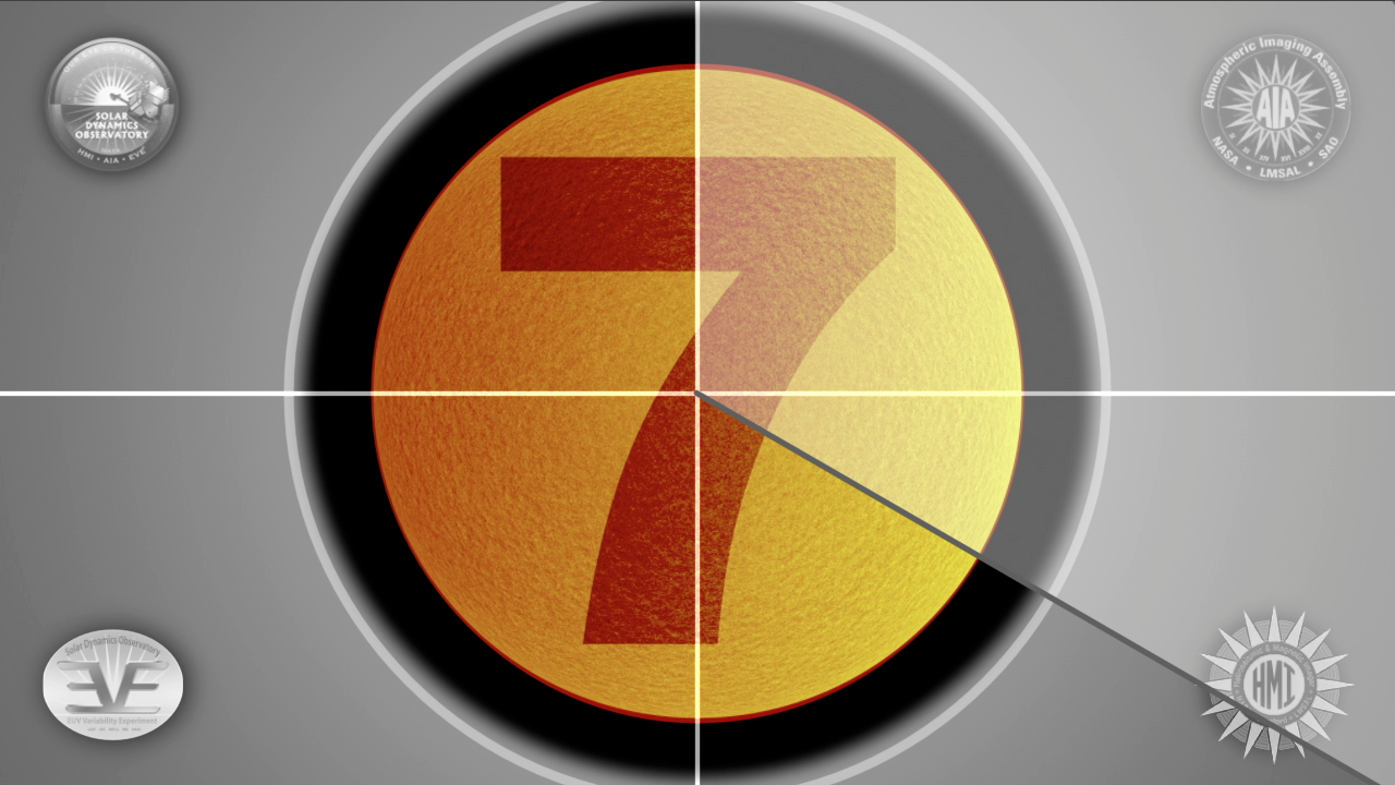
Solar Dynamics Observatory countdown
Go to this pageA 10-second countdown using SDO imagery of the sun. The instruments and wavelengths are as follow:10-HMI Magnetogram; 9-AIA 4500; 8-AIA 094; 7-HMI Dopplergram; 6-AIA 171; 5-AIA 171-211-304; 4-AIA 171-211-304; 3-AIA 304; 2-AIA 304; 1-AIA 304 The last 5 seconds of countdown show the large prominence eruption that occured March 30, 2010, just after SDO's sensors were turned on. ||
- ID: 11071 Produced Video
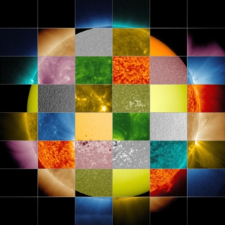
SDO Wavelength Graphics
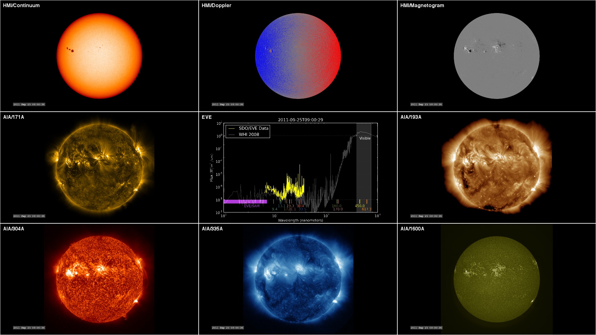
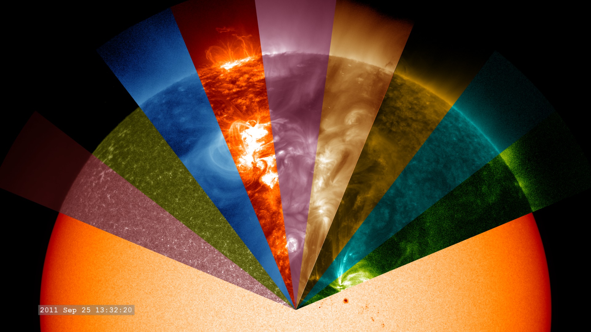
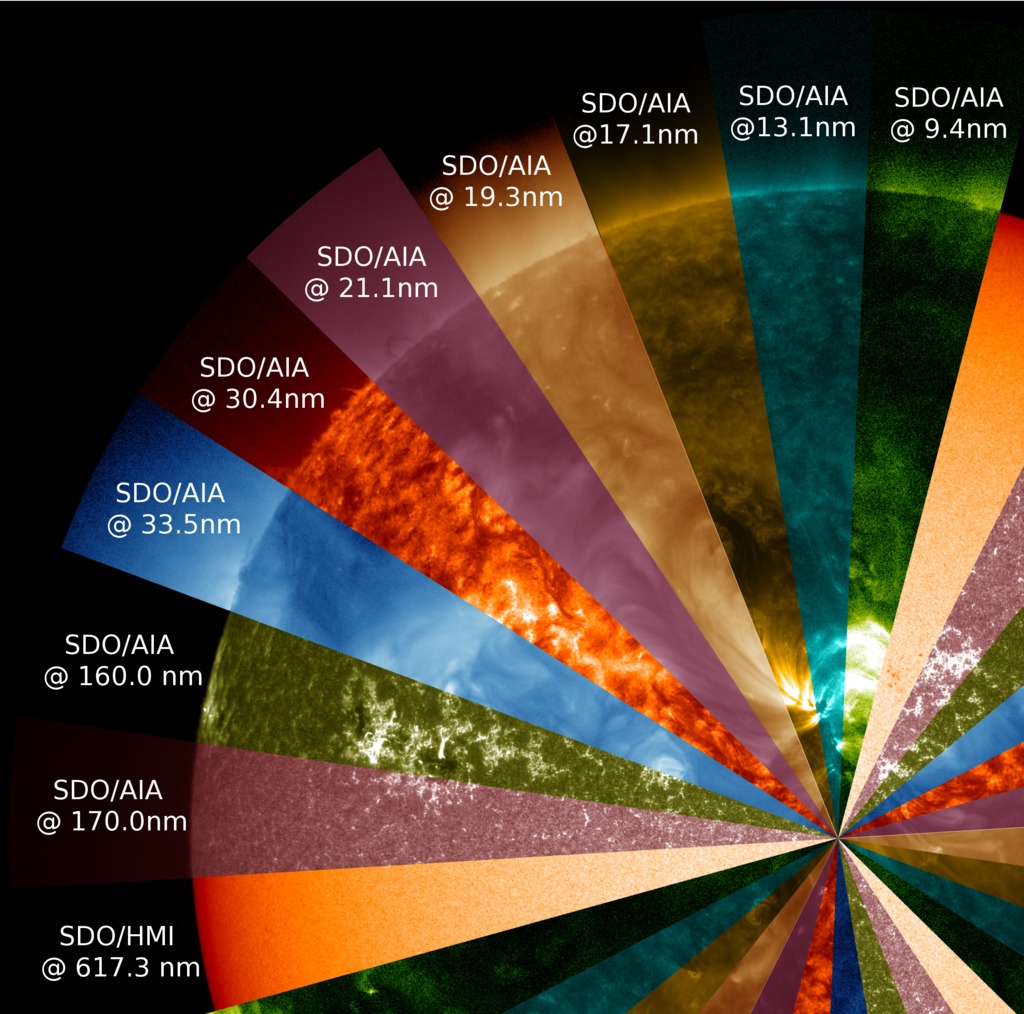
Go to this pageSpecialized instruments, either in ground-based or space-based telescopes, can observe light far beyond the ranges visible to the naked eye. Different wavelengths convey information about different components of the sun's surface and atmosphere, so scientists use them to paint a full picture of our constantly changing and varying star.Yellow light of 5800 angstroms, for example, generally emanates from material of about 10,000 degrees F (5700 degrees C), which represents the surface of the sun. Extreme ultraviolet light of 94 angstroms, on the other hand, comes from atoms that are about 11 million degrees F (6,300,000 degrees C) and is a good wavelength for looking at solar flares, which can reach such high temperatures. By examining pictures of the sun in a variety of wavelengths — as is done through such telescopes as NASA's Solar Dynamics Observatory (SDO), NASA's Solar Terrestrial Relations Observatory (STEREO) and the ESA/NASA Solar and Heliospheric Observatory (SOHO) — scientists can track how particles and heat move through the sun's atmosphere.We see the visible spectrum of light simply because the sun is made up of a hot gas — heat produces light just as it does in an incandescent light bulb. But when it comes to the shorter wavelengths, the sun sends out extreme ultraviolet light and x-rays because it is filled with many kinds of atoms, each of which give off light of a certain wavelength when they reach a certain temperature. Not only does the sun contain many different atoms — helium, hydrogen, iron, for example — but also different kinds of each atom with different electrical charges, known as ions. Each ion can emit light at specific wavelengths when it reaches a particular temperature. Scientists have cataloged which atoms produce which wavelengths since the early 1900s, and the associations are well documented in lists that can take up hundreds of pages.Instruments that produce conventional images of the sun focus exclusively on light around one particular wavelength, sometimes not one that is visible to the naked eye. SDO scientists, for example, chose 10 different wavelengths to observe for its Atmospheric Imaging Assembly (AIA) instrument. Each wavelength is largely based on a single, or perhaps two types of ions — though slightly longer and shorter wavelengths produced by other ions are also invariably part of the picture. Each wavelength was chosen to highlight a particular part of the sun's atmosphere.From the sun's surface on out, the wavelengths SDO observes, measured in angstroms, are: 4500: Showing the sun's surface or photosphere. 1700: Shows surface of the sun, as well as a layer of the sun's atmosphere called the chromosphere, which lies just above the photosphere and is where the temperature begins rising. 1600: Shows a mixture between the upper photosphere and what's called the transition region, a region between the chromosphere and the upper most layer of the sun's atmosphere called the corona. The transition region is where the temperature rapidly rises. 304: This light is emitted from the chromosphere and transition region. 171: This wavelength shows the sun's atmosphere, or corona, when it's quiet. It also shows giant magnetic arcs known as coronal loops. 193: Shows a slightly hotter region of the corona, and also the much hotter material of a solar flare. 211: This wavelength shows hotter, magnetically active regions in the sun's corona. 335: This wavelength also shows hotter, magnetically active regions in the corona. 94: This highlights regions of the corona during a solar flare. 131: The hottest material in a flare. ||
- ID: 11180 Produced Video
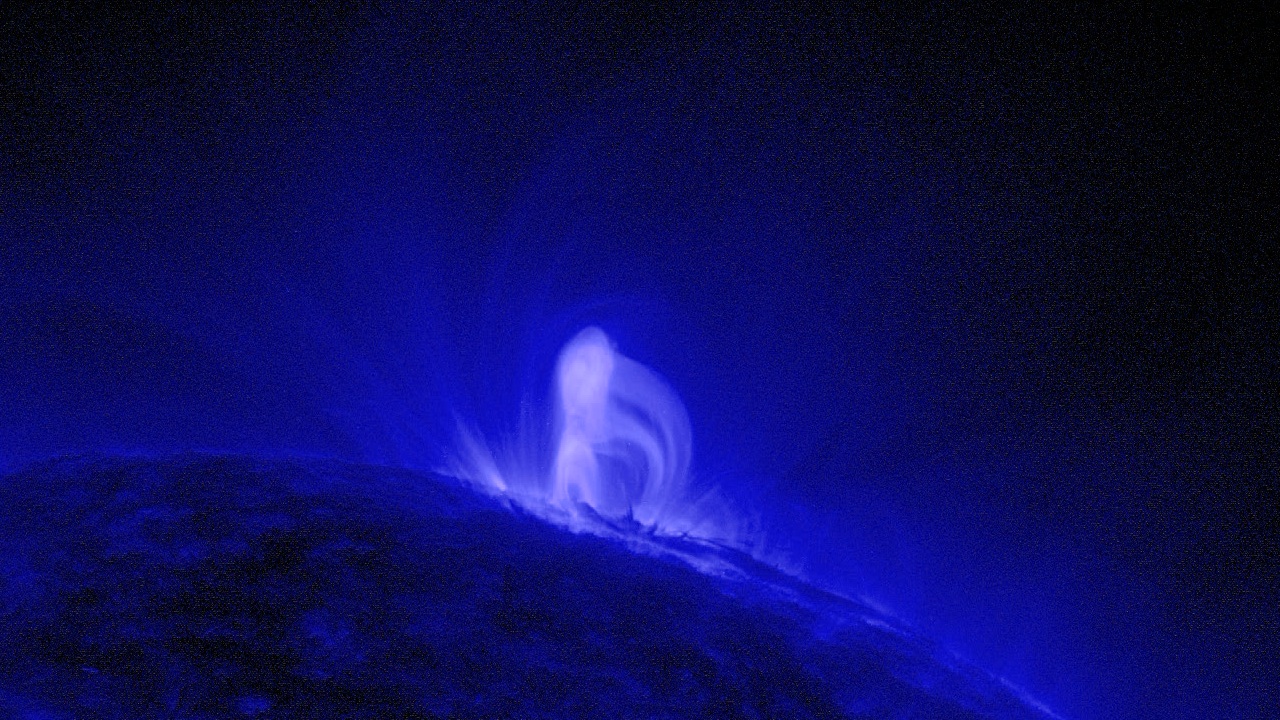
SDO Provides First Sightings of How
a CME FormsGo to this pageOn July 18, 2012, a fairly small explosion of light burst off the lower right limb of the sun. Such flares often come with an associated eruption of solar material, known as a coronal mass ejection or CME — but this one did not. Something interesting did happen, however. Magnetic field lines in this area of the sun's atmosphere, the corona, began to twist and kink, generating the hottest solar material — a charged gas called plasma — to trace out the newly-formed slinky shape. The plasma glowed brightly in extreme ultraviolet images from the Atmospheric Imaging Assembly (AIA) aboard NASA's Solar Dynamics Observatory (SDO) and scientists were able to watch for the first time the very formation of something they had long theorized was at the heart of many eruptive events on the sun: a flux rope. Eight hours later, on July 19, the same region flared again. This time the flux rope's connection to the sun was severed, and the magnetic fields escaped into space, dragging billions of tons of solar material along for the ride — a classic CME. More than just gorgeous to see, such direct observation offers one case study on how this crucial kernel at the heart of a CME forms. Such flux ropes have been seen in images of CMEs as they fly away from the sun, but it's never been known — indeed, has been strongly debated — whether the flux rope formed before or in conjunction with a CME's launch. This case shows a clear-cut example of the flux rope forming ahead of time.Watch this video on YouTube. ||
- ID: 11255 Produced Video
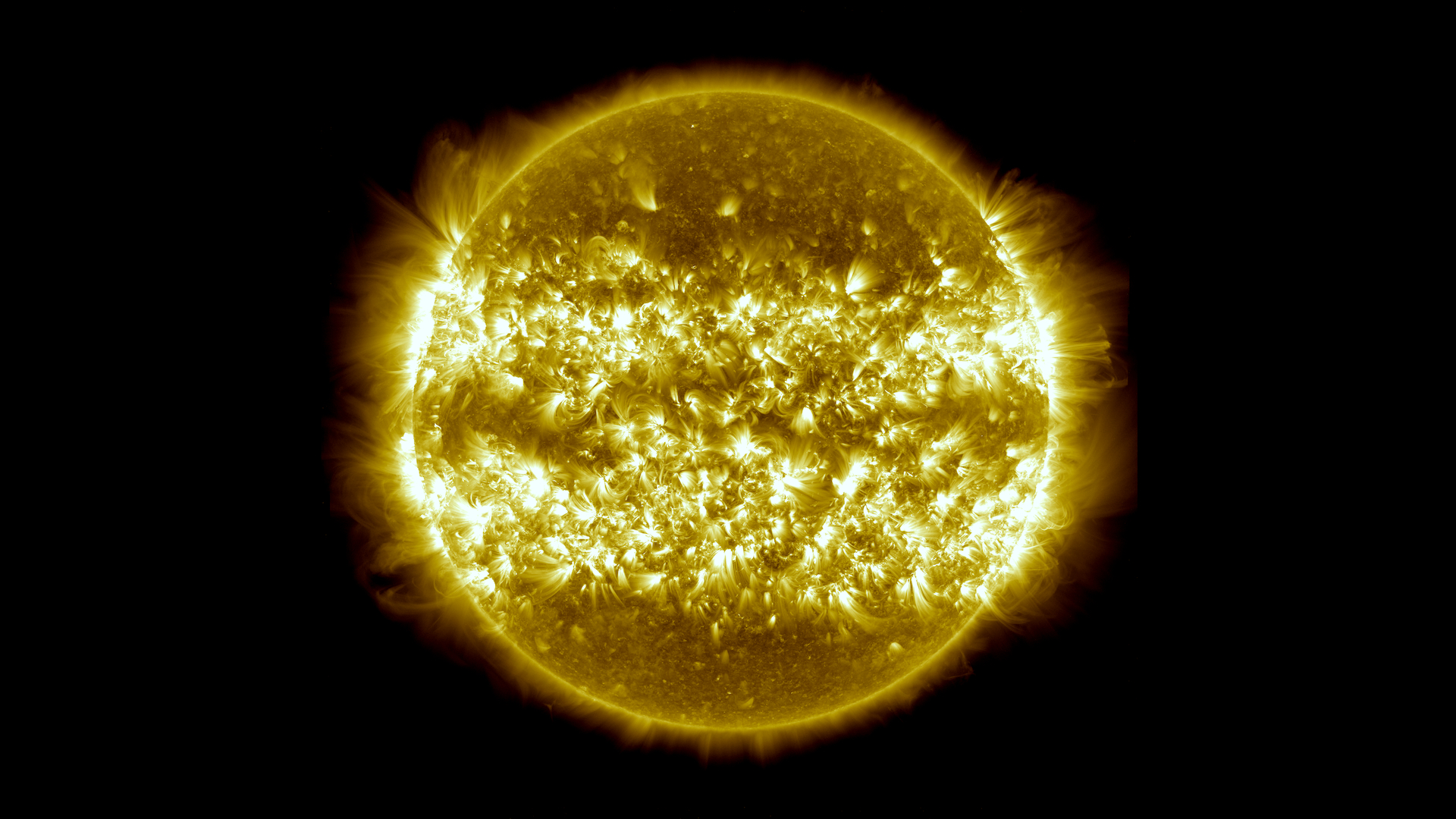
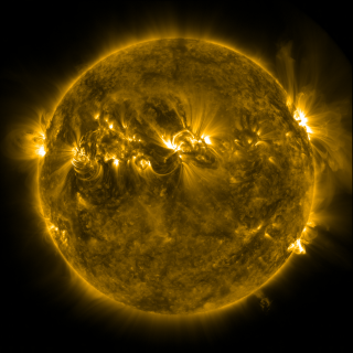
Three Years of SDO Images
Go to this pageIn the three years since it first provided images of the sun in the spring of 2010, NASA's Solar Dynamics Observatory (SDO) has had virtually unbroken coverage of the sun's rise toward solar maximum, the peak of solar activity in its regular 11-year cycle. This video shows those three years of the sun at a pace of two images per day. Each image is displayed for two frames at a 29.97 frame rate.SDO's Atmospheric Imaging Assembly (AIA) captures a shot of the sun every 12 seconds in 10 different wavelengths. The images shown here are based on a wavelength of 171 angstroms, which is in the extreme ultraviolet range and shows solar material at around 600,000 Kelvin. In this wavelength it is easy to see the sun's 25-day rotation as well as how solar activity has increased over three years.During the course of the video, the sun subtly increases and decreases in apparent size. This is because the distance between the SDO spacecraft and the sun varies over time. The image is, however, remarkably consistent and stable despite the fact that SDO orbits the Earth at 6,876 miles per hour and the Earth orbits the sun at 67,062 miles per hour.Such stability is crucial for scientists, who use SDO to learn more about our closest star. These images have regularly caught solar flares and coronal mass ejections in the act, types of space weather that can send radiation and solar material toward Earth and interfere with satellites in space. SDO's glimpses into the violent dance on the sun help scientists understand what causes these giant explosions — with the hopes of some day improving our ability to predict this space weather.The four wavelength view at the end of the video shows light at 4500 angstroms, which is basically the visible light view of the sun, and reveals sunspots; light at 193 angstroms which highlights material at 1 million Kelvin and reveals more of the sun's corona; light at 304 angstroms which highlights material at around 50,000 Kelvin and shows features in the transition region and chromosphere of the sun; and light at 171 angstroms.Noteworthy events that appear briefly in the main sequence of this video:00:30;24 Partial eclipse by the moon00:31;16 Roll maneuver01:11;02 August 9, 2011 X6.9 Flare, currently the largest of this solar cycle01:28;07 Comet Lovejoy, December 15, 201101:42;29 Roll Maneuver01:51;07 Transit of Venus, June 5, 201202:28;13 Partial eclipse by the moonWatch this video on YouTube. ||
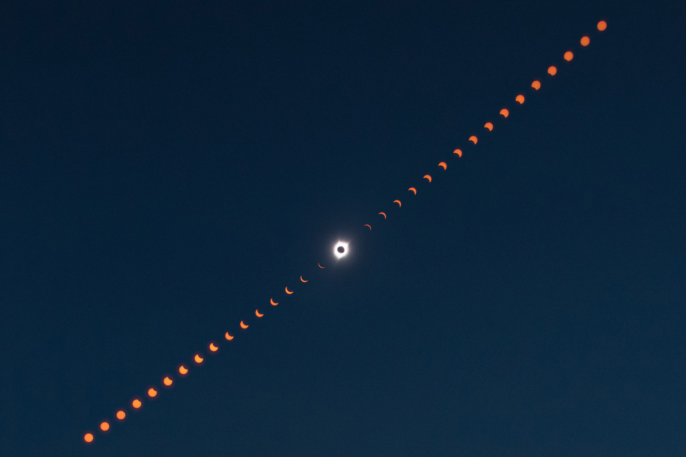
- ID: 11291 Produced Video
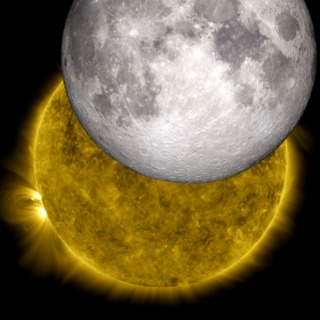
The Moon and the Sun: Two NASA Missions Join Their Images
Go to this pageTwo or three times a year, NASA’s Solar Dynamics Observatory observes the moon traveling across the sun, blocking its view. While this obscures solar observations for a short while, it offers the chance for an interesting view of the shadow of the moon. The moon’s crisp horizon can be seen up against the sun, since the moon does not have an atmosphere. (At other times of the year, when Earth blocks SDO’s view, the Earth’s horizon looks fuzzy due to its atmosphere.) If one looks closely at such a crisp border, the features of the moon’s topography are visible, as is the case in this image from Oct. 7, 2010. This recently inspired two NASA visualizers to overlay a 3-dimensional model of the moon based on data from NASA’s Lunar Reconnaissance Orbiter into the shadow of the SDO image. Such a task is fairly tricky, as the visualizers — Scott Wiessinger who typically works with the SDO imagery and Ernie Wright who works with the LRO imagery — had to precisely match up data from the correct time and viewpoint for the two separate instruments. The end result is an awe-inspiring image of the sun and the moon. To start the process, the visualizers took the viewing position and time from the SDO image. This information was dropped into an LRO model that can produce the exact view of the moon from anywhere, at any time, by incorporating 6 billion individual measurements of the moon’s surface height from LRO’s Lunar Orbiter Laser Altimeter instrument. The model had to take many factors into consideration, including not only SDO’s distance and viewing angle, but also the moon’s rotation and constant motion. Wright used animation software to wrap the elevation and appearance map around a sphere to simulate the moon. The two images were put together and the overlay was exact. The mountains and valleys on the horizon of the LRO picture fit right into the shadows seen by SDO. In its own way, this served as a kind of calibration of data. It means that the SDO data on its position and time is highly accurate and that the LRO models, too, are able to accurately provide images of what’s happening at any given moment in time. And of course, the whole exercise provides for a beautiful picture. ||
- ID: 11522 Produced Video
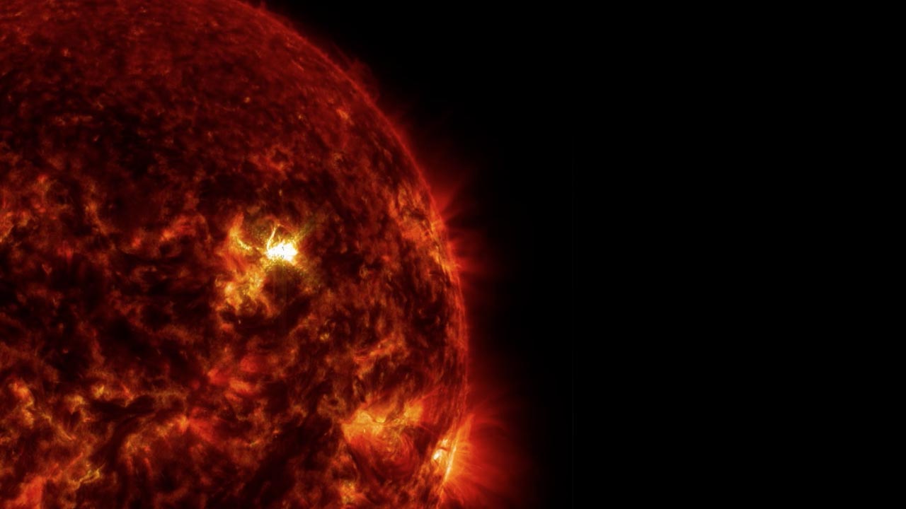
The Best Observed X-class Flare
Go to this pageOn March 29, 2014 the sun released an X-class flare. It was observed by NASA's Interface Region Imaging Spectrograph, or IRIS; NASA's Solar Dynamics Observatory, or SDO; NASA's Reuven Ramaty High Energy Solar Spectroscopic Imager, or RHESSI; the Japanese Aerospace Exploration Agency's Hinode; and the National Solar Observatory's Dunn Solar Telescope located at Sacramento Peak in New Mexico. To have a record of such an intense flare from so many observatories is unprecedented. Such research can help scientists better understand what catalyst sets off these large explosions on the sun. Perhaps we may even some day be able to predict their onset and forewarn of the radio blackouts solar flares can cause near Earth – blackouts that can interfere with airplane, ship and military communications. ||
- ID: 11651 Produced Video
September 10, 2014 X1.6 flare
Go to this pageThe sun emitted a significant solar flare, peaking at 1:48 p.m. EDT on Sept. 10, 2014. NASA's Solar Dynamics Observatory captured images of the event. Solar flares are powerful bursts of radiation. Harmful radiation from a flare cannot pass through Earth's atmosphere to physically affect humans on the ground. However — when intense enough — they can disturb the atmosphere in the layer where GPS and communications signals travel.This flare is classified as an X1.6 class flare. "X-class" denotes the most intense flares, while the number provides more information about its strength. An X2 is twice as intense as an X1, an X3 is three times as intense, etc. ||
- ID: 12973 Infographic
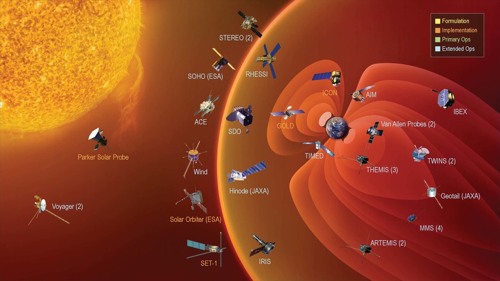
NASA's Heliophysics Fleet
Go to this pageHeliophysics encompasses science that improves our understanding of fundamental physical processes throughout the solar system, and enables us to understand how the Sun, as the major driver of the energy throughout the solar system, impacts our technological society. The scope of heliophysics is vast, spanning from the Sun’s interior to Earth’s upper atmosphere, throughout interplanetary space, to the edges of the heliosphere, where the solar wind interacts with the local interstellar medium. Heliophysics incorporates studies of the interconnected elements in a single system that produces dynamic space weather and that evolves in response to solar, planetary, and interstellar conditions. ||
Press Conference Media
- ID: 10733 Produced Video
SDO First Light Media
Go to this pageA compilation of some of the videos and stills used during the SDO First Light press conference.There are more video and stills available. ||
- ID: 10817 Produced Video
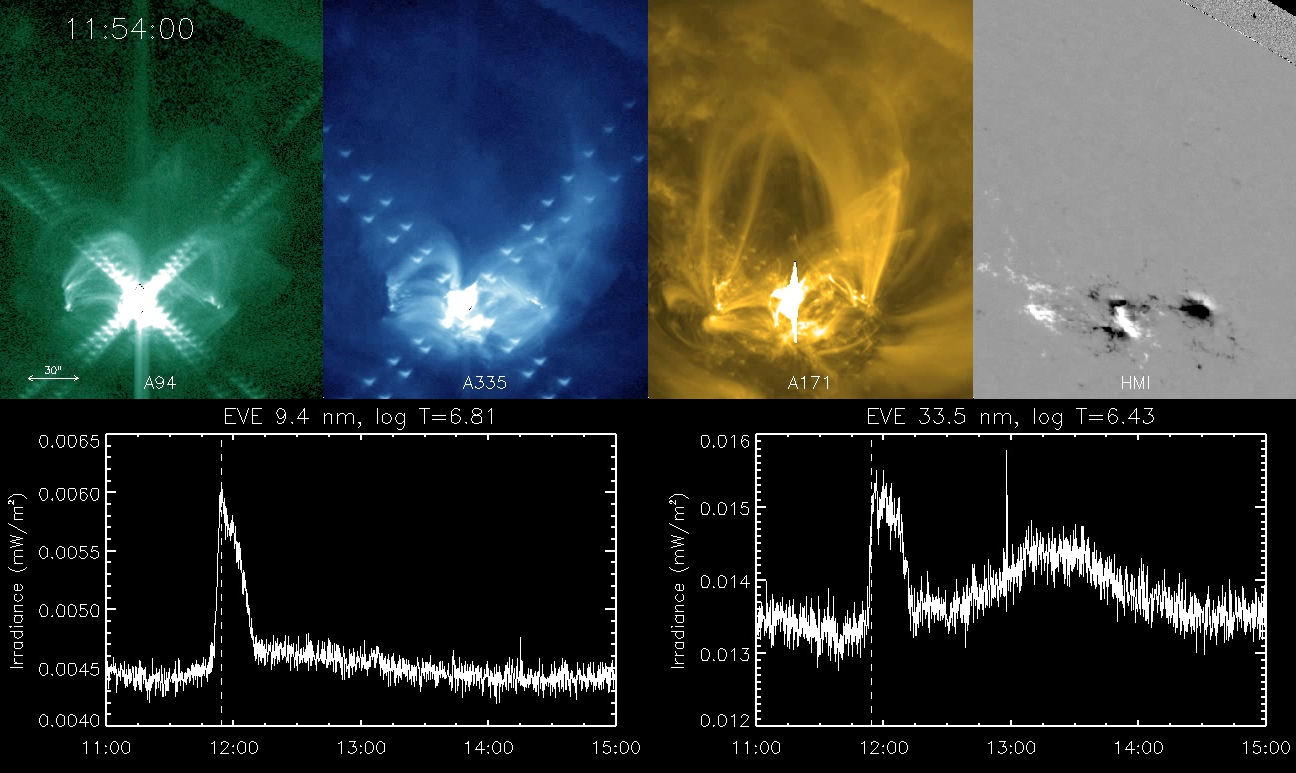
SDO EVE Late Phase Flares
Go to this pageScientists have been seeing just the tip of the iceberg when monitoring flares with X-rays. With the complete extreme ultraviolet (EUV) coverage by the SDO EUV Variability Experiment (EVE), they have observed enhanced EUV radiation that appears not only during the X-ray flare, but also a second time delayed by many minutes after the X-ray flare peak. These delayed, second peaks are referred to as the EUV Late Phase contribution to flares.The solar EUV radiation creates our Earth's ionosphere (plasma in our atmosphere), so solar flares disturb our ionosphere and consequently our communication and navigation technologies, such as Global Positioning System (GPS), that transmit through the ionosphere. For over 30 years, scientists have relied on the GOES X-ray monitor to tell them when to expect disturbances to our ionosphere. With these new SDO EVE results, they now recognize that additional ionospheric disturbances from these later EUV enhancements are also a concern. ||
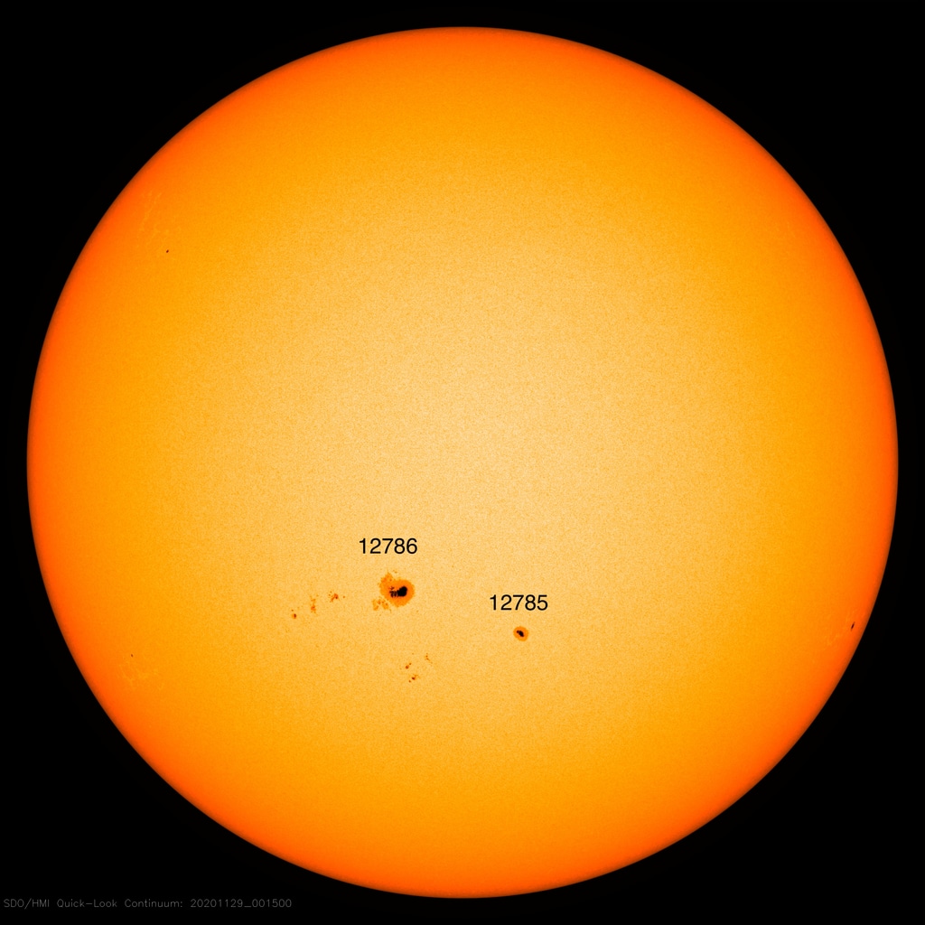
- ID: 13714 Produced Video
Solar Cycle 25 Is Here. NASA, NOAA Scientists Explain What This Means
Go to this pageSolar Cycle 25 has begun. The Solar Cycle 25 Prediction Panel announced solar minimum occurred in December 2019, marking the transition into a new solar cycle. In a press event, experts from the panel, NASA, and NOAA discussed the analysis and Solar Cycle 25 prediction, and how the rise to the next solar maximum and subsequent upswing in space weather will impact our lives and technology on Earth.A new solar cycle comes roughly every 11 years. Over the course of each cycle, the star transitions from relatively calm to active and stormy, and then quiet again; at its peak, the Sun’s magnetic poles flip. Now that the star has passed solar minimum, scientists expect the Sun will grow increasingly active in the months and years to come.Understanding the Sun’s behavior is an important part of life in our solar system. The Sun’s outbursts—including eruptions known as solar flares and coronal mass ejections—can disturb the satellites and communications signals traveling around Earth, or one day, Artemis astronauts exploring distant worlds. Scientists study the solar cycle so we can better predict solar activity.Click here for the NOAA press kit.Listen to the media telecon.Participants:• Lisa Upton, Co-chair, Solar Cycle 25 Prediction Panel; Solar Physicist, Space Systems Research Corporation• Doug Biesecker, Solar Physicist, NOAA’s Space Weather Prediction Center; Co-chair, Solar Cycle 25 Prediction Panel• Elsayed Talaat, Director, Office of Projects, Planning and Analysis; NOAA’s Satellite and Information Service • Lika Guhathakurta, Heliophysicist, Heliophysics Division, NASA Headquarters • Jake Bleacher, Chief Exploration Scientist, NASA Human Exploration and Operations Mission Directorate ||
- ID: 13776 Produced Video
2020 AGU Roundtable: What will we learn from Solar Cycle 25?
Go to this pageSolar Cycle 25 is here, ushering in the next season of space weather from the Sun. As our star’s activity ramps up—a natural part of its roughly 11-year cycle—scientists are eager to test their predictions. In this AGU 2020 media roundtable, scientists will discuss outstanding questions in solar cycle science, what opportunities this new cycle provides researchers, and how we track progress in predictions. ||