Increase in Ocean Heat since 1957 Map - Spilhaus Projection

A graph of changes in ocean heat content since 1957 overlaying a Spilhaus projection map highlighting the world’s oceans.
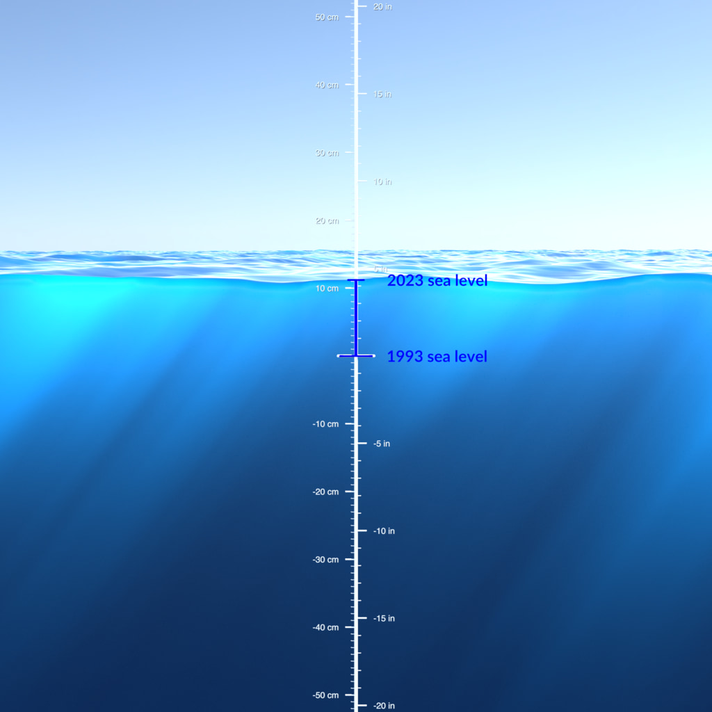
The internal temperature of the ocean has been increasing since modern recordkeeping began in 1955. The ocean has been absorbing the increased amount of heat trapped by greenhouse gasses in the Earth system. If the ocean absorbs more heat than is released, its heat content rises. The graph on the map above illustrates this increase in ocean heat content.
The ocean heat graph is overlaid on a map in the Spilhaus projection to highlight the world’s oceans. This map projection presents the oceans as one body of water.
A graph of ocean heat content changes since 1957. Each data point represents a five-year average.
A map in the Spilhaus projection highlighting the world’s oceans.
Credits
Please give credit for this item to:
NASA's Scientific Visualization Studio
-
Visualizers
- Michala Garrison (SSAI)
-
Mark SubbaRao
(NASA/GSFC)

-
Technical support
- Laurence Schuler (ADNET Systems, Inc.)
- Ian Jones (ADNET Systems, Inc.)
Datasets used
-
Ocean Heat Content (Ocean Heat Content Changes since 1955)
ID: 1184Credit: NOAA/NCEI World Ocean Database
This dataset can be found at: https://www.ncei.noaa.gov/data/oceans/woa/DATA_ANALYSIS/3M_HEAT_CONTENT/DATA/basin/pentad/pent_h22-w0-2000m.dat
See all pages that use this dataset
Note: While we identify the data sets used on this page, we do not store any further details, nor the data sets themselves on our site.
Related
- ID: 5520
 Visualization
 - ID: 5304

- ID: 5235
 Visualization
 - ID: 5114
 Visualization
Release date
This page was originally published on Friday, June 16, 2023.
This page was last updated on Thursday, September 21, 2023 at 10:44 PM EDT.