A newer version of this visualization is available.
Five-Year Global Temperature Anomalies from 1880 to 2014
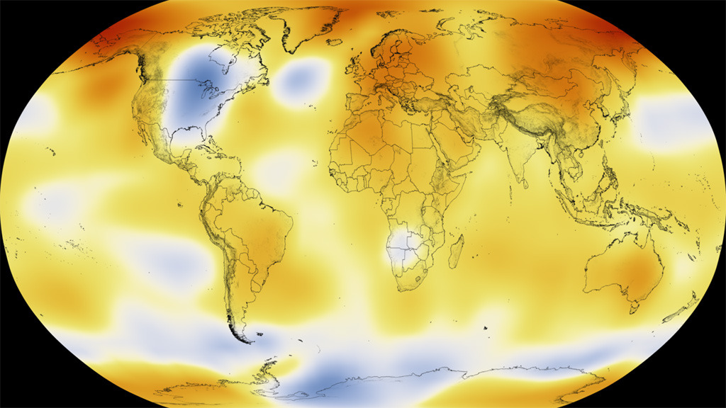
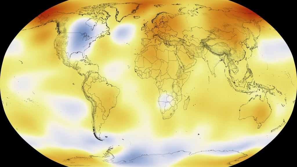
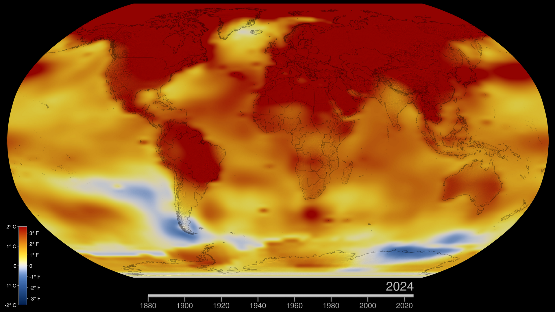
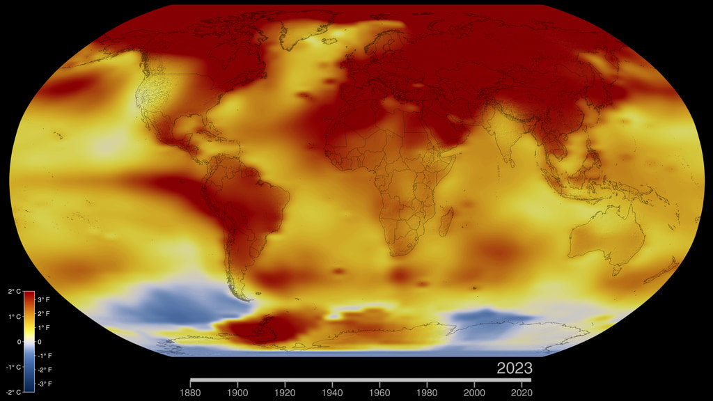
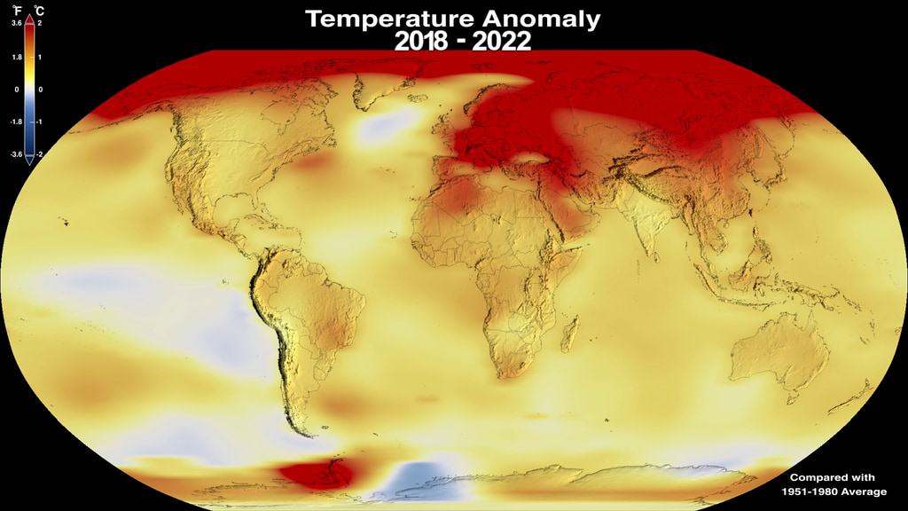
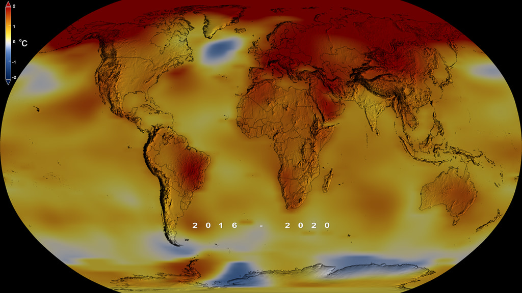
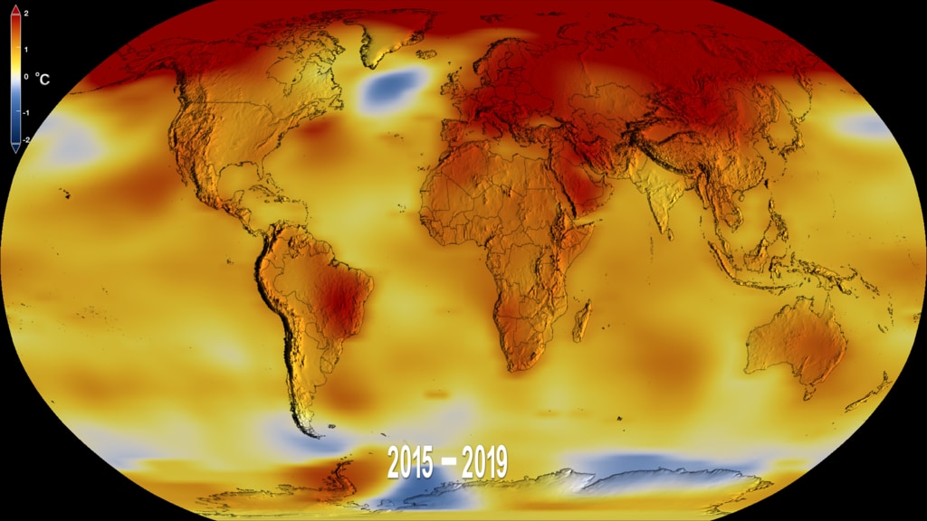
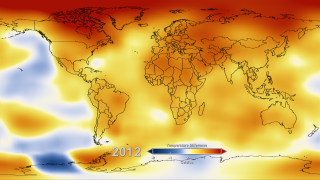
This color-coded map in Robinson projection displays a progression of changing global surface temperature anomalies from 1880 through 2014. Higher than normal temperatures are shown in red and lower then normal termperatures are shown in blue. The final frame represents the global temperatures 5-year averaged from 2010 through 2014.
NASA Finds 2014 Was Warmest Year in Modern Record
The year 2014 ranks as Earth’s warmest since 1880, according to an analysis by NASA scientists.
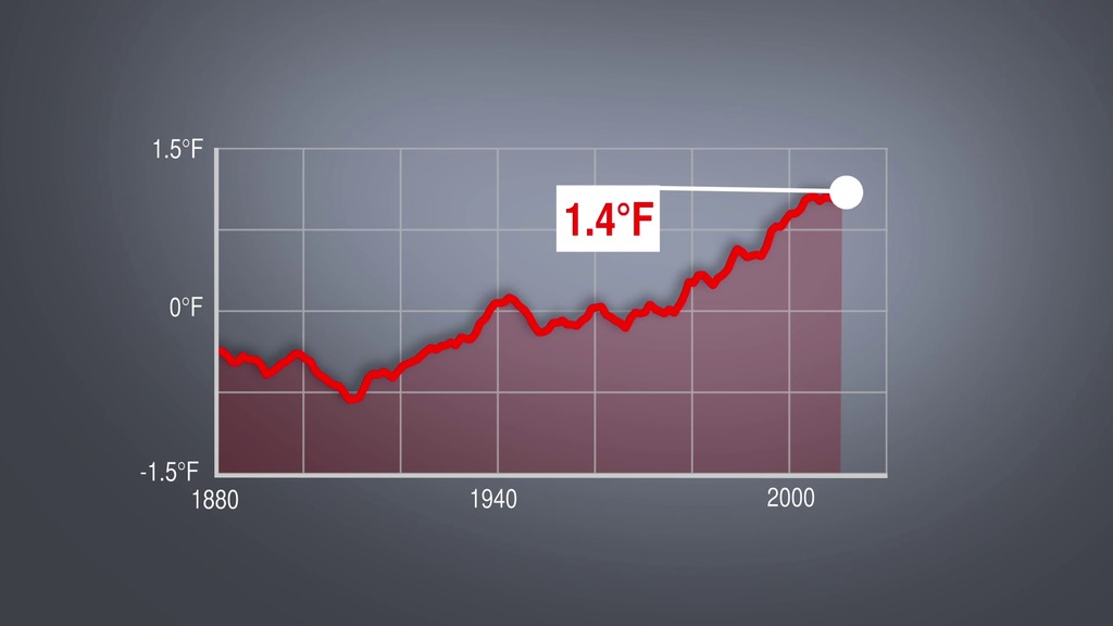
The 10 warmest years in the instrumental record, with the exception of 1998, have now occurred since 2000. This trend continues a long-term warming of the planet, according to an analysis of surface temperature measurements by scientists at NASA’s Goddard Institute of Space Studies (GISS) in New York.
In an independent analysis of the raw data, NOAA scientists also found 2014 to be the warmest on record.
For understanding climate change, the long-term trend of rising temperatures across the planet is more important than any year’s individual ranking. These rankings can be sensitive to analysis methods and sampling. While 2014 ranks as the warmest year in NASA’s global temperature record, it is statistically close to the values from 2010 and 2005, the next warmest years.
Since 1880, the average surface temperature of Earth has warmed by about 1.4 degrees Fahrenheit (0.8 degrees Celsius), a trend that is largely driven by the increase in carbon dioxide and other human emissions into the planet’s atmosphere. The majority of that warming has occurred in the past three decades.
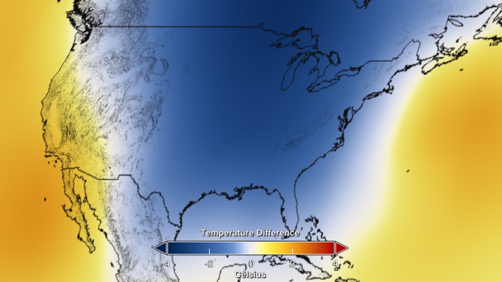
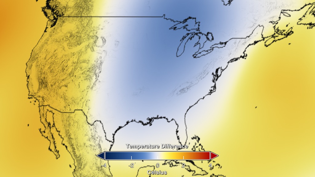
Regional differences in temperature in any year are more strongly affected by weather dynamics than the global mean. For example, in the U.S. in 2014, parts of the Midwest and East Coast were anomalously cool, while Alaska and three western U.S. states – California, Arizona and Nevada – recorded their warmest years on record, according to NOAA, which assesses official U.S. temperature records.
The GISTEMP analysis website is located at: http://data.giss.nasa.gov/gistemp/

Temperature Difference Colorbar

This frame set displays the same content as the above frame set. It is the progression of changing global surface temperatures anomalies from 1880 through 2014 without the dates or colorbar overlays.
This is the abbreviated 14 second movie starts in 1950 and runs through 2014 with dates and colorbar applied.
Date Overlay
This frame sequence of color-coded Global temperatures in robinson projection display a progression of changing global surface temperature anomalies from 1880 through 2014. Each image represents a unique 5 year time period in the sequence. Higher than normal temperatures are shown in red and lower then normal termperatures are shown in blue.
For More Information
Credits
Please give credit for this item to:
NASA/Goddard Space Flight Center Scientific Visualization Studio
Data provided by Robert B. Schmunk (NASA/GSFC GISS)
-
Data visualizer
- Lori Perkins (NASA/GSFC)
-
Scientists
-
Gavin A. Schmidt
(NASA/GSFC GISS)

-
Robert B Schmunk
(SIGMA Space Partners, LLC.)
-
Reto A. Ruedy
(SIGMA Space Partners, LLC.)
-
Gavin A. Schmidt
(NASA/GSFC GISS)
-
Writer
- Patrick Lynch (Wyle Information Systems)
-
Producers
- Michelle Handleman (USRA)
- Leslie McCarthy
- Joy Ng (USRA)
Series
This page can be found in the following series:Datasets used
-
GISTEMP [GISS Surface Temperature Analysis (GISTEMP)]
ID: 585The GISS Surface Temperature Analysis version 4 (GISTEMP v4) is an estimate of global surface temperature change. Graphs and tables are updated around the middle of every month using current data files from NOAA GHCN v4 (meteorological stations) and ERSST v5 (ocean areas), combined as described in our publications Hansen et al. (2010), Lenssen et al. (2019), and Lenssen et al. (2024).
Credit: Lenssen, N., G.A. Schmidt, M. Hendrickson, P. Jacobs, M. Menne, and R. Ruedy, 2024: A GISTEMPv4 observational uncertainty ensemble. J. Geophys. Res. Atmos., 129, no. 17, e2023JD040179, doi:10.1029/2023JD040179.
This dataset can be found at: https://data.giss.nasa.gov/gistemp/
See all pages that use this dataset
Note: While we identify the data sets used on this page, we do not store any further details, nor the data sets themselves on our site.
Related
- ID: 11733
 Produced Video
 - ID: 11729
 Produced Video
 - ID: 11727
 Produced Video
 - ID: 11730
 Produced Video
 - ID: 11731
- ID: 4254
 Visualization
 - ID: 4255
Newer Versions
- ID: 5450
 Visualization
 - ID: 5207
 Visualization
 - ID: 5060
 Visualization
 - ID: 4964
 Visualization
 - ID: 4882
 Visualization
 - ID: 4787
 Visualization
Older Versions
- ID: 4030
 Visualization
Release date
This page was originally published on Friday, January 16, 2015.
This page was last updated on Sunday, February 2, 2025 at 10:19 PM EST.