GPM Dissects Hurricane Arthur
The Global Precipitation Measurement mission's Core Observatory flew over Hurricane Arthur five times between July 1 and July 6, 2014. Arthur is the first tropical cyclone of the 2014 Atlantic Hurricane season. It formed as a tropical storm on Tuesday, July 1 and reached maximum intensity as a Category 2 hurricane on July 4, disrupting some coastal U.S. Independence Day celebrations. This visualization is taken from the flyover on July 3, 2014 with Hurricane Arthur just off the South Carolina coast. GPM data showed that the hurricane was asymmetrical, with spiral arms, called rain bands, on the eastern side of the storm but not on the western side.
The GPM Core Observatory carries two instruments that show the location and intensity of the rain, which defines a crucial part of the storm structure – and how it will behave. The GPM Microwave Imager sees through the tops of clouds to observe how much and where precipitation occurs, and the Dual-frequency Precipitation Radar observes precise details of precipitation in 3-dimensions.
For forecasters, GPM's microwave and radar data are part of the toolbox of satellite data, including other low Earth orbit and geostationary satellites, that they use to monitor tropical cyclones and hurricanes.
The addition of GPM data to the current suite of satellite data is timely. Its predecessor precipitation satellite, the Tropical Rainfall Measuring Mission, is 18 years into what was originally a three-year mission. GPM's new high-resolution microwave imager data and the unique radar data ensure that forecasters and modelers won't have a gap in coverage.
GPM is a joint mission between NASA and the Japan Aerospace Exploration Agency. The satellite launched Feb. 27, and after its check-out period began its prime mission on May 29, in time for hurricane season.
All GPM data products will be released to the public by September 2, 2104. Current and future data sets are available to registered users from NASA Goddard's Precipitation Processing Center website.
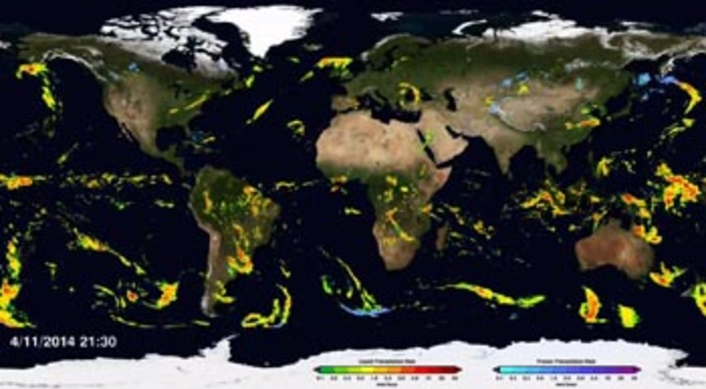
Animation of Hurricane Arthur on July 3rd, 2014. The animation begins with global infrared data showing the progression of the storm as it forms into a hurricane. Then GPM flies overhead measuring rain rates on the ground. GPM's Dual frequency Precipitation Radar (DPR) then dissolves in to reveal the internal structure of the hurricane. Next, a cutting plane appears to dissect the storm and show the inner rain patterns.
. Shades of green represent low amounts of liquid precipitation, whereas shades of red represent high amounts of precipitation.")
Colorbar for liquid precipitation rates (ie, rain rates). Shades of green represent low amounts of liquid precipitation, whereas shades of red represent high amounts of precipitation.
. Shades of cyan represent low amounts of frozen precipitation, whereas shades of purple represent high amounts of precipitation.")
Colorbar for frozen precipitation rates (ie, snow rates). Shades of cyan represent low amounts of frozen precipitation, whereas shades of purple represent high amounts of precipitation.

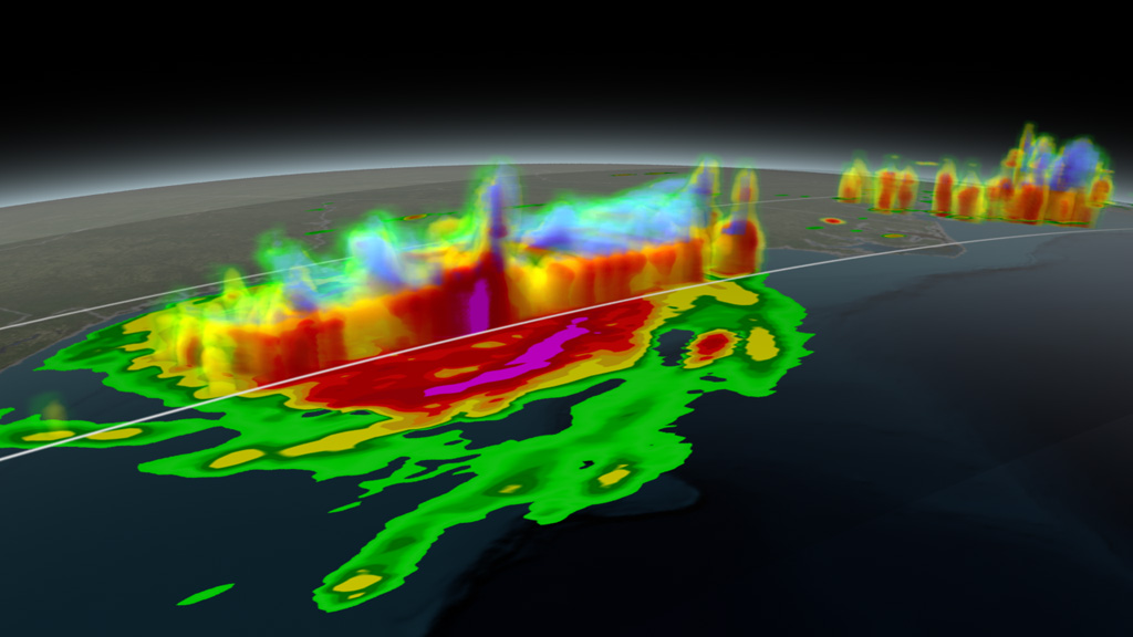
Print resolution still of Hurricane Arthur as seen through GPM's GMI and DPR sensors. This is Hurricane Arthur on July 3rd, 2014 off the South Carolina coast. Colors ranging from light green to red indicate areas of low to high liquid precipitation. The violet areas in the upper atmosphere are areas showing frozen precipitation.
Print resolution still showing a cross section of Hurricane Arthur as seen through GPM's DPR sensors. Colors ranging from light green to red indicate areas of low to high liquid precipitation. The areas in the upper atmosphere that range from light blue to violet indicate frozen precipitation.
Print resolution still showing a cross section of Hurricane Arthur through it's eye. Colors ranging from light green to red indicate areas of low to high liquid precipitation. The areas in the upper atmosphere that range from light blue to violet indicate frozen precipitation.
Credits
Please give credit for this item to:
NASA's Scientific Visualization Studio
-
Animators
-
Alex Kekesi
(Global Science and Technology, Inc.)

-
Greg Shirah
(NASA/GSFC)
-
Alex Kekesi
(Global Science and Technology, Inc.)
-
Producers
- Ryan Fitzgibbons (USRA)
- Rani Gran (NASA/GSFC)
-
Scientists
- Gail Skofronick Jackson (NASA/GSFC)
-
George Huffman
(NASA/GSFC)
- Dalia B Kirschbaum (NASA/GSFC)
-
Project support
- Laurence Schuler (ADNET Systems, Inc.)
- Ian Jones (ADNET Systems, Inc.)
- Chris Kidd (University of Maryland)
- John M. Kwiatkowski (George Mason University)
- William S. Olson (JCET/UMBC)
-
Writer
- Ellen T. Gray (ADNET Systems, Inc.)
Missions
This page is related to the following missions:Series
This page can be found in the following series:Datasets used
-
CPC (Climate Prediction Center) Cloud Composite
ID: 600Global cloud cover from multiple satellites
See all pages that use this dataset -
Rain Rates (Surface Precipitation) [GPM: GMI]
ID: 822Credit: Data provided by the joint NASA/JAXA GPM mission.
See all pages that use this dataset -
Volumetric Precipitation data (Ku) [GPM: DPR]
ID: 830Credit: Data provided by the joint NASA/JAXA GPM mission.
See all pages that use this dataset
Note: While we identify the data sets used on this page, we do not store any further details, nor the data sets themselves on our site.
Related
- ID: 11826
 Produced Video
 - ID: 11590
 Produced Video
Release date
This page was originally published on Tuesday, July 8, 2014.
This page was last updated on Wednesday, May 3, 2023 at 1:50 PM EDT.