A newer version of this visualization is available.
Shifting Distribution of Northern Hemisphere Summer Temperature Anomalies, 1951-2011
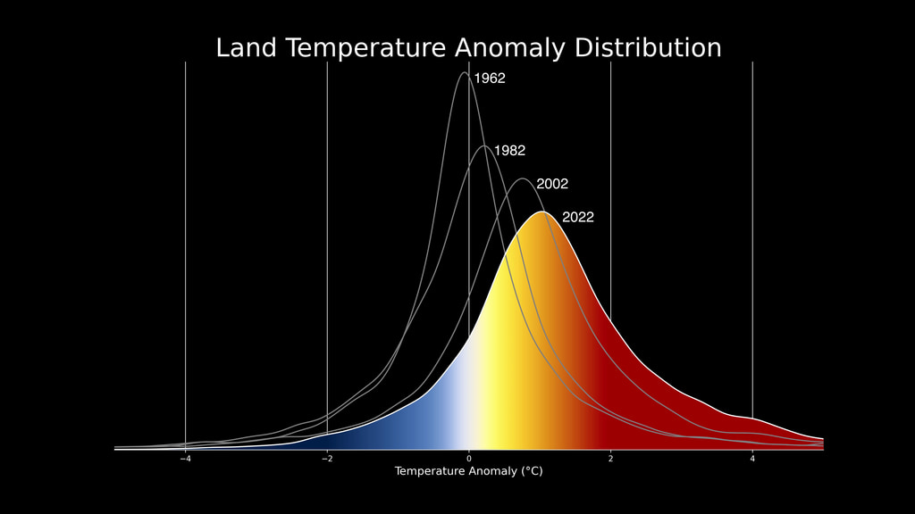
This bell curve graph shows how the distribution of Northern Hemisphere summer temperature anomalies has shifted toward an increase in hot summers. The seasonal mean temperature for the entire base period of 1951-1980 is plotted at the top of the bell curve. Decreasing in frequency to the right are what are defined as "hot" anomalies (between 1 and 2 standard deviations from the norm), "very hot" anomalies (between 2 and 3 standard deviations) and "extremely hot" anomalies (greater than 3 standard deviations). The anomalies fall off to the left in mirror-image categories of "cold, "very cold" and "extremely cold." The range between the .43 and -.43 standard deviation marks represent "normal" temperatures.
As the graph moves forward in time, the bell curve shifts to the right, representing an increase in the frequency of the various hot anomalies. It also gets wider and shorter, representing a wider range of temperature extremes. As the graph moves beyond 1980, the temperatures are still compared to the seasonal mean of the 1951-1980 base period, so that as it reaches the 21st century, there is a far greater frequency of temperatures that once fell 3 standard deviations beyond the mean.
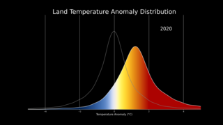
As the graphic indicates, each bell curve shown through the time series represents the distribution of anomalies over an 11-year period.
Animated bell curve
This video is also available on our YouTube channel.
Credits
Please give credit for this item to:
NASA/Goddard Space Flight Center GISS and Scientific Visualization Studio
-
Animator
-
Greg Shirah
(NASA/GSFC)

-
Greg Shirah
(NASA/GSFC)
-
Producer
- Kayvon Sharghi (USRA)
-
Scientists
- James Hansen (NASA/GSFC GISS)
- Makiko Sato (NASA/GSFC GISS)
-
Writer
- Patrick Lynch (Wyle Information Systems)
Datasets used
-
GISS Climate Dice Analysis
ID: 743
Note: While we identify the data sets used on this page, we do not store any further details, nor the data sets themselves on our site.
Newer Versions
- ID: 5065
- ID: 4891
Release date
This page was originally published on Saturday, August 4, 2012.
This page was last updated on Wednesday, May 3, 2023 at 1:52 PM EDT.