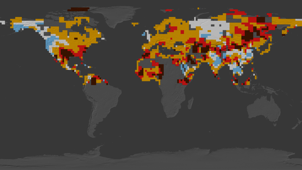
Summer Temperature Anomalies for the Northern Hemisphere, 1955-2011
This visualization shows a flat map of the Earth with summertime temperature anomalies for the Northern Hemisphere. This analysis compares observed seasonal mean temperatures (June-July-August) to the seasonal mean temperatures during a base period from 1951 to 1980.
The colors correspond to statistical standard deviations from the seasonal mean of the base period. The hot anomalies are defined as "hot" (orange); "very hot" (red); and "extremely hot" (bown). The cold anomalies are defined as "cold" (light blue); "very cold" (dark blue); and "extremely cold" (purple). Regions in white fall within the normal category.
The visualization shows the increasing occurrence, in particular, of "extremely hot" temperatures since 2000. While these temperatures were experienced by less than 1 percent of land areas during the base period, about 10 percent of land areas have experienced these summer temperatures since 2000. These extreme heat events include the heat waves in Europe in 2003, Russia in 2010, and Texas and Oklahoma in 2011.
No data is shown below the equator because this only uses Northern Hemisphere June-July-August temperature data. The visualization shows the data for 1955, 1965, 1975 and then 1985-2011.
Dice temperature variations on a flat map
; \"very hot\" (red); extremely hot\" (brown); \"cold\" (light blue); \"very cold\" (dark blue); \"extremely cold\" (purple)")
Color bar for summer temperature anomalies:
"hot" (orange); "very hot" (red); extremely hot" (brown); "cold" (light blue); "very cold" (dark blue); "extremely cold" (purple)
Credits
Please give credit for this item to:
NASA/Goddard Space Flight Center GISS and Scientific Visualization Studio
-
Animators
-
Greg Shirah
(NASA/GSFC)

- Lori Perkins (NASA/GSFC)
-
Greg Shirah
(NASA/GSFC)
-
Producer
- Kayvon Sharghi (USRA)
-
Scientists
- James Hansen (NASA/GSFC GISS)
- Makiko Sato (NASA/GSFC GISS)
-
Writer
- Patrick Lynch (Wyle Information Systems)
Datasets used
-
GISS Climate Dice Analysis
ID: 743
Note: While we identify the data sets used on this page, we do not store any further details, nor the data sets themselves on our site.
Related
- ID: 11066
 Produced Video
Release date
This page was originally published on Saturday, August 4, 2012.
This page was last updated on Wednesday, May 3, 2023 at 1:52 PM EDT.