Arctic Sea Ice Reaches 2019 Minimum Extent
- Visualizations by:
- Bailee DesRocher,
- Cindy Starr, and
- Trent L. Schindler
- Written by:
- Maria-Jose Vinas Garcia
- Produced by:
- Katie Jepson
- View full credits
Movies
- Arctic_Min_2019_LKW.mov (1920x1080) [3.8 GB]
- Arctic_Min_2019_LKW.mp4 (1920x1080) [182.4 MB]
- Arctic_Min_2019_LKW.webm (1920x1080) [19.9 MB]
Captions
- Arctic_Min_2019_LKW.en_US.srt [3.4 KB]
- Arctic_Min_2019_LKW.en_US.vtt [3.3 KB]
Images
- Arctic_Min_2019_Thumbnail_LKW_print.jpg (1024x576) [102.3 KB]
- Arctic_Min_2019_Thumbnail_LKW.png (1920x1080) [2.2 MB]
- Arctic_Min_2019_Thumbnail_LKW_thm.png (80x40) [6.9 KB]
- Arctic_Min_2019_Thumbnail_LKW_searchweb.png (320x180) [88.1 KB]
Music: Hiraeth by Anthony Edwin Phillips [PRS], James Edward Collins
Complete transcript available.
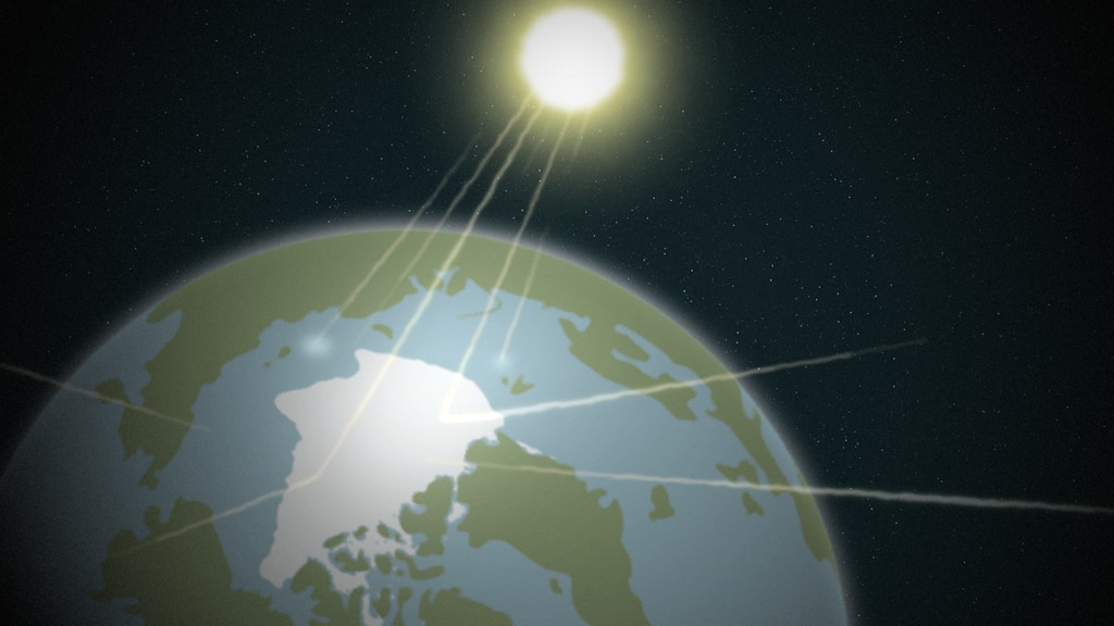
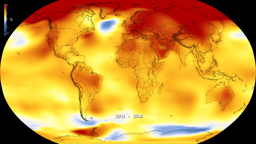
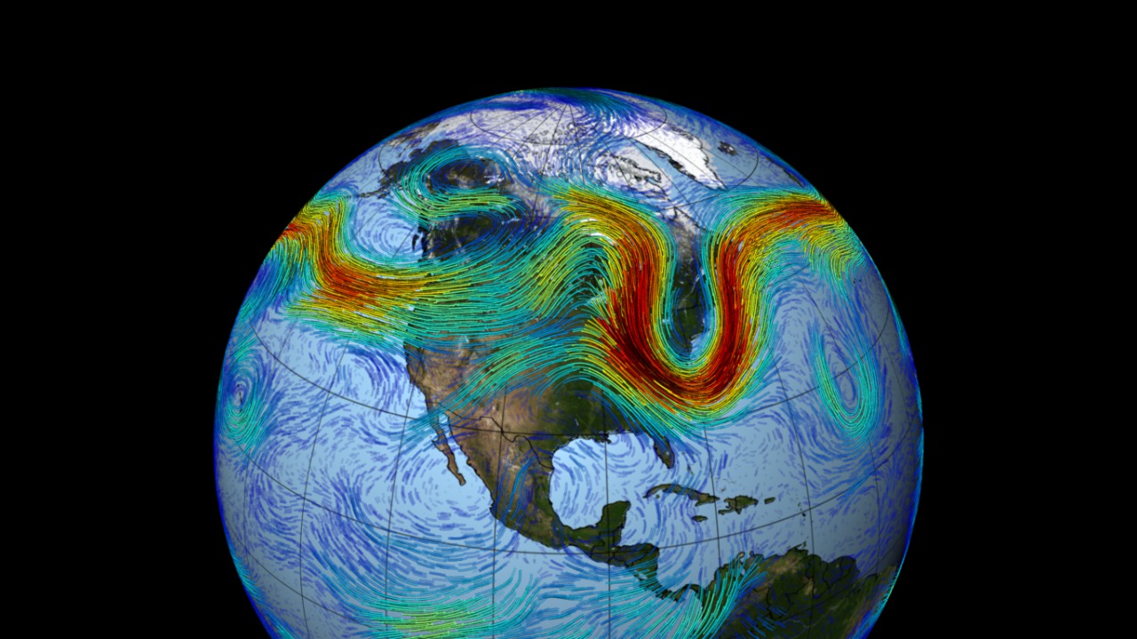
The Arctic sea ice cap is an expanse of frozen seawater floating on top of the Arctic Ocean and neighboring seas. Every year, it expands and thickens during the fall and winter and grows smaller and thinner during the spring and summer. But in the past decades, increasing temperatures have caused marked decreases in the Arctic sea ice extents in all seasons, with particularly rapid reductions in the minimum end-of-summer ice extent. The shrinking of the Arctic sea ice cover can ultimately affect local ecosystems, global weather patterns, and the circulation of the oceans.
Credits
Please give credit for this item to:
NASA's Goddard Space Flight Center
Animator
- Bailee DesRocher (USRA) [Lead]
Visualizers
- Cindy Starr (GST) [Lead]
- Trent L. Schindler (USRA) [Lead]
- Lori Perkins (NASA/GSFC)
Writer
- Maria-Jose Vinas Garcia (Telophase) [Lead]
Scientists
- Nathan T. Kurtz (NASA/GSFC)
- Walt Meier (NASA/GSFC)
Producer
- Katie Jepson (KBRwyle) [Lead]
Narrator
- LK Ward (KBRwyle)
Videographers
- Jefferson Beck (KBRwyle)
- John Caldwell (AIMM)
- Kate Ramsayer (Telophase)
Technical support
- Aaron E. Lepsch (ADNET)
Series
This visualization can be found in the following series:Related pages
NASA Sees High Temperatures, Wildfires, and Annual Sea Ice Minimum Extent in Warming Arctic
Sept. 21st, 2020
Read moreMusic: Curves Ahead by Donn Wilkerson [BMI] and Genetic Analyzer by Le Fat Club [SACEM]Complete transcript available. On Sept. 15, 2020, Arctic sea ice reached its annual minimum extent -- the second-lowest on record. This summer, temperatures soared in the Siberian Arctic, and intense fires burned through peatland. The Arctic region is warming three times faster than the rest of the planet. Related pages
Global Temperature Anomalies from 1880 to 2022
Jan. 12th, 2023
Read moreThis color-coded map in Robinson projection displays a progression of changing global surface temperature anomalies. Normal temperatures are shown in white. Higher than normal temperatures are shown in red and lower than normal temperatures are shown in blue. Normal temperatures are calculated over the 30 year baseline period 1951-1980. The final frame represents the 5 year global temperature anomalies from 2018-2022. This data visualization shows the 2022 global surface temperature anomaly compared with the 1951-1980 average. This data visualization shows only the 2022 global surface temperature anomalies on a rotating globe to highlight the La Niña. 2022 was one of the warmest on record despite a third consecutive year of La Niña conditions in the tropical Pacific Ocean. NASA scientists estimate that La Niña’s cooling influence may have lowered global temperatures about 0.11 degrees Fahrenheit from what the average would have been under more typical ocean conditions. Colortable is both degrees fahrenheit and degrees celsius. This image is the single year 2022 GISS temperature anomaly as compared with the 1951-1980 average. This version does not have any titles or text overlays, except for the corresponding colorbar. This frame sequence of color-coded global temperature anomalies in robinson projection display a progression of changing global surface temperatures anomalies in even degrees Fahrenheit. The first frame in this sequence represents the data from 1880-1884. The second frame represents 1881-1885, ...and the last frame represents 2018-2022. Higher than normal temperatures are shown in red and lower than normal are shown in blue. Normal temperatures are the average over the 30 year baseline period 1951-1980. This sequence of images are the corresponding date overlays for the 5 year rolling averages used in the first visualization on this page. This frame sequence of color-coded global temperature anomalies in degrees celsius is designed to be displayed on the Science on a Sphere projection system. Each image represents a unique 5 year rolling time period with no fades between datasets. Frame 1884 represents data from 1880-1884, frame 1885 represents data from 1881-1885,... frame 2022 represents data from 2018-2022. Higher than normal temperatures are shown in red and lower than normal are shown in blue. Normal temperatures are the average over the 30 year baseline period 1951-1980. This is the colorbar for the Science on a Sphere frameset above. It is in degrees celsius.
Global Temperature Anomalies from 1880 to 2021
Jan. 13th, 2022
Read moreThis color-coded map in Robinson projection displays a progression of changing global surface temperature anomalies. Normal temperatures are shown in white. Higher than normal temperatures are shown in red and lower than normal temperatures are shown in blue. Normal temperatures are calculated over the 30 year baseline period 1951-1980. The final frame represents the 5 year global temperature anomalies from 2017-2021. Scale in degrees Fahrenheit. This data visualization shows the 2021 global surface temperature anomalies on a rotating globe to highlight the La Niña. La Niña has developed and is expected to last into early 2022. Despite the cooling influence of this naturally occurring climate phenomenon, temperatures in many parts of the world are above average. The year 2000 also saw a La Niña event of similar strength to that in 2021, but 2021 global temperatures was more than 0.75 degrees Fahrenheit hotter than 2000. This color-coded map in Robinson projection displays a progression of changing global surface temperature anomalies. Normal temperatures are shown in white. Higher than normal temperatures are shown in red and lower than normal temperatures are shown in blue. Normal temperatures are calculated over the 30 year baseline period 1951-1980. The final frame represents the 5 year global temperature anomalies from 2017-2021. Scale in degrees Celsius. This frame sequence is the corresponding date range for each frame in the sequence. Degrees Fahrenheit Colorbar Degrees Celsius Colorbar This frame sequence of color-coded global temperature anomalies in robinson projection display a progression of changing global surface temperatures anomalies in Fahrenheit. The first frame in this sequence represents the data from 1880-1884. The second frame represents 1881-1885, ...and the last frame represents 2017-2021. Higher than normal temperatures are shown in red and lower than normal are shown in blue. Normal temperatures are the average over the 30 year baseline period 1951-1980. This frame sequence of color-coded global temperature anomalies in degrees celsius is designed to be displayed on the Science on a Sphere projection system. Each image represents a unique 5 year rolling time period with no fades between datasets. Frame 1884 represents data from 1880-1884, frame 1885 represents data from 1881-1885,... frame 2021 represents data from 2017-2021. Higher than normal temperatures are shown in red and lower than normal are shown in blue. Normal temperatures are the average over the 30 year baseline period 1951-1980. This is the colorbar for the Science on a Sphere frameset above. It is in degrees celsius. Earth’s global average surface temperature in 2021 tied with 2018 as the sixth warmest on record, according to independent analyses done by NASA and NOAA. Continuing the planet’s long-term warming trend, global temperatures in 2021 were 1.5 degrees Fahrenheit (or 0.85 degrees Celsius) above the average for NASA’s baseline period, according to scientists at NASA’s Goddard Institute for Space Studies (GISS) in New York.Collectively, the past eight years are the top eight warmest years since modern record keeping began in 1880. This annual temperature data makes up the global temperature record – and it’s how scientists know that the planet is warming.GISS is a NASA laboratory managed by the Earth Sciences Division of the agency’s Goddard Space Flight Center in Greenbelt, Maryland. The laboratory is affiliated with Columbia University’s Earth Institute and School of Engineering and Applied Science in New York.For more information about NASA’s Earth science missions, visit: https://www.nasa.gov/earth Related pages
Global Temperature Anomalies from 1880 to 2020
Jan. 14th, 2021
Read moreThis color-coded map in Robinson projection displays a progression of changing global surface temperature anomalies. Normal temperatures are the average over the 30 year baseline period 1951-1980. Higher than normal temperatures are shown in red and lower than normal temperatures are shown in blue. The final frame represents the 5 year global temperature anomalies from 2016-2020. Scale in degrees Celsius. This color-coded map in Robinson projection displays a progression of changing global surface temperature anomalies. Normal temperatures are the average over the 30 year baseline period 1951-1980. Higher than normal temperatures are shown in red and lower than normal temperatures are shown in blue. The final frame represents the 5 year global temperature anomalies from 2016-2020. Scale in degrees Fahrenheit. This data visualization places the most recent time step, 2016-2020, of our global surface temperature anomalies on a rotating globe. Normal temperatures are the average over the 30 year baseline period 1951-1980. Higher than normal temperatures are shown in red and lower than normal temperatures are shown in blue. Scale is in degrees Fahrenheit. THe Earth's topography is exaggerated by 10x. This frame sequence is the corresponding date range for each frame in the sequence. This 136 frame sequence of color-coded global temperature anomalies in robinson projection display a progression of changing global surface temperatures anomalies in Fahrenheit. The first frame in this sequence represents the data from 1880-1884. The second frame represents 1881-1885, ...and the last frame represents 2016-2020. Higher than normal temperatures are shown in red and lower than normal are shown in blue. Normal temperatures are the average over the 30 year baseline period 1951-1980. Degrees Fahrenheit Colorbar Degrees Celsius Colorbar This frame sequence of color-coded global temperature anomalies in degrees celsius is designed to be displayed on the Science on a Sphere projection system. Each image represents a unique 5 year rolling time period with no fades between datasets. Frame 1884 represents data from 1880-1884, frame 1885 represents data from 1881-1885,... frame 2020 represents data from 2016-2020. Higher than normal temperatures are shown in red and lower than normal are shown in blue. Normal temperatures are the average over the 30 year baseline period 1951-1980. Degrees Celsius horizontal colorbar 2020 Tied for Warmest Year on Record, NASA Analysis ShowsEarth’s global average surface temperature in 2020 tied with 2016 as the warmest year on record, according to an analysis by NASA. Continuing the planet’s long-term warming trend, the year’s globally averaged temperature was 1.84 degrees Fahrenheit (1.02 degrees Celsius) warmer than the baseline 1951-1980 mean, according to scientists at NASA’s Goddard Institute for Space Studies (GISS) in New York. 2020 edged out 2016 by a very small amount, within the margin of error of the analysis, making the years effectively tied for the warmest year on record.“The last seven years have been the warmest seven years on record, typifying the ongoing and dramatic warming trend,” said GISS Director Gavin Schmidt. “Whether one year is a record or not is not really that important – the important things are long-term trends. With these trends, and as the human impact on the climate increases, we have to expect that records will continue to be broken.”A Warming, Changing WorldTracking global temperature trends provides a critical indicator of the impact of human activities – specifically, greenhouse gas emissions – on our planet. Earth's average temperature has risen more than 2 degrees Fahrenheit (1.2 degrees Celsius) since the late 19th century. Rising temperatures are causing phenomena such as loss of sea ice and ice sheet mass, sea level rise, longer and more intense heat waves, and shifts in plant and animal habitats. Understanding such long-term climate trends is essential for the safety and quality of human life, allowing humans to adapt to the changing environment in ways such as planting different crops, managing our water resources and preparing for extreme weather events.Land, Sea, Air and SpaceNASA’s analysis incorporates surface temperature measurements from more than 26,000 weather stations and thousands of ship- and buoy-based observations of sea surface temperatures. These raw measurements are analyzed using an algorithm that considers the varied spacing of temperature stations around the globe and urban heating effects that could skew the conclusions if not taken into account. The result of these calculations is an estimate of the global average temperature difference from a baseline period of 1951 to 1980.NASA measures Earth's vital signs from land, air, and space with a fleet of satellites, as well as airborne and ground-based observation campaigns. The satellite surface temperature record from the Atmospheric Infrared Sounder (AIRS) instrument aboard NASA’s Aura satellite confirms the GISTEMP results of the past seven years being the warmest on record. Satellite measurements of air temperature, sea surface temperature, and sea levels, as well as other space-based observations, also reflect a warming, changing world. The agency develops new ways to observe and study Earth's interconnected natural systems with long-term data records and computer analysis tools to better see how our planet is changing. NASA shares this unique knowledge with the global community and works with institutions in the United States and around the world that contribute to understanding and protecting our home planet. NASA’s full surface temperature data set – and the complete methodology used to make the temperature calculation – are available at: https://data.giss.nasa.gov/gistempGISS is a NASA laboratory managed by the Earth Sciences Division of the agency’s Goddard Space Flight Center in Greenbelt, Maryland. The laboratory is affiliated with Columbia University’s Earth Institute and School of Engineering and Applied Science in New York.For more information about NASA’s Earth science missions, visit: https://www.nasa.gov/earth Related pages
Global Temperature Anomalies from 1880 to 2019
Jan. 15th, 2020
Read moreThis color-coded map in Robinson projection displays a progression of changing global surface temperature anomalies. Normal temperatures are the average over the 30 year baseline period 1951-1980. Higher than normal temperatures are shown in red and lower than normal temperatures are shown in blue. The final frame represents the 5 year global temperature anomalies from 2015-2019. Scale in degrees Celsius. This color-coded map in Robinson projection displays a progression of changing global surface temperature anomalies. Normal temperatures are the average over the 30 year baseline period 1951-1980. Higher than normal temperatures are shown in red and lower than normal temperatures are shown in blue. The final frame represents the 5 year global temperature anomalies from 2015-2019. Scale in degrees Fahrenheit. Degrees Celsius Colorbar Degrees Fahrenheit Colorbar Date Sequence This data visualization places the most recent time step, 2015-2019, of our global surface temperature anomalies on a rotating globe. Normal temperatures are the average over the 30 year baseline period 1951-1980. Higher than normal temperatures are shown in red and lower than normal temperatures are shown in blue. Scale is in degrees Fahrenheit. This frame sequence of color-coded global temperature anomalies in robinson projection display a progression of changing global surface temperatures anomalies in Fahrenheit. Each image represents a unique 5 year rolling time period with no fades between datasets. The frame number of each frame is the last year for that frame's time period. Higher than normal temperatures are shown in red and lower than normal are shown in blue. Normal temperatures are the average over the 30 year baseline period 1951-1980. This frame sequence of color-coded global temperature anomalies in degrees celsius is designed to be displayed on the Science on a Sphere projection system. Each image represents a unique 5 year rolling time period with no fades between datasets. Frame 1884 represents data from 1880-1884, frame 1885 represents data from 1881-1885,... frame 2019 represents data from 2015-2019. Higher than normal temperatures are shown in red and lower than normal are shown in blue. Normal temperatures are the average over the 30 year baseline period 1951-1980. NASA, NOAA Analyses Reveal 2019 Second Warmest Year on RecordAccording to independent analyses by NASA and the National Oceanic and Atmospheric Administration (NOAA), Earth's global surface temperatures in 2019 were the second warmest since modern recordkeeping began in 1880.Globally, 2019 temperatures were second only to those of 2016 and continued the planet's long-term warming trend: the past five years have been the warmest of the last 140 years. This past year, they were 1.8 degrees Fahrenheit (0.98 degrees Celsius) warmer than the 1951 to 1980 mean, according to scientists at NASA’s Goddard Institute for Space Studies (GISS) in New York. “The decade that just ended is clearly the warmest decade on record,” said GISS Director Gavin Schmidt. “Every decade since the 1960s clearly has been warmer than the one before.”Since the 1880s, the average global surface temperature has risen and the average temperature is now more than 2 degrees Fahrenheit (a bit more than 1 degree Celsius) above that of the late 19th century. For reference, the last Ice Age was about 10 degrees Fahrenheit colder than pre-industrial temperatures.Using climate models and statistical analysis of global temperature data, scientists have concluded that this increase mostly has been driven by increased emissions into the atmosphere of carbon dioxide and other greenhouse gases produced by human activities.“We crossed over into more than 2 degrees Fahrenheit warming territory in 2015 and we are unlikely to go back. This shows that what’s happening is persistent, not a fluke due to some weather phenomenon: we know that the long-term trends are being driven by the increasing levels of greenhouse gases in the atmosphere,” Schmidt said.Because weather station locations and measurement practices change over time, the interpretation of specific year-to-year global mean temperature differences has some uncertainties. Taking this into account, NASA estimates that 2019’s global mean change is accurate to within 0.1 degrees Fahrenheit, with a 95% certainty level.Weather dynamics often affect regional temperatures, so not every region on Earth experienced similar amounts of warming. NOAA found the 2019 annual mean temperature for the contiguous 48 United States was the 34th warmest on record, giving it a “warmer than average” classification. The Arctic region has warmed slightly more than three times faster than the rest of the world since 1970.Rising temperatures in the atmosphere and ocean are contributing to the continued mass loss from Greenland and Antarctica and to increases in some extreme events, such as heat waves, wildfires, intense precipitation.NASA’s temperature analyses incorporate surface temperature measurements from more than 20,000 weather stations, ship- and buoy-based observations of sea surface temperatures, and temperature measurements from Antarctic research stations.These in situ measurements are analyzed using an algorithm that considers the varied spacing of temperature stations around the globe and urban heat island effects that could skew the conclusions. These calculations produce the global average temperature deviations from the baseline period of 1951 to 1980.NOAA scientists used much of the same raw temperature data, but with a different interpolation into the Earth’s polar and other data-poor regions. NOAA’s analysis found 2019 global temperatures were 1.7 degrees Fahrenheit (0.95 degrees Celsius) above the 20th century average.NASA’s full 2019 surface temperature data set and the complete methodology used for the temperature calculation and its uncertainties are available at:https://data.giss.nasa.gov/gistempGISS is a laboratory within the Earth Sciences Division of NASA’s Goddard Space Flight Center in Greenbelt, Maryland. The laboratory is affiliated with Columbia University’s Earth Institute and School of Engineering and Applied Science in New York.NASA uses the unique vantage point of space to better understand Earth as an interconnected system. The agency also uses airborne and ground-based measurements, and develops new ways to observe and study Earth with long-term data records and computer analysis tools to better see how our planet is changing. NASA shares this knowledge with the global community and works with institutions in the United States and around the world that contribute to understanding and protecting our home planet.For more information about NASA’s Earth science activities, visit:https://www.nasa.gov/earthThe slides for the Jan. 15 news conference are available at:https://www.ncdc.noaa.gov/sotc/briefings/20200115.pdfNOAA’s Global Report is available at:https://www.ncdc.noaa.gov/sotc/global/201913 Related pages
Weekly Arctic Sea Ice Age with Graph of Ice Age By Area: 1984 - 2019
Sept. 30th, 2019
Read moreThis visualization shows the age of the Arctic sea ice between 1984 and 2019. Younger sea ice, or first-year ice, is shown in a dark shade of blue while the ice that is four years old or older is shown as white. A graph displayed in the upper left corner quantifies the area covered sea ice 4 or more years old in millions of square kilometers.This video is also available on our YouTube channel. This is the same visualization as above without the graph except that this animation has been updated through the end of August, 2019.This video is also available on our YouTube channel. Pair 1A: This image shows the Arctic sea ice age in September 2019 when the sea ice reached its annual minimum extent (week 38). During this week, the area covered by the sea ice that was 4 years of age or older extended 53,000 square kilometers. Pair 1B: This image shows the Arctic sea ice age in September 1984 (week 38). During this week, the area covered by the sea ice that was 4 years of age or older extended 2,687,000 square kilometers. Pair 2A: This image shows the Arctic sea ice age in August, 2019 (week 34). During this week, the area covered by the sea ice that was 4 years of age or older extended 59,000 square kilometers. Pair 2B: This image shows the Arctic sea ice age in August, 1987 (week 34). During this week, the area covered by the sea ice that was 4 years of age or older extended 2,639,000 square kilometers. Pair 3A: This image shows the Arctic sea ice age in the first week (week 1) of January, 2019. During this week, the area covered by the sea ice that was 4 years of age or older extended 116,000 square kilometers. Pair 3B: This image shows the Arctic sea ice age in the first week (week 1) of January, 1988. During this week, the area covered by the sea ice that was 4 years of age or older extended 3,121,000 square kilometers. Pair 4A: This image shows the Arctic sea ice age in April, 2019 (week 15). During this week, the area covered by the sea ice that was 4 years of age or older extended 89,000 square kilometers. Pair 4B: This image shows the Arctic sea ice age in April, 1986 (week 15). During this week, the area covered by the sea ice that was 4 years of age or older extended 2,791,000 square kilometers Pair 5A: This image shows the Arctic sea ice age in October, 2018 (week 42). During this week, the area covered by the sea ice that was 4 years of age or older extended 132,000 square kilometers. Pair 5B: This image shows the Arctic sea ice age in October, 1985 (week 42). During this week, the area covered by the sea ice that was 4 years of age or older extended 2,879,000 square kilometers. This layer shows only the sea ice age with transparency on the Earth with no text labels, dates, graph or colorbar. All of these components are in a separate layer below. The overlay layer with the graph, colorbar, date and text labels with transparency One significant change in the Arctic region in recent years has been the rapid decline in perennial sea ice. Perennial sea ice, also known as multi-year ice, is the portion of the sea ice that survives the summer melt season. Perennial ice may have a life-span of nine years or more and represents the thickest component of the sea ice; perennial ice can grow up to four meters thick. By contrast, first year ice that grows during a single winter is generally at most two meters thick.Above is a visualization of the weekly sea ice age between 1984 and 2019. The animation shows the seasonal variability of the ice, growing in the Arctic winter and melting in the summer. In addition, this also shows the changes from year to year, depicting the age of the sea ice in different colors. Younger sea ice, or first-year ice, is shown in a dark shade of blue while the ice that is over four years old is shown as white. A color scale identifies the age of the intermediary years.Note that data for the sea ice age is not available along the coastlines. The region where data is not available is shown in a dark lavender color.A graph in the upper left corner the quantifies the change over time by showing the area covered by sea ice that is 4 years old or older in millions of square kilometers. This graph also includes a memory bar - the green line that indicates the maximum value seen thus far in the animation for the given week being displayed. For example, when viewing the sea ice age for the first week in September, the memory bar will display the maximum value seen for the first week of September in all prior years from the beginning of the animation (1984). In addition, a violet bar indicates the average area covered by sea ice greater than 4 years of age during the the 20-year time period from 1984 through 2003.Below are matching pairs of images showing identical weeks in two different years, where one year is late in the time series and the other is early. These matched images are labeled Pair 1A and Pair 1B. The caption below the image provides additional details. Each image is available with and without the graph. Related pages
Albedo Animation
Sept. 5th, 2019
Read moreFull albedo sequence As this ice begins to melt, less sunlight gets reflected into space. It is instead absorbed into the oceans and land, raising the overall temperature, and fueling further melting. This is a conceptual animation showing how polar ice reflects light from the sun. Related pages
Global Temperature Anomalies from 1880 to 2018
Feb. 6th, 2019
Read moreThis color-coded map in Robinson projection displays a progression of changing global surface temperature anomalies from 1880 through 2018. Higher than normal temperatures are shown in red and lower then normal termperatures are shown in blue. The final frame represents the global temperatures 5-year averaged from 2014 through 2018. Scale in degree Celsius. This color-coded map in Robinson projection displays a progression of changing global surface temperature anomalies from 1880 through 2018. Higher than normal temperatures are shown in red and lower then normal termperatures are shown in blue. The final frame represents the global temperatures 5-year averaged from 2014 through 2018. Scale in degree Fahrenheit. Dates Sequence for the series. temperature anomaly in degrees Celsius colorbar temperature anomaly in degrees Fahrenheit colorbar Global temperature anomaly data from 1880- 2018, in degrees Fahrenheit, on a spinning globe. Higher than normal temperatures are shown in red and lower than normal temperatures are shown in blue. This frame sequence of color-coded global temperature anomalies in robinson projection display a progression of changing global surface temperatures anomalies in Fahrenheit. Each image represents a unique 5 year rolling time period with no fades between datasets. The frame number of each frame is the last year for that frame's time period. Higher than normal temperatures are shown in red and lower than normal are shown in blue. This frame sequence of color-coded global temperature anomalies in degrees celsius. This frame sequence is designed to be displayed on the Science on a Sphere projection system. Each image represents a unique 5 year rolling time period with no fades between datasets. Frame 1 represents data from 1880-1884, frame 2 represents data from 1881-1885,... frame 135 represents data from 2014-2018. There is a metadata file called dateinfo_4626.txt. Higher than normal temperatures are shown in red and lower than normal are shown in blue. 2018 Fourth Warmest Year in Continuing Warming Trend, According to NASA, NOAAEarth's global surface temperatures in 2018 were the fourth warmest since 1880, according to independent analyses by NASA and the National Oceanic and Atmospheric Administration (NOAA).Global temperatures in 2018 were 1.5 degrees Fahrenheit (0.83 degrees Celsius) warmer than the 1951 to 1980 mean, according to scientists at NASA’s Goddard Institute for Space Studies (GISS) in New York. Globally, 2018's temperatures rank behind those of 2016, 2017 and 2015. The past five years are, collectively, the warmest years in the modern record.“2018 is yet again an extremely warm year on top of a long-term global warming trend,” said GISS Director Gavin Schmidt.Since the 1880s, the average global surface temperature has risen about 2 degrees Fahrenheit (1.1 degrees Celsius). This warming has been driven, in large part, by increased emissions into the atmosphere of carbon dioxide and other greenhouse gases caused by human activities, according to Schmidt. Warming trends are strongest in the Arctic region, where 2018 saw the continued loss of sea ice. In addition, mass loss from the Greenland and Antarctic ice sheets continued to contribute to sea level rise. Increasing temperatures can also contribute to longer fire seasons and some extreme weather events, according to Schmidt.Warming trends are strongest in the Arctic regions, where 2018 saw the continued loss of sea ice, as well as mass loss from the Greenland and Antarctic ice sheets that contribute to sea level rise. Increasing temperatures can also contribute to longer fire seasons and some extreme weather events, according to Schmidt.“The impacts of long-term global warming are already being felt - in coastal flooding, heat waves, intense precipitation and ecosystem change,” said Schmidt.NASA’s temperature analyses incorporate surface temperature measurements from 6,300 weather stations, ship- and buoy-based observations of sea surface temperatures, and temperature measurements from Antarctic research stations.These raw measurements are analyzed using an algorithm that considers the varied spacing of temperature stations around the globe and urban heat island effects that could skew the conclusions. These calculations produce the global average temperature deviations from the baseline period of 1951 to 1980.Because weather station locations and measurement practices change over time, the interpretation of specific year-to-year global mean temperature differences has some uncertainties. Taking this into account, NASA estimates that 2018’s global mean change is accurate to within 0.1 degree Fahrenheit, with a 95 percent certainty level.NOAA scientists used much of the same raw temperature data, but with a different baseline period and different interpolation into the Earth’s polar and other data poor regions. NOAA’s analysis found 2018 global temperatures were 1.42 degrees Fahrenheit (0.79 degrees Celsius) above the 20th century average.NASA’s full 2018 surface temperature data set — and the complete methodology used to make the temperature calculation — are available at:https://data.giss.nasa.gov/gistempGISS is a laboratory within the Earth Sciences Division of NASA’s Goddard Space Flight Center in Greenbelt, Maryland. The laboratory is affiliated with Columbia University’s Earth Institute and School of Engineering and Applied Science in New York.NASA uses the unique vantage point of space to better understand Earth as an interconnected system. The agency also uses airborne and ground-based monitoring, and develops new ways to observe and study Earth with long-term data records and computer analysis tools to better see how our planet is changing. NASA shares this knowledge with the global community and works with institutions in the United States and around the world that contribute to understanding and protecting our home planet.For more information about NASA’s Earth science missions, visit:https://www.nasa.gov/earth Related pages
The Polar Jet Stream
Oct. 2nd, 2011
Read morePolar JetThis video is also available on our YouTube channel. Jet Stream, Print Resolution Meandering around the planet like a rollicking roller coaster in the sky, the Northern Hemisphere's polar jet stream is a fast-moving belt of westerly winds that traverses the lower layers of the atmosphere. The jet is created by the convergence of cold air masses descending from the Arctic and rising warm air from the tropics. Deep troughs and steep ridges emerge as the denser cold air sinks and deflects warm air regions north, giving the jet stream its wavy appearance. This pattern propagates across the mid-latitudes of North America, Europe and Asia, as pockets of cold air sporadically creep down from the Arctic - creating contrasting waves and flows that accelerate eastward due to Earth's rotation. Running from June 10 to July 8 of 1988, the visualization below uses weather and climate observations from NASA's MERRA dataset to model nearly a month of the jet stream's whirling journey over North America. Related pages