Greenland's Jakobshavn Glacier Reacts to Changing Ocean Temperatures
NASA's Oceans Melting Greenland (OMG) mission uses ships and planes to measure how ocean temperatures affect Greenland's vast icy expanses. Jakobshavn Glacier, known in Greenlandic as Sermeq Kujalle, on Greenland's central western side, has been one of the island's largest contributor's to sea level rise, losing mass at an accelerating rate.
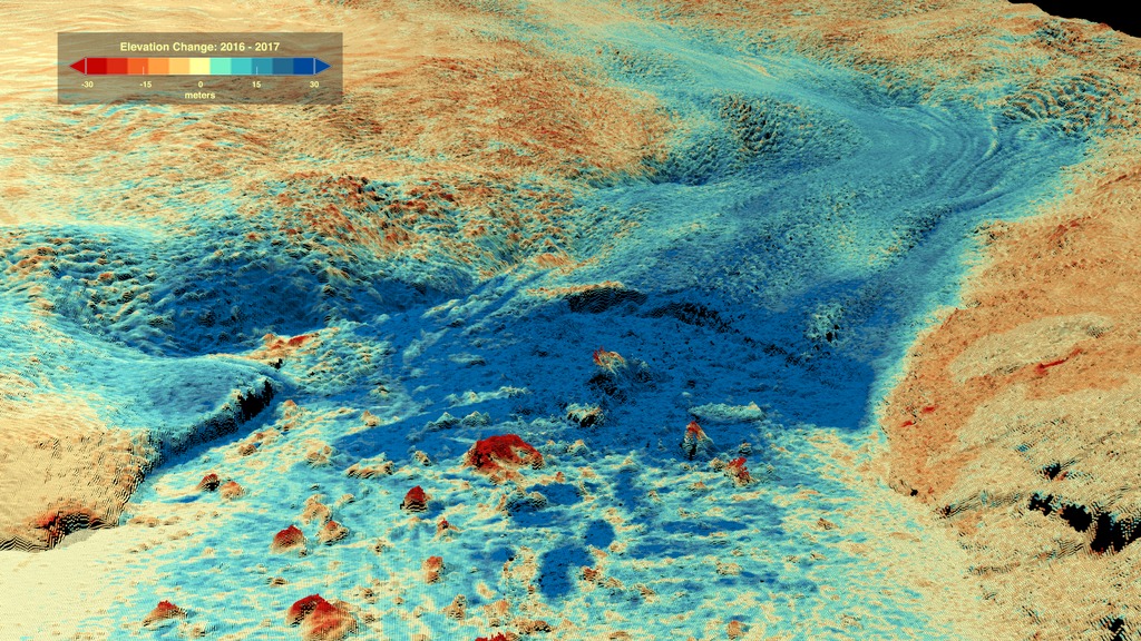
In a new study, the OMG team found that between 2016 and 2017, Jakobshavn Glacier grew slightly and the rate of mass loss slowed down. They traced the causes of this thickening to a temporary cooling of ocean temperatures in the region.
Credits
Please give credit for this item to:
NASA's Goddard Space Flight Center
-
Producer
- Kathryn Mersmann (USRA)
-
Writer
- Carol Rasmussen (NASA/JPL CalTech)
-
Visualizer
-
Cindy Starr
(Global Science and Technology, Inc.)

-
Cindy Starr
(Global Science and Technology, Inc.)
-
Scientists
-
Josh Willis
(JPL)
- Ala Khazendar (JPL)
- Ian Fenty (JPL)
-
Josh Willis
(JPL)
-
Narrator
-
Josh Willis
(JPL)
-
Josh Willis
(JPL)
Series
This page can be found in the following series:Sources
- ID: 4688
 Visualization
Release date
This page was originally published on Monday, March 25, 2019.
This page was last updated on Wednesday, May 3, 2023 at 1:46 PM EDT.