DYAMOND Global Carbon Dioxide for Science On A Sphere
This is the Science-on-a-Sphere version of svs.gsfc.nasa.gov/5196.
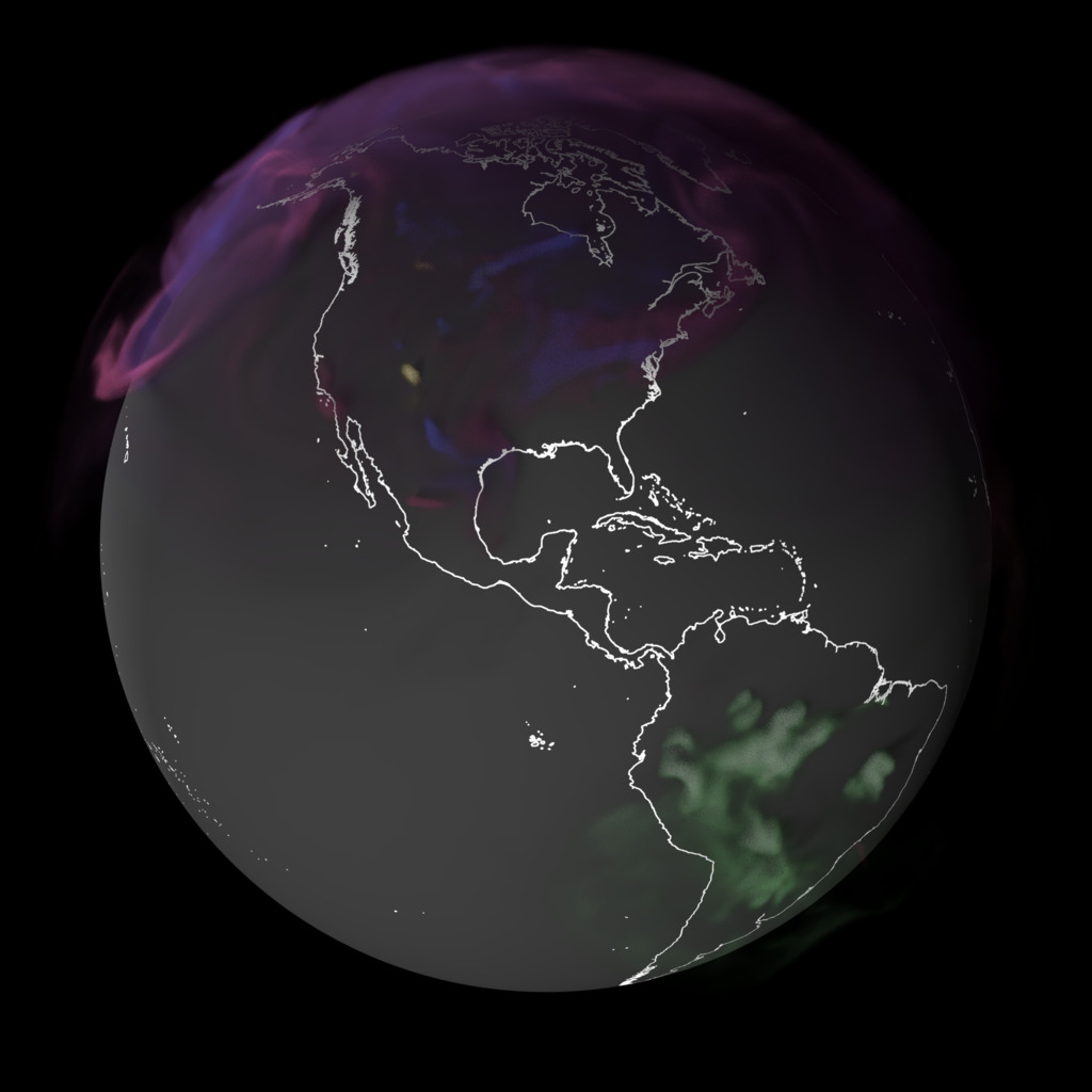
Global CO2 ppm for January-March of 2020.
This map shows concentrations of carbon dioxide (CO2) as wind and air masses moved the gas through Earth’s atmosphere in the winter of 2020. The majority of emissions over China, the United States, and South Asia came from power plants, industrial facilities, cars, and trucks. Over Africa and South America, emissions largely stemmed from fires related to farm and land management and from deforestation, with some contributions from fossil fuel burning. This visualization was created using a high-resolution weather model powered by supercomputers. It pulls together billions of data points from real-world ground observations and satellite instruments.
Global CO2 ppm for January-March of 2020. These frames are provided as a layer for video producers and only shows the CO2 volume, with no background.
Earth's surface for January-March of 2020, interpolated from the monthly Blue Marble data. These frames are provided as a layer for video producers and only shows the surface of the Earth, intended as a background for the CO2 volume.

Color bar showing the range, color, and opacity transfer functions for the above visualizations.
Credits
Please give credit for this item to:
NASA's Scientific Visualization Studio
-
Visualizers
-
AJ Christensen
(SSAI)

-
Greg Shirah
(NASA/GSFC)
-
Helen-Nicole Kostis
(USRA)
-
Mark SubbaRao
(NASA/GSFC)
-
AJ Christensen
(SSAI)
-
Technical support
- Laurence Schuler (ADNET Systems, Inc.)
- Ian Jones (ADNET Systems, Inc.)
-
Scientists
-
Lesley Ott
(NASA/GSFC)
- Brad Weir (Morgan State University)
- William Putman (NASA/GSFC)
- Tomohiro Oda (USRA/EfSI)
-
Lesley Ott
(NASA/GSFC)
Datasets used
-
DYAMOND
ID: 1193The data from the experimental coupled GEOS-MITgcm model known as DYAMOND that was run on NASA Advanced Supercomputing facility.
See all pages that use this dataset
Note: While we identify the data sets used on this page, we do not store any further details, nor the data sets themselves on our site.
Related
- ID: 5424
 Visualization
Release date
This page was originally published on Friday, July 4, 2025.
This page was last updated on Thursday, July 3, 2025 at 4:54 PM EDT.