The NASA Scientific Visualization Studio
Overview
Explore data brought to life by NASA’s artists and scientists
Introduction: Data Brought to Life
 Link
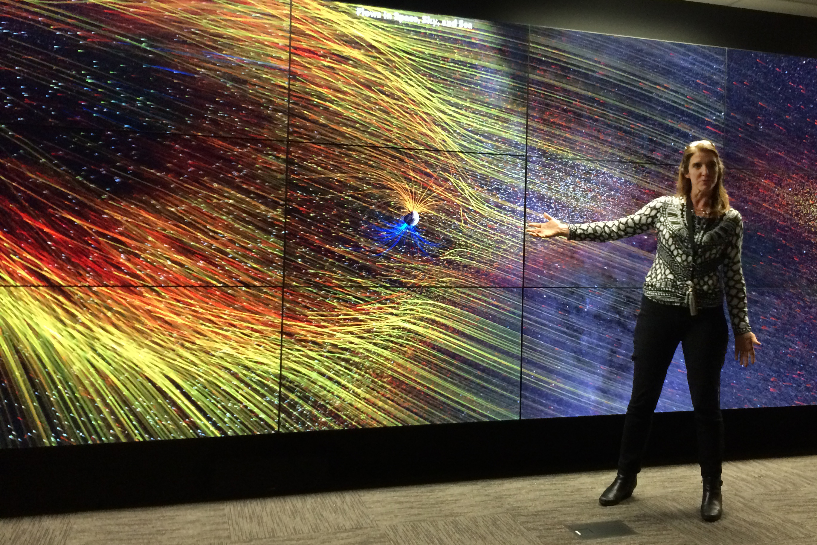
LinkIntroduction Header Image: Lori Perkins at the Hyperwall
Data is only as useful as our ability to make sense of it. When visualizers and scientists work in concert, they unearth stories within datasets and push the boundaries of knowledge. Scientific visualization is not a mere translation of numbers into pictures: shapes and colors breathe life into real scientific data, allowing us to see patterns and complexities that were once invisible or unknown. The visualization process itself becomes a vehicle for scientific inquiry, capturing the curiosity of both visualizer and scientist. When shared with the world, the resulting data-driven artworks inspire as much as they educate and entertain. Scientific visualization reminds us of the beauty in understanding, and it is a means of discovery all its own. Scientific Visualization at NASA
Go to this link
At NASA’s Goddard Space Flight Center, the members of the Scientific Visualization Studio work with scientists to create animations and videos that showcase NASA research and missions in the Earth and space sciences. These visualizations are designed to be enjoyed by people of all walks of life, and to be accurate enough to also be insightful for the NASA research community. The Scientific Visualization Studio empowers scientists to share the meaning and excitement of their work as widely as possible. Link
LinkHyperwall Presenter Video
To do: This video is a placeholder. The final video will be new, and will show a presenter at the Hyperwall introducing visitors to the work of the SVS. This video needs to be filmed.
Go to this link
Beauty and Understanding
 Link
LinkChapter Header Image: Perpetual Ocean Still
It’s often the beauty of a visualization that commands our attention. At first, a visualization may seem more like a wildly imaginative piece of art than a representation of concrete scientific observations. The rhythm of the colors, shapes and motions is so wondrous we don’t expect it to be real, but its realness is actually the most beautiful part of it all. A beautiful visualization invites us to venture to a place of deeper understanding, and a profound appreciation comes with the realization that we can learn from its elegance. Look for: Meaning in swaths of color, processes as patterns
Go to this link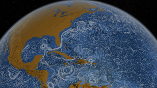 Link
LinkPerpetual Ocean Animation
What begins as an exercise in beauty evolves into a map of the dynamic, chaotic nature of ocean currents around the world. To do: Add a narration, by Greg and/or Horace; possibly by looping the animation.
Go to this link- Section
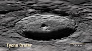
Tour of the Moon Animation
Go to this sectionThis tour of the lunar landscape reveals the stark beauty of the Moon’s features and chronicles the events throughout cosmic history that created them. To do: Recreate this visualization with newer data and add a narration by Ernie and Noah Petro; decide whether this is a continuous video or whether cuts are allowed.
Making the Invisible Visible
- Section

Chapter Header Image: Solar Magnetic Field Still Image
Go to this sectionScience uncovers the inner workings of the universe that we can’t see for ourselves — phenomena that are measurable, but not visible. Sometimes the processes we seek to understand occur on microscopic scales, and other times they are so vast that, without a view from above, we remain oblivious to their true breadth. Complexities may hide in the distance or in an inconspicuous wavelength. Scientific visualization opens our eyes to the unseen, giving us an originative means of exploring that which in one way or another is invisible. Look for: Wavelengths that reveal detail, vantage points that provide clarity
- Section
The Dynamic Solar Magnetic Field
Go to this sectionThe human eye is ill equipped to see all of the Sun’s complexity. By measuring and then visualizing these invisible intricacies, the true nature of the Sun as a magnetic star is made clear. To do: Extend the visualization at the beginning with a "true color" sun, an ultraviolet sun, and a magnetogram sun prior to showing the magnetic field lines. Add a narration from Tom and a solar scientist.
- Section
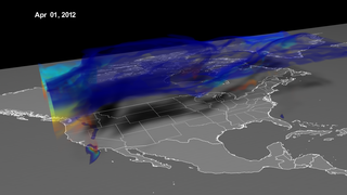
Stratospheric Ozone Intrusion
Go to this sectionOzone is an invisible part of the atmosphere, but the effects it has on human life can be seen everywhere. Visualizing how this gas behaves highlights cause and effect relationships that were also once invisible. To do: If the narration is not changed, add some visual elements that point out the features in the narration. e.g., indicate the stratospheric and tropospheric levels and point out the intrusion signature on the ground. Change the color bar to a more explanatory form.
Fitting Data Together
 Link
LinkChapter Header Image: Global Biosphere Still Image
Discoveries depend on making connections. The more lines we draw from one dataset to another, the closer we get to a complete understanding of the complex relationships that constitute our world. Our web of knowledge grows as we explore and embrace this interconnectedness. In some cases, we can rectify our understanding by bridging the gap between scientific theories and real data. Scientific visualization gives us the power to watch multiple systems unfold simultaneously, test our theories against reality and witness the ebbs and flows of the natural world. Look for: Links between seemingly unrelated systems, big pictures made of many layers
Go to this link- Section
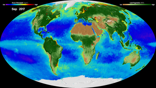
20 Years of Global Biosphere
Go to this sectionEarth works on many timescales, from sub-seconds to millennia. A product of many short-term datasets stitched together, this visualization tells the story of life on Earth over the last two decades. To do: Add a narration by Alex and Gene Feldman. Decide on the specific visualization or visualization edit to be narrated.
- Section
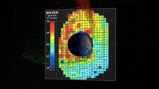
Solar Wind Strips the Martian Atmosphere
Go to this sectionScience often begins with a theory. Connecting a theory with real data, as in this visualization of the Red Planet, makes for a glorious display of the scientific method. To do: Decide whether to use the version narrated by Joy Ng or to have a more SVS-centric narration.
Playing With Time and Space
 Link
LinkChapter Header Image: 60 years of Earth Science Missions Still
Datasets are unsung time machines. Long-term data records teach us about the past and let us peer into the future. What appears unremarkable in real-time may be truly spectacular when we simply rewind, fast forward, speed up or slow down. Just as we can wield time with data, data allows us to also transform physical space and uncover mysteries within shapes and dimensions. Scientific visualization plays with these scales of time and space to reveal hidden relationships. Look for: Adapted timescales, science behind shapes
Go to this link- Link
60 years of Earth Science Missions
This visualization shows the orbits of the NASA-related near-Earth science missions in the 60 years since the launch of Explorer-1 in 1958. Depicting Individual orbits in the context of a 60-year animation required the use of several time-scales simultaneously. To do: Add a narration (probably from Greg). Make this animation public.
Go to this link - Section
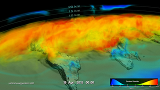
Seasonal Changes in Carbon Dioxide
Go to this sectionPlaying with spatial scales can make it easier to recognize patterns. Here, the vertical scale is exaggerated by a factor of 400 to clarify how carbon dioxide moves through the atmosphere. To do: Probably nothing. We can use this version as is.
Putting Data in Its Place
- Link
Chapter Header Image: Sea Ice Age Still Image
Data often refers to place and time. It may encapsulate the events of a single second or a series of events over a period of many years; it may span a relatively small patch of Earth or envelop entire systems of planets orbiting other suns. In any case, affixing this data within its natural environment maximizes the potential for learning and discovery. Scientific visualization clarifies data’s location in time and space. Look for: Landscapes and their histories, unusual details that provide context
Go to this link - Link
Arctic Sea Ice Age 2016 with VO from Walt Meier
Visualizing Arctic sea ice within the context of the land that surrounds it stimulates understanding of how it behaves and how it has changed over the course of many years. To do: Add the Walt Meier narration to a better version of the Ice Age visualization. Extend the Ice Age visualization by adding a "beauty" visualization of the daily sea ice to the beginning; possibly a sea ice minimum section also. Create a new narration for the opening segment. Make this animation public.
Go to this link - Section
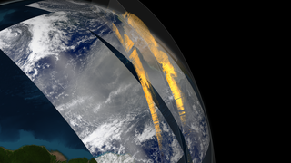
CALIPSO observes Saharan dust crossing the Atlantic Ocean
Go to this sectionIn satellite images, Saharan dust is easily seen traversing the Atlantic Ocean. Pairing them with numerical data sheds light on surprising effects that dust has on a continent an entire ocean away. To do: Decide whether Kel's narration needs to be modified, or whether a different visualization should be used here.

From the Mind of the Scientist
- Link
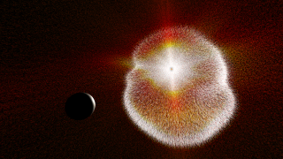
Chapter Header Image: Neutron Stars Create Gravitational Waves Still Image
When data falls short of the whole picture, knowledge and imagination can combine to simulate reality and promote understanding. Sometimes what we seek to understand is largely immeasurable or abstract. This originative approach to science often applies to phenomena we know of but may never be able to see: What did the early Earth look like? How does dark energy work? A scientist’s understanding and imagination interpolate where there are gaps in facts and figures. When such concepts are visualized, we receive a rare opportunity to peer into the mind of a scientist and join in on the exploration. Look for: Artful medlies of known and unknown, creative realism in simulations Note: The animations in this chapter were created by the Conceptual Image Lab, a NASA group specializing in computer graphics that illustrate scientific and engineering concepts.
Go to this link - ID: 12740 Produced Video
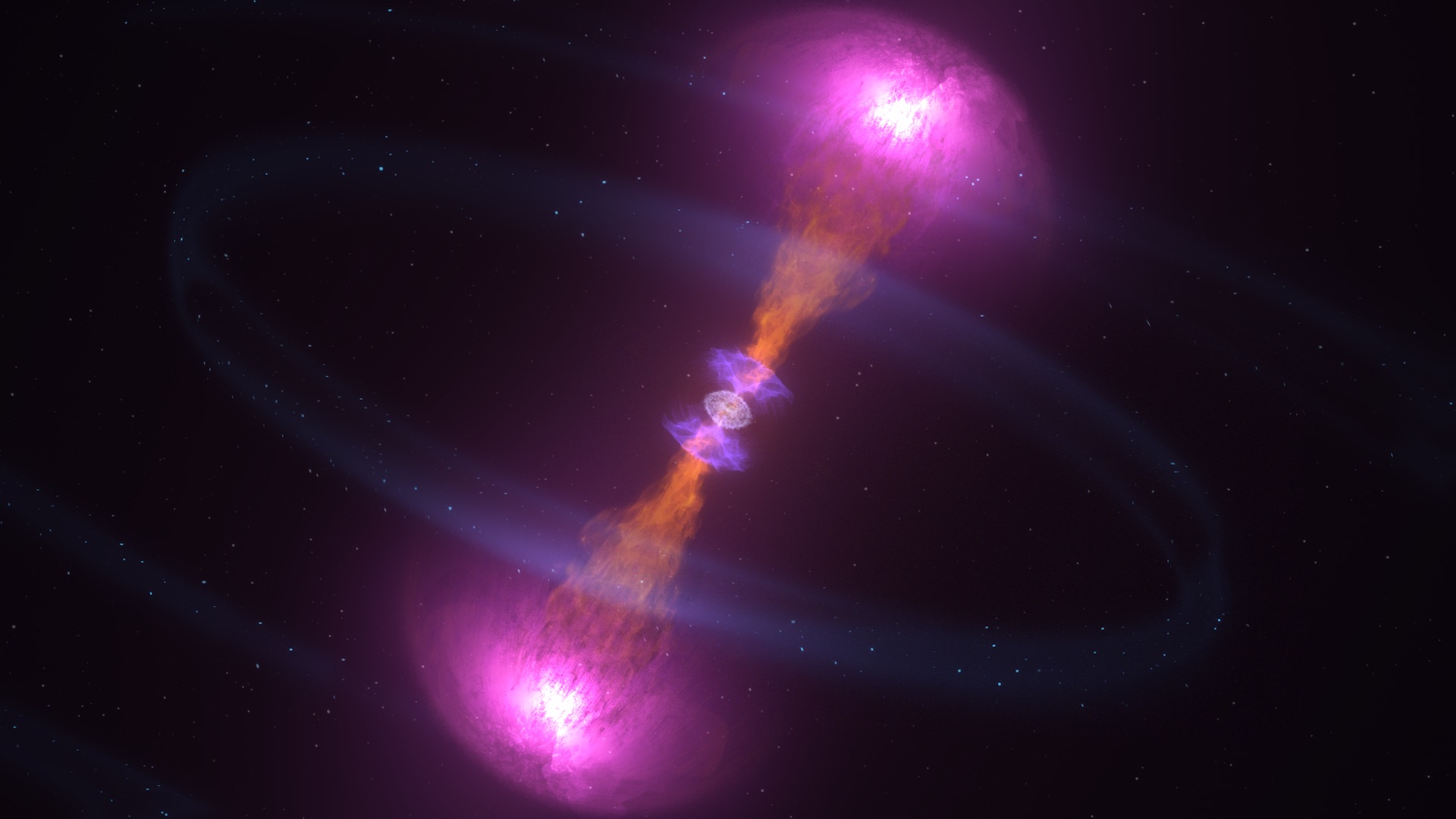
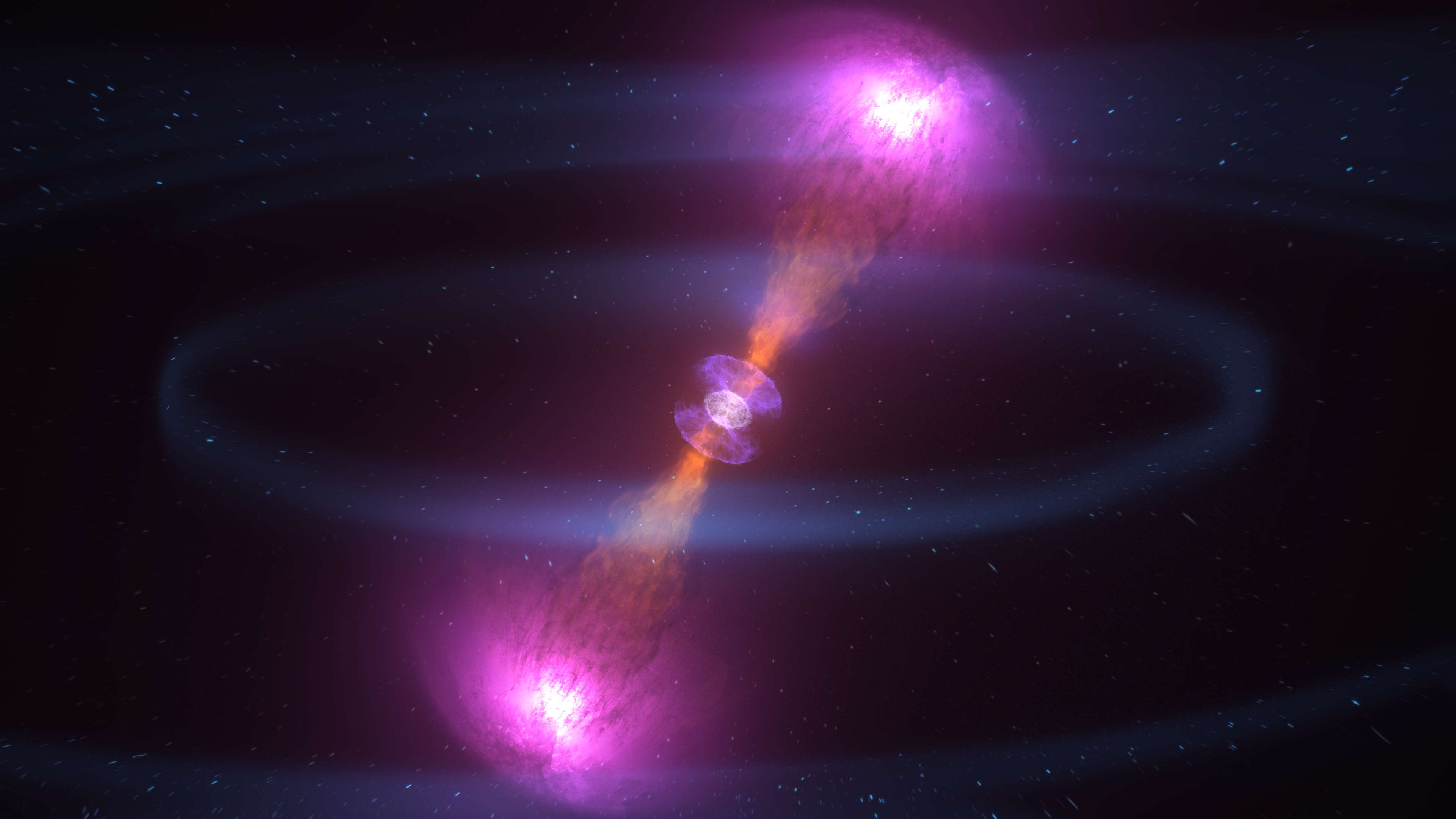
Doomed Neutron Stars Create Blast of Light and Gravitational Waves
Go to this pageThis animation captures phenomena observed over the course of nine days following the neutron star merger known as GW170817, detected on Aug. 17, 2017. They include gravitational waves (pale arcs), a near-light-speed jet that produced gamma rays (magenta), expanding debris from a kilonova that produced ultraviolet (violet), optical and infrared (blue-white to red) emission, and, once the jet directed toward us expanded into our view from Earth, X-rays (blue). Credit: NASA's Goddard Space Flight Center/CI LabMusic: "Exploding Skies" from Killer TracksWatch this video on the NASA Goddard YouTube channel.Complete transcript available. || Neutron_Star_Merger_Still_2_new_1080.png (1920x1080) [2.5 MB] || Neutron_Star_Merger_Still_2_new_1080.jpg (1920x1080) [167.3 KB] || Neutron_Star_Merger_Still_2_new_print.jpg (1024x576) [50.4 KB] || Neutron_Star_Merger_Still_2_new.png (3840x2160) [7.7 MB] || Neutron_Star_Merger_Still_2_new.jpg (3840x2160) [1.0 MB] || Neutron_Star_Merger_Still_2_new_thm.png (80x40) [4.4 KB] || Neutron_Star_Merger_Still_2_new_searchweb.png (320x180) [51.4 KB] || 12740_NS_Merger_Update_1080.m4v (1920x1080) [50.3 MB] || 12740_NS_Merger_Update_H264_1080.mp4 (1920x1080) [96.9 MB] || 12740_NS_Merger_Update_1080p.mov (1920x1080) [101.9 MB] || NS_Merger_SRT_Captions.en_US.srt [417 bytes] || NS_Merger_SRT_Captions.en_US.vtt [399 bytes] || 12740_NS_Merger_4k_Update.webm (3840x2160) [10.0 MB] || 12740_NS_Merger_4k_Update_H264.mp4 (3840x2160) [254.9 MB] || 12740_NS_Merger_4k_Update_H264.mov (3840x2160) [516.7 MB] || 12740_NS_Merger_4k_Update_ProRes_3840x2160_5994.mov (3840x2160) [5.1 GB] || 12740_NS_Merger_4k_Update_H264.hwshow [90 bytes] ||
- ID: 20220 Animation
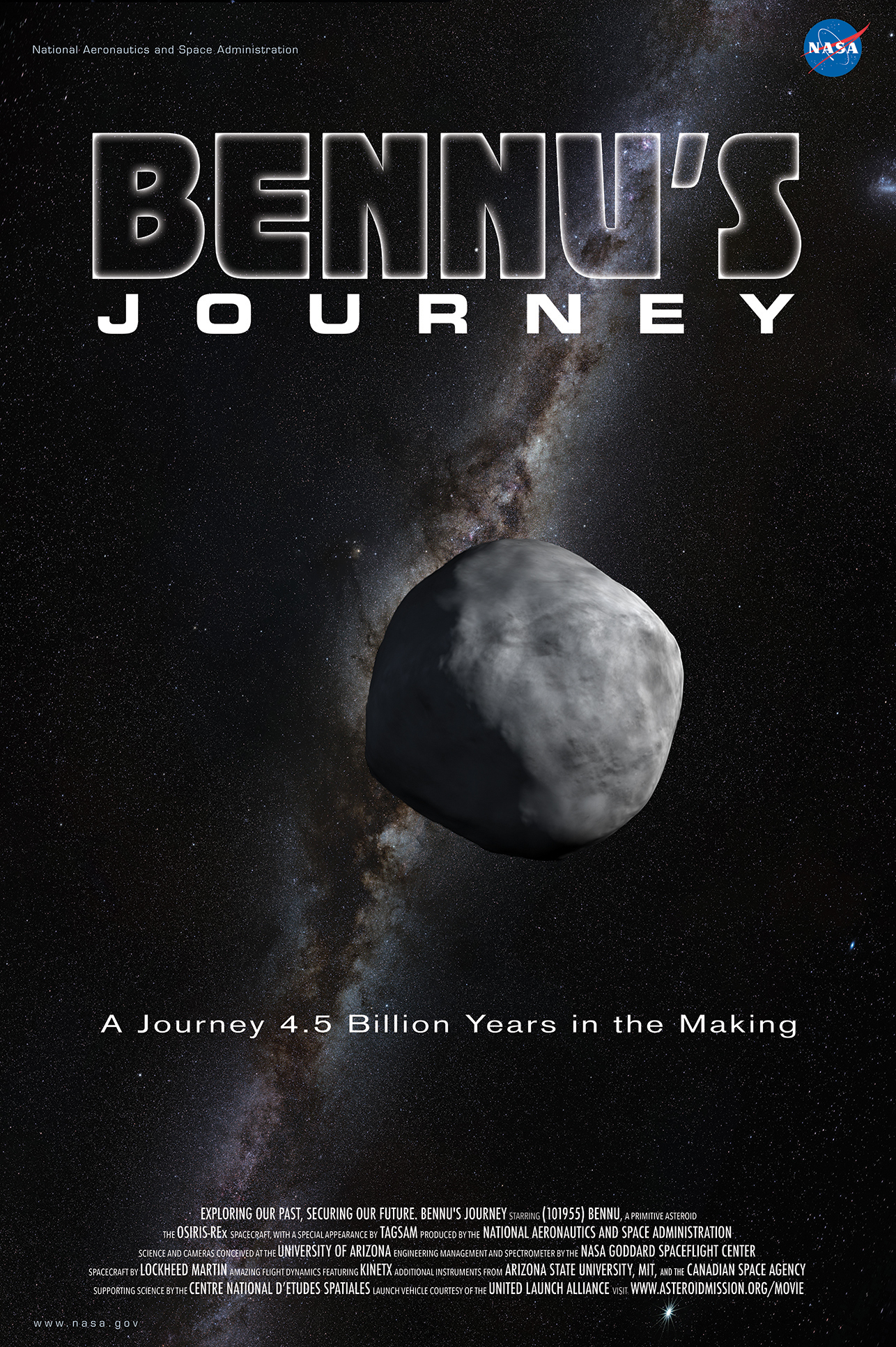
Bennu's Journey
Go to this pageBennu's Journey is a 6-minute animated movie about NASA's OSIRIS-REx mission, asteroid Bennu, and the formation of our solar system. Born from the rubble of a violent collision, hurled through space for millions of years, asteroid Bennu has had a tough life in a rough neighborhood - the early solar system. Bennu's Journey shows what is known and what remains mysterious about the evolution of Bennu and the planets. By retrieving a sample of Bennu, OSIRIS-REx will teach us more about the raw ingredients of the solar system and our own origins.The animation was produced in an 8 x 3 aspect ratio at a resolution of 5760 x 2160 and is available in its full resolution, 4K Ultra HD, 1080HD and 720HD versions in both a letter boxed and a 16 x 9 cropped format. ||
Telling the Story
- Section
Chapter Header Image: Dynamic Earth Stll Image
Go to this sectionTo do: Chapter header paragraph to be added.
- Section
Excerpt from "Dynamic Earth"
Go to this sectionThis visualization puts events large and small into the dynamic context of how the Earth is affected by the Sun, and brings many visualization principles to bear in the service of telling the story. To do: This visualization should be OK as is, unless we want to introduce the 360 version of Dynamic Earth in this Gallery.
- ID: 4129 Visualization
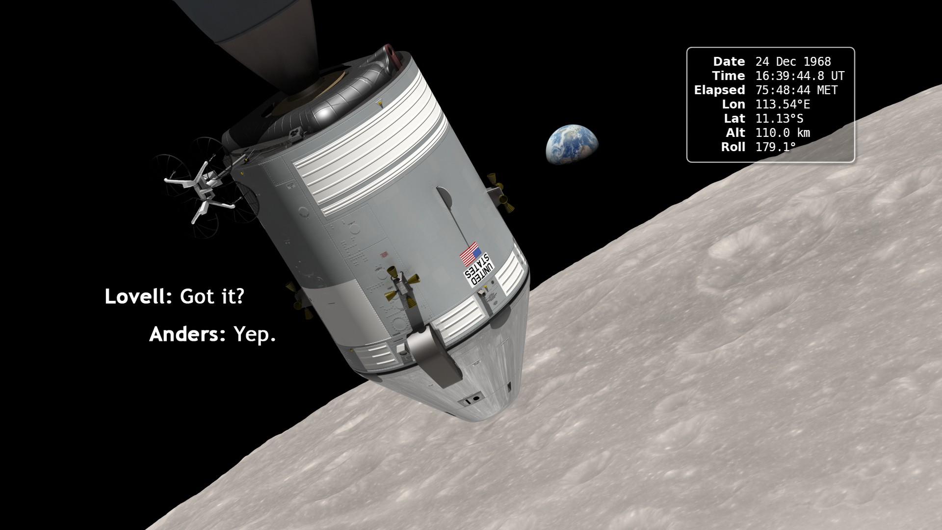
Earthrise: The 45th Anniversary
Go to this pageIn December of 1968, the crew of Apollo 8 became the first people to leave our home planet and travel to another body in space. But as crew members Frank Borman, James Lovell, and William Anders all later recalled, the most important thing they discovered was Earth.Using photo mosaics and elevation data from Lunar Reconnaissance Orbiter (LRO), this video commemorates the 45th anniversary of Apollo 8's historic flight by recreating the moment when the crew first saw and photographed the Earth rising from behind the Moon. Narrator Andrew Chaikin, author of A Man on the Moon, sets the scene for a three-minute visualization of the view from both inside and outside the spacecraft accompanied by the onboard audio of the astronauts.The visualization draws on numerous historical sources, including the actual cloud pattern on Earth from the ESSA-7 satellite and dozens of photographs taken by Apollo 8, and it reveals new, historically significant information about the Earthrise photographs. It has not been widely known, for example, that the spacecraft was rolling when the photos were taken, and that it was this roll that brought the Earth into view. The visualization establishes the precise timing of the roll and, for the first time ever, identifies which window each photograph was taken from.The key to the new work is a set of vertical stereo photographs taken by a camera mounted in the Command Module's rendezvous window and pointing straight down onto the lunar surface. It automatically photographed the surface every 20 seconds. By registering each photograph to a model of the terrain based on LRO data, the orientation of the spacecraft can be precisely determined.Andrew Chaikin's article Who Took the Legendary Earthrise Photo From Apollo 8? appeared in the January, 2018 issue of Smithsonian magazine. It includes the story of the making of this visualization.A Google Hangout discussion of this visualization between Ernie Wright (creator of the visualization), Andrew Chaikin, John Keller (LRO project scientist), and Aries Keck (NASA media specialist) was held on December 20, 2013. A replay of that hangout is available here.Ernie Wright presented a talk about the making of this animation at the 2014 SIGGRAPH Conference in Vancouver. He also wrote a NASA Wavelength blog entry about Earthrise that includes links to educator resources related to LRO. ||
Credits
- Link
Credits Header Image: SVS Personnel Still Image
The Scientific Visualization Studio and the Conceptual Image Lab are located at the NASA Goddrd Space Flight Center in Greenbelt MD USA. The visualizations and animations created by these two groups are free for use by the public and are available through our joint website, at svs.gsfc.nasa.gov. To do: This picture needs to be updated to represent the current staff of the SVS and CIlabs. The text also needs to be expanded as necessary.
Go to this link
