Sun
ID: 4680
This version is a more polished update to Space Weather to the Edge of the Solar System with more focus on the space weather simulation.
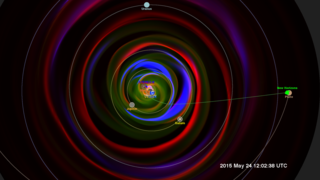
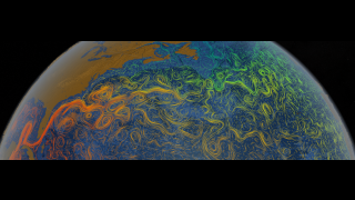
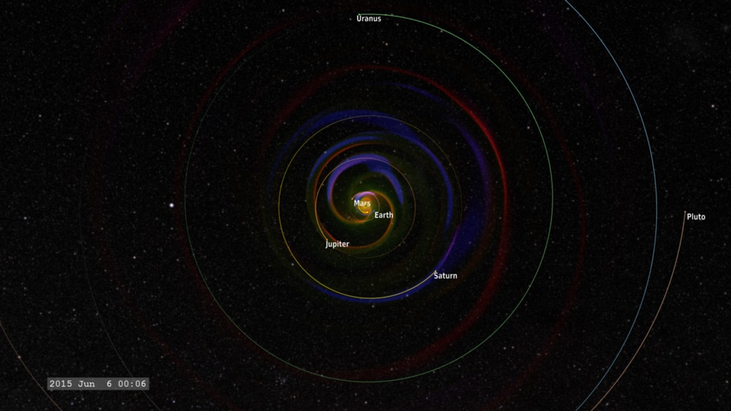
This visualization presents a slice of the data through the ecliptic plane, the plane in which the planets of our solar system orbit. Because Pluto is a bit above this plane, the orbit is projected into the ecliptic plane of the data.
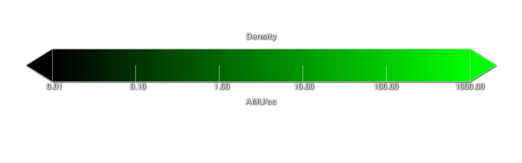
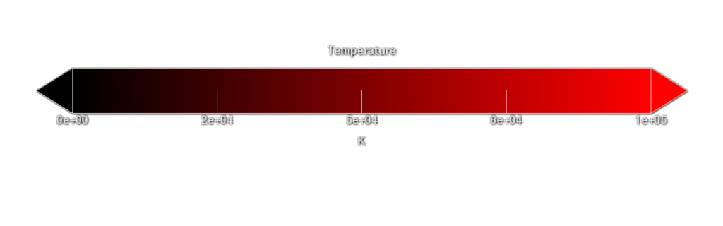
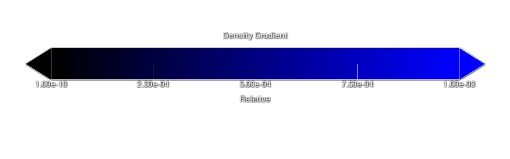
Three different variables are presented from the model - temperature, density, and pressure gradient, simultaneously, using the red, green and blue color channels of the color image. The density of the solar wind (green) flowing outward from the sun decreases as it spreads out. The temperature stays roughly constant as the solar wind material spreads through the solar system. We see the Parker spiral imprinted on the outflow from the spinning sun, much like the outflow from a spinning water sprinkler. We also see the strong density gradients (blue) created by coronal mass ejections and other shocks, propagating outward from the sun in the solar wind.
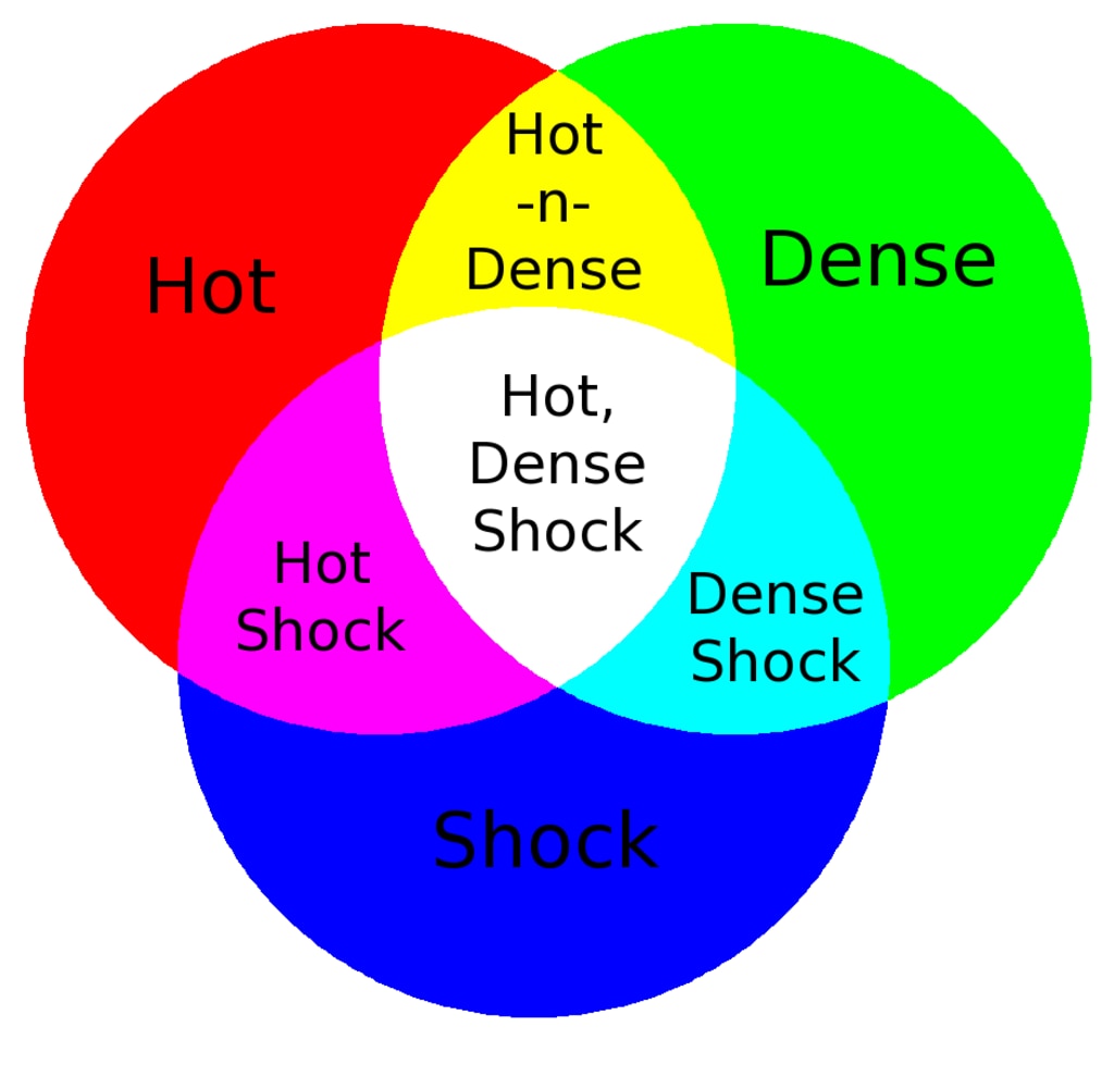
We can observe regions of interesting interactions when the three primary colors of the basic variables combine to enhance the color, represented in the tricolor diagram below. White represents a hot, dense shock, while cyan (blue-green) represents a dense shock (usually visible close to the sun), magenta (purple) represents a hot, low-density shock, while yellow indicates hot and dense material, again usually close to the sun.
Space Weather to the Edge of the Solar System - Revisited
This visualization presents a slice of the data through the ecliptic plane, the plane in which the planets of our solar system orbit. Because Pluto is a bit above this plane, the orbit is projected into the ecliptic plane of the data.
Three different variables are presented from the model - temperature, density, and pressure gradient, simultaneously, using the red, green and blue color channels of the color image. The density of the solar wind (green) flowing outward from the sun decreases as it spreads out. The temperature stays roughly constant as the solar wind material spreads through the solar system. We see the Parker spiral imprinted on the outflow from the spinning sun, much like the outflow from a spinning water sprinkler. We also see the strong density gradients (blue) created by coronal mass ejections and other shocks, propagating outward from the sun in the solar wind.
We can observe regions of interesting interactions when the three primary colors of the basic variables combine to enhance the color, represented in the tricolor diagram below. White represents a hot, dense shock, while cyan (blue-green) represents a dense shock (usually visible close to the sun), magenta (purple) represents a hot, low-density shock, while yellow indicates hot and dense material, again usually close to the sun.
Related
Visualization Credits
Tom Bridgman (Global Science and Technology, Inc.): Lead Visualizer
M. Leila Mays (Catholic University of America): Lead Scientist
Genna Duberstein (USRA): Producer
Laurence Schuler (ADNET Systems, Inc.): Technical Support
Ian Jones (ADNET Systems, Inc.): Technical Support
M. Leila Mays (Catholic University of America): Lead Scientist
Genna Duberstein (USRA): Producer
Laurence Schuler (ADNET Systems, Inc.): Technical Support
Ian Jones (ADNET Systems, Inc.): Technical Support
Please give credit for this item to:
NASA's Scientific Visualization Studio
NASA's Scientific Visualization Studio
Short URL to share this page:
https://svs.gsfc.nasa.gov/4680
Data Used:
Note: While we identify the data sets used in these visualizations, we do not store any further details nor the data sets themselves on our site.
Keywords:
SVS >> Solar Wind
SVS >> Space Weather
SVS >> Hyperwall
SVS >> SDO
SVS >> Heliophysics
SVS >> Corona
NASA Science >> Sun
https://svs.gsfc.nasa.gov/4680
Data Used:
Enlil Heliospheric Model also referred to as: Enlil Heliospheric Model
Model - Community Coordinated Modeling Center (CCMC) - 2015-02-01T00:03:37 - 2015-08-31T21:04:36
MHD solar wind simulation
SPICE Ephemerides also referred to as: SPICE Ephemerides
Ephemeris - NASA/JPL
Satellite and planetary ephemerides
Keywords:
SVS >> Solar Wind
SVS >> Space Weather
SVS >> Hyperwall
SVS >> SDO
SVS >> Heliophysics
SVS >> Corona
NASA Science >> Sun