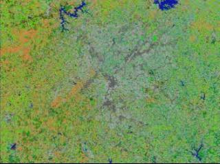
Atlanta Heat Island: Slower Flyover, Yellow TIR Data
A animation showing the correlation between thermal and visible Landsat data of the Atlanta Heat Island

Correlated thermal and land use data of the region around Atlanta as measured by LAndsat, where the top image is thermal data and the bottom is land use.

Thermal data of the region around Atlanta as measured by Landsat, where red represents the hottest regions.
For More Information
Credits
Please give credit for this item to:
NASA/Goddard Space Flight Center
Scientific Visualization Studio
-
Animator
- Jesse Allen (Raytheon)
-
Scientist
- Chor-Pang Lo (University of Georgia)
Release date
This page was originally published on Friday, April 9, 1999.
This page was last updated on Wednesday, May 3, 2023 at 1:59 PM EDT.
Missions
This visualization is related to the following missions:Series
This visualization can be found in the following series:Datasets used in this visualization
-
[Landsat-5: TM]
ID: 53
Note: While we identify the data sets used in these visualizations, we do not store any further details, nor the data sets themselves on our site.
