Terrestrial Atmosphere ITM (Ionosphere, Thermosphere, Mesosphere) Processes

Large image version
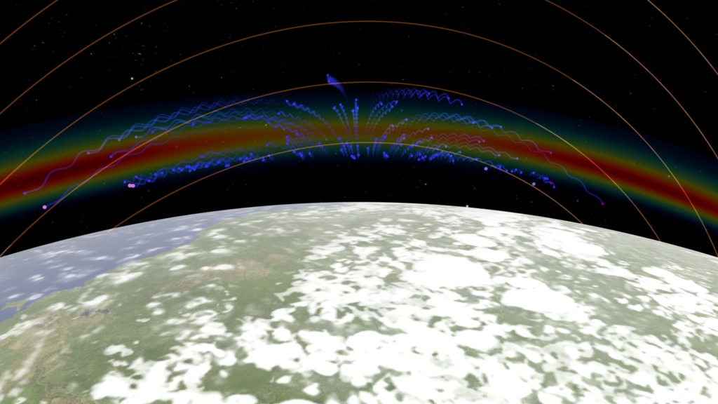
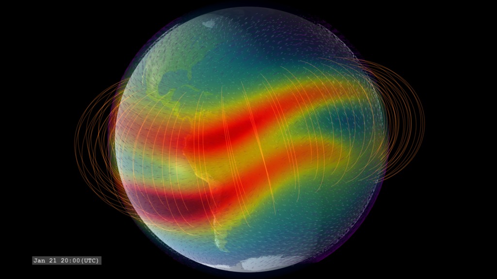
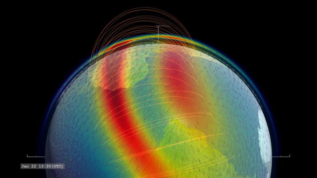
This graphic presents an overview of the physical processes that have been identified in Earth's upper atmosphere.
Credits
Please give credit for this item to:
NASA's Scientific Visualization Studio
-
Multimedia designer
- Mary P. Hrybyk-Keith (TRAX International)
Series
This page can be found in the following series:Related
- ID: 4617
 Visualization
 - ID: 4539
 Visualization
 - ID: 4540
 Visualization
 - ID: 4504
 Visualization
Release date
This page was originally published on Thursday, May 3, 2018.
This page was last updated on Wednesday, May 3, 2023 at 1:46 PM EDT.