Weekly Animation of Arctic Sea Ice Age with Two Graphs: 1984 - 2016
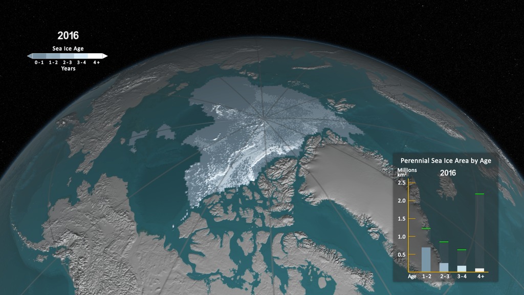
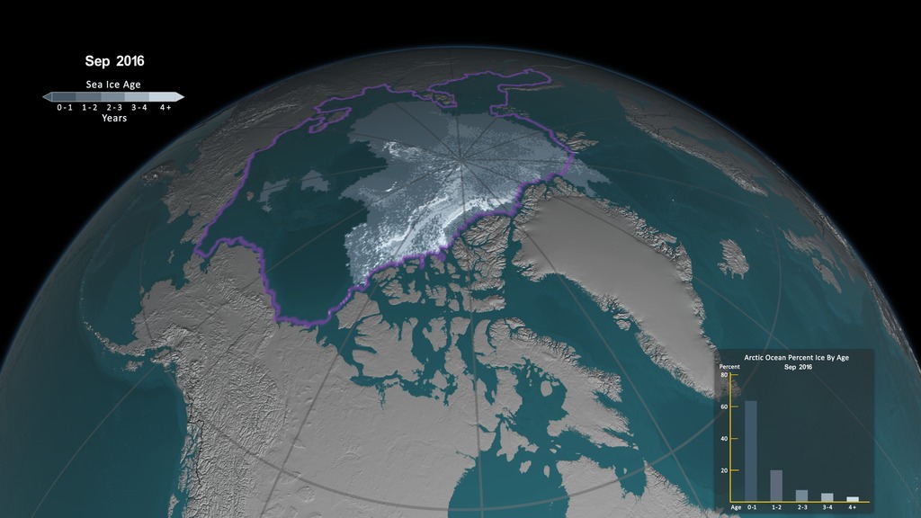
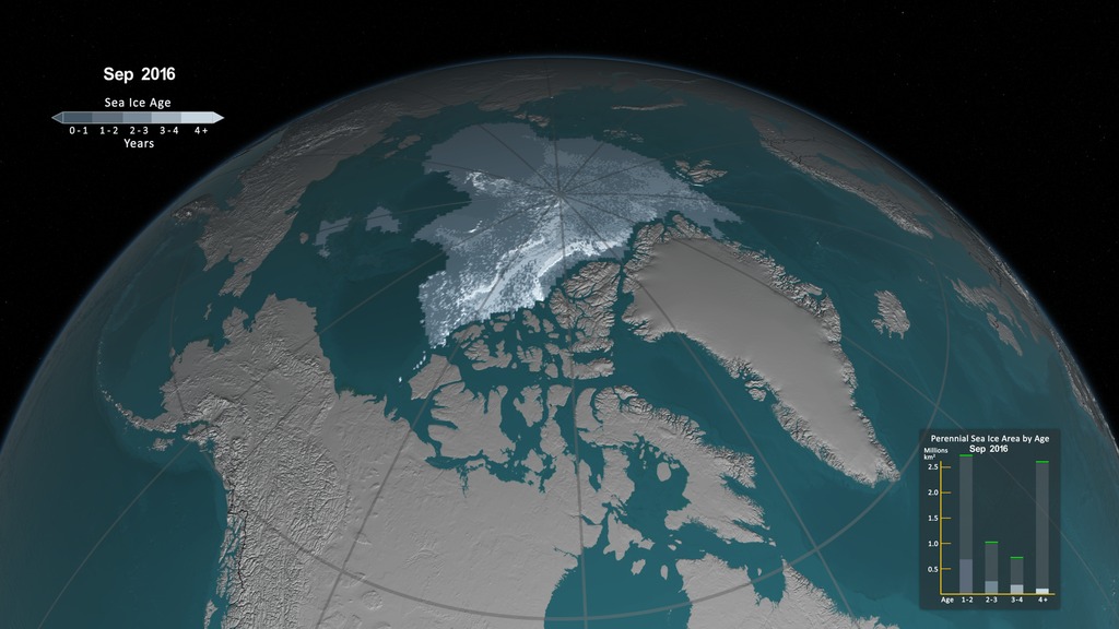
This visualization shows the age of the sea ice between 1984 and 2016. Younger sea ice, or first-year ice, is shown in a dark shade of blue while the ice that is four years old or older is shown as white. Two bar graphs, described below, are shown in the lower left and right corners.
This video is also available on our YouTube channel.
One significant change in the Arctic region in recent years has been the rapid decline in perennial sea ice. Perennial sea ice, also known as multi-year ice, is the portion of the sea ice that survives the summer melt season. Perennial ice may have a life-span of nine years or more and represents the thickest component of the sea ice; perennial ice can grow up to four meters thick. By contrast, first year ice that grows during a single winter is generally at most two meters thick.
Below is an animation of the weekly sea ice age between 1984 and 2016. The animation shows the seasonal variability of the ice, growing in the Arctic winter and melting in the summer. In addition, this also shows the changes from year to year, depicting the age of the sea ice in different colors. Younger sea ice, or first-year ice, is shown in a dark shade of blue while the ice that is four years old or older is shown as white. A color scale identifies the age of the intermediary years.
A graph in the lower, right corner the quantifies the change over time by showing the area in millions of square kilometers covered by each age category of perennial sea ice. This graph also includes a memory bar - the green line that here represents the current maximum value seen thus far in the animation for the particular week displayed. For example, when showing the first week in September, the memory bar will show the maximum value seen for all prior years' first week of September since the beginning of the animation (January 1, 1984).
A graph in the lower, left corner the quantifies the change over time by showing each age category of sea ice as a percent of total ice cover in the Arctic Ocean. The lavender outline on the map indicates the spatial region covered by the Arctic Ocean and thus included in the graph.
This visualization shows the age of the sea ice between 1984 and 2016. Younger sea ice, or first-year ice, is shown in a dark shade of blue while the ice that is four years old or older is shown as white. The colorbar is displayed in the upper left corner along with the current month and year.
The weekly sea ice age without the any overlay.

The overlay that includes both graphs, the date, colorbar and outline of the Arctic Ocean with transparency.
Credits
Please give credit for this item to:
NASA's Scientific Visualization Studio
Special thanks to:
Mark Tschudi, Univ. of Colorado, for providing the data. For more information, click here.
-
Visualizer
-
Cindy Starr
(Global Science and Technology, Inc.)

-
Cindy Starr
(Global Science and Technology, Inc.)
-
Scientists
- Walt Meier (NASA/GSFC)
- Nathan T. Kurtz (NASA/GSFC)
-
Producer
- Jefferson Beck (USRA)
-
Project support
- Joycelyn Thomson Jones (NASA/GSFC)
- Leann Johnson (Global Science and Technology, Inc.)
-
Technical support
- Laurence Schuler (ADNET Systems, Inc.)
- Ian Jones (ADNET Systems, Inc.)
Datasets used
-
Weekly Sea Ice Age
ID: 940SSMI-SSMIS passive microwave data, augmented with buoys, AVHRR, AMSR-E, and winds
See all pages that use this dataset
Note: While we identify the data sets used on this page, we do not store any further details, nor the data sets themselves on our site.
Related
- ID: 4750

- ID: 4489
Alternate Versions
- ID: 4616
 Visualization
 - ID: 4509
- ID: 4510
Release date
This page was originally published on Thursday, November 10, 2016.
This page was last updated on Sunday, February 2, 2025 at 12:09 AM EST.