A newer version of this visualization is available.
GPM Monitors Hurricane Matthew Nearing Florida
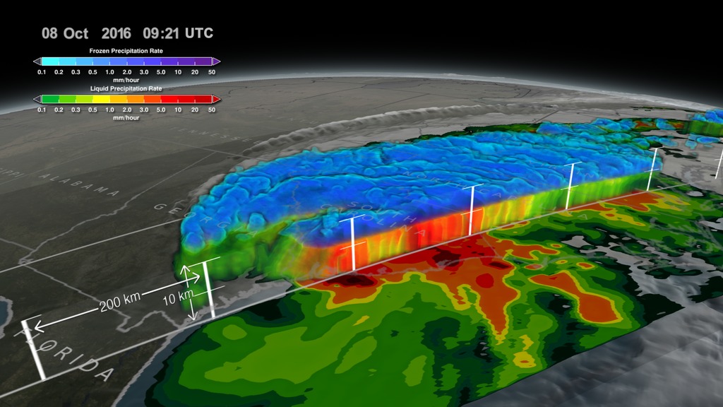
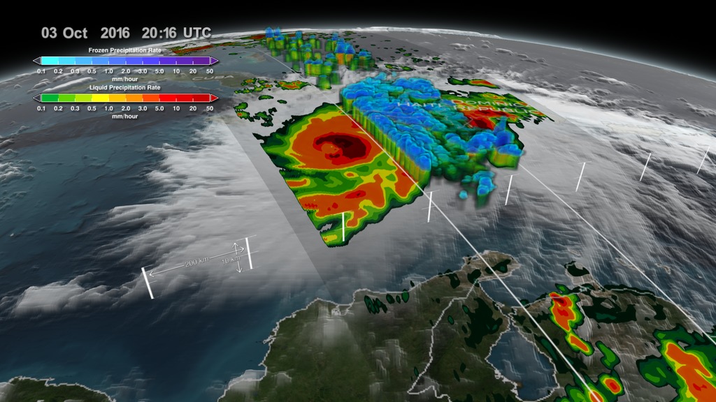
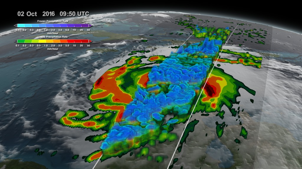
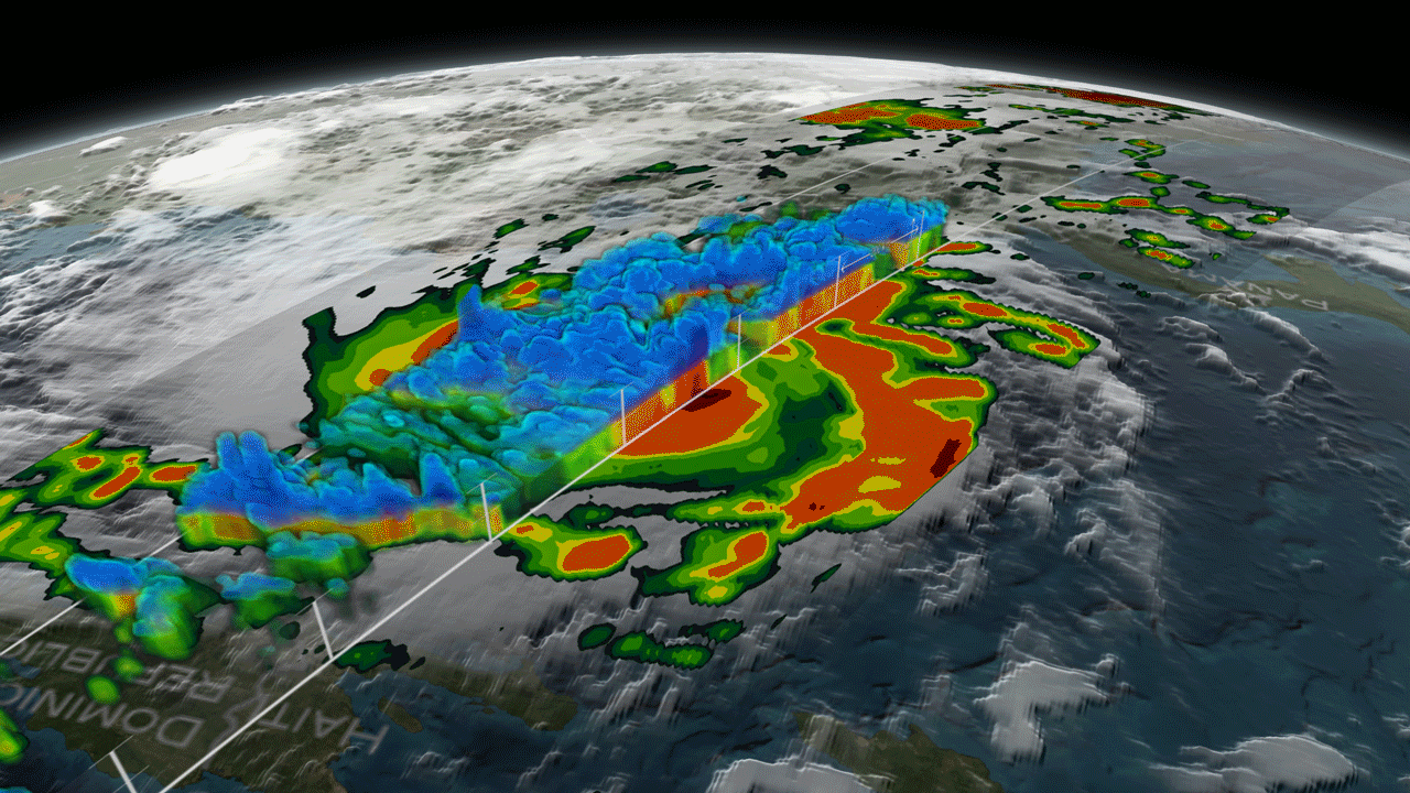
This data visualization resumes where the visualization "GPM Captures Hurricane Matthew Over Haiti" leaves off. After dissolving away GPM's DPR and GPROF data over Haiti on October 3rd, 2016, we follow Matthew to October 4th as the eye makes landfall over Haiti. GPM's GPROF sweeps in to show the tremendous amounts of rainfall throughout Haiti. We then move forward in time to October 6th as Matthew approaches Florida. Another GPM GPROF swath shows how close the outer bands of precipitation are to the Florida coast. Finally, we move a little further into the same day revealing the massive amounts of rainfall being produced by this storm as it begins to impact Florida.
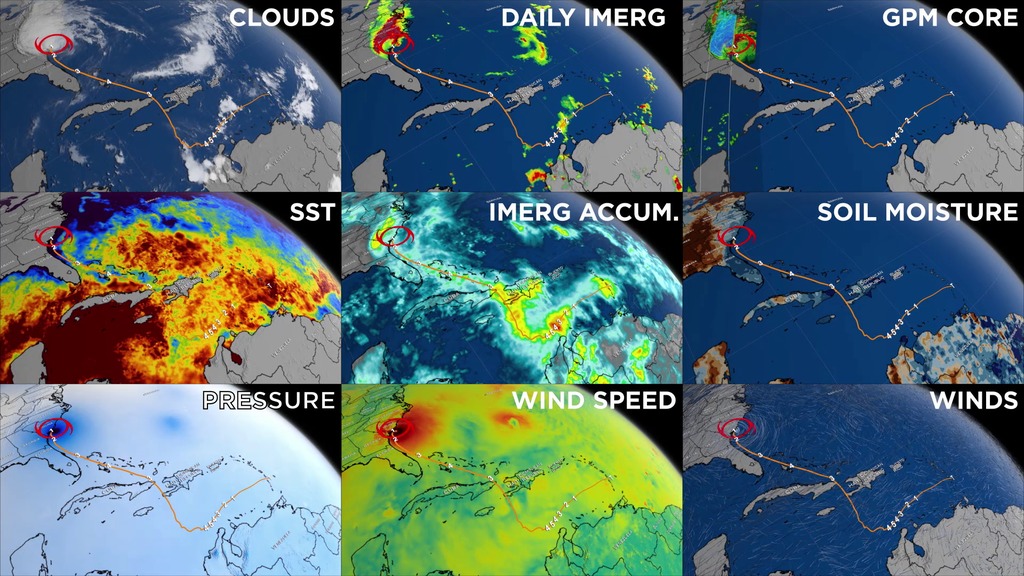
NASA's Global Precipitation Measurement mission or GPM core observatory satellite flew over Hurricane Matthew several times as the category 4 storm headed toward Florida.
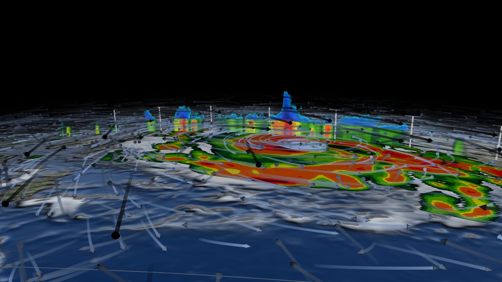
The GPM Core Observatory carries two instruments that show the location and intensity of rain and snow, which defines a crucial part of the storm structure – and how it will behave. The GPM Microwave Imager sees through the tops of clouds to observe how much and where precipitation occurs, and the Dual-frequency Precipitation Radar observes precise details of precipitation in 3-dimensions.
GPM data is part of the toolbox of satellite data used by forecasters and scientists to understand how storms behave. GPM is a joint mission between NASA and the Japan Aerospace Exploration Agency. Current and future data sets are available with free registration to users from NASA Goddard's Precipitation Processing Center website.
This visualization is the same as above except without colorbars and dates overlayed. (Useful for broadcasters who wish to organize the annotation layout differently.)
. Shades of cyan represent low amounts of frozen precipitation, whereas shades of purple represent high amounts of precipitation.")
Color bar for frozen precipitation rates (ie, snow rates). Shades of cyan represent low amounts of frozen precipitation, whereas shades of purple represent high amounts of precipitation.
Color bar for liquid precipitation rates (ie, rain rates). Shades of green represent low amounts of liquid precipitation, whereas shades of red represent high amounts of precipitation.
Credits
Please give credit for this item to:
NASA's Scientific Visualization Studio Data provided by the joint NASA/JAXA GPM mission.
-
Animator
-
Alex Kekesi
(Global Science and Technology, Inc.)

-
Alex Kekesi
(Global Science and Technology, Inc.)
-
Producer
- Ryan Fitzgibbons (USRA)
-
Scientists
- Gail Skofronick Jackson (NASA/GSFC)
- Dalia B Kirschbaum (NASA/GSFC)
-
George Huffman
(NASA/GSFC)
-
Technical support
- Laurence Schuler (ADNET Systems, Inc.)
- Ian Jones (ADNET Systems, Inc.)
Missions
This page is related to the following missions:Series
This page can be found in the following series:Datasets used
-
[GOES: IR4]
ID: 33 -
Rain Rates (Surface Precipitation) [GPM: GMI]
ID: 822Credit: Data provided by the joint NASA/JAXA GPM mission.
See all pages that use this dataset -
Volumetric Precipitation data (Ku) [GPM: DPR]
ID: 830Credit: Data provided by the joint NASA/JAXA GPM mission.
See all pages that use this dataset
Note: While we identify the data sets used on this page, we do not store any further details, nor the data sets themselves on our site.
Related
- ID: 5361
 Visualization
 - ID: 4575
 Visualization
 - ID: 4543
 Visualization
 - ID: 4548
 Visualization
Newer Versions
- ID: 4512
 Visualization
Older Versions
- ID: 4508
 Visualization
 - ID: 4507
 Visualization
Used as a Source In
- ID: 12195
![Music credit: 'Cellular Signals' by Laurent Levesque [SACEM] from Killer TracksComplete transcript available.Watch this video on the NASA Goddard YouTube channel.](/vis/a010000/a012100/a012195/LARGE_MP4-12195_EPOCH_Hurricanes2_large.00151_print.jpg) Produced Video
Produced Video - ID: 12635
 Produced Video
 - ID: 12391
 Produced Video
 - ID: 12389
 Produced Video
Release date
This page was originally published on Thursday, October 6, 2016.
This page was last updated on Sunday, February 2, 2025 at 12:08 AM EST.