Beyond Graphs: You, Too, Can Be A Data Visualizer!
This gallery was created for Earth Science Week 2015 and beyond. It includes a quick start guide for educators and first-hand stories (blogs) for learners of all ages by NASA visualizers, scientists and educators. We hope that your understanding and use of NASA's visualizations will only increase as your appreciation grows for the beauty of the science they portray, and the communicative power they hold. Read all the blogs and find educational resources for all ages at: the Earth Science Week 2015 page.
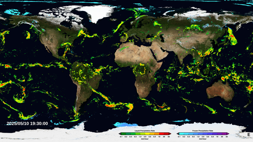
As an education specialist for NASA, I help teachers and students access and make sense of data. This often means using a type of visual representation. This could be anything from a simple bar graph to a complex animated visualization. Take a look at the last seven days of global precipitation, or other great examples relating to Visualizing Earth Systems here. While the complex animations may be difficult to replicate, a line or bar graph is just the beginning.
I work for the Global Precipitation Measurement (GPM) mission, so let's use snow data for an example. This data is from a big snowstorm that hit upstate New York in November 2014. While the GPM satellite does measure snowfall, we'll start with data collected by "citizen scientists." Citizen science is research conducted by non-professional scientists — which could include you! These particular citizen scientists are part of the Community Collaborative Rain, Hail and Snow Network (CoCoRaHS.)
The data below is from one station, graphed using Microsoft Excel. It shows snow accumulation in inches at the location of one monitoring station over four days. (Note: CoCoRaHS reports are made in the morning reflecting the previous 24 hours of precipitation. The dates below show snow that fell the day and night prior.)

Graph of snow accumulation at a particular CoCoRaHS station in upstate New York in November 2014.
We can see on which day the most snow fell, as well as cumulative snowfall (snow built up over time.) But we can’t see what’s happening in the area around this station. This could be really interesting. What kind of visualization can show us this information? Maps!
I'm sure many of you have used Google Maps to look up directions. For example, deciding on the closest place to eat. But how many of you realize you can also use Google Maps to display datasets? To do this, you need to use the "My Maps" feature, upload your data layers, and play around with color and style settings. Here's what the results might look like for the snowstorm data. (Explore the full map.)

Google Maps rendering of CoCoRaHS data in upstate New York in November 2014.
Now we can see snowfall levels across the region. Notice that areas closest to the lake (around NY-ER-96, circled in white) accumulated the most snow in the three days. This is explained by the lake effect snow phenomenon.
What we've looked at so far are ground observations. Let's also take a look at satellite data. NASA satellite data is available from many sources and there are options to create your own visualizations. MY NASA DATA (MND) allows you to explore NASA satellite data and create charts, plots and graphs using a web-based data visualization and analysis tool, the Live Access Server (LAS). For example, we can view average precipitation measurements from the Tropical Rainfall Measuring Mission that operated from 1997 until 2015, as well as historical data going back as far as 1979.
If you want more current precipitation data, another good option is the Giovanni visualization system. You can see time series for a particular location, area-averaged maps, or even animations of the data over time. For example, see the map below with data about accumulated rainfall from the Integrated Multi-satelitE Retrievals for GPM (or IMERG) algorithm.

Accumulated rainfall from the IMERG algorithm over November 16, 2014 to November 19, 2014.
The map above covers the same time period in November as we've been discussing. Look just east of the end of Lake Erie — you can see the same elevated amounts of precipitation compared to the surrounding area as we observed in the ground data.
As you determine the best way to visualize your data, think about the story you want to tell. If geography and location are important, a map will express the story more clearly than just a graph. I've always loved maps for the way they put the world in perspective, and help you learn about a new place or a new aspect of a familiar place. We've moved far beyond the paper road maps I used to draw on to track family car trips, a very simple form of visualizing the data about where we'd been. Now we can create neat digital maps and overlay data about so many things — precipitation is just one example — which makes the spark to imagination and understanding that much stronger. With that in mind, I encourage you to explore maps and data visualizations that move beyond the bar graph!
-- Kristen Weaver, Education Specialist (NASA’s Global Precipitation Measurement (GPM) Mission)

Kristen Weaver taught middle school science for eight years, with a primary focus in Earth Science. She has a graduate degree in Education and undergraduate studies in Computer Science and Psychology. Since attending Space Camp in 6th grade, Kristen has always wanted to be an astronaut. Even though her life took a different path, she still ended up working for a NASA satellite mission, showing how things can work out in unexpected and wonderful ways!
For More Information
Credits
Please give credit for this item to:
NASA's Scientific Visualization Studio
-
Author
- Kristen L. Weaver (USRA)
-
Project support
- Leann Johnson (Global Science and Technology, Inc.)
Related
- ID: 4285
Release date
This page was originally published on Friday, October 9, 2015.
This page was last updated on Wednesday, November 15, 2017 at 1:46 PM EST.