Garbage Patch Visualization Experiment
This gallery was created for Earth Science Week 2015 and beyond. It includes a quick start guide for educators and first-hand stories (blogs) for learners of all ages by NASA visualizers, scientists and educators. We hope that your understanding and use of NASA's visualizations will only increase as your appreciation grows for the beauty of the science they portray, and the communicative power they hold. Read all the blogs and find educational resources for all ages at: the Earth Science Week 2015 page.
You may have heard of "ocean garbage patches," areas in the ocean where litter and debris concentrates. This might stir up a vivid image of large blanketed areas of trash on the ocean surface that are easy to spot. But that’s not the case. Much of the debris consists of smaller pieces of plastic that are always moving and changing with the ocean currents, waves and winds. These can be difficult to see and predict. We set out to explore the processes and interactions that cause debris to flow to these patches using buoy and model data, and created a visualization based on our results.
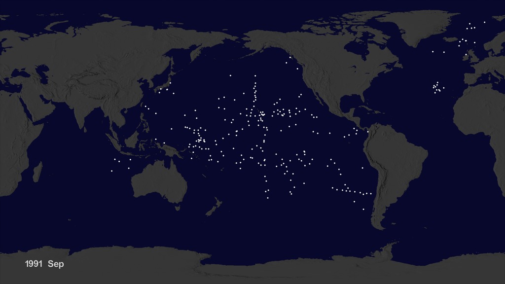
The final visualization that assimilates ocean buoy datasets and ECCO-2 ocean current model. (Credit: Greg Shirah and Horace Mitchell, NASA SVS)
We started with data from floating, scientific buoys that NOAA has been distributing in the oceans for the last 35-years, represented in our visualization as white dots. These buoys are used to track currents, temperature and salinity, and all of this data is publicly available.
In the visualization, we can speed up time to see where the buoys travelled. But because new buoys are continually released, it was hard to see where the older buoys moved. Once we cleared the map and added the starting locations of all the buoys we started to pick up on interesting patterns all over world. For example, lines of buoys began to appear along shipping and plane routes because these were the vessels used to periodically release buoys.
The next step was to shift the timing of each buoy data set to release the buoys all at the same time to observe buoy migration patterns. You’ll notice that the number of buoys shown decreases over time, because some buoys don't last as long as others (they either wash up on the shores of coastlines, disintegrate, sink, experience technical failure etc.) When projected onto the same visualization, we noticed that the buoys migrated to five known gyres, or locations that some call the ‘ocean garbage patches,’ where debris or litter accumulate in certain pockets of the ocean.
We can also see this pattern in a computer model of ocean currents called ECCO-2. We released simulated particles evenly around the world, letting the modeled currents carry the particles. The particles from the model also migrate to the same five ocean garbage patches as the NOAA buoys. Even though the retimed buoys and modeled particles did not react to currents at the same times, the fact that the data tends to accumulate in the same regions helps validate the result.
-- Greg Shirah, Development Lead – Earth Science-Related Visualizations (NASA GSFC Scientific Visualization Studio)

Greg Shirah works closely with scientists from NASA Goddard and other organizations in visualizing the data from satellites, other observational platforms, and supercomputer simulations. His work powerfully communicates changes in our planet's atmosphere, oceans, and land to an audience ranging from scientists to schoolchildren. Shirah's work has been shown on every major television network, in newspapers, magazines, the web, Science On a Sphere, planetariums, and even in a few motion pictures! It's been estimated that over one billion people have seen his visuals.
For More Information
See the following sources:
Credits
Please give credit for this item to:
NASA's Scientific Visualization Studio
-
Author
-
Greg Shirah
(NASA/GSFC)

-
Greg Shirah
(NASA/GSFC)
-
Project support
- Leann Johnson (Global Science and Technology, Inc.)
Related
- ID: 4174
 Visualization
Release date
This page was originally published on Friday, October 2, 2015.
This page was last updated on Wednesday, May 3, 2023 at 1:49 PM EDT.