Dust in the Wind
This gallery was created for Earth Science Week 2015 and beyond. It includes a quick start guide for educators and first-hand stories (blogs) for learners of all ages by NASA visualizers, scientists and educators. We hope that your understanding and use of NASA's visualizations will only increase as your appreciation grows for the beauty of the science they portray, and the communicative power they hold. Read all the blogs and find educational resources for all ages at: the Earth Science Week 2015 page.
Each year, millions of tons of dust from the Sahara Desert in Africa is swept up into the atmosphere. The dust travels across the Atlantic Ocean, with some of it reaching as far as the Amazon Rainforest. African dust contains phosphorus, which is an important nutrient for plants, so each year the Amazon Rainforest is fertilized by dust blown all the way from Africa! We created this data visualization to tell the incredible story of this great migration.
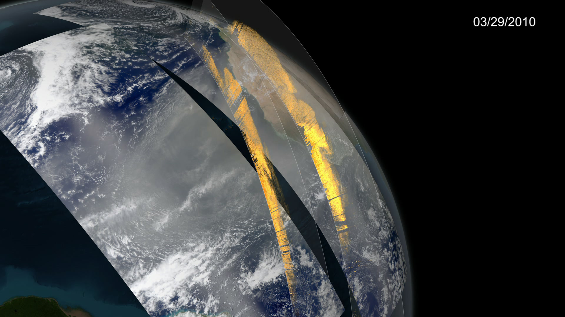
To create this visualization, I used data from NASA’s CALIPSO satellite, which measures aerosols in the atmosphere. Using Autodesk Maya and Pixar’s Renderman software (the same software Pixar uses to make movies), I created a virtual Earth with vertical walls for each time the CALIPSO satellite passed over the dust cloud. Each wall has a picture (we call them "textures") that represents the data collected by the satellite at that location. Each wall slices through the dust cloud, and shows us a cross-sectional view of dust distribution in the atmosphere.
Although dust clouds can be seen in satellite imagery as hazy brown sections, it’s hard to determine their altitude. Knowing the height at which dust travels will help scientists determine where the dust will go, how it moves at different altitudes and how it will interact with the Earth’s climate. CALIPSO allows scientists to clearly see the shape of a dust cloud in three dimensions.
The second section of the visualization describes dust flux, or how much dust flows through a specific region over a period of time. To visualize flux, I used a particle system in Autodesk Maya that creates particles at a rate and velocity relative to the flux value for a region at each time step. As the flux value increases, additional particles are created and they move faster. As flux goes down, fewer particles are created and they move slower. The result is a particle cloud that changes shape with the seasons as flux values go up and down.
The dust migration is shown visualizing dust distribution on vertical walls that slice through the atmosphere. For more information, click here.
What is the most challenging part of creating scientific visualizations?
The greatest challenge to creating a scientific visualization is finding the right balance between visuals that are technically accurate, and are easy to understand. A really good visualization is one that ANYONE can look at, both scientists and non-scientists, and come away with the same appreciation and understanding. That being said, this is also my favorite part of the job!
Everyday at NASA, I get to work with satellite data to determine the best way to share that data with others. The goal is to create a visualization that is both accurate and compelling to look at. I love this challenge because it’s both technical and artistic. We try our best to use common artistic principles of color, composition, and storytelling when communicating technical data. I sometimes use the term ‘technical artist’ because we combine our skills in visual arts and storytelling with our technical backgrounds to communicate science. It’s a fantastic role for anyone interested in both art and science/engineering!
-- Kel Elkins , Visualizer (NASA GSFC Scientific Visualization Studio)
 Kel lives in Baltimore and enjoys playing guitar, travelling, and playing in the Goddard Soccer League (Go Purple!)")
Kel Elkins creates technically accurate visualizations using data from NASA missions. He holds degrees in Rocket Science and Video Games (better known as Aerospace Engineering and Computer Graphics and Game Technology.) Kel lives in Baltimore and enjoys playing guitar, travelling, and playing in the Goddard Soccer League (Go Purple!)
For More Information
Credits
Please give credit for this item to:
NASA's Scientific Visualization Studio
-
Visualizer
-
Kel Elkins
(USRA)

-
Kel Elkins
(USRA)
-
Author
-
Kel Elkins
(USRA)
-
Kel Elkins
(USRA)
-
Project support
- Leann Johnson (Global Science and Technology, Inc.)
Related
- ID: 4273
Release date
This page was originally published on Monday, September 28, 2015.
This page was last updated on Wednesday, October 9, 2024 at 6:20 PM EDT.