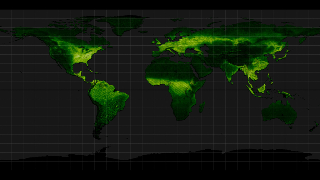
Fluorescence Visualizations in High-Resolution (Comparison to NDVI)
During photosynthesis, plants fluoresce. This faint glow is in the infrared part of the spectrum, not visible to the naked eye but detectable by satellites orbiting hundreds of miles above Earth. NASA scientists established a method to turn this satellite data into global maps of the subtle phenomenon in more detail than ever before.
The new maps, released in 2013, provide a 16-fold increase in spatial resolution and a 3-fold increase in temporal resolution over the first proof-of-concept maps released in 2011. This lets scientists use fluorescence to observe, for example, variation in the length of the growing season.
These visualizations of the phenomenon shows global land plant fluorescence data collected from 2007 to 2011, combined to depict a single average year. Darker greens indicates regions with little or no fluorescence; lighter greens and white indicate regions of high fluorescence.
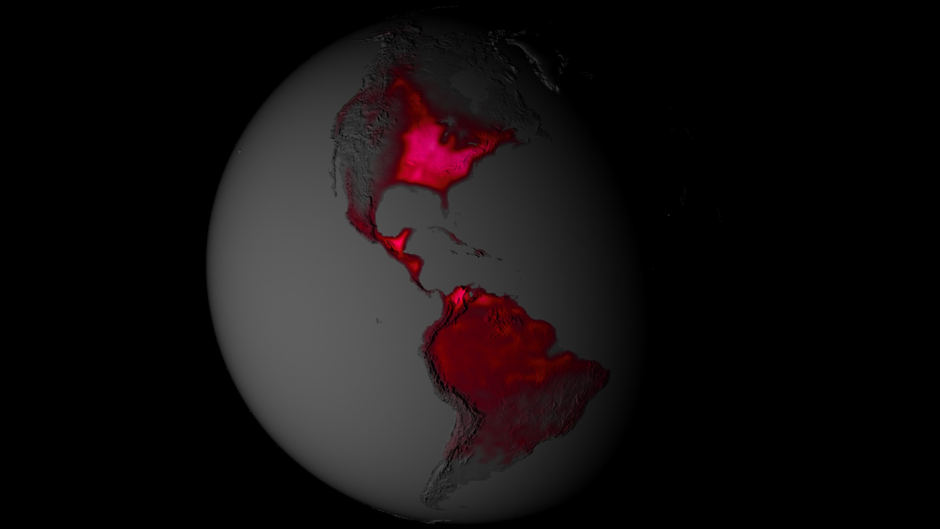
Fluorescence and Normalized Difference Vegetation Index (NDVI) are compared. A visualization is provided comparing the northern hemisphere of both data sets. Individual visualizations are also provided in a standard cylindrical equidistant projection for wrapping to a globe. The same color bars are used for both data sets for easier comparison.
Comparison of fluorescence data (top) to NDVI data (bottom)
Cylindrical equidistant projection of fluorescence data (each frame is one day starting January 1)
Cylindrical equidistant projection of NDVI data (each frame is one day starting January 1).
 with a range from 0 to 6")
Fluorescence color bar (black -> dark green -> light green -> white) with a range from 0 to 6
 with a range from 0 to 0.85")
NDVI color bar (black -> dark green -> light green -> white) with a range from 0 to 0.85
Credits
Please give credit for this item to:
NASA's Goddard Space Flight Center Scientific Visualization Studio
-
Animator
-
Greg Shirah
(NASA/GSFC)

-
Greg Shirah
(NASA/GSFC)
-
Producer
- Kayvon Sharghi (USRA)
-
Scientist
- Joanna Joiner (NASA/GSFC)
-
Writer
- Kathryn Hansen (Wyle Information Systems)
Series
This page can be found in the following series:Datasets used
-
GOME-2 Solar Induced Fluorescence at 740 nm [MetOp: GOME-2]
ID: 792
Note: While we identify the data sets used on this page, we do not store any further details, nor the data sets themselves on our site.
Related
- ID: 11420
 Produced Video
 - ID: 4086
 Visualization
Release date
This page was originally published on Friday, November 8, 2013.
This page was last updated on Wednesday, October 9, 2024 at 12:03 AM EDT.