How Much Carbon do Plants Take from the Atmosphere?
Plant life converts atmospheric carbon dioxide into biomass through photosynthesis, a process called 'fixing'. This is one of the main ways in which carbon dioxide is removed from the atmosphere and is a major part of the carbon cycle. The amount of carbon removed is called the gross primary productivity (GPP), and the change in GPP due to rising global temperatures is very important factor in the response of the Earth to climate change.
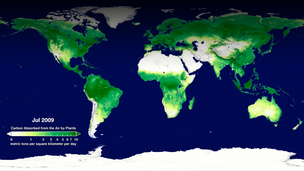
Data from the MODIS instrument on NASA's Terra satellite has been recently used to calculate the GPP for the whole world for the last 10 years. This animation shows a time sequence of GPP on land as measured by MODIS during the years 2000 through 2009. Two things to note are the year-long productivity of the tropical regions and the large seasonal productivity in the northern hemisphere. A close look at the animation also reveals major urban areas for which the productivity is negligible.
For a look at why the decade from 2000 through 2009 meant lower productivity, see the page 'How has the Atmospheric Carbon Uptake from Plants Changed in the Last Decade?'
The gross primary productivity of the world's land areas for the period 2000-2009 as calculated from Terra's MODIS instrument. The original 8-day average GPP data has been smoothed to a 24-day average to make the animation less noisy.
This product is available through our Web Map Service.
The gross primary productivity of the world's land areas for the period 2000-2009 as calculated from Terra's MODIS instrument. The original 8-day average GPP data has been smoothed to a 24-day average to make the animation less noisy. This version adds a date and colorbar to the animation.
This video is also available on our YouTube channel.
The gross primary productivity of Africa's southern land areas for the period 2000-2009 as calculated from Terra's MODIS instrument. The original 8-day average GPP data has been smoothed to a 24-day average to make the animation less noisy. This animation shows the full resolution of the 1-km dataset.
This product is available through our Web Map Service.
The gross primary productivity of Africa's southern land areas for the period 2000-2009 as calculated from Terra's MODIS instrument. The original 8-day average GPP data has been smoothed to a 24-day average to make the animation less noisy. This animation shows the full resolution of the 1-km dataset. This version adds a date and colorbar to the animation.

The colorbar legend for the gross primary productivity. This is the descriptive version of the colorbar.
The colorbar legend for the gross primary productivity. This is the scientific version of the colorbar.
Credits
Please give credit for this item to:
NASA/Goddard Space Flight Center Scientific Visualization Studio
Data was provided by Maosheng Zhao.
-
Animator
- Horace Mitchell (NASA/GSFC)
-
Producer
- Michelle Williams (UMBC)
-
Scientists
- Maosheng Zhao (University of Montana)
- Steven W Running (University of Montana)
Missions
This page is related to the following missions:Related papers
Zhao, M. and S. W. Running, 2010, Drought-induced reduction in global terrestrial net primary production from 2000 through 2009. Science, 329: 940-943.
Zhao, M. and S. W. Running, 2010, Drought-induced reduction in global terrestrial net primary production from 2000 through 2009. Science, 329: 940-943.
Datasets used
-
GTOPO30 Topography and Bathymetry
ID: 274 -
Leaf Area Index (FPAR/LAI) [Terra: MODIS]
ID: 697
Note: While we identify the data sets used on this page, we do not store any further details, nor the data sets themselves on our site.
Related
- ID: 3842
 Visualization
Release date
This page was originally published on Thursday, August 19, 2010.
This page was last updated on Sunday, February 2, 2025 at 10:02 PM EST.