GRACE Gravity Model
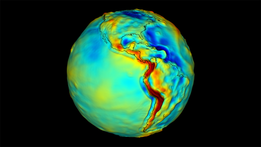
The following animation displays the Earth's gravitational anomalies. The colors and heights represent the strength of gravity at the locality. Areas with less mass, such as ocean basins, show up as blue, that is less gravity, while mountains such as the Andes are red, representing the greater pull of gravity. The visualization utilizes a version of the GRACE Gravity Model 02 that has been smoothed for greater readability.
Rotating globe with outlines of land masses.
Rotating globe without outlines of land masses.
Credits
Please give credit for this item to:
NASA/Goddard Space Flight Center Scientific Visualization Studio
-
Animator
- Adam Martin (UMBC)
-
Producer
- Paul Reddish (Free Spirit Films)
-
Scientists
- John C. Ries (University of Texas)
- Scott Luthcke (NASA/GSFC)
Missions
This page is related to the following missions:Datasets used
-
K-band Intersatellite Range Rate [Gravity Recovery and Climate Experiment (GRACE): KBR Horn]
ID: 598This dataset can be found at: http://www.nasa.gov/home/hqnews/2004/sep/HQ_04286_GRACE.html
See all pages that use this dataset
Note: While we identify the data sets used on this page, we do not store any further details, nor the data sets themselves on our site.
Related
- ID: 11234
 Produced Video
Release date
This page was originally published on Tuesday, November 24, 2009.
This page was last updated on Monday, July 15, 2024 at 12:00 AM EDT.