A newer version of this visualization is available.
Grand Tour of the Coronal Loops Model
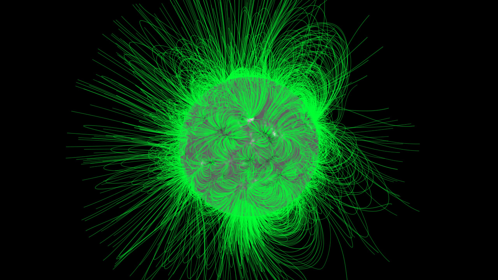
This is a longer coronal loops tour combining components of the two previous versions (Animation IDs 3286 and 3287). The solar model is constructed from magnetogram data collected by SOHO/MDI. Because we do not see the full solar surface at any one time, the magnetograms collected over the course of a solar rotation are processed through a time-evolving solar surface model which provides a snapshot of the surface at a fixed time. The resulting magnetogram is then processed through the Potential Field Source Surface (PFSS) model which constructs the magnetic field above the solar surface. The magnetic field around the Sun is then analyzed for field lines, which creates the loop structures we see in the model. Hot plasma tends to flow along the magnetic field lines, creating the coronal loops. These loops are only visible at the higher temperatures corresponding to ultraviolet light, in this case, 195 angstroms, one of the filter wavelengths of SOHO/EIT. For this version, we color the coronal loops green for ready comparison to the EIT 195 angstrom imagery using the EIT standard color table.
Starting with an animated view of SOHO/EIT data, we fade to a coronal loops model constructed from SOHO/MDI magnetogram data and the PFSS model. After a spin around the model, we zoom in for a 'through the loops' fly-through.
This is a stereographic version of the movie. Red/Cyan stereo glasses are required to view it properly. 

We open with a time-series of EIT/195 Ångstrom images. The ultraviolet corona has been extended beyond the EIT image using a power-law falloff function fitted to the data.
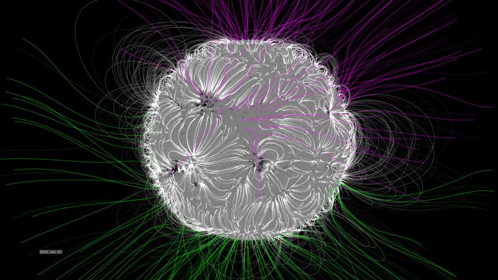
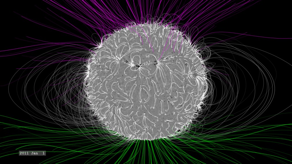
Next we fade out the EIT data to view the PFSS model and magnetogram.
We spin the solar model to observe the loop structures.
We move closer to the surface of the model, near a small sunspot where we see the dipole structure of the field lines and spot region.
We begin our flight through the loops, noting that the more prominent regions on the surface have a higher density of field lines.
We end the tour on completing the orbit.
Credits
Please give credit for this item to:
NASA/Goddard Space Flight Center Scientific Visualization Studio
-
Animator
- Tom Bridgman (Global Science and Technology, Inc.)
-
Scientists
- Michael Kaiser (NASA/GSFC)
- Therese Kucera (NASA/GSFC)
- Russ Howard (NRL)
- Don Michels (NRL)
- Marc L. DeRosa (LMSAL)
Missions
This page is related to the following missions:Series
This page can be found in the following series:Datasets used
-
PFSS (Magnetic Field Lines) [PFSS]
ID: 409This model generated from SOHO/MDI magnetograms through the SolarSoft package.
This dataset can be found at: http://sohowww.nascom.nasa.gov/solarsoft/
See all pages that use this dataset -
SOHO/EIT 195 (195 Filter) [SOHO: Extreme-UV Imaging Telescope (EIT)]
ID: 477This dataset can be found at: http://sohowww.nascom.nasa.gov
See all pages that use this dataset -
Magnetogram [SOHO: Michelson Doppler Interferometer (MDI)]
ID: 618This dataset can be found at: http://sohowww.nascom.nasa.gov
See all pages that use this dataset
Note: While we identify the data sets used on this page, we do not store any further details, nor the data sets themselves on our site.
Related
- ID: 11277
 Produced Video
Newer Versions
- ID: 4623
 Visualization
 - ID: 4391
 Visualization
Release date
This page was originally published on Thursday, March 30, 2006.
This page was last updated on Wednesday, May 3, 2023 at 1:55 PM EDT.