Earth: A System of Systems
- Visualizations by:
- Amy Moran
- View full credits
Movies
- R_beach_ball_flat_720p.mp4 (1280x720)
- R_beach_ball_flat_720p.webm (1280x720)
- beach_ball_noLabels_720p.mp4 (1280x720)
- R_beach_ball_flat_1080p.mp4 (1920x1080)
- beach_ball_noLabels_1080p.mp4 (1920x1080)
- R_beach_ball_flat_360p.mp4 (640x360)
- beachball_2304p.mp4 (4096x2304)
- beach_ball_noLabels_2304p.mp4 (4096x2304)
Images
- R_beach_ball_flat_1080p.00001_print.jpg (1024x576)
- R_beach_ball_flat_1080p.00001_thm.png (80x40)
- R_beach_ball_flat_1080p.00001_searchweb.png (320x180)
Frames
- frames/4104x2304_16x9_30p/cam_held/ (4104x2304)
Presentations
- earth_system_of_systems_30701.key
- earth_system_of_systems_30701.pptx
Right click movies to download them if they automatically play in your browser.
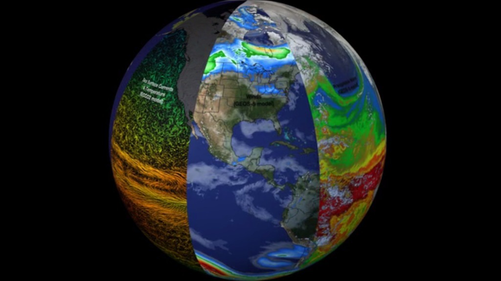
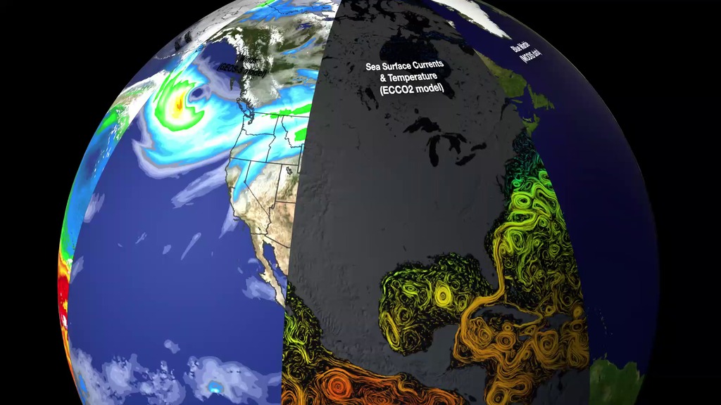
Slices of Earth observational and modeling data
List of visualizations used:
Slice 1: Sea Surface Currents & Temperature (ECCO2 model)
Slice 2: Winds (GEOS-5 model)
Slice 3: Precipitable Water (GEOS-5 model)
Slice 4: Clouds (GEOS-5 model)
Slice 5: Precipitation (IMERG data)
Slice 6: Soil Moisture (SMAP data)
Slice 7: Biosphere (Multiple satellite datasets)
Slice 8: Blue Marble (MODIS data)
Credits
Please give credit for this item to:
NASA's Goddard Space Flight Center
Animator
- Amy Moran (GST) [Lead]
Visualizer
- Marit Jentoft-Nilsen (None)
Missions
This visualization is related to the following missions:Related pages
Calling All Meteorologists! How NOAA Satellites Are Keeping an Eye on Extreme Spring Weather
March 19, 2020, 10 a.m.
Read moreGREENBELT, Md., Goddard Space Flight Center — If it feels like spring came early this year, it’s not your imagination. Thanks to the leap year, this is the earliest spring equinox since 1896 — more than 120 years ago. NOAA satellites, launched by NASA, can see signs of spring everywhere from the unique vantage point of space. From plants greening up to changes in our weather, NOAA satellites have you covered by continuously monitoring instant and long-term change.For 50 years, NOAA’s weather satellites have provided observations and imagery of storm systems, which helps forecasters monitor and assess a storm’s evolution. Orbiting Earth at different heights and paths, NOAA’s fleet of satellites gives us an important, comprehensive view of our planet. The Geostationary Operational Environmental Satellite (GOES) system is parked in an orbit over the equator and continuously tracks the same area. Meanwhile, the Joint Polar Satellite System (JPSS) is in a lower orbit, flying over the north and south poles to give us a constantly shifting global perspective. These satellites work in concert to provide imagery for monitoring a storm, and temperature and moisture data to be fed into the weather forecast models meteorologists use to develop the weather forecast you rely on every day.Follow us on Twitter for the latest information: @NOAASatellitesFor more check out the following links:www.goes-r.gov/www.jpss.noaa.gov/www.nesdis.noaa.gov/ Canned interview to be posted soon Canned interview with Kevin Fryar Canned interview in Spanish with Alfonso Delgado Bonal Social media video with Kevin Fryar Social media video with Alfonso Delgado Bonal For More InformationSee [https://www.goes-r.gov/](https://www.goes-r.gov/)
Earth Day 2019 Live Shots
April 15, 2019, 2 a.m.
Read moreCelebrate Earth Day With NASAUse the hashtag #PictureEarth and share the beauty of EarthWhen you think of NASA you might be picturing astronauts, images of Jupiter and far-away galaxies, basically everything beyond our planet. But did you know that one of NASA’s biggest fields of study is our home, Earth?Of all the planets that NASA studies, none have matched the complexity of Earth. For 50 years, NASA has been sharing images of Earth that have changed our views of the planet. From the deep blue oceans to the many colors of the aurora and Earth’s vast landscapes.This Earth Day, NASA invites you to celebrate the planet we call home with a world-wide #PictureEarth social media event. Take a photo of the nature around you and share it on your social media accounts using the hashtag #PictureEarth.Join NASA scientists on 6:00 a.m. to 12:00 p.m. EDT on Friday, April 19 to find out how your viewers can join the fun and learn more about our interesting/unique/strange home.NASA has a fleet of satellites that are regularly collecting data to help us better understand and admire this little blue strange and mysterious planet. For more information about #PictureEarth, click HERE.*** To schedule an interview, fill out this form: https://forms.gle/JpFZdyjTtF1DnZ8i7 ***Location: NASA s Goddard Space Flight Center/ Greenbelt, MDsuggested questions1. Why do we study Earth? What makes it different from other planets?2. Can you talk about the different ways that NASA observes our planet from space?3. NASA also observes Earth from the ground. Can you talk about some of your field and airborne campaigns?4. How can our viewers participate in #PictureEarth? 5. Where can we learn more about our little blue planet?satellite coordinatesHD Satellite Coordinates for G17-K18/Lower: Galaxy 17 Ku-band Xp 18 Slot Lower| 91.0 ° W Longitude | DL 12051.0 MHz | Vertical Polarity | QPSK/DVB-S | FEC 3/4 | SR 13.235 Mbps | DR 18.2954 MHz | HD 720p | Format MPEG2 | Chroma Level 4:2:0 | Audio Embedded ** Questions?? Contact michelle.z.handleman@nasa.gov or 301-286-0918 ** B-roll for the live shot will be added on Thursday April 18 by 6:00 p.m. EST. B-roll for Earth Day live shot. Canned interview with NASA Scientist Dr. Lesley Ott looking off camera. TRT 3:35 Canned interview with NASA scientist Dr. Melinda Webster. TRT 3:50 For More InformationSee [https://www.nasa.gov/press-release/nasa-invites-you-to-picture-earth-for-earth-day](https://www.nasa.gov/press-release/nasa-invites-you-to-picture-earth-for-earth-day)
Resource Page For His Majesty Carl XVI Gustaf of Sweden Visit To Goddard
May 2, 2017, 8 p.m.
Read moreNASA s Goddard Space Flight Center.
Meteorologists live shots April 21
April 20, 2017, 11 a.m.
Read moreWe think of NASA as a space agency, but NASA also has eyes on our planet. NASA and its science partners have a collection of Earth observing satellites, some that circle Earth every 90 minutes. NASA t be gained from the ground. Satellites circle the entire globe, seeing both where people live and the remote parts of deserts, mountains, and the vast oceans that are difficult, if not impossible, to visit. All of this data is important for helping us better understand our home planet. NASA Scientist Dr. Michelle Thaller is available on Friday, April 21 from 6:00a.m. – 9:00a.m. EST to chat with you on camera about new NASA science, and show your viewers some of the great Earth science research NASA is doing. HD Satellite Coordinates for G17-K18/Lower: Galaxy 17 Ku-band Xp 18 Slot Lower| 91.0 ° W Longitude | DL 12051.0 MHz | Vertical Polarity | QPSK/DVB-S | FEC 3/4 | SR 13.235 Mbps | DR 18.2954 MHz | HD 720p | Format MPEG2 | Chroma Level 4:2:0 | Audio Embedded*****To book a window *** / michelle.z.handleman@nasa.gov / 301-633-5135 cellSuggested Questions:1.How has our view of Earth changed since the first “Earth Rise” image from the 1969 Apollo mission?2.Why is this global view important? 3.What’s next?4.How can our viewers celebrate Earth Day tomorrow?5.Where can we learn more?Live Shot Details: Location: NASA’s Goddard Space Flight Center/Greenbelt, MarylandScientist: Dr. Michelle Thaller/ NASA Scientist 1. How has our view of Earth changed since the first “Earth Rise” image from the 1969 Apollo mission?2. Why is this global view important? 3. What’s next?4. How can our viewers celebrate Earth Day tomorrow?5. Where can we learn more? For More InformationSee [nasa.gov/earth](nasa.gov/earth)
NASA On Air: NASA Depicts Earth's System Of Systems (2/26/2016)
Feb. 26, 2016, 9 a.m.
Read moreLEAD: A new NASA visualization reveals that the Earth system, like the human body, comprises diverse components that interact in complex ways. 1. Heat absorbed by the ocean is transported by ocean currents.2. This energy is released into Earth’s atmosphere. 3. Heat and moisture influence weather patterns with clouds and precipitation.TAG: Improved observational and computational capabilities increasingly allow scientists to study the numerous interactions and gain unprecedented insight into how the Earth system works—and how it might change in the future.
Earth: A System of Systems (updated)
May 7, 2020, 8 p.m.
Read moreIn order to study the Earth as a whole system and understand how it is changing, NASA develops and supports a large number of Earth-observing missions. These missions provide Earth science researchers the necessary data to address key questions about global climate change.
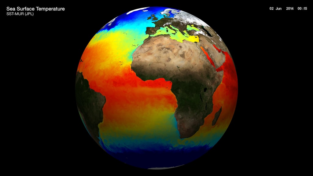
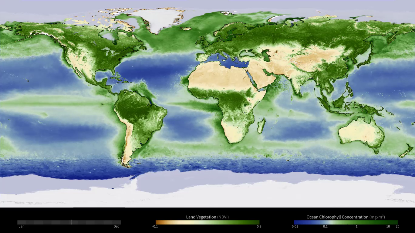
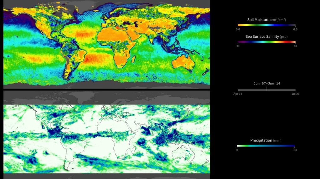
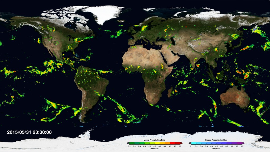
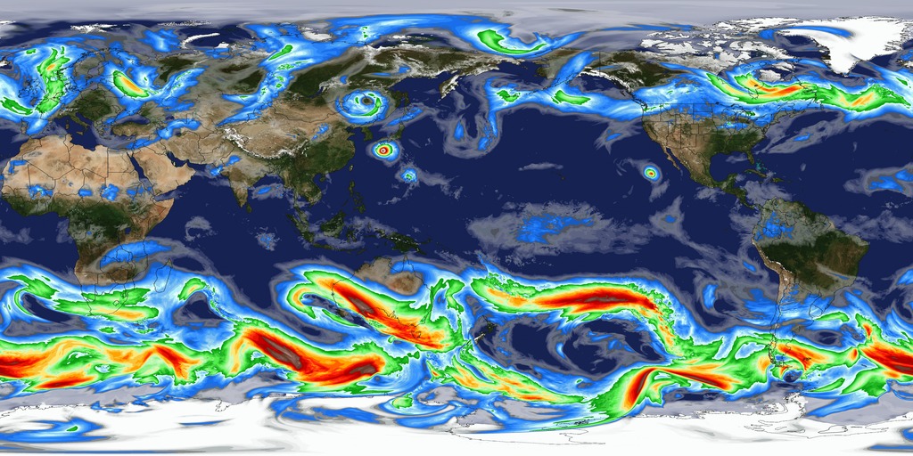
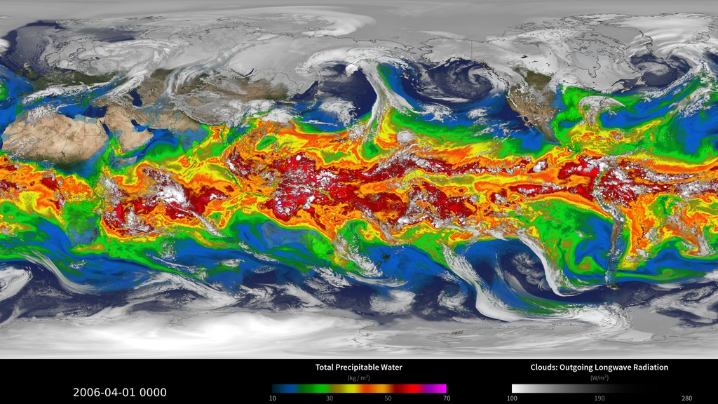
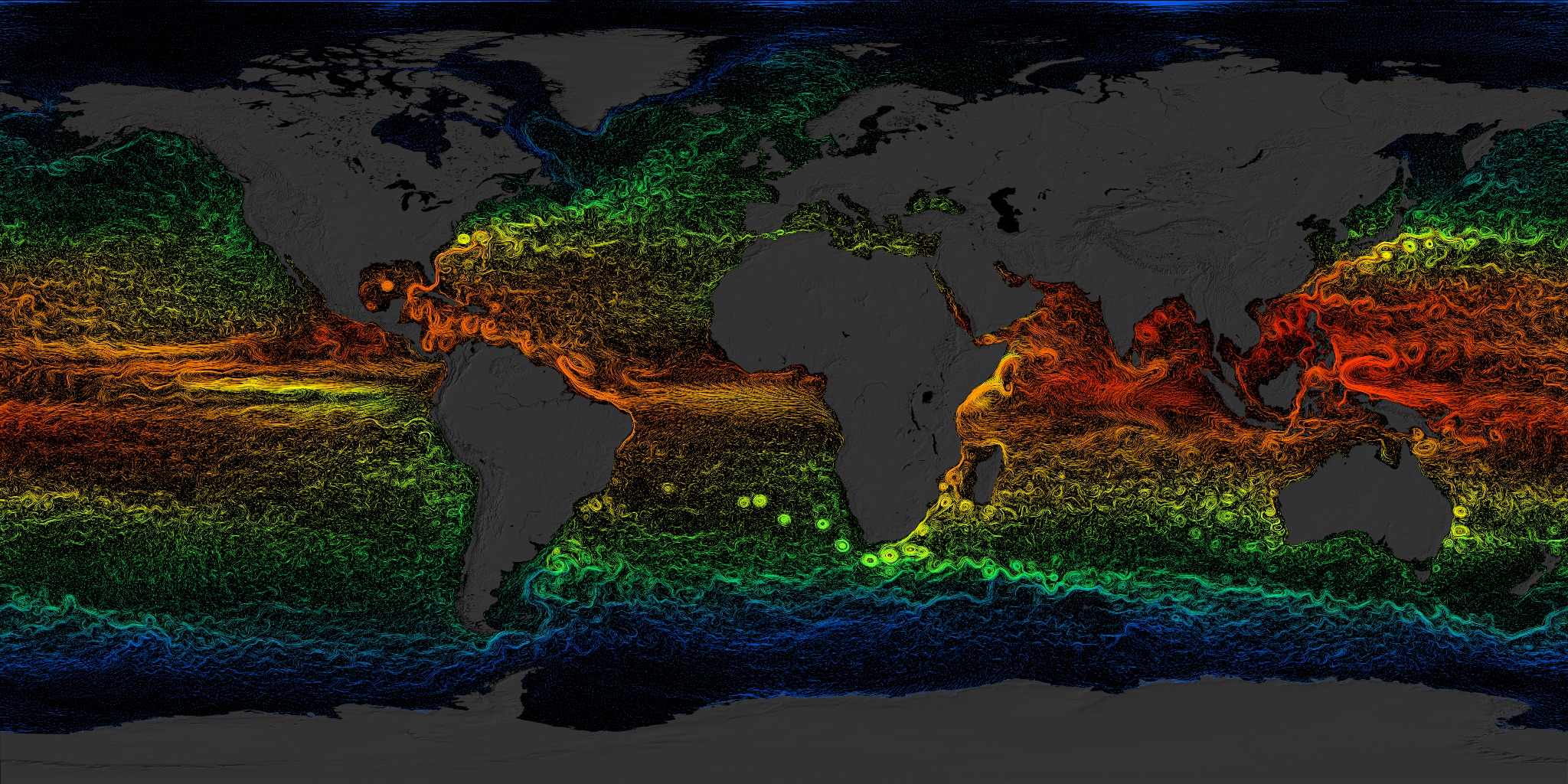
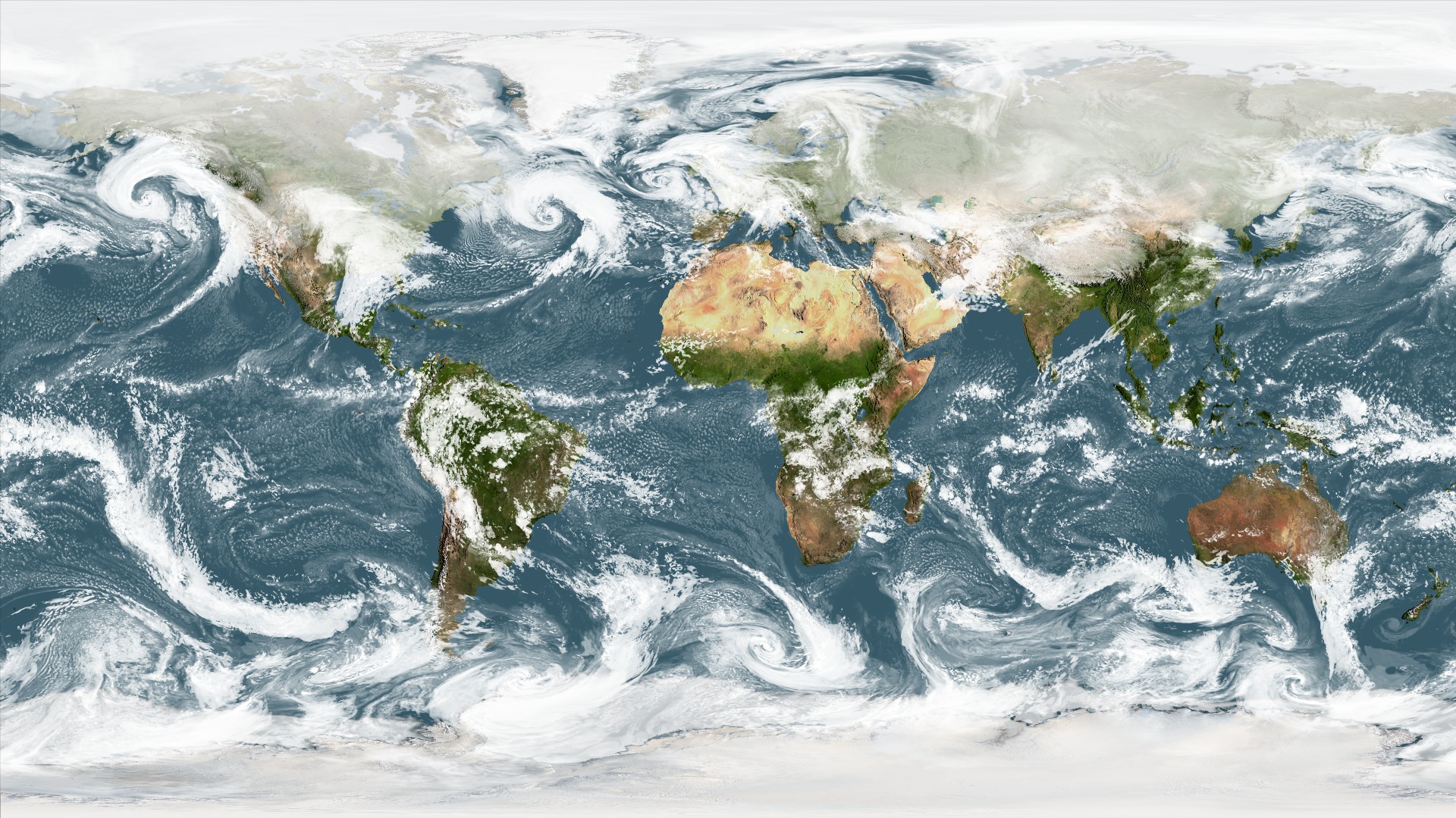
This visualization reveals that the Earth system, like the human body, comprises diverse components that interact in complex ways. Shown first, the Multi-Scale Ultra-High Resolution (MUR) sea surface temperature (SST) dataset combines data from the Advanced Very High-Resolution Radiometer (AVHRR), Moderate Imaging Spectroradiometer (MODIS) Terra and Aqua, and Advanced Microwave Spectroradiometer-EOS (AMSR-E) instruments. Constantly released into the Earth’s atmosphere, heat and moisture from the ocean and land influence Earth’s weather patterns—represented here as wind speeds from the Modern-Era Retrospective analysis for Research and Applications (MERRA) dataset. Moisture in the atmosphere—represented as water vapor (also from MERRA)—forms clouds (shown here using cloud layer data from the NOAA Climate Prediction Center) and precipitation. Precipitation (data from GPM IMERG) significantly impacts water availability, which influences soil moisture (data from NASA-USDA-FA) and ocean salinity.While scientists learn a great deal from studying each of these components individually, improved observational and computational capabilities increasingly allow them to study the interactions between these interrelated geophysical and biological parameters, leading to unprecedented insight into how the Earth system works—and how it might change in the future. All six time-synchronous datasets, individually and then layered two at a time
Yearly Cycle of Earth's Biosphere
Nov. 5, 2015, 7 p.m.
Read moreSatellite instruments reveal the yearly cycle of plant life on the land and in the water. On land, the images represent the density of plant growth, while in the oceans they show the chlorophyll concentration from tiny, plant-like organisms called phytoplankton. From December to February, during the northern hemisphere winter, plant life in the higher latitudes is minimal and receives little sunlight. However, even in the mid latitudes plants are dormant, shown here with browns and yellows on the land and dark blues in the ocean. By contrast the southern ocean and land masses are at the height of the summer season and plant life is revealed with dark green colors on the land and in the ocean. As the year progresses, the situations reverses, with plant life following the increased sunlight northward, while the southern hemisphere experiences decreased plant actvity during its winter.Rather than showing a specific year, the animation shows an average yearly cycle by combining data from many satellite instruments and averaging them over multiple years.Data Sources include:Land BioProductivity - VIP01P4 - A long term data record for Vegetation Phenology. http://vip.arizona.edu/ 1980-2010, running 7 day averageOcean Color - GSMChl - a multi-satellite ocean color product made using Level 3, daily, binned imagery from SeaWiFS, MODIS-Aqua, Meris, and Viirs. http://wiki.icess.ucsb.edu/measures/GSM 2003-2010, 29 day running averageCryosphere data are: Sea Ice - AMSR-E/Aqua Daily Sea Ice concentration http://nsidc.org/data/AE_SI12 2002-2011, running 5-day average Snow - IMS Daily Northern Hemisphere Snow and Ice Analysis http://nsidc.org/data/G02156 2006-2014, running 29 day averageThe supporting static/still data are used to show the permenent cryosphere features. They are: Antarctic Icesheet - LIMA - Landsat Image Mosaic of Antarctica, this mosaic was created from Landsat images collected primarily during 1999–2003. http://lima.usgs.gov images collected primarily during 1999–2003. Greenland Icesheet - MODIS composite from 2011 - this is a cloud-free mosaic from several images from summer 2011 Summer 2011 Glaciers - GLIMs glacier database http://nsidc.org/data/nsidc-0272 animation with traditional colors for chl Animation showing the 12-month cycle of all plant life on Earth — whether on land or in the ocean. Rather than showing a specific year, the animation shows an average yearly cycle by combining data from many satellite instruments and averaging them over multiple years. Animation showing the 12-month cycle of all plant life on Earth — whether on land or in the ocean. Rather than showing a specific year, the animation shows an average yearly cycle by combining data from many satellite instruments and averaging them over multiple years.Version without legend.
Soil Moisture and Rainfall
Oct. 26, 2015, 8 p.m.
Read moreThis visualization compares weekly soil moisture and sea surface salinity data (over land and water, respectively) from NASA’s Soil Moisture Active Passive Satellite (SMAP) mission [top map] with a precipitation product called Integrated Multi-satellite Retrievals for GPM, or IMERG [bottom map], from April 17 to August 2, 2015. IMERG is derived using data from the Global Precipitation Measurement (GPM) international constellation of satellites. These maps reveal how precipitation amounts influence soil moisture conditions and sea surface salinity. For example, high amounts of precipitation along the equator coincide with relatively moist soil conditions on land (blue shades) and low salinity values in the ocean (green and blue shades). Conversely, areas that receive little or no precipitation, such as the Sahara Desert in northern Africa, coincide with dry soils (dark yellow shades). Scientists can use data from SMAP and IMERG to develop improved flood prediction and drought monitoring capabilities. Societal benefits include improved water-resource management, agricultural productivity, and wildfire and landslide predictions. Data from SMAP also allow us to extend the data record of the highly successful 3-year Aquarius sea surface salinity mission into the future. Soil Moisture and Ocean Salinity are compared to Rainfall
IMERG Global Precipitation Rates (New Colorbar)
Oct. 1, 2015, 8 p.m.
Read moreNASA s climate and weather systems, and how they could change in the future, GPM provides a major step forward in providing the scientific community comprehensive and consistent measurements of precipitation. This movie shows IMERG liquid and frozen precipitation for the period June, 2015, through September, 2015.This video is also available on our YouTube channel. Liquid precipitation (rain) colorbar Frozen precipitation (snow) colorbar
Simulated Wind Speeds at 500 mb
Dec. 10, 2014, 5 a.m.
Read moreThis simulation, produced by the Goddard Earth Observing System Model Version 5 (GEOS-5), shows 500 mb wind speeds at 7-kilometer resolution from August 1 to November 30, 2006, ranging from 0 to 135 knots (0 to 155 mph). The 500 mb wind speeds are often referred to as the “steering winds” of the atmosphere. Simulations such as this allow scientists to better understand global upper-level wind patterns that influence how weather systems such as cyclones and anticyclones move. In addition, scientists can study how atmospheric constituents such as aerosols can be transported from the surface to upper-levels. 500MB winds animation of Aug 1 - Nov 30, 2006
Simulated Clouds and Precipitable Water
Dec. 10, 2014, 5 a.m.
Read moreTo better understanding Earth’s hydrological cycle, energy budget, and climate, scientists study moisture and clouds in the atmosphere. This simulation, produced by the Goddard Earth Observing System Model Version 5 (GEOS-5), shows precipitable water and clouds at 7-kilometer resolution from April 1 to July 31, 2006. Precipitable water is the total amount of water vapor contained within a vertical column of the atmosphere. In other words, its how much water would result if all the water in that column precipitated as rain. The amount of precipitable water in the air is small in extremely arid areas and in locations where the temperatures are very low (e.g., polar regions). Simulations such as this one allow scientists to gain new insights into atmospheric humidity and how clouds and water vapor impact precipitation and surface temperature. Clouds and precipitable water animation of Apr 1 - Jul 31, 2006.
Global Sea Surface Currents and Temperature
March 16, 2012, 6 a.m.
Read moreThis visualization shows sea surface current flows. The flows are colored by corresponding sea surface temperature data. This visualization is rendered for display on very high resolution devices like hyperwalls or for print media.This visualization was produced using model output from the joint MIT/JPL project entitled Estimating the Circulation and Climate of the Ocean, Phase II (ECCO2). ECCO2 uses the MIT general circulation model (MITgcm) to synthesize satellite and in-situ data of the global ocean and sea-ice at resolutions that begin to resolve ocean eddies and other narrow current systems, which transport heat and carbon in the oceans. The ECCO2 model simulates ocean flows at all depths, but only surface flows are used in this visualization. Global sea surface currents colored by temperature. These are the assembled (contiguous) versions of the animation. There are several resolutions to choose from, some are cropped for various purposes. The 6840x3420 version is the complete, full resolution visualization at the appropriate 2x1 aspect ratio and has not been cropped or resized. The time range for these visualizations is from 2007-03-25T12:00Z to 2008-03-03T12:00Z. A cropped region in the Pacific illustrating the distribution of the actual flow vector data points relative to the flow curves. The white dots represent locations where the ECCO2 model defines the ocean current directions. Locations in between those locations are interpolated. A cropped region in the Atlantic illustrating the distribution of the actual flow vector data points relative to the flow curves. The white dots represent locations where the ECCO2 model defines the ocean current directions. Locations in between those locations are interpolated. Notice the irregular distribution of grid points (e.g., bright spot near the center). This is due to the advanced cube-sphere distribution of the data points. The bright spot is one of the cube-sphere corners. Full resolution ECCO2 flow field illustrating the distribution of the actual flow vector data points relative to the flow curves. The white dots represent locations where the ECCO2 model defines the ocean current directions. Locations in between those locations are interpolated. Sea surface currents and temperatures cropped, scaled, and diced for a 5x3 hyperwall.Date and time information for each frame can be found here. Individual cut-up frames and movie files are available for download. Sea Surface currents of the northern Atlantic Ocean. This version was produced for a 5x3 hyperwall. Hyperwall material - Does not display. Sea surface temperature color bar (blue is 0 degrees C, green is 10-20 degrees C, yellow is about 25 degrees C, red is 32 degrees C) This visualization shows the sea surface currents and temperatures in the eastern Pacific Ocean.
NCCS Hyperwall Show: GEOS-5 Modeled Clouds at 5-km Resolution (Flat Map)
June 17, 2010, 8 p.m.
Read moreThis visualization shows clouds from a simulation using the Goddard Earth Observing System Model, Verison 5 (GEOS5). The global atmospheric simulation ran at a resolution of 5-km per grid cell and covered a period from Feb 2, 2010 through Feb 22, 2010. The results of the simulation were written out at 30 minute intervals. This is a high-resolution non-hydrostatic global model.This visualization was created for display on the NASA Center for Climate Simulation (NCCS) hyperwall. This is a set of tiled high definition displays consisting of 5 displays across by 3 displays down. The full resolution of all combined displays is 6840 pixels accross by 2304 pixels down. This movie was rendered at this high resolution, then diced up into images to be displayed on each screen.A similar, lower resolution visualization is available in entry #3724. The lower resolution version is for comparison to current operational model resolution output. When displaying these visualizations on the hyperwall, we sometimes show them in a checkerboard pattern with alternating 5-km and quarter-degree tiles for easy comparison. We chose to stretch the image to fit the hyperwall aspect rather than cropping or adding black bars. Full image of GEOS-5 Modeled Clouds Cropped version of GEOS-5 modeled clouds showing most of North America. Two major 2010 East coast snow storms can be seen in this animation. The large animation above is diced-up into smaller pieces that can be played on the hyperwall. Each piece is named according to a standard spreadsheet convention with a1 at the upper left and e3 at the lower right. This image illustrates this naming convention used in the diced-up frame sets below. Display a1 of GEOS-5 modeled clouds Display a2 of GEOS-5 modeled clouds Display a3 of GEOS-5 modeled clouds Display b1 of GEOS-5 modeled clouds Display b2 of GEOS-5 modeled clouds Display b3 of GEOS-5 modeled clouds Display c1 of GEOS-5 modeled clouds Display c2 of GEOS-5 modeled clouds Display c3 of GEOS-5 modeled clouds Display d1 of GEOS-5 modeled clouds Display d2 of GEOS-5 modeled clouds Display d3 of GEOS-5 modeled clouds Display e1 of GEOS-5 modeled clouds Dsiplay e2 of GEOS-5 modeled clouds Display e3 of GEOS-5 modeled clouds This is an alternate version of the movie with a different background.