Plants Are Struggling to Keep Up with Rising Carbon Dioxide Concentrations
-
- Written by:
- Esprit Smith
-
- Produced by:
- Kathryn Mersmann
- View full credits
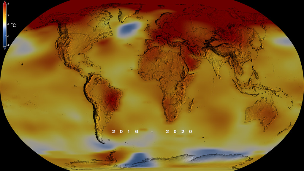
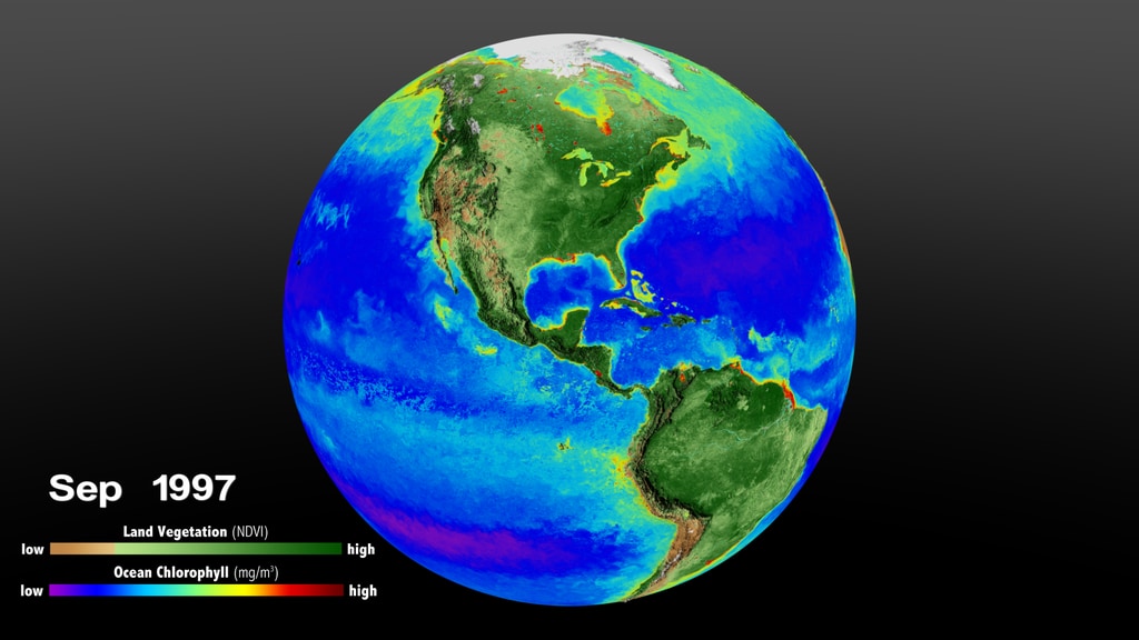
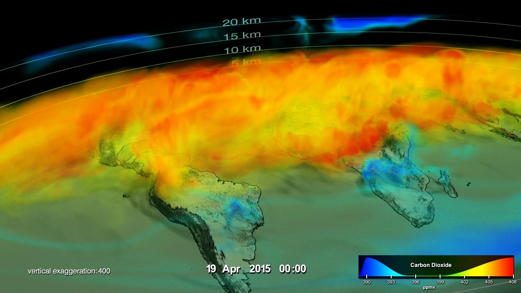
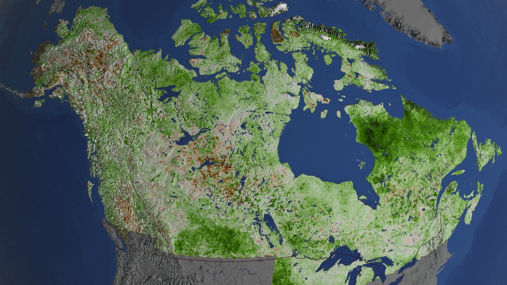
Plants play a key role in mitigating climate change. The more carbon dioxide they absorb during photosynthesis, the less carbon dioxide remains trapped in the atmosphere where it can cause temperatures to rise. But scientists have identified an unsettling trend – 86% of land ecosystems globally are becoming progressively less efficient at absorbing the increasing levels of CO2 from the atmosphere.
Movies
- 13781_PlantEfficiency_Final.webm (960x540) [45.8 MB]
- TWITTER_720_13781_PlantEfficiency_Final_twitter_720.mp4 (1280x720) [21.4 MB]
- YOUTUBE_1080_13781_PlantEfficiency_Final_youtube_1080.mp4 (1920x1080) [177.5 MB]
- 13781_PlantEfficiency_Final.mov (1920x1080) [1.7 GB]
-
Images
- CO20.jpg (1920x1080) [1.1 MB]
- CO20_thm.png (80x40) [6.5 KB]
- CO20_searchweb.png (320x180) [84.5 KB]
-
Captions
- PlantEfficiency.en_US.srt [2.3 KB]
- PlantEfficiency.en_US.vtt [2.3 KB]
-
Music: A Curious Incident by Jay Price [PRS] and Paul Reeves [PRS]
Complete transcript available.
Credits
Please give credit for this item to:
NASA's Goddard Space Flight Center
-
Writer
- Esprit Smith (KBR) [Lead]
-
Scientist
- Benjamin Poulter (NASA/GSFC)
-
Producer
- Kathryn Mersmann (KBR Wyle Services, LLC) [Lead]
Series
This visualization can be found in the following series:Related pages
-
-
Global Temperature Anomalies from 1880 to 2022
This color-coded map in Robinson projection displays a progression of changing global surface temperature anomalies. Normal temperatures are shown in white. Higher than normal temperatures are shown in red and lower than normal temperatures are shown in blue. Normal temperatures are calculated over the 30 year baseline period 1951-1980. The final frame represents the 5 year global temperature anomalies from 2018-2022. ||
-
Global Temperature Anomalies from 1880 to 2021
This color-coded map in Robinson projection displays a progression of changing global surface temperature anomalies. Normal temperatures are shown in white. Higher than normal temperatures are shown in red and lower than normal temperatures are shown in blue. Normal temperatures are calculated over the 30 year baseline period 1951-1980. The final frame represents the 5 year global temperature anomalies from 2017-2021. Scale in degrees Fahrenheit. ||
-
Climate Drivers
What are the latest climate models saying about why climate has changed and what might happen in the future? Scientists improve these models using the latest satellite data.GISS is a NASA laboratory managed by the Earth Sciences Division of the agency’s Goddard Space Flight Center in Greenbelt, Maryland. The laboratory is affiliated with Columbia University’s Earth Institute and School of Engineering and Applied Science in New York. ||
-
Global Temperature Anomalies from 1880 to 2020
This color-coded map in Robinson projection displays a progression of changing global surface temperature anomalies. Normal temperatures are the average over the 30 year baseline period 1951-1980. Higher than normal temperatures are shown in red and lower than normal temperatures are shown in blue. The final frame represents the 5 year global temperature anomalies from 2016-2020. Scale in degrees Celsius. ||
-
Earth Day 2020: Biosphere
Global Biosphere data from 1997 through 2017 with corresponding colorbars and date stamp.This video is also available on our YouTube channel. || By monitoring the color of reflected light via satellite, scientists can determine how successfully plant life is photosynthesizing. A measurement of photosynthesis is essentially a measurement of successful growth, and growth means successful use of ambient carbon. This data visualization represents twenty years' worth of data taken primarily by SeaStar/SeaWiFS, Aqua/MODIS, and Suomi NPP/VIIRS satellite sensors, showing the abundance of life both on land and in the sea. In the ocean, dark blue to violet represents warmer areas where there is little life due to lack of nutrients, and greens and reds represent cooler nutrient-rich areas. The nutrient-rich areas include coastal regions where cold water rises from the sea floor bringing nutrients along and areas at the mouths of rivers where the rivers have brought nutrients into the ocean from the land. On land, green represents areas of abundant plant life, such as forests and grasslands, while tan and white represent areas where plant life is sparse or non-existent, such as the deserts in Africa and the Middle East and snow-cover and ice at the poles. ||
-
Earth Day 2020: Normalized Difference Vegetation Index (NDVI) Seasonal Cycles
NDVI Seasonal Cycles, With LabelsThis video is also available on our YouTube channel. || This visualization shows the Normalized Difference Vegetation Index (NDVI) over seaveral seasonal cycles. This NDVI dataset is part of the Next Generation Blue Marble product.This visualization was created in part to support Earth Day 2020 media releases. || NDVI Seasonal Cycles, No Labels ||
-
Global Temperature Anomalies from 1880 to 2019
This color-coded map in Robinson projection displays a progression of changing global surface temperature anomalies. Normal temperatures are the average over the 30 year baseline period 1951-1980. Higher than normal temperatures are shown in red and lower than normal temperatures are shown in blue. The final frame represents the 5 year global temperature anomalies from 2015-2019. Scale in degrees Celsius. || NASA, NOAA Analyses Reveal 2019 Second Warmest Year on RecordAccording to independent analyses by NASA and the National Oceanic and Atmospheric Administration (NOAA), Earth's global surface temperatures in 2019 were the second warmest since modern recordkeeping began in 1880.Globally, 2019 temperatures were second only to those of 2016 and continued the planet's long-term warming trend: the past five years have been the warmest of the last 140 years. This past year, they were 1.8 degrees Fahrenheit (0.98 degrees Celsius) warmer than the 1951 to 1980 mean, according to scientists at NASA’s Goddard Institute for Space Studies (GISS) in New York. “The decade that just ended is clearly the warmest decade on record,” said GISS Director Gavin Schmidt. “Every decade since the 1960s clearly has been warmer than the one before.”Since the 1880s, the average global surface temperature has risen and the average temperature is now more than 2 degrees Fahrenheit (a bit more than 1 degree Celsius) above that of the late 19th century. For reference, the last Ice Age was about 10 degrees Fahrenheit colder than pre-industrial temperatures.Using climate models and statistical analysis of global temperature data, scientists have concluded that this increase mostly has been driven by increased emissions into the atmosphere of carbon dioxide and other greenhouse gases produced by human activities.“We crossed over into more than 2 degrees Fahrenheit warming territory in 2015 and we are unlikely to go back. This shows that what’s happening is persistent, not a fluke due to some weather phenomenon: we know that the long-term trends are being driven by the increasing levels of greenhouse gases in the atmosphere,” Schmidt said.Because weather station locations and measurement practices change over time, the interpretation of specific year-to-year global mean temperature differences has some uncertainties. Taking this into account, NASA estimates that 2019’s global mean change is accurate to within 0.1 degrees Fahrenheit, with a 95% certainty level.Weather dynamics often affect regional temperatures, so not every region on Earth experienced similar amounts of warming. NOAA found the 2019 annual mean temperature for the contiguous 48 United States was the 34th warmest on record, giving it a “warmer than average” classification. The Arctic region has warmed slightly more than three times faster than the rest of the world since 1970.Rising temperatures in the atmosphere and ocean are contributing to the continued mass loss from Greenland and Antarctica and to increases in some extreme events, such as heat waves, wildfires, intense precipitation.NASA’s temperature analyses incorporate surface temperature measurements from more than 20,000 weather stations, ship- and buoy-based observations of sea surface temperatures, and temperature measurements from Antarctic research stations.These in situ measurements are analyzed using an algorithm that considers the varied spacing of temperature stations around the globe and urban heat island effects that could skew the conclusions. These calculations produce the global average temperature deviations from the baseline period of 1951 to 1980.NOAA scientists used much of the same raw temperature data, but with a different interpolation into the Earth’s polar and other data-poor regions. NOAA’s analysis found 2019 global temperatures were 1.7 degrees Fahrenheit (0.95 degrees Celsius) above the 20th century average.NASA’s full 2019 surface temperature data set and the complete methodology used for the temperature calculation and its uncertainties are available at:https://data.giss.nasa.gov/gistempGISS is a laboratory within the Earth Sciences Division of NASA’s Goddard Space Flight Center in Greenbelt, Maryland. The laboratory is affiliated with Columbia University’s Earth Institute and School of Engineering and Applied Science in New York.NASA uses the unique vantage point of space to better understand Earth as an interconnected system. The agency also uses airborne and ground-based measurements, and develops new ways to observe and study Earth with long-term data records and computer analysis tools to better see how our planet is changing. NASA shares this knowledge with the global community and works with institutions in the United States and around the world that contribute to understanding and protecting our home planet.For more information about NASA’s Earth science activities, visit:https://www.nasa.gov/earthThe slides for the Jan. 15 news conference are available at:https://www.ncdc.noaa.gov/sotc/briefings/20200115.pdfNOAA’s Global Report is available at:https://www.ncdc.noaa.gov/sotc/global/201913 ||
-
Seasonal Changes in Carbon Dioxide
Narrated visualization showing seasonal drawdown in carbon dioxideThis video is also available on our YouTube channel. || Carbon dioxide is the most important greenhouse gas released to the atmosphere through human activities. It is also influenced by natural exchange with the land and ocean. This visualization provides a high-resolution, three-dimensional view of global atmospheric carbon dioxide concentrations from September 1, 2014 to August 31, 2015. The visualization was created using output from the GEOS modeling system, developed and maintained by scientists at NASA. The height of Earth’s atmosphere and topography have been vertically exaggerated and appear approximately 400 times higher than normal to show the complexity of the atmospheric flow. Measurements of carbon dioxide from NASA’s second Orbiting Carbon Observatory (OCO-2) spacecraft are incorporated into the model every 6 hours to update, or “correct,” the model results, called data assimilation.As the visualization shows, carbon dioxide in the atmosphere can be mixed and transported by winds in the blink of an eye. For several decades, scientists have measured carbon dioxide at remote surface locations and occasionally from aircraft. The OCO-2 mission represents an important advance in the ability to observe atmospheric carbon dioxide. OCO-2 collects high-precision, total column measurements of carbon dioxide (from the sensor to Earth’s surface) during daylight conditions. While surface, aircraft, and satellite observations all provide valuable information about carbon dioxide, these measurements do not tell us the amount of carbon dioxide at specific heights throughout the atmosphere or how it is moving across countries and continents. Numerical modeling and data assimilation capabilities allow scientists to combine different types of measurements (e.g., carbon dioxide and wind measurements) from various sources (e.g., satellites, aircraft, and ground-based observation sites) to study how carbon dioxide behaves in the atmosphere and how mountains and weather patterns influence the flow of atmospheric carbon dioxide. Scientists can also use model results to understand and predict where carbon dioxide is being emitted and removed from the atmosphere and how much is from natural processes and human activities. Carbon dioxide variations are largely controlled by fossil fuel emissions and seasonal fluxes of carbon between the atmosphere and land biosphere. For example, dark red and orange shades represent regions where carbon dioxide concentrations are enhanced by carbon sources. During Northern Hemisphere fall and winter, when trees and plants begin to lose their leaves and decay, carbon dioxide is released in the atmosphere, mixing with emissions from human sources. This, combined with fewer trees and plants removing carbon dioxide from the atmosphere, allows concentrations to climb all winter, reaching a peak by early spring. During Northern Hemisphere spring and summer months, plants absorb a substantial amount of carbon dioxide through photosynthesis, thus removing it from the atmosphere and change the color to blue (low carbon dioxide concentrations). This three-dimensional view also shows the impact of fires in South America and Africa, which occur with a regular seasonal cycle. Carbon dioxide from fires can be transported over large distances, but the path is strongly influenced by large mountain ranges like the Andes. Near the top of the atmosphere, the blue color indicates air that last touched the Earth more than a year before. In this part of the atmosphere, called the stratosphere, carbon dioxide concentrations are lower because they haven’t been influenced by recent increases in emissions.This version of the visualization was created specifically to support a series of papers in the journal Science and for submission to SIGGRAPH 2017's Computer Animation Festival.This visualization won Science magazine's 2017 Data Stories contest in the "professional" category (see: http://www.sciencemag.org/projects/data-stories/winners/2017)This visualization was shown at the SIGGRAPH 2017 Electronic Theater in Los Angeles, CA in July 2017 (see: http://s2017.siggraph.org/content/computer-animation-festival#etvrlistings) ||
-
Vegetation Greening Trend in Canada and Alaska: 1984-2012
This animation examines the change in the vegetation trend over Canada and Alaska between 1984 and 2012. || High-latitude regions have been warming rapidly since the last century, at a rate higher than the global average. At continental scales, satellite data since the 1980s have indicated increased vegetation productivity (greening) across northern high latitudes, and a productivity decline (browning) for certain areas of undisturbed boreal forest of Canada and Alaska. These remote sensing results have been corroborated by in-situ evidence. This research provides a spatially complete view of the vegetation greenness change for all of Canada and Alaska by calculating per-pixel NDVI trend from all available 1984–2012 peak-summer Landsat-5 and -7 surface reflectance data. By incorporating observations from overlapping scenes, researchers obtained up to 160 valid NDVI values for certain areas from this 29-year period, establishing the mid-Summer greenness trend. This animation shows the resulting greenness trend over Canada and Alaska with special attention focused on the regions of Quebec and northern Alaska. ||
-
Carbon Dioxide Sources From a High-Resolution Climate Model
Animation of carbon dioxide released from two different sources: fires (biomass burning) and massive urban centers known as megacities. The animation covers a five day period in June 2006. The model is based on real emission data and is then set to run so that scientists can observe how the greenhouse gas behaves once it has been emitted. || This animation is based on a supercomputer climate simulation that shows two different sources of atmospheric carbon dioxide — fires (biomass burning) and massive urban centers known as megacities.Scientists are using climate models like this one — called GEOS-5 (Goddard Earth Observing Model, Version 5, created at NASA’s Goddard Space Flight Center) — to better understand how carbon dioxide moves around Earth’s atmosphere and how carbon moves through Earth’s air, land and ocean over time. Rising carbon dioxide levels in the atmosphere are driving Earth’s ongoing climate change.This animation shows a five-day period in June 2006. The model is based on real emissions inventory data and is then set to run so that scientists can observe how the greenhouse gas behaves in the atmosphere once it has been emitted. ||
-