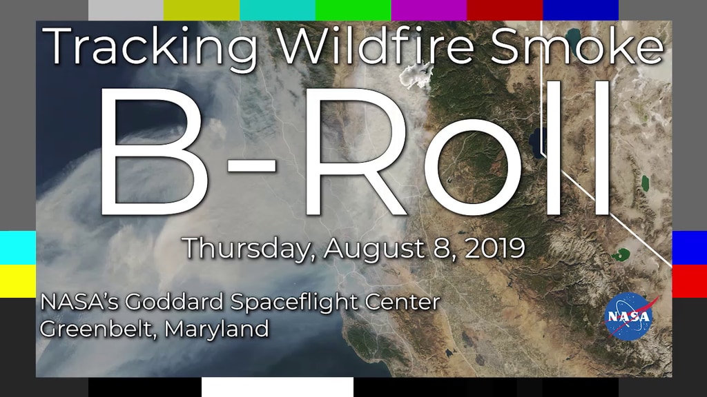
NASA Studies How Arctic Fires Change the World
Music: Stepping Stone Bridge by Timothy Michael Hammond [PRS], Wayne Roberts [PRS]
Watching Ladybirds by Benjamin James Parsons [PRS]
This video can be freely shared and downloaded. While the video in its entirety can be shared without permission, some individual imagery provided by pond5.com and Artbeats is obtained through permission and may not be excised or remixed in other products. Specific details on stock footage may be found here. For more information on NASA’s media guidelines, visit https://www.nasa.gov/multimedia/guidelines/index.html.
Complete transcript available.
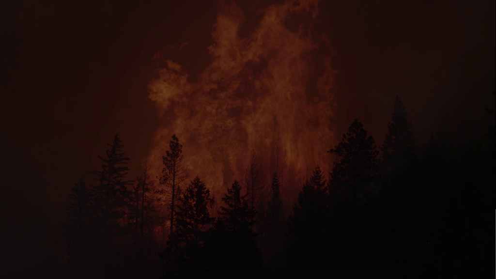
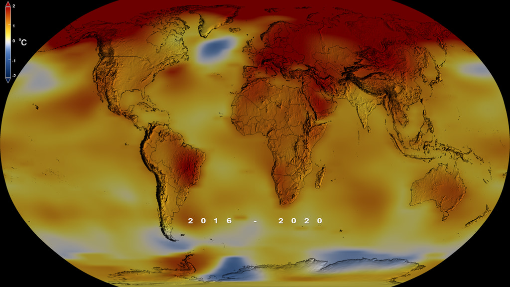
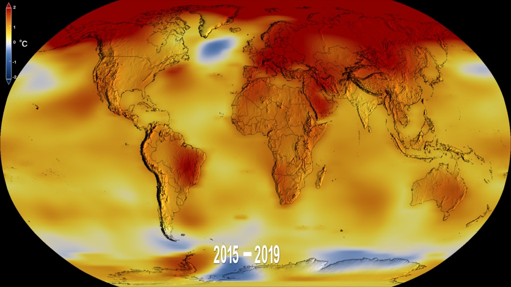
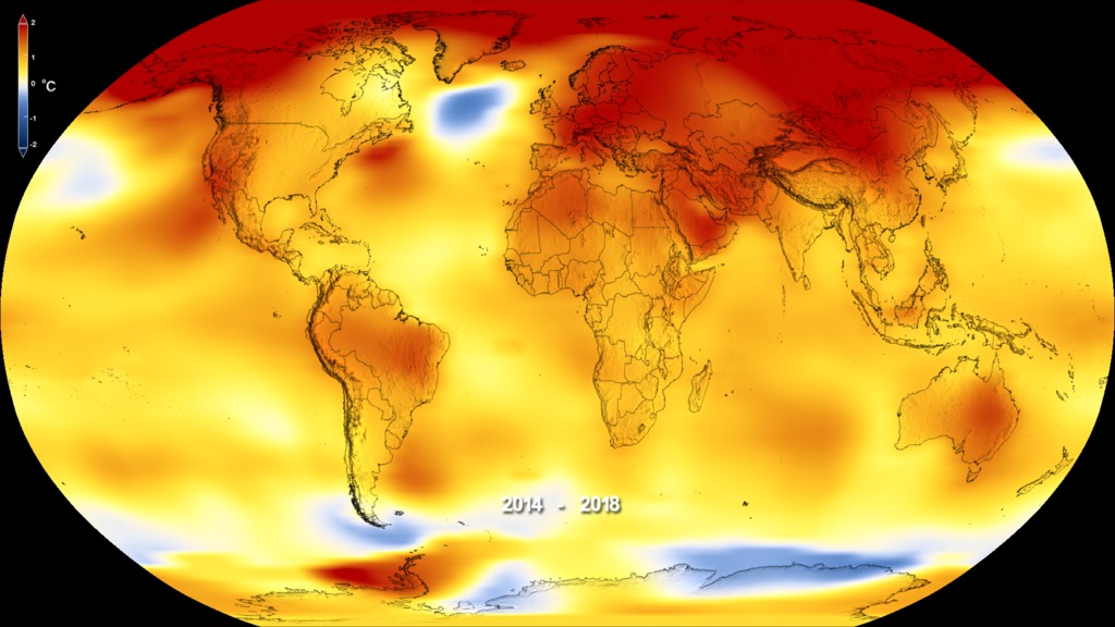
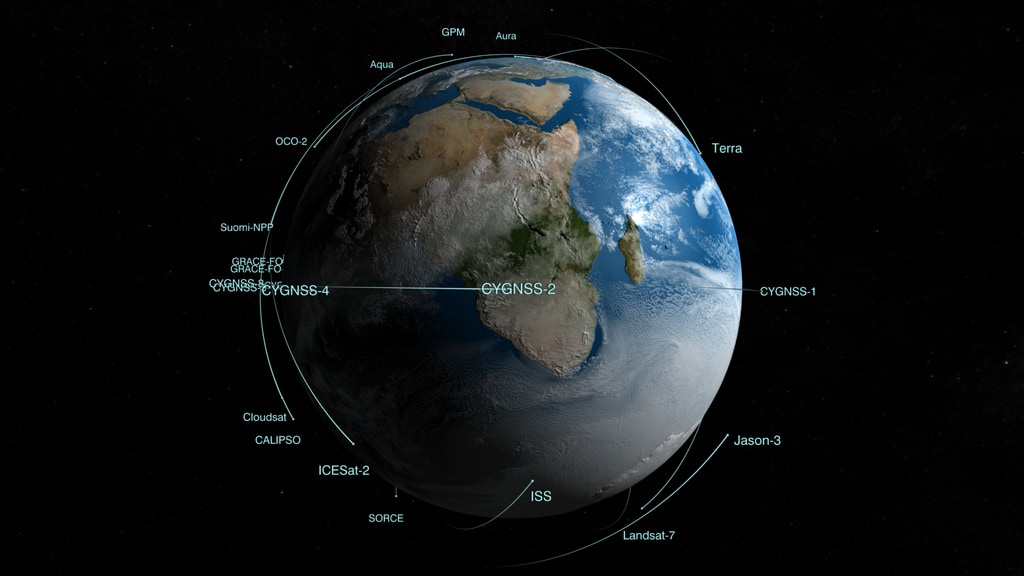
Wildfires in the Arctic often burn far away from population centers, but their impacts are felt around the globe. From field and laboratory work to airborne campaigns and satellites, NASA is studying how climate change is contributing to more frequent and powerful boreal forest and tundra fires and what that means for climate forecasting, ecosystems and human health.
To learn more about ABoVE, visit:
https://above.nasa.gov
For More Information
See nasa.gov/fire
Credits
Please give credit for this item to:
NASA's Goddard Space Flight Center
-
Producers
- Katie Jepson (USRA)
- Samson K. Reiny (Wyle Information Systems)
-
Technical support
- Aaron E. Lepsch (ADNET Systems, Inc.)
-
Videographers
- Harrison Bach (Intern)
- Liz Wilk (USRA)
- Jefferson Beck (USRA)
- John Caldwell (Advocates in Manpower Management, Inc.)
- Rob Andreoli (Advocates in Manpower Management, Inc.)
- Kathryn Mersmann (USRA)
-
Writer
- Maria-Jose Vinas Garcia (Telophase)
-
Visualizer
- Lori Perkins (NASA/GSFC)
-
Scientist
- Elizabeth Hoy (Global Science and Technology, Inc.)
-
Narration
- Katie Jepson (USRA)
Series
This page can be found in the following series:Related
- ID: 13263
- ID: 13264
 Produced Video
 - ID: 13262
![Music: Broad Horizons by Chris White [PRS]Complete transcript available.](/vis/a010000/a013200/a013262/Still.png) Produced Video
Produced Video
Sources
- ID: 5207
 Visualization
 - ID: 5060
 Visualization
 - ID: 4964
 Visualization
 - ID: 4882
 Visualization
 - ID: 4787
 Visualization
 - ID: 4626
 Visualization
 - ID: 4698
 Visualization
Release date
This page was originally published on Tuesday, August 13, 2019.
This page was last updated on Wednesday, May 3, 2023 at 1:45 PM EDT.