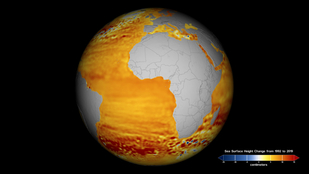
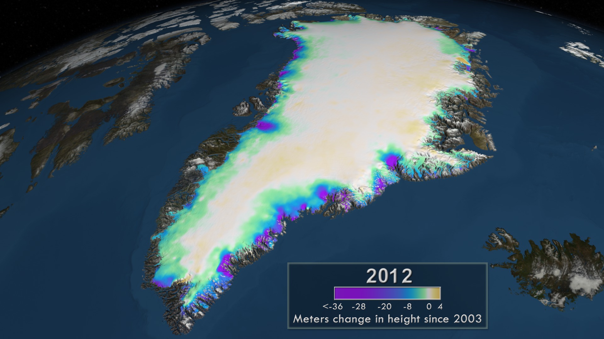
March 25th, 2014
(updated May 3rd, 2023)
Since the late 1970's, NASA has been monitoring changes in the Greenland Ice Sheet. Recent analysis of seven years of surface elevation readings from NASA's ICESat satellite and four years of laser and and ice-penetrating radar data from NASA's airborne mission Operation IceBridge shows us how the surface elevation of the ice sheet has changed.The colors shown on the surface of the ice sheet represent the accumulated change in elevation since 2003. The light yellow over the central region of the ice sheet indicates a slight thickening due to snow. This accumulation, along with the weight of the ice sheet, pushes ice toward the coast. Thinning near coastal regions, shown in green, blue and purple, has increased over time and now extends into the interior of the ice sheet where the bedrock topography permits. As a result, there has been an average loss of 300 cubic kilometers of ice per year between 2003 and 2012.This animation portrays the changes occurring in the surface elevation of the ice sheet since 2003 in three drainage regions: the southeast, the northeast and the Jakobshavn regions. In each region, the time advances to show the accumulated change in elevation from 2003 through 2012.—><!——><!—Above: Move bar to compare the change in surface elevation (left) to the bedrock topography (right) in the northeast region. Download HTML to embed this in your web page.The ice sheet is cut away to reveal how the bedrock topography beneath the ice sheet affects the movement of glacial ice in each region. The bedrock topography is colored by elevation with areas below sea level shown in brown and areas above sea level shown in green. Yellow indicates regions at sea level. —><!——><!—Above: Move bar to compare the change in the surface elevation (left) to the bedrock topography (right) in the Jakobshavn region. Download HTML to embed this in your web page.The bedrock topography affects the movement of the ice sheet. Blue/white velocity flows indicate the direction and speed of the ice over time. Slower moving ice is shown as shorter blue flow lines while faster moving ice is shown as longer white flow lines. ||
Read more