A New Multi-dimensional View of a Hurricane
Music: "Buoys," Donn Wilkerson, Killer Tracks; "Late Night Drive," Donn Wilkerson, Killer Tracks.
Complete transcript available.
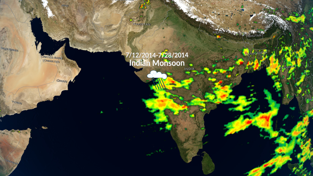
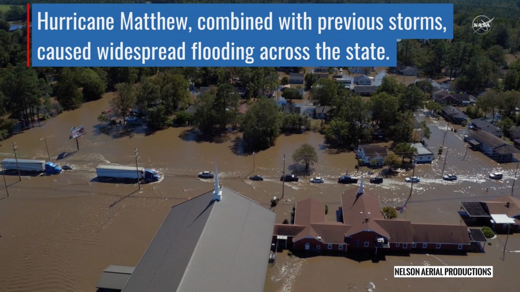
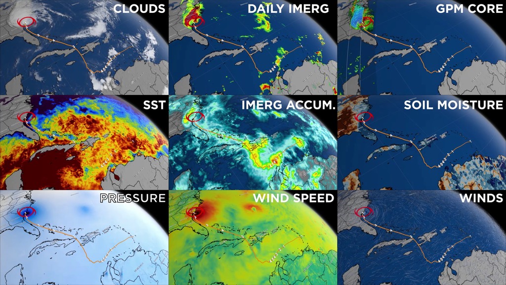
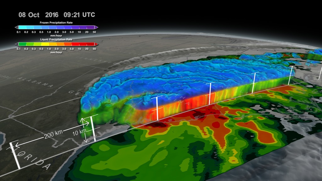
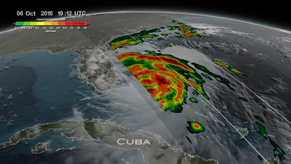
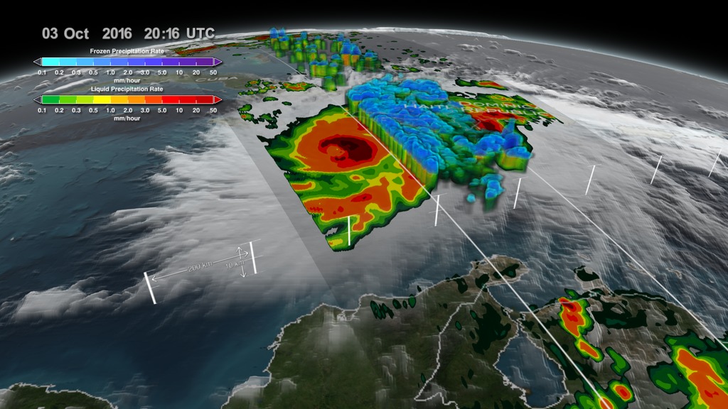
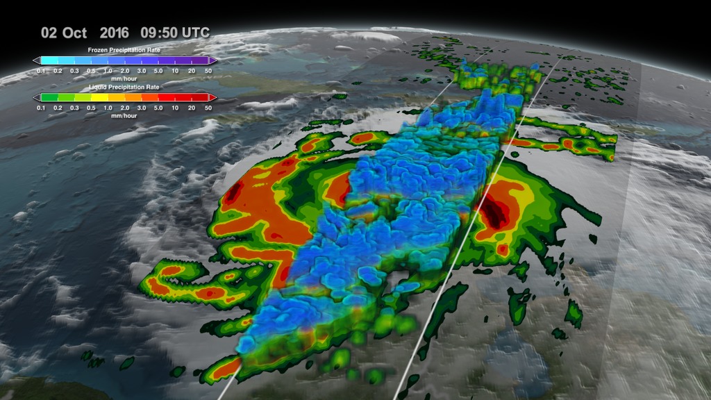
NASA researchers now can use a combination of satellite observations to re-create multi-dimensional pictures of hurricanes and other major storms in order to study complex atmospheric interactions. In this video, they applied those techniques to Hurricane Matthew. When it occurred in the fall of 2016, Matthew was the first Category 5 Atlantic hurricane in almost ten years. Its torrential rains and winds caused significant damage and loss of life as it coursed through the Caribbean and up along the southern U.S. coast.
Credits
Please give credit for this item to:
NASA's Goddard Space Flight Center
-
Producer
- Ryan Fitzgibbons (USRA)
-
Visualizers
-
Alex Kekesi
(Global Science and Technology, Inc.)

- Horace Mitchell (NASA/GSFC)
-
Alex Kekesi
(Global Science and Technology, Inc.)
-
Scientists
-
George Huffman
(NASA/GSFC)
- Dalia B Kirschbaum (NASA/GSFC)
-
George Huffman
(NASA/GSFC)
-
Writers
- Ryan Fitzgibbons (USRA)
-
George Huffman
(NASA/GSFC)
-
Narrator
- Ryan Fitzgibbons (USRA)
-
Editor
- Ryan Fitzgibbons (USRA)
-
Technical support
-
Greg Shirah
(NASA/GSFC)
-
Greg Shirah
(NASA/GSFC)
Missions
This page is related to the following missions:Series
This page can be found in the following series:Related
- ID: 5361
 Visualization
 - ID: 12738
![Watch this video on the NASA Goddard YouTube channel.Complete transcript available.Music credits: 'Micro Currents' by Jean-Patrick Voindrot [SACEM], 'Sink Deep' by Andrew Michael Britton [PRS], David Stephen Goldsmith [PRS], Mikey Rowe [PRS] from Killer Tracks.](/vis/a010000/a012700/a012738/LARGE_MP4-12738_RapidIntensification_large.00084_print.jpg) Produced Video
Produced Video - ID: 12195
![Music credit: 'Cellular Signals' by Laurent Levesque [SACEM] from Killer TracksComplete transcript available.Watch this video on the NASA Goddard YouTube channel.](/vis/a010000/a012100/a012195/LARGE_MP4-12195_EPOCH_Hurricanes2_large.00151_print.jpg) Produced Video
Produced Video - ID: 12391
 Produced Video
Alternate Versions
- ID: 4543
 Visualization
Sources
- ID: 4575
 Visualization
 - ID: 4512
 Visualization
 - ID: 4511
 Visualization
 - ID: 4508
 Visualization
 - ID: 4507
 Visualization
Used as a Source In
- ID: 4742
 Visualization
 - ID: 13216
![Complete transcript available.Music credits: “Northern Breeze” by Denis Levaillant [SACEM], “Stunning Horizon” by Maxime Lebidois [SACEM], Ronan Maillard [SACEM], “Magnetic Force” by JC Lemay [SACEM] from Killer TracksWatch this video on the NASA Goddard YouTube channel.This video can be freely shared and downloaded. While the video in its entirety can be shared without permission, some individual imagery provided by pond5.com is obtained through permission and may not be excised or remixed in other products. Specific details on stock footage may be found here. For more information on NASA’s media guidelines, visit https://www.nasa.gov/multimedia/guidelines/index.html.Notes on footage:• 0:03 - 0:17 provided by Pond5• 1:38 - 1.43 provided by Pond5• 1:49 - 1:52 provided by Pond5• 2:21 - 1:27 provided by Pond5](/vis/a010000/a013200/a013216/13216_NASA_Has_Eyes_On_The_Atlantic_Hurricane_Season_YouTube.00050_print.jpg) Produced Video
Produced Video
Release date
This page was originally published on Tuesday, July 25, 2017.
This page was last updated on Wednesday, May 3, 2023 at 1:47 PM EDT.