Instagram: NASA Hosts TV Program On Sea Level Rise
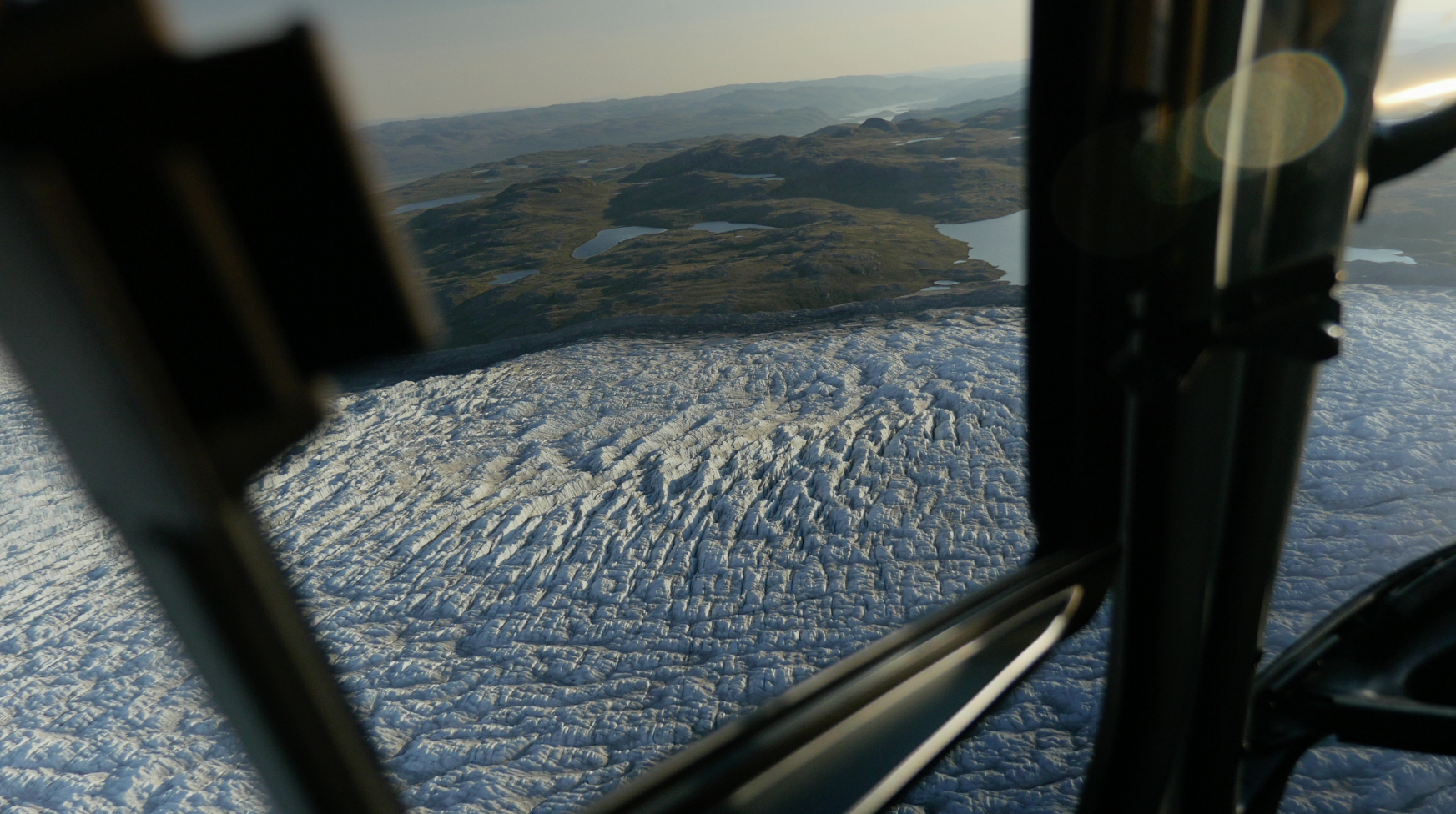
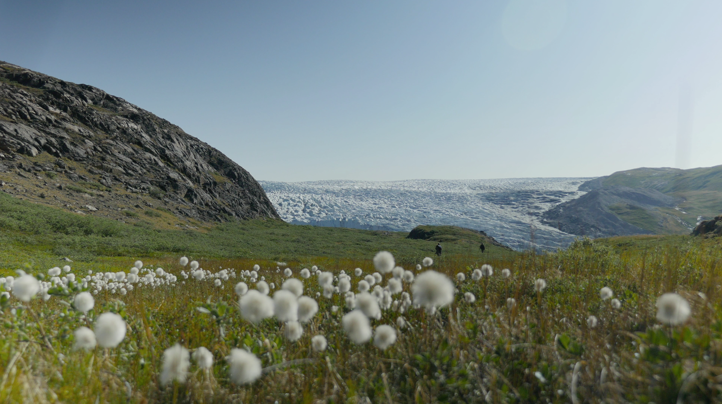
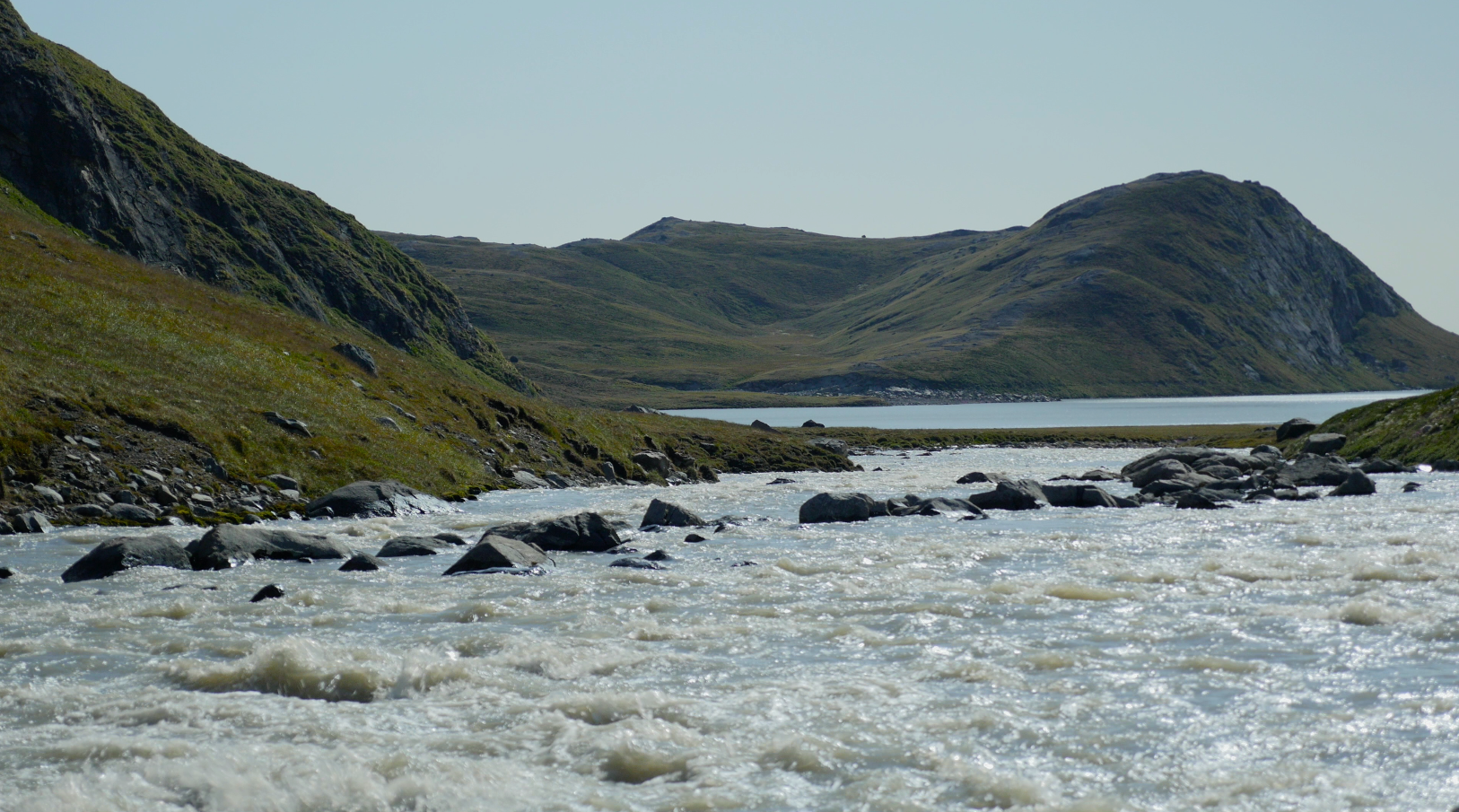
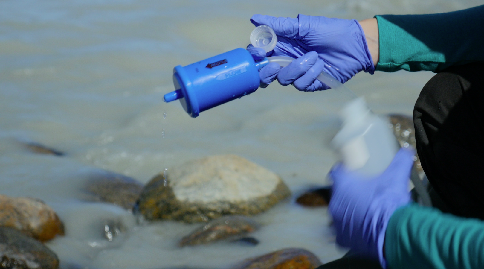
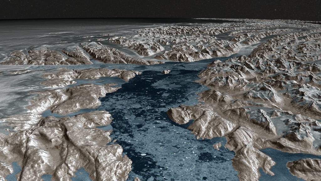
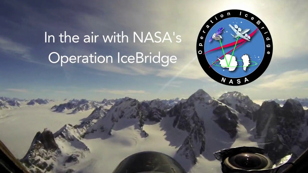
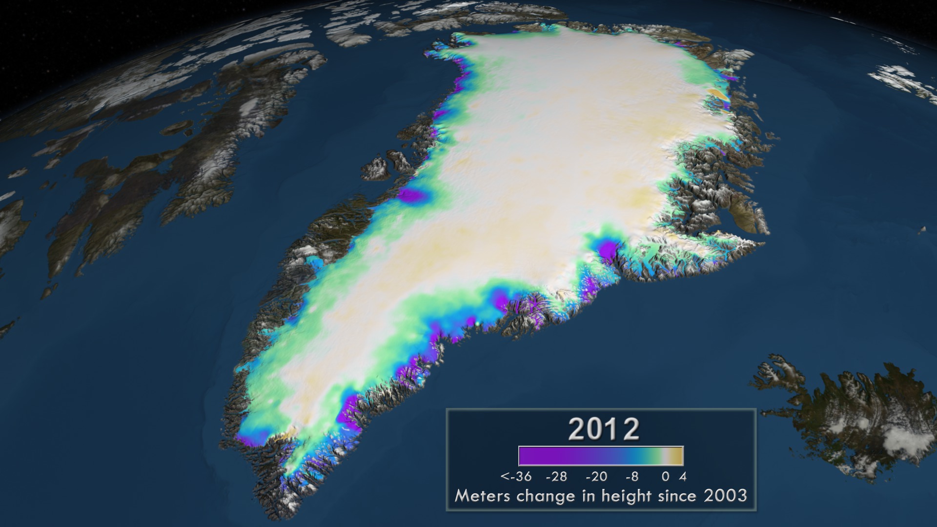
Movies
- GL_INST_2.mov (640x640)
- GL_INST_2.webm (640x640)
Images
- GL_INST_2_print.jpg (1024x1024)
- GL_INST_2_thm.png (80x40)
- GL_INST_2_searchweb.png (320x180)
- GL_INST_2_web.png (320x320)
Right click movies to download them if they automatically play in your browser.
For complete transcript, click here.
Panelists include: Tom Wagner (cryosphere program scientist with NASA's Earth Science Division), Laurence Smith (chair of the University of California, Los Angeles Department of Geography), Mike Bevis (professor of geodynamics at Ohio State University in Columbus), Sophie Nowicki (physical scientist at Goddard), and Josh Willis (JPL).
The Friday program will air live on NASA TV and stream online at: https://www.nasa.gov/nasatv. To ask questions via social media during the televised event, use the hashtag #askNASA.
Credits
Please give credit for this item to:
NASA's Goddard Space Flight Center
Writer
- Patrick Lynch (NASA/GSFC)
Producers
- Jefferson Beck (KBRwyle)
- Joy Ng (KBRwyle)
Series
This visualization can be found in the following series:Related pages
27-year Sea Level Rise - TOPEX/JASON
Nov. 5, 2020, 5 a.m.
Read moreSea surface height change from 1992 to 2019, with colorbar This visualization shows total sea level change between 1992 and 2019, based on data collected from the TOPEX/Poseidon, Jason-1, Jason-2, and Jason-3 satellites. Blue regions are where sea level has gone down, and orange/red regions are where sea level has gone up. Since 1992, seas around the world have risen an average of nearly 6 inches. The color range for this visualization is -15 cm to +15 cm (-5.9 inches to +5.9 inches), though measured data extends above and below 15 cm (5.9 inches). This particular range was chosen to highlight variations in sea level change. Sea surface height change from 1992 to 2019, no colorbar Sea surface height change in the Pacific region from 1992 to 2019, with colorbar Sea surface height change in the Pacific region from 1992 to 2019, no colorbar Sea surface height change from 1992 to 2019, with colorbar, flat projection Sea surface height change from 1992 to 2019, no colorbar, flat projection Colorbar
Greenland Icebergs
Aug. 26, 2015, 11:45 a.m.
Read moreIceberg footage in Disko Bay near Ilulissat, Greenland filmed in July, 2015.
NASA GSFC MASCON Solution over Greenland from Jan 2004 - Jun 2014
Aug. 26, 2015, 6 a.m.
Read moreVisualization of the mass change over Greenland from January 2004 through June 2014. The surface of Greenland shows the change in equivalent water height while the graph overlay shows the total accumulated change in gigatons. GRACE, NASA s ice sheets.This animations shows the change in the the Greenland Ice Sheet between January 2004 and June 2014. The 1-arc-deg NASA GSFC mascon solution data was resampled to a 998 x 1800 data array using Kriging interpolation. A color scale was applied in the range of +250 to -250 centimeters of equivalent water height, where blue values indicate an increase in the ice sheet mass while red shades indicate a decrease. In addition, the running sum total of the accumulated mass change over the Greenland Ice Sheet is shown on a graph overlay in gigatons.Technical Note: The glacial isostatic adjustment signal (Earth mass redistribution in response to historical ice loading) has been removed using the ICE-6G model (Peltier et al. 2015). A print-resolution image of the accumulated change in equivalent water height over the Greenland Ice Sheet from January 2004 through June 2014. A graph showing the total change in gigatons is overlaid on the image. The same movie as shown above without the reference to the data source: NASA GSFC NASCON Solution. The background visualization without the graph overlay or labels. The graph overlay of the mass change in gigatons with transparency along with all text labels, colorbar and date. The colorbar alone with transparency The date overlay alone with transparency.
NASA GSFC MASCON Solution over Antarctica from Jan 2004 - Jun 2014
Aug. 26, 2015, 6 a.m.
Read moreVisualization of the mass change over the Antarctic Ice Sheet from January 2004 through June 2014. The color on the surface of the ice sheet shows the change in equivalent water height while the graph overlay shows the total accumulated change in gigatons. GRACE, NASA s total change in gigatons is overlaid on the image. The same movie as shown above without the reference to the data source: NASA GSFC NASCON Solution. The background visualization without the graph overlay or labels. The colorbar alone with transparency The graph overlay of the mass change in gigatons with transparency along with all text labels, colorbar and date. The date overlay alone with transparency
Aerials over Greenland
Aug. 26, 2015, 6 a.m.
Read moreA reel of helicopter footage taken in July of 2015 over Greenland including a transit from Kangerlussuaq, Greenland to a field camp on the ice sheet, operated by UCLA s Larry Smith footage over the Ilulissat IceFjord and nearby glaciers.
Greenland Beauty Shots
Aug. 26, 2015, 6 a.m.
Read moreViews of Greenlandic scenery from Kangerlussuaq, the terminous of the Russell Glacier, and the Ilulissat region.
Greenland Melt Water
Aug. 26, 2015, 6 a.m.
Read moreVarious scenes of water melting from the Greenland Ice Sheet on its way to the sea.
Researchers in the Field
Aug. 26, 2015, 6 a.m.
Read moreUCLA s Larry Smith, Vena Chu from UC Berkeley and other reserachers conduct work in the ablation, or melt zone of the Greenland Ice Sheet. The work included the deployment of floating sensors, conducting 72 continuous hours of melt water profiles, and ice mapping using fixed-wing drones. NASA, the National Science Foundation, and universities support a variety of field research in Greenland. Grace Andrews and her colleague sample melt water originating from the Russell Glacier as part of a study on C02 evasion led by Andrew Jacobson from Northwestern University.
22-year Sea Level Rise - TOPEX/JASON
Aug. 26, 2015, 5:30 a.m.
Read moreSpinning globe showing TOPEX/JASON 22-year sea level data. Earth spins once before camera zooms into West Atlantic, East Pacific, and West Pacific regions. With colorbarThis video is also available on our YouTube channel. This visualization shows total sea level change between 1992 and 2014, based on data collected from the TOPEX/Poseidon, Jason-1, and Jason-2 satellites. Blue regions are where sea level has gone down, and orange/red regions are where sea level has gone up. Since 1992, seas around the world have risen an average of nearly 3 inches. The color range for this visualization is -7 cm to +7 cm (-2.76 inches to +2.76 inches), though measured data extends above and below 7cm(2.76 inches). This particular range was chosen to highlight variations in sea level change. Spinning globe showing TOPEX/JASON 22-year sea level data. Earth spins once before camera zooms into West Atlantic, East Pacific, and West Pacific regions. TOPEX/JASON 22-year sea level data. Flat map - print still TOPEX/JASON 22-year sea level data. Flat map - print still. With color bar TOPEX/JASON 22-year sea level data. 3d globe focused on the Atlantic Ocean - print still TOPEX/JASON 22-year sea level data. 3d globe focused on the eastern portion of the Pacific Ocean - print still TOPEX/JASON 22-year sea level data. 3d globe focused on the western portion of the Pacific Ocean - print still TOPEX/JASON 22-year sea level data. 3d globe focused on the western portion of the Atlantic Ocean - print still red to white to blue colorbar. -3cm to 3cm red to white to blue colorbar. -2.76in to 2.76in
Greenland's Glaciers as seen by RadarSat
Aug. 24, 2015, 8 p.m.
Read moreAn animation up the Greenland s Applied Physics Lab and accurately registered to the topography data. Each of six tile sets represents data for one year between 2000 and 2013, while the final one is a composite of the six years that has most areas of missing data resolved. Each of these tile sets consist of a 5 x 5 array of 421 megapixel tiles. The false color of the surface is derived as follows. Three different color scales are applied to the floating point Radarsat reflectance data based on their relationship within the GIMP masks. Areas within the ice sheet mask are mapped to a color ramp from white (high) to grey (low). Areas within the land region of the ocean mask but not in the ice sheet mask are similarly mapped to a color ramp of light to dark tan. The area indicating ocean is mapped to blue. An animation of flows showing the drainage area of the Petermann glacier An animation showing the region around Northeast Greenland along with the change in the calving front of the Zackary Istrom glacier from 2000 to 2013
Operation IceBridge Arctic 2015 video series
April 22, 2015, 10 a.m.
Read moreThe Helheim ExperienceTake a few minutes to sit back, put on your headphones, go full screen, and enjoy a birds-eye view of a vast expanse of Greenland s a small dose of how it feels to be part of the IceBridge team during a typical Kangerlussuaq morning, from that frigid ride to the airfield to wheels up over gorgeous Greenlandic scenery. Helheim Footage for Instagram This flight footage was taken from the cockpit of a NASA C-130 aircraft en route to the Helheim Glacier in eastern Greenland. Helheim has shrunk considerably in recent years. (Music courtesy Moby.)
Measuring Elevation Changes on the Greenland Ice Sheet
March 25, 2014, 7 a.m.
Read moreThis narrated animation shows the accumulated change in the elevation of the Greenland ice sheet between 2003 and 2012. This is the official release without the scrolling credits. If needed, a complete transcript is available. Since the late 1970 !—Above: Move bar to compare the change in the surface elevation (left) to the bedrock topography (right) in the Jakobshavn region. Download HTML to embed this in your web page.The bedrock topography affects the movement of the ice sheet. Blue/white velocity flows indicate the direction and speed of the ice over time. Slower moving ice is shown as shorter blue flow lines while faster moving ice is shown as longer white flow lines. This narrated animation shows the accumulated change in the elevation of the Greenland ice sheet between 2003 and 2012. This version has the full list of scrolling credits at the end of the animation.If needed, a complete transcript is available. This print resolution image shows where measurements were taken on the Greenland Ice sheet. The paths of the ICESat satellite are colored in gray and the tracks of the airborne mission Operation IceBridge are shown in purple. This print resolution image shows the accumulated change in the surface elevation of the Greenland ice sheet between 2003 and 2012. This print resolution image shows the bedrock topography of Greenland with the ice sheet removed. Areas below sea level are shown in brown while areas above sea level are colored green. Yellow indicates regions at sea level. The blue/white flows indicate the direction and speed of the ice movement with slower moving ice is shown as shorter blue flow lines and faster shown as longer white flow lines. This print resolution image shows the change in the surface elevation of the southeast region of the Greenland ice sheet between 2003 and 2012. In addition, blue/white flows indicate the direction and speed of the ice movement. This print resolution image shows the southeast region of the Greenland Ice Sheet with a portion of the ice sheet remove to reveal the mountains along the coast. In addition, blue/white flows indicate the direction and speed of the ice movement. This print resolution image shows the bedrock topography under the northeast region of the Greenland Ice Sheet. In addition, blue/white flows indicate the direction and speed of the ice movement. The camera view of this frame matches the image below showing the change in surface elevation. This print resolution image shows the change in the surface elevation of the northeast region of the Greenland ice sheet between 2003 and 2012. In addition, blue/white flows indicate the direction and speed of the ice movement. The camera view of this frame matches the image above showing the bedrock topography under the ice sheet. This print resolution image shows the bedrock topography under the Jakobshavn region of the Greenland Ice Sheet. In addition, blue/white flows indicate the direction and speed of the ice movement. The camera view of this frame matches the image below showing the change in surface elevation. This print resolution image shows the change in the surface elevation of the Jakobshavn region of the Greenland ice sheet between 2003 and 2012. In addition, blue/white flows indicate the direction and speed of the ice movement. The camera view of this frame matches the image above showing the bedrock topography under the ice sheet. This print resolution image shows the change in the surface elevation of the Jakobshavn region of the Greenland ice sheet between 2003 and 2012. In addition, blue/white flows indicate the direction and speed of the ice movement. This print resolution image shows where the measurements were taken on the Greenland Ice sheet. The paths of the ICESat satellite are colored in gray and the tracks of the airborne mission Operation IceBridge are shown in purple. This colorbar shows the colors and corresponding values for the accumulated change in the surface elevation of the ice sheet since 2003. This colorbar shows the colors and corresponding values for the elevation of the bedrock topography. This layer contains the background image without the date, colorbar or credit overlay. This layer contains the colorbars for both the change in elevation over time as well as for the bedrock topography with transparency. In addition it contains the ending credits. The date overlay with transparency