Fluorescence Visualizations in High-Resolution
During photosynthesis, plants emit fluorescence – a form of light invisible to the naked eye but detectable by satellites orbiting hundreds of miles above Earth. NASA scientists established a method to turn this satellite data into global maps of the subtle phenomenon in more detail than ever before.
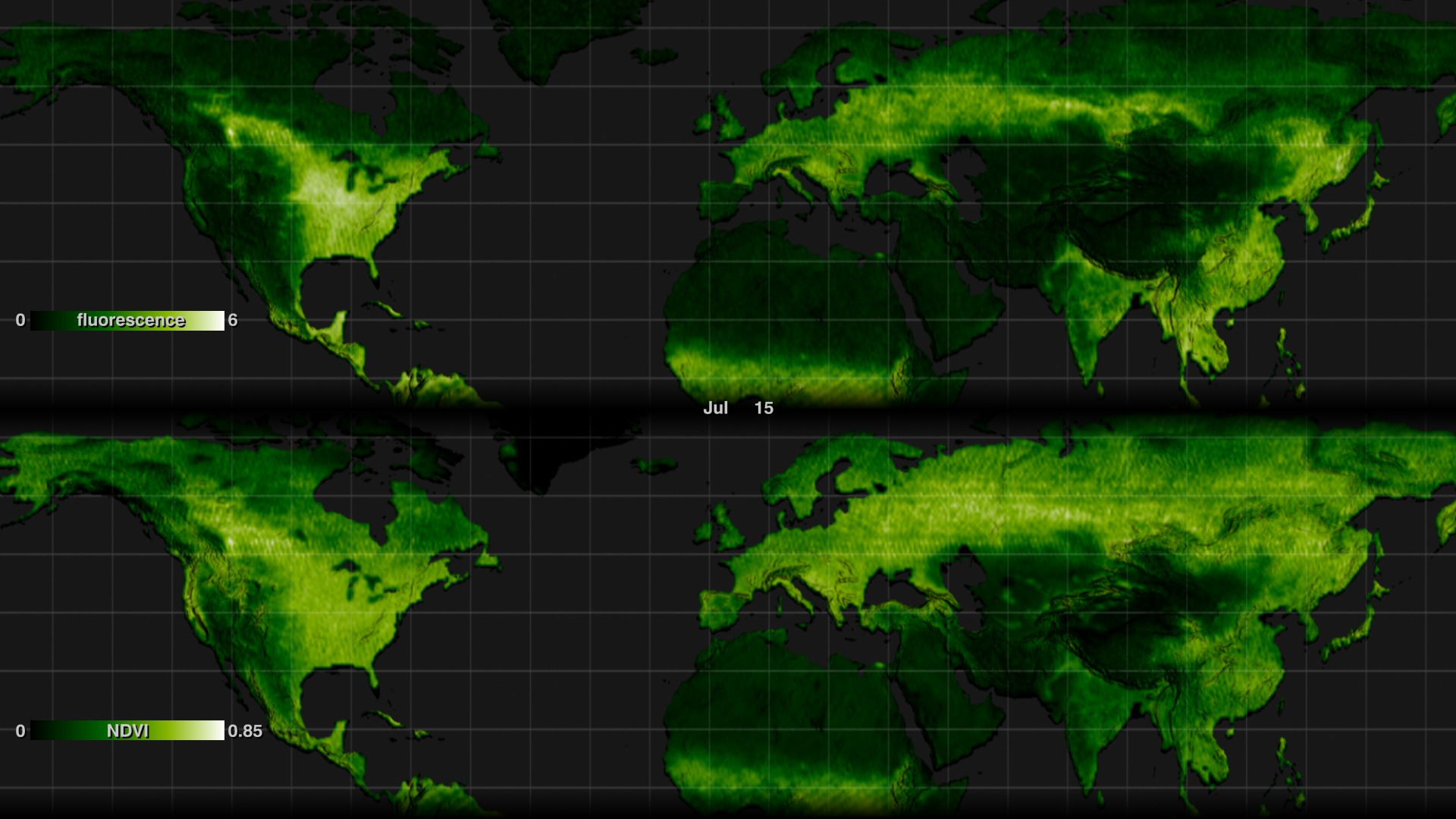
The new maps, released in 2013, provide a 16-fold increase in spatial resolution and a 3-fold increase in temporal resolution over the first proof-of-concept maps released in 2011. This lets scientists use fluorescence to observe, for example, variation in the length of the growing season.
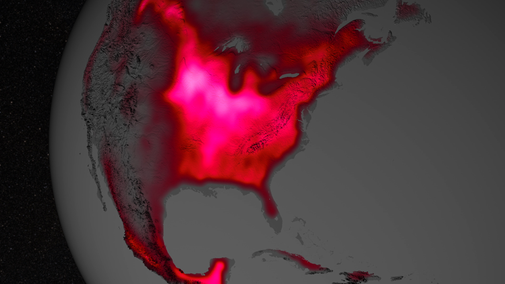
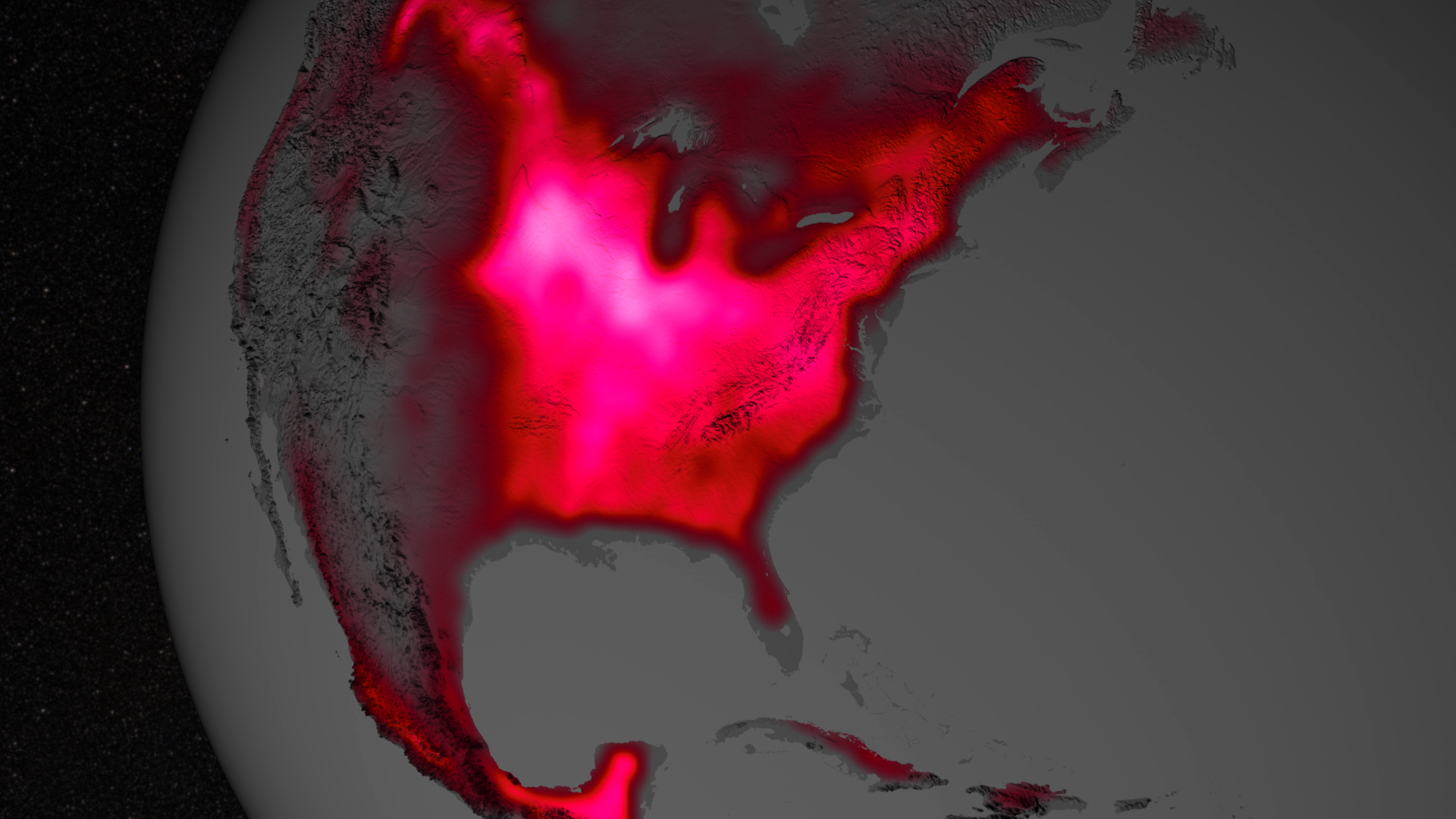
A visualization of the phenomenon shows global land plant fluorescence data collected from 2007 to 2011, combined to depict a single average year. Gray indicates regions with little or no fluorescence; red, pink and white indicate regions of high fluorescence.
Land plant fluorescence across North America and South America
Land plant fluorescence in South Africa
Land plant fluorescence across Europe and East Asia
Land plant fluorescence in North America
Land plant fluorescence in the UK
Land plant fluorescence in Africa

Solar Induced Fluorescence color bar. Range is 1 to 6 with dark gray at the low end through reds and pink to white at the high end.
Credits
Please give credit for this item to:
NASA's Goddard Space Flight Center Scientific Visualization Studio
-
Animator
- Greg Shirah (NASA/GSFC)
-
Producer
- Kayvon Sharghi (USRA)
-
Scientist
- Joanna Joiner (NASA/GSFC)
-
Writer
- Kathryn Hansen (Wyle Information Systems)
Release date
This page was originally published on Wednesday, July 24, 2013.
This page was last updated on Wednesday, May 3, 2023 at 1:51 PM EDT.
Datasets used in this visualization
-
GOME-2 Solar Induced Fluorescence at 740 nm [MetOp: GOME-2]
ID: 792
Note: While we identify the data sets used in these visualizations, we do not store any further details, nor the data sets themselves on our site.
Related
- ID: 11583
- ID: 4100
- ID: 11322
 Produced Video
 - ID: 11317
 Produced Video